
The Simplicity & Beauty of Dynamic Symmetry – Visual Glossary
14/365
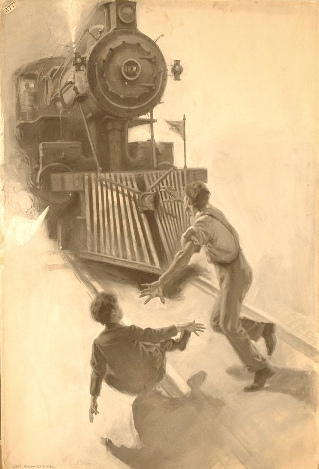
“Instinctive art without mental control is bound to fail” Jay Hambidge.
What is Dynamic Symmetry? It is an easy way to compose and organize your art with unity, movement, rhythm, strength and dominant diagonals. It’s a subject covered extensively throughout this site (see All Articles, Grids, Book and More Info), but before we go any further, I think we should cover where we are getting the term dynamic symmetry and how the armature of our rectangle was built.
I would call Jay Hambidge the grandfather of dynamic symmetry. He writes a book that covers it in great detail…though he doesn’t show how it relates to art. That’s where the Canon of Design comes into play.
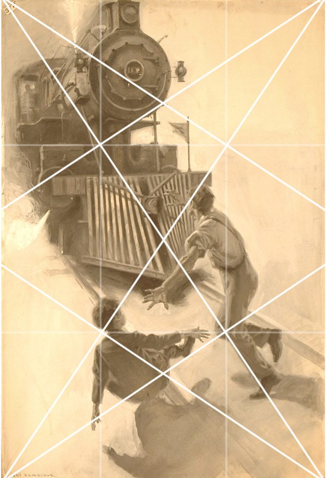
With just the basic armature, we can see how Jay Hambidge is lining up his subjects with the major diagonals, and using his gamut to echo them.
Below I’ll introduce you to a handful of rectangles which you can use to design your art within. Knowing how to build each will help you decide which one you will need in the future. because your rectangle’s armature and shape should compliment your subjects structure. Have a good idea of what your subject is, then choose a dynamic rectangle to fit it in…not the other way around.
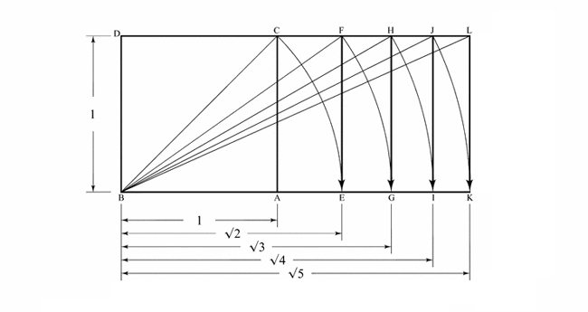
Dynamic Symmetry Root Rectangles
Here is a simple diagram of how to build each root rectangle. It all begins with a square. Swing the diagonal of the square down to make a root 2. Swing the diagonal of the root 2 down to make a root 3….and so on. Easy right?
After a root 5, things start getting rather long, and difficult to apply…but if you need to compose a long panorama shot, you could construct a root 6 or 7 using the same method.
Watch the three-part video series that helps you understand how to build the dynamic symmetry grids in Photoshop.
What are the Ratios Used for?
Below you’ll see ratios next to the root rectangles. Don’t let this freak you out! You won’t even really need these numbers unless you want to make a canvas or image a specific size. For instance, if you have a 24×36 that you bought at the art store and you want to cut it down to a root 3 rectangle. You like the length of 36 inches, so all you need to do is cut it down according to the root 3 ratio, 1.732.
36in / 1.732 = 20.78 inches
The same works for centimeters if it’s easier for you to measure.
Your final canvas size will be 20.78in x 36in which will equal your root 3 rectangle. What does that mean? Well if you want to shoot for a specific frame size, you will know which rectangle to use with the minimal amount of cropping.
More Info on Root Rectangles
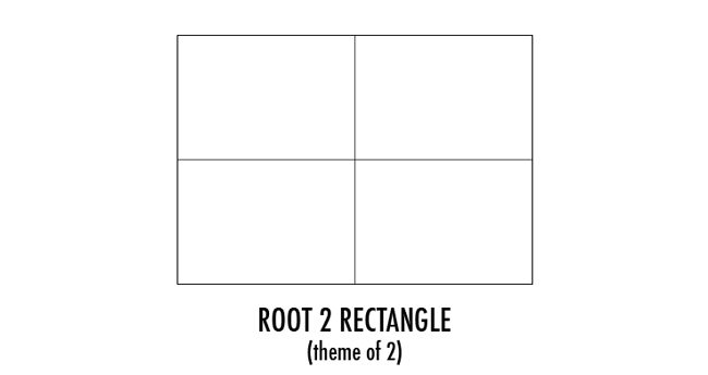
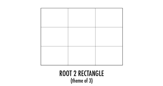
Root 2 Rectangle= 1.414, very close to 5×7
We can easily break down the Root 2 rectangle on the theme of two or three. Theme, meaning divide it in half or in thirds. But remember, we are still going to build the basic armature within each rectangle.
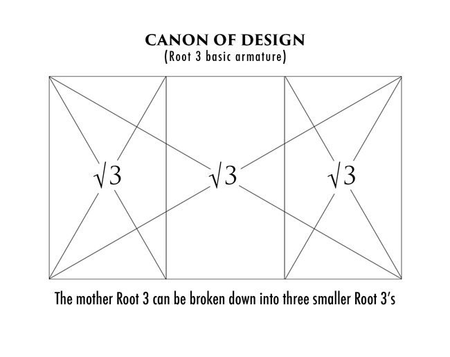
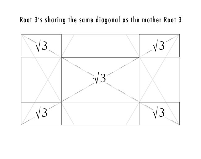
Root 3 Rectangle = 1.732 very close to the 16:9 cinema screen
Remember when you created one of these Root 3 rectangles from a dot to dot (see Day 6)? Did you have flashbacks of elementary school? Anyway, all of these Root rectangles can be broken down into the same exact number of root rectangles. Root three can equally fit three root rectangles inside the mother rectangle, the Root 2 can fit two root rectangles, etc. We can see this in the example below.
To complete the armature, we can run a vertical and horizontal line through the “eyes” of the intersection points, or polar points (see Day 5). This is my preference for photography, and to analyze paintings.
NOTE: The vertical lines in the armature above can be used as well. The dynamic symmetry is not affected in these two examples because we are using the eyes to create the lines…when we use the eyes, we are still keeping the integrity of dynamic symmetry.
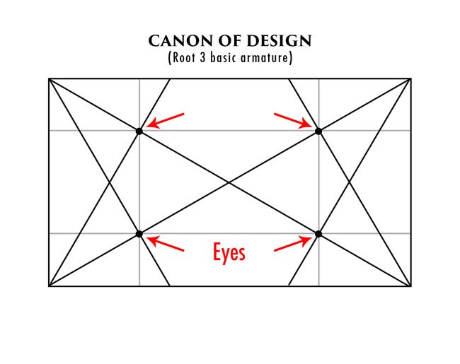
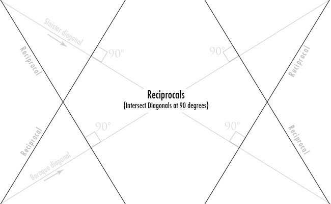
Just in case you forgot how to create the eyes in the diagram above, I’ve included this refresher. We run a line from each corner of the rectangle, then intersect the major diagonals (baroque and sinister) at 90 degrees…that’s it!
And we know that if the rectangle shares the same diagonal, then it is the same proportions as the mother. When we look at our basic armature from the previous diagram, we can see that we already have five Root 3 rectangles hiding within it. Isn’t this fun?!
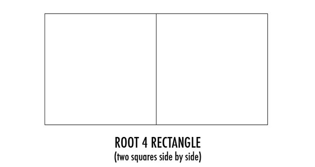
Root 4 Rectangle = 2
The root 4, 9, 16, and 25 are all rectangles with a rational number (equal number of squares), but only the root 4 and 9 are commonly used today.
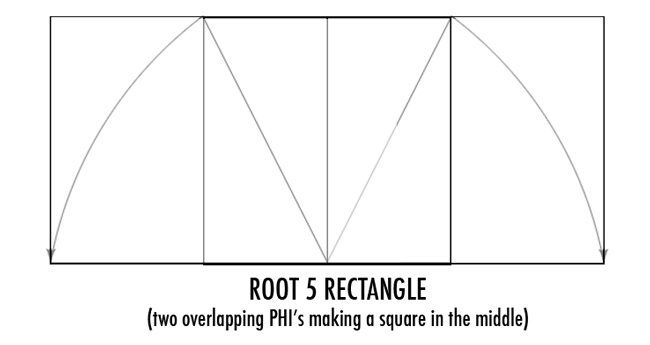
Root 5 Rectangle = 2.236 very close to the 21:9 ultra wide cinema screen
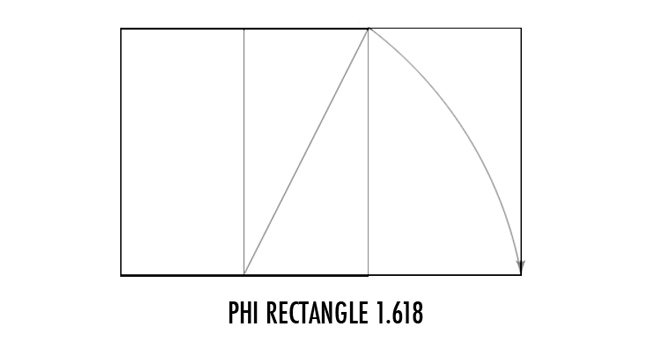
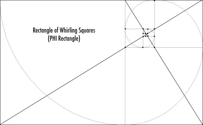
Phi Rectangle- 1.618 This is the rectangle of the whirling squares. The ratio that is found in the human body and nature. This is close to the 1.5 ratio rectangle, so if you had to, you could use the frame sizes for that and not crop anything. (I always like to make it the size of the rectangle I chose to shoot because the dynamic symmetry is specific to the rectangle. Cropping your image differently than the rectangle you composed with will violate the integrity of the dynamic symmetry…but if you are trying to match a certain frame you will have to something custom to fit, or make a compromise.)
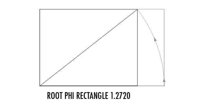
Root Phi Rectangle- 1.2720 Take the length of the PHI rectangle, swing it up from the bottom and this will give you the Root PHI. It’ is the smallest of all of them, and it is almost exactly the same ratio as the standard 11×14 frame size, and very close to 8.5×11, 14×18 and 28×22.
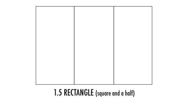
1.5 Rectangle – a square and a half. Equal to 4×6, 8×12 or 24×36 frame size
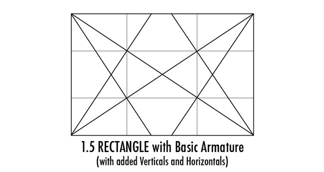
As we covered in the Canon of Design Essentials (see Day 7), the basic armature of a rectangle consists of two diagonals, and four reciprocals. Then you can add horizontals and verticals through the eyes of each intersection. That’s it. Easy!
When you are building your composition, say a large painting, or a well laid out photograph with set design, you can break it down even further using major area divisions (MAD). Just use the same basic armature of the original rectangle, and shrink it down to make 4 more.
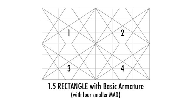
Here is the basic armature (dark) with the underlying MAD (lighter). This is the technique you can use for composing your work as well as analyzing other works of art. 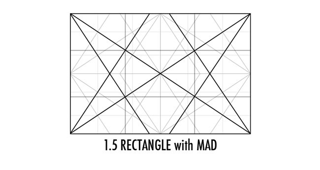
You can use this basic armature build up with all of the rectangles (even arbitrary rectangles if you really must).
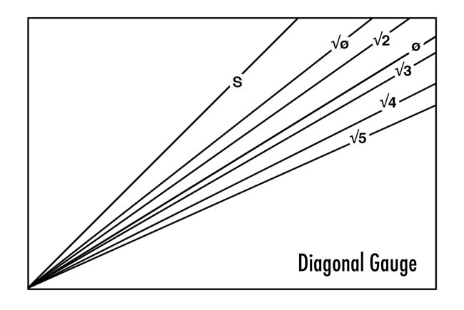
The gauge below can be used on unknown rectangles to find the diagonal easily, then you’ll know exactly which one was being used.
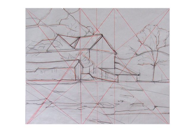
Below is an example of how Dot Bunn, a student of Myron Barnstone, uses dynamic symmetry to create the basic armature of her rectangle and design her composition. This is a rare occurrence because we don’t usually get to see the under structure of paintings. I still haven’t found any of the masters. Remember, they wanted this to be a secret. Dot Bunn has more examples of her designs on her site.

Cropping your image differently than the rectangle you composed with will violate the integrity of the dynamic symmetry.
The Rule of thirds won’t give us variety, unity, and order like dynamic symmetry and design will.
“Design created within rectangles which do not possess dynamic symmetry, the qualities of life and growth, are always flat and dead.” Jay Hambidge
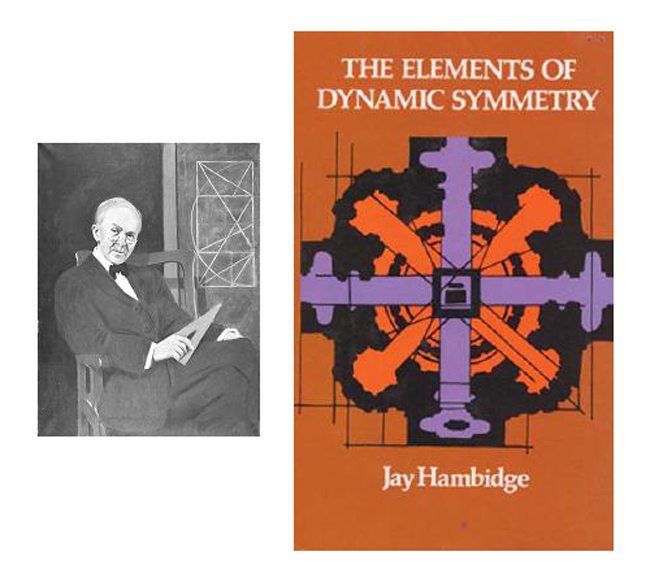
If you want to learn more about the math side of the dynamic rectangles you can always buy The Elements of Dynamic Symmetry or you can DOWNLOAD various formats from a public domain site.

DYNAMIC SYMMETRY GRID DOWNLOAD
*available on the Resources page (members only freebies)
If you don’t have time to construct the rectangles and use them in your photos or other design, feel free to download the grids I use to analyze art and crop to size. Meaning design the photo first, on location, then use these in post to help with cropping size. Don’t go shooting, then come back to Photoshop and try to line things up to the grid…you’ll be doing it backwards.
Each root rectangle has it’s own harmony, so to design your photo on location to a Root 4, then come back and crop it to the size of a Root Phi will be killing all of the harmony you’ve created with the specific diagonals and reciprocals of the rectangle.
DOWNLOAD 30 Essential Dynamic Symmetry grids from the Resources, or get all 240 dynamic symmetry grids for computer, camera, phone, and iPad are available HERE


February 16, 2014 @ 5:59 am
I haven’t finished the series yet so sorry if you have already answered this. When you compose to a certain rectangle’s armature do you want to repeat that same ratio used to construct the rectangle throughout the composition? For instance if I am doing a 1.5 rectangle piece would it be more visually appealing to place my elements at ratios of 1.5 intervals as opposed to phi ratios?
I just some phi calipers and was wondering if they are most useful in phi based compositions like the golden rectangle, root 5 and root phi. I was thinking that for 1.5 and root 2, 3, and 4 my best option would be halves and thirds. Of course, I don’t mean rule of thirds ;-D
February 17, 2014 @ 12:54 pm
Hi Chibamonster, that’s a good question. And yes, no rule of thirds! haha! From what I’ve discovered by analyzing George Seurat’s work is that you can design in a 1.5 and still use the PHI calipers for your proportions. As far as halve’s or thirds go, you can use those when you are determining a nice ratio for overlapping objects (when PHI doesn’t suffice) as seen in Day 48. The PHI calipers will supply you with most of what you need though. Be sure to check out Day 23 and 67 to see how Seurat designs his painting. He uses calipers in a 1.5 rectangle and also manages to incorporate the grid and many other design techniques…hence a masterpiece is born.
Congrats on getting some Phi calipers! Best of luck in your design! Let me know if you have other questions.
Tavis
March 30, 2014 @ 11:47 pm
You can use the phi ratio in any rectangle.
WARNING : For the sake of visual clarity, harmony and unity it’s better to divide up the space of the canvas based on the gamut and ratio created by the armature of the rectangle you are using.
The Root rectangles makes it reciprocal rectangles divide equally into itself according to its root number. So a root 2 divides equally into 2 reciprocal. Root 3 into thirds, root 4 into quarters and root 5 into 5 equal reciprocal rectangles.
Now if you want to replace the reciprocal theme of 2,3,Quarters or 5ths with Phi — you can.
But again for visual clarity, harmony and unity use a theme. Unless you really really want to use both the phi and the ratios of the rectangle.
How will that effect your design?
1. It expands your gamut from 8 line directions to 12. Which gives the viewers eyes more information to process.
2) The more points along a line your composition can place intersecting lines the heavier and more clutter your design may feel to the viewer.
So if you have a line. And in your composition you declare that all lines are only permitted to intersect or join another line at 4 points rather than say 6 or 8 points. The 4 point design will give your composition more space between lines. This helps your design “breathe”.
Hope this helps.
March 31, 2014 @ 11:12 pm
Thanks for helping with the in-depth comment Aladine!
March 30, 2016 @ 8:31 am
Hi Dee, thanks for the comment.
It’s kinda confusing in written form, but when you look at the attached image you can see that BC is the diagonal of the square. When that diagonal swings down, it meets E. Then to complete the root 2 you run a line up from E to F. So now the final root 2 rectangle is BEFD. Hope that helps! 🙂 Please comment again if you are still stuck. Thank you!
April 5, 2016 @ 6:47 pm
Thanks Travis.
I’m slowly getting it. But your work is amazing. Its mind blowing and its changing the way I look at art and my own work.
Thank you.
April 6, 2016 @ 7:08 am
Thanks Dee, I really appreciate that! I’m glad the info is inspiring your work so much 😀
April 12, 2016 @ 7:19 am
Hey Travis, I’ve downloaded the grid and want to get them printed for my lcd screen.
I am having trouble with the sizing. I am printing them as they are from the psd files, but are coming out too big. Could you tell me what you did for the correct sizing on a 3.2″ lcd screen?
Thank you in advance.
April 13, 2016 @ 7:37 am
Hi Dee, I would recommend measuring the width and height of your LCD, then resizing the grid layout according to those measurements. Also, make sure that it stays within the 8.5×11 paper size without shrinking it to a printable area. To get it exact, might take a bit of finessing. Hope that helps Dee! I’m glad you’re starting to practice with the grids!
April 14, 2016 @ 6:38 pm
I’m so freaking excited.
Thank you Travis. https://uploads.disquscdn.com/images/96cd11c89d14edb6ed1a4f9a1b43fb8a7d45dd46df53dcae33bad58192c4055d.jpg
June 7, 2016 @ 11:41 am
The PDF is a hard read, but get a load of this quote:
“Unless rectangles are used which possess this dynamic property of modulation and measurableness it will be impossible to give design the vital qualities of life and growth. Design created within rectangles which do not possess this function of commensurable area are always flat and dead.” (page 67)
June 8, 2016 @ 7:17 am
Wow, that is a mouthful! Hambidge has a way with words 😀 I agree with the quote though. Thanks for sharing, I haven’t read his book in a while. Awesome reference though!
June 10, 2016 @ 9:26 am
Tavis, you mention the 1.5 is close to Phi, but is it also a special rectangle like the Phi or roots? Or do you just include it because that is the most common sensor size in our cameras today?
June 10, 2016 @ 10:53 am
It’s special in it’s own way I suppose. It is the most common sensor size, plus popular printing/canvas sizes like 4×6 and 24×36. I wish they would make phi ratio camera sensors though 😉
June 10, 2016 @ 11:23 am
And after further analysis, it seems to me the 1.5 is closer to a Root 2 instead of Phi, right? 1.5-1.414=.085 vs 1.618-1.5=1.118
June 12, 2016 @ 11:42 am
You’re right, but with the root 2 you would snip at the sides, and the phi you would snip at the top and bottom. I like the phi because it’s skinnier than the root two and works better with the photography I do…mostly models in the landscape, or full body shots. It all depends though….all of the root rectangles come in handy for different subjects.
July 27, 2016 @ 7:17 am
That’s awesome, looks great! Sorry for the delayed response 😉
September 13, 2016 @ 7:42 am
Hi Tavis,
Great blog so far, the only thing that stops me from reading all night is that I have to go to work in the morning.
I plan to get in touch in a more personal matter later this year, but for now I just want to quote HCB from his book “The decisive moment”:
“Any geometrical analysis, any reducing of the picture to the schema, can be done only after the photograph has been taken, developed and printed – and then it can be used only for a post-mortem examination of the picture. I hope we will never see the day when photo shops sell little schema grills to clamp onto our view-finder; and that the Golden Rule will never be found etched on our ground glass”.
I had to quote this since you are teaching the old school of design, but in the same time you are offering free downloadable grids to be stick on displays (on your resources page). Isn’t this a form of cheating after all? Of course it helps on finding the right arrangement, but once you see it works why would anyone remove the grid and really learn how to “see”? Of course, technology had greatly evolved since the invention of photography (LCD, Photoshop, digital printing, well digital sums it all – if 30 years ago developing a photography took a couple of hours, now everything is just a matter of a mouse click). However, this doesn’t mean that people shouldn’t study and learn the craft from great masters’ works and then just copy them, trial and error, until they manage to master their technique.
Now let me quote you: “[…] we don’t usually get to see the under structure of paintings. I still
haven’t found any of the masters. Remember, they wanted this to be a
secret”. Again, I believe that personal studies over paintings and photographs have more to teach than a cheating grid. After all the legacy is huge.
Would love to hear your take on this.
Thanks and keep up the excellent work!
September 15, 2016 @ 7:19 am
Hi Sandru, thanks for the nice comment and question! Glad you’re enjoying the content so far.
That’s a great question and it’s interesting because I was just looking at this quote and writing about it in the upcoming street photography book 😀
His book was published in the 50’s and a ton has changed since then. Like you mentioned, technology has advanced greatly and Bresson didn’t have an LCD screen to enjoy 😉 I still think his quote is great because we can learn a lot from analyzing our own work for composition techniques. I am a firm believer of starting with the LCD grids though, because it worked for me. I’m a visual learner, so it might not be for everyone. It helped me see the lines and understand it in a way I could comprehend and put into practice. I don’t think it’s a form of cheating because none of us were classically trained by an accomplished cubist painter like Bresson was. He learned a great deal about his “geometry” from Andre Lhote….lucky guy!
The grid on an LCD is similar to the lines on a highway I suppose. When we are beginning to drive they are helpful guides to keep us from veering off into the other lane. After a while though, we know which side to be on, when to safely pass cars, and we could easily do it without lines guiding us. The grid is a tool, but shouldn’t be considered a cheat. I recommend others to use both the grid, and analyze their work….the best of both worlds 😉
Hope that answers your question Sandru, take care.
September 16, 2016 @ 11:14 am
Hi Tavis,
Thanks for answering. What can I say? Good answer 🙂 I must admit that I was a bit selfish and didn’t thought at visual learners prior on writing my comment.
And I also have to admit that I do miss a grid from times to times, but in the end the grid overlay applied in lightroom helps a lot on learning where did I go wrong when taking the shot and I can see the difference as weeks pass and I study and practice. As Bresson used to say something like: “it’s a matter of millimeters that can define a good composition” (not the exact quote).
I wonder from time to time, how did Bresson selected his photos in post production? Let’s say that for each decisive shot he had 10 others frames to choose from. What tool did he use, a grid over his photos, a golden ratio caliper? Same goes for other photographers? How did they “measure” their composition? I am especially referring on those that were against cropping. It’s hard to believe that they always had time for exact composing.
Maybe I’ll find out someday. For the moment I’m glad I found Myron Barnstone, Adam Marelli and you (any other recommendations are more than welcomed). Dynamic symmetry is a big game changer.
September 22, 2016 @ 6:39 am
Hi Sandru, thanks for the comment, and sorry for the delayed response. I’ve been working hard on the new book, which covers street photography, Bresson, and the other masters.
You have some great questions. I think Bresson might have used tracing paper to analyze a print of his work. That’s what Myron Barnstone did…he had tons of books in his library that had several pages with tracing paper and grid lines on them. With technology, we can do it quicker in Photoshop or Lightroom. The way I do it is I created an action in Photoshop that places the grid onto the photo…one button and the grid is on top. Pretty handy!
Barnstone used Calipers as well. If you haven’t had a chance yet, take a look at this article about Bresson using dynamic symmetry. You might find it inspiring…it basically explains how he mostly used two lines…diagonal and reciprocal.
https://ipoxstudios.com/henri-cartier-bresson-geometry-exposed/
Another great resource for Dynamic Symmetry is my friend Jim’s site…check it out when you get a chance. He studied Myron’s method also, and has developed a site with excellent resources. http://www.dynamicsymmetry.net/
I’m excited that you are putting this great info to use 😀
September 22, 2016 @ 6:42 am
Thanks for helping out Frank! I agree, the overlapping root 4 rectangles are quite messy, and I always try to analyze by using the 1.5 armature when it comes to Bresson. He seemed to use a diagonal and reciprocal the most in his work.
August 31, 2017 @ 3:47 am
Hey Tavis
Loving uncovering the secrets behind the masters. FYI: The link to Dott Bunn’s site is dead I think.
August 31, 2017 @ 4:24 pm
Great to hear! 😀 Thanks for the heads up on the link too.