12 Things I Learned from Van Gogh (Master Copy)
#688
Welcome back everyone and thanks for checking out this article to show support!
Today we are going to learn a ton about Vincent Van Gogh’s painting process. This is info you can’t typically find in his biographies or letters to Theo. It’s discovered when creating a master copy! There’s 12 things that I learned when remaking his famous painting “Sunflowers.” Let’s find out what they are!
Master Copy Sunflowers
There’s a lot master painters can teach us, but unfortunately they’re not here to guide us through the process. We have to dig deep and discover what we can on our own. A great way to do that is to create a master copy (see #382), so that’s what I did.
I wanted to learn more about Van Gogh’s colors and brushwork, and “Sunflowers” looked like it could provide these lessons. A master copy is different than a master copy remake (see #583), because you’re trying to replicate it rather than infuse your own style and change the subject matter.
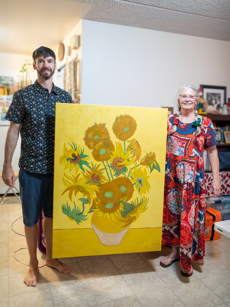
It was finished in November, 2021, and given to my amazing mom for Christmas. You can see how big it is in the photo below (48×36 inches). The original by Van Gogh is only about half that size (36×28 inches).
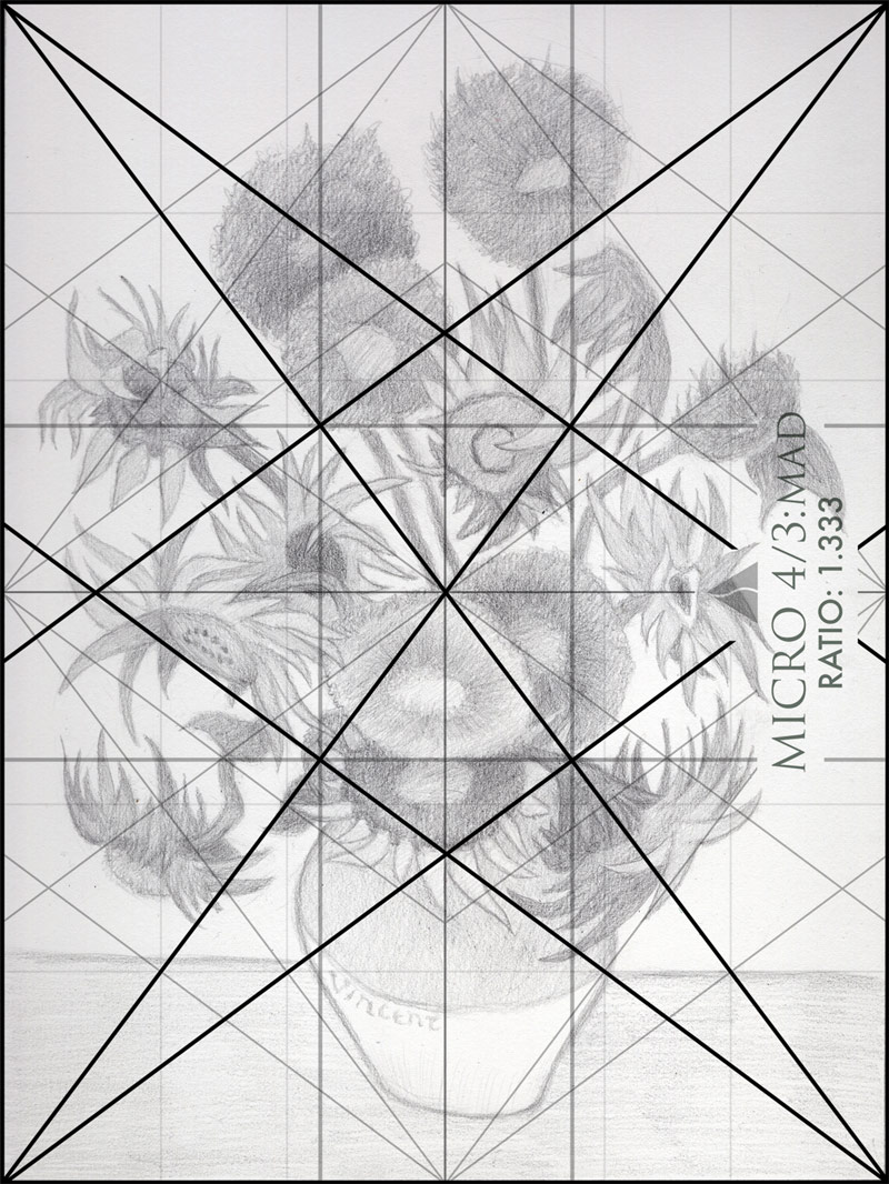
Van Gogh’s design process was also something I wanted to learn about, so I analyzed his Sunflowers painting (see #669), then recreated the techniques in a drawing. You can see some of the early design process below-left, like the arabesques (see Day 17), triangular enclosure (see Day 32), and ellipses (see Day 34). The final rendered drawing can be seen on the right.
Of course, dynamic symmetry always plays its part to help organize the composition and promote design techniques. We can see the 4/3 MAD grid overlaid here, which was also used in the original Sunflowers painting by Van Gogh. Notice how things are locking in and paralleling nicely.
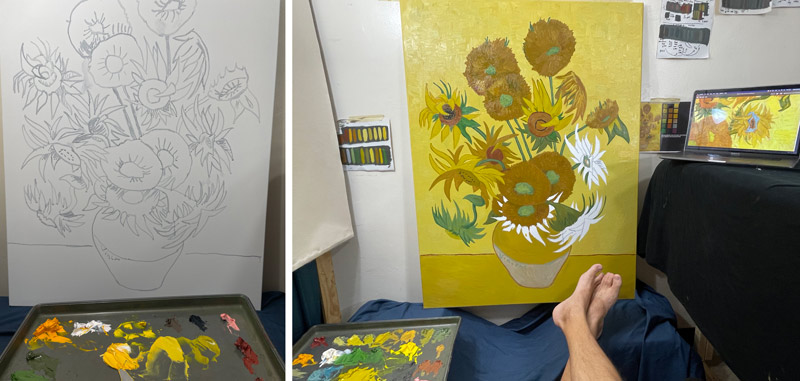
Here are a couple of behind the scenes photos of the transfer and painting process. A projector was used to transfer the drawing to the canvas (left) (see #662), then oil paints were used to finish the color (right).
Now that you’ve seen the beginning process of the master copy, let’s get into the 12 things that were discovered as it was made.
12 Things I Learned Master Copy
Here’s a comparison of the original Sunflowers painting by Van Gogh and my master copy. You can see how the colors are similar, but much brighter. Van Gogh’s may have been this bright in his time (1888), but over the years it has aged. The composition is similar, but things have been refined just to be linear with what is taught on this site.
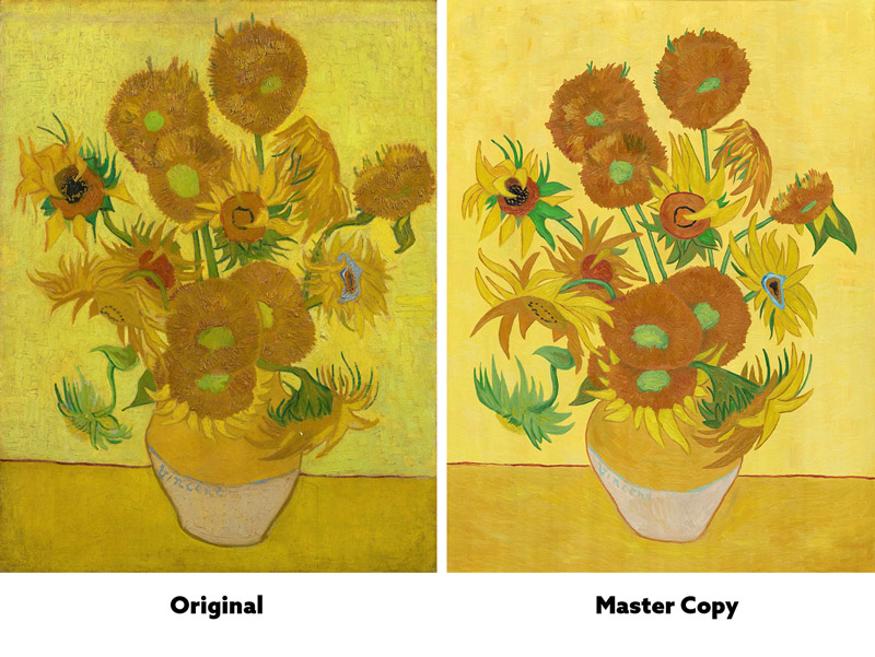
1. Organizing this many shapes is difficult.
The first difference between the paintings you may not have noticed. It had to do with the shapes. I spent a lot of extra time as to not create kissing edges (see Day 48) or bad overlaps (see #564). It was mostly difficult because there are tons of shapes to organize.
Each petal, sunflower, and stem is a shape, which means things can become very complex. When wanting to accurately copy a painting while also making adjustments takes some patience and knowledge of design.
In the comparison below, you can see Van Gogh’s kissing shapes, then the master copy where they were corrected. It’s understandable to get a few kissing shapes when working fast and not wanting to ruin the spontaneity of the brushstrokes (see #585 & #586), but avoid them when you can. Not having kissing shapes adds more visual clarity, which is always a good thing.
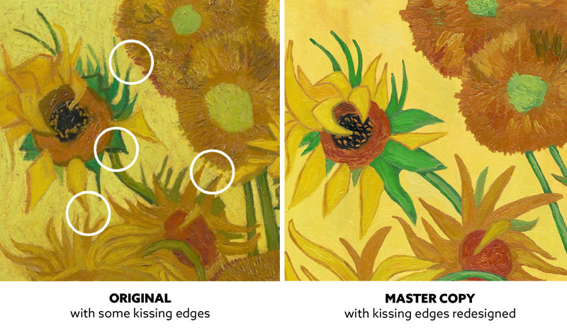
Can you tell the subtle difference between the two examples? Can you see more visual clarity in the redesigned shapes on the right?
2. He used simultaneous contrast and FGR.
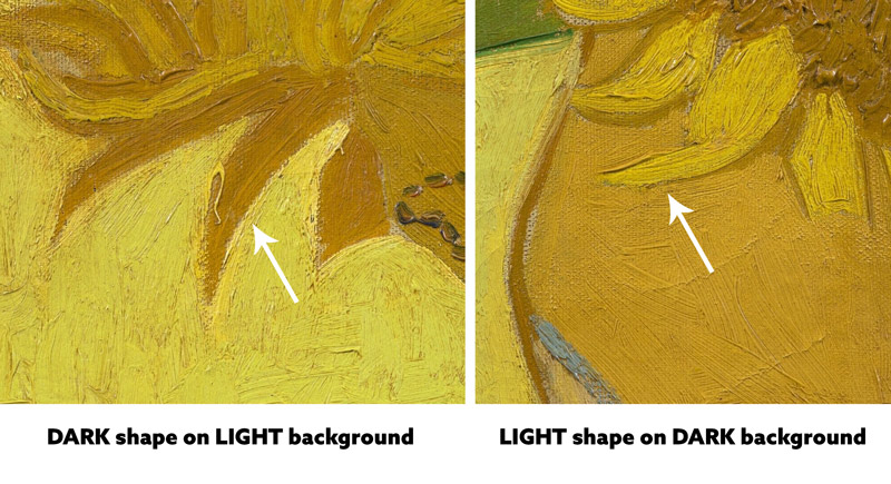
Van Gogh was fully aware of the power of simultaneous contrast (see Day 28) and figure-ground relationship (FGR)(see Day 21). In the example below we can see him using a darker color for the sunflower petals on a lighter background (left), then a lighter color for the petals on a dark background (right). These techniques need to be understood so the shapes are clearly defined where they need to be.
3. He used color contrast to separate shapes.
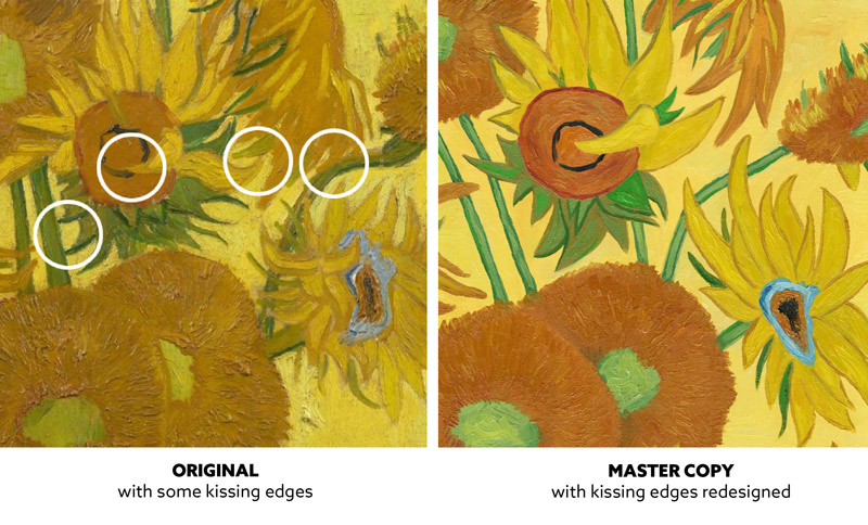
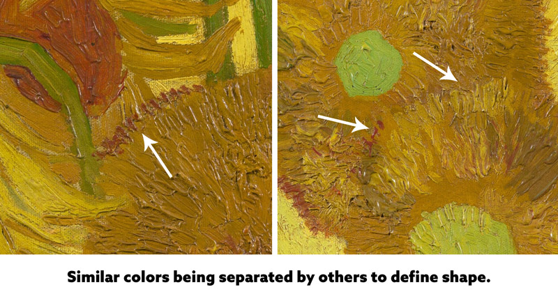
As I worked my way around the composition, laying in brushstroke after brushstroke, I noticed that Van Gogh used color to separate some of the sunflower shapes. In the example on the left he used red to separate the two yellow shapes of similar color. On the right he used a lighter yellow and red to separate them. Van Gogh was fully aware of how to define each shape.
4. He strategically used color intensity.
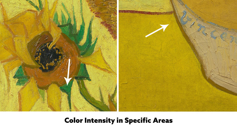
As your eyes run around the beautiful still life, you may notice how Van Gogh used intense colors in specific areas. The sunflower on the left, for instance, is a main focal point with an intense green. There’s also an intense yellow near the vase, as we can see in the lower-right image. These intense colors work together with grays and subdued colors to create color harmony (see #686).
5. Solid colors are boring.
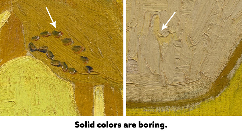
Yes, you heard right. Solid colors are boring…or at least that’s what I gathered from Van Gogh. When we look closer at the examples below, we’ll see how he’s using different colors with similar values to add color variation to the area (see #571). The sunflower seeds are black with a dark red (left), and the yellow is next to a grayish-purple (right). Cool!
6.He used four colors in a hierarchy
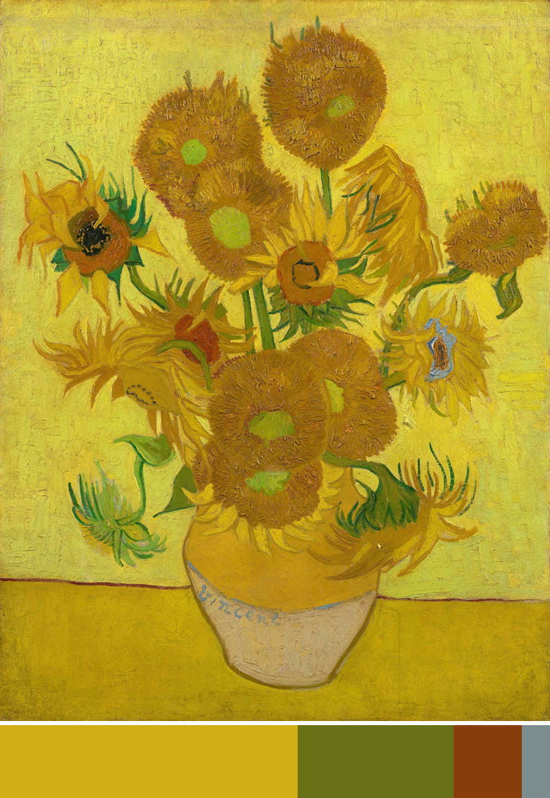
Van Gogh was known for his colorful paintings, and in this case he’s showing us a hierarchy of four colors. He’s got yellow as the majority, then green, red, then a splash of blue. This is a great way to get a completed color balance (see #470). You can see the colors simplified in the swatch below the painting.
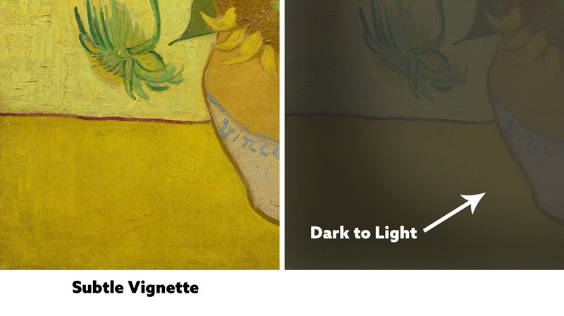
7. A subtle vignette works well.
Vignettes are used a lot in photos, but they can also be used in drawings and paintings for the same reason. It helps bring some attention away from the corners of the image…back to where the action is. Subtlety is key, and we can see how subtle Van Gogh has applied his vignette. He doesn’t want it to have the opposite effect and create a distraction with too much contrast.
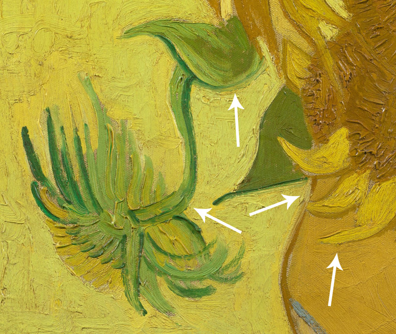
8.Broken outlines can create depth.
A lot of the sunflower shapes Van Gogh creates in his masterpiece have outlines around them. This is to help define them with nice FGR, but we can see how some of them are broken. When they aren’t solid lines, they can create a thick-to-thin look for line variation, but also create depth. In some cases, when the outline is broken it reduces the contrast in that area and can create something similar to a lost edge (see #578).
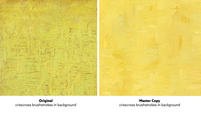
9.Textures come alive with light.
In the comparison below, you can see how Van Gogh creates texture with the crisscross brushstrokes in the background. This is especially noticeable when the painting is lit from above. My version on the right was scanned, so we don’t see the texture as well, but as I was painting it I could really see the painting come alive. It’s really a great thing to see, and it adds so much depth!
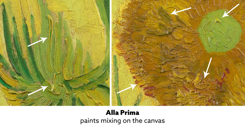
10. Mixing paint on the canvas is beautiful.
Painting “alla prima,” or wet into wet (see #585) allows you to mix paint on the canvas. We can see in the examples below how Van Gogh is able to create beautiful brushstrokes as the sunflower colors blend together. This is a desirable effect and you can see why!
When painting alla prima and laying down some thick paint like Van Gogh, you can try something fun. Load up your brush with paint and only use about four to six strokes. Keep doing this and watch the paint pile up and mix on the canvas. Van Gogh didn’t fuss with his brushstrokes. He laid down paint with confidence, which to some, may look sloppy when compared to an artist like Bouguereau (see #667).
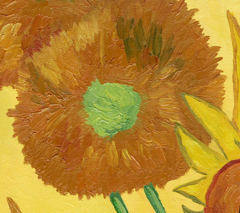
Here’s an example of the Sunflower master copy, and you can see how the paint is mixing together on the canvas. This is a scanned image, which appears much flatter than the actual painting.
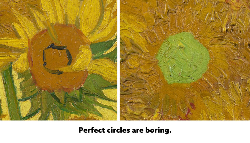
11. Perfect circles are boring.
When you look at Van Gogh’s original painting, you’ll notice that none of the sunflowers have a perfect circular shape. They are all wobbly and wonky. Why? Because perfect circles are boring! That’s not me saying this, it’s just what Van Gogh is telling us with his painting.
Here are some examples from his painting. Look at how imperfect they are! Like I said, it may seem sloppy to realist artists, but I love it!
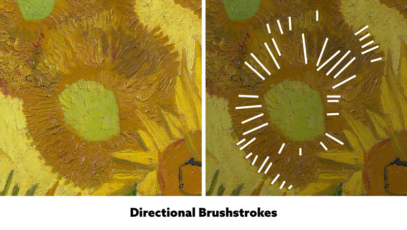
12.Directional brushstrokes can define the object.
Van Gogh was great at creating textures in his painting, but he also used directional brushstrokes to help define the object. We can see how the sunflower has lines radiating from the center.
Conclusion
Wow, thanks Van Gogh! That was a great lesson!
So, is your mind exploding with inspiration now? Be sure to try these techniques next time you’re creating a painting. Or better yet, do a master copy of your favorite painter, photographer, or cinematographer. See what you can learn!
Thanks again for joining in, see you in the next one!



January 7, 2022 @ 3:16 pm
These blogs are a rare treasure. My knowledge in art has expanded way more than I could have imagined. The quality of information in these blog teachings are exceptional.
January 8, 2022 @ 2:05 pm
Thanks for the nice comment, I’m glad the content is helping you out! Take care!