Solaris by Andrei Tarkovsky – Analyzed Cinema
#525
Hey everyone, thanks for joining in today! And thanks for all of the amazing support, it means a lot!
We’re going to be digging deep into a cinematic masterpiece called “Solaris.” It was directed by Andrei Tarkovsky, who has been frequently compared to Stanley Kubrick (see #489) because of his visionary approach to cinema. Both are excellent directors that know exactly how to tell a story and communicate it clearly with powerful design techniques. Let’s take a look at the compositions within Solaris and see why they work so well.
Andrei Tarkovsky Who was
Andrei Arsenyevich Tarkovsky (1932-1986) was a Russian filmmaker and writer. I If you’re familiar with his work, you’ll know how it draws you in with distinct visuals, natural sounds and silence, long takes, and well-composed scenes. He was so set on being original (see Day 133), that if his shots started to look like another directors, he would rework it like a ball of clay.
Much like the movies of Stanley Kubrick, Tarkovsky creates great mystery and ambiguity (see #440) within his storytelling. If this is done right it makes for great replay value. Some Tarkovsky fans will surely see his movies more than once. With the sounds, visuals, and story combined, it’s a lot to take in. All of these qualities are also contributing factors to his great success.
In the movie, they show how one of the characters is mesmerized by a Pieter Bruegel painting. It’s one of my favorite paintings and you can see it analyzed for design techniques (see Day 58). Here are screenshots from the movie, which also show two more of Bruegel’s paintings (left and right).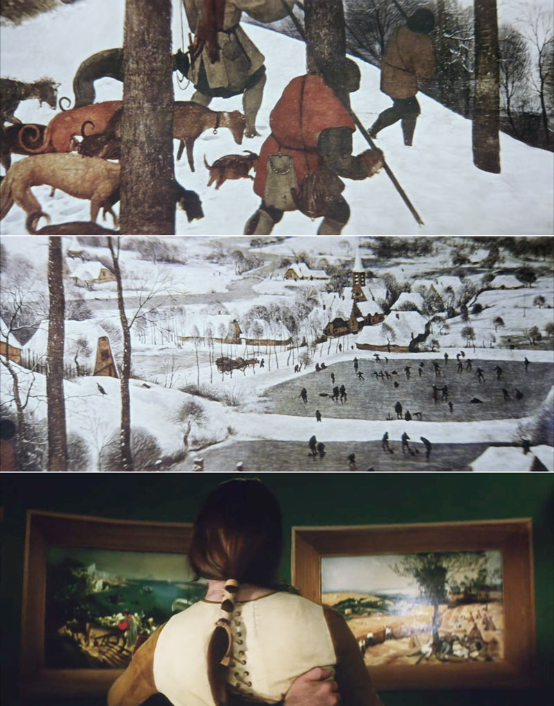
Design Techniques Analyzed
Let’s start digging into his compositions and design techniques. SPOILER ALERT! If you haven’t seen the movie, perhaps watch it first so nothing is ruined for you.
We’ll notice that he loves to use nature to help tell his story. Not only does it add an organic feel to the mechanical environment later in the movie, but it also helps with the composition. The movement of the grass in this first screenshot is captured in a way to create sinister diagonals (see Day 63), which can add to the uneasy feeling he’s aiming to invoke on the viewer.

Tarkovsky is using negative space (see Day 83) in this scene to portray loneliness in the subject. The characters gazing direction (see Day 99) and gesture also help with the storytelling.
Another technique that makes this scene great is the aerial perspective (see Day 42) in the background. It adds depth and a sense of atmosphere, which we’ll see in a lot of his shots. Actually, a lot of cinematographers and photographers use this excellent, emotion provoking technique (see Day 353).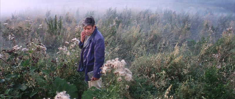
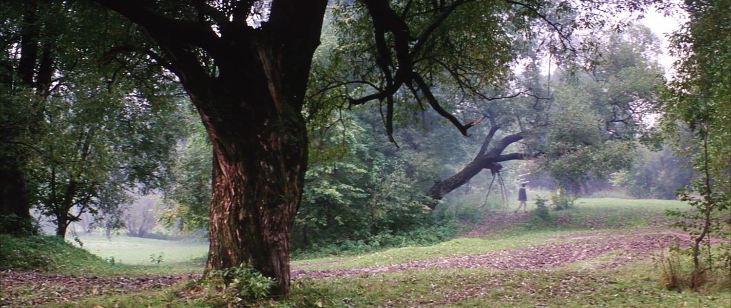
Here we see an excellent shot with several trees, aerial perspective, and the subject walking in the distance. He creates an aspective view (see Day 78) in his stride as he walks across the field.
The cool thing is that we can see many different elements locking in and paralleling the root 6 cinematic grid. We have the large tree locking into the square vertical on the left, the man is on the eye of the diagonals, and many of the branches are paralleling as well.
As Tarkovsky directs the man to walk through the landscape, we see him stopping at several spots. Each time he does, we see well composed scenes. In this one, we can see an arabesque (see Day 18) being created by the water, and the nice figure-ground relationship (see Day 21) of the dark silhouetted man against the light water. We also have foreground interest adding depth, which was just seen in the Simon Stalenhag analysis (see #524).
When we place something on one side of the composition, we can balance it with context on the other side. That’s what we’re seeing here. Tarkovsky uses the house as a counterpart (see Law of Symmetry) for the men and trees on the left.
We see the Law of Symmetry being used here as well, with some aerial perspective, and nice framing with the tree.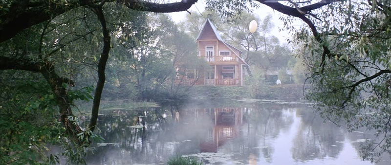
Tarkovsky has the group on the bridge stop right where we can see them clearly, but also directly about the large cylindrical structure. This creates a coincidence (see Day 48) and helps with unity and movement. We also see an elliptical shape (see Day 34) being captured within the tree branches and shadow. It reminds me of a painting by Corot.
Here we have nice FGR reversal (see Day 21) and an arabesque sweeping through the scene.
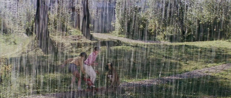
You gotta love this! How Tarkovsky captures the sense of atmosphere with the rain in the foreground. Great idea!
Ever heard of Stephen Shore? Well, this screenshot looks just like one of his photos (see #480). We can even see how it’s locking into the root 6 grid.
Here’s another great example of how Tarkovsky captures the diagonals of trees to make the scene more dynamic than straight vertical trees. The horizon line is in the center, and trees are paralleling and locking in. He’s capturing the Law of Symmetry in this one too. Nicely done! The more techniques used, the stronger the visuals.
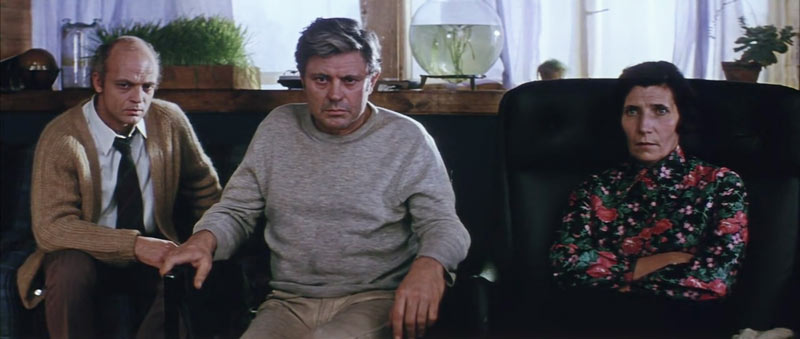
With a room full of subjects, how do you possibly position them to create visual clarity? Well, we can see in this scene how Tarkovsky used separated shapes (see Day 374) and FGR to do this with ease.
I love the blank stare of everyone in this, and the flattering rim light from the window is nice too. We can also see repeating diagonals in the left arm of each man. It’s a subtle pose gamut (see Day 39) that helps with the unity and rhythm of the scene. If an arm on the woman was repeating this diagonal, the three characters would be more unified.
Do you see the diagonal of the tree? It parallels the grid nicely, right? How about the bend of his neck? It’s locking in! The diagonals are the key element found within dynamic symmetry and not the rule of thirds.
Have a look at the nice movement and unity created by the arcs and arabesques here.
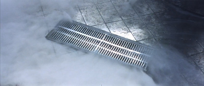
Tarkovsky captures this grill at a diagonal! This just shows us that he knows the difference created by using diagonals versus straight lines.
We can see some nice one-point perspective here, echoing classic scenes by Kubrick (see Day 260).
The balance of a scene can be affected by the values as well. If we convert this to see just the light and dark shapes, we’ll find that they balance nicely from the left and right side of the vertical centerline (see Law of Symmetry).
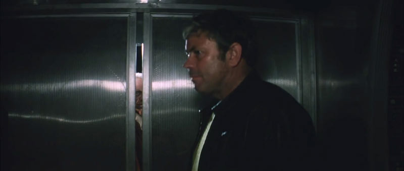
Tarkovsky adds light to this scene so it will bounce off of the metal door and create a horizontal design. It also happens to coincide with the man peeking out.
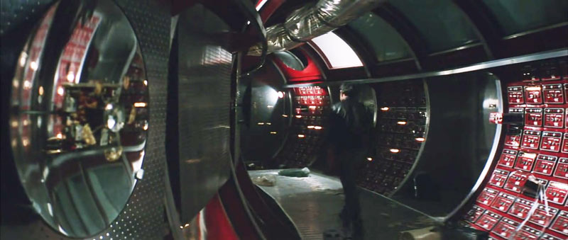
He adds a little mystery and depth to this scene by using the mirror on the left (see Day 238).
The girl walks by the dark corridor, and she is off-center left to help balance with her left-to-right gazing direction. She’s also got an aspective view timed perfectly to be in the center of the doorway!
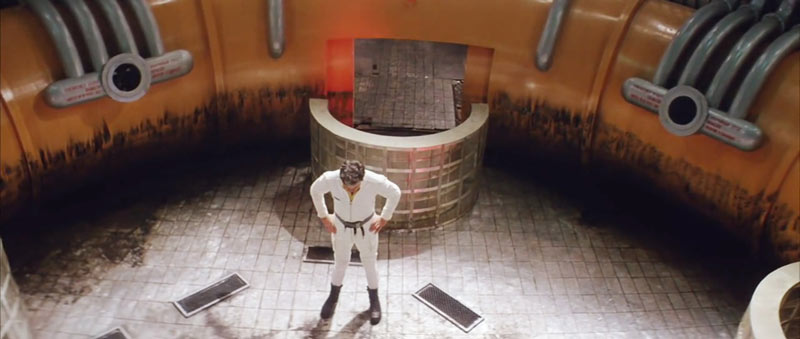
This is a unique perspective, which Tarkovsky does to add interest to the scene.
In this variation of the same scene, we can see the repetition and balance he captures within the shapes.
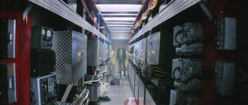
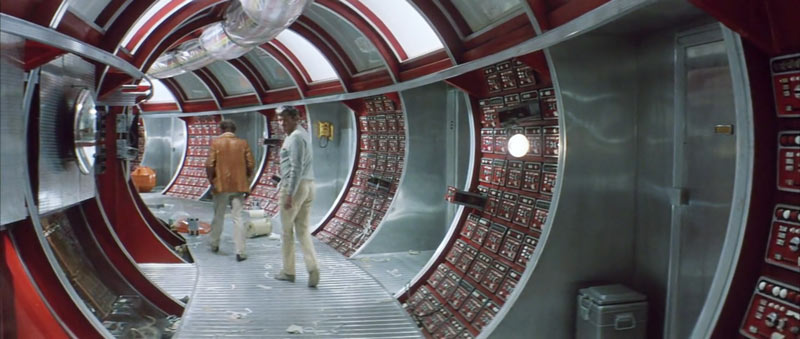
Here we see a nice tunneling effect being captured which gives us a nice sense of depth.
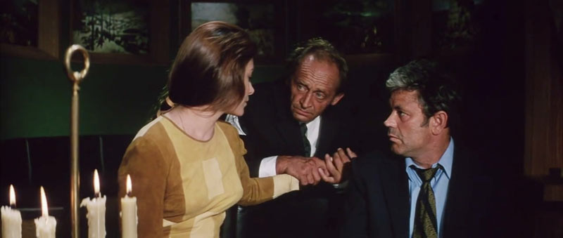
Gotta love how Tarkovsky includes the candles on the left and balances the scene with the characters to the right. Typically, we’ll see unimportant elements like this in front of the characters and not as an object to help balance the scene.
Here we see a nice hierarchy (see #442) within the scene being created by the different sizes of each subject. We see large, medium, and small which helps with depth. Tarkovsky is also capturing aerial perspective (see Day 43) with the candles. We see how the candles stand bright, while the characters fade into darkness. He’s using two design techniques to help create depth!
It’s helpful to see how Tarkovsky composes a scene without diagonals. We can still use the root 6 dynamic symmetry grid to compose and balance things. The doorway on the left is a counterpart to the candles on the right. We also have the woman’s eye directly center and her gazing direction going from left to right. If the doorway was replaced with darkness, the scene would be visually heavier on the right side.
The door on the left also helps add depth to the scene.
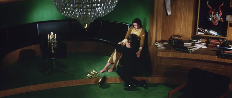
Here’s another unique perspective shot from above. See how it makes a really interesting scene?
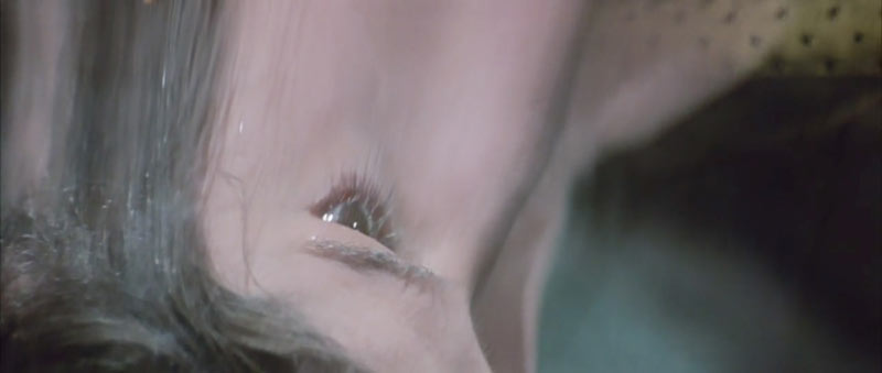
This reflection shot adds some nice mystery to the dramatic scene.
Here we can see the tunneling effect, as well as the composition lining up to the grid. The woman’s legs, arm, and head lock in, and the man’s body parallels the reciprocal diagonal on the left.
Notice how he captures her on a sinister diagonal, adding to the uneasy feeling of the scene.
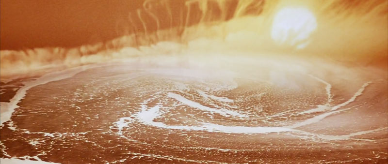
Here’s a screenshot of some of the crazy visuals in the movie. We’ve got a swirling effect with the hot brilliance of the sun.
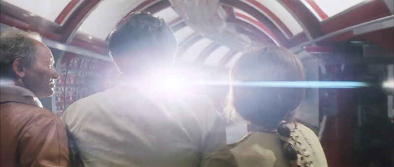
Lens flares can also be used to create a sense of atmosphere just like aerial perspective.
OK, now we’re at the part of the movie where the main character is back home and in nature where he was before. Only, things are different now. He walks along the same path as he did in the beginning of the movie, but he’s in a daze.
We can see how Tarkovsky captures the same trees, but this time they have no leaves. This adds to the dreary mood created near the end of the movie. We also have nice FGR and the trees paralleling and locking in.
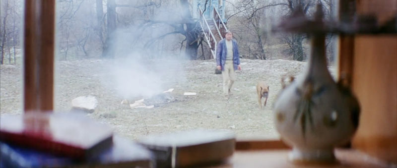
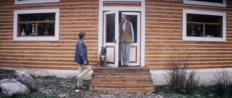
Tarkovsky captures another unique perspective as he shoots from the inside of the house, through the window, and to the man walking with his dog. Aerial perspective is created in the fire pit to add to the drama.
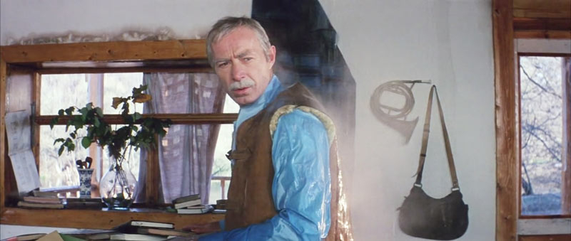
As the man looks through the window, his arm parallels the 45-degree angle of the square.
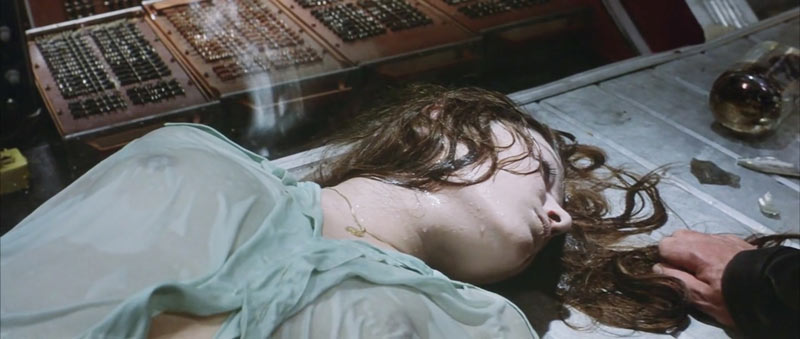
In this scene, you’ll notice that the water drips on the man and starts steaming. This can be done if the water is warm and the environment is cold. Quite a cool effect that most cinematographers wouldn’t think of. The strong direction of light coming from the right side helps illuminate the steam.
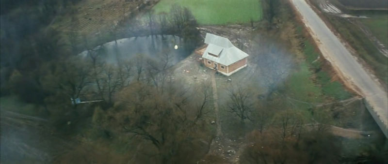
As the movie ends, it starts with a center composition, then pans out to the next aerial scene.
The final composition ends with us floating into the clouds high above the main characters. The End!
Conclusion
Are you full of inspiration now!? We covered tons of composition and design techniques, and the more that are included within each scene, the better. We learned how Tarkovsky wanted to stand out from the other directors, and his knowledge of design techniques allowed him to do so with great success.
Thanks for joining in everyone, I appreciate you all! See you next time!
Bonus Video
If you’re still interested in learning more about Tarkovsky and his approach to cinematography, please check out this video by Criswell on YouTube. He talks about the textures and sounds that Tarkovsky used to emphasize the mood within his movies.


