Mr. Robot Creates Visual Tension with Composition Techniques

#411
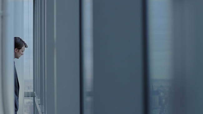
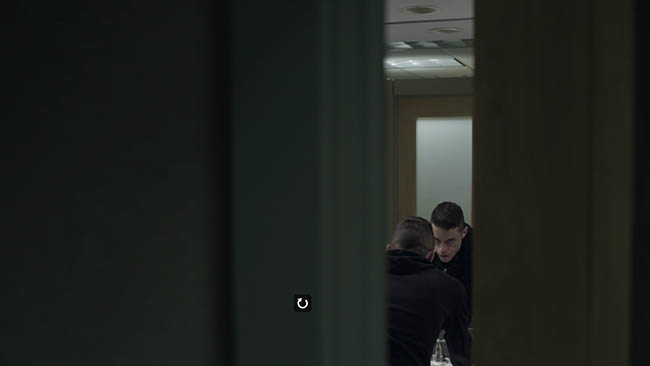
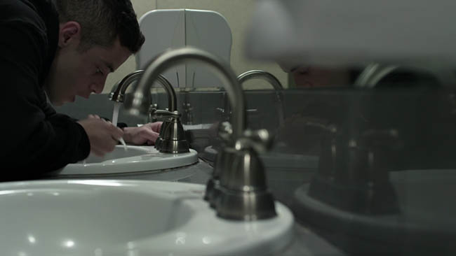
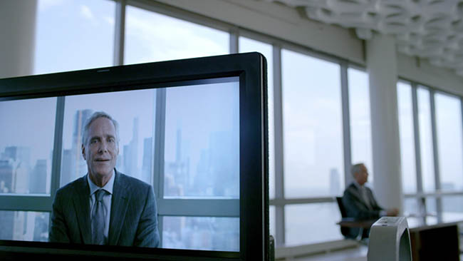
Today we are going to take a look at a very entertaining tv series called “Mr. Robot,” which uses several composition techniques in a very effective way to create visual tension. Let’s get into it!
Mr. Robot (2015-2016) is great if you are into hacker-type shows. It’s like a combination of Dexter, Hackers, and Fight Club…all worth watching…even though Hackers is a bit on the cheesy side now. Mr. Robot is directed by Sam Esmail, and the cinematographer is Tod Campbell. Usually the cinematographer establishes the style of the film, but in this case I think Sam Esmail had some influence on Tod Campbell’s approach. I say this because he directed an earlier movie called “Comet” (2014), which uses the same techniques, but Tod Campbell wasn’t involved. Later, I found this awesome quote by Campbell and found that I was right…Esmail did influence him…Campbell took it to the next level though.
Campbell credits creator Esmail with making Mr. Robot’s distinctive look possible. “In my phone interview with him for the job, he was like, ‘I want to do a lot of negative space. I really want to change this up,’” Campbell says. “I’d never met him before, and I was like, ‘I’m so sick and tired of directors coming in on episodes I’m shooting like, “Oh, I want it to look like House of Cards! I want it to look like blah blah blah!” Sam, we need to become the reference point everybody uses from now on. I want everybody to say, “I want it to look like Mr. Robot.”‘ He was like, ‘Oh shit, dude — you got the job.’” ~ Tod Campbell
Visual Tension Techniques
There are three composition techniques that we can use to create visual tension. If you’ve read and understood the articles on Gazing Direction (see Day 99), Breathing Room (see Day 102 & 104), and Negative Space (see Day 83), then you’ll start to see how we can use them to get the visual tension seen in the Mr. Robot examples below. Basically, you must learn the technique, then go against the approach of conventional filmmaking.
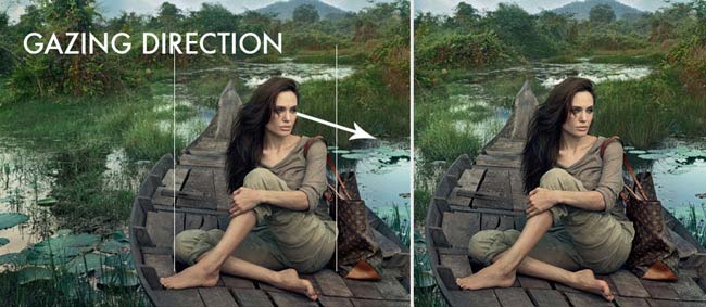
As a refresher of the previous articles, we can see how the gazing direction of the subject should be leading us to some interesting context, but in this case, Annie Leibovitz has more negative space behind the subject. This makes the area behind her not as important, and creates the visual tension…almost like a standoffish feeling. We can crop off the negative space behind her and not lose any context. Now, if it were Annie’s intentions to create this visual tension, then that is great, but I don’t think that was the case. Why would she want to create visual tension for this particular Louis Vuitton ad?
In this portrait photo by Julia Margaret Cameron we can see that the face is very close to the edge of the frame. This can create a suffocating feeling…or again, visual tension. When we add more negative space on the left the portrait is allowed to breathe. 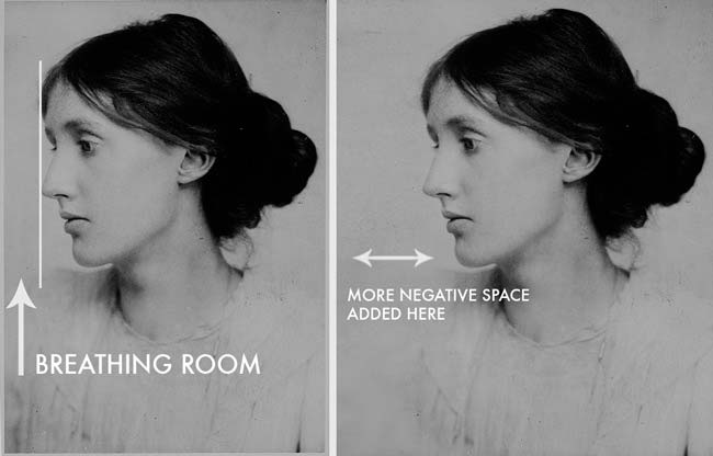
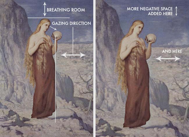
In this next example, we can see how Puvis has the subject in the center, both vertically and horizontally. This creates an unsteady balance because the gazing direction of the subject can also add weight, therefore it should be a bit more on the left. Also, we typically leave a bit more room at the top of the composition to breathe, which helps us establish the weight of the image…..that is unless Puvis is trying to create visual tension. So, in the adjusted example on the right we can see how the image feels more balanced from top to bottom, and left to right.
As with any of these composition techniques, we can use them how we wish as long as it fits our story. They are tools and not rules. Realizing that will allow you to be in full control of your composition.
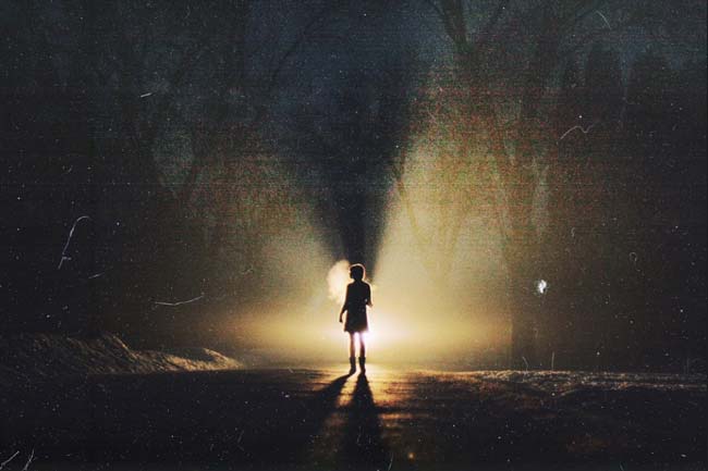
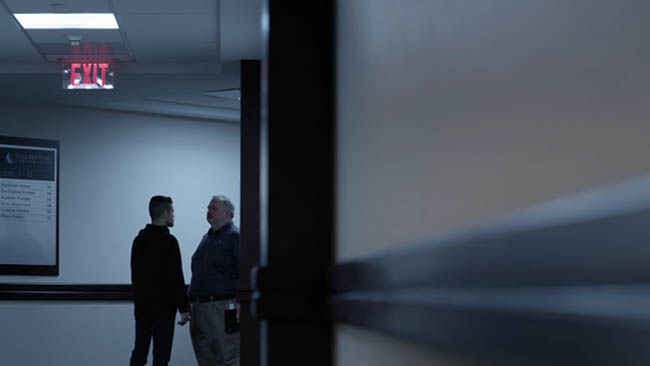
In this photo by Craig Schlewitz we can see how excessive negative space can create isolation or loneliness. Something that is used quite frequently throughout Mr. Robot.
How the Cinematographer Went Against the Grain
Now we’ll take a look at how Tod Campbell goes against most conventional methods, not to be a rebel, but to help tell the story. It’s so extreme that it even goes against the rule of thirds, which is always a pleasant escape from the mundane.
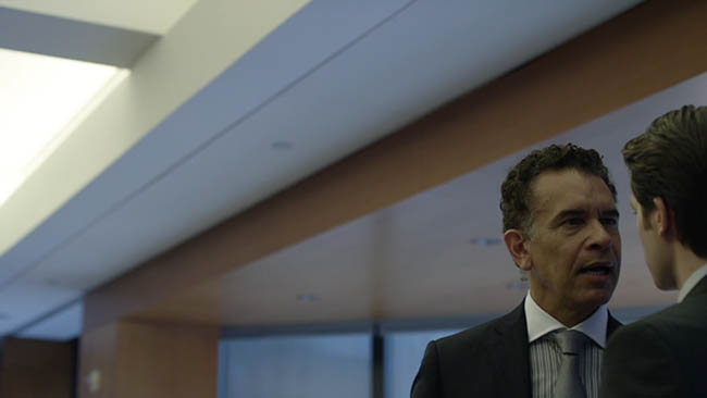
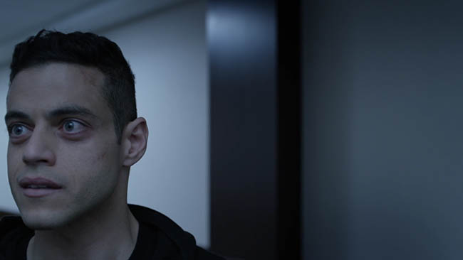
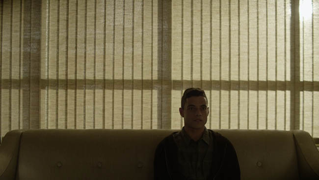
Unlike conventional filmmaking, there is no leading room in conversation cuts…meaning the negative space is usually in front of the actor, not behind them. This refers to breathing room and gazing direction. Campbell pushes the face right up next to the edge to create excessive negative space. This all helps to create the visual tension he was looking to achieve.
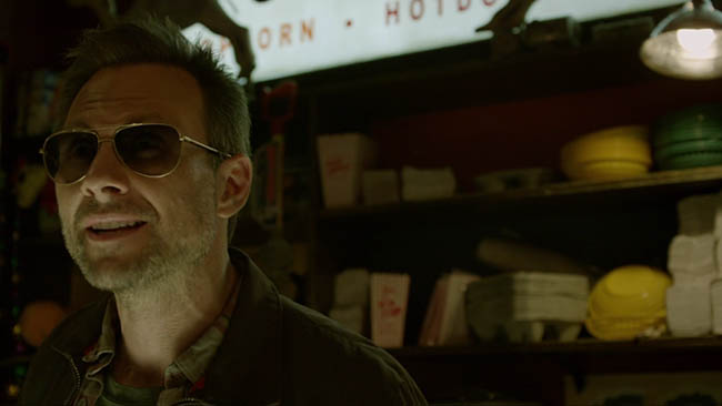
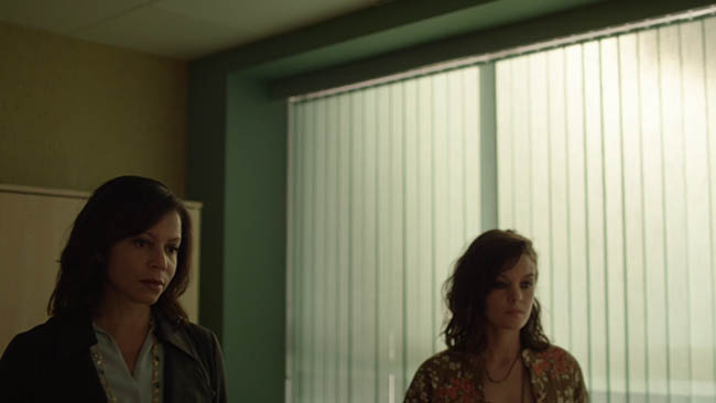
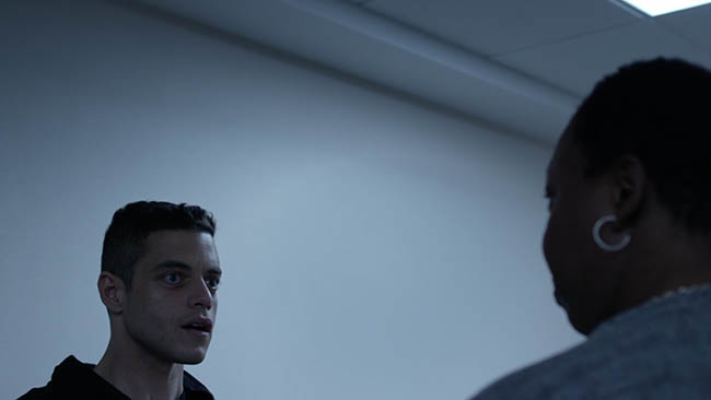
In this next conversation we can see how both actresses are placed near the edge, speaking towards the nearest edge, and leaving excessive negative space opposite of their gaze. And what does excessive negative space do when used appropriately? It creates isolation, loneliness, and in this case, continues the visual tension carried throughout the series.
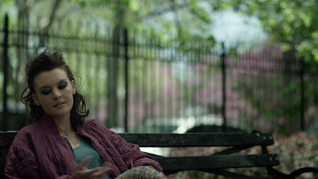
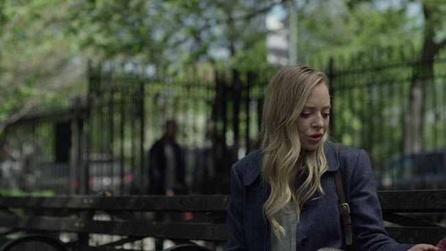
We see it again in this conversation.
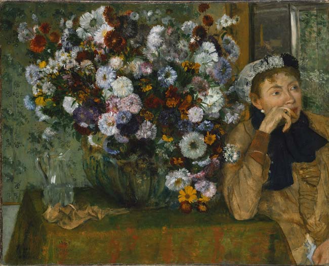
We can even see this being used in a painting by Degas. This lack of breathing room intensifies the look of contemplation on the woman’s face.
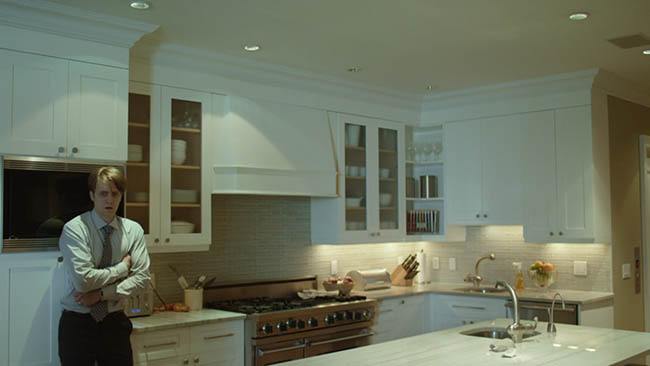
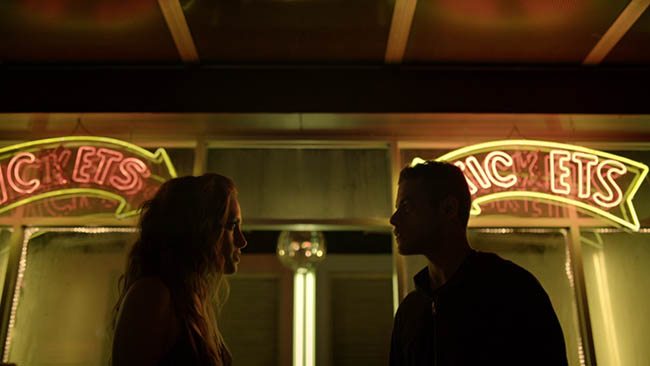
Lots of negative space is used in these next five screen shots.
From the Shoulders to the Ceiling
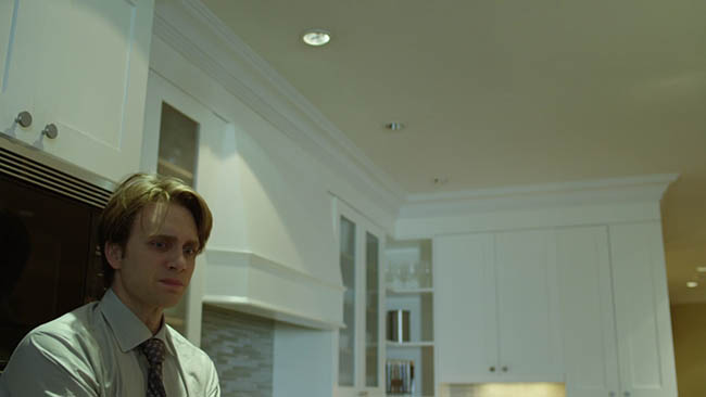
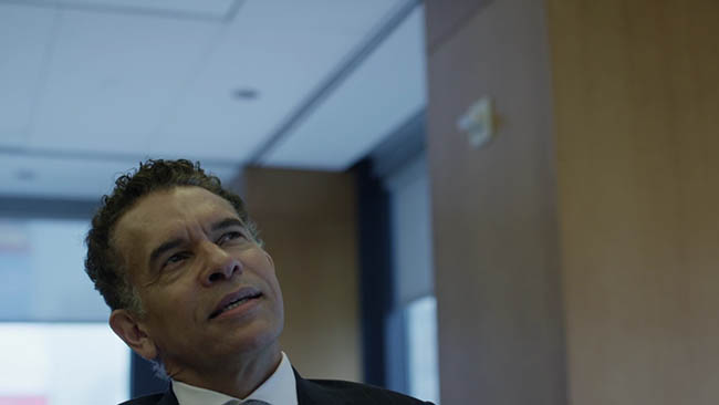
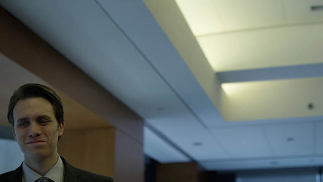
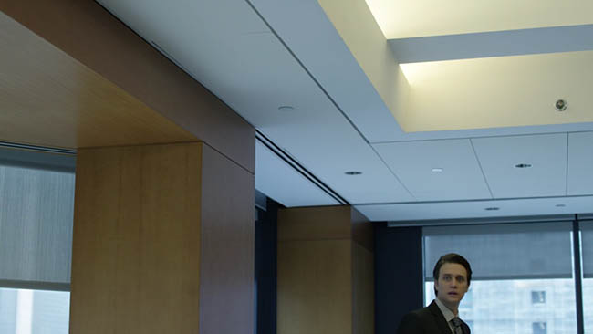
We can also see how Campbell doesn’t capture the characters in a conventional way. In these next examples we can see him getting the top of their shoulders and then a large portion of the ceiling. This is great because it adds to the visual tension, plus he’s able to incorporate the diagonals in the ceiling.
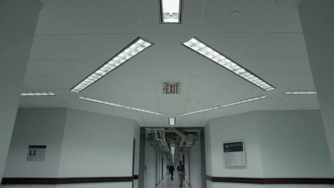
See the diagonals created by the lights and the ceiling?
Sequence One – Creating Visual Tension
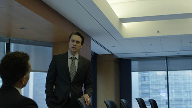
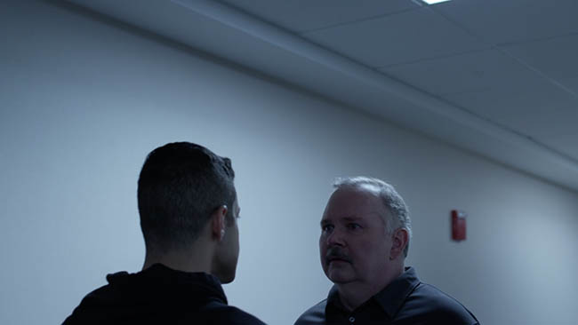
In this sequence we can see how there is a power shift, just from the way it was framed. The man is low in the frame and looking up….signifying weakness.
This actor is looking down, meaning he has the upper hand…more power. Look at all of that negative space! And the diagonals! Visual tension is building.
This shows clearly that the man standing thinks he is in power.
Now both men are standing, and one is up against the edge of the frame. Kinda like he’s up against a wall…losing his power…being bullied back.
Now we can see how small he feels as his shoulders are captured with tons of negative space above. Such an effective way to film the story being told.
Sequence Two – Creating Visual Tension
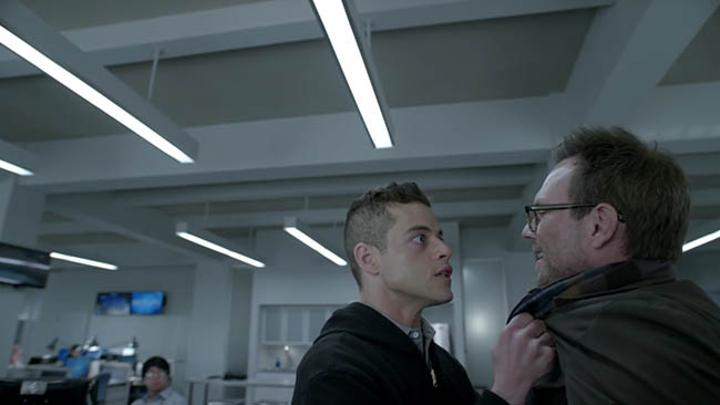
Here’s another tension building sequence. In this first screenshot we can see all of the negative space being used. Both men are at the same height…meaning they are of equal power.
He’s extremely close to the edge of the frame, intensifying his changing mood. Zero breathing room!
Now he’s seen higher in the frame and looking down on the man he is insulting.
Now he’s lower in the frame because the woman on the right holds more power…she’s about to kick him out of the building. You’ll have to watch the sequence to get the full effect.
Extreme Low and High Point of View
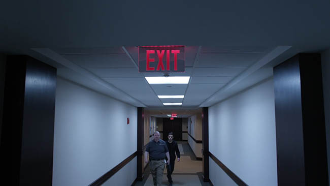
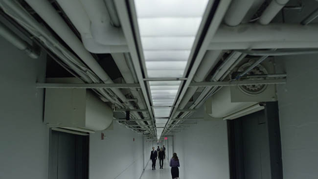
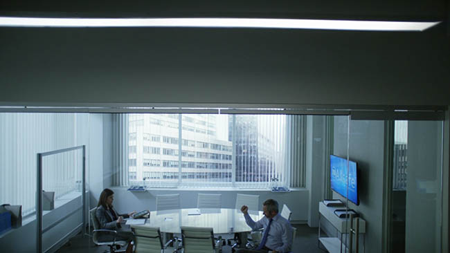
Another great part of Tod Campbell’s cinematography is the way he incorporates the diagonals of the environment by getting very high to the ceiling, or very low to the ground.
In a lot of the shots I was seeing that the cinematographer used wide angle lenses. Which ones? I have no idea. But, as I was searching for the answers I came across a great article with a Tod Campbell interview and how he talks about a “Cooke S5s” lens (retail $8,500) they used to bring out the curvature of the actors eyes.
I knew they had to be very nice lenses, because most wide angle lenses I’ve used create distortion around the edges…none is seen in here.
Doesn’t this make for a stunning shot? Almost like something from 2001 by Kubrick.
Law of Symmetry
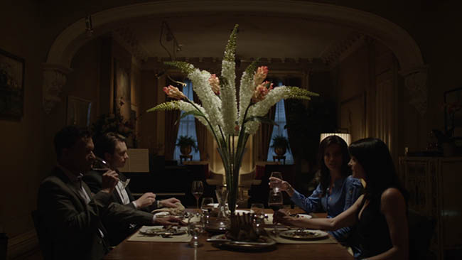
If you’ve gone over the Gestalt psychology section on the Law of Symmetry (see Day 57), then you’ll see how Campbell uses it to create a nice balance in some scenes.
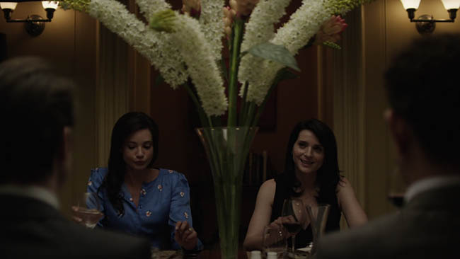
The mind is always seeking balance in visual art, and we see it here. In the people, the windows, the vases in the background, etc.
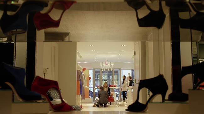
In this shot, he pans through a reflective surface where the shoes are displayed.
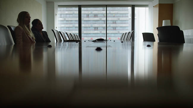
Capturing the reflection on the table.
Some more nice examples of the Law of Symmetry being used.
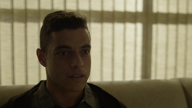
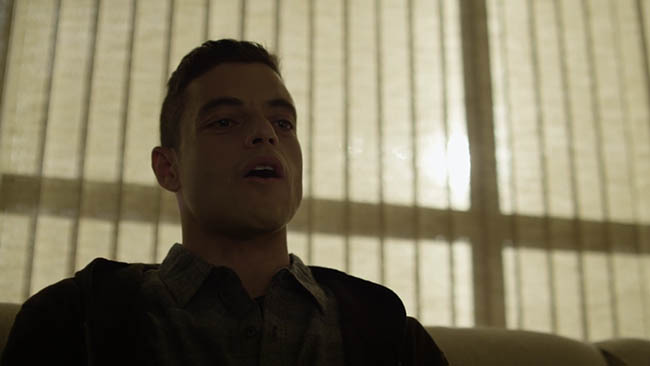
Amazing Power Shift Slowly Changing
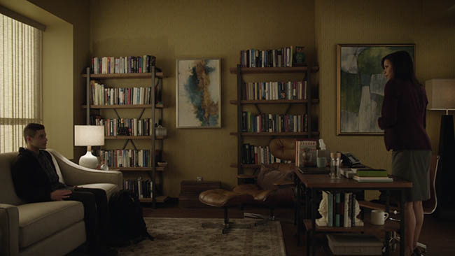
This is an awesome scene where they slowly portray an intense power shift. The main character sits in the room and talks to his psychiatrist…he’s obviously the one without power.
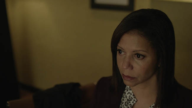
…she’s standing up, showing her as being more powerful. A regular occurrence I would think…but it soon changes…
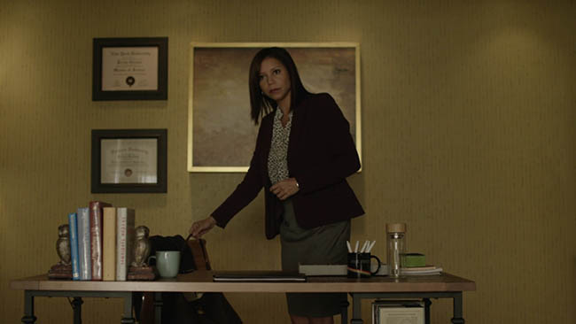
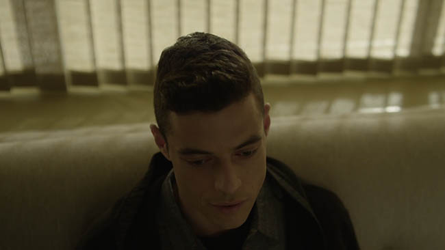
He starts to tell her how he hacked into her life, how he knows what she bought at the coffee shop, how she’s bad with money, what kind of porn she likes, etc. The shot starts above his head, looking down…showing his weakness, but it slowly changes…
It gets lower as he continues to tell her how he knows everything about her…
Now the shot finishes below him…making him seem higher…more powerful…
Now we are looking down on her because she is weak in this moment of humiliation and exposure. An amazing display of how excellent cinematography can be used to tell the story.
That’s it for today! I hope that inspires you to pick up your camera and be in full control of your composition. Don’t abuse these techniques just to be a rebel…use them to your advantage. Tell your story in a way that will effectively communicate to the audience. Thanks for all of the continued support, see you next time!






Mr. Robot Creates Visual Tension with Compositi...
August 8, 2016 @ 7:17 am
[…] Today we are going to take a look at a very entertaining tv series called "Mr. Robot," which uses several composition techniques in a very effective way to create visual tension. […]
Creating Sympathy & Suspense/Tension Visually – Sam Cane Scripts
December 4, 2017 @ 5:04 am
[…] Glover, T. (2016) Mr. Robot Creates Visual Tension With Composition Techniques. Avaliable: https://ipoxstudios.com/mr-robot-creates-visual-tension-with-composition-techniques/ […]