Composition for Dummies

74/365
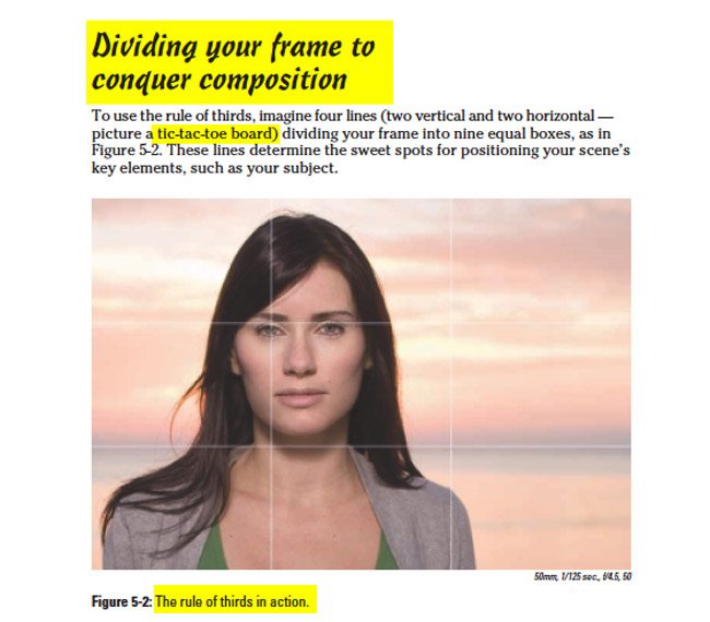
I was reading “Digital Photography Composition for Dummies” and guess what? There was a section about the rule of thirds in there. I guess it is trying to live up to it’s name! No section on the Canon of Design thankfully. Design is not for dummies. I’m not saying everything the book covered was hog wash, but it continues to cripple the artistic future by harping about the rule of thirds. They even have a section titled “Dividing your frame to conquer composition.” So I say, “Conquer composition? Please, demonstrate your profound knowledge to us schmucks. Teach us as the masters were taught.” Low and behold they show a picture of a model who is generically positioned on the left third, while the background horizon is on the…yep, you guessed it…lower third. Who knew you could conquer such magnificent composition so easily? But wait. Why does it look so boring? Because it is! I don’t think you will be finding this picture included amongst the masters of composition like Henri-Cartier Bresson, or Annie Liebovitz (and her crew), Ernst Haas, Gregory Crewdson, or David Bellemere. Now I’m not saying you won’t learn anything from the book. In fact, it’s great for beginners…I just wanted to point out the hideous rule of thirds section.

It also goes on about the intersecting points…calling them “Golden Points”. With a name like that, it certainly does imply that the golden ratio has been simplified to only four points. Sad face. Another phrase that got my attention was
“as you gain experience, the rule of thirds becomes so embedded in your brain that you stop noticing it’s there. At this point, you automatically place the key elements on the thirds of your frame.”
Now this points out a few things. The rule of thirds has been “SO EMBEDDED” into photographers minds, it’s not going to be easy for photographers to consider another method of composition…a far superior one at that. But if this simple method of thirds can be embedded after experienced application, can’t the canon of design just as easily be learned? I think so!

There may be hope for composition yet, but the book for dummies keeps spewing out absurdities.
“Because a frame includes four points of intersection among the thirds, you have options when considering where to place particular elements in your frame.”
Yes, lots of options…a total of four!
“Certain elements in composition (including your subject almost always are placed on one of the thirds because of their naturally striking visual impact.”
Like he said, “almost always” meaning that it’s not original, not a great composition, not artful. Plotting your subject in the same four spots as every other photographer is a great sign of weak composition. And to say “naturally striking visual impact” when referring to the rule of thirds makes me facepalm. There is nothing that proves a certain point on your screen is naturally more pleasing than other spots. Again, they are regurgitating tasteless Chicken soup. An old folklore that we’ve all been duped into believing.


