Bresson Photos Reimagined as Satirical Paintings (2020)
#587
Hey everyone, I hope you’re all doing well. Thanks a ton for all of the continued support!
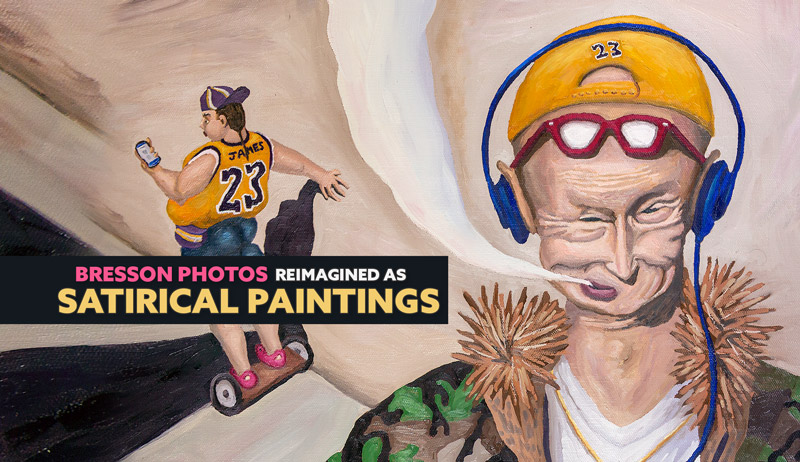
Today we are going to take a look at a huge project where Henri Cartier-Bresson’s black and white photos are reimagined into satirical paintings. What would Bresson see if he were still shooting today? The colorful paintings will definitely give you a glimpse!
Bresson and Street Photography Why
So of all the photographers in the world, why Henri Cartier-Bresson?
The best reason is for his amazing compositions. Among the plethora of photographers out there, his use of “geometry” as he calls it, is some of the best there is. As most of us know, he was classically trained by a painter named Andre Lhote (see Day 232), the author of an excellent book “Treatise of Landscape Painting.” Bresson was also inspired by the surrealist painters and took photos of quite a few famous masters like Salvador Dali, Man Ray, Maurice Tabard, Henri Matisse, Pierre Bonnard, Marcel Duchamp, Alberto Giacometti, and Pablo Picasso. He even considered himself a surrealist, but had to keep that a personal secret if he wanted to get any serious work as a photojournalist.
Quote from an Interview with Charlie Rose:
Charlie: Composition for you?
HCB: Geometry.
Charlie: Geometry? Are you born with that; a sense of geometry?
HCB: Has to be cultivated.
“It’s a rhythm, the way the head falls here, this goes back, there’s a line between different elements. There’s a square here, a rectangle, another rectangle. See, it’s all these problems which I’m preoccupied with. The greatest joy for me is geometry; that means a structure. You can’t go shooting for shapes, for patterns and all this, but it is a sensuous pleasure, an intellectual pleasure, at the same time to have everything in the right place. It’s a recognition of an order which is in front of you.”
~Henri Cartier-Bresson~
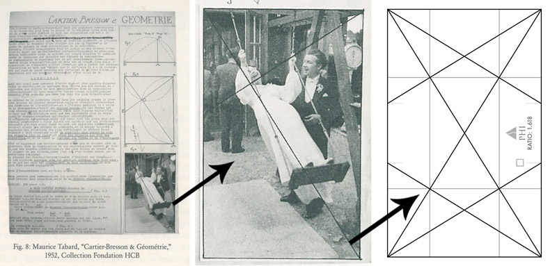
If you google the word “geometry” and look at the definition along with images, you’ll see lots of triangles, squares, circles, and rectangles. If you look in Bresson’s book “The Decisive Moment,” which is known to be “A Bible for Photographers,” you’ll even see a geometrical diagram.
The diagrammed image is cropped (his 35mm camera was a 1.5 ratio) to be the same size as the phi rectangle. When we combine all of our knowledge of what geometry is (found online), with the phi rectangle next to the diagram on Bresson’s photo, we can see that dynamic symmetry is definitely geometry related. Whether or not you think Bresson used dynamic symmetry is beside the point. Start applying more geometry to your photography and art, then perhaps you’ll eventually learn that dynamic symmetry is a tool you’d like to use as well.
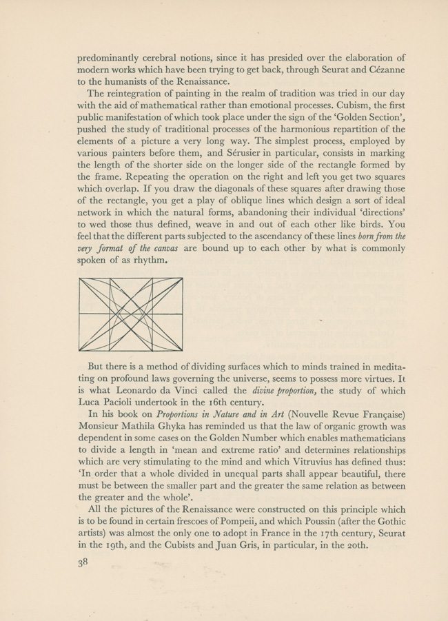
We’ve also got this diagram from Andre Lhote’s book with a geometric diagram. If you read the page below, you’ll learn that Lhote talks about the master painters and how they used phi to construct their masterpieces. He also mentions Matila Ghyka, who also wrote a book called “The Geometry of Art and Life.” All of these are breadcrumbs left behind for anyone seeking to know more.
For all of the reasons covered, that is why Henri Cartier-Bresson was the master of choice to pay an homage to. He prioritized composition in his work, surrounded himself with other artists, and followed in the footsteps of the masters before him.
So, Why Street Photography?
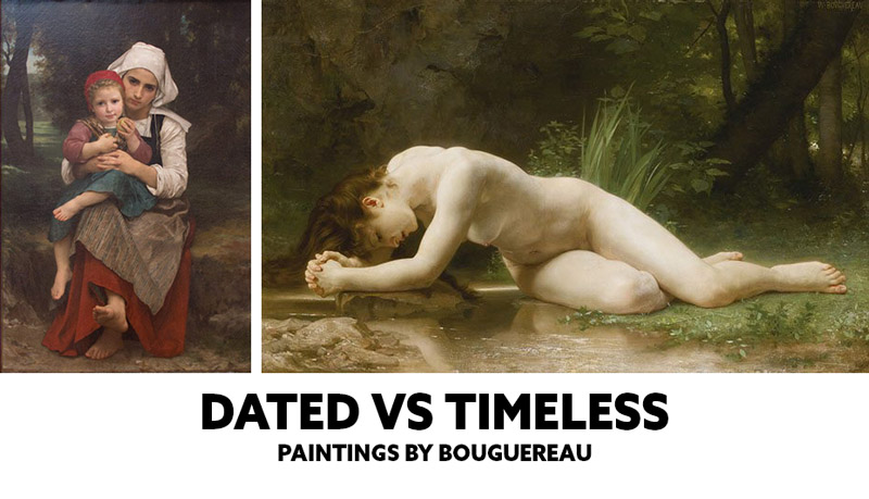
Street photography has its finger on the pulse of the life as we live today, which is an important part of the history of our time. When we look back at the masterful paintings in museums, we see a history of their time. Imagine if it were all fantasy art with people floating in clouds or timeless like the nude figure (see #461). It would probably tantalize the eyes just as well, but we wouldn’t have the important aspect of history.
Ironically, I prefer mostly timeless photos and paintings that have no clues of when they were created. Some images or paintings might provoke an emotional response like humor because they present something relatable to the time we live in. This doesn’t mean in 200 years that emotional response will still have an impact on the viewer. Times change and things are sometimes no longer relative, that’s why we can’t rely on emotional response alone if our art is to stand the test of time. We have to have a solid foundation of design and technique as well.
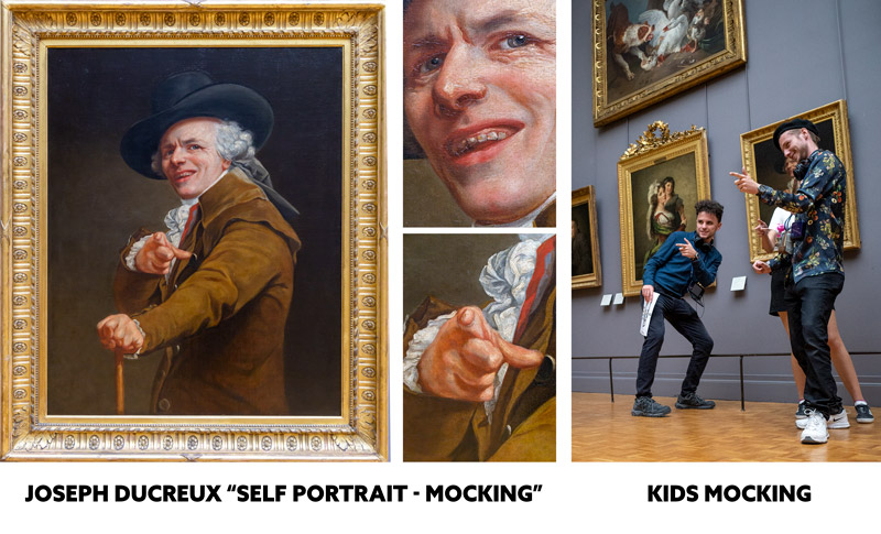
A good example of creating art that represents the time you live in and still holds its emotional impact hundreds of years later is this painting by Joseph Ducreux “Self Portrait-Mocking,” painted in 1793. I saw this group of kids excitingly mocking the “mocking” painting. If you search out Ducreux, you’ll see more of his paintings capturing funny gestures.
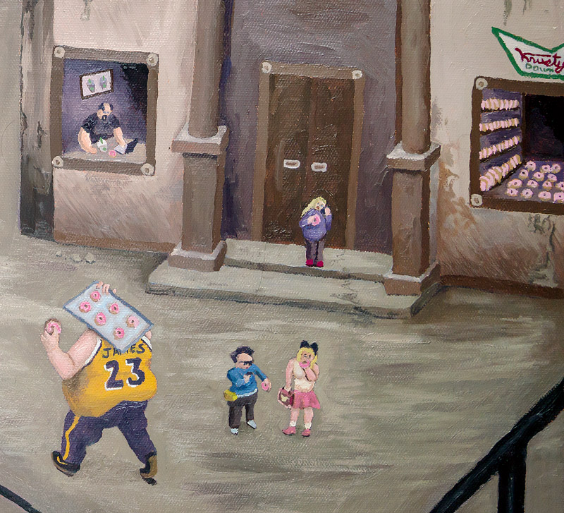
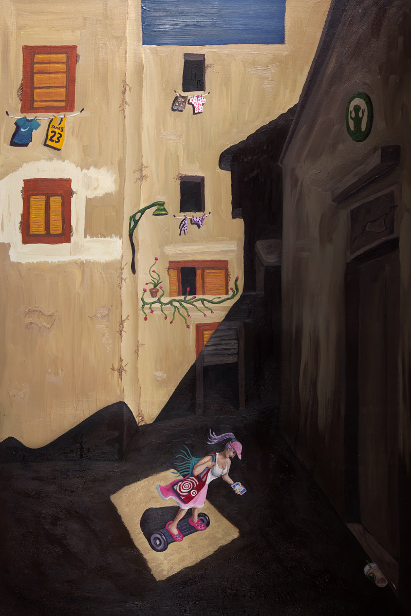
When mixing satire with the time we live in, just as they do in movies (i.e. Fight Club, Office Space, Spaceballs, Anchorman, American Psycho, Borat, Team America), it gives us a chance to acknowledge trends that are humorous while also shedding light on potentially heavy topics. This was the approach for the ten paintings to follow, which were selected from Bresson’s best compositions.

Bresson Video
In the video below, you can see some clips of Bresson’s interview and see some of the photos he took of master artists.
Master Copy Remakes Henri Cartier-Bresson
What is a Master Copy Remake?
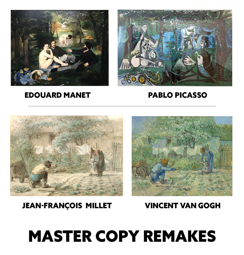
This was first inspired by seeing how Pablo Picasso remade a painting by Edouard Manet. He didn’t copy it exactly like most artists would, he infused his own artistic style (see Day 122). We can see many artists doing this like Vincent Van Gogh did with Jean-Francois Millet. So, a master copy remake is getting inspiration from a master, using a similar composition, then reinventing it with your own personal tastes and style. Simple and fun!
Quick Overview of the Process
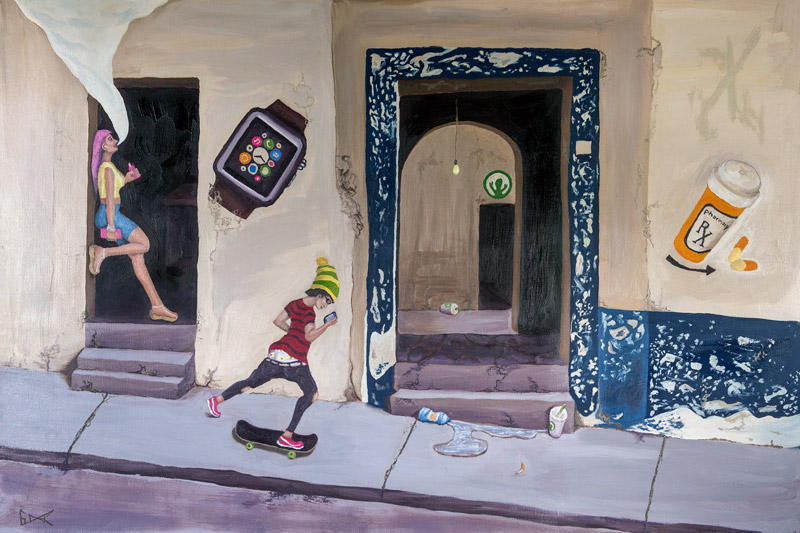
The paintings are 20×30 which are a 1.5 ratio, the same rectangle Bresson used to compose his images. Most cameras have the ratio of 1.5, but some are 1.333 (micro 4/3 cameras), and 1.25 (5/4 film cameras). I used a limited palette, including Burnt Umber (brown), French Ultramarine Blue, Permanent Alizarin Crimson (red), Cadmium Yellow, Titanium White.
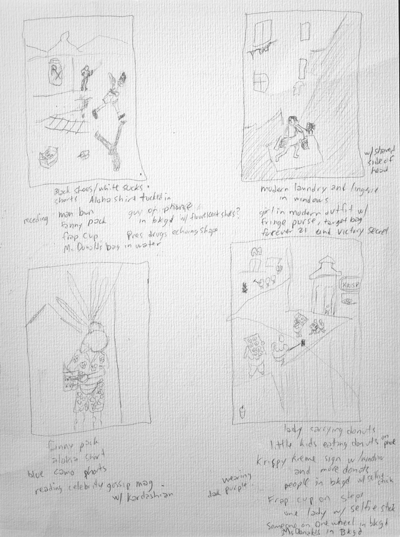
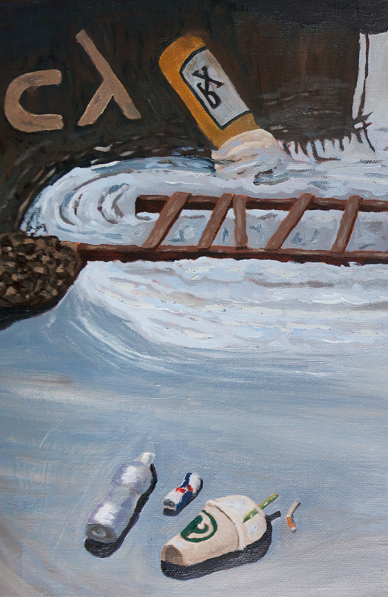
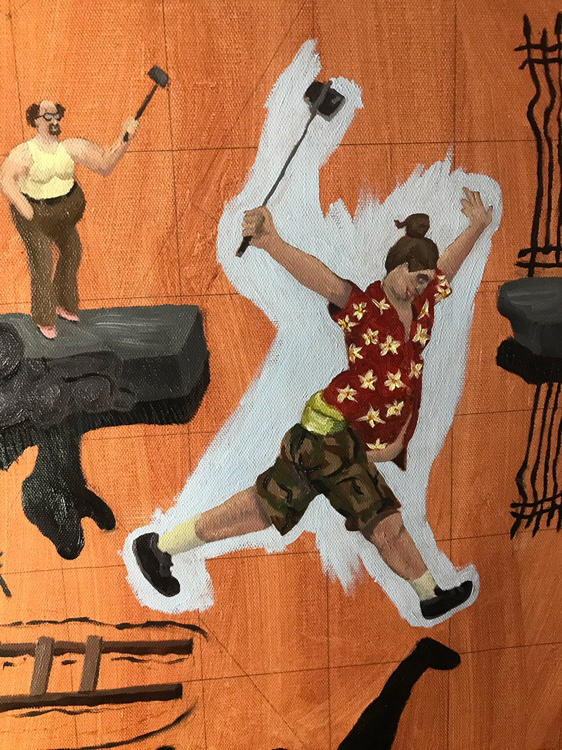
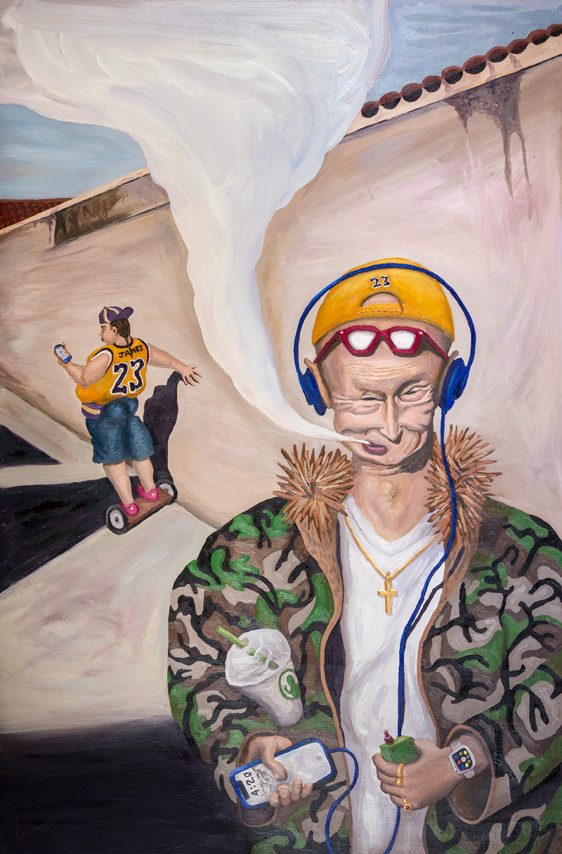
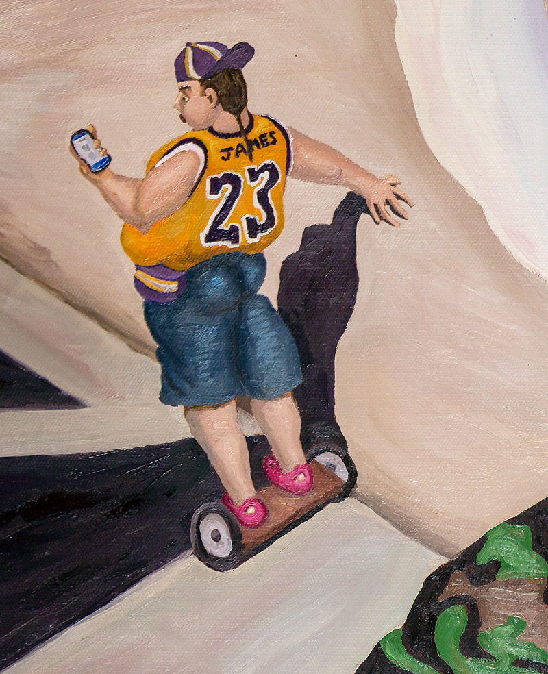
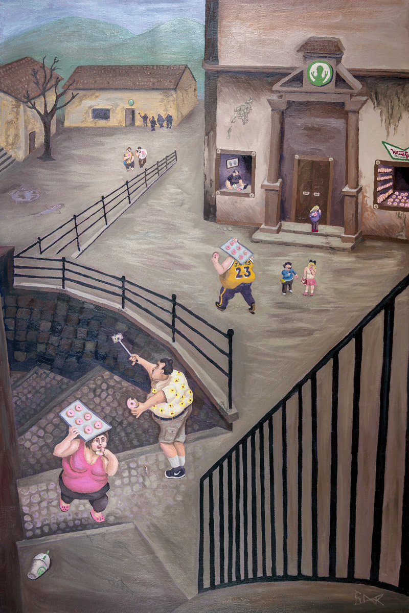
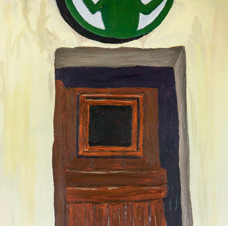
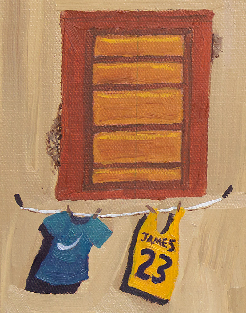
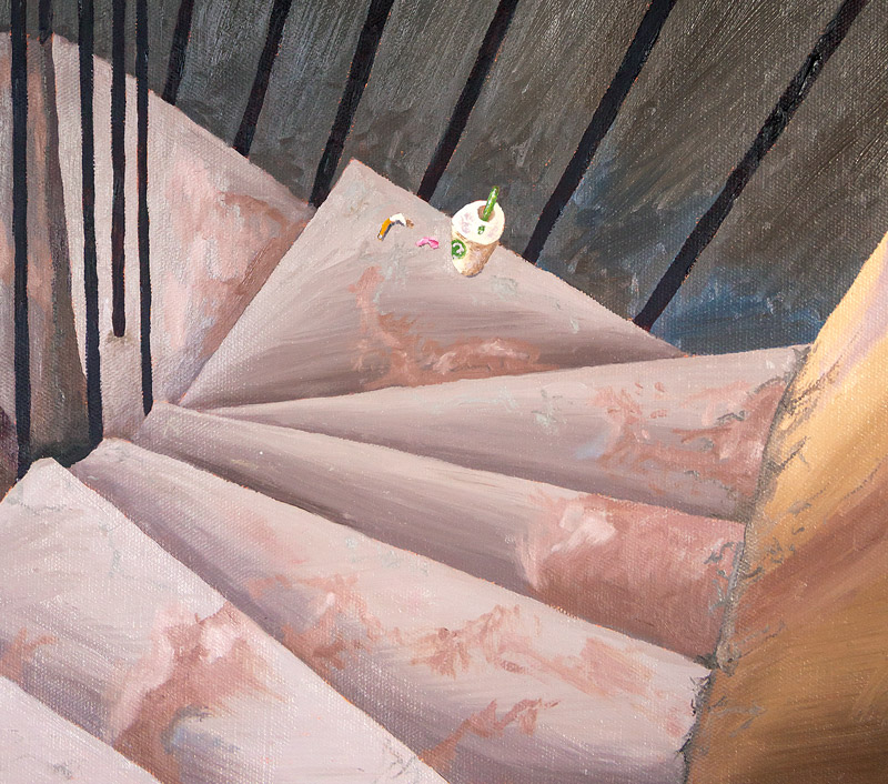
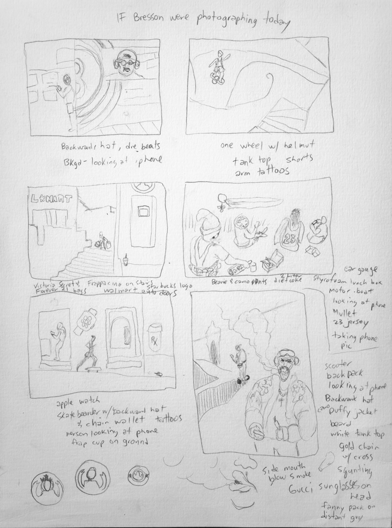
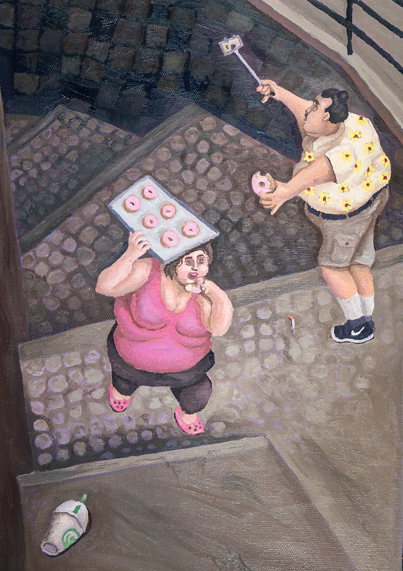
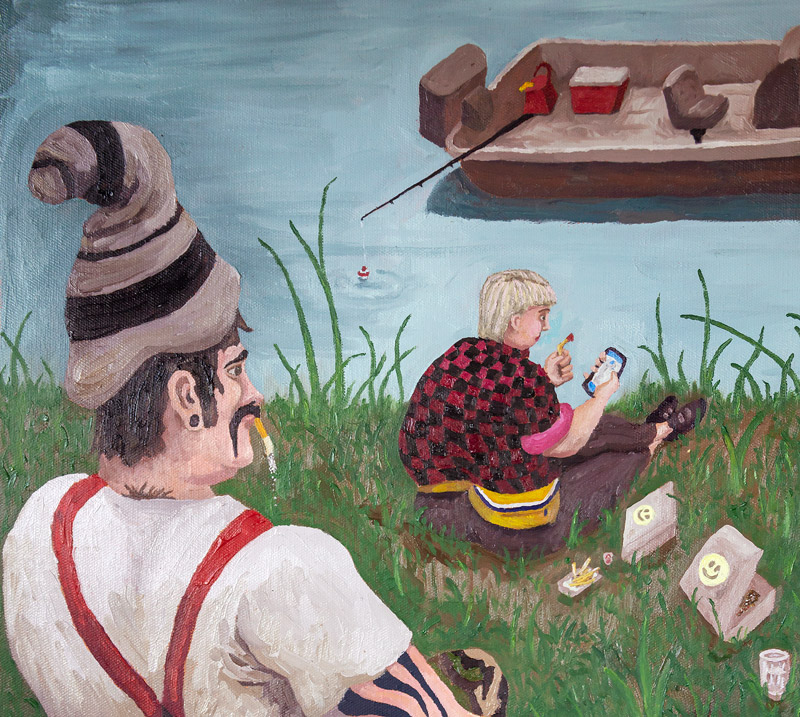
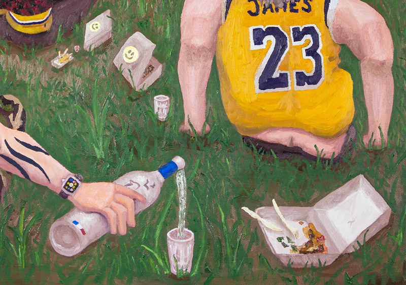
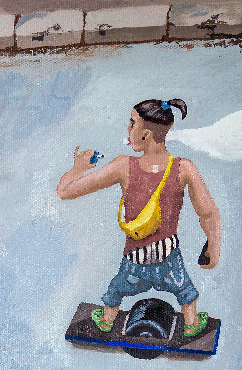
Thumbnails and notes were created first. I used inspiration from Bresson’s photos, mixed it with my own style, then made rough sketches with items I wanted to include. You’ll see reoccurring themes and objects in the paintings to unify them, but also to hit home some of the growing trends of society today (Starbucks Frappuccino, old cigarette butts, plastic bottles, red bull cans, vaping, Crocs foot wear, hover boards, one wheel, white socks with black shoes, saggy pants, prescription drugs, fanny packs, camouflage, beanies, Target bags, James Laker Jersey, Dre Beats headphones, Tattoos, Piercings, Fringe purses, Obesity, hair styles, Apple technology, Hawaiian shirts, Facebook, etc).
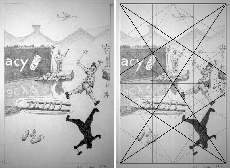
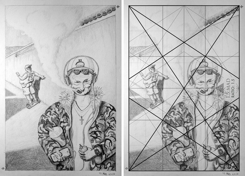
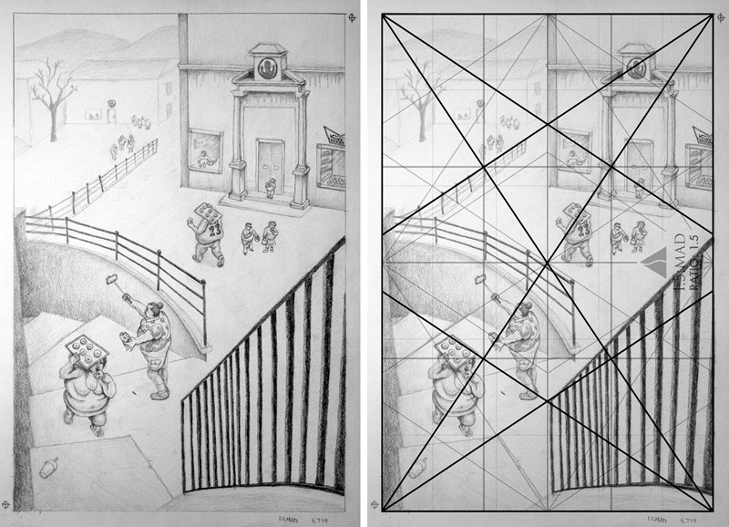
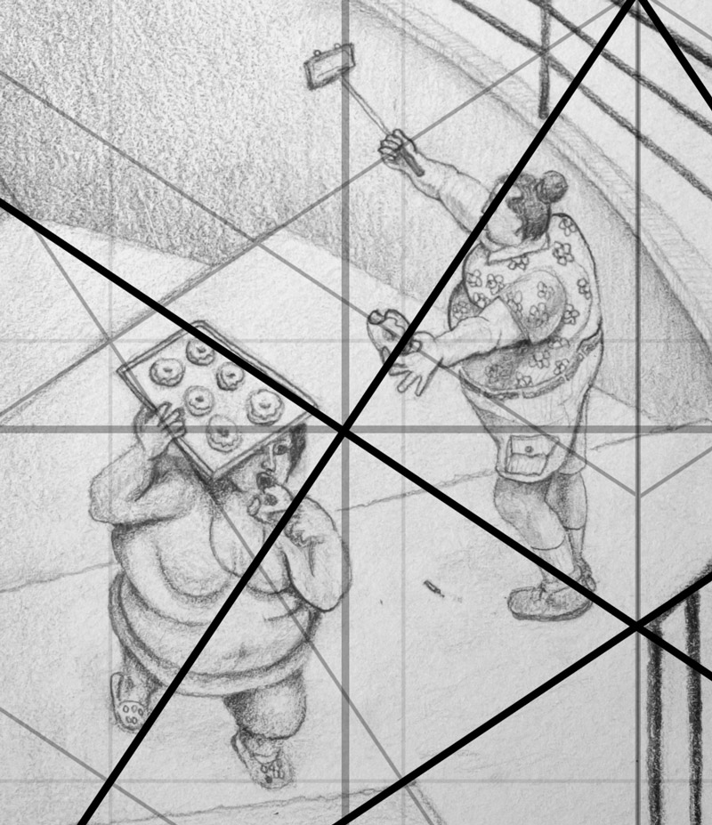
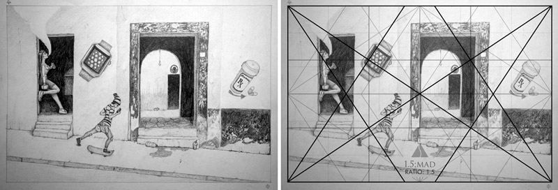
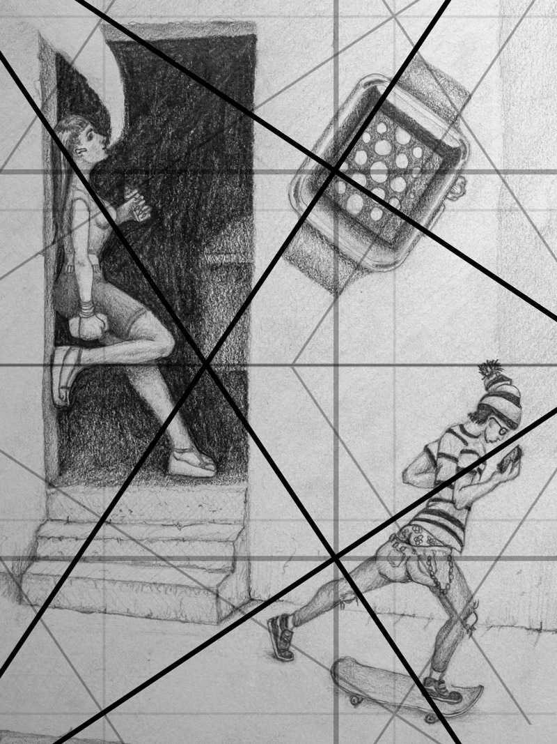
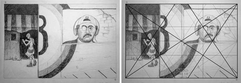
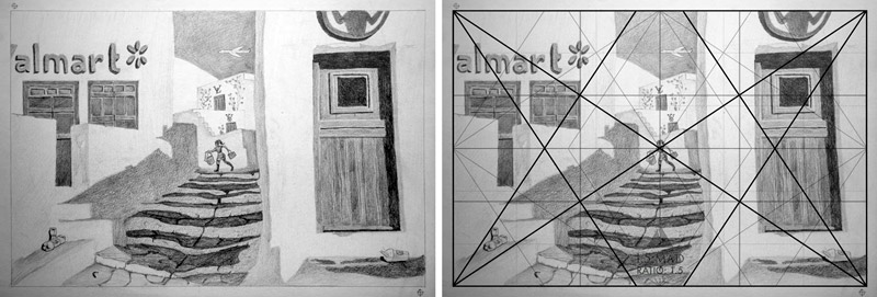
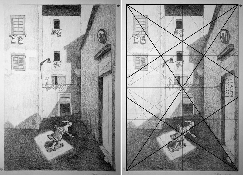
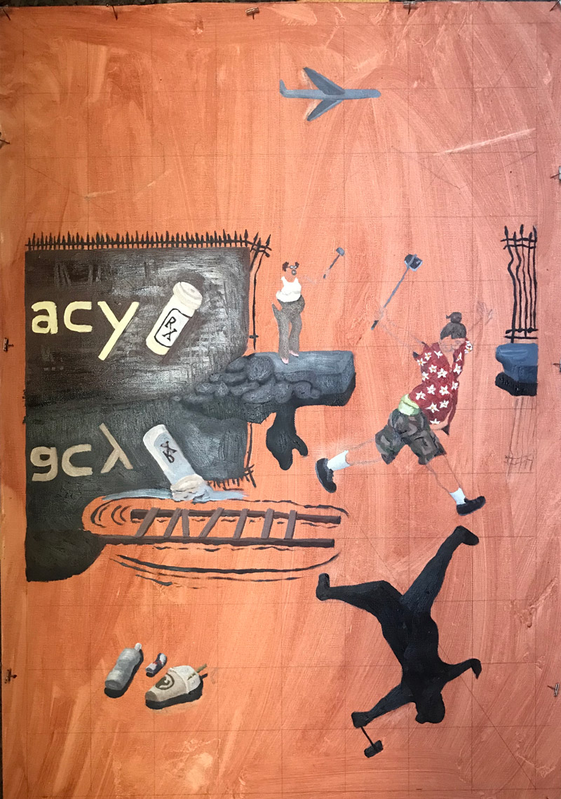
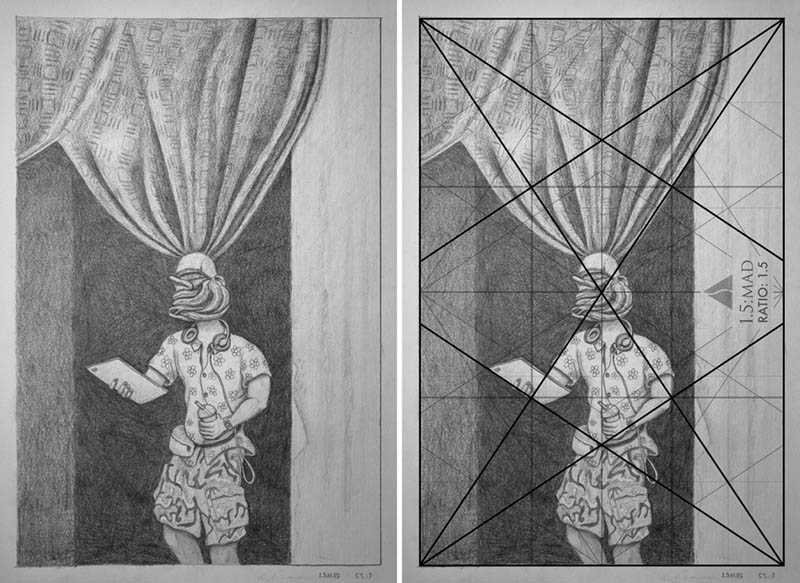
The preliminary drawings were started near the end of April, 2019, and organized with the 1.5 dynamic symmetry grid, and other design techniques like arabesques and ellipses. The canvas was stained, then squared for enlarging the drawing.
Since I was still learning to paint when these were started, I finished what I could at the time, set the painting aside, then came back to it once all of them were finished. This way I could make retouches with more experience and knowledge of the painting process. This is a great example of applying dynamic symmetry and design techniques while the painting skills are still developing. You don’t have to be a professional photographer or painter to apply the techniques. Starting with a solid foundation and an informed composition is the most important thing when creating masterful work.
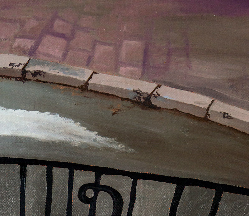
All titles are the same as the original photo, but with the updated year of 2020. The Henri Cartier-Bresson Foundation requested that I don’t display a side-by-side shot with the original, but I’ve provided a link to all of the originals if you’d like to compare.
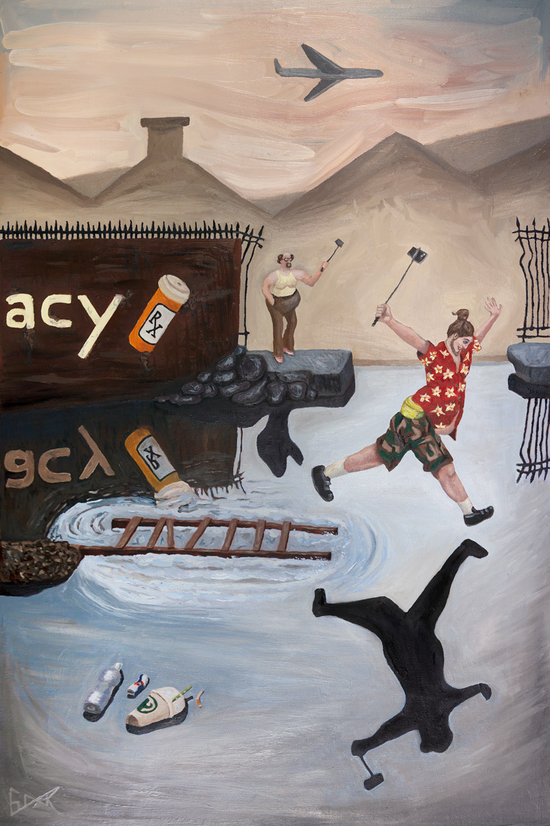
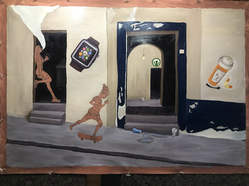
“Behind the Gare St. Lazare, 2020”
Original photo by Henri Cartier-Bresson: “Behind the Gare St. Lazare, 1932“
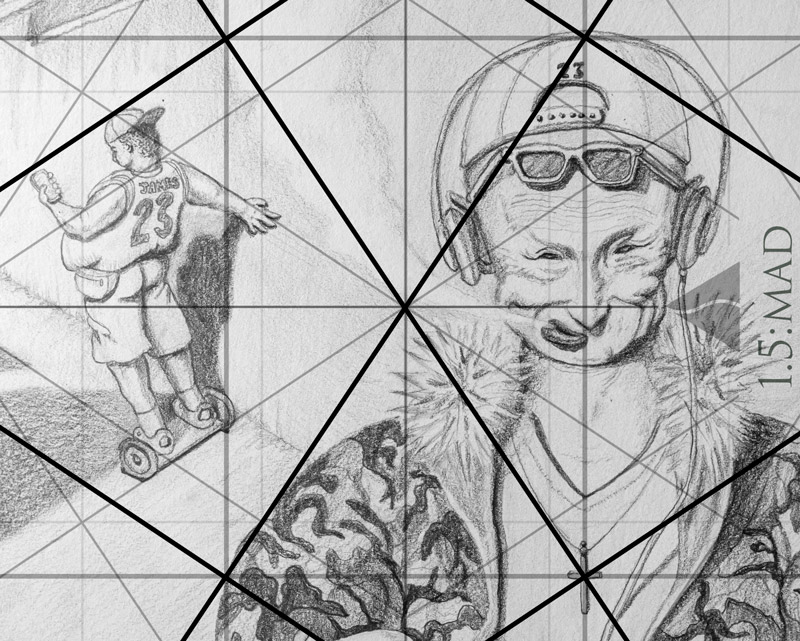
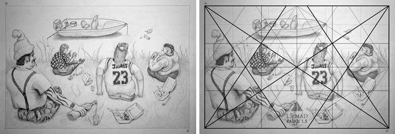
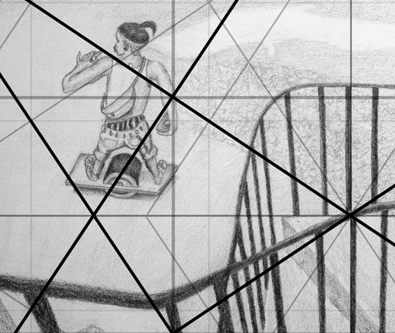
The preliminary drawing with the grid overlaid onto it.
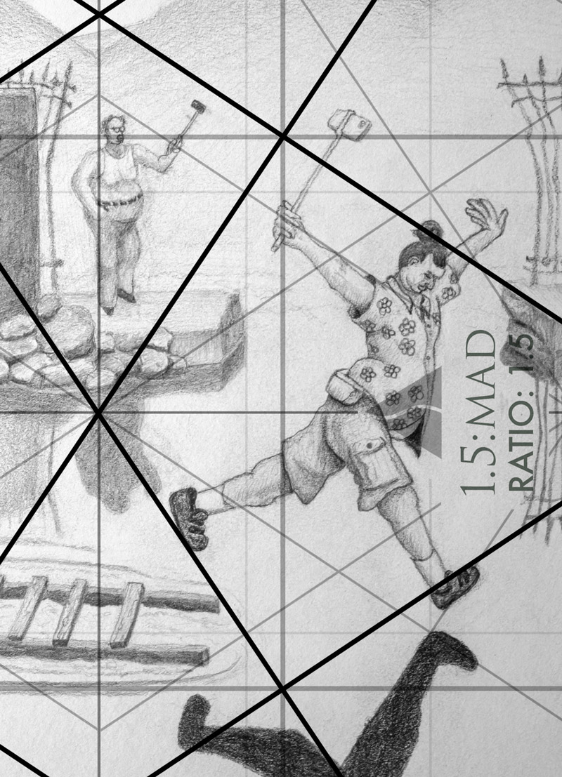
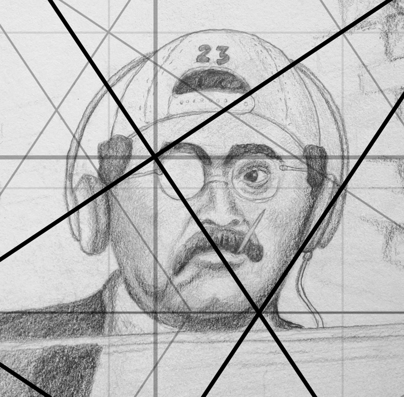
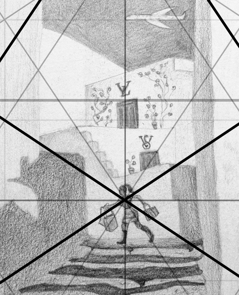
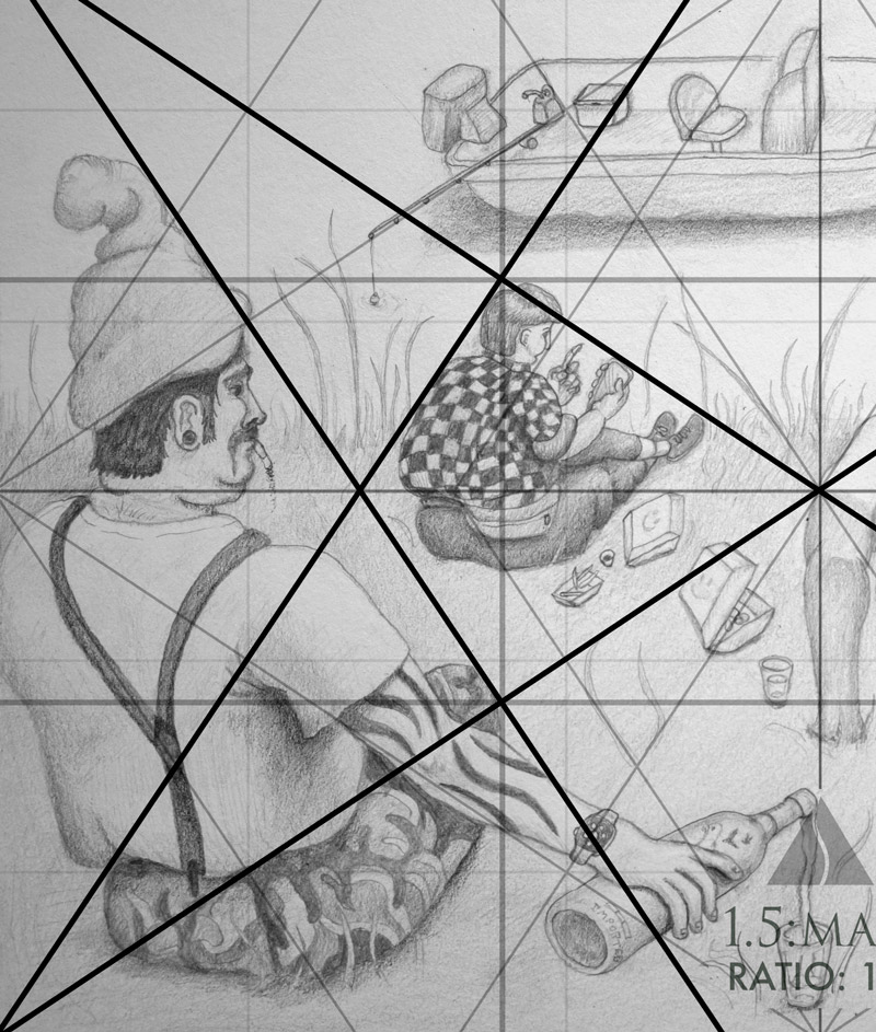
Here’s the dynamic symmetry grid detail where you’ll find parts of the drawing being aligned and paralleled.
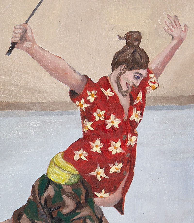
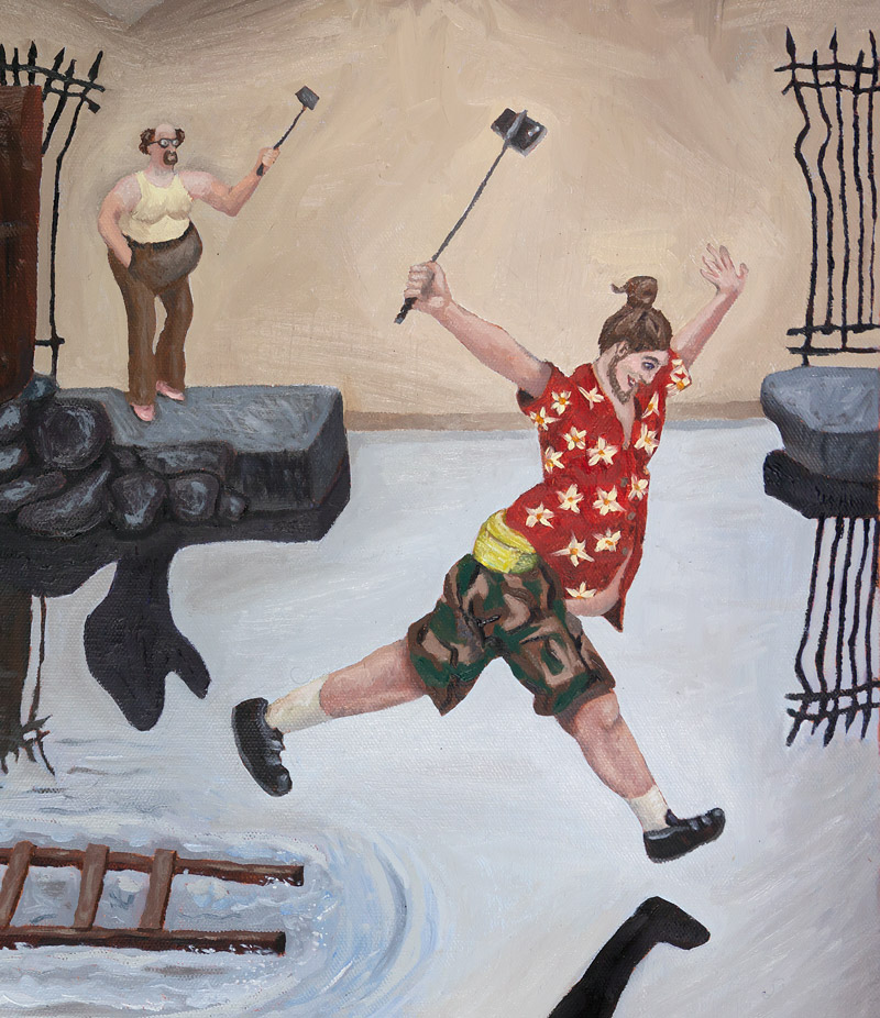
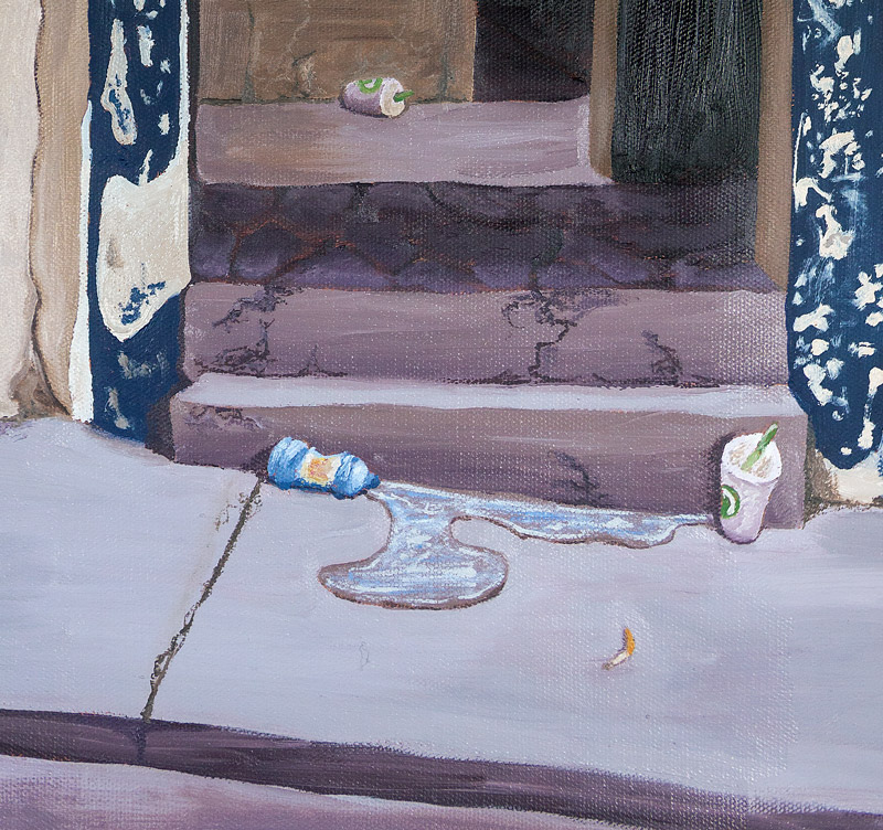
This is a behind-the-scenes look at the squaring process for enlargement. The dark areas are filled in first.
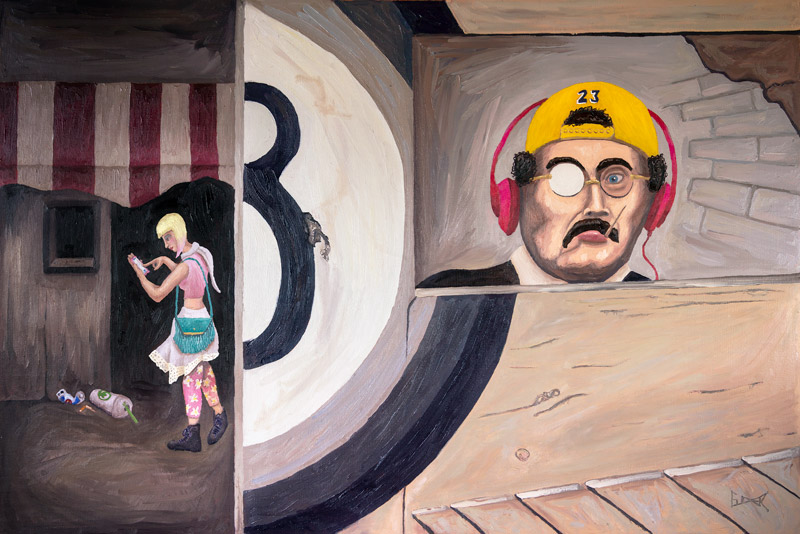
“Eunuch of the Imperial Court, Peking, 2020”
Original photo by Henri Cartier-Bresson: “Eunuch of the Imperial Court, Peking, 1949“
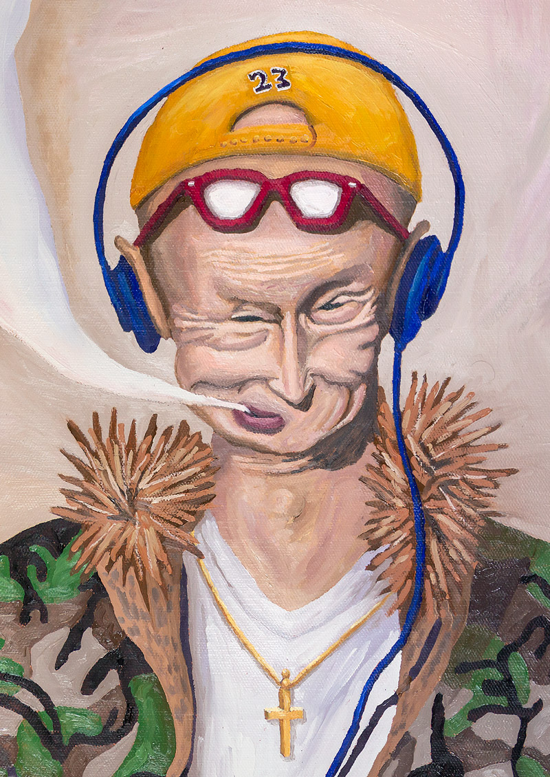
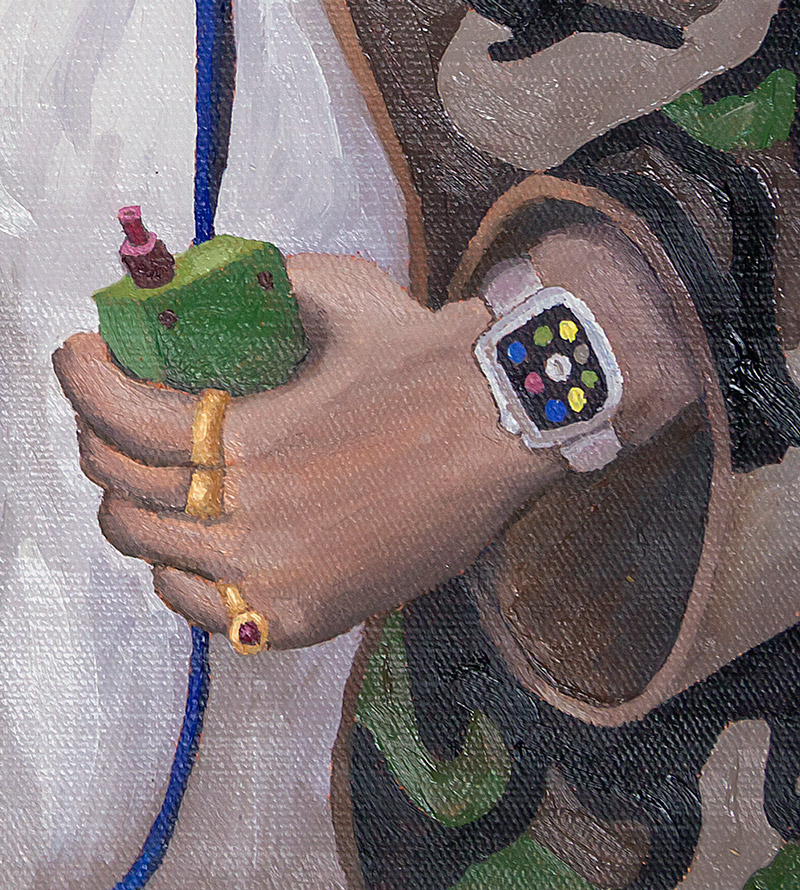
“Abruzzo, Italy, 2020”
Original photo by Henri Cartier-Bresson: “Abruzzo, Italy, 1951“
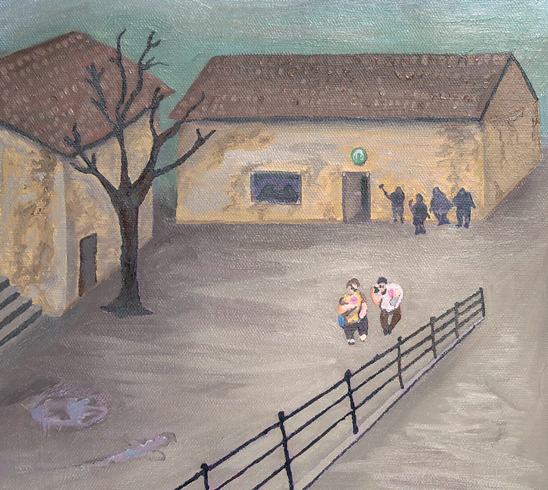
“Tuscany, Livorno, Italy, 2020”
Original photo by Henri Cartier-Bresson: “Tuscany, Livorno, Italy, 1933 “
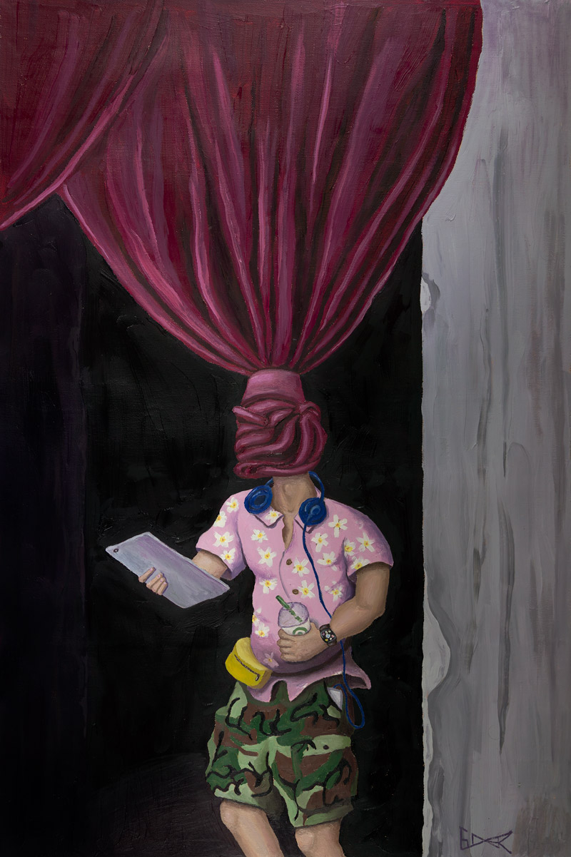

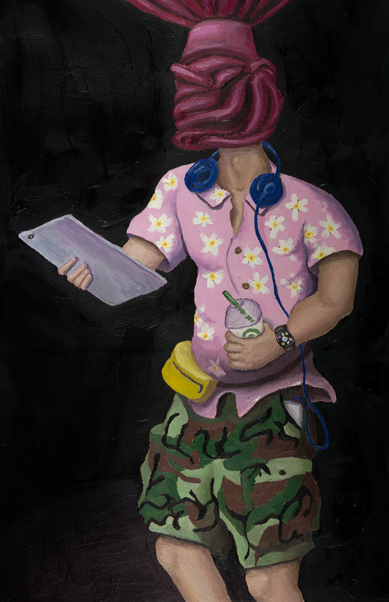
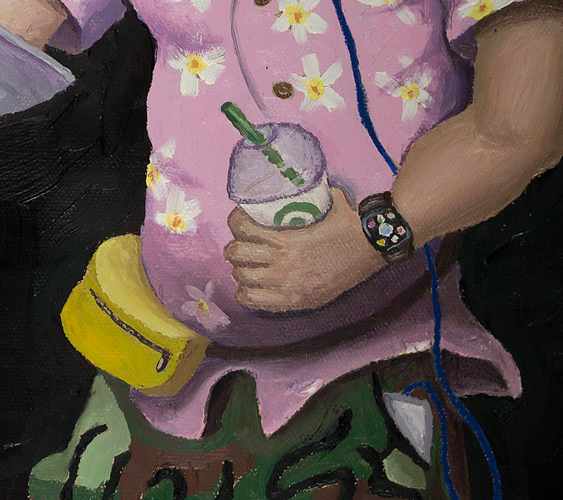
“Mexico, 2020”
Original photo by Henri Cartier-Bresson: “Mexico, 1964“
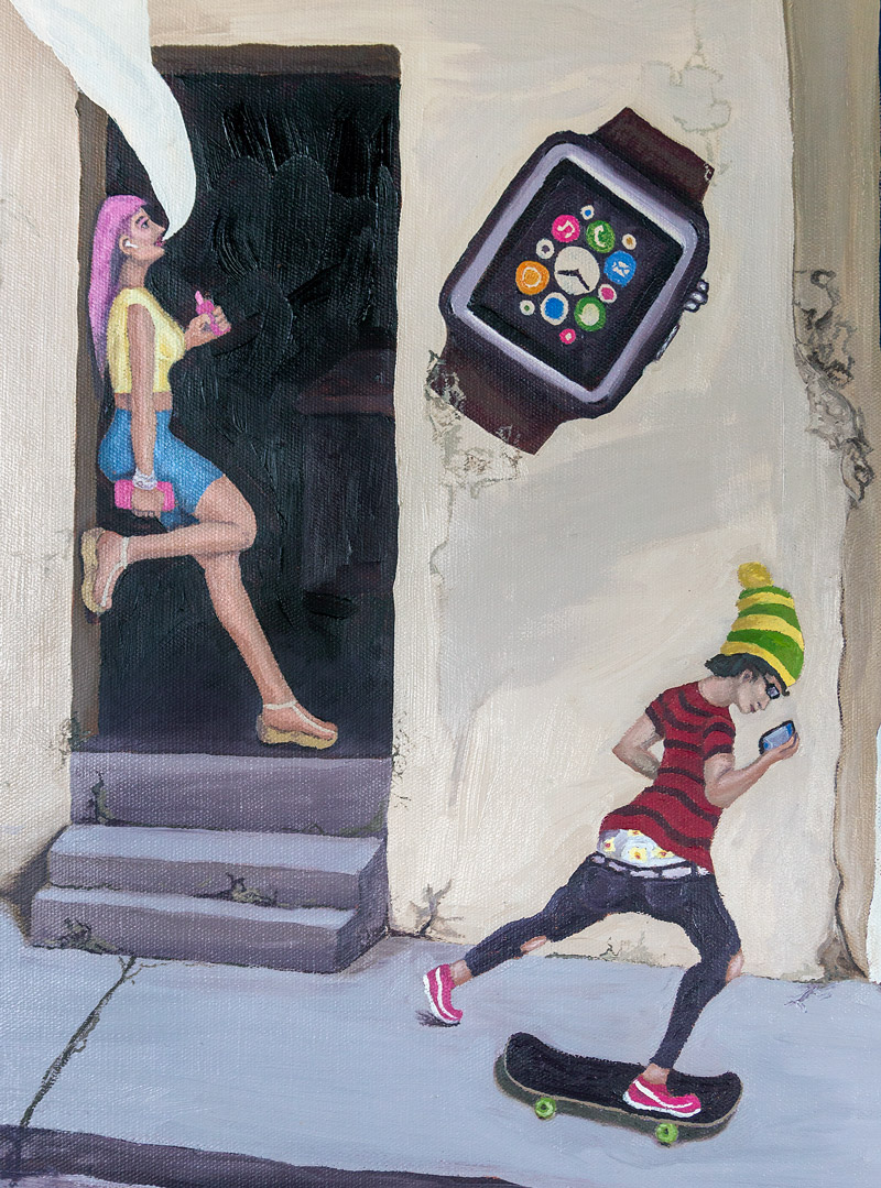
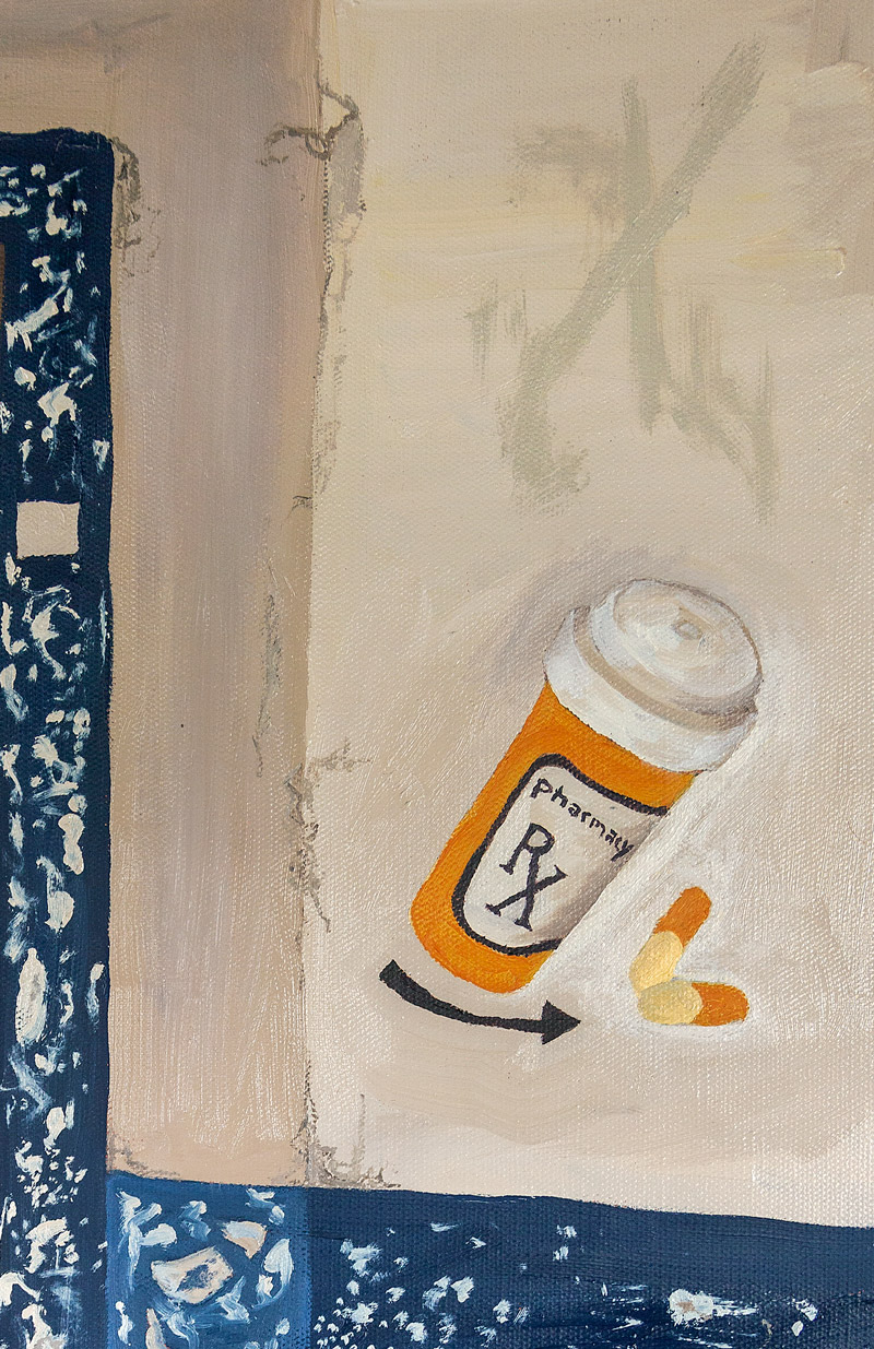
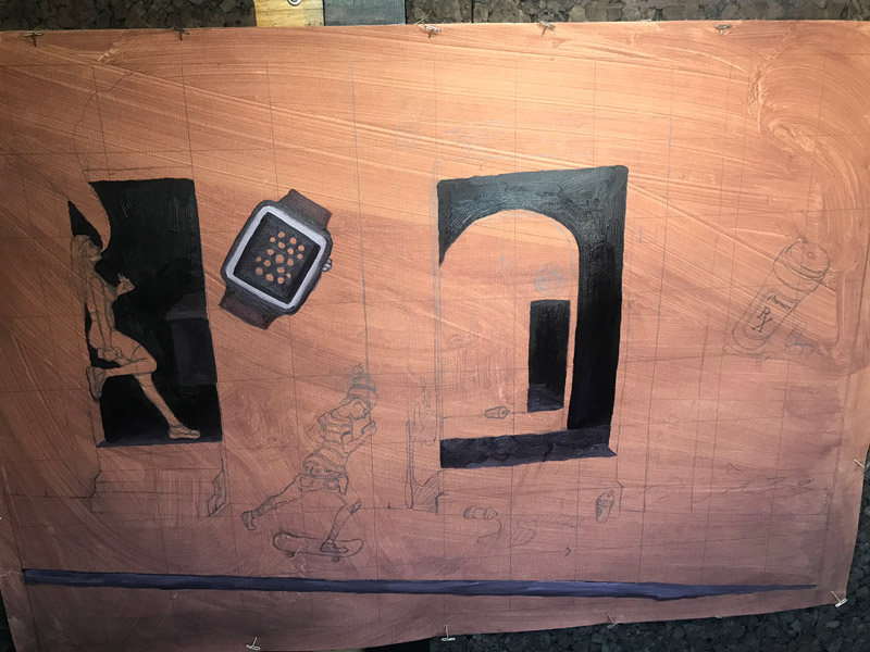
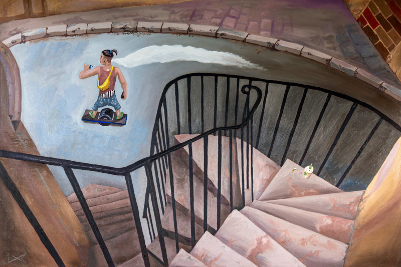
“Roman Amphitheater, Valencia, Spain, 2020”
Original photo by Henri Cartier-Bresson: “Roman Amphitheater, Valencia, Spain, 1933“
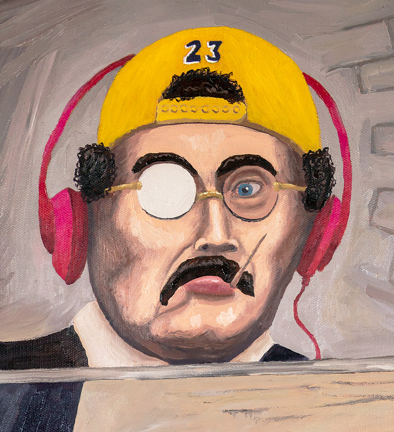
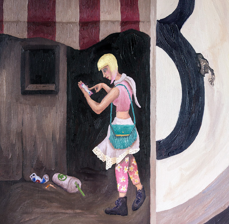
“Sifnos, Greece, 2020”
Original photo by Henri Cartier-Bresson: “Sifnos, Greece, 1961“

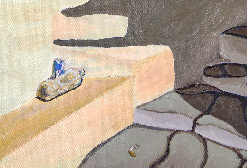
“Trastevere, Rome, 2020”
Original photo by Henri Cartier-Bresson: “Trastevere, Rome, 1959“
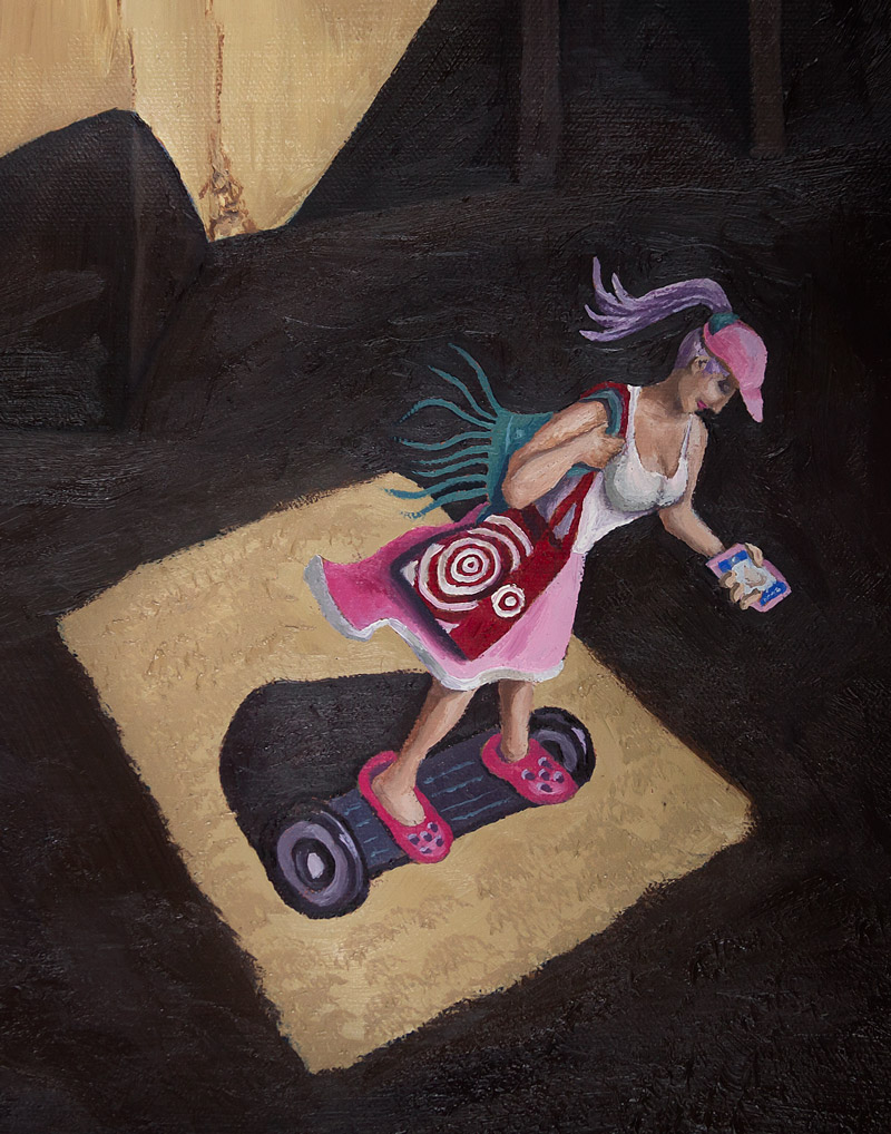
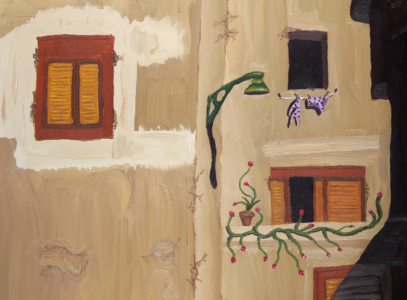
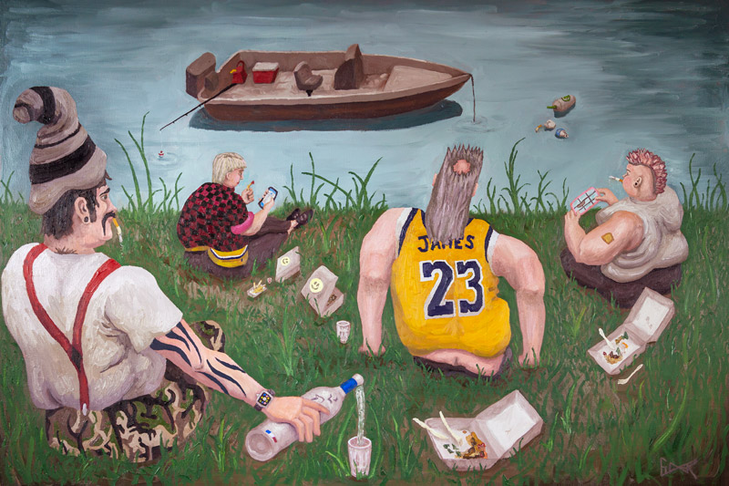
“Au Bord de la Marne, 2020”
Original photo by Henri Cartier-Bresson: “Au Bord de la Marne, 1938“
“Hyeres, France, 2020”
Original photo by Henri Cartier-Bresson: “Hyeres, France, 1932“
Conclusion
Start your own project because once you have a goal in mind and work towards it, you’ll feel a sense of joy and purpose. If you do your own master copy remake, have fun with it. Slowly incorporate the same geometry or dynamic symmetry that Henri Cartier-Bresson did. If you’re analyzing a master painter, make note of the design techniques they used and try to use them in your own work.
That’s it for this one, thanks so much for joining in! Do you have a favorite painting? Please let me know below, I’d love to hear your thoughts. See you next time!

