Design Techniques for Quick Portrait Paintings (Fun Video)
#605
I’m hoping you’re all doing well. Thanks for joining in today and showing your support!
Today we’re going to look at some essential techniques you can use portrait paintings where time is of the essence. We’ll also check out a fun video that will most definitely inspire your art. Let’s get into it!
Best Ones to Use Design Techniques
There’s a fun portrait contest video further below, where artists rush through a painting in four hours. It’s a great look at their process, critiques by judges, and how they quickly apply design techniques…if any. First we’ll cover the essential design techniques, then you’ll be able to see if any competitors used them in their art.
Artists have plenty of design techniques they can use in their art, but not all of them can be done with minimal effort. Some take much more brain power than others, but with continual practice they can become much more synergistic.
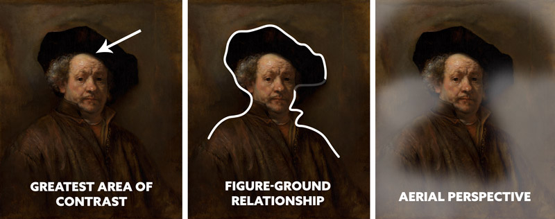
We need light to see anything, so let’s start with the greatest area of contrast (GAC)(see Day 27). Sometimes this technique is applied with ease, but other times it’s not even considered. When the GAC is disregarded, the art usually ends up with many distractions that pulls attention away from the main subject.
In this painting below, we can see Rembrandt easily applying the GAC to his face, but he also incorporates other techniques with ease. He uses a blank background, much like Annie Leibovitz (see #466), which helps create a nice figure-ground relationship (FGR) (see Day 21). The next technique is aerial perspective (see Day 43), which helps create a sense of atmosphere and depth. These all relate to contrast (rendering light), which is especially important for those of you who draw or paint.
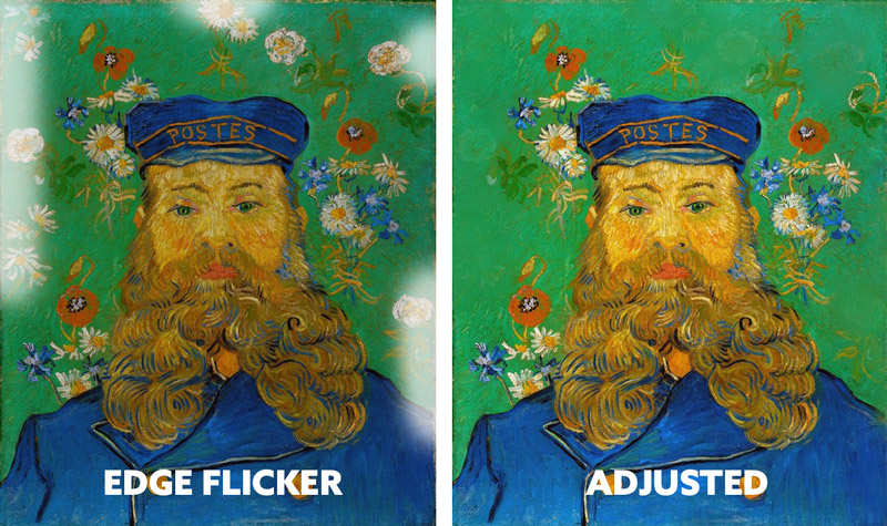
Another technique that is easy to apply, but sometimes disregarded is edge flicker (see Day 49) (also see 564). Hey, even the masters make mistakes! Here’s an excellent, colorful painting by Vincent Van Gogh, where he has high contrast near the edge. This creates distractions and pulls the viewers attention away from the subject. Can you feel the difference in the adjusted image? It’s ok for things to be on the edge as he has them, but in order to reduce distractions they would have to be lower in contrast.
Anytime we feel something tugging at our attention, we have to contemplate whether to keep it, subdue it, or remove it. In most cases, less is more. Since his edge flicker was equally distributed from the vertical centerline, it worked better than most cases.
When creating a portrait, somet dominant diagonals are created without even thinking. The collar of the shirt leads up to the neck, then the head. BOOM, you have a dominant diagonal. We see something similar in this painting by Picasso.
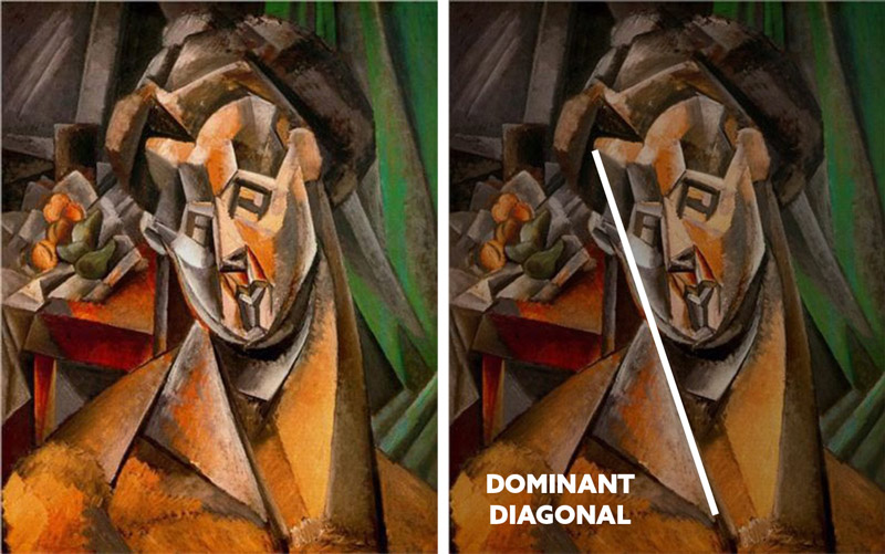
In this drastically different painting by Picasso, we see three easy techniques being used. The first one is aspective view (see Day 78), which is basically showing us the most identifiable shape; a side profile. Even if this were a silhouette, we would be able to tell that it is a woman looking down.
Most artists have a good sense of balance. That is, except for those who’ve been using the rule of thirds (see Day 396); that creates imbalance. In the middle image, we see how the head is placed more at the top, creating a movement from top to bottom. This is the breathing room (see Day 102), which is appropriate because her gazing direction is downward (right example) (see Day 99).

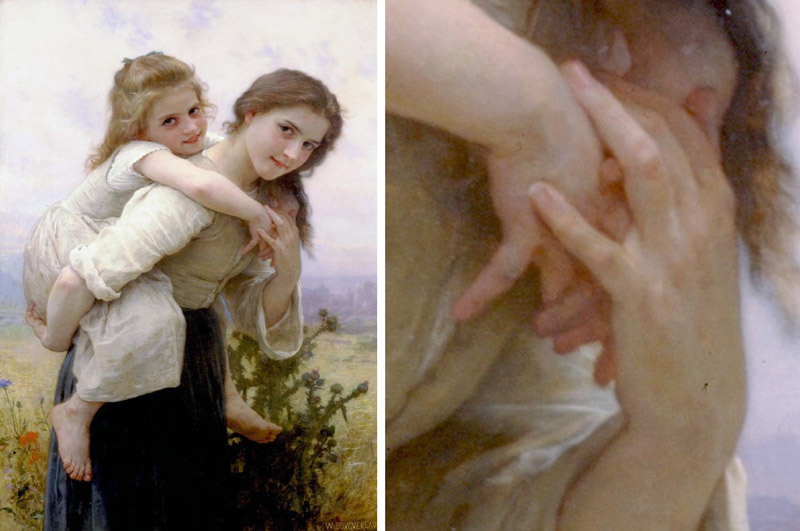
When you’re blocking in your drawing or painting, you’ll also probably be aware of overlapping shapes (see #591). If we look at the hand detail from Bouguereau’s painting, we’ll see how each finger is easy to identify. Nothing is creating an unwanted illusion or “kissing.” This visual clarity is very important for every shape in your composition, large or small.
In this case, it’s almost like we’re seeing FGR on a smaller scale. If we run an imaginary line around each pinky, we see them very clearly. The same goes for the other fingers, which overlap and fade into the shadows.
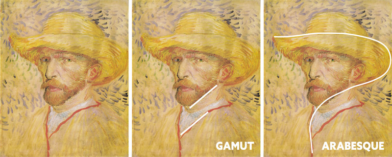
Some other techniques that are easily incorporated into portrait paintings are gamut (see Day 38) and arabesques (see #581). The simple repeating diagonals from Van Gogh’s beard and collar can be applied simply, but for more complex pieces you’ll have to use your training. The same goes with his arabesque. This is a hidden curvilinear movement which is relatively simple to apply with practice, but for more elaborate paintings with multiple subjects you would need more time to work out a design.
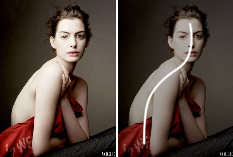
Here we can see an old photo I took, before I knew about the technique of gamut. By just posing the model in this way, I was able to create repetition. If I were using a grid, I would’ve repeated the diagonals of the grid in her pose.

This photo by Annie Leibovitz creates a simple arabesque by just having the model hunch over a bit. This is the “gesture” of her pose, for those of you who are familiar with the term.
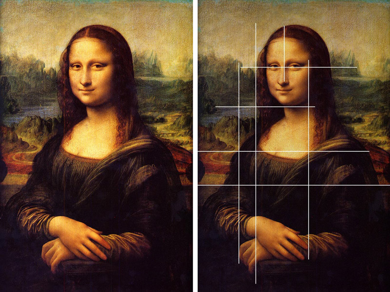
Now let’s cover some techniques that are a bit harder to incorporate. In this well-known painting by Da Vinci, we see plenty of coincidences (see Day 48) being used to create unity and movement. Sure, some coincidences can be accidentally made, but not the extent we see in the example. You have to apply your training to get multiple elements linking up. And if you’re in a rush, as the artists in the video below, some opportunities for this technique will be missed.
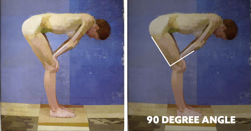
Another technique that takes more effort to apply is the 90 degree angle (see Day 76). These can occur easily when using a dynamic symmetry grid, but assuming that you don’t have time to draw out the grid, you’ll have to try and remember how they add strength to the composition. This painting by Euan Uglow shows how the tilted 90 degree angle adds strength to her pose.
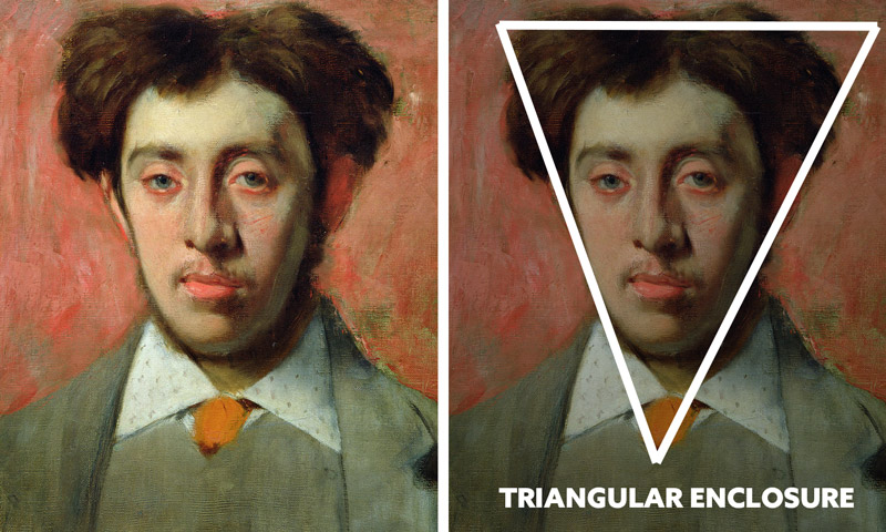
Another technique that could be more easily created by using a grid is the triangular enclosure (see Day 32). In this painting by Degas, we can see how his knowledge and efforts towards his design have created unity and movement in the man’s head and outfit. The triangle is also repeated in his collar…clever!
In this painting by Toulouse Lautrec, we see a hidden ellipse (see Day 34) being formed to create unity and movement. If you’re in a rush, this is another technique that might be overlooked. Practice, practice, practice, and perhaps it will be applied easier.
Painting Quickly Artists
Now that we’ve got the hard stuff out of the way, let’s have some fun with our knowledge. Run through these images, then watch the video below. See if you can be inspired by some of their expressive artistic styles (see Day 122). In the paintings that win, see if you can pause the video and try to locate any techniques that were present. Were they some of the easier techniques, or more difficult ones?
Also, pay attention to the critiques of the judges. Critiques are tremendously helpful for growth!
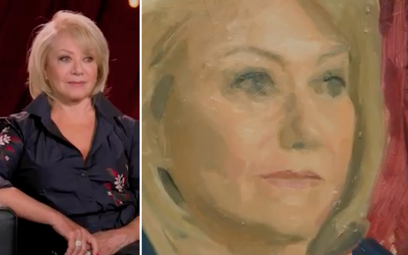
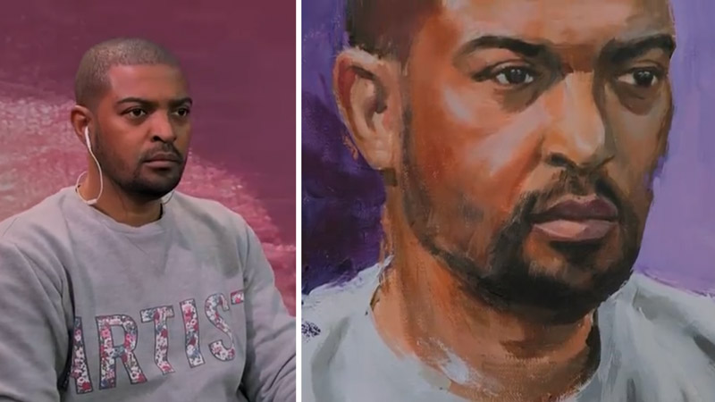
For this next painting, the judges commented that they “enjoyed the loose brush marks that brought the face to life.”
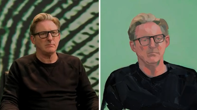
This one was described as “fresh and delicate.” It’s also interesting to look closer and see how the glasses parallel the shoulder. A dominant diagonal would be much more dynamic thin a subtle tilt, but it is the one thing that adds character to the painting. Also, notice the blank background for clean FGR. You’ll find that most of the artists in the contest keep the background blank to save time.
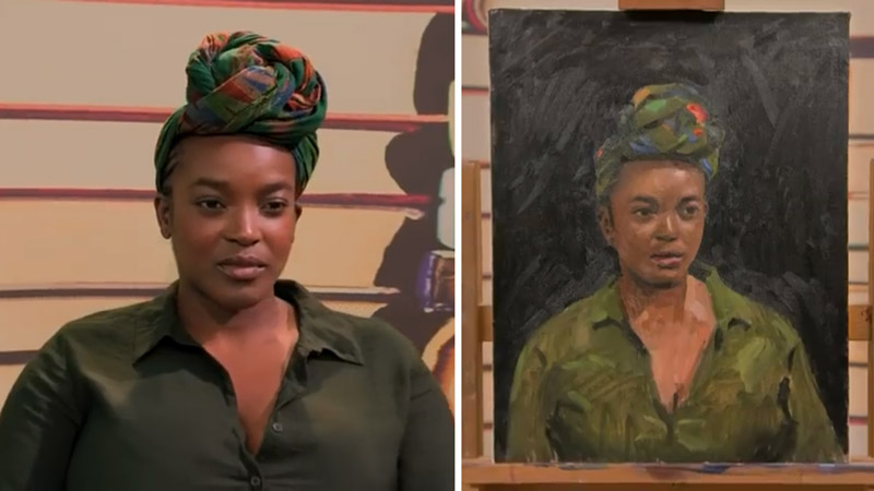
The judges said that the artist “brought a contemporary edge to a classical style.” We have that natural occurring coincidence created by the left side of the head and the collar. Blank background for nice FGR, but there seems to be a bit of extra negative space above her head.
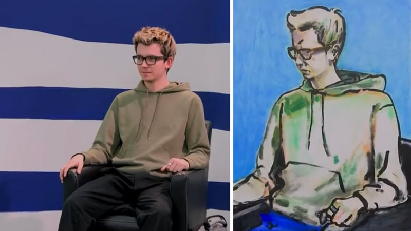
For this one, they said the artist “captured his essence in a masterful way.” Notice the breathing room above his head. Contrary to the previous example, this seems to have too little of negative space. Perhaps there could’ve been a bit more, don’t you think?
Portrait Artist of the Year 2020 Video
Here is a LINK where you might find Episode 9, which includes the artists from above. There are definitely more educational videos for painting where you’ll learn more, but if you’re needing a break and looking for something that is more entertaining than Netflix reruns, here you go. They show time lapses of the portraits, have fun humor, and might inspire your art. If you search for the title “Portrait Artist of the Year” you’ll find the full season. Watch actively instead of passively to get more out of it. And watch for those techniques!
Note: I would love to post the video here, but YouTube keeps deleting it.
Conclusion
Feeling inspired? Can you paint a decent portrait in four hours? I’ve never tried, but it would be fun to see. Always try to incorporate as many techniques as you can. Use the design checklist from the Resources page if you like. It’s a lot to remember and understand at first, but every time you make a mistake or feel frustrated it’s an opportunity for growth.
Thanks for joining in and showing your support! See you in the next one!

