The Tragedy of Macbeth – Stunning Cinematography (ANALYZED)
#693
Thanks for joining in everyone, I appreciate the support!
Today we are going to dig deep into the stunning cinematography seen in “The Tragedy of Macbeth.” Which design techniques did they use to capture their beautiful visuals? Did they use dynamic symmetry? Let’s find out now!
**WARNING – TONS AND TONS OF SPOILERS**
The Tragedy of Macbeth Interesting Info & Trailer
If you haven’t heard anything about the movie, maybe watch it first before you read this article. Most of us have heard of Macbeth, but a quick synopsis is that he was a Scottish general that received a prophecy by three witches. They told him he would be King of Scotland some day. They were right, but he did it by killing and lying. The story of Macbeth is a tragedy written by William Shakespeare, but for this movie it’s been interpreted through the eyes of Joel Coen.
Who is Joel Coen? He’s one of the “Coen brothers,” who directed many popular films like Fargo, No Country for Old Men, Burn After Reading, True Grit…lots of great ones! His wife, Francis McDormand, is in a lot of these movies and plays Lady Macbeth.
Basically anything the Coen brothers do is a must see because they have a unique artistic style (see Day 122) full of grit, dark humor, and everything else good about a movie. The Tragedy of Macbeth has all the great Coen qualities, but is different compared to those mentioned above. It has more of a “fantasy” type of feel, which is definitely cool to see.
Credit must also be given to the cast, as the acting is top notch. The cinematographer, Bruno Delbonnel, also plays his part to help create some stunning visuals. He is known for his excellent work on “Amelie,” and a few others.
Check out the trailer below and see if you can identify any composition techniques before they are pointed out further below. So many good shots, it reminds me of The Lighthouse (see #612).
Stunning Cinematography Analyzed
Aerial Perspective
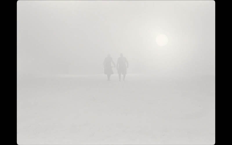
As with most cinematic scenes, they never forget their smoke machines. Capturing aerial perspective (see Day 42) in a movie will add depth to the scene, and we’ve seen it in other analyzed movies like The Revenant (see #418), The Shining (see #677), and Under the Skin (see Day 354). Aerial perspective can also add a sense of mystery, which reenforces that fantasy feeling I get when watching this movie. In some scenes, like the one below, the characters slowly appear through the thick cloud of smoke in a land of snowy grays.
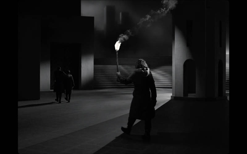
This incredibly artistic shot has aerial perspective in the background and smoke coming from the torch, but it also uses another technique called “the shadow’s edge” (see Day 160). As the dark silhouette approaches the shadow’s edge he becomes more defined.
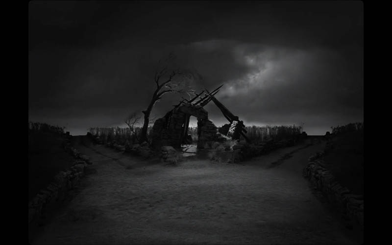
This shot looks like an Ansel Adams photo (see Day 293), but with a crumbled house and a forked road.
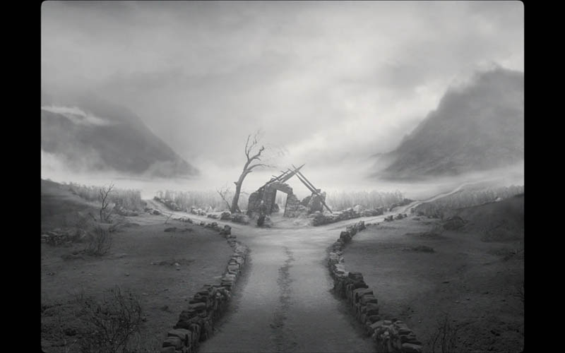
Are you getting that sense of depth? Are you seeing how they put their smoke machines into overtime? It certainly creates an appealing aesthetic and is used in countless scenes.
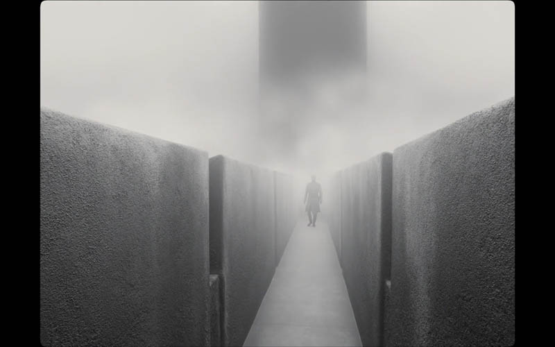
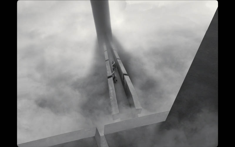
Figure-Ground Relationship (FGR)
With so much aerial perspective going on, we’re certain to get nice FGR from it (see Day 21). When the smoke reduces the contrast of the background, the foreground characters have a chance to be easily separated.
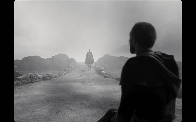
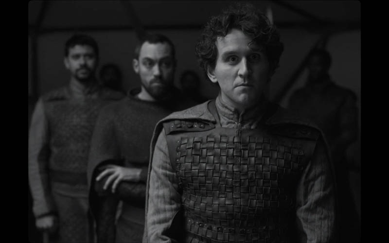
Speaking of separated, here’s a scene without smoke, but it still incorporates aerial perspective with the lighting effects. It also has nice FGR, which is helped by the separating shapes (see #374). See how all six subjects are organized to show their heads?
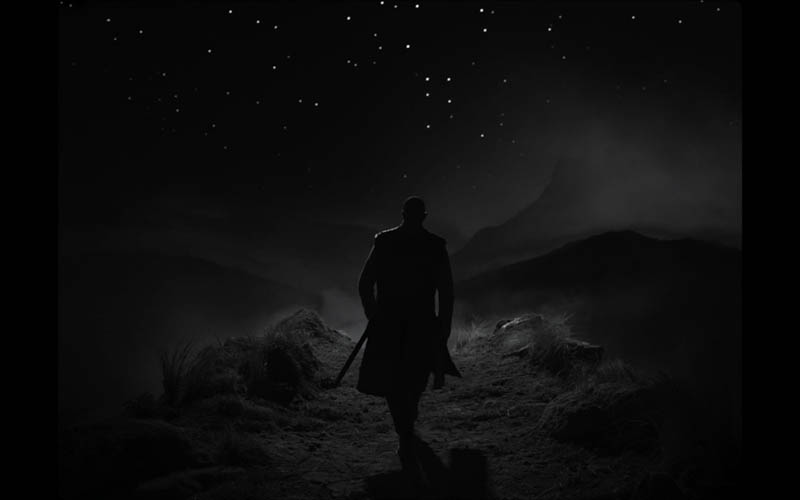
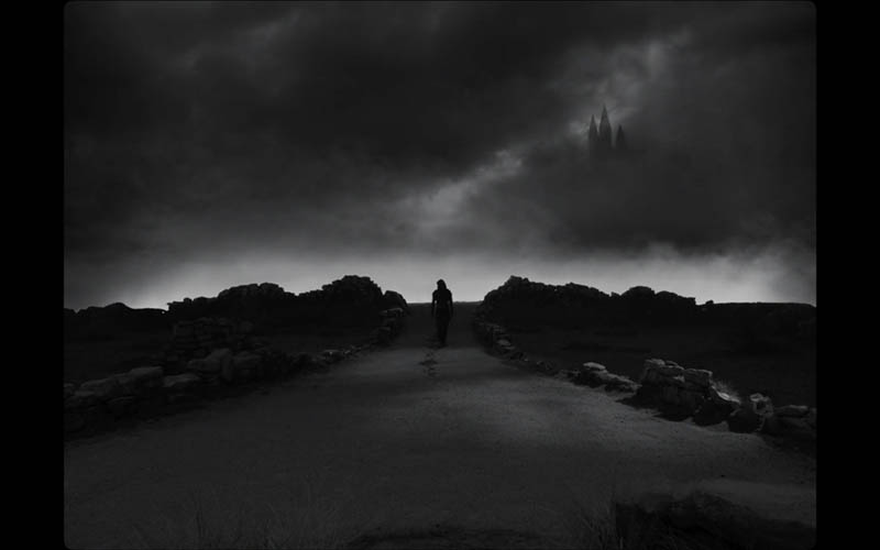
This is an iconic shot of Macbeth walking into the distance with the area in front of him being lit. This creates a silhouetted shape against the starry, cloudy night.
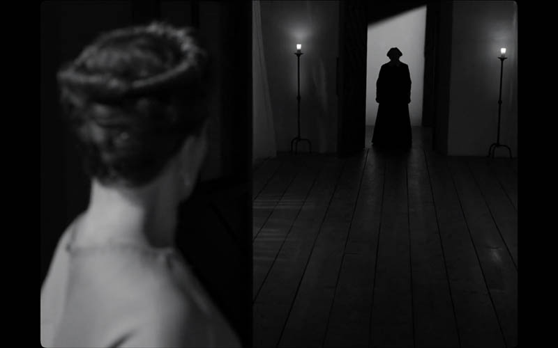
I love how they play games with FGR in this one. On the left we have a light figure on a dark background, and on the right we have the opposite. Really cool shot, which is helped by those sharp verticals and the small diagonal in the background lighting. Two people, two candles…another nice touch!
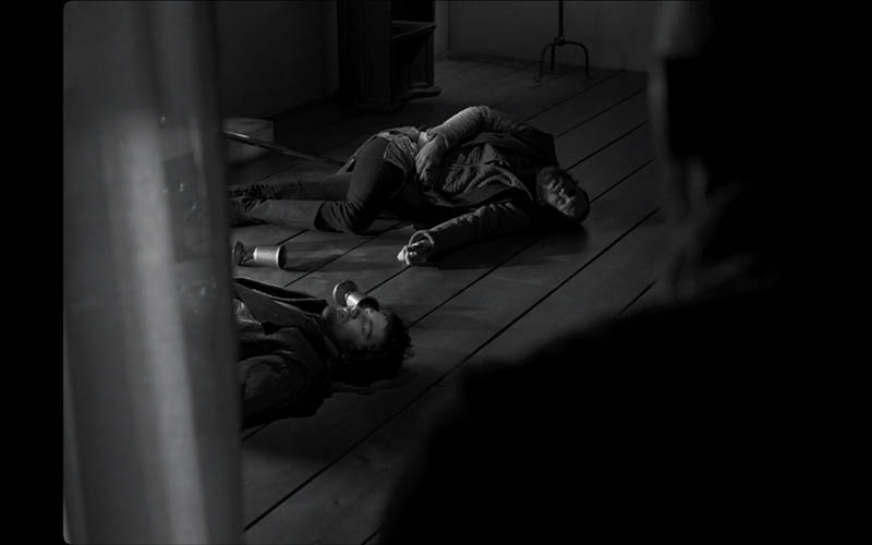
Here we have FGR Reversal, which puts us in the characters shoes. The guys laying on the ground also have nice FGR from each other. If we were to have perfect FGR, we could adjust the cup near the guy’s head and separate the shapes even more.
Aspective View
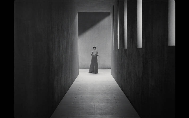
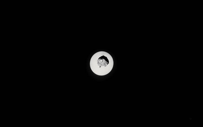
When aerial perspective promotes nice FGR, it can also promote an aspective view (see Day 78). This next shot has very little information, but we have a good idea of what’s going on. The man (or short haired woman) is walking towards us with either a bowling ball or a severed head. Even if we don’t know the full story of Macbeth, we can safely assume they’re not the bowling type…not in that dress!
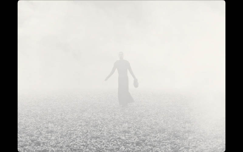
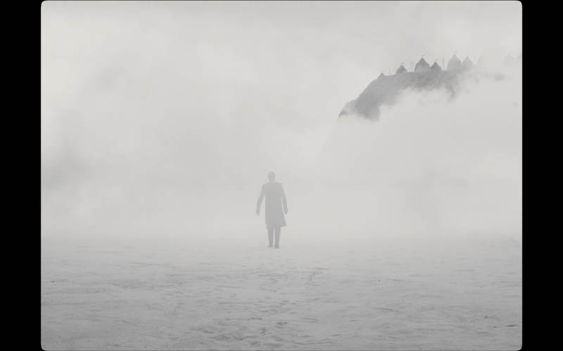
Here’s another great shot with aspective view, aerial perspective, and FGR. The distant mountains add a nice touch!
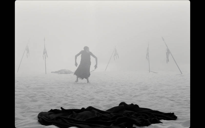
This woman did a creepily-excellent job of being a Gollum-like witch. Her voice changes from kind, to deep, to creepy all in the same breath. Another cool thing we don’t really analyze on this site, but is worth mentioning, is the sound design. It adds so much to the movie, just like Dune (see #680 & #681).
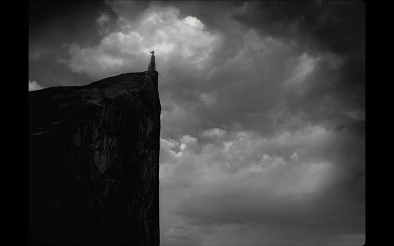
The side profile of the face and hair helps us identify the character in this shot, even though the person is small in the frame. They also have the greatest area of contrast (GAC) (see Day 27) by her head and with nice FGR. See how they make sure the cloud behind her head helps create the most contrast? Clever!
Centered
This section is in honor of all of the artists that were taught the rule of thirds in order to get the subject out of the center (see #692). Ho hum. Little did they know that center compositions can create jaw-dropping scenes like these!
The shot below is of the witch, but there is actually three of them. Such a cool and mysterious scene! All of these centered compositions adhere to the Law of Symmetry (see Day 57), which is all about balance.
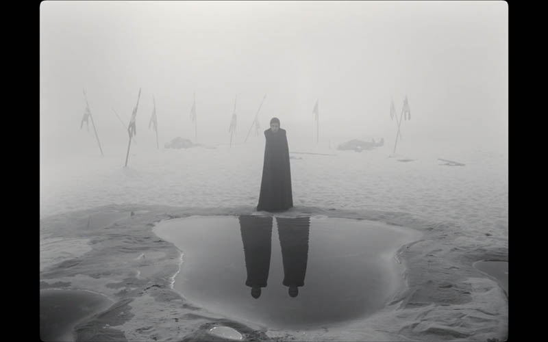
Here we see Macbeth in the center as he looks out from his castle walls.
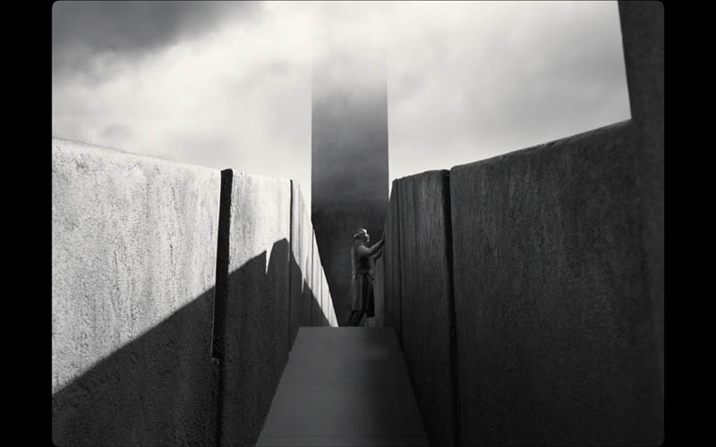
This centered shot looks great with the repeating trees receding into the smoky atmosphere.
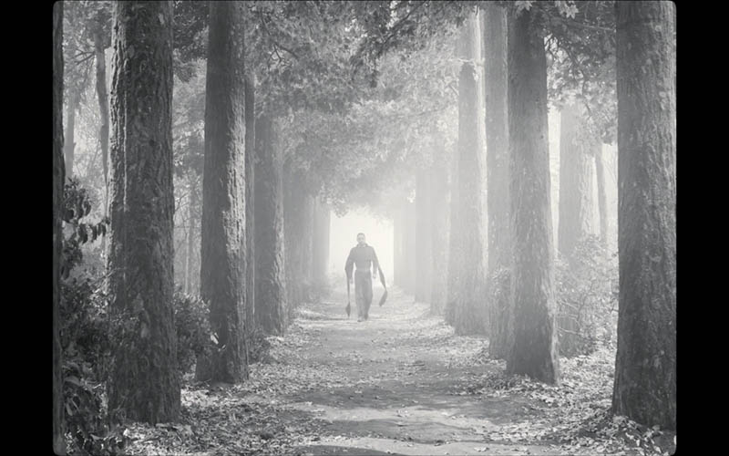
So many beautifully centered shots. Who would’ve thought that the center could be so welcoming to the eyes?!
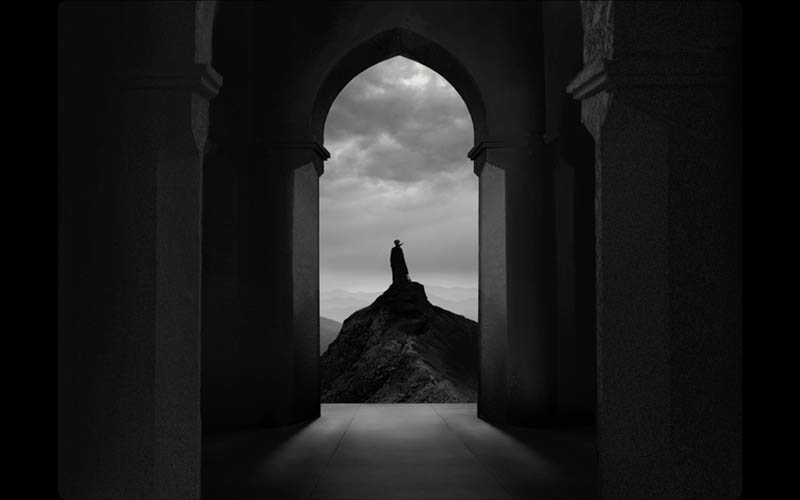
Counterpart
When we talk about balance, the use of a counterpart (see Day 57) can be very beneficial. In these next scenes, we’ll see how they use the center of the frame as a fulcrum to create nice balance from left to right.
This next shot, as with most of the others, looks way better in-motion. The foreground character (right) paces back and forth as the man walks up the stairs (left) and Macbeth stands near the middle. So they have two smaller characters on the left of the vertical centerline, and a larger one on the right…creating balance. They also have a size hierarchy too (see #442). Oh, and we also have repetition in the robe and the stairs. So good!
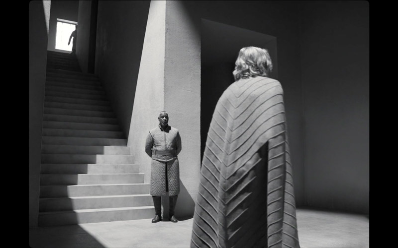
Another excellent scene! They’re really stacking all the design techniques to create remarkable visuals.
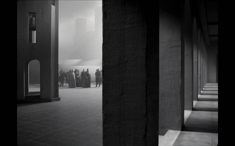
Can you see the counterpart in these next shots? How about other techniques that we recently covered? Do you see the GAC in this one…how they control the contrast?
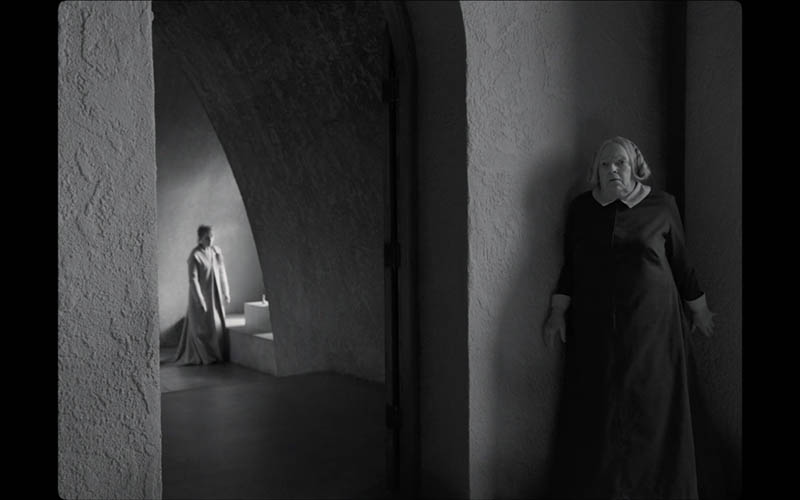
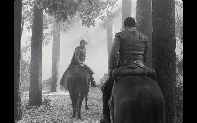
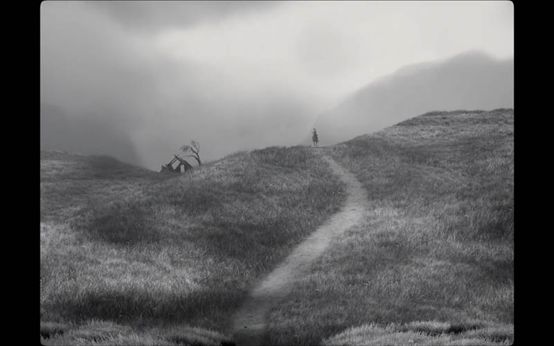
Light and Shadow
Ah yes, what would a black and white movie be without interesting scenes of light and shadow. In a lot of scenes, they use light and shadow to create the element of surprise. For instance, we’ll see a shadow in a doorway before the person walks through it.
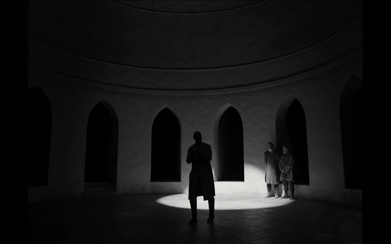
In this next one, we see how they have a bright spotlight for the scene and the characters walk through it and around it.
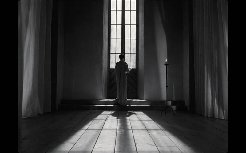
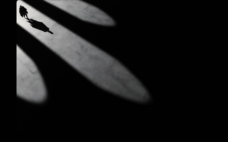
In this scene, the woman is silhouetted as the light from the window casts shadows on the ground. These shadows blend with the planks of the floor and repeat the rectangular pattern of the window. Cool!
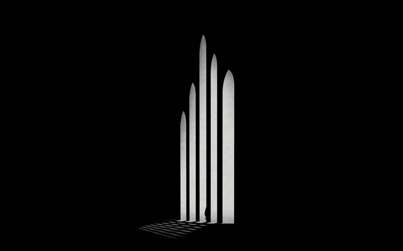
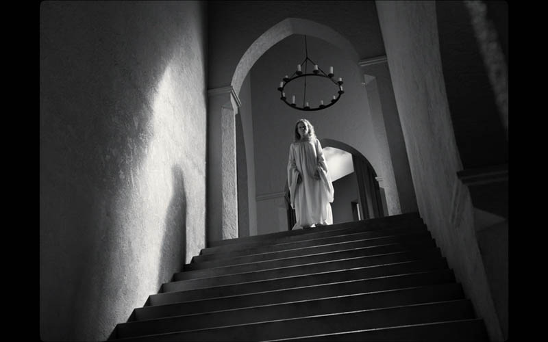
A lot of these scenes work with the shadow’s edge or shadow play (see Day 113), where the shadow becomes an important part of the composition.
Diagonals
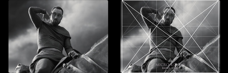
This movie is definitely not neglecting diagonals! Almost every scene seems to have a diagonal or a skewing of some sort. It adds to the eeriness and mystery, but also helps the compositions. As we know, dominant diagonals can add visual impact (see #441) and we can see it in this next shot aligning to the 4/3 grid.
We see the diagonal of the horse and background cloud paralleling the baroque diagonal, and the man’s arm on the sinister diagonal. This creates a 90 degree angle (see Day 76), which also adds a sense of strength to the shot.
Here we see the left edge of the wall paralleling the baroque reciprocal diagonal, and the large baroque diagonal leading us to the man in the middle.
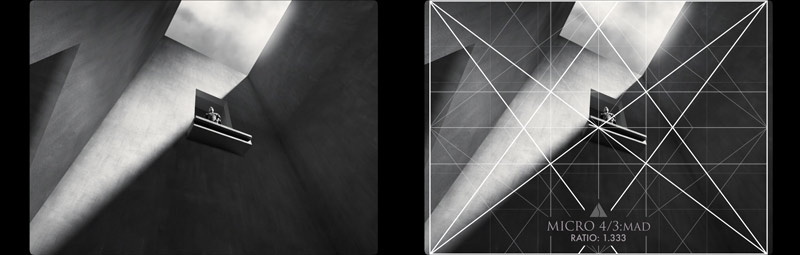
They even capture this man walking towards the crown on a diagonal! Imagine how they had to twist the camera to capture this shot. It’s not your typical angle, but works great!
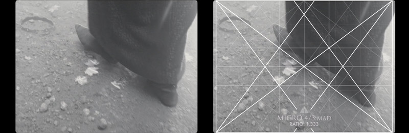
Why have horizontals and verticals when showing a severed finger, when you can have a more dynamic shot with diagonals? This has some David Lynch “Blue Velvet” vibes.
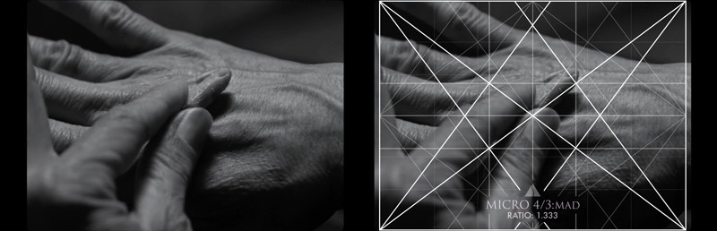
Can you find the paralleling diagonal in this one? They are fighting on a sinister diagonal…interesting. Is it to create more movement with magnetic momentum? (see Day 64)
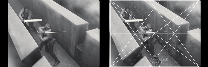
The sinister reciprocal diagonal is locking in on the left, and I love the visual tension this shot has with the diagonals behind the man’s head.
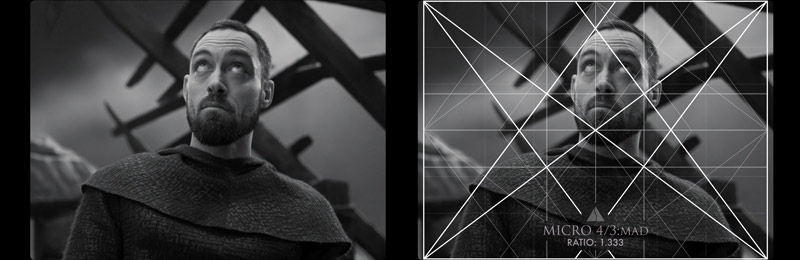
More Interesting Compositions
There are too many excellent shots to show, so hopefully you’ve seen the movie and can appreciate it even more. Here are some killer scenes that you can go through. They mostly stood out to me as being really unique, as opposed to any specific design techniques.
For instance, this first scene shows the water rippling the window reflection. Strange and unique!
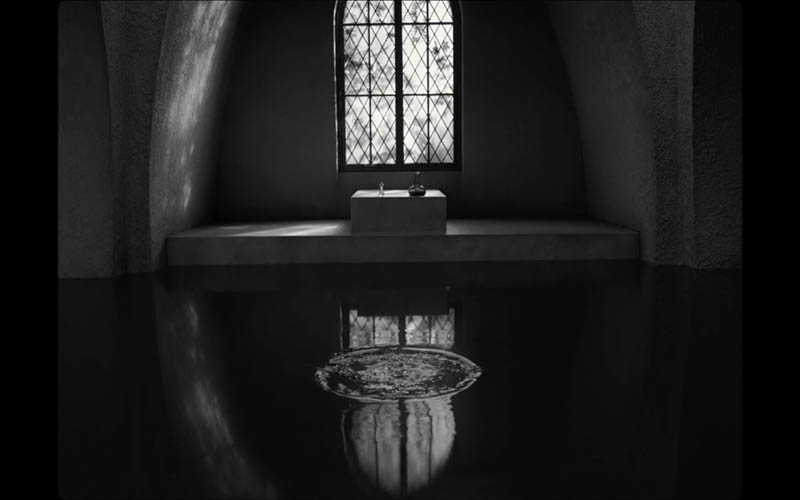
This is another scene that adds to the fantasy feeling. The witches make Macbeth see a boy in the water reflection.
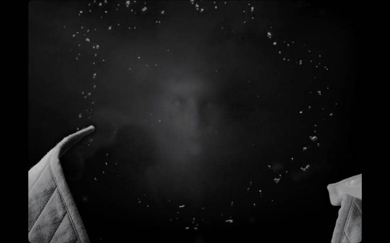
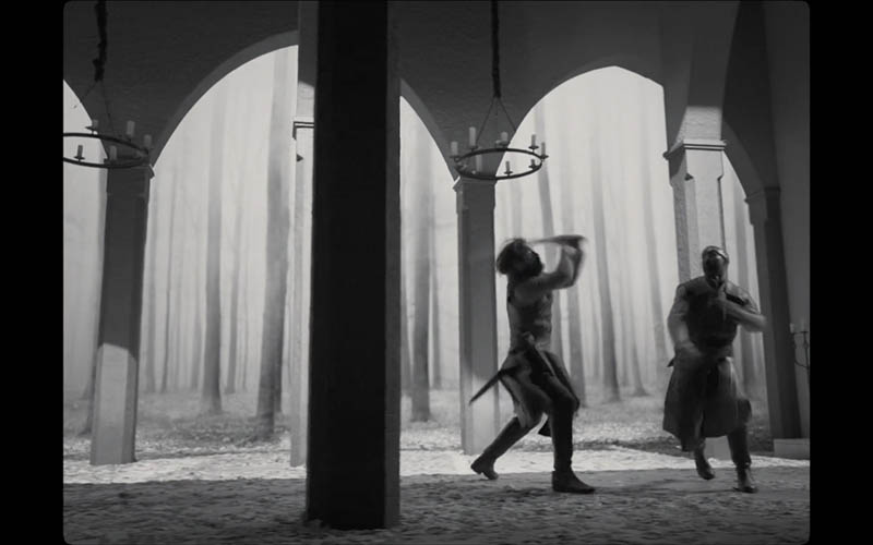
The background of this fighting scene was pretty epic, with all the repeating trees and aerial perspective.
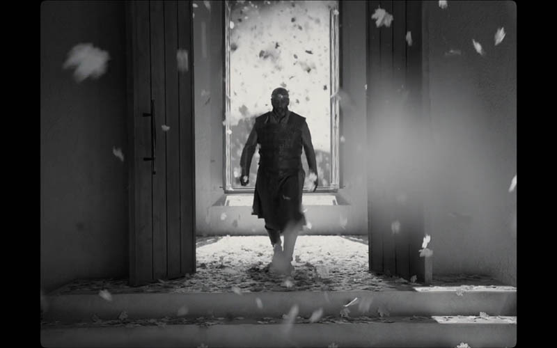
This room gets filled with leaves, and we can see in some areas (lower right) that the leaf creates an effect like aerial perspective by reducing the contrast.
This shot of the boy falling into a pit of smoke was sadly stunning!
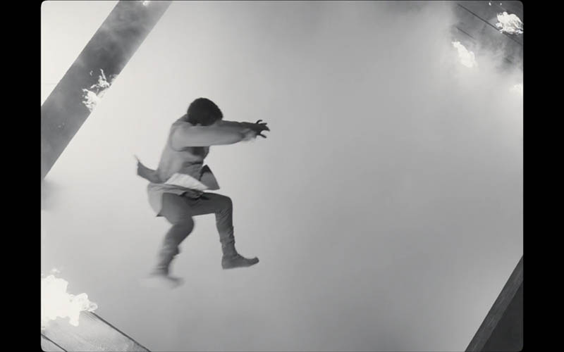
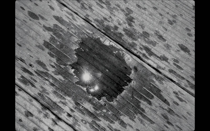
Sinister diagonals in the wood and specular highlights in the splashing water…a simply interesting scene indeed.
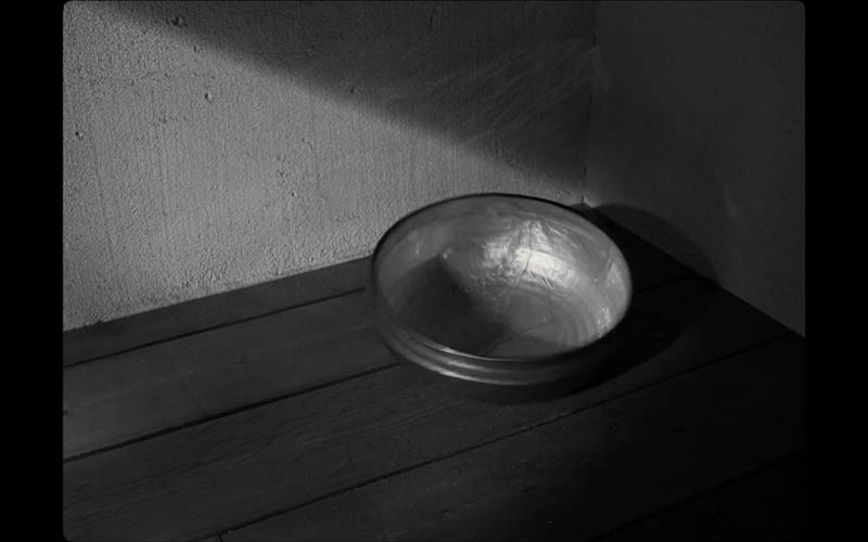
Another great shot that uses shadows to add interest.
This shot is on a diagonal and he spreads the tall grass to reveal his face. You definitely have to see this movie in-motion to appreciate it fully.
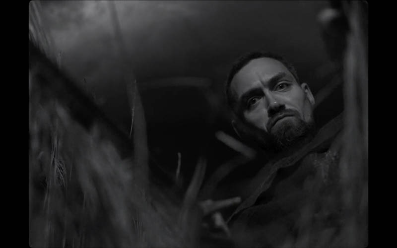
Here’s another one, where the light casts diagonal shadows over the boy’s face.
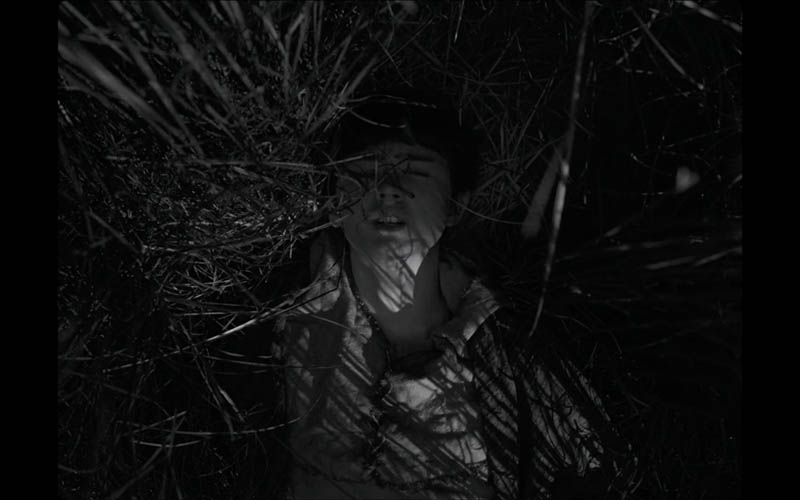
I’ll let you appreciate these next few scenes on your own.
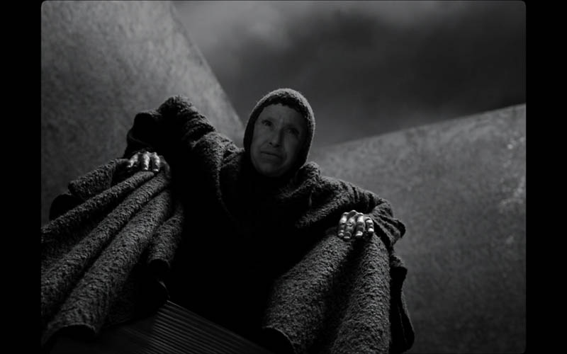
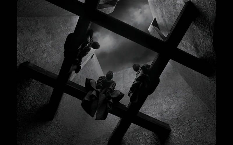
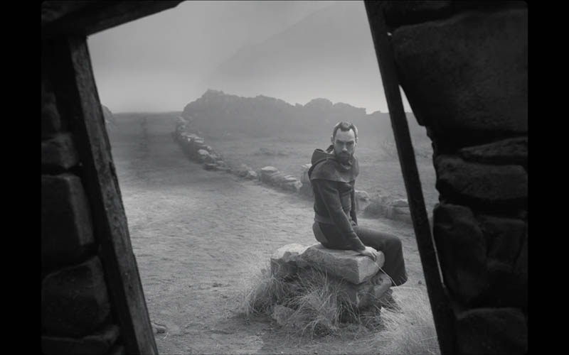
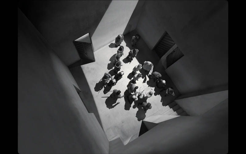
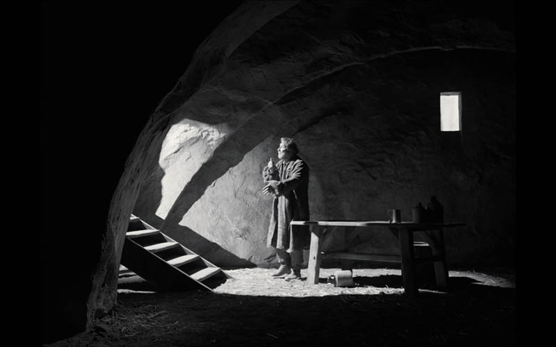
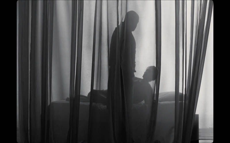
This perspective from above…so many good shots!
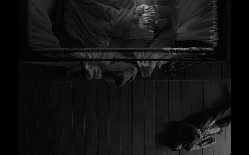
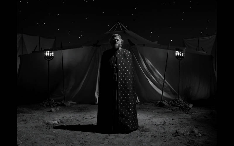
This one has a repeating pattern in his outfit and the stars in the sky.
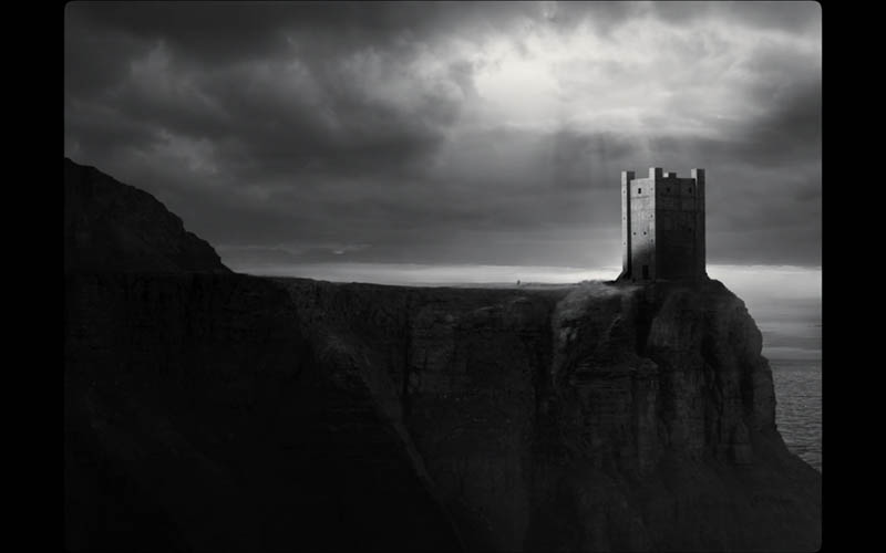
This scene shows a tiny little person running towards the castle with light shining from the clouds.
Conclusion
Hopefully your mind is exploding with inspiration and you’ve learned how the design techniques are super important for creating something visually remarkable. Use the grid, incorporate tons of diagonals, play with balance and shadows, blow some smoke around…it all adds to the composition!
Thanks so much for the continued support, see you next time!