Lindsay Adler – Top 10 Techniques (Analyzed Photos)

#770
Welcome back, everyone! Glad to have you here, showing your support—because today, we’re diving into the world of Lindsay Adler’s photography.
We’re about to break down the top 10 techniques that make her images so striking, so cinematic, so next level. But here’s the real question—does she have any weak spots? Is there room for improvement? Let’s dig in and find out!
Lindsay Adler Who Is
Lindsay Adler is basically what happens when you mix a fashion photographer with a mad scientist—except instead of test tubes, she’s armed with strobes, gels, and an almost supernatural ability to bend light to her will. She could give Annie Leibovitz a run for her money, but let’s be real—there are a few tweaks she could make (which we’ll get into soon). A high-fashion photographer based in New York, Adler has an eye for the dramatic and the avant-garde, creating images that look like stills from a neon-drenched sci-fi epic—think Blade Runner 2049 meets high fashion. Her work is all about bold contrast, rich colors, and sculptural lighting—imagine if Rembrandt moonlighted as a Vegas nightclub designer. And if you’ve ever wished you could control light as effortlessly as a Jedi wields a lightsaber, Adler is your gal.
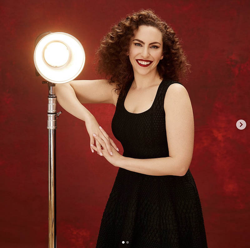
But don’t worry, she’s not hoarding her secrets in a dark lair somewhere. When she’s not crafting surreal, otherworldly portraits, she’s making sure the rest of us don’t fumble around in the dark—literally. Through workshops and online tutorials, she generously hands out her lighting techniques to anyone willing to pay attention. Her approach is methodical, breaking down complex setups with the precision of an engineer but delivering it all with the enthusiasm of a puppy that just found the world’s most perfect fire hydrant. Whether she’s sculpting hard-edged light for a striking, cinematic look or wrapping her subjects in soft, ethereal glows, one thing’s for sure—she’s ridiculously skilled. But, of course, no one’s perfect. Beyond all her expertise and mastery, there are still areas where she could refine her craft even further. And that, is where things get interesting.
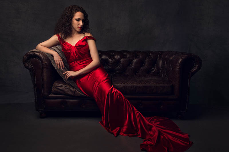
Top 10 Techniques Lindsay Adler
All of the photos below are screenshots from her Instagram, which explains the little arrows you may see. Be sure to give her a follow if you’re wanting to be inspired by her work!
1. Lighting
Let’s kick things off with the technique she’s most known for—lighting! After all, photography without light is just…nothingness. But having light isn’t enough; real mastery comes from controlling it to shape a clear visual message and bring creative concepts to life. Lindsay does this masterfully in the next image, using background lighting to accentuate the silhouetted shape with an aspective view (see Day 78). She’s applied selective lighting—likely with a couple of snoots—to highlight the hair and earrings with precision. And those sparkles? A clever touch we’ll dive into later. This shot is a perfect example of how she wields light like Michelangelo (see Day 191) sculpting marble—shaping every detail with precision and intention.

Admire how she masterfully controls the light on the model’s face while also illuminating the smoke around her. Contrary to what some might think, smoke and airborne particles don’t just magically look dramatic when you shine a light at them. To make them pop, you usually need to position the light behind or to the side of the smoke—placing it between the light source and the camera. Lindsay nails this technique, ensuring the smoke isn’t just an afterthought but an important part of the composition.

The lighting in this shot is extremely unique, don’t you think? We’ve got a lot of great things going on in this one. The triangle of light in the background with dominant diagonals is a nice touch (see Day 87), but she’s also capturing an aspective view and interesting textures (see #698).

The lighting surrounding this woman is etherial and relies on aerial perspective, which is another technique we’ll cover soon. Standard lighting wouldn’t illuminate her face with such grace—oh no. Lindsay is flexing her knowledge of light to sculpt it with precision.

2. Color Gels
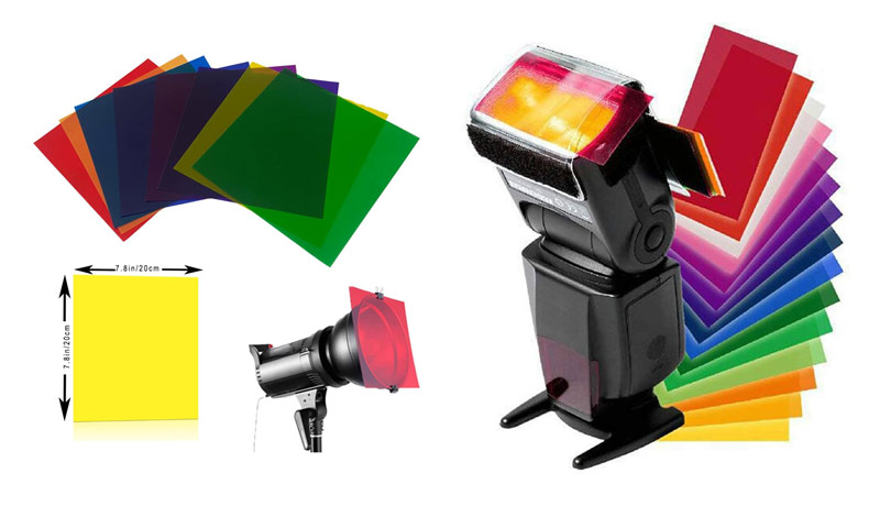
Lindsay’s masterful use of lighting is usually combined with color. Photographers achieve this by placing color gels in front of the light source, which casts the color. Yes, it’s like magic! In the image below, you’ll see that it’s nothing more than a thin piece of colored plastic. Actually, if you wanna see some photos where I used a red gel and slow shutter speed, check out the cinematography page and scrub through the “Mimosa Live in Hawaii” video. Gels are so fun to use!
Here we can see she’s capturing an awesome shot by using blue and red gels, while also creating depth and mystery with the mirror (see Day 238). Heck, that red light might even be some type of neon tubing. Either way, it’s excellent!

The way the light and color gels merge to form new hues is mesmerizing. Here we have a blue gel on the face, while the right side of her face and the back of her head have pinkish-red gels. Her hair might be bright orange, which also adds to the onslaught of jaw-dropping colors.

We can see the difference it makes when we just have warm yellow and red colors. Without the blues and greens it has a different feel and doesn’t have the same pop as the previous image.

Now, let’s add some blue back in there and we get something much more interesting!

3. Bread and Butter Portraits
Amongst all of Lindsay’s techniques, her portraits have to be her bread and butter. If you’ve been watching the new Photography Masterclass Series on YouTube, you’ll know that I mention artistic style (see Day 122) quite often. It’s a way that artists can keep certain techniques consistent in order to develop their “brand,” which helps others identify their work. Lindsay’s signature style is evident in these portraits, making her work instantly recognizable. While she occasionally experiments in ways that push her brand’s boundaries, these core portraits are what solidify her artistic identity. We’ll go over more of that later, but for now let’s admire some of her picture perfect portraits.
The lighting and retouching are flawless in this one, and we can see she’s aware of how dominant diagonals can create visual impact (see #441).

We can see her lighting and gel techniques coming together in this nice portrait where there’s just a whisper of light across the model’s lower face. So mysterious! The dappled background light also adds to the scene.

These next few shots show you Lindsay’s solid artistic style and allow us to identify her work without her name being directly below it. Take them in, get used to them, try to see where she might’ve placed her lighting and if she used colored gels, then later we’ll see just how different some of her experimental photos are.


4. High Fashion Glamour
Aside from Lindsay’s incredible lighting and portraits, she excels at capturing high-fashion glamour. And I’m sure you’ve probably noticed the sparkling effect in some of her previous images. It looks great! Actually, while writing this I got to thinking, “Could this actually be a filter instead of Photoshop magic?” So I did a google search and it lead me to the star filter. I clicked on a video showing its effect and guess what, it was Lindsay Adler explaining exactly how to use it! So there’s our proof, she’s creating this glamorous vintage look with a star filter. Cool!

If you watch the tutorial by Lindsay, she mentions that the star filter works best when the surface creates specular highlights. This is why the sequin hat works so well here. But she doesn’t stop with just using a cool filter, nice lighting, colored gels, and beautiful model—she also adds interest to the background that compliments the foreground.

More sequins and glittery surfaces in this one too!

5. Aerial Perspective
When it comes to using aerial perspective for depth (see Day 43) in photography, it can be incorporated in many different ways. This first example shows how Lindsay uses lighting to create the depth she’s looking for. If you’ve checked out the article for the Inverse Square Law (see Day 209), you’ll see how the light on her face “falls off” or reduces in brightness the further away it gets from the light source. This is what creates the depth.
The woman’s face has the highest contrast, but unfortunately it’s in the upper-left corner creating visual tension. She needs a bit more negative space around her head to help with the breathing room (see Day 102).

We can also create depth by using smoke in our images. This is a great image; the only problem is that the smoke is creating edge flicker (see Day 49). The area on the left could be subdued, which would bring more attention back to the model. We need aerial perspective on this aerial perspective to get the depth we’re looking for.

This one is controlled a little better, don’t you think?

We can also create aerial perspective with lens flares similar to this effect. It shows the warmth of the environment and gives us a feel that the air is steamy.

6. Feminity
One thing that you may have noticed already is that Lindsay saturates her images with overflowing femininity. Her images are mostly soft and beautiful, with a that feminine touch. Unfortunately, that carries over to her male photos. We can see in the various male photos below that they are soft, feminine, and have polished skin like the females. This is good or bad depending on the subject and what the ultimate goal is.

Sure, some of these guys might appreciate the softer aesthetic, but it’s unclear if that was the intention for all of them.

Lindsay’s signature softness carries over into her portraits of men, giving them a polished and delicate aesthetic. Whether intentional or not, this creates an interesting contrast with traditionally rugged depictions of masculinity. This dude could be the leader of the Hells Angels biker club, but the photo doesn’t depict this.

Same with this one.

Great shots, great lighting, and dripping with femininity. Was this Lindsay’s goal?

Look at the soft nature of his face, and the perfectly sculpted hair. Perhaps she polished it a bit much. Even the shallow depth of field and soft lighting adds to the fluffiness.

This pose with the finger on his chin has a feminine quality. It’s a subtle ballerina’s touch as opposed the the strong fist of a man. Do you see how Lindsay’s femininity is bleeding in these shots?

7. Aspective View
When Lindsay uses an aspective view (see Day 78) she’s able to communicate even more to the viewer, especially in low lighting or silhouetted scenarios. The side profile of the face helps us see the model’s features, and she’s controlled the contrast masterfully.

This one’s really nice with the figure and the palm leaf showing an aspective view.

Such a cool shot!

The side profile is a classic, and the lighting and lens flare just make it really impressive.

This risqué pregnancy shot is all thanks to the pose with a perfect aspective view! She’s incorporating her colored gels, nice FGR, arabesques, and shooting from below to give the model more perceived power.

8. Heavy Photoshop
Now we start getting into some of Lindsay’s more playful images, which venture outside her normal bread and butter shots. She definitely relies on Photoshop heavily to complete her aesthetic, but this next shot goes above and beyond. It’s a great image, but it doesn’t scream “Lindsay Adler did this,” which means it’s outside of her artistic style. She’s breaking her consistency a little bit. Not a bad thing, but if she continues to do images like this and posting them on her Instagram she’ll start changing her brand.

The Photoshop effects in this image feel over-processed, and the lighting doesn’t integrate well with the background, making the composition feel disjointed. The background is cool and has some nice depth and potential, but the model in the foreground doesn’t mix well and it ruins the entire shot. This is one that should be hidden from her stream.

You might not want to look at this next one…it’s pretty bad! No Lindsay…just no! The effects in this look amateurish, forced, and super fake. She’s taken out everything organic and replaced it with plasticity.

9. Graphic Elements
In these next photos she’s using Photoshop quite a bit, but it’s not hurting the overall composition. She specifically adds graphic elements, like strong geometric shapes, to create interest within the photo. This one is edited like a comic book character—different from her artistic style, but at least she’s got nice FGR, an aspective view, and great balance.

There are quite a few triangular shapes in this one. Can you find them?

This one is fun, and has a repetition that would make any lady bug jealous.

Another great one!

These next two are very similar, but one has better FGR than the other. Can you tell which one?

Hint: It’s not this next one. The dark figure on a dark background don’t allow them to separate with visual clarity.

10. Expermental
If you’re familiar with Elizavita Porodina (see #752) and Paolo Roversi (see #494) (see images below), you’ll start to notice how they’ve influenced Lindsay’s experimental photos.
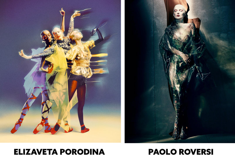
In my humble opinion, some of these next shots, while they might be technically sound and pretty cool looking on their own, shouldn’t be with her other portfolio images. That is, unless they were part of a collection. Say she did a spread for Vogue and they wanted 20 experimental shots with the same aesthetic, she could post them appropriately. But as they are now , they are scattered in her Instagram feed, and muddy her unique brand with the aesthetics of other photographers.

I could see Elizavita creating this one, but not Lindsay. The femininity is non-existent, there’s no aerial perspective, aspective view or pristine lighting, and Photoshop processing is over-the-top and amateurish.

This one is cool on its own, but it’s more weird than pretty and soft and feminine.

She might’ve used some time of filter or object placed in front of her lens to create this one. Again, it’s not her typical style and falls short of her other glamorously fabulous techniques.

This next one…can you say “ewww?”

The smoke she captures in some of her images adds a lot to the images if the contrast is controlled, but this one is more weird because she’s snorting it through her nose. Some of this was probably photoshopped because the smoke is perfectly going around her eye.

Then she has these basic photos posted in her Instagram, which really look below her skill level. Any photographer with a year of experience could take this photo.

Again, this is another cool photo, but the edit looks really basic and amateurish compared to her more polished portraits.

Conclusion
Lindsay Adler’s photography is a masterclass in controlled creativity—whether she’s sculpting light with precision, using color gels to set the mood, or experimenting with techniques inspired by legends like Paolo Roversi. From high-fashion glamour to striking graphic elements, she proves that strong design and technical expertise go hand in hand. By breaking down her approach, we gain insight into refining our own work, whether through lighting mastery, bold composition, or innovative post-processing.
A huge thanks to all of the Master Pass members for your support—your dedication to pushing your craft forward is what keeps this community going. See you next time!