A Misleading Guide to Mastering Composition
25/365
I really hate to keep harping on the brainwash effect that the rule of thirds has had on composition., but I feel it’s important for you to notice. Knowing what I have learned about composition it really upsets me to see this pumped out to everyone. There are many books and magazines out there which cover composition….most of them are vague, brief, or entirely misleading. Here is a blundering section from “Digital Camera Magazine – Mastering Composition.”
“….you can create more interesting, balanced and powerful compositions by placing the subject off-centre in your photograph.” As I mentioned earlier in the 365, there’s nothing wrong with the center of the photograph as long as you know how to design and carry the eye through the image with an arabesque or other design elements.
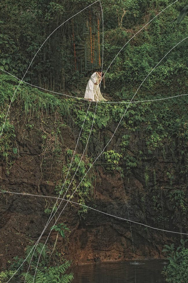
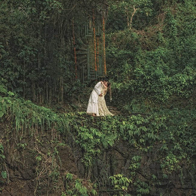
Here’s an example of how Jonas Peterson uses the center of the image, but still has movement in the image because of the arabesques found in nature. Is he aware of arabesques or how they help this image? Maybe not. But he certainly picked this image because it “works”. And it works because of the arabesque.

There’s a variety of arabesques, and even a nice coincidence leading down the top center reddish…vines? Is that a hidden staircase too? Can you see the major arabesque leading from lower left to the subject? It carries right through the Baroque diagonal.
I know what you’re thinking..”but wait, he lined it up to the top third!” Sure, it’s lined up close to a third, but if I take away your claim, and crop it to a square, it still works. Even when we amputate the image and get rid of the major arabesque…it still works. Everything is centered, but still a nice image with plenty of movement. You can thank mother nature’s arabesque for that.
I see a lot of square crops with center compositions that make me cringe. You may have an arabesque such as flowing hair or dress, but only using this to design isn’t strong enough to make a great photo. You need to incorporate other techniques such as Gamut, GAC, FGR, EF, coincidences, aerial perspective…all of these will help achieve a great composition. A boxer doesn’t learn one move and win a fight. He learns combos, left, right, uppercut, dodge, weave, duck, jab…all of these to become a champion.
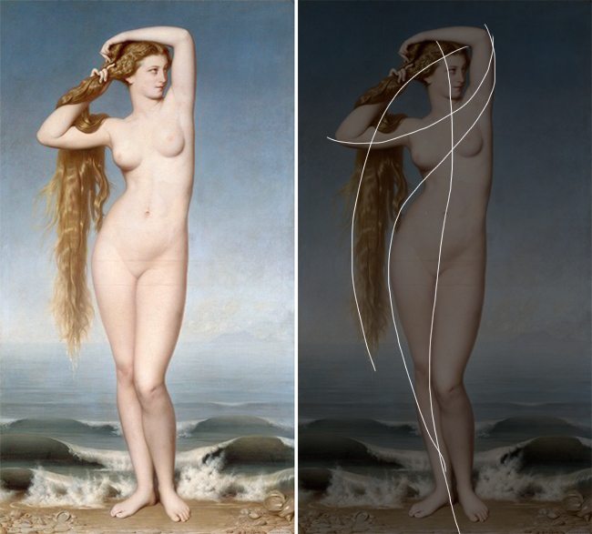
Speaking of champs, heres a painting by Bouguereau. Center composition, but plenty of movement with the help of the arabesque.


More from the article by Digital Camera Magazine….“One of the most frequently used ways of directing the viewer’s eye to the centre of interest in a picture is by following the rule of thirds.” Wrong again, as we know that plotting it on one of the four points has nothing to do with moving the viewers eye. As we start to cover each design technique in more detail, you will see my point…if you don’t see it already.
Does the image below, plotted on the thirds, move your eye around? I think all it accomplishes is make it look generic and boring.
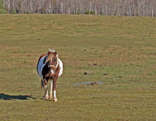
More assumptions by the same book, “…the most common compositional tool, developed by painters centuries ago.” Well, we know who coined the phrase “rule of thirds”, so we know the writer is not talking about master painters like Rubens or Degas. If he rephrased it and said the “amateur painters from centuries ago developed it” then I would believe him.
I continue to read…“By placing your subject or a key part of your scene at or near a point where the lines cross -a point of power- you’ll lead your viewer’s eye through the image and create a more balanced composition.”
Are you beginning to shake your head with me? By now we know what leads the eye through the piece…it’s not based on a specific point either. Placing your subject in a “power point” (more intellectually described as polar points) does not balance your image at all. Everything in the scene contributes to the balance of the image, not just the placement of one object.
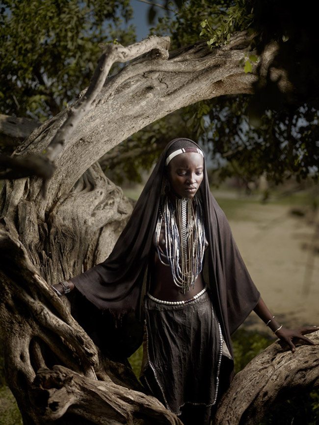
Here’s a photo by Joey Lawrence with an obvious arabesque. He uses the curving of the tree to create movement.
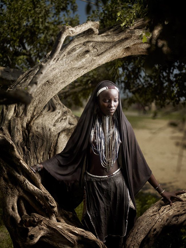
He has an issue with GAC (which we’ll cover in full detail very soon), where the lighting he uses blows out the texture of the skin and lights up the tree a bit too much. But don’t worry, my friend Photoshop helped me enhance the minor GAC errors.
The more I dig into other compositional theories, books, examples, claims, rules, the more I realize that there are a lot of vague definitions leaving the reader with nothing but confusion. Readily available composition information (especially that which boasts about the rule of thirds) is mostly scatter brained, leaving people like a fish out of water. Flipping and flopping, gasping for air. Giving a principle, but not really understanding why they should use it, how it works, or if it works as it claims. Sad but true. Stick with the canon of design and you will no longer be lost!

