Analyzing Smith’s Rule of Thirds Statement
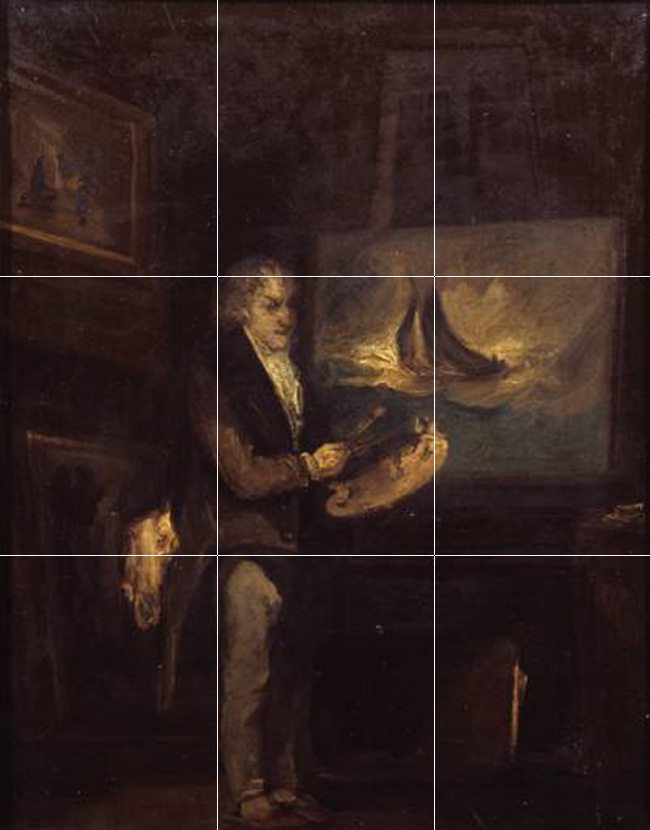
By now you should be able to see some flaws in Smith’s painting. No arabesque, GAC is confused by two other bright points…I will stop there. But, he did in-fact hold true to his rule of thirds statement…look at that leg, perfectly lined up on the left third. Bravo! Just please, don’t follow his example.
13/365
So, why was design taken out to the forest, shot and left for dead? To simplify things? If that’s true, then shame on us. I don’t think Smith’s intentions were to have the rule of thirds become a watered down version for design, but he definitely got the ball rolling. I can’t blame him for trying to help others and better their compositions though. It’s likely no one was there to teach him the ways of design. Some things can be simplified and come out better in a result, like the invention of microwavable popcorn or the dishwasher, but artistic composition shouldn’t have been one of them.
Design was kept a secret, and the rule of thirds was praised by the Gods of oversimplified mediocrity.
I’m going to start by trying to understand exactly what Smith was talking about when he wrote his rule of thirds “invention”. And since he wrote, “I should think myself honored by the opinion of any gentleman on this point”, I hope he is feeling honored because here comes my unadulterated opinion.
First, let’s take a look at a simple diagram which describes his rule of thirds in a landscape.
“to determine the sky at about two-thirds ; or else at about one-third, so that the material objects might occupy the other two : Again, two thirds of one element, (as of water) to one third of another element (as of land); and then both together to make but one third of the picture, of which the two other thirds should go for the sky and aerial perspectives”

Worst composition ever in my opinion. Below is how most new (and some experienced artists) have utilized the rule of thirds.

Both examples are flat and boring. Let me drill this point even further by giving some examples of some cliche settings.
Everyone likes a nice hallmark style sailboat shot right? Sure, but that doesn’t mean it has to look like everyone else’s. It doesn’t matter how beautiful your sunset is if you are plotting your sailboat on the third, and lining up the water on a third, you’ve just made a copy, of a copy, of a copy. It looks just like everyone else’s photo which means if you are striving for originality you have miserably failed.


Here are some examples of those who decided to think outside of the box. Photos that aren’t generic like everyone else’s from above.

The same goes for lighthouses. On the third, on the third, on the third, on the third, on the third, on the third, on the third, on the third, on the third, on the third, on the third, on the third.
I hope you enjoyed that. If I ever see another lighthouse or sailboat sitting on a third I will probably lose my lunch. It’s pretty sad because there was potential in most of these for a better composition, but they defaulted to the status quo, the norm, the unoriginal, the mediocre. And these are only a few of the ones I pulled from the internet. It seems the rule of thirds has contaminated the thought process of countless artists out there. It’s not entirely their fault either. Design was kept a secret, and the rule of thirds was praised by the Gods of oversimplified mediocrity.
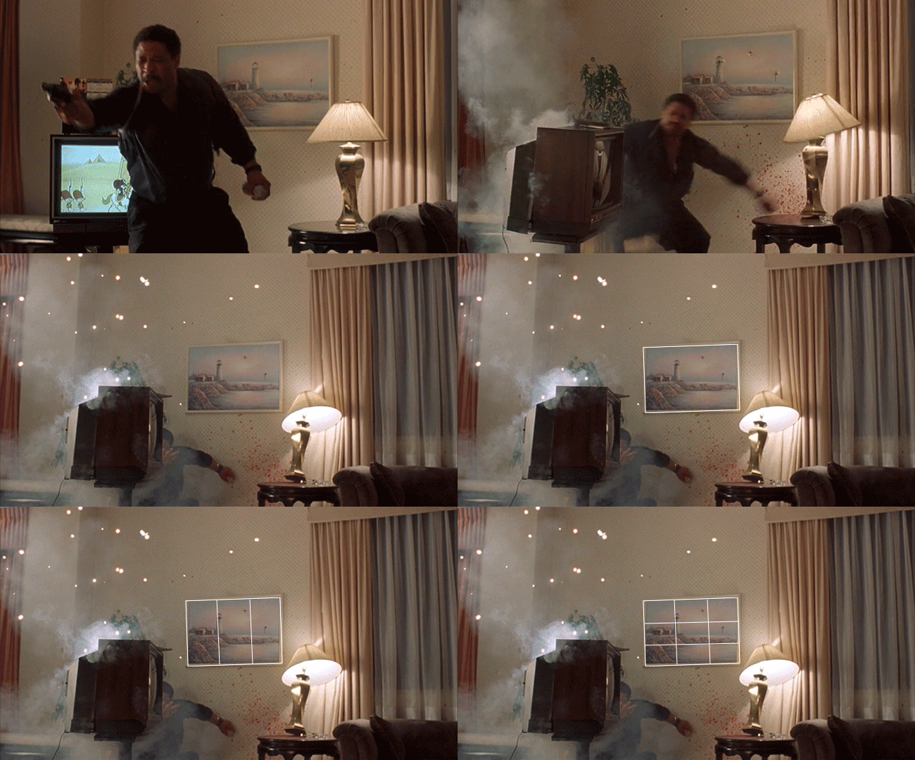
UPDATE 10/14/13: I was watching an old movie called King of New York and guess what I saw?! Noooooooo!!! Once you learn design, you will notice things you never noticed before. In this case, I wish I had missed it!
Here are some examples of original thinking. Not great compositions, but at least they are trying to capture the lighthouse differently.
So, back to reality. Using the Canon of Design, we’re not dividing fractions…one third this, two-thirds of a third that. No. We start very simply by connecting the dots. Drawing a line from point to point. So simple, yet the beginning of something enormously powerful.
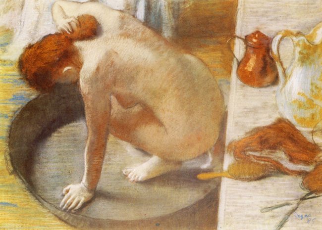
Smith also writes, “In short, in applying this invention…I have found the ratio of about two thirds to one third, or of one to two, a much better and more harmonizing proportion, than the precise formal half, the too-far-extending four-fifths”
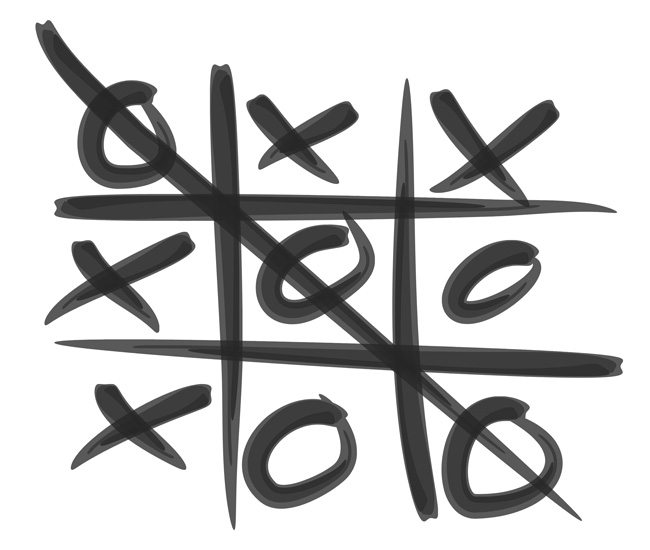
If he were painting tic-tac-toe boards, he would’ve been better off. Some of us were using this rule of thirds to compose our pictures and thought we were geniuses. “We finally figured it out! Yay!” But then we look back at the pictures and it’s stagnant. Keep looking around at all of the other photographers, look on the internet to see where they are placing the subject. The rule of thirds has infected the art world with ignorance. Ok, maybe that’s a bit harsh, it may have helped some artists get the subject out of the center, but mindlessly placing it in a crosshair isn’t much better…and there’s nothing wrong with the center if you know how to design. When your composition looks like everyone else’s and we know exactly what you were thinking when you plotted it there, sorry, that’s not going to work anymore. It’s like going to see David Copperfield and knowing every single one of his tricks. It’s not interesting. Do you think the masters reproduced the same boring compositions over and over, limiting themselves to four points? No way! You’ll see, as I continue to analyze and compare both methods, just how much you’ve been missing out on. Anyone with an inkling of compositional skills has studied master painters or were taught by someone who studied them.
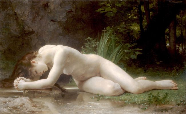
You will probably hear me refer to Bouguereau quite a bit. Not only is he an excellent painter, but he incorporates every single design element in each painting…every time…so does Rubens, but I personally like Bouguereau’s style better. For composition, he uses the basic armature and MAD every time, yet he doesn’t repeat himself…like all of the rule of thirds copies…plotted generically. All of these masters used Dynamic Symmetry and design techniques to compose…they never duplicated a composition. Something to think about!
Finally, Smith says, “until I shall be better informed, shall conclude this general proportion of two and one to be the most picturesque medium in all cases of breaking or otherwise qualifying straight lines and masses and groups”
The rule of thirds might be better than the halfway point in some cases, it may be better than extreme four-fifths in some cases, but this concept is misleading, misguiding, misunderstood, and a mistake that leads to the death of design and a plethora of boring compositions plotted with the skills a 3-year-old could grasp. Consider yourself better informed Mr. Smith. I greatly admire your contributions, but I really wish someone would’ve challenged your invention of the rule of thirds and shown you the possibilities of design. That might’ve given the art world something much more valuable.












February 9, 2014 @ 9:42 pm
You also would want to completely change the purse, leopard skin? Really?
February 10, 2014 @ 8:46 pm
That’s so strange, how did my comment end up on #13? I would’ve sworn I posted it after #12… oh well, that’s what I meant…the purse just does not work with that outfit 🙂
February 11, 2014 @ 9:09 am
Haha, not sure what happened, but I agree with you!