Annie Leibovitz Group Photo – ANALYZED #10 (Video)

#627
Hey everyone, welcome back to another in-depth article. Thanks for all of your continued support!
Today we are going to be analyzing the composition and design for this amazing group photo by Annie Leibovitz. We’ll even be looking closer at her lighting and Photoshop techniques. And if that weren’t enough to get you excited, it’s all discussed in a detailed video. Let’s get into it!
Composites and Lighting Photography
Annie Leibovitz always seems to amaze us with her photos and ability to get such beautiful compositions. No matter how complex it may seem, we’ll look at some ways to simplify the design process.
When most people look at this next photo, they think she directed the models to get in a group and pose a certain way. Photographers with less time and budget may have to do this for group photos at weddings, but for a high end shoot like this you can bet it was composited in Photoshop. Composite just means it has several images stitched together.
Not convinced?
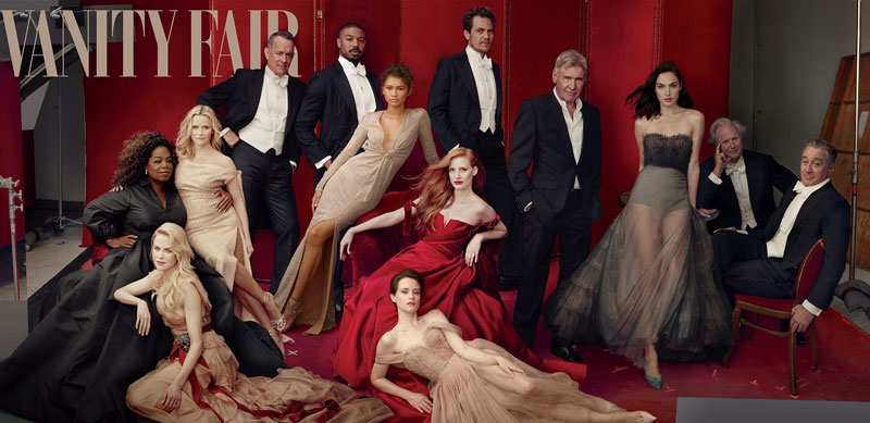
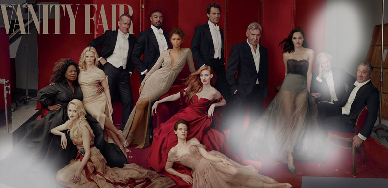
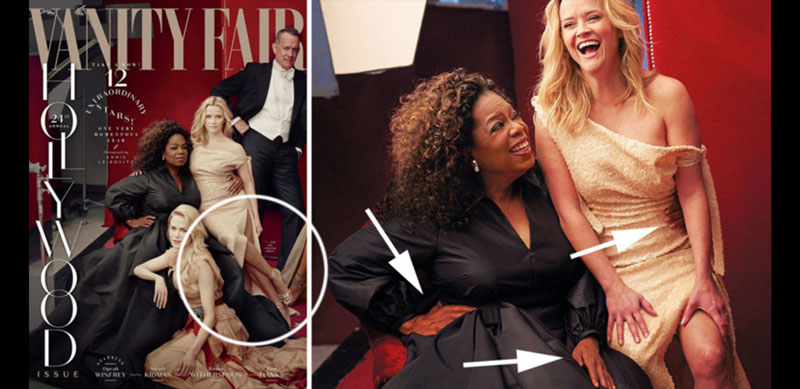
Check out these editing flaws. We see Reese Witherspoon (blonde) with three legs, and Oprah with three hands. Someone made an oopsy daisy!
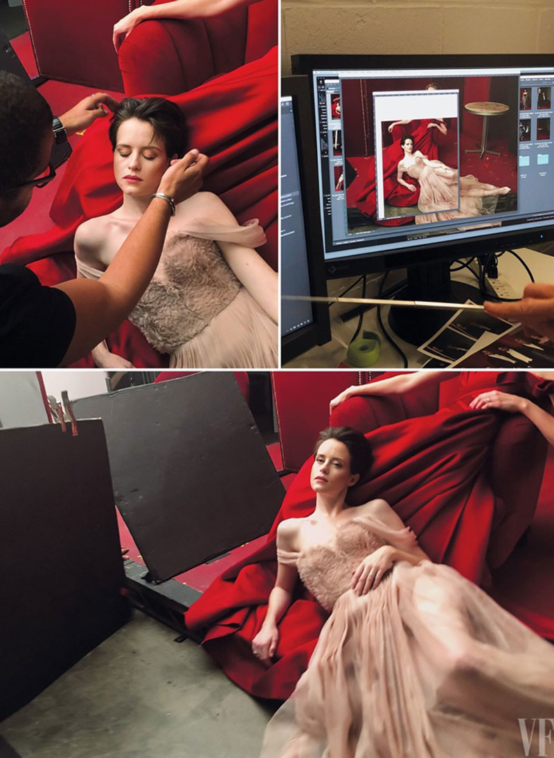
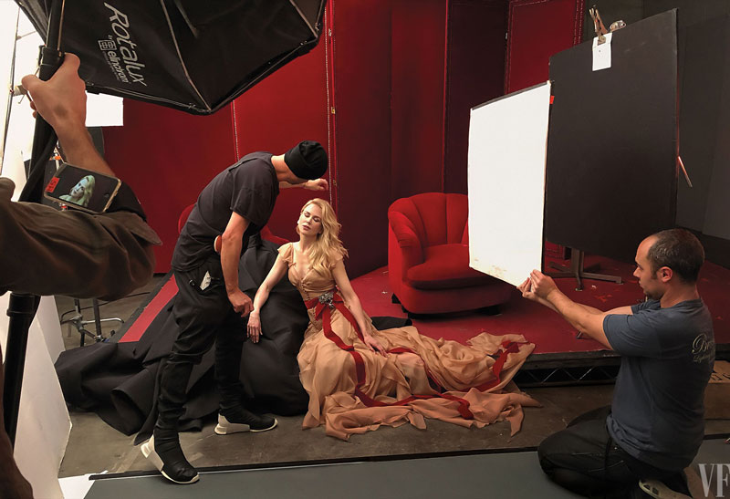
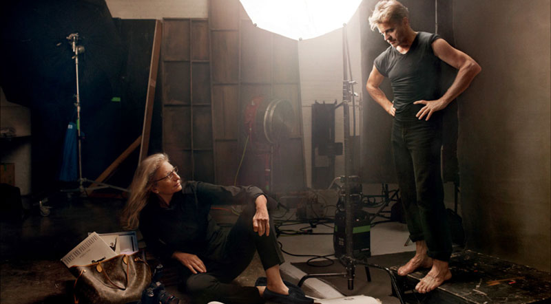
We can see how they pose smaller groups of models in these behind the scenes photos. They do this in order to get nice portrait lighting on the models rather than the hard or flat lighting you’d get when shooting them all at once.
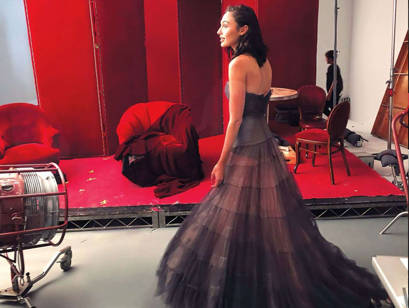
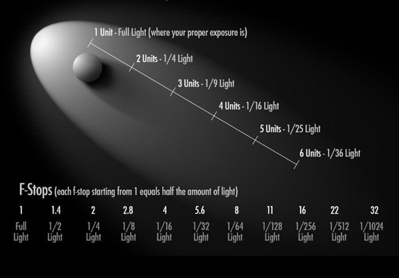
In the book “Canon of Design – Mastering Artistic Composition,” you’ll find a section that discusses the Inverse Square Law (see Day 209). It sounds difficult to understand, but it’s just showing how quickly light will be reduced as it moves away from the light source and the subject.
The light will be 1/4 less if you take the same distance from the light source and subject, then extend it behind the subject. This is shown in the diagram below.
So if you hold your right hand six inches from a lightbulb, then put your left hand six inches from the right hand, it will be lit with about 1/4 of the light.
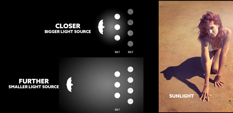
Knowing the inverse square law comes in handy when you’re shooting big groups like Annie Leibovitz. If you have the light source close to a group, as seen in the diagram below, you’ll light the front group, but the group behind will be 1/4 the light (underexposed). Therefore we have to move the light back to increase the distance from the light to the subject. This will make the unit of measurement greater, resulting in a better exposure for the entire group.
There’s a trade off though. The further the light source gets from the subject, the smaller it gets. Smaller light sources produce harder light. Look at the sun, for instance. It’s super far away, so we get a hard light as seen in the manipulated photo below.
If that is still confusing, just look at this next Annie photo. If you exposed your camera to capture the guy standing, then any subjects further away from the light source will be underexposed. We can see how Annie is much darker than him. They probably had to bump up her exposure in post.
These lighting issues are precisely why Annie chooses to create a composite; to get nicer light on the subjects.
Perfecting the design is another benefit of compositing, and we’ll see that next.
Annie Leibovitz Analyzed Video
Here’s the quick tips video that shows some of the analysis, but we’ll see many more techniques further below. This is the first of many “quick tips” videos, so it’s a little longer than most others.
Annie Leibovitz Analyzed
Now that we know this is a composite photo, it opens up many other doors. The main one being that we don’t have to just shoot, shoot, shoot, without planning something. Annie had a very high budget and many things to consider for the final image, so it makes sense that her and the team would design the image beforehand. Designing a photo can be done with a simple or elaborate sketch. With a final design they could pose everyone quickly, get the shots, then stitch it all together later. Time is money in her business!
It would be completely unprofessional if she went into this shoot with no plan and was just guided by her gut or the rule of thirds. Sorry, but not even Annie’s well-developed intuition can create an image like this. It’s too complex and demands planning.
Knowing the design and composition techniques allows her team to have a crystal clear direction. This way all they have to worry about is keeping the celebrities happy with cold beverages and fresh makeup.
Dynamic Symmetry
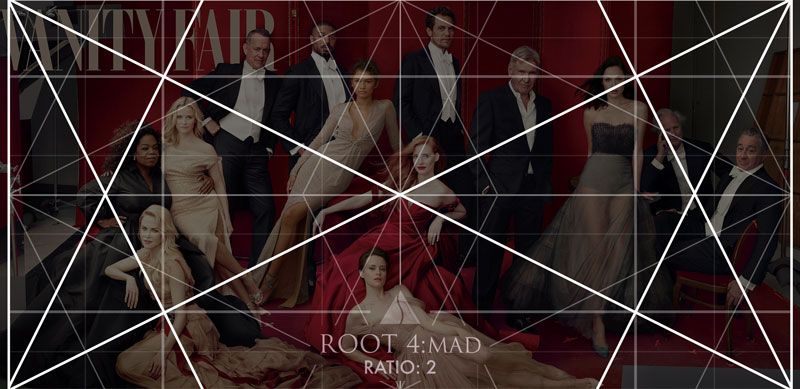
If you’ve flipped through the Dynamic Symmetry book, you’ll know that the Ratio Guide can help you find the appropriate grid for most photos or paintings. In this case, we can find that the pixels of the image are 2500 x 1216. Divide 2500 by 1215 and we get a ratio of 2.05 (2500 / 1215 = 2.05). It’s always recommended to use the grid that is closest to your rectangle. For this image it would be the root 4 rectangle (ratio 2).
When we align it to the photo, we start to get an idea of how Annie planned this shoot.
These are the Major Area Divisions (MAD), which means there are four smaller root four grids inside the mother.
Locked Into the Grid
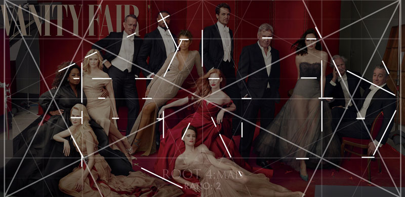
Here we can see all of the areas locking into the grid. Any edge of contrast can be used to lock into the grid. We’ll see eyes, clothes, arms, etc.
Pose Gamut
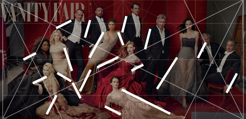
Speaking of arms, check out the pose gamut (see Day 39) Annie is using in this composition. Gamut is a limited number of diagonals (see Day 38), and the limbs of the models are being used to create a hidden unity and rhythm.
90 Degree Angle
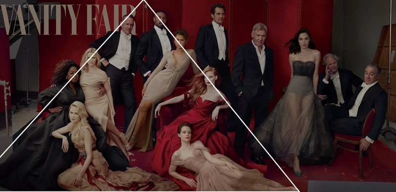
When a tilted 90 degree angle is added to the composition it can add a sense of strength (see Day 76). We can see three of them being hidden within Annie’s design. Hiding these “magic tricks” is always recommended. Thanks to the Law of Continuity we can break the line and the viewer’s mind will complete the movement; fill in the gaps. Much like a dot-to-dot image.
Enclosures
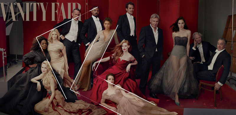
When we use enclosures (see Day 32), we also create unity and movement within the composition. Here we can see a triangle (see Day 87) being formed with the models.
Ellipses
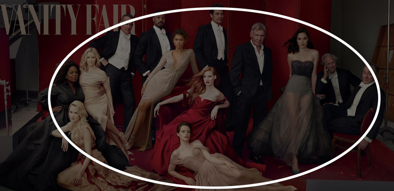
As if we didn’t already have enough unity and movement! Here we can see several ellipses (see Day 34) being created. How did she do this??
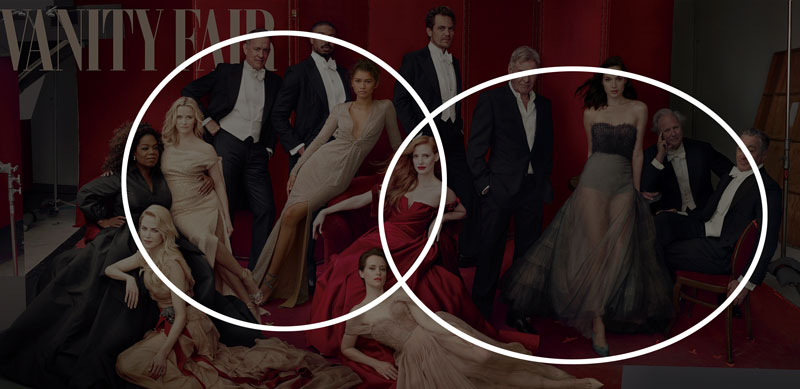
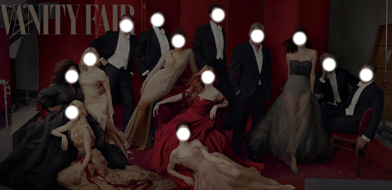
Using the heads of the models is a great way to create your dot-to-dot movement around the composition. We can see in the next example that Annie is aligning the heads on an elliptical path.
Arabesques
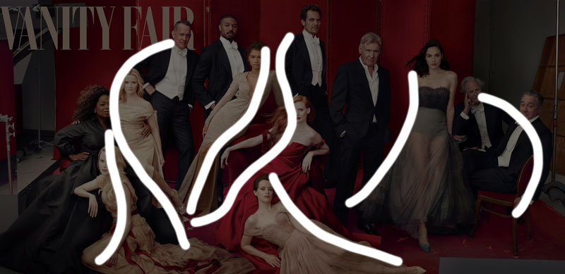
The edge to edge relationships can also create arabesques (see Day 17), which add to the movement and unity. Are you starting to see how important unity and movement are in a composition? These design techniques can help you achieve this!
Aerial Perspective
We can see some areas of reduced contrast which we call aerial perspective (see Day 42). This adds depth to the image.
Figure-Ground Relationship (FGR)
Mostly every model has nice FGR (see Day 21), but if we were going to critique something we could look at some overlapping shapes. The circles show bad overlap or “kissing” areas (see #591). Since this is a photograph, we have to cut her some slack. If this were a painting, we would want to make sure the shapes are overlapped properly and not creating random areas of confusion.
For instance, the woman in the lower left (Nicole Kidman) could have her head a bit more to our left. This would put the black dress behind her head more and improve the FGR. As it is right now, it coincides (see Day 48) or “kisses” the leg of the other model.
BW Blur
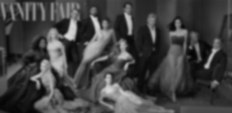
When we convert the image to black and white, throw on a blur, then look at it again we see a more simplified scene. This is much like squinting and allows us to see the shapes and contrast easier.
Edge Flicker
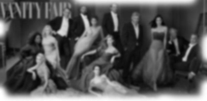
Areas of high contrast near the edge are called edge flicker (see Day 49), and we can see a few areas here. The specular highlight on the right-side pole could easily be subdued to reduce the distraction.
Greatest Area of Contrast (GAC)
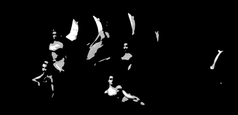
The group of celebrities is the main subject, not anyone individually. So, when we convert the image to find the GAC (see Day 71) we’ll see that most of the contrast is found in the men with the black and white suits. No surprise there!
Conclusion
That was quite a lot for one image, right? That’s what it takes if you’re wanting to create a masterpiece like Annie. Learn these design techniques one by one. Use the heads and limbs of the models to help you design the composition. If you learn one thing at a time, you’ll slowly be able to combine more and more techniques to ensure unity, movement, rhythm, and strength.
Thanks for joining in today. You’re support is much appreciated! See you in the next one!

