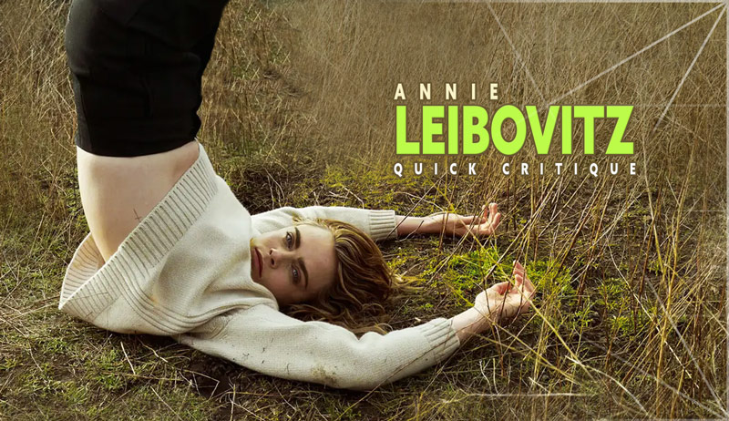
Annie Leibovitz – Quick Critique #1
#734
Welcome back everyone, I hope all is well! Thanks for joining in to show support!
Today we’ll be taking a look at several photo shoots by Annie Leibovitz. We’ll quickly critique the good and bad to learn all we can about her photo process. Did she make perfect pictures each time, or were there some mistakes? Let’s find out now!
Annie Leibovitz What Do We Know So Far?
We’ve covered Annie Leibovitz a lot on the site, and she continually impresses. She’s been shooting long enough to have developed her own artistic style (see Day 122); her own “recipe” full of secret ingredients.
Check out the articles below if you haven’t already. You’ll learn a ton about her style!
The Leibovitz Recipe: Number One (Figure-Ground Relationship)
The Leibovitz Recipe: Number Two (Lighting)
The Leibovitz Recipe: Number Three (Wind)
The Leibovitz Recipe: Number Four (Fabric)
The Leibovitz Recipe: Number Five (Cutting Off Limbs)
The Leibovitz Recipe: Number Six (Quirky)
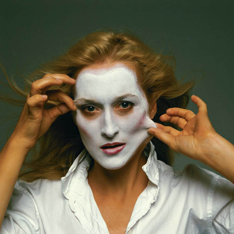
Constructive Criticism Helps!
Most artists learn more by constructive criticism, rather than high praise. That being said, when we critique the images further below we’ll be super picky. Let’s try to point out any flaws that could make the image even better.
This also sets the foundation for a video idea for YouTube. I’d like to assist artists with their own work and any concerns they may have. I’ll be doing quick critiques in YouTube shorts to provide help more frequently. These will be 60 seconds for now, but I should be able to do a couple per day. If you’d like, please submit your work or another artists (painter, photographer, sculptor), and I will do a quick critique. I’ll try to boil it down to the main thing that could help. Use the contact form or use my email from the same page to send a link/image.
Be sure to provide the following information for each submission (one per week max):
1. Artist name
2. Website, IG, Facebook or TikTok handle (only one).
NOTE: All rights remain to each artist and the quick critique is for educational purposes only.
Now that that’s out of the way, let’s get into the quick critique!
Annie Leibovitz Quick Critique
Here we have our first image to critique. There will be four other covers with images to follow, so now is the time to dust off your trained eyes and get ready to dig deep.
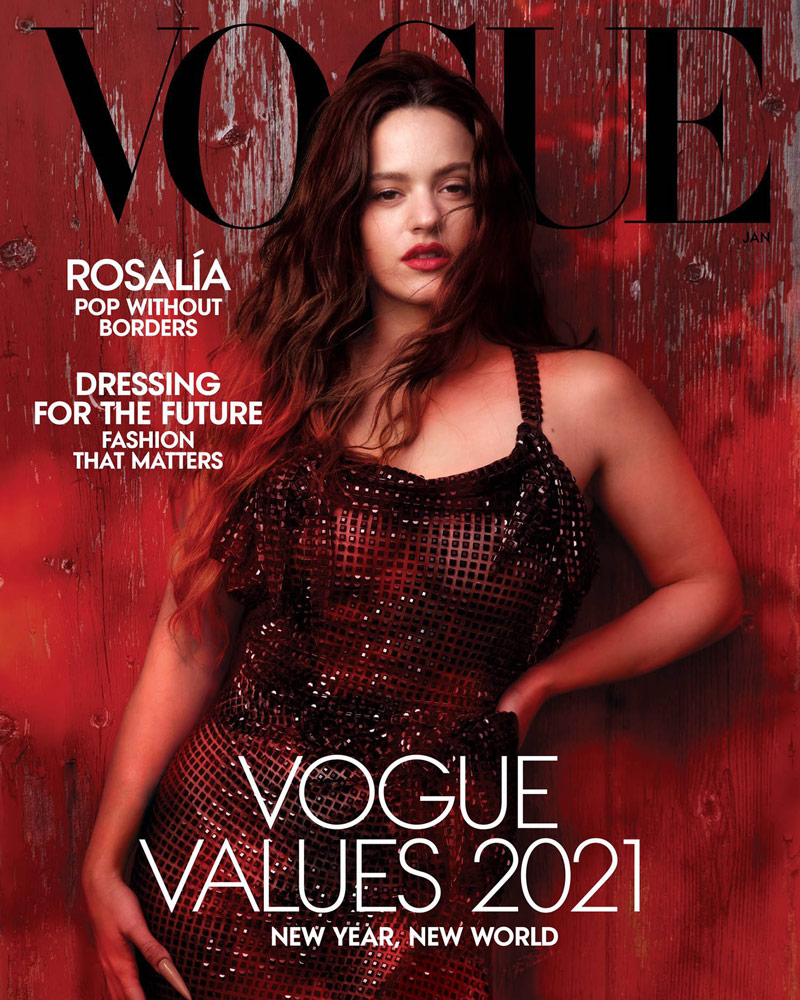
Do you see anything standing out in this first image? Of course it’s a great image, but is there anything that can help push Annie even further? We can see that she’s using wind, has a blank background (pretty much), and is cutting off a limb. This is all part of her artistic style, so nothing new.
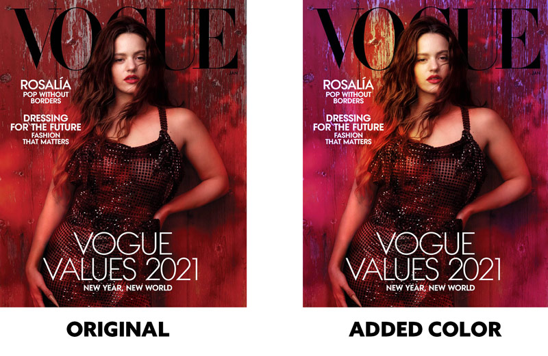
One thing that is noticeable is the red colors they placed over the left side of the model. Perhaps this was used to make the text more readable, but it creates an unwanted illusion. At first glance, it looks like her hair is short (just past her shoulders), but it’s actually much longer. If not colored red it would also help create an arabesque (see Day 19) down her side. Squint your eyes and you’ll see how her shoulder disappears within the red.
She’s using analogous colors (all red), which is fine, but more colors could potentially improve the image. In the edited version we get a little more life with the extra colors, don’t you think? This was quickly done in photoshop by setting colored layers to overlay mode, then adjusting the colored layer opacity.
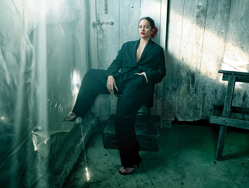
How about this next great image? See anything that could be improved?
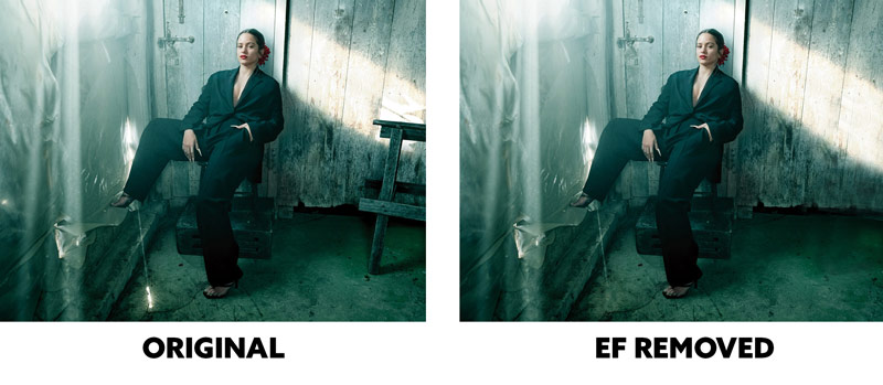
As we’ve learned through many articles, running your eyes around the edge of the frame is always a good idea. This gives you time to see if there’s any high contrast near the edge, or edge flicker (EF) (see Day 49). We’ll see in the next comparison why this is so important.
We always want to avoid edge flicker if we can because it can distract from the main subject. Can you see the difference in the comparison below? The edited version keeps the attention on the subject rather than pulling our eyes to the unimportant wooden object near the edge.
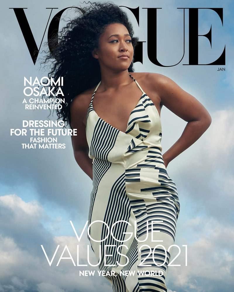
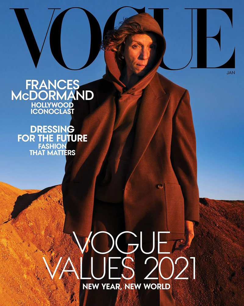
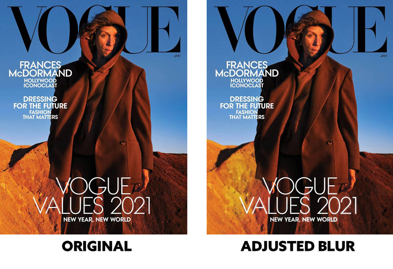
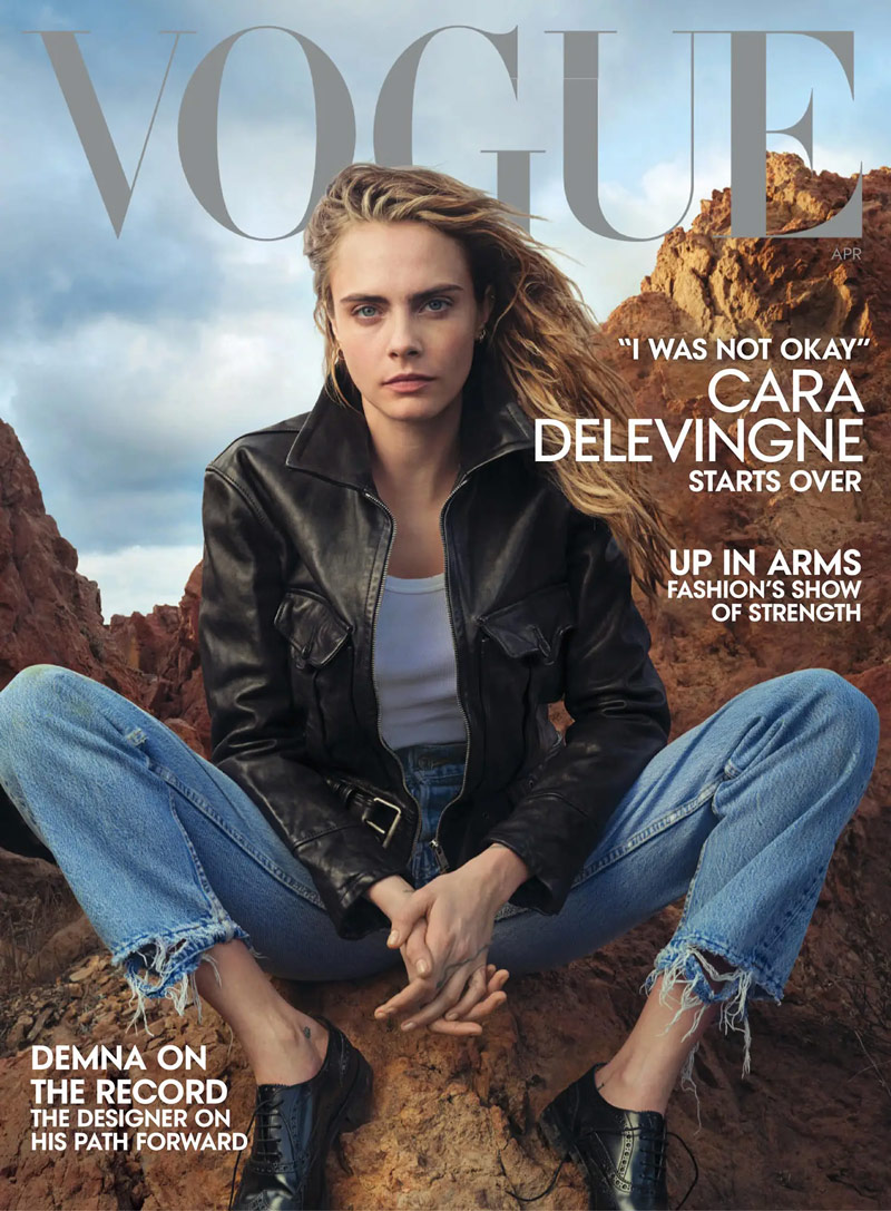
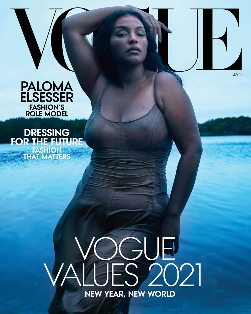
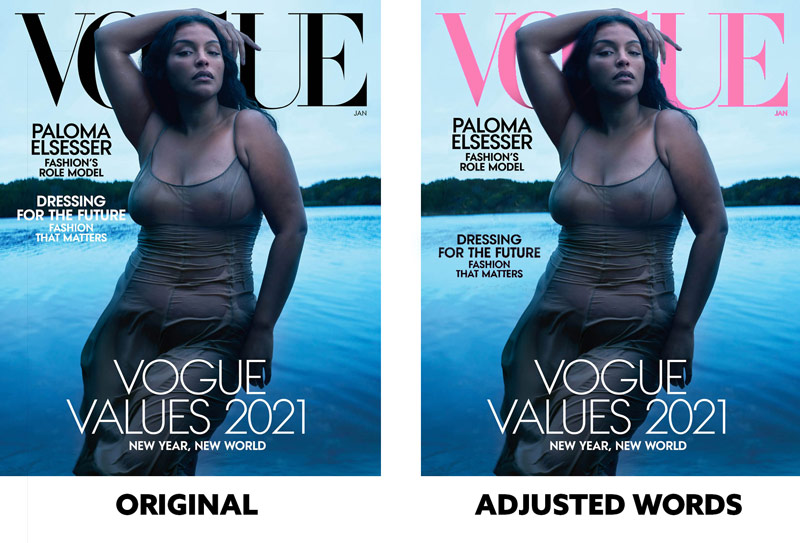
Can you find anything to adjust in this cover? It’s a beautiful image, but the figure-ground relationship (FGR) (see Day 21) could be improved. The word “Vogue” is blending with her dark hair and shadows.
We could add more color to the cover by changing “Vogue” to pink. Also, the words on the cover would be more readable if they had nice FGR as well. You can see how they are adjusted on the right to give more visual clarity. It’s almost like they hire a professional photographer and an amateur graphic designer. Not a good combo! Most words are meant to be read.
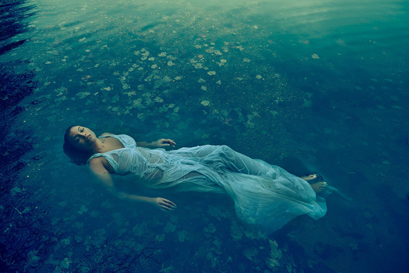
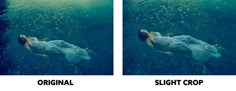
This photo is pretty perfect. Next! Ohhh, ok. Since we have to be super picky, I guess we could address the negative space. What if we snipped some of it off?
Here we see a slight crop to reduce some of the negative space and bring more attention to the main subject. It still tells the same story of isolation and loneliness, which is good. The edge flicker on the left was also reduced. See the difference?
This is a great image, but it could be adjusted like the previous cover. Changing the color or value of the word “Vogue” would create better figure-ground relationship behind the model’s head. Also, if she were twisted just a bit more, the arm on the left would have more of an aspective view (see Day 78).
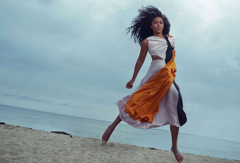
In this photo, Annie seemed to have taken a page out of Garry Winogrand’s book. The crooked horizon line is an ingredient of his artistic style. Annie uses it here to give the image a sense of spontaneity (see #412). What else can we see?
The original is lacking “punch,” so what if we increased the contrast of the model and the vibrance of the colors? It’s a subtle change, but brings more life back into the photo.
This one could perhaps be improved by adding more color, or maybe even reducing the sharpness of the background image.
The foreground and background images were most likely composited because they are both super sharp. Typically when you focus on a foreground subject, background elements will be more blurry depending on their distance from the camera and the f/stop (see #565). By adding a slight blur to the background image we get more depth. A bit of red and yellow were also added to give more color variation.
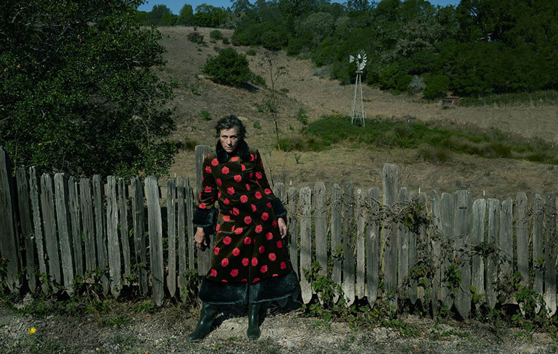
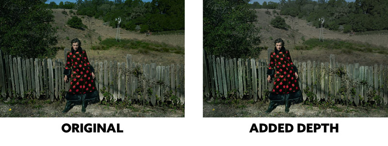
We have a nice counterpart (see Day 57) with the model and the windmill in the background, but we can still improve the image with subtle changes.
Here we see the light areas of the fence subdued to control the contrast and keep it on the main subject. The brightness/contrast was also increased on the model and slightly decreased in the background. This adds a sense of aerial perspective (see Day 42) which adds even more depth. Hints of yellow were added to the fence as well.
This one has a similar issue as the previous red cover. Mainly it has to do with her hair and how it blends in with the background too much. This could’ve been done to help the text be easily read, but as we’ve seen before they never seem too concerned about the text and its FGR…why would they start now?
If we’re looking at this image on its own, we could safely say that her hair would appear more flowing if it were clearly separated from the background. This could be done in post, but it could’ve also been done with different lighting scenarios on location.
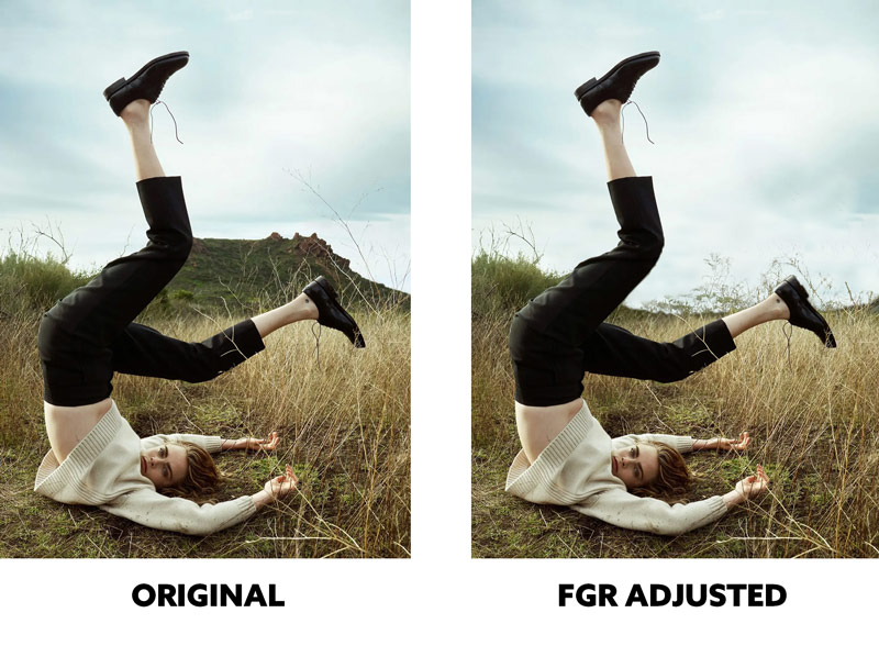
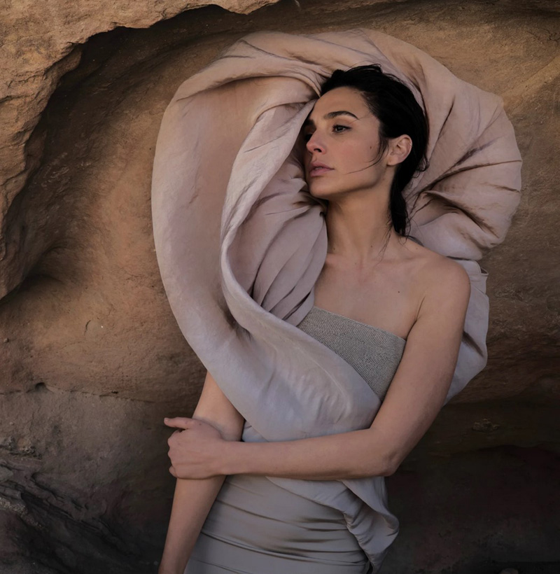
This is a great image and it plays into the quirky ingredient of Annie’s artistic style (see #660). Can anything be improved?
We always have to consider the FGR because it’s the main technique that helps with visual clarity. If you squint, you’ll see that the original shape of the figure blends in with the background rock structure. If Annie were able to reposition herself (sometimes it’s not possible) she could’ve selected a background that would accentuate the shape and create more visual clarity. We can see the difference in the adjusted version when squinting.
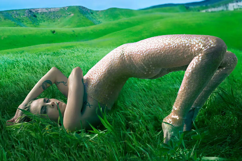
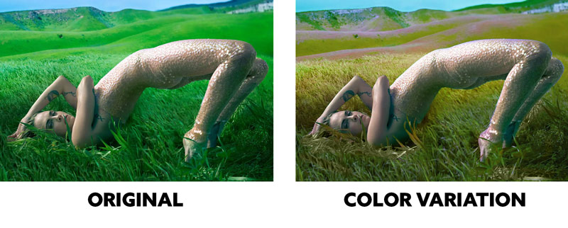
This is another great pose, but something is off. Do you feel it too? I like the color green, but this is overly saturated and it’s bleeding into the color of her face…making her appear sickly. One technique a lot of beginner painters never use is color variation (see #571). Not that Annie is a beginner…she took the photo…she probably wasn’t on the computer editing the photo. This looks like the background could be another image, so perhaps they put a blanket of saturated green over everything to help the blending process.
In the edited version we definitely get more color variation and it complements the sci-fi aesthetic they seem to be going for. Her face is a little less green too. Cover your hand over the edited version and look at the original for about 15 seconds. Now do the same for the edited version. You’ll see the difference color variation makes!
Conclusion
That’s it for this one! As we see, constructive criticism can provide a wealth of knowledge even in a short amount of time. Annie Leibovitz is definitely a master of photographer, but that doesn’t mean she can’t make mistakes. We’ll all make mistakes along the way, and it’s great to know that someone can help guide us along the way.
Thanks so much for joining in, I hope to see a submission from you soon! See you next time!

