Best Composition Tips for Posing a Model

#604
Thanks for all of the continued support everyone, welcome back!
Today we are going to dig into a swimsuit photoshoot and see how to pose the model for a better composition. We’ll be looking at dynamic symmetry, design techniques, and other things that will optimize the final image. Let’s get into it!

Small Changes Make a Difference Composition
Photography gets easier with more experience, but that doesn’t mean there aren’t challenges along the way. To give you an idea of what I’m referring to, the model was late. No biggie, but if you’re shooting with natural light every minute counts. She was also recovering from a cold and stayed up all night, so she looked more sleepy in the photos. I’m definitely not perfect either. I planned and packed things a week before the shoot, but I ended up forgotting my lighting. Again, no biggie, I just had to spend 10 minutes running back to get it. When we were shooting in the park, a homeless man moved his sleeping spot so he could see the model better. This made her clam up and uncomfortable, but we laughed it off and he eventually turned the other way. A shoot wouldn’t be a shoot without the wind blowing down my soft box. Thankfully nothing broke. Yet, despite all of these little obstacles, it was fun to collaborate with a new model and create art.
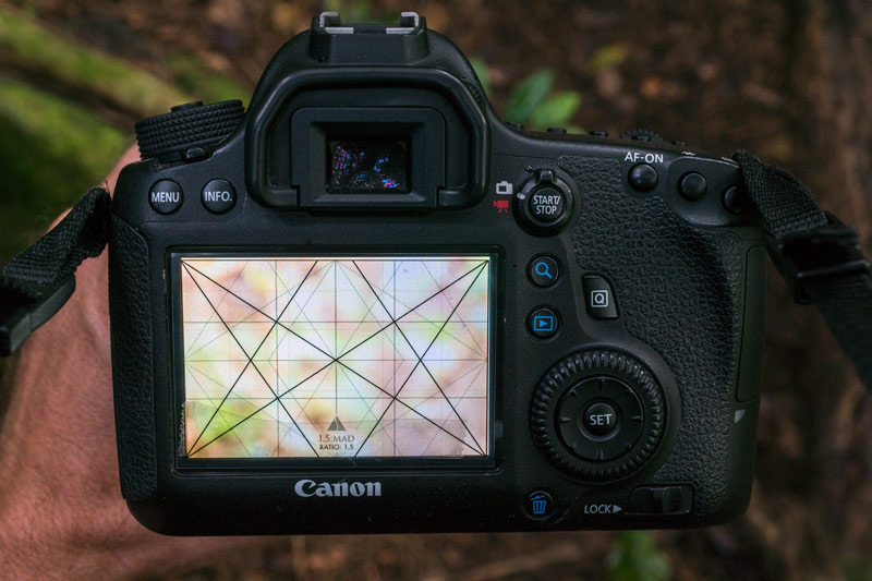
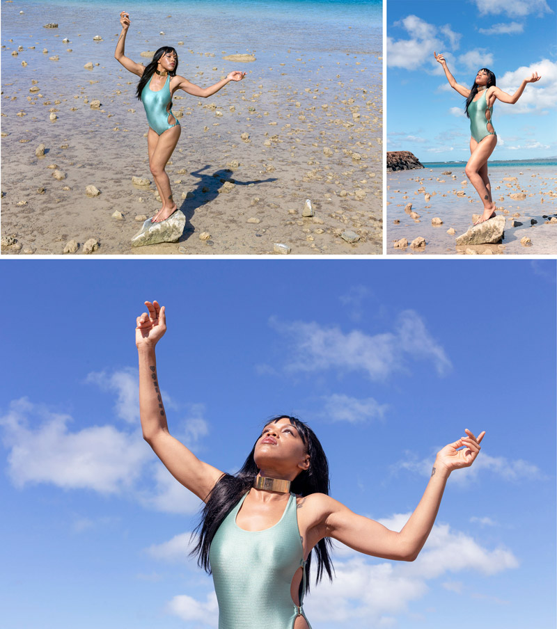
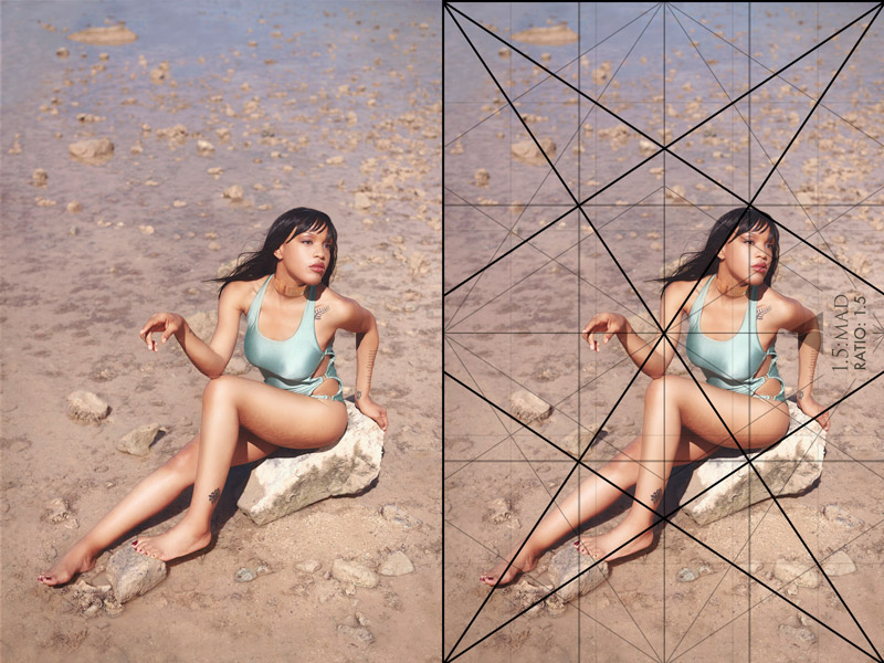
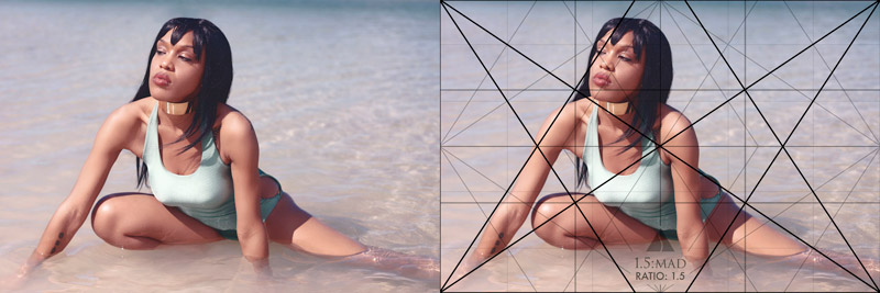
We only had one outfit to work with, so we started with the dry scenes, then worked our way to the ocean. I was shooting with a Canon EOS 6D, mostly the 50mm f/1.4, and a large soft box. The 1.5 MAD grid was placed onto my LCD also.
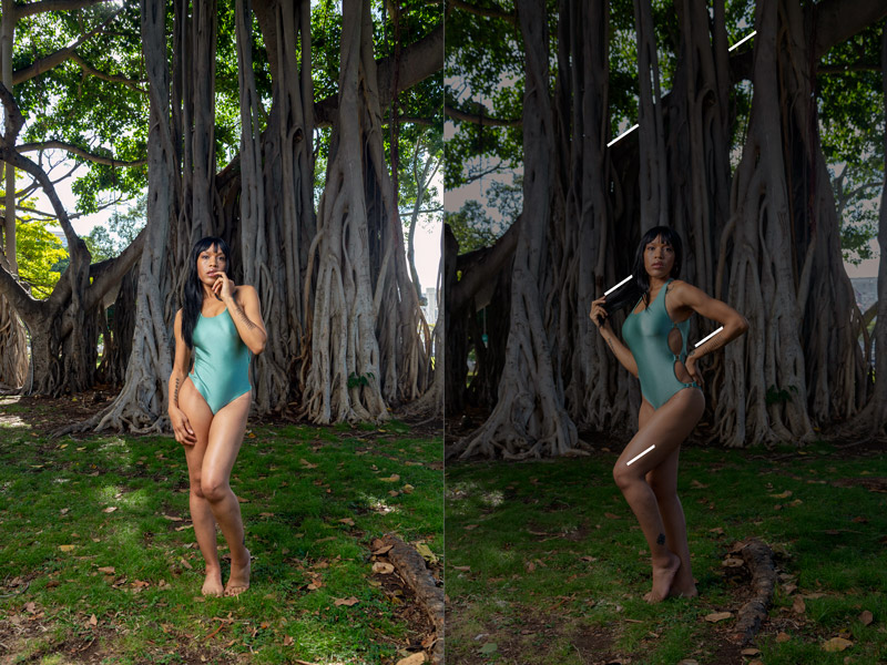
I wanted to really push arabesques (see Day 19) in each pose if I could, but this next photo is an exception. On the left, we see the nice arabesque in her pose, but there is another opportunity hiding in the trees. Its dominant diagonal allows us to unify the model with the background if we pose her appropriately. This is where we can guide the model to angel her leg, arm, and hair to create a gamut (see Day 39).
Note: It’s important to know that most of these images are SOOC (straight out of the camera, no cropping and minimal processing). The final image is more refined and even manipulated to be as clean as possible. The editing I do with fine art photos is much different than the almost non-existent editing done in my street photos.
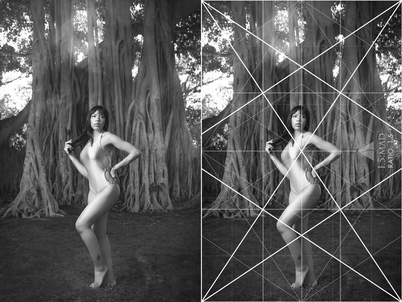
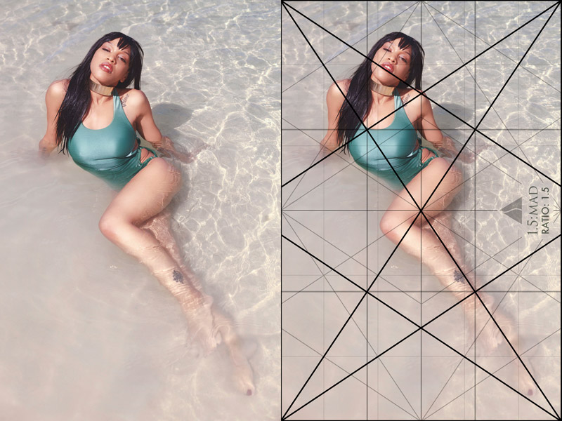
In the final image on the left, we can see how the gamut plays a role in creating unity and rhythm. The grid can be seen on the right where her pose parallels many diagonals. Notice how the ground was cleaned up too. This helps take care of edge flicker (see Day 49) and other distractions. Now you can see why I’ve grown to dislike photo editing…too many hours on the computer. You don’t have to go overboard like this, but it’s my own personal tastes to have a cleaner, well designed image.
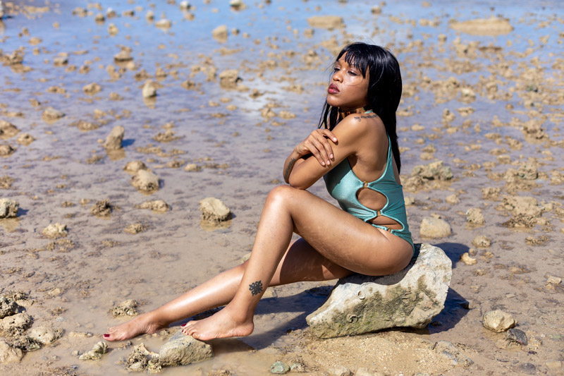
I actually hired a retoucher to help with the skin, but the final design edits had to be done by me.
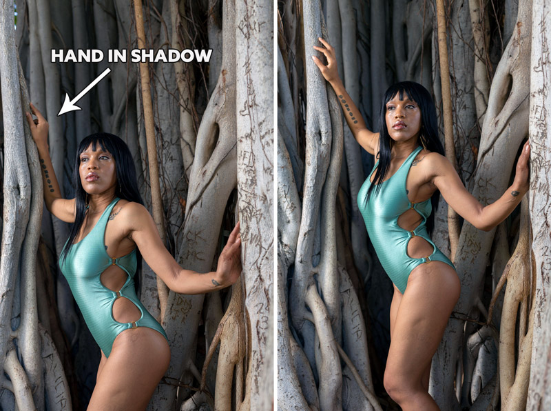
This next one shows how the model’s hand had to be adjusted to be more exposed to the light. It was behind the banyan tree branch and darker than her body. These small adjustments can make a big difference in the final image. Don’t be afraid to take a minute to check the image and look at the overall design.
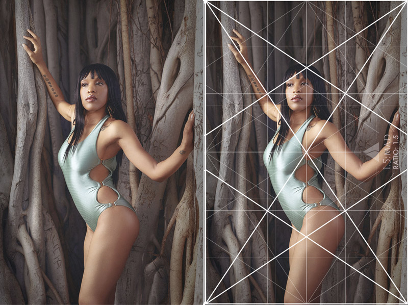
Can you see the arabesque in her body and arms?
In this final edit, you might be able to see how the edges were cleaned up to be free of high contrasting distractions. The grid on the right is also locking into the model quite well. Using the grid is the easy part. Trying to sculpt the model into a pose like a piece of clay is a bit more difficult.
This tree was interesting to shoot and easy for the model to climb up, but it presented a lot of distractions noted by the circles. I tried to tilt the camera up to crop in-camera (see #574) and eliminate the distractions near the bottom, but that exposed the sawed part at the top.
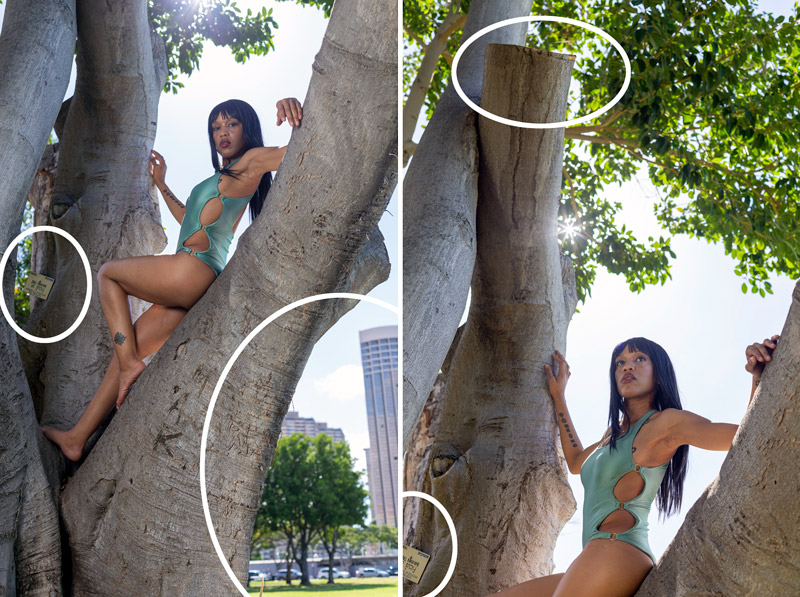
The final edit had to be cropped in a little more to get rid of distractions, and the grid was used to help lock-in the model. When you compose the image with a certain grid, the same grid can also be used in post to help you crop if needed. The less you crop, the more pixels you have when printing.
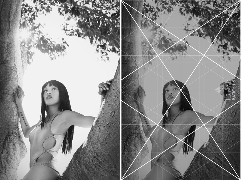
The arm on our left could’ve been adjusted a bit more to parallel the sinister diagonal of the grid. Since the colors were lacking and the sky was very bright, it was converted to black and white (see Day 178). This changed the mood to something more timeless (see #461).
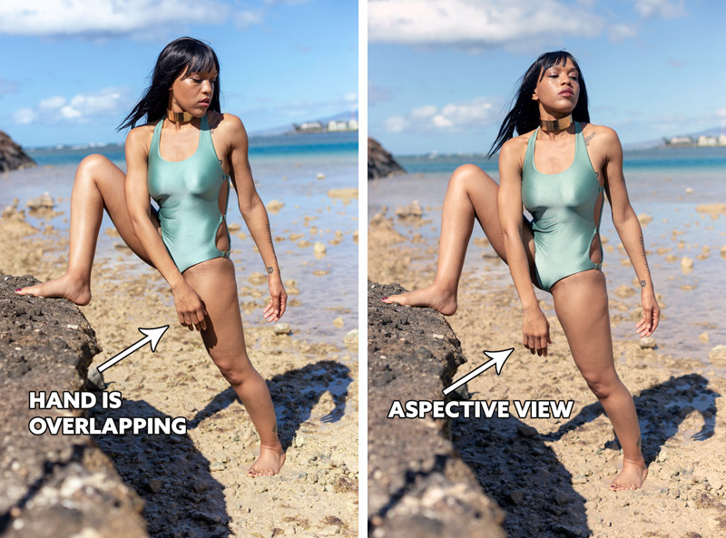
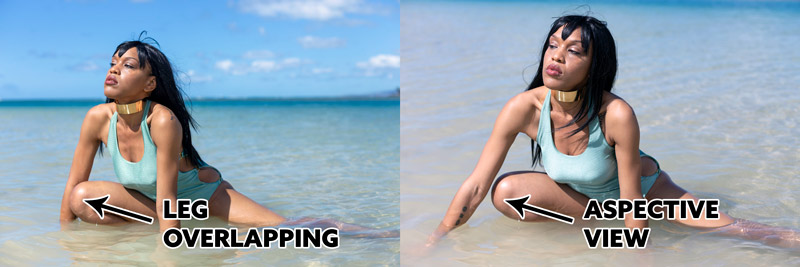
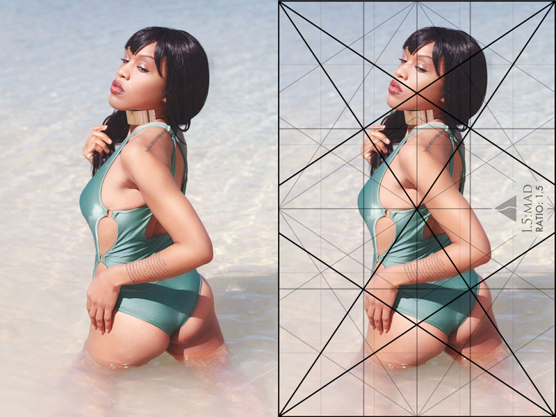
Let’s see if you can tell the subtle difference in this next one. The model’s hand is overlapping on the left, which is fine, but it should be adjusted if you want a more aspective view (see Day 78). Can you see how that small change helps with the visual clarity?
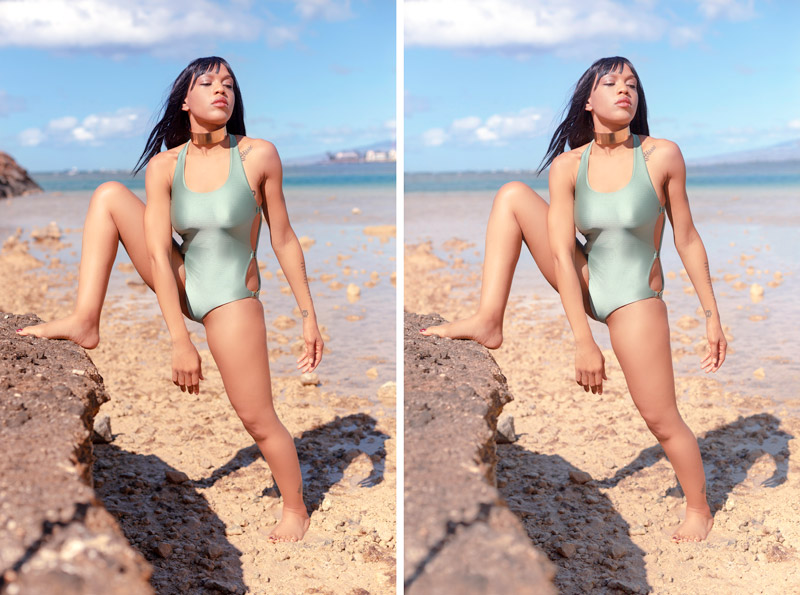
Run your eyes around the model in these next examples. The one on the left is by the retoucher, and the one on the right is with my design technique edits. You might notice how the figure-ground relationship was improved by editing out rocks or subduing the contrast of them. Most notably by her thigh and hand. The background was also edited to be simplified so all of the attention stays on the model.
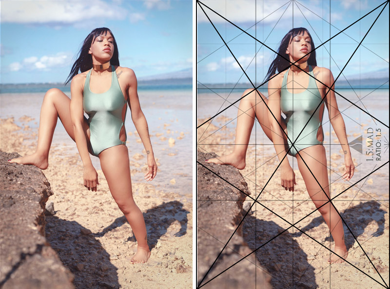
Here’s the final edit with subtle toning and the grid overlaid. Notice how the sinister diagonal of her thigh is locking in nicely and runs down to her calf. Her shadow also parallels the baroque reciprocal diagonal and coincides with the crack in the rock on the lower-left.
We can see how separating the arms of the model helps create the aspective view we’ve grown to love. This is a simple movement and pose, but you’ll need to be aware of the technique to incorporate it. Having a slight bend in the arm or body also helps create arabesques. Can you feel the subtle difference in the right image compared to the one on the left? The one on the right has more movement.

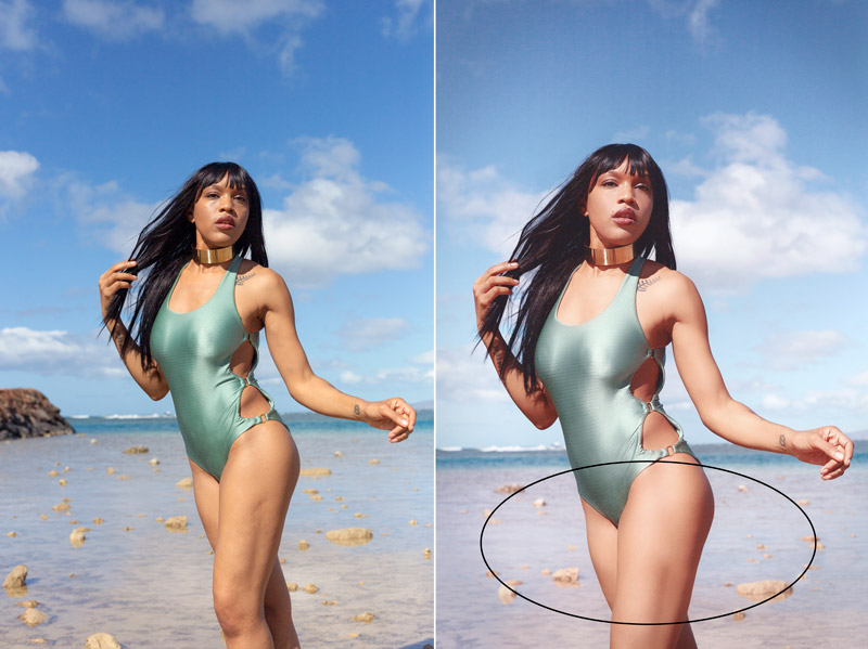
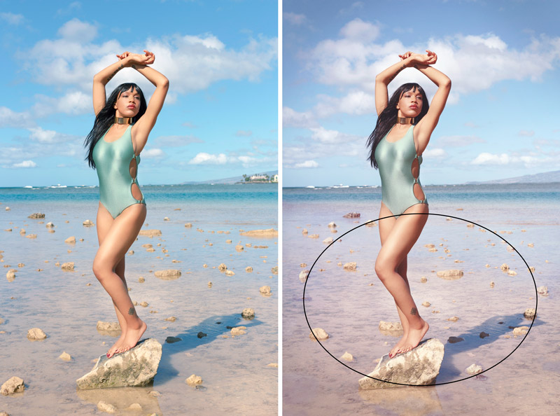
In this next comparison, we can see how the design editing manipulates the scene and creates an ellipse. Rocks can be shuffled around or removed to help your design. If it’s hidden (not an obvious circle), then the design will be enhanced with more movement. If it’s too obvious, it could become a distraction.
You’ll also notice that the image was slightly cropped from the original (left) to help center the balance (see Day 57) of the model.
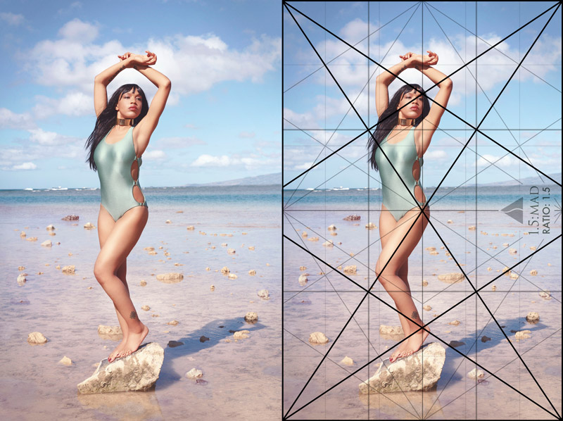
Here’s the final edit where we can see the results of the ellipse and the grid locking into the pose.
This next one is a variation of the “Birth of Venus” pose (see Day 65). This one is more confident feeling, rather than romantic. The same design edits were used to create the ellipse in this one too. The edges are free of distractions and the background was cleaned up.
Here we can see the final edit and the grid being used to lock-in the model. The sun was very bright, which affected the way I could see the LCD. I didn’t have my LCD Viewfinder either, so sometimes I would use the LCD to make adjustments, then switch to the viewfinder to take the final image.
When you’re shooting, don’t be afraid to change up your perspective. Here are some different variations of the same scene and pose. You can get close, move further away and higher, or switch to landscape instead of portrait.
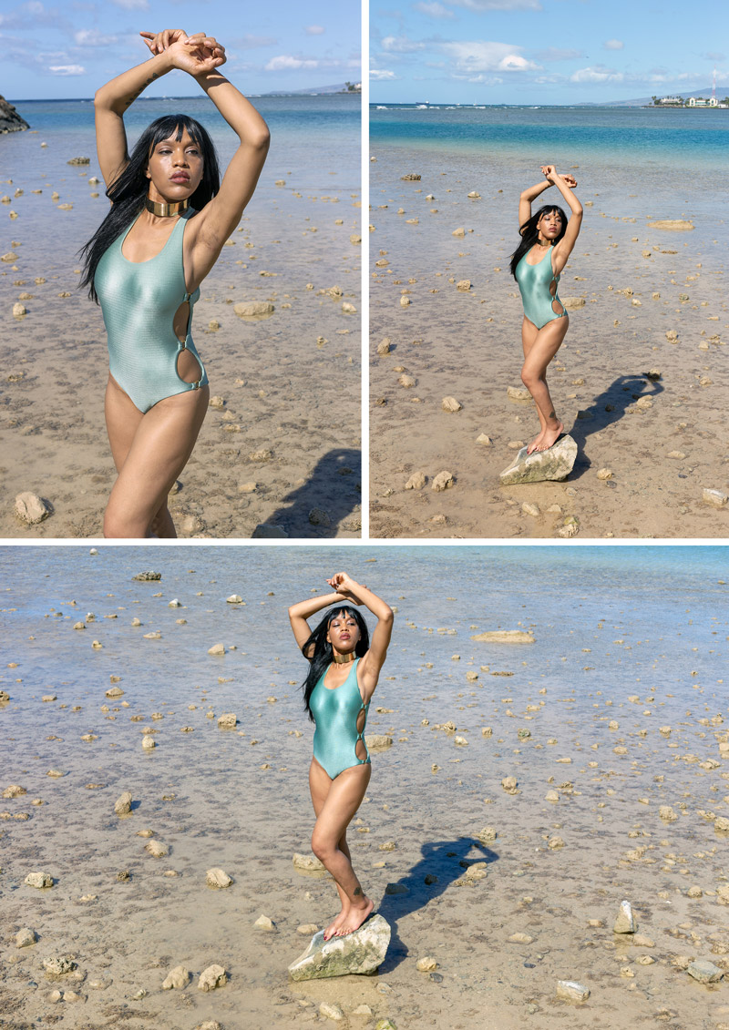
You can even work more with the limbs to see if you can create different arabesques.
You’ll notice in the background of the image on the left that things are a little unorganized. With design techniques, we can manipulate the background to have more order and unity with the model. In this case, coincidences (see Day 48) and arabesques were used. The rocks lined up with the vertical of the grid, and the arabesques were created to link up with the model. The edges of the frame were also cleaned up, and we can see the movement created by her hand/leg and gazing direction (see Day 99). This might be overkill for some artists, but it’s all about unifying the model with the background and keeping the attention where it needs to be. If you’re going to create an image, make it the best you can make it. It’s just like building a house; the stronger it’s built, the longer it will stand the tests of time. I may dislike tedious editing, but I do it because I know how important it is.

In this final image, we get a better sense of balance with the rocks edited to add more weight on the left. The model is also being posed with directions to better lock her into the grid.
Here’s a variation of the same pose, but wasn’t used because her hair kept blowing in her face.
We start to ease our way to the water and thankfully she was dedicated enough to get wet. The water was probably 60 degrees (not cold), but she was still sensitive to it.
We can see how an aspective view pose is better achieved by slightly moving the arm away from the knee. The perspective was changed also, to remove the horizon line from her neck and create more visual clarity.
The final image will show the simple pose, with nice geometry. She’s creating a triangular enclosure (see Day 32), and locking into the grid well.
When you add a twist to the body, you can also create an aspective view. In the first pose on the left, we see that she isn’t twisted all the way. With further guidance, she twists more towards the camera, showing us four sides. This creates the illusion of the third dimension; seeing multiple sides. Much like an illustration of a box with two sides vs three.
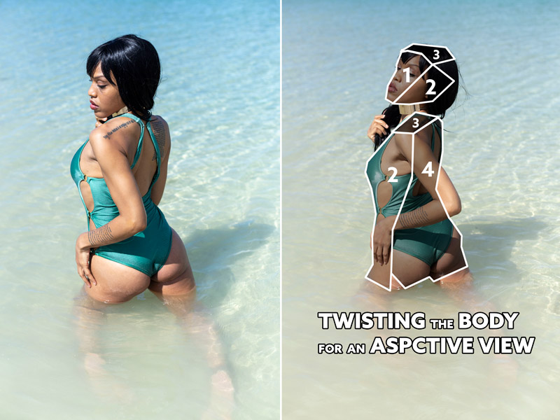
Here’s the final image that was cropped just a bit to help the model fill the grid. Her arm parallels the sinister diagonal, and the left side of her body locks into the vertical.
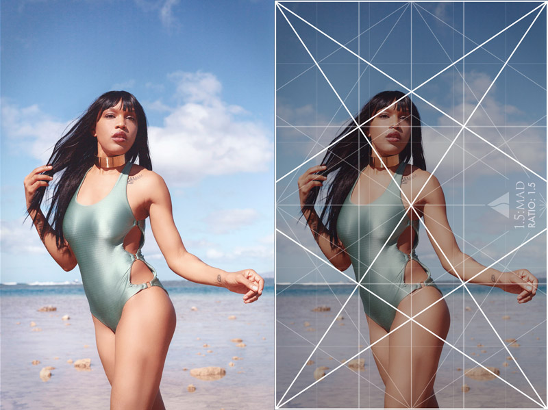
This next pose will show you how the slight movements can help create a better arabesque. When you’re photographing a model, don’t be afraid to direct them. Pretend you’re Stanley Kubrick or Marin Scorsese. In this case, I encouraged her that her pose was awesome, but if she moved her thigh to the left more we could get a nicer “S-curve” in the pose. I also asked her to tilt her head to complete the arabesque.
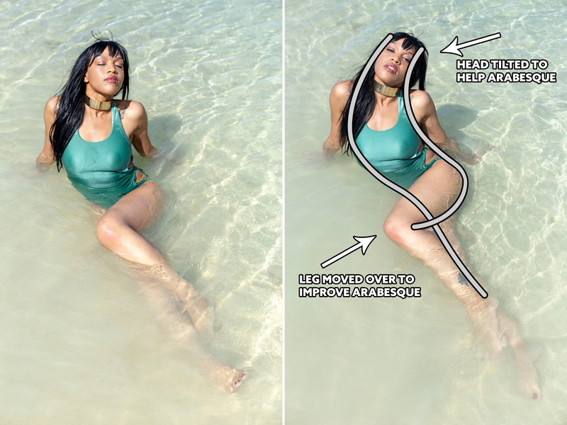
This will show the final image, and her leg locking into the sinister diagonal of the grid. Her thigh, torso, and head also lock into the 1.5 MAD grid.
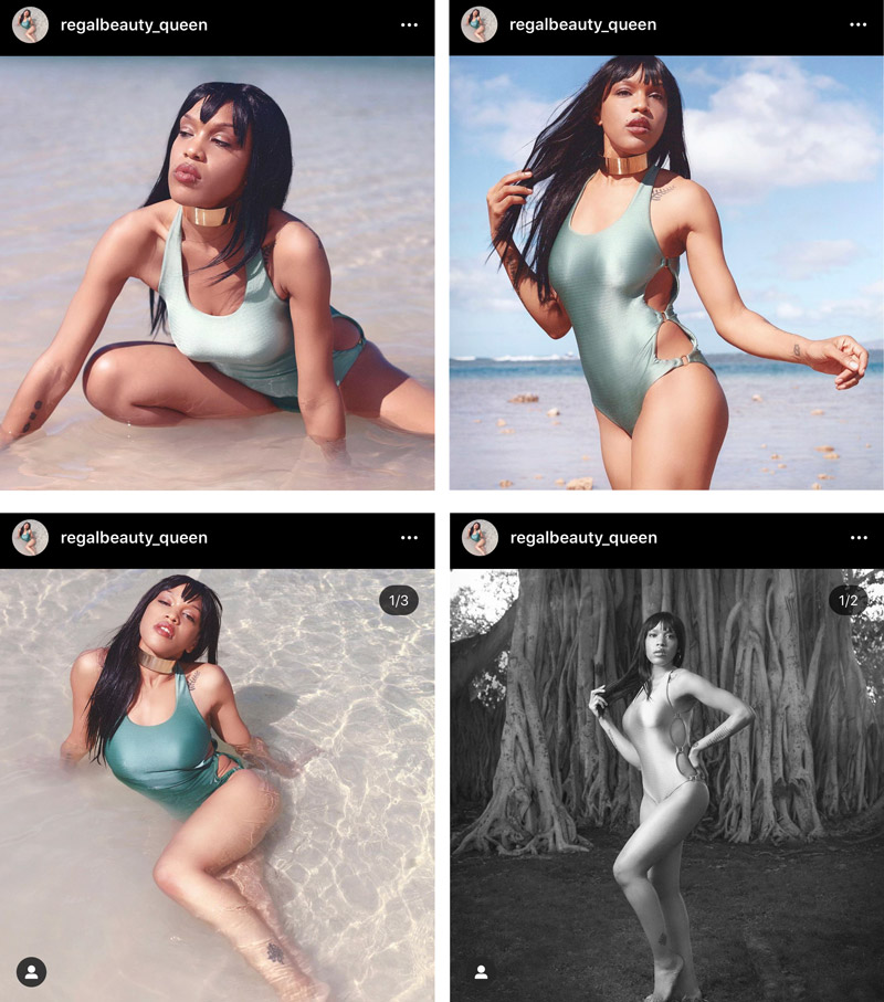
Now you know what can go into a simple swimsuit shoot. Quite a bit! And after all of this fussing about composition and editing things to be as good as they could be, the model did something I didn’t expect. She uploaded the images to her Instagram and cropped them all. Noooo! This kills the geometry and overall design of the image, but she had no idea. She’s more concerned with her beauty, rather than the design. Of course, I thought this was funny and unfortunate, but it’s her choice and I said nothing. If you’re wanting the model to share the images as you design them, you can offer instructions on how to upload them as a square with a border. Or better yet, give her photos that are already adjusted for social media.
Conclusion
That’s it for this one! Hopefully by now, you’re seeing how subtle adjustments can help the overall design of the image. Spread the limbs or twist the body for an aspective view. Manipulate the background to create ellipses or arabesques. Direct the model to pose in a way that will lock them into the grid and create a remarkable design.
Thanks so much for being a Master Pass member, you’re much appreciated! Take care!