Color Theory, Monet, and Bruno Barbey – Part I
#370
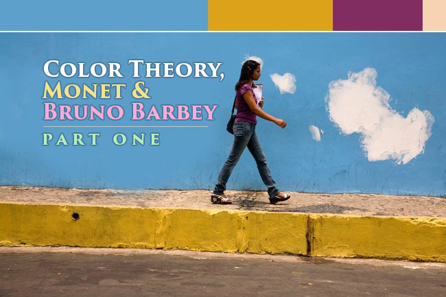
Bruno Barbey, of Magnum Photography, has gotta be one of the best color street photographers I’ve been inspired by. He’s also one of the best at Magnum which is probably why his portfolio contains 147 images and most of the others averaging around 50. Not to say they aren’t all amazing photographers, but it seems that he’s landed more “keepers.” Right? Perhaps this is because of his attention to color? We’ll take a close look at color theory, Monet, and the palette Barbey uses in many of his photos. Let’s see if we can get a better idea of how colors work harmoniously together!
I tried not to include the neutrals…white, black, gray, etc, but these are just as important and help enhance the colors. The swatches of color are displayed in the guesstimated order of color amount…if that makes sense. The most prominent color is the largest swatch, and so on.
“Photography is the only language that can be understood anywhere in the world.” ~ Bruno Barbey
Here’s a great video which shows Bruno Barbey capturing some shots in various Korean food markets. Warning: it might make you hungry!
A Lesson in Color Theory From Monet
One of the master painters who had a profound understanding of color theory was Monet. His color schemes always seem to be perfectly controlled. He has a hierarchy, and that’s important to be aware of when messing about with colors. Of course it’s a lot easier to control when painting compared to photography unless you’re Bruno Barbey, William Eggleston, or Fred Herzog (see Day 337), but understanding how color can attract your attention (see Day 183), or complete a palette is valuable for any artist trying to create harmonious color.
The color red is well known for grabbing our attention. Here we can see how Monet uses it not only to bring attention to the flowers (which adds nice repetition to the scene), but he does something more important. He ignites the color scheme with his limited palette and breathes life into the painting. We see mostly cool colors (blues and greens), then a hint of warm to ignite it (reds and yellows).
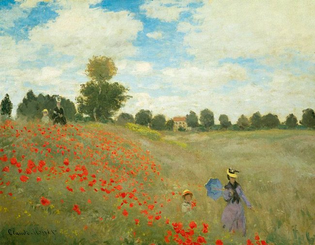
This is a simplified look at his limited Palette. When the colors are arranged like this we can easily see that the cool colors are dominating the palette, so all it takes is a little warmth to ignite it. The smaller amount of color present (warm or cool) is what ignites the palette. Myron Barnstone calls it the “soloist.”

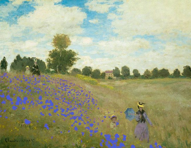
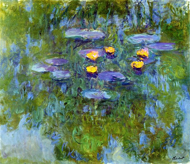
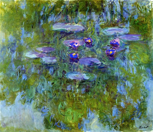
Here we can see the difference the red makes in the scene when the flowers are converted to yellow and blue. Even though yellow is a warm color, it still blends in too much with the yellow-green grass in the scene. Contrast in color is important just as it is in tonal value.
For example, if you want something to be more prominent, you place it next to it’s opposite value or color. If you want it to be more subtle, you place it next to a similar value of color. It’s simultaneous contrast (see Day 28) for color. Later we’ll look at the color wheel to see which colors are opposite of each other.
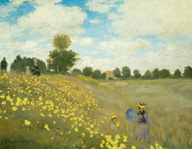
The blue is a cool color, but it’s not igniting the painting like the red because there is already plenty of blue in the sky. There’s no hierarchy, and it’s a cool color (blue) on a cool color (yellow-green).
Can you see how Monet uses the hint of red (warm) to ignite the blue and green (cool) of his water lilies?
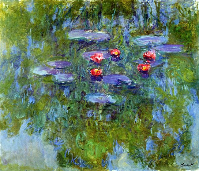
This is his limited palette. The cool colors dominate the warm colors.

Here’s what it looks like when the red is converted to yellow. Still a warm color, but not igniting the scene because of the yellow-green colors.
Same thing with the blues. Now there is no hierarchy.
Color Wheel
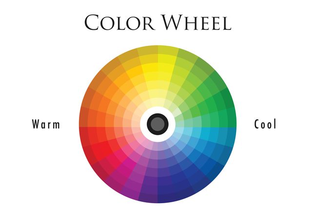
If we take what we saw in Monet’s paintings and look at our color wheel, we will see that he always offset the cool colors with a warm color. They are opposite colors or “complimentary colors”. If you look at the color wheel going clockwise you’ll see that it starts to cool off when yellow transitions to green, and doesn’t begin to warm up until purple transitions to red. So basically your warm colors are red, orange, yellow, and magenta. I could say red-orange and yellow-orange, but for some reason I see the warm side in it’s simplest color…kind of like the colors of the rainbow. You have more cool colors which include yellow-green, green, cyan, blue, and purple.
So with this color wheel in mind we can attempt to create a hierarchy as Monet did…all cools with a hint of warm, or vice versa.
A Lesson in Color Theory from Nature
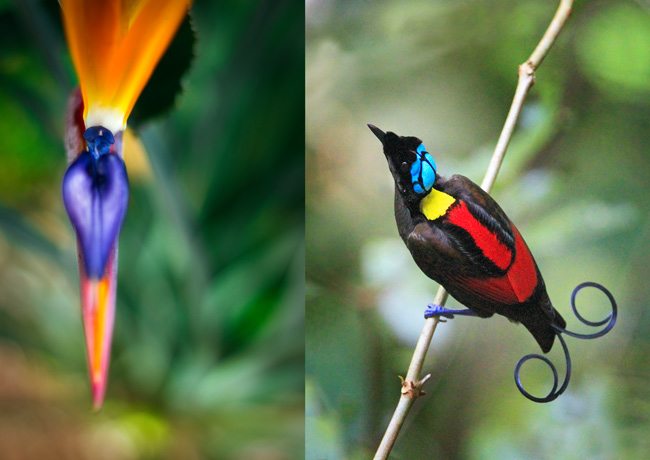
We can see in the images below of the bird of paradise, both flower and bird, that nature has provided a vibrant color palette. The flower on the left has a hierarchy…even when we exclude the green around it. The orange is more dominant, so the cool blue ignites the palette. With the bird of paradise on the right we can see that the warm red and yellow are more dominant, and the cool blue is what ignites the limited colors. Make these cool colors warm and it won’t have the same harmonious effect.
The examples of Bruno Barbey’s photos and a swatch to show his color palette will be seen on the next article. Until then, try this color theory out. Grab a photo you like, find the most dominant color, then the secondary, and so on. It’s funny that the hierarchy is reversed in a way…the less dominant temperature of color (warm or cool) is what ignites the color palette of the image.




Color Theory, Monet, and Bruno Barbey - Part I ...
April 29, 2015 @ 5:56 pm
[…] Bruno Barbey, of Magnum Photography, has gotta be one of the best color street photographers I've been inspired by. He's also one of the best at Magnum which is probably why his portfolio contains 147 images and most of the others averaging around 50. Not to say they aren't all amazing photographers, but it seems that he's landed more "keepers." Right? Perhaps this is because of his attention to color? We'll take a close look at the color palette in many of his photos to see if we can get a bett […]