Composition Eclipsed by Aesthetic
#713
Hey everyone, are you ready to be inspired today?
Thanks for joining in because we’re going to dig deep into art from many different movements and compare it to the art of today. We’ll try to figure out what the heck is going on since many artists on social media are experimenting in ridiculous ways to get attention. They’re trying to discover a new aesthetic, and throwing composition out the window. What is the direction of art as we know it, and where can we hope it’s heading? Let’s find out now!
How it All Began? Is this
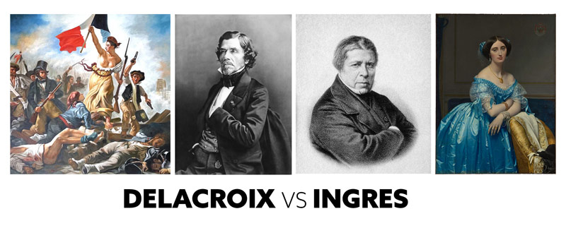
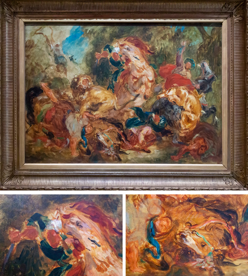
There once was an artist named Eugene Delacroix (1798-1863), and he was a huge inspiration to many artists that followed after. He was a French Romantic artist and is considered a master painter. His rival was Ingres (1780-1867), which makes sense because Ingres was also a talented master painter and only 18 years older than Delacroix.
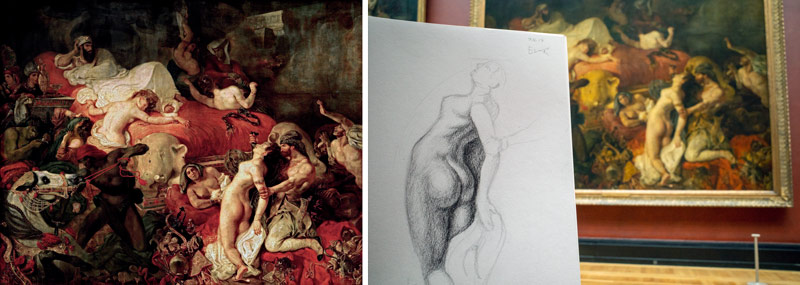
Delacroix was inspired by Peter Paul Rubens (1577-1640) (see Day 331) and produced some very well-known paintings like “The Death of Sardanapalus” (see Day 310). I saw this painting in the Louvre, and attempted to draw from it…it’s huge!
As a painter and muralist, Delacroix was interested in color, but what seems to have stood out most is his expressive brushstrokes (see #585). This was super different compared to other artists from his time. Was he the master painter that started it all? Started the ball rolling into art movements (see #656) like Impressionism (1860-1890), Post-Impressionism (1886-1905), Modern Art (1860-1945), then the Contemporary Art of today?
Take a look at this study, which I was able to photograph in the Musee d’Orsay. It’s a study, but the brushwork looks exactly like something we’d see today. Yet, there’s a huge difference when compared to what we see on Instagram today. This brushwork, this aesthetic he’s creating, is accompanied with a profound knowledge of composition. This is something that is lacking in the aesthetic explosion that’s consuming online art spaces today.
Let’s take a look!
Aesthetic vs Composition Who wins in the End?
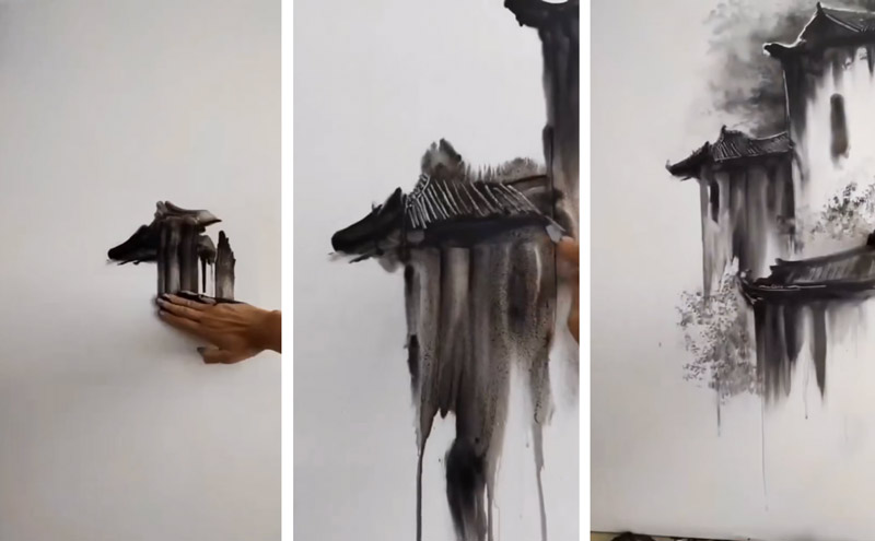
All of these examples to follow were found on social media sites like Instagram and TikTok. It seems that art these days seems to be searching for that perfect aesthetic. Is it this, is it that, is it painting with a wiffle ball bat? Artists seem to be experimenting with emotion, intuition, and mediums more than ever before. This is great and everyone is entitled to create art as they wish. But, and this is a big butt. We can’t all snort cocaine and have the time of our lives without expecting some consequences. These emotional aesthetics come at a cost, and it’s usually the composition.
Some of the aesthetics actually look cool-ish, but when we see the finished artwork it looks weak and massively lacking any ounce of compositional quality. In fact, with each art movement since Post Impressionism, the composition seems to be more and more eclipsed by the fascination of aesthetic.
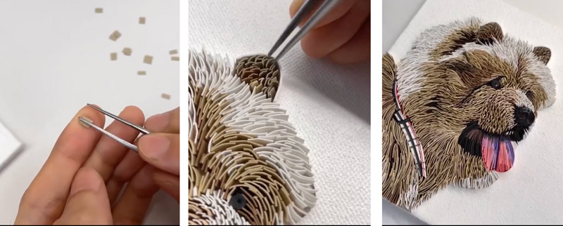
Like this artwork that uses little pieces of colored paper to create a textured image. Interesting idea, but that final composition is disappointing.
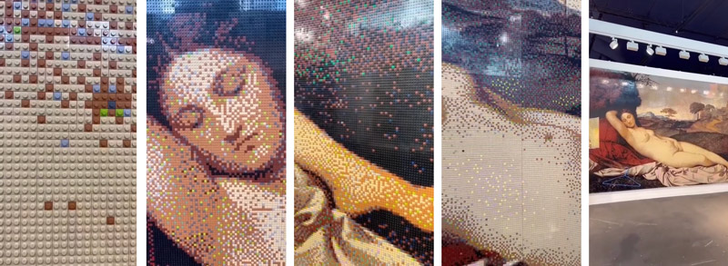
Not all experimental aesthetics will reflect poor compositions, but most of them will. Like this next one, which is made of legos. It copies a master painting, so the composition is well intact. Wouldn’t it be more impressive if the artist created something new, with a great composition, and with legos as a medium? This shows us what legos look like in an arranged way and we can use it in our great compositions. Or, we can simply be entertained by it for a second, heart it, then keep scrolling.
From the artists perspective, it would be hard to imagine why they would spend 100’s of hours on something like this that is completely unoriginal as a final work. Is this considered a master copy to try and step inside the masters shoes and learn more about their technique, or is it just to get attention on social media?? Attention is a big deal to some artists of today, regardless of the quality of their work.
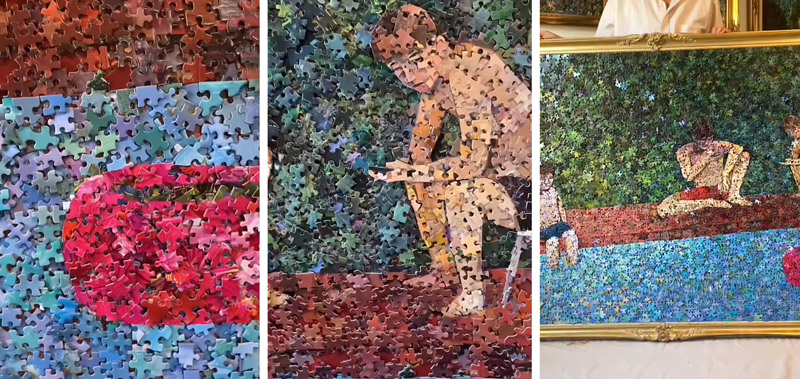
The same can be said for this artwork created out of puzzle pieces. It’s aesthetic is new and interesting perhaps, but look at the final composition. Some of it can be seen, but we can tell that it’s pretty horrific!
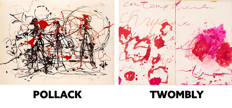
Jackson Pollack (1912-1956) and Cy Twombly (1928-2011) didn’t help things at all when trying to encourage nice compositions. Their modern art was all about the Shock and Awe effect (see Day 111).
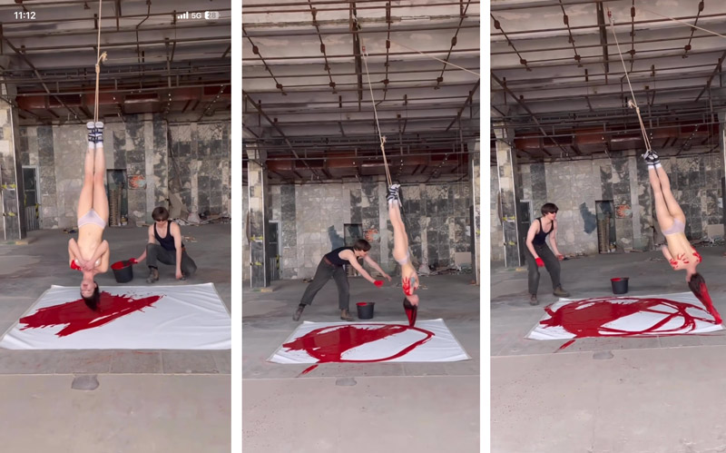
Speaking of “Shock and Awe,” look at this artist that decides to hang a topless girl upside down, dip her hair in paint, then swing her around. This is art on the lowest level, but there is something to be learned from this. Does this method produce results we can use in our own art? Most of you might answer “Hellz nah,” but perhaps this could be used to add a little spice to an already beautifully composed painting. Maybe?? I doubt it, but let’s look at the bright side because there are always exceptions. It’s mostly something to share with serious artists for a laugh, and this is definitely the kind of stuff that goes viral. It’s rare to see excellent paintings by Bouguereau going viral.
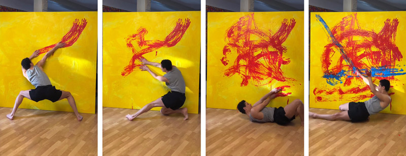
Here’s another one, where a guy dances dramatically in front of a canvas and smears paint with his hands. It’s begging for attention, but perhaps we can use this aesthetic and lock it into the grid. Maybe draw something out first and incorporate dominant diagonals for visual impact (see #441) and maybe more arabesques for movement (see Day 17). Any plan is better than this dramatic dance approach.
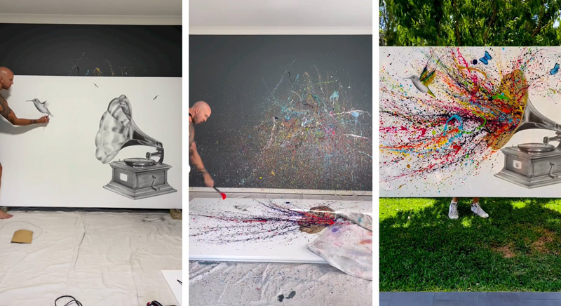
This artist is trying to emulate the Pollack aesthetic by splattering and dripping paint, but this stylistic choice hasn’t been en vogue since Pollack was urinating in Peggy Guggenheim’s fireplace (see proof). Such a huge painting, many hours of work…for what? Doesn’t he want it to be a successful painting and not just a shock piece? Like, how about having better FGR on the bird? What about adding a hierarchy of colors (see #470), with a clear directional movement?
The major problem with this obsession of aesthetic is that it does nothing to create visual clarity, movement, unity, rhythm, strength, or anything else. These things are the foundation of a masterful paintings! What it does do is entertain temporarily and perhaps discover new methods of applying paint, etc. It’s like Santa gathered a bunch of little elves willing to give up their time and effort to create different aesthetics in hopes of discovering something new and fresh. It’s better to bet on composition and not the aesthetic!
This is all fine because we know better, right? Let’s let them spend their hours and money on experimenting, while we create art that can communicate our visual message with clarity.
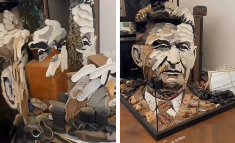
Here’s a piece of art that works with the Law of Pragnanz (see Day 55) by making a portrait out of shoe soles. Cool idea, but if you had a photo of this would you hang it on your wall? I could see a shoe store displaying it, but that’s it.
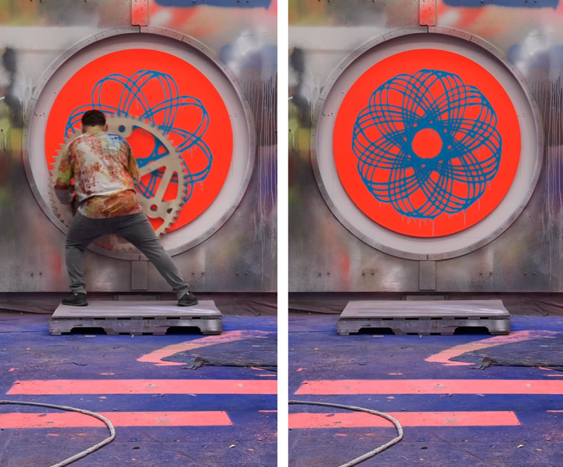
A cog and wheel creating a spiraled design? Reminds me of something I did in elementary school.
Painting with your hand and no compositional skills produces results like this. Why waste our time?
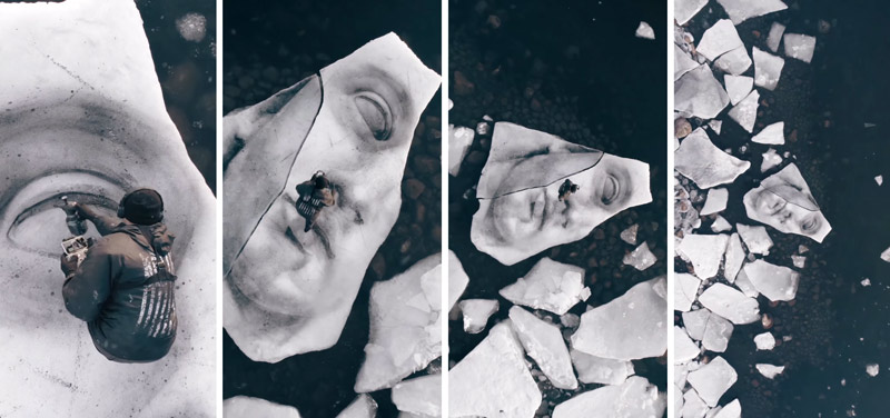
Painting on ice with a drone? But why? Cool idea, but wouldn’t it be better to plan a composition on a canvas then paint cracked ice and underwater rocks? He could create more rhythm, visual impact, unity, etc if it were planned. In the last image it just looks like dirty snow because the contrast isn’t there.
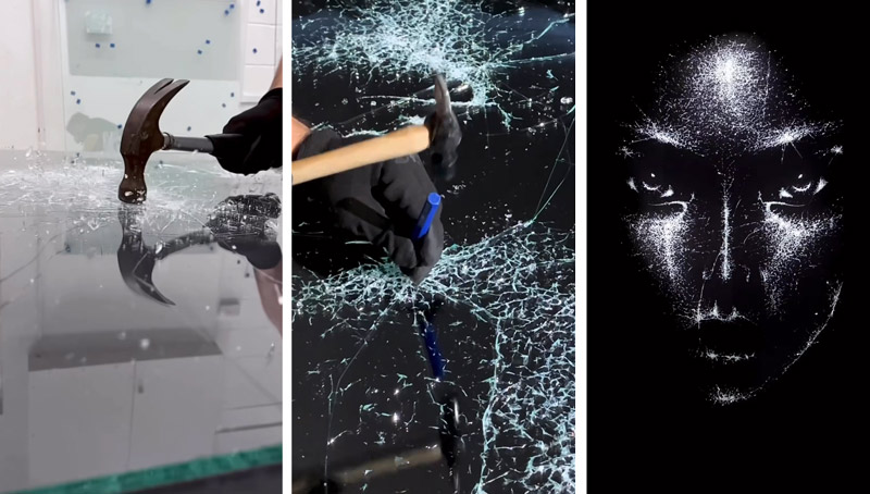
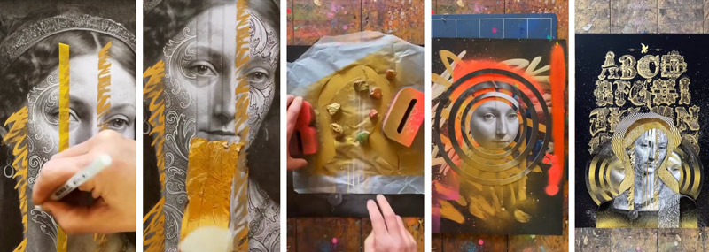
This one is interesting, with cracked glass, but the final image is generic looking. The face looks too symmetrical (look at the eyes), and the shadow of the nose looks unattractive like a skull or alien. This all sounds harsh, but it’s just honest disappointment. They were so close to creating something absolutely stunning…if they just knew more about composition.
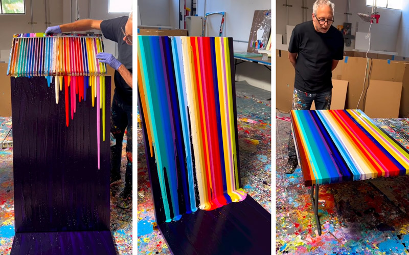
How many different ways can we drip paint??
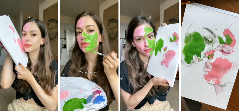
This one is literally painting with her face. Cringe!
Here’s another one that started out good, but they complicated it too much with two faces and stole attention from the main subject. These artists spend hours, and hours, and hours on creating, which is time well spent, but wouldn’t they want the final result to reflect their efforts? With just a little more planning, a little more education and thought put into the composition, they could create something more remarkable.
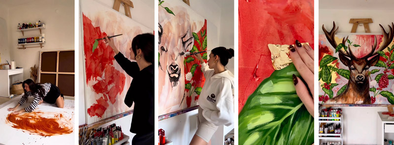
This next one with a deer head starts out with promise and incorporates some of her experimental aesthetics, but the final composition is lacking visual clarity. The figure-ground relationship (FGR) (see Day 21) is horrible! She’s got a lot of aesthetics going on like smeared paint, expressive brushstrokes, extended canvas, gold leafing, but simple things like FGR and color variation (see #571) are non-existent.
There are others that had more potential, but still needed some more knowledge on composition. Like this one for instance. Great colors and concept! They’re using size variation of the beads and creating a familiar shape (fruit) and story (mold), but in a unique way. If this were a composition of several fruits together, with equally beautiful color harmony, we’d have some remarkable stuff!
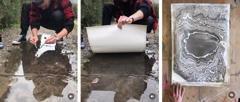
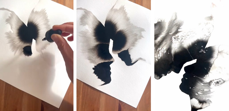
This one was interesting too. I’m biased towards black ink and the effects it makes when mixed with water, so this one stood out. Interesting concept, but the final composition could be better with maybe a double dip into the water, and just a little more ink to add contrast to one certain area. He could even try filling in the white triangle at the bottom because it’s considered edge flicker (see Day 49) and distracting from the center.
This one was pretty good, but there’s an area of edge flicker at the top.
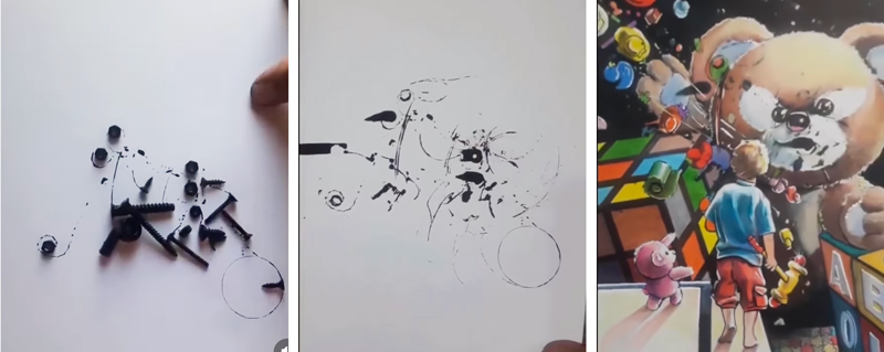
This person took screws and bolts, dipped them in ink, then swirled them on a page to create abstract marks. Then he let his imagination create the final image. Cool idea, but the final image needs some more visual clarity. The boy is jumbled together with a ton of other shapes. Squint your eyes and you’ll have a hard time understanding what the image is about…high contrast is everywhere!
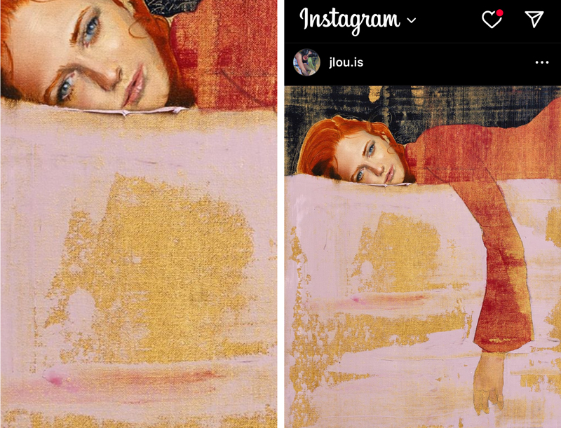
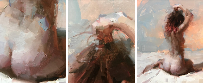
This one is a simple portrait with really nice brush work. The shadow on the right could be lightened to show her leg as a separate form from the shadow. As it is now, they are joined together and create a weird illusion.
This is a typical type of drawing we see today, where the artist smears charcoal, then erases parts out. It had potential, but they are lacking the knowledge of the Law of Proximity (see Day 59) and not controlling the contrast. The index finger is in close proximity to her eye, so they are joined together…almost like a weird eye patch. Try placing your hand in this same position…it feels awkward when the hand is so close. This area also has a significant amount of contrast, which brings attention to the zig-zag of the square-shaped fingers.
This artist has certainly nailed the child-like aesthetic in his drawings, but the final composition could be even better. Not bad for his artistic style though….very similar to Jean Michal Basquiat.
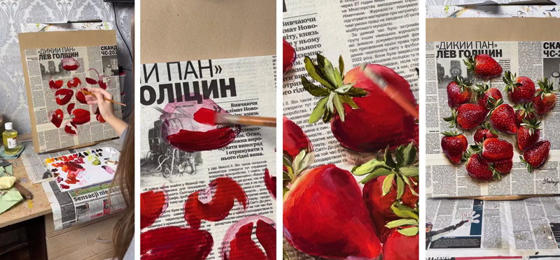
This next one seems like a waste of time. It’s an interesting idea, but the final composition is not organized, there’s no unity and movement when there were tons of opportunities to create arabesques and ellipses. Plus the FGR is bad because the dark strawberry is on top of dark lettering and images. This all disrupts the visual clarity.
Here’s more ink and water, which caught my eye. They are using the aspective view (see Day 78) of the face, and nice FGR. It has potential, but the face profiles seem too generic, and the foreheads touching is very cliche. When I was a wedding photographer, I would always cringe when the couples wanted me to take a photo like this. No one ever does this in real life, do they? It’s awkward…try it. Almost touching would be better!
How the Masters Do It
Now that we’ve seen artwork that was created with pure emotion, or the blind search for a new aesthetic, let’s look at paintings from masters. These paintings have their own expressive aesthetic, but we should see a stark difference because these artists put more thought into the compositions.
We don’t have to talk much about the aesthetics and compositions. It will be really obvious from the images and details. I’ll list the artist for each one, so you can scroll and see how the masters did it.
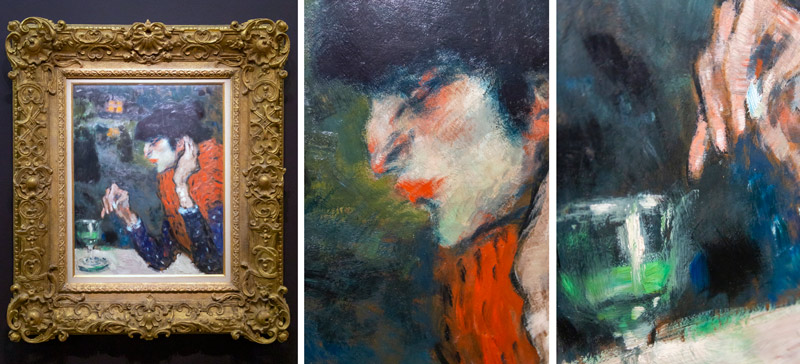
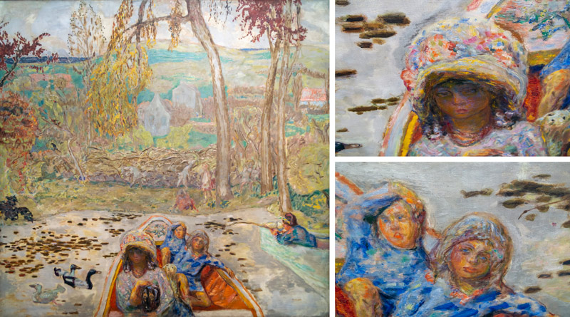
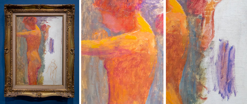
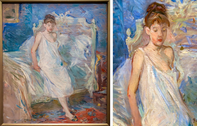
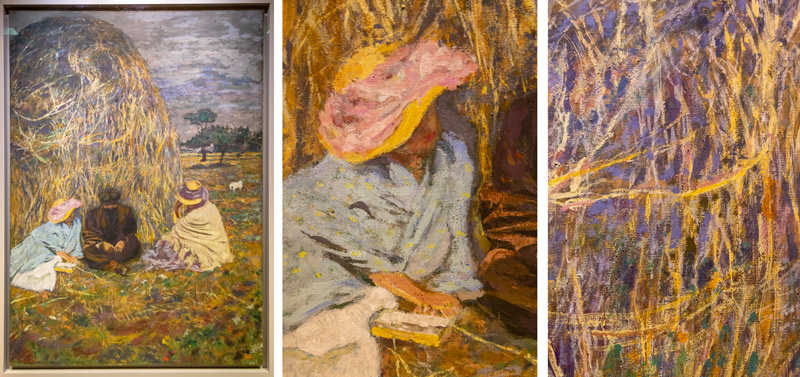
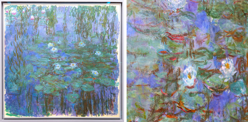
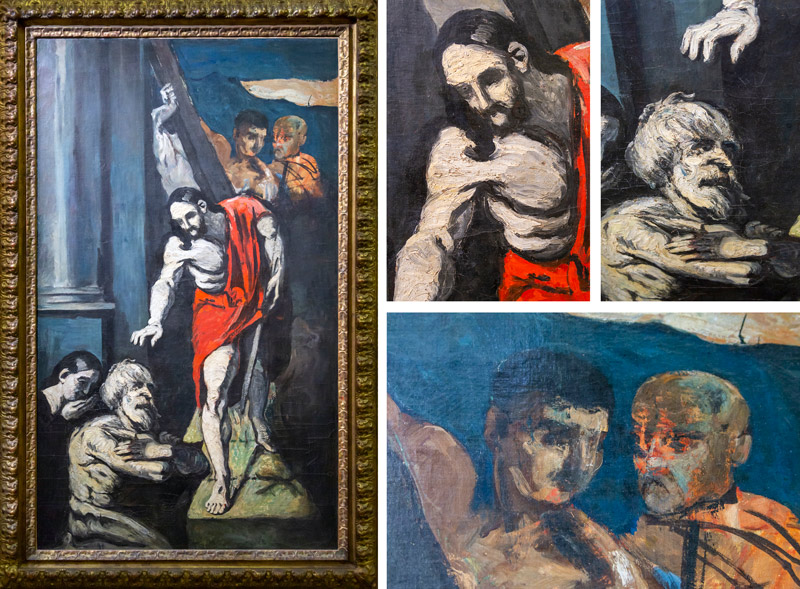
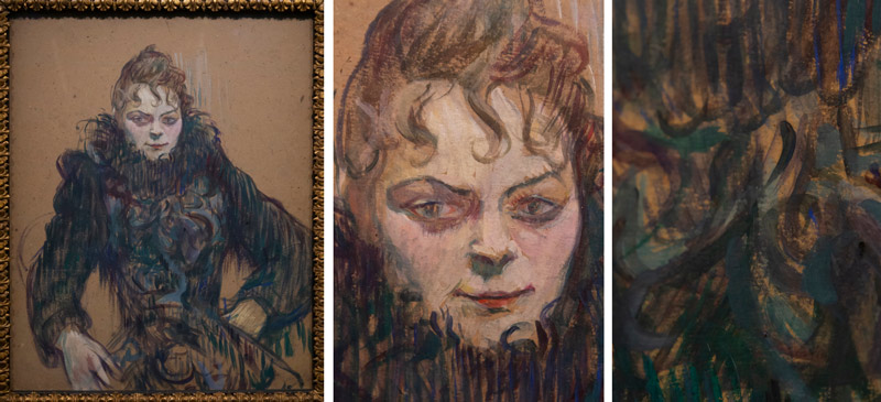
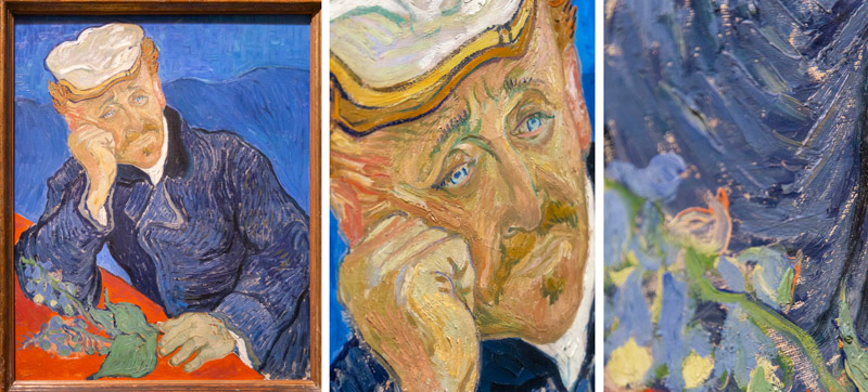
Masters can make composition mistakes, but when they do they’re still able to add more value to the art world than the emotional abominations we saw in the beginning.
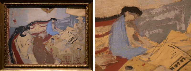
Edouard Vuillard (1868-1940) did his own aesthetic experiments back in the day. He’s got bad FGR on the woman’s hair, but he’s still got nice movement, colors, and balance.
Here’s a painting by Degas that doesn’t have the best Figure-ground relationship (squint and you’ll see), but you’ll see the value when compared to the aesthetic experiment to follow. It’s gold vs garbage.
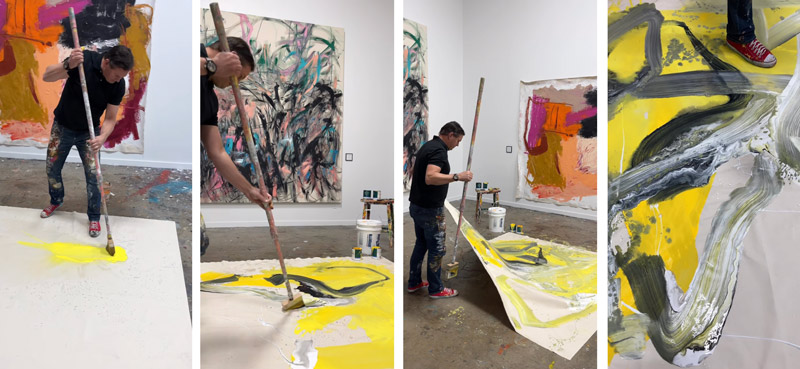
Here’s the experimental one where the artist paints onto large canvases with a broom and dumps thinner onto it to create washes of color in areas. Look at the background images too…they are pretty bad. Degas wins this comparison, sorry!
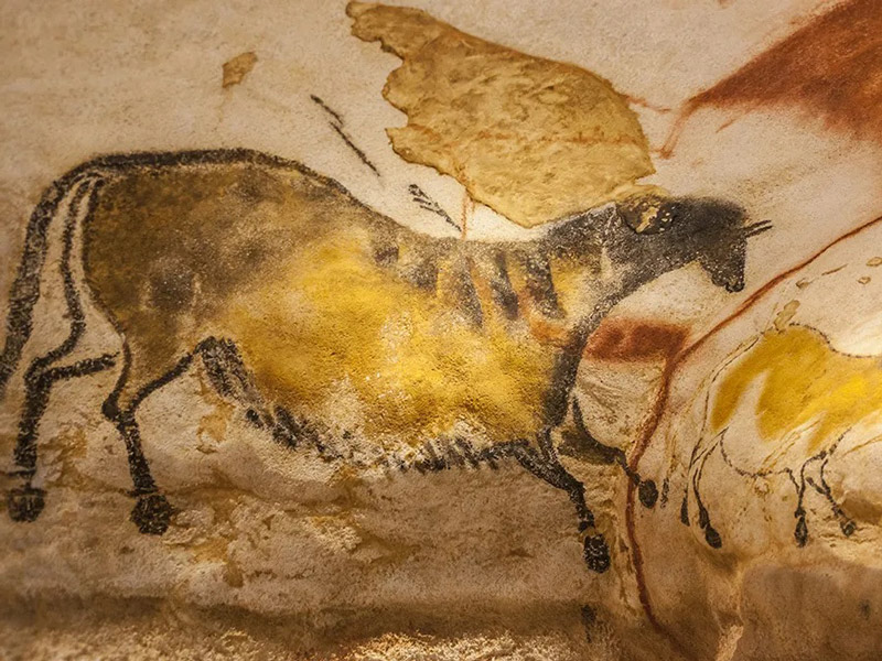
Ancient cave drawings (see #709) used expressive marks, but they still had better compositions than some art of today.
Compare the cave drawing from above to this thickly painted alligator and you’ll see why aesthetic can’t be everything. Eww, that thing is nasty!
Conclusion
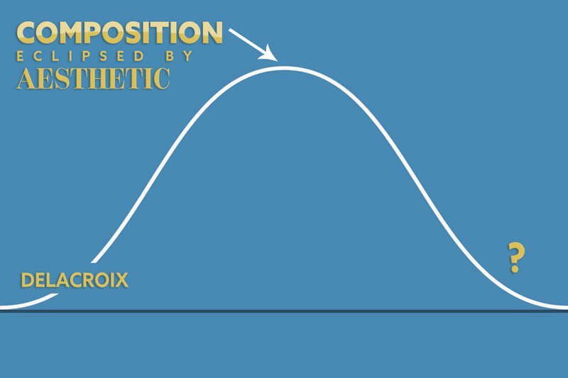
We seem to be at the very top of the bell curve. The pinnacle of exploring new aesthetics, but eventually we have to come back down and start creating remarkable art. I believe the winners in this day and age will take these experimental aesthetics (the ones that fit their own style) then incorporate composition techniques to create something that is both expressive and visually clear. Let these relentless pioneers spend their valuable time and materials on experimenting, while you learn more about composition. Picasso did this with the Ancient Romans (see #701), and it can work for us too!
When the time is right, you’ll be equipped with exactly what you need to create your own masterpiece. Thanks so much for the continued support, you are appreciated! See you in the next one!

