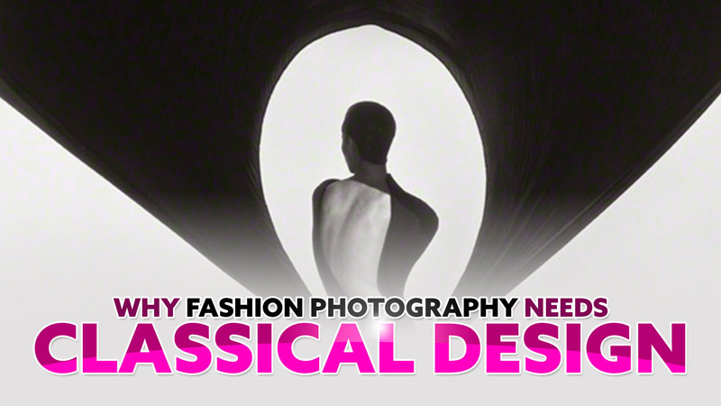
Create a Futuristic Cyberpunk Image in Photoshop with Lighting Effects

#767
Welcome back everyone, thanks for joining in!
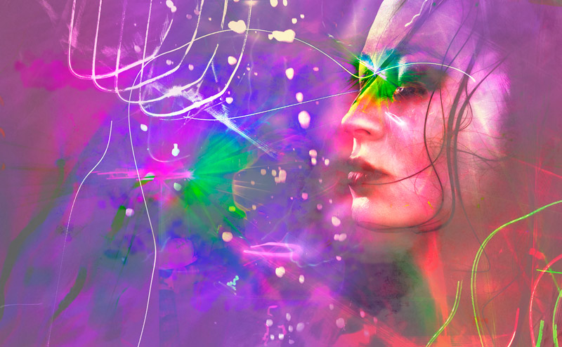
Today we have a juicy new article/video that includes a massive download of goodies. It’s a Photoshop tutorial that shows you step-by-step how to make a futuristic cyberpunk photo full of energy. You’ll learn cool Photoshop tricks in a simple way, and see some creative texturing techniques to add depth to an image. And of course, we’ll cover dynamic symmetry and other composition techniques along the way so you don’t create unwanted illusions, or contrast hiccups. Let’s get into it!
Video Inspiration Photoshop Tutorial
This video was referred to as a “Masterclass Tutorial,” so strap up because there’s a ton to learn!
Most importantly, let’s start with the download! If you’re a Master Pass member be sure to download the file from the Resources Page, or feel free to join the newsletter and download it from the linked page. It’s a massive download and full of images and textures you can use on your future futuristic projects!
Below you’ll find the video, and further below you’ll see each delicious step—10 of them! The video will guide you along the process to show you a ton of tricks that range from beginner to expert.
Inspiration from Photographers
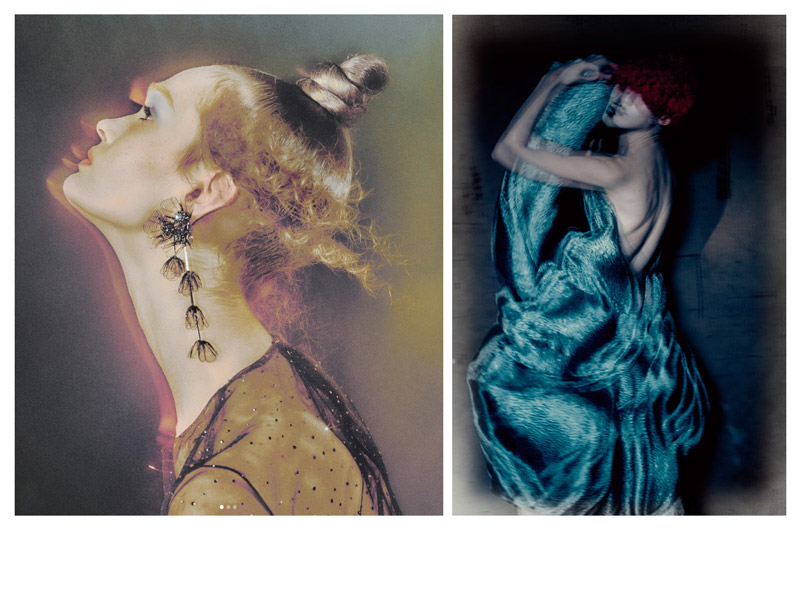
The main photographer that inspired this video is Elizaveta Porodina. Be sure to check out her Top 5 techniques in another article (see #752). She’s got a unique, flashy style that is full of movement and electric energy! It’s also very similar to Paolo Roversi (see video or #494), so he may have inspired her in many ways. We can see them side by side below—not your standard photo, which is great!
Now let’s get into the fun part…creating in photoshop!
10 Steps with Bonus Photoshop Techniques
By now you should have the files downloaded and ready to go. Be sure to take your time and follow the video step by step to learn all of the excellent techniques. Don’t be frustrated or discouraged if your version of the image doesn’t look exactly like the one shown in the video. It’s just meant as a way to show you the techniques, and not to create an exact copy. Take notes if you need to, and it will be knowledge you can refer to the rest of your photo editing days.
If you’re curious about each step, scroll through them below and learn breifly what each one consists of. This’ll get your tastebuds salivating for the in-depth knowledge found inside the invaluable video.
1. Retouch
As with any portrait, you’ll want to retouch it and get it ready for the following layers. You don’t really want to retouch a portrait at the end of the process.
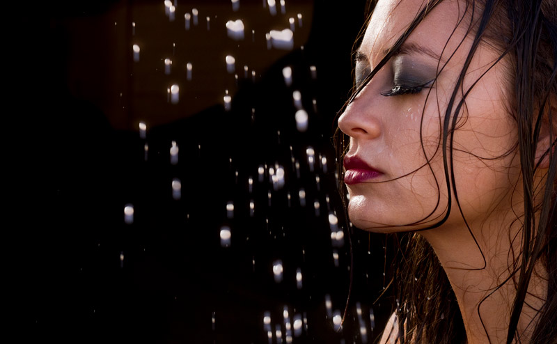
I usually start with the healing brush and clone stamp set at various opacity levels, then go from there. This particular image was shot to be cropped to the phi grid, which will come into play later in the process.
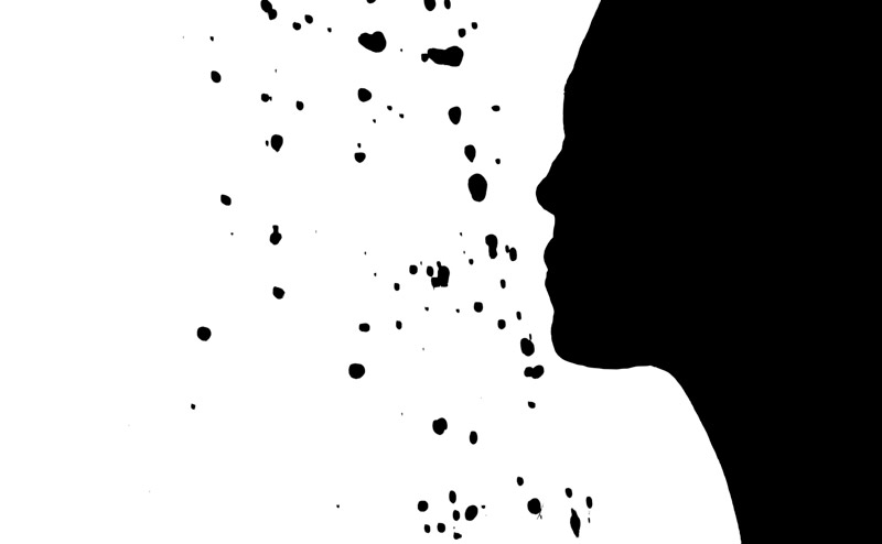
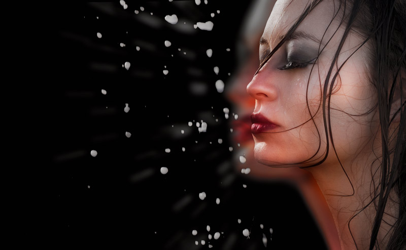
2. Profile Cutout
To prep ourselves for the effects to follow, we need a good cutout. It doesn’t have to be perfect, but decent enough to allow us to select the profile of the model and the milk droplets. Yes, those are milk droplets! Want a chuckle? Check out the behind the scenes photo in the video, it was so fun to create!
Using the curvature pen tool is one of the easiest ways to create a cut out if you’re not familiar with the normal pen tool. You just click around and it automatically creates the curves! There are many different ways you can cut an object out and I show you two working methods.
3. Blur Effect
Now comes the cool stuff! This is the first effect we add, which emulates the motion blur you get when using a flash and slow shutter speed. It’s much easier to do in-camera, but we can get it close enough in Photoshop. The next image will show you some of the tools I use to create effects like this for wedding receptions and concerts.
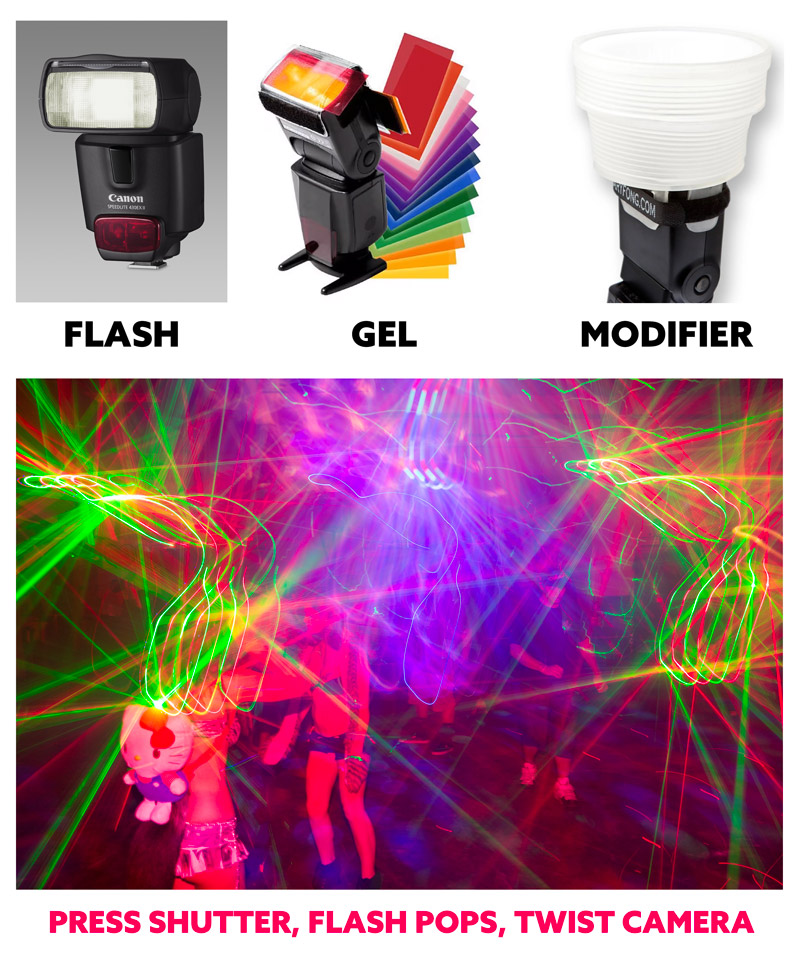
Lighting Effects in Camera
The image below was taken at a concert for Mimosa, an edgy electronic artist. I made a full edited video you can find in the cinematography section on the site, and you’ll see a ton of images I took by using the equipment below.
First up you’ll need a flash that can swivel around. In my case, I had it pointed straight up. The red gel is optional, but you can see in the image below, and within the video, that it creates some cool effects. The Gary Fong light modifier was used to soften the shadows, but it’s optional as well. You basically just need the flash because it’s what freezes the motion.
When you’re ready to capture motion blur, you’ll need to be in a dark environment with ambient light. Anywhere indoors is usually dark enough. If you have to use high ISO settings, you’re most likely in a dark enough environment.
You’ll want to start with shutter priority mode so you can dial in the amount of motion blur you want—a lot or a little. After that, you can switch to manual mode to keep the images consistent. If your shutter is set to 0.5 seconds, you will press the shutter, the flash will pop and freeze the subjects within 10ft of the camera, then you’ll twist the camera to allow the ambient light to create the motion blur. It’s that easy!
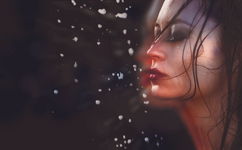
4. Toning
This toning step shows you the inside scoop on Adjustment Layers and how to refine the effects with sliders, layer modes, and brush scattering effects. You can also use the toning within the Photoshop file on one of your own images—just drag and drop it onto your photo and resize it to fit the image (if needed). Tweak the settings and create your own “secret sauce” toning recipe for all of your photos.
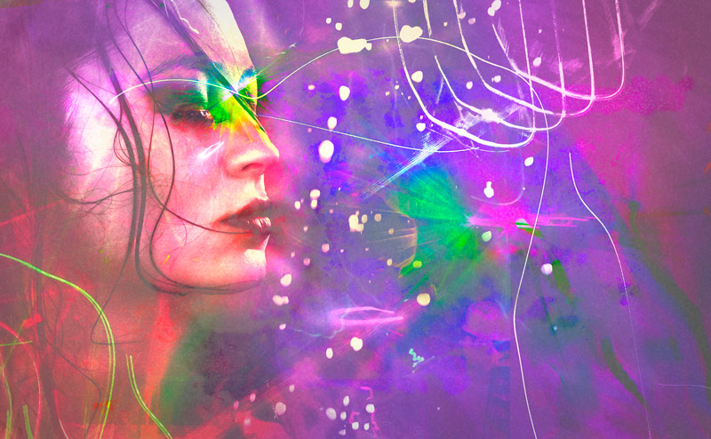
5. Adding Lighting Effects & Dynamic Symmetry
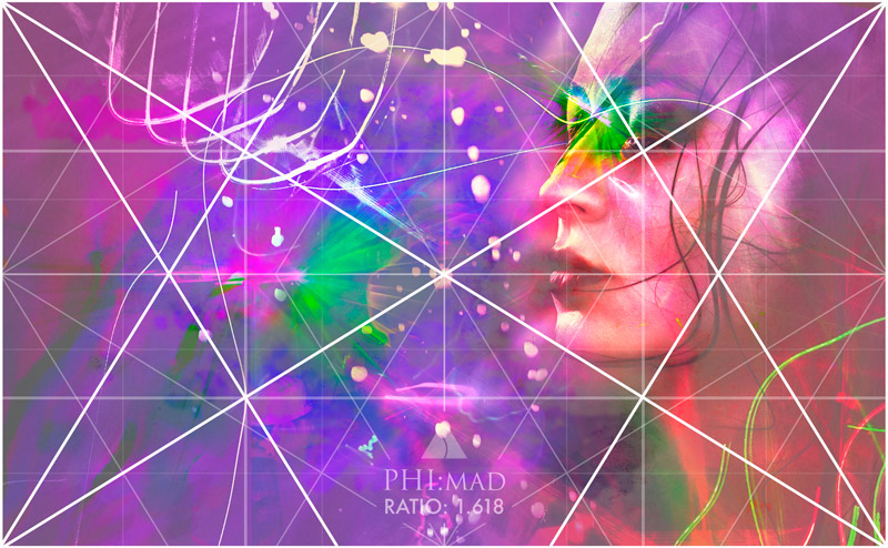
Now we’ll take the images with lighting effects and overlay them onto the image to create unique shapes and colors. We also use the phi dynamic symmetry grid to align the shapes within the image to create more movement, repeating diagonals and geometry (see Day 38). We’ll later see how the grid aligns to everything!
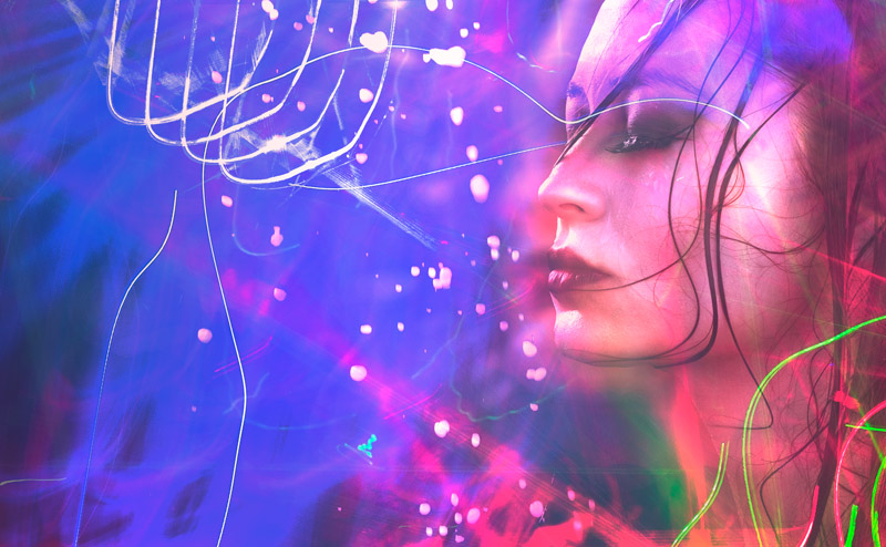
6. Dynamic Symmetry & Color Harmony
In this step we add even more lighting effects, but it’s also to help create more color harmony. We can’t just slap images over our main portrait just to make a colorful image. We still have to pay attention to our design techniques and apply some color theory. To harmonize the colors we have to have an understanding of color hierarchy (see #470) and complementary colors (see #615). This is explained more within the video.
As mentioned before, this image is full resolution, but was snipped at the top and bottom to fit the phi grid. We can see how the model and lighting effects lock in and parallel the grid. The grids are as essential as a measuring tape to a carpenter or a metronome to a musician. They promote techniques and help us organize the composition!
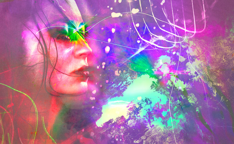
7. Adding Film Grain
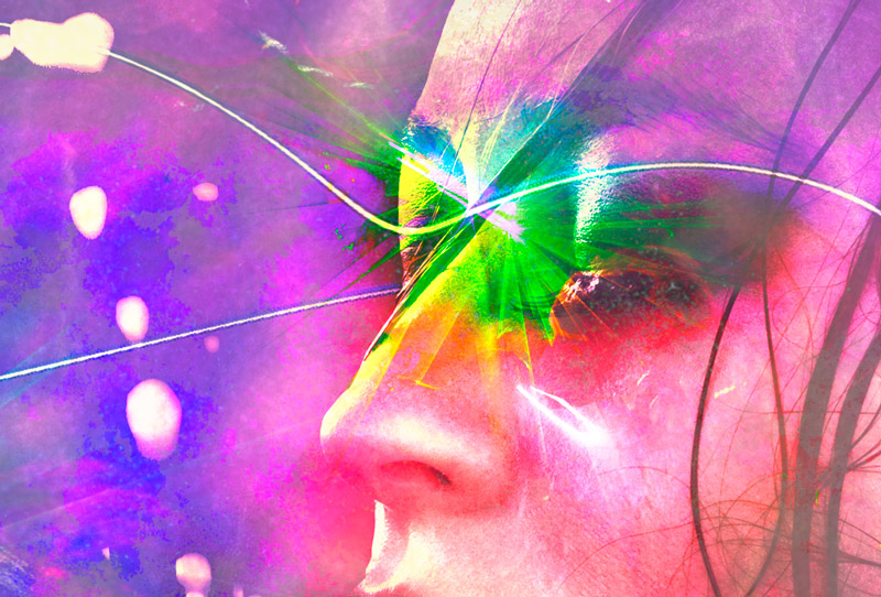
Another great effect to add more of an organic filmic look is to add noise, or grain, to the image. This can easily be done with the noise filter, but there are some things to tweak so it doesn’t look grossly amateurish. In the detail below, we can see the tiny light spots around the dark areas and it helps glue all of the layers together.

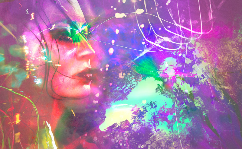
8. Vignette & Edge Flicker
If it’s one thing we’ve learned from master painters (see book), we must be in full control of our contrast. If we’re not, the viewer’s eyes could be bouncing around to unimportant areas of the image like a rubber pinball hyped up on Red Bull. This is especially true for areas with high contrast near the edges, or edge flicker (see Day 49). Some masters allow edge flicker when it leads the eyes back into the composition, but it should always be avoided if you’re not sure how to control it.
9. Selective Saturation
If you’re wanting to make the pixels bleed into the neon-lit chaos of cyberpunk dystopia, the masking technique shown in the video is your golden ticket. Wanna make your viewers feel like they’re stepping into a world where a diabetes-inducing Frappuccino costs $50 but hacking a megacorp takes 10 minutes? Selective saturation is your best friend. The eyes are always drawn to areas that are more saturated and have more contrast, that’s why we can desaturate and lower the contrast in certain areas to create more depth and mystery—understanding aerial perspective (see Day 42) and the greatest area of contrast (see Day 27) will help your compositions in the same exact way.
10. Gazing Direction & Flipping
The final step should sometimes be the first step. You should always have an understanding of how we read left to right and how it can affect the way people view your image. The gazing direction (see Day 99) of the image can be flipped to see if the movement of the image is improved. In this case, we see more movement that helps the composition.
Bonus Techniques
In the video, I added some bonus techniques to show you how to use the additional lighting effects within the download. In this one, we use a masking technique over a new image and align it to the grid to add even more cyberpunk aesthetic to this ultra-futuristic photo. This distracts from the model a bit because of the high contrast, but it could be a good technique if you’re wanting to add a logo or text to the image in a stylistic way with readability.
This one uses the lighting effects captured within a rainy city street to make the model look like a cyborg. There’s so much you can do in Photoshop!
Conclusion
By the end of the video you should have a great understanding of Photoshop shortcuts, layers, adjustment layers, pen tool, brushes, clone stamps, layer modes, layer masks and more! Hopefully you’re full of inspiration and pumped up to create your own unique masterpiece! Please feel free to comment below or send me an email from the contact page if you have any questions or issues with the download.
Thanks again for the support, see you in the next one!