Create Killer Compositions Like Kubrick (The Shining Analyzed)
#677
Welcome back everyone! Thanks for joining in for this hauntingly good analysis!
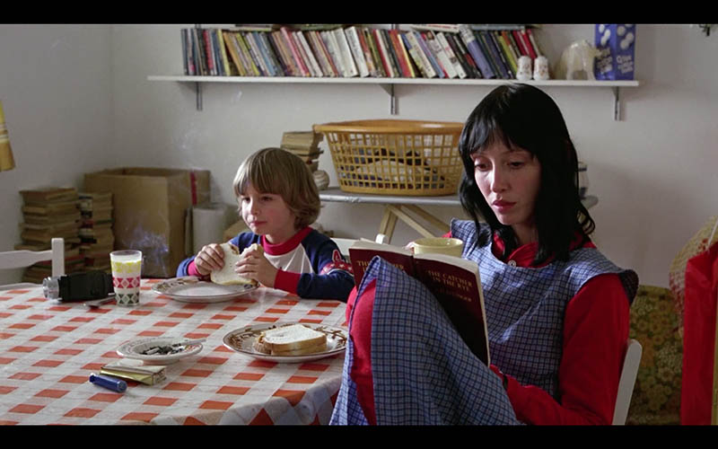
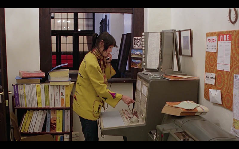
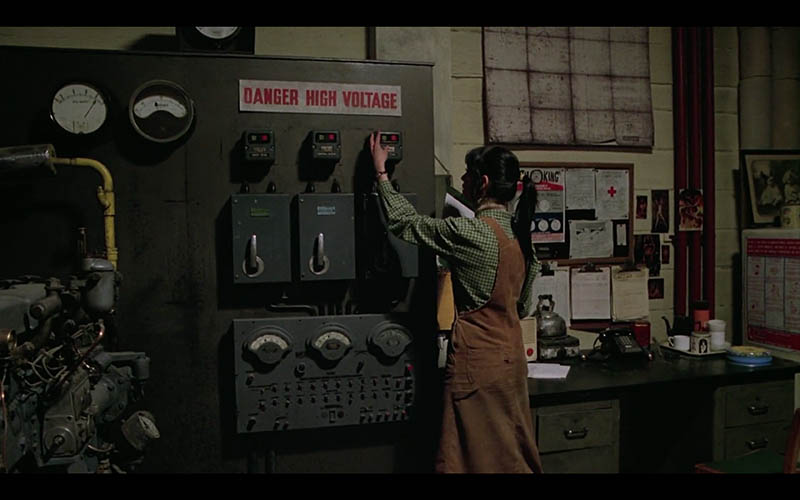
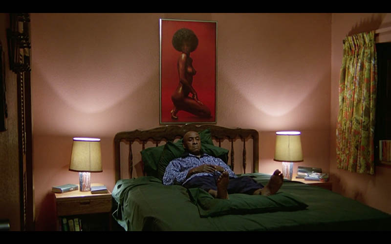
Today we are going to delve into the depths of Stanley Kubrick’s “The Shining” to discover how he created his amazing compositions. What grid can be used, how much was the original film cropped, what colors and design techniques did he use? Learn all of that and more below!
Video The Shining Analyzed
****SPOILER ALERT – YOU’LL SEE LOTS OF AMAZING SHOTS FROM THE MOVIE!!****
Anyone that has been bored enough to read the About section of this site will know I’m a huge Stanley Kubrick fan (see #426). His films are what inspired me to shoot video and photos in an artistic way. That’s why it’s so exciting to be digging deep into “The Shining” and discover how Kubrick created such killer compositions!
Although this classic horror movie is scary to some, I’ve seen it so many times it’s become a hilarious dark comedy to me. Jack Nicholson’s acting and facial expressions are quite comedic, and it adds so much to his character.
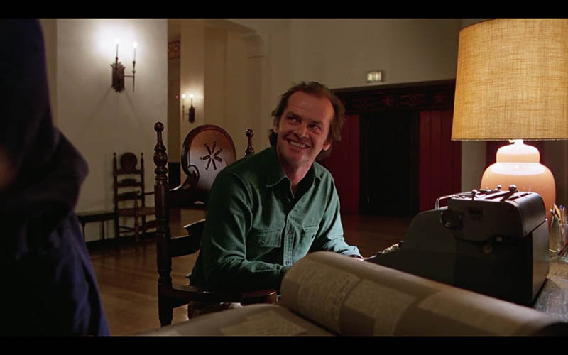
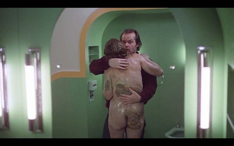
After digging deep into the movie, you may realize the excellent character development presented in Jack Torrence. The psychology of his character is that he’s a loser drunk on the wagon that is physically abusive to his son and verbally abusive to his wife. In the movie you’ll see him slacking as a writer; throwing a ball rather than working on his book. He fooled everyone into thinking he was working hard, all while he was writing the same phrase over and over again; “all work and no play makes jack a dull boy.” It doesn’t get lazier than that! He even shows more affection to a disgusting naked-ghost-lady than his wife.
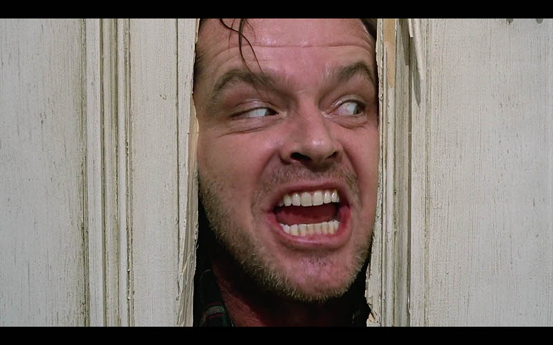
His wife treats him with nothing but respect and gives him room to write, but his own short comings are blamed on his family instead of taking credit for his own actions. Such a horribly great character development!
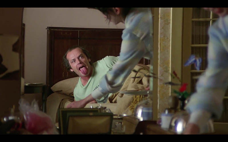
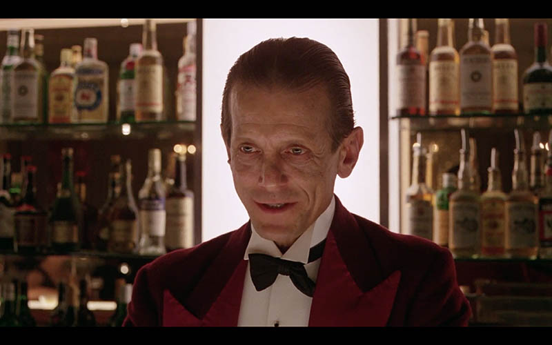
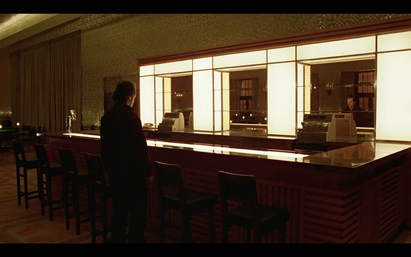
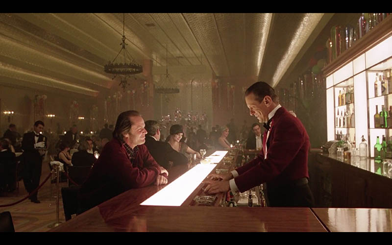
This scene at the bar is absolute gold as he talks to Lloyd, the imaginary bartender. Or is he a ghost? Watch Jack’s acting and facial expressions when he’s explaining what happened to Danny; he does it all in almost one take, which is amazing!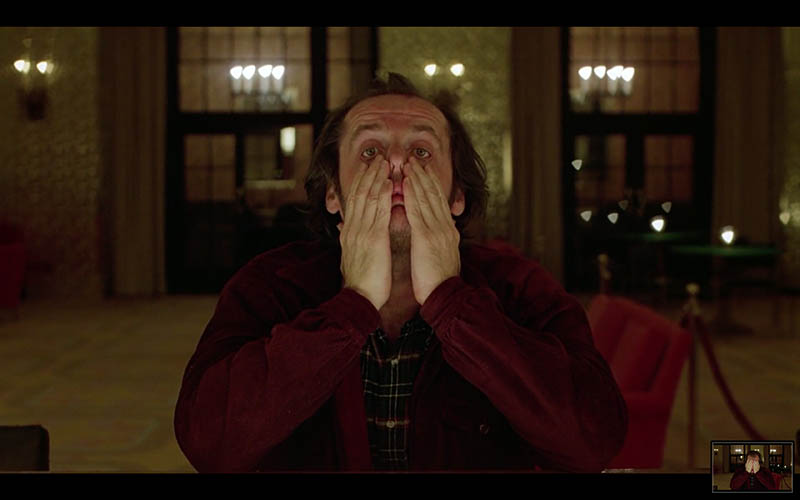
Analysis Video
Here’s the full analysis video with Kubrick’s excellent compositions pointed out. Learn these techniques so you can apply them to your own movies or photos! Be sure to keep scrolling down to see tons of images and analysis.
The Shining Analyzed
Dynamic Symmetry
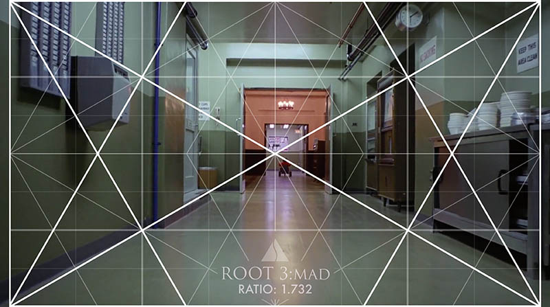
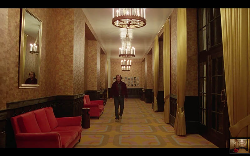
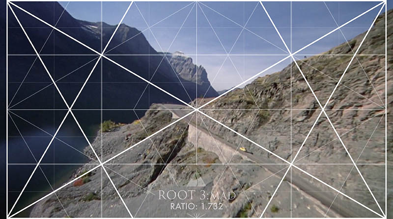
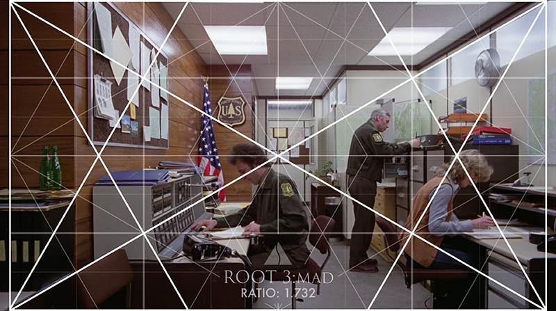
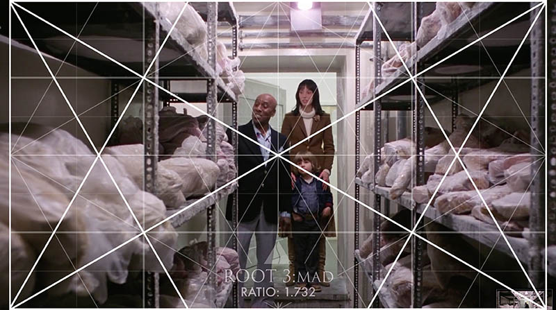
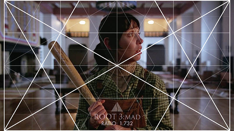
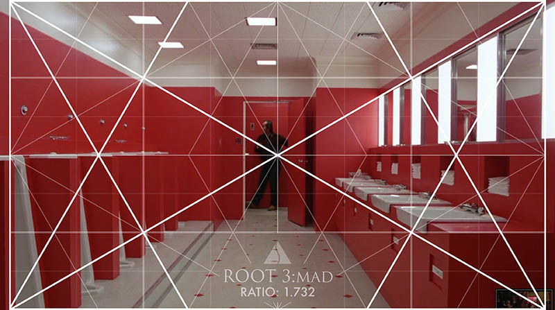
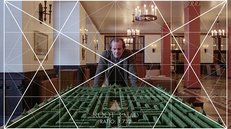
First off, we should establish the cinematic ratio Kubrick used originally and what the cropped version looks like. Kubrick was very strategic (i.e. severe anal retentive) with his films and he planned for a lot of things that most people won’t catch. If you’ve ever watched some of the conspiracy videos on YouTube surrounding The Shining, you’ll know what I mean. He shot the movie with a 1.37 ratio (very close to 4/3 grid – 1.333 ratio), and planned for it to be cropped to a wider format (equivalent to the root 3 grid with a ratio of 1.732). You can see these comparisons below.
It’s recommended to watch both the original DVD format and the cropped format to see how the compositions line up. The DVD version looks great in these long hallway shots!
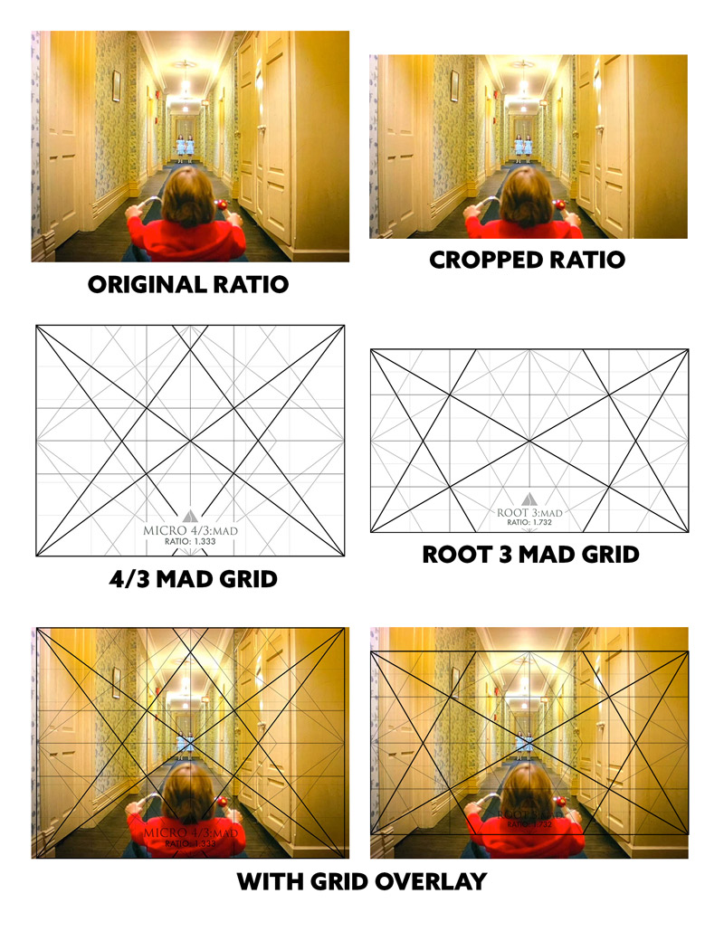
If you’re watching the DVD version, this first establishing shot (see Day 267) will have the shadow of a helicopter in the bottom right corner. A movie mistake, but not if it was planned to be cropped off to this wider format (see it in the video above).
Check out the other screenshots with the root 3 grid and see how they line up. We can use grids on our cameras exactly as we see here!
Centered Shots
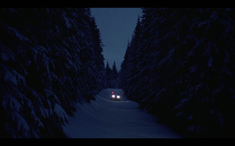
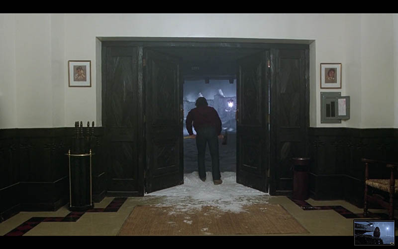
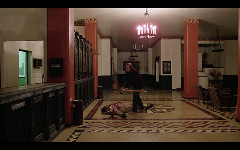
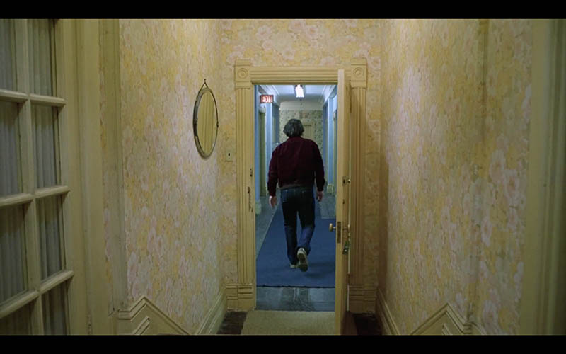
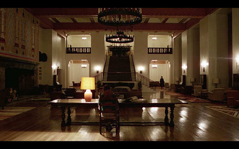
Kubrick loved using one-point perspective in his shots (see Day 260), which is why we get a lot of images centered. Hey, I thought the center of the image was bad?! Isn’t that why the rule of thirds was invented? Is Stanley “breaking all of the rules?” (see Day 396 & funny video)
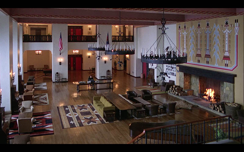
Let’s just say Stanley is concerned with the shot as a whole rather than plotting the subject in a certain crosshair. The diagonals he captures with his one-point perspective shots look glorious, don’t they? Plus he’s creating excellent balance, a very important technique to include in your shots (see Law of Symmetry).
Color Theory
Next up we have color! If you’ve checked out Van Gogh’s color theory (see #470), you’ll know that the masters usually include variations of four colors (red, blue, yellow, green) in a hierarchy. This gives them color balance and harmony. When we apply this to cinematography, we achieve the same goal.
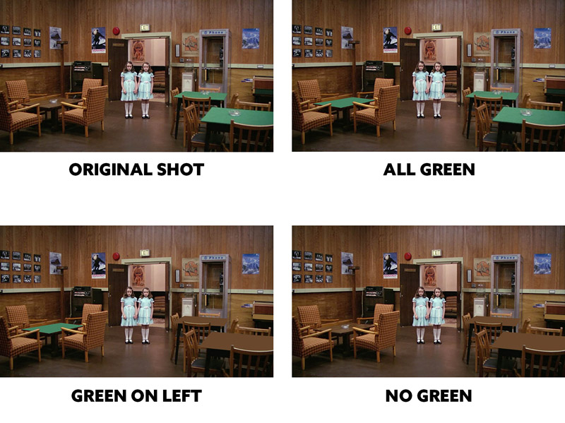
Here we have a few comparisons of how the green in the shot can affect the image or redirect our eyes. When all of the tables are green we get more balance from left to right. When it’s on the left, our eyes are redirected to the left side. When the green is missing, we lack the harmony. You see, the set designers know what they are doing! We’ll see this type of color theory in almost every shot.
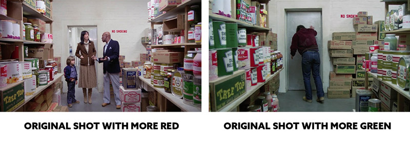
The way the color works in the shot can depend on what the characters are wearing…not just their surrounding environment. On the left we have the environment more red and this could be the set designer adjusting the color balance for the characters blue and neutral outfits. On the right, Jack is wearing red and blue, and the environment is more green with a splash of yellow. Interesting, right?
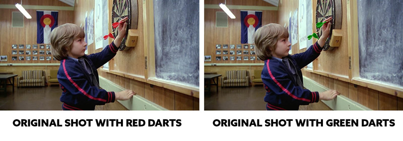
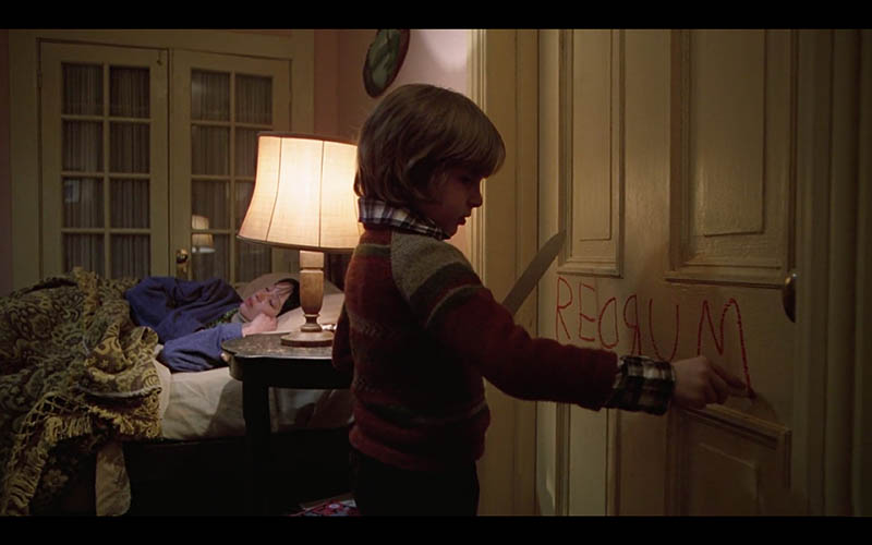
Red plays a huge role in this classic horror film, so try to hone in on where it’s used. It could be relating to danger, or it could just be directing our eyes and helping the color balance. What if they replaced the darts in this next shot with bright green darts instead? In this case, the red helps because it is a warning of what’s to come seconds later. The green is more friendly.
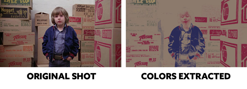
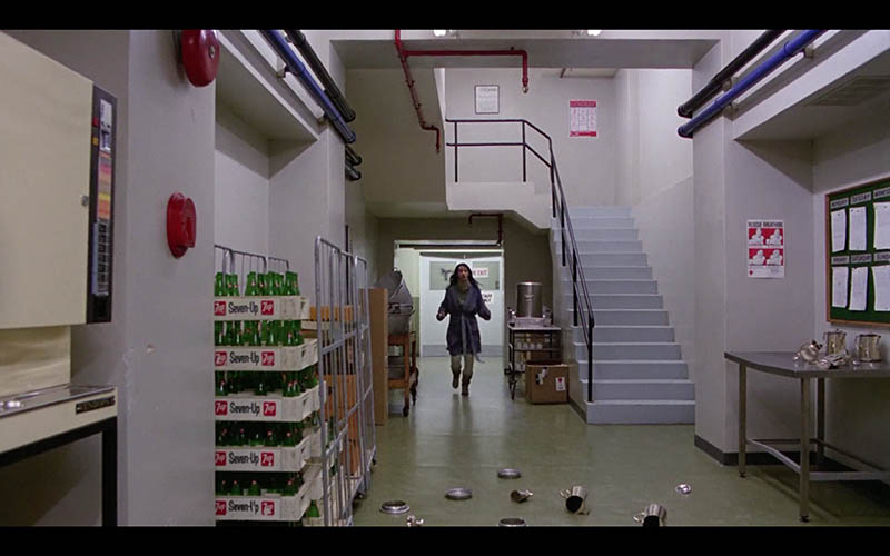
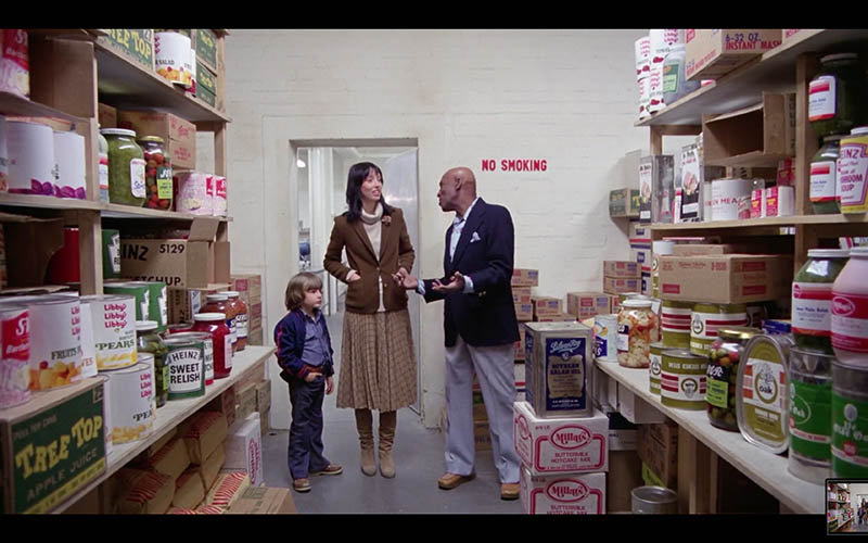
In this shot, when Danny is starting to “Shine” in the pantry, he is surrounded by red labels. This is also another visual warning for us. We can see in the illustration on the right how the four colors are within the shot, but red holds the majority. Kubrick and the set designer planned this, it’s not just coincidence.
This iconic shot of “fruit punch” pouring out of the elevators is another example of how they planned the colors. In most of the scenes so far, we’ve seen a balance and hierarchy of the four colors. In this case, they’ve eliminated most of the colors except for red. Why? Because it adds to the horror!
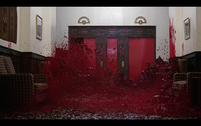
Figure-Ground Relationship (FGR)
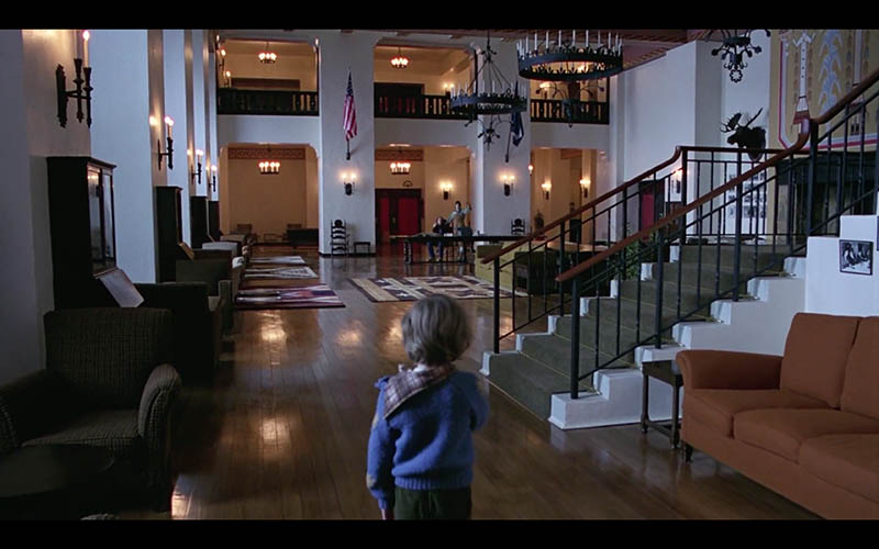
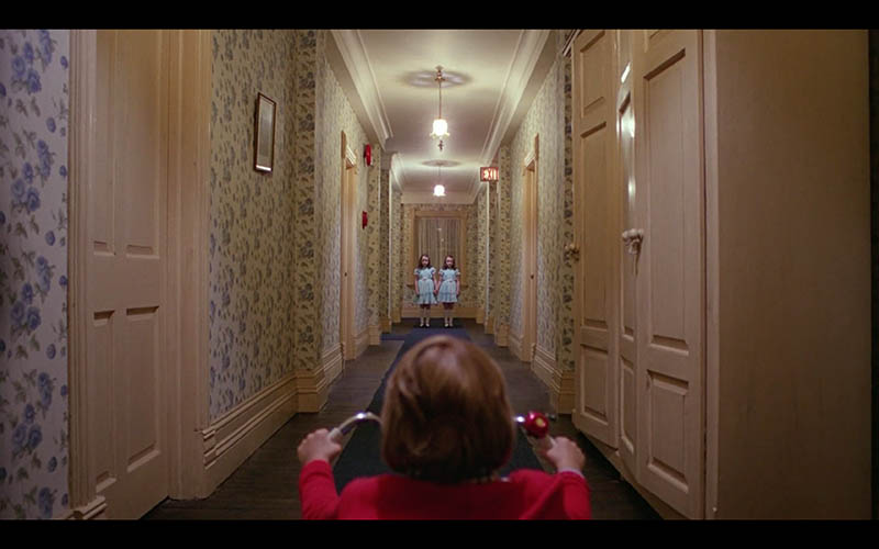
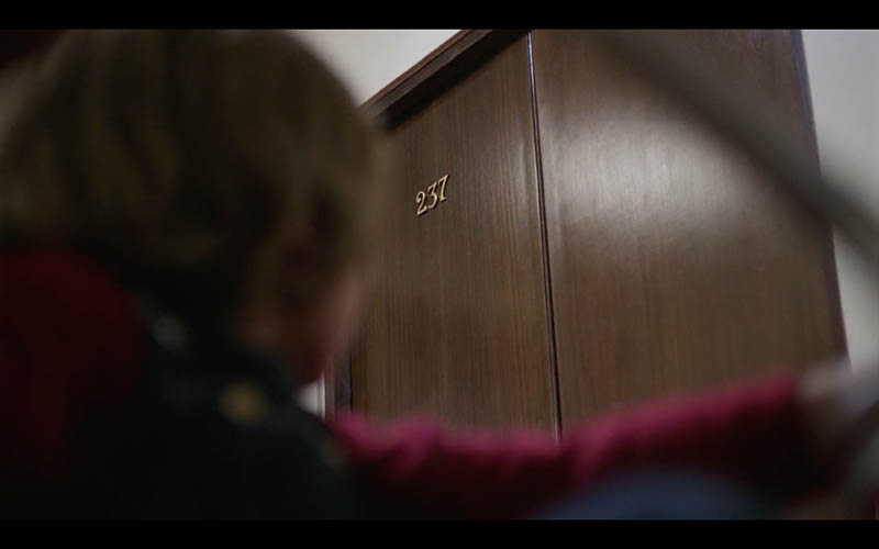
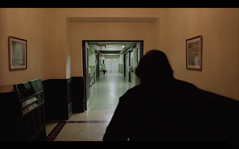
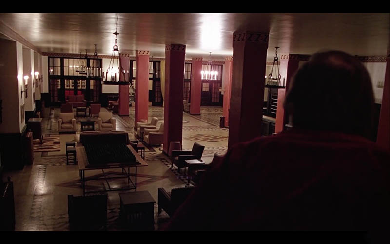
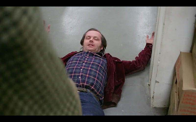
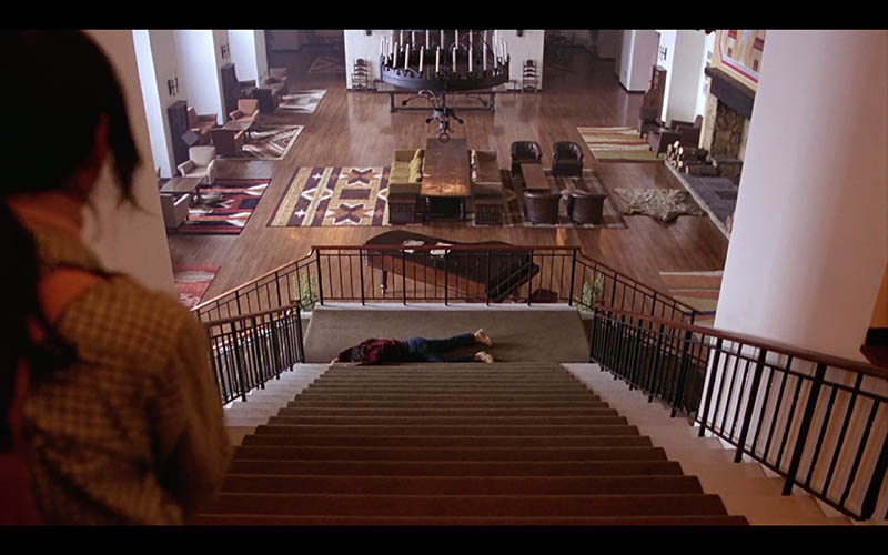
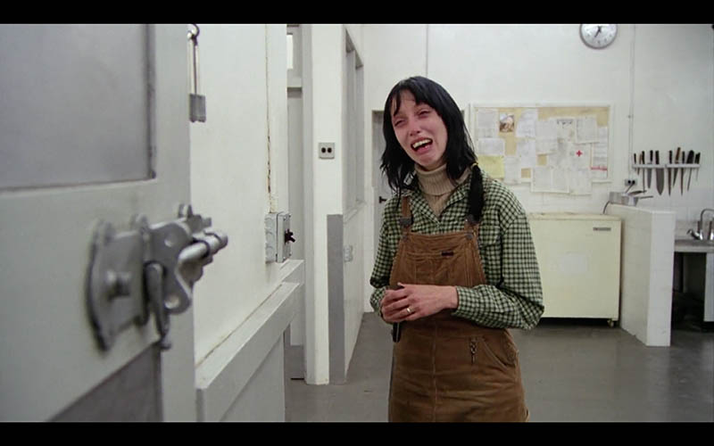
Another excellent technique you should always be practicing is FGR (see Day 21). If you’re not paying attention to the way the subject fits into the background it will usually affect the visual clarity. We can get lucky, sure, but luck doesn’t provide us with consistency. Pros and masters are consistent.
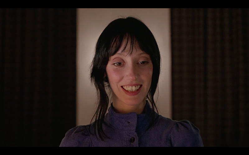
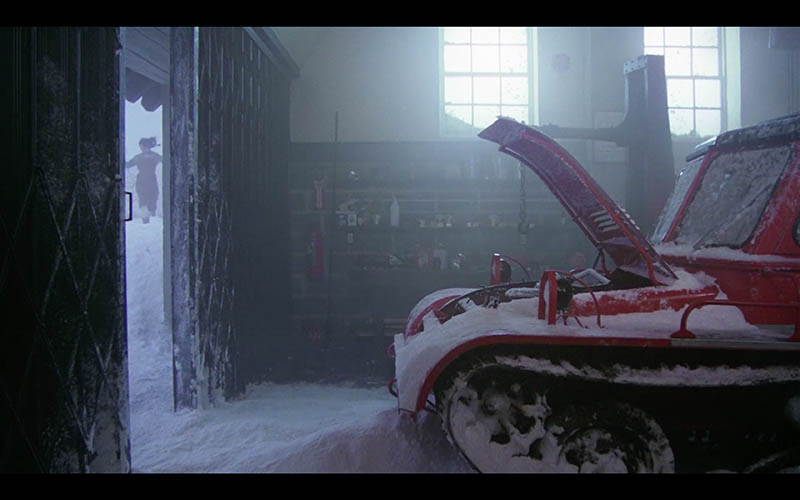
Check out all of the great ways Kubrick incorporates this technique. So many good ones!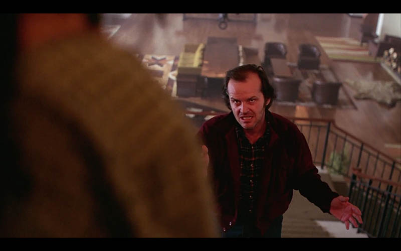
Aspective View
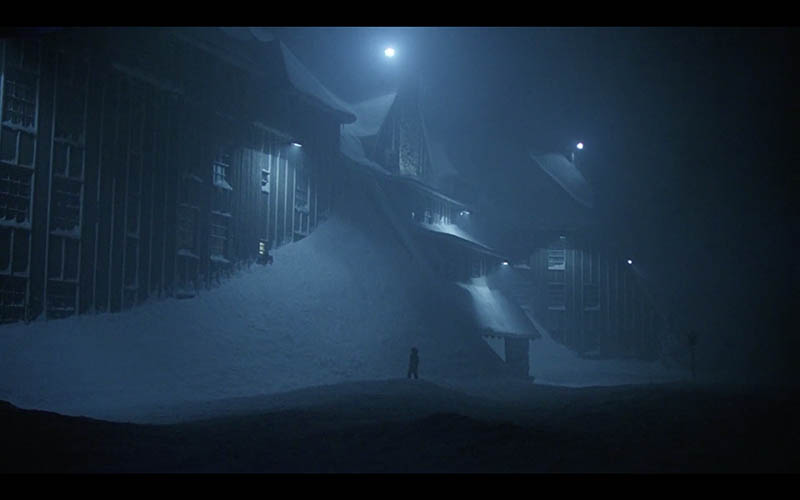
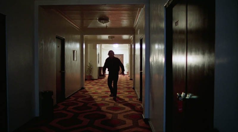
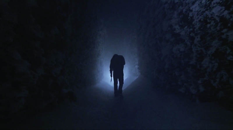
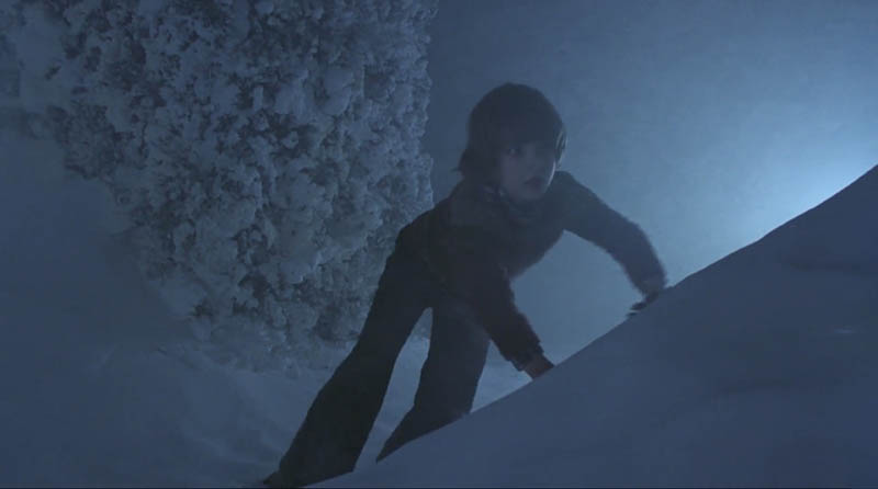
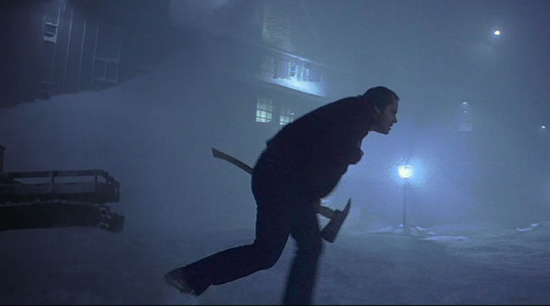
Stanley sets the mood of the movie with dark scenes and directional lighting (see #489), so he uses an aspective view (see Day 78) to help identify the subject. This is a great technique which a lot of street photographers use, but also anyone trying to describe a silhouetted figure.
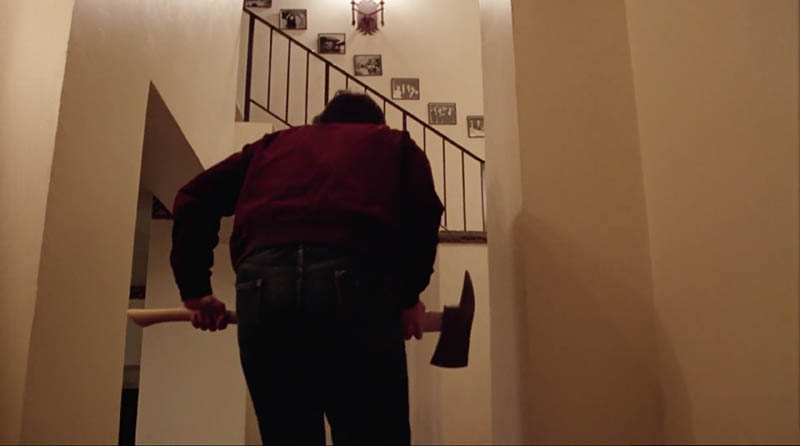
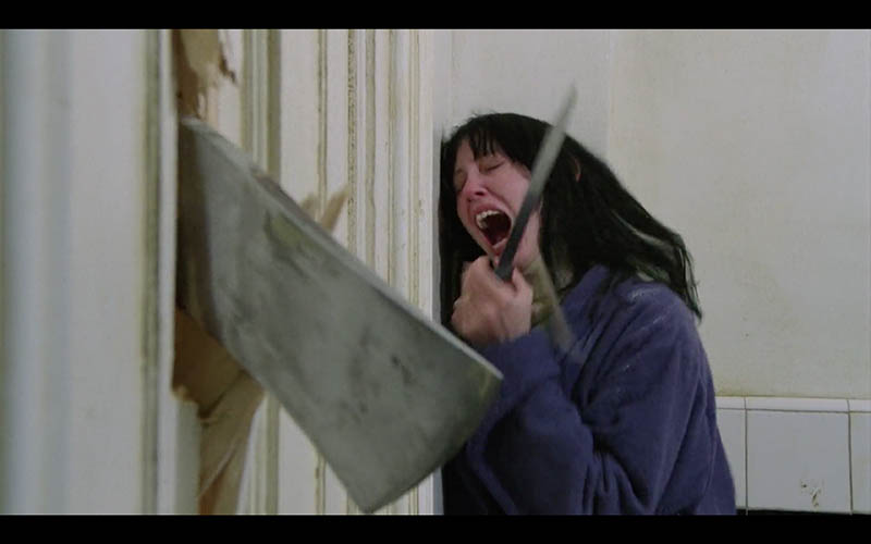
In the images below we can identify the characters in the scene as well as the axe Jack is holding. It all ties into the composition to create an epic shot!
Separated Shapes
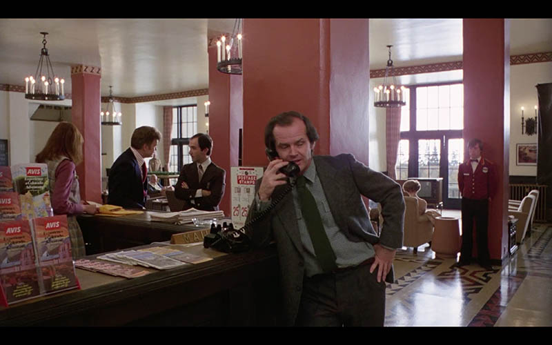
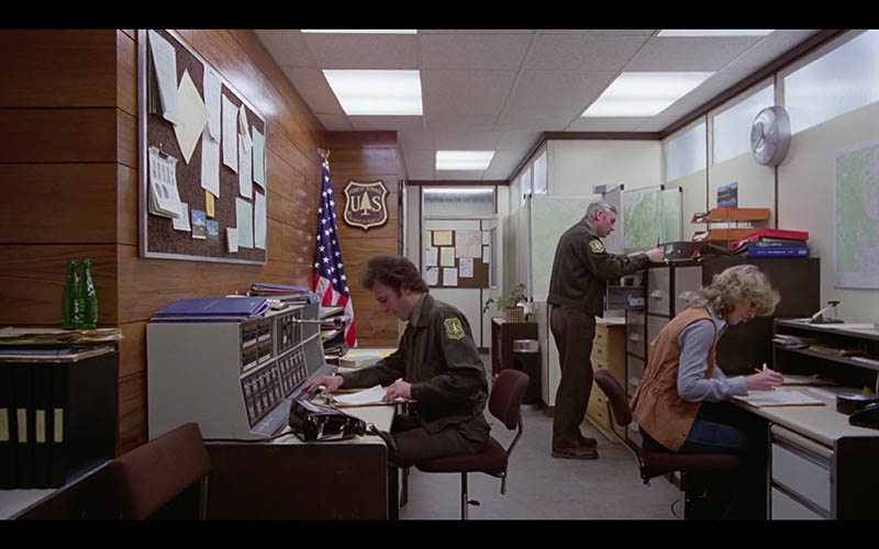
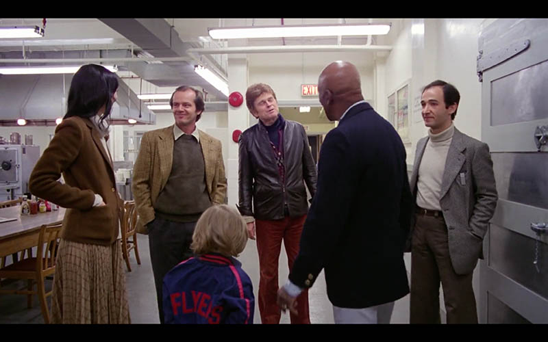
When you have multiple subjects within a scene you can use separated shapes (see #374) to help the viewer easily see everyone. These characters can be closer and further away from the camera as long as they are separated and fitting into the background nicely. Seems like an easy techniques to achieve with obedient actors, but painters and photographers have a more difficult time separating while also having nice FGR.
Aerial Perspective
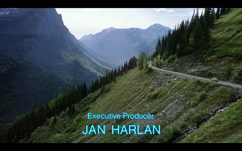
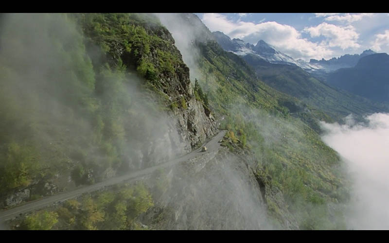
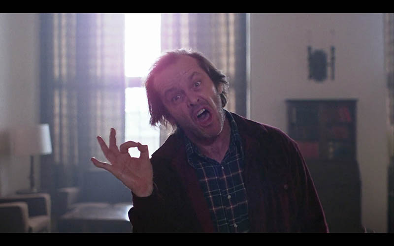
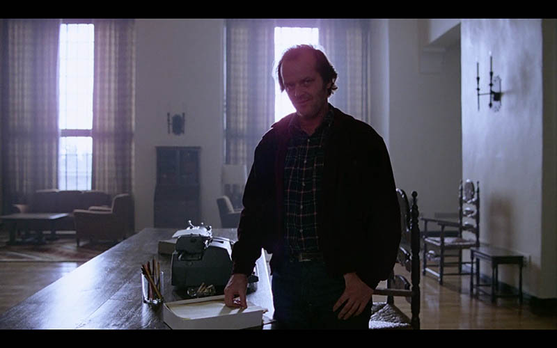
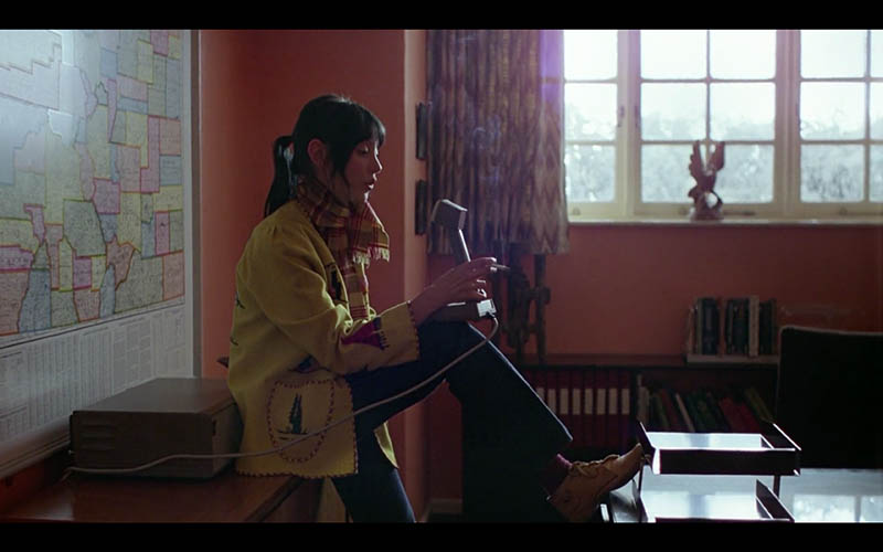
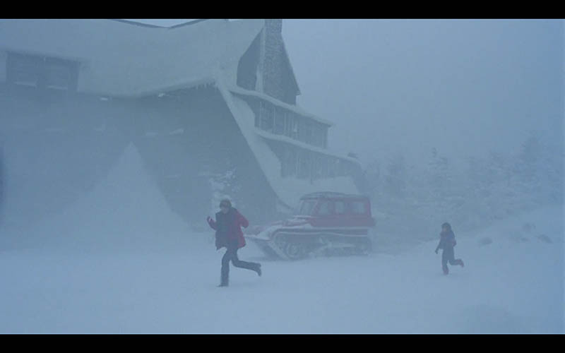
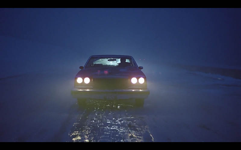
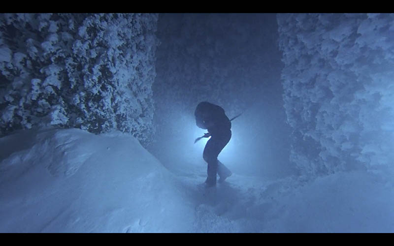
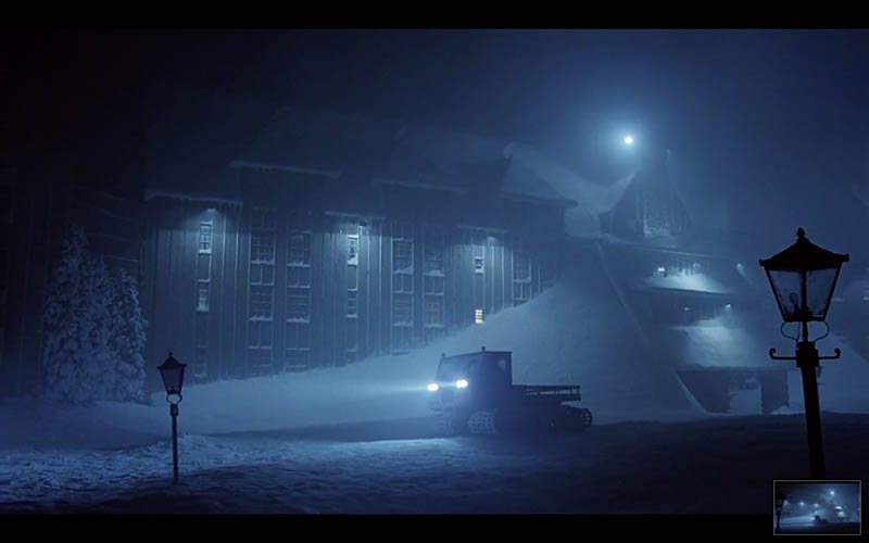
Kubrick is able to capture some excellent depth in these next shots thanks to aerial perspective (see Day 42). Sure the clouds and distant mountains are easily achieved in nature, but you can also capture lens flares and manipulate lighting to create this illusion of depth too.
Counterpart
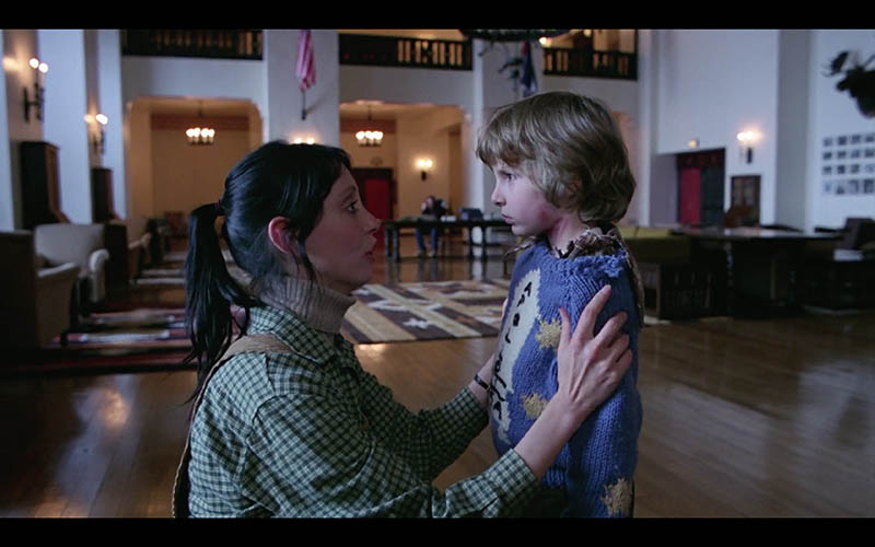
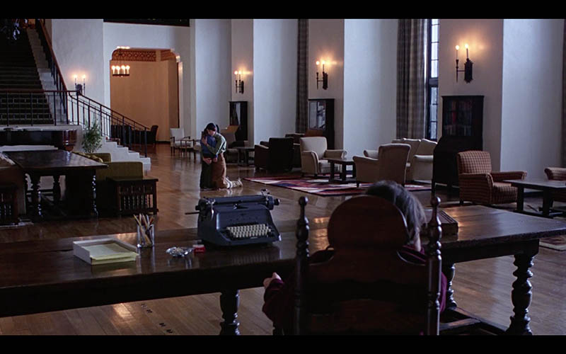
We already mentioned how Kubrick creates nice balance with his one-point perspective, but he also uses counterparts to help with this (see Day 57). When we use the center of the frame as a fulcrum, like a teeter totter, we can achieve balance from left to right.
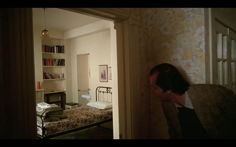
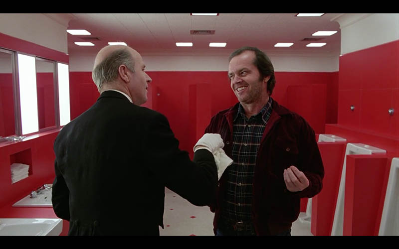
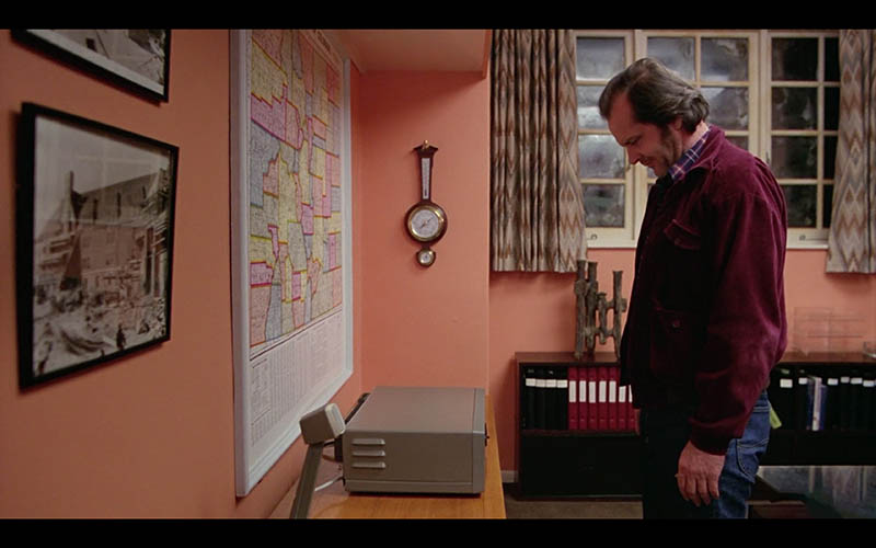
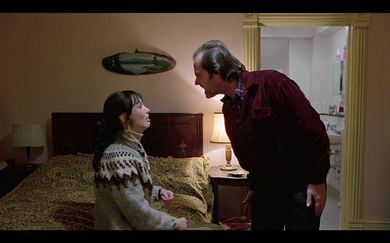
In this first shot, and the others, we can see how Kubrick splits the frame down the center and adds points of interest to each side. The gazing direction (see Day 99) of the characters adds visual weight, so that’s another important technique to understand.
Mirrors
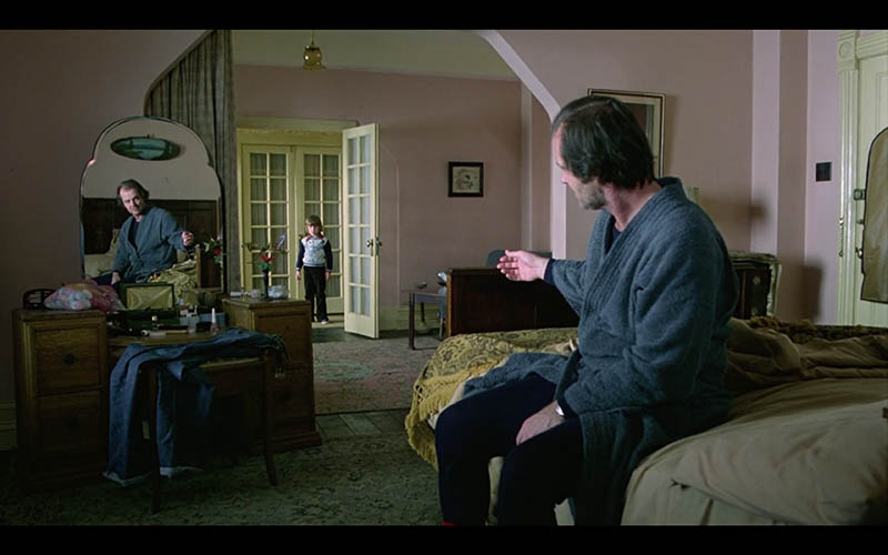
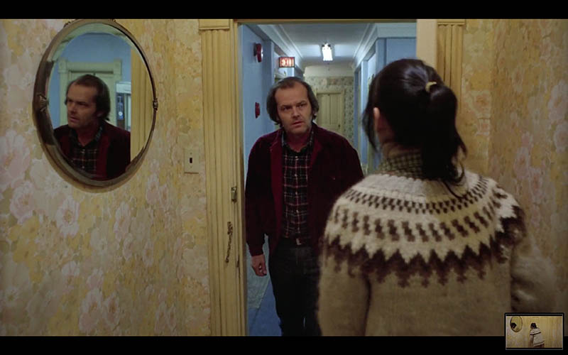
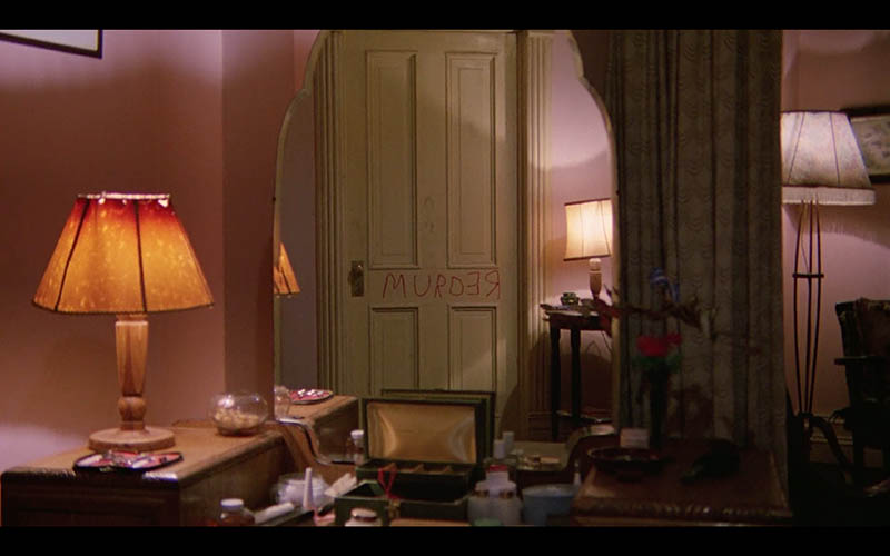
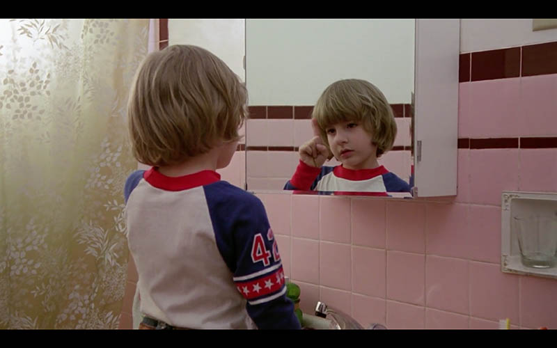
What would this movie be like without the use of mirrors? Probably not as creepy! It definitely adds that sense of mystery, but also adds depth (see Day 238).
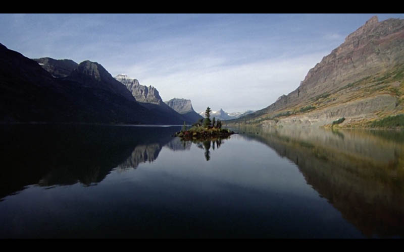
This first reflecting shot of the water is like a mirror, and it adheres to the Law of Symmetry. You’ve made it this far, so as you scroll through these mirror shots try to notice how Kubrick is framing it. Is he using a counterpart? What colors are present? Does he capture nice FGR? Try to put your knowledge to the test!
Change Elevation
It’s always a great technique to show the viewer another perspective while creating your art. In this case, Kubrick changes his elevation to dramatize the scenes. Get low, get high, do whatever it takes to mix things up and give the viewer something other than eye-level shots.
Other Techniques
There are several other design techniques you can apply to cinematography, photography and painting. We’ll see some of them below like this ellipse (see Day 34) they created with the background and foreground. This creates unity and movement around the shot.
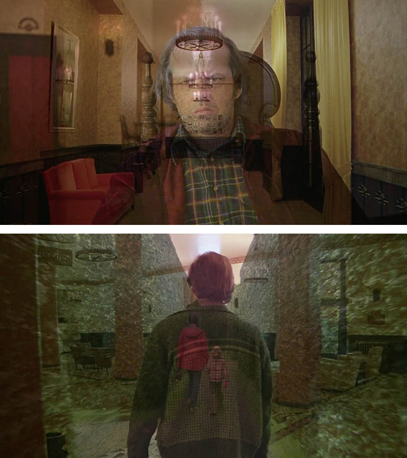
Kubrick cross dissolves many of the scenes and you’ll find some pretty entertaining double exposures…much like the opening credits of “True Detective.” (see Day 277)
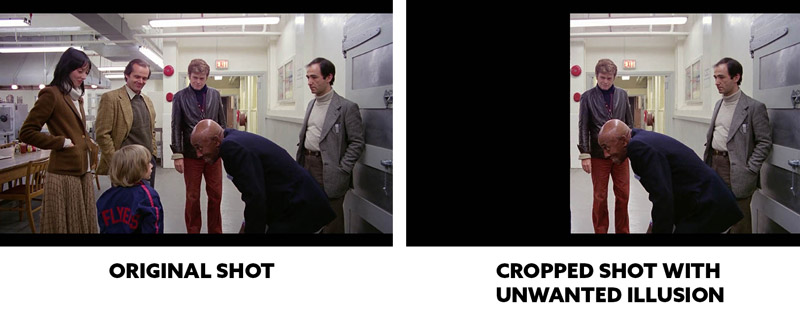
If you’re familiar with Gestalt Psychology principles, then you’ll know that the Law of Pragnanz (see Day 55) is responsible for creating a lot of illusions. Salvador Dali used this technique all the time!
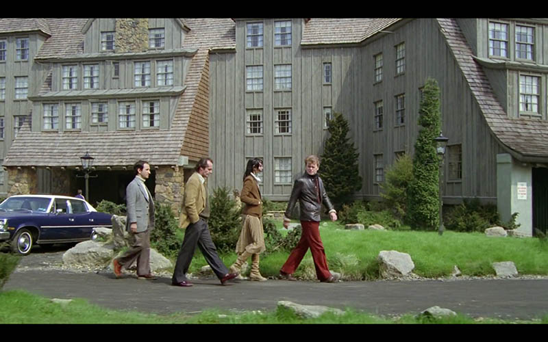
In this next shot, we see a rather funny situation. It’s not so bad since this is a movie and not really the final product, but if this were a photo or painting it would be much different. When we look at how the shapes are interacting with each other, we see that the three characters on the right are creating a humorous illusion. Something to always be aware of when you’re piecing together the elements of your composition. Street photographers hunt for these kind of confusing shots to create a funny story.
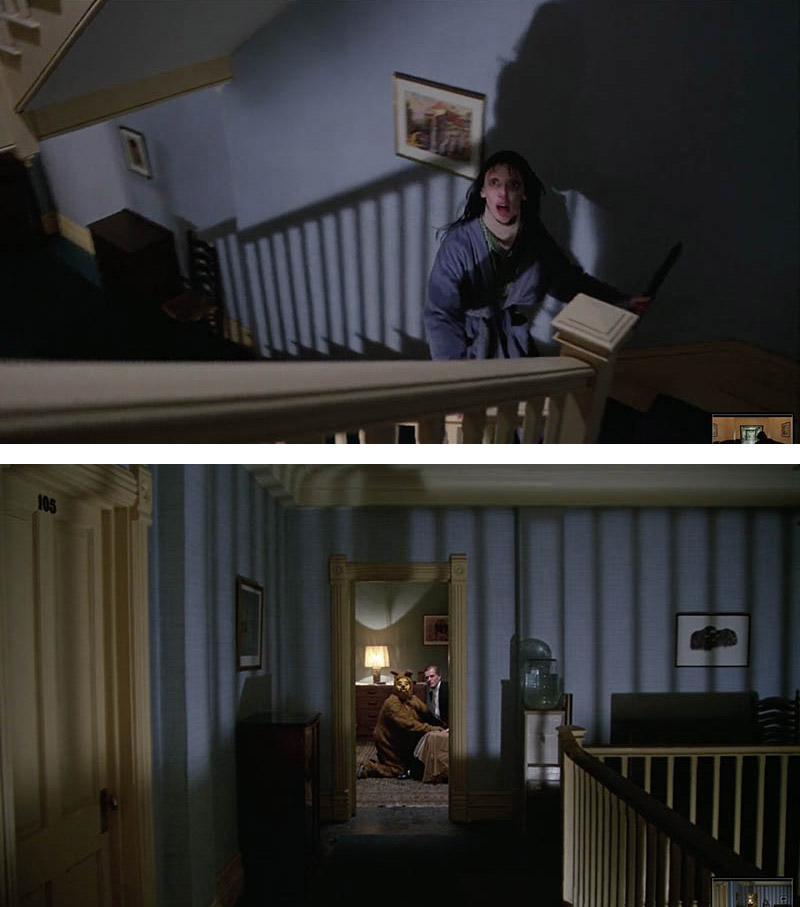
Kubrick uses lighting to create spooky shadows in these next shots. He even incorporates a pattern with the shadows and railing for rhythm and unity (see Day 189).
Conclusion
Whew, that was another epic article! Did you survive? Be sure to check out the video above, subscribe on YouTube… all of that stuff. It helps out! Take notes of the techniques Kubrick used in The Shining and try to apply them to your own videos or photos. They work with almost every visual art, so you can’t go wrong. These techniques will benefit you your entire art career! It’s much tougher to apply your knowledge rather than looking at the pictures, but I know you can do it. Take baby steps if you need, but steps you must take!
Thanks again for the continued support, it keeps articles like this flowing! See you in the next one!

