Deborah Turbeville Best Compositions (ANALYZED PHOTOS)

#622
I hope you’re all doing great. Welcome back and thanks for showing your support!
Today we are going to look at some of the best compositions by fashion photographer Deborah Turbeville. Who was she and what design techniques did she frequently use in her photos? Let’s find out now!
Deborah Turbeville? Who Was
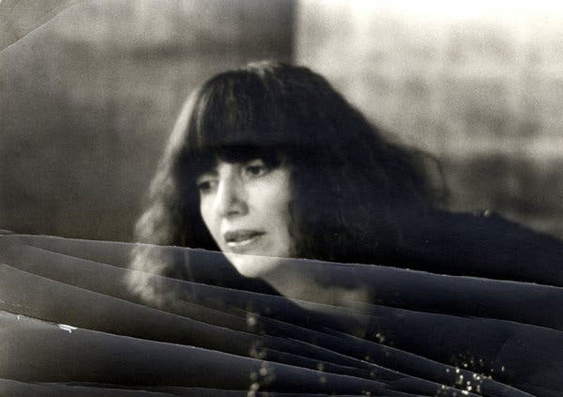
Deborah Turbeville started out as a fashion editor at Harper’s Bazaar, a women’s fashion magazine, but later became a photographer. She was well known for her artistic style (see Day 122), which was considered edgy for the 1970’s. The critics remember her for transforming fashion photography into avant-garde art.
Deborah was timid and shy as a child, and pulled a lot of her inspiration from her child-like ways. Her mother surely had something to do with her desire to create unique images. Her mom would always tell her, “don’t ever try to be like others, strive to be yourself, be original.” This is something I can definitely relate to and try to share with other artists (see Day 133). Originality is an uncomfortable path to go down, but it’s how most remarkable artists are remembered. If you’re not original, you’ll have to be extremely exceptional because you’ll have tons of competition.
In 2013, at the age of 81, Deborah passed away from lung cancer. Thankfully, her stylistic photos remain to give us clues as to which techniques she used to create them.
Digging Deeper Analyzed Photos
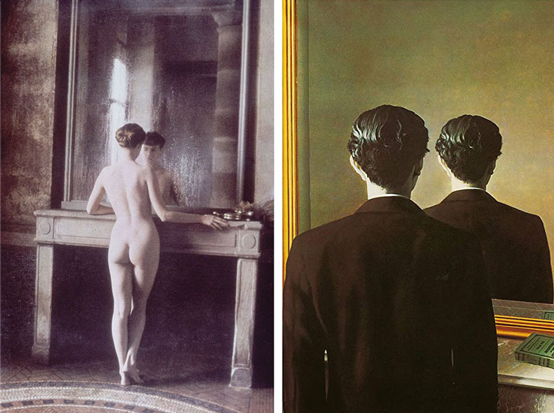
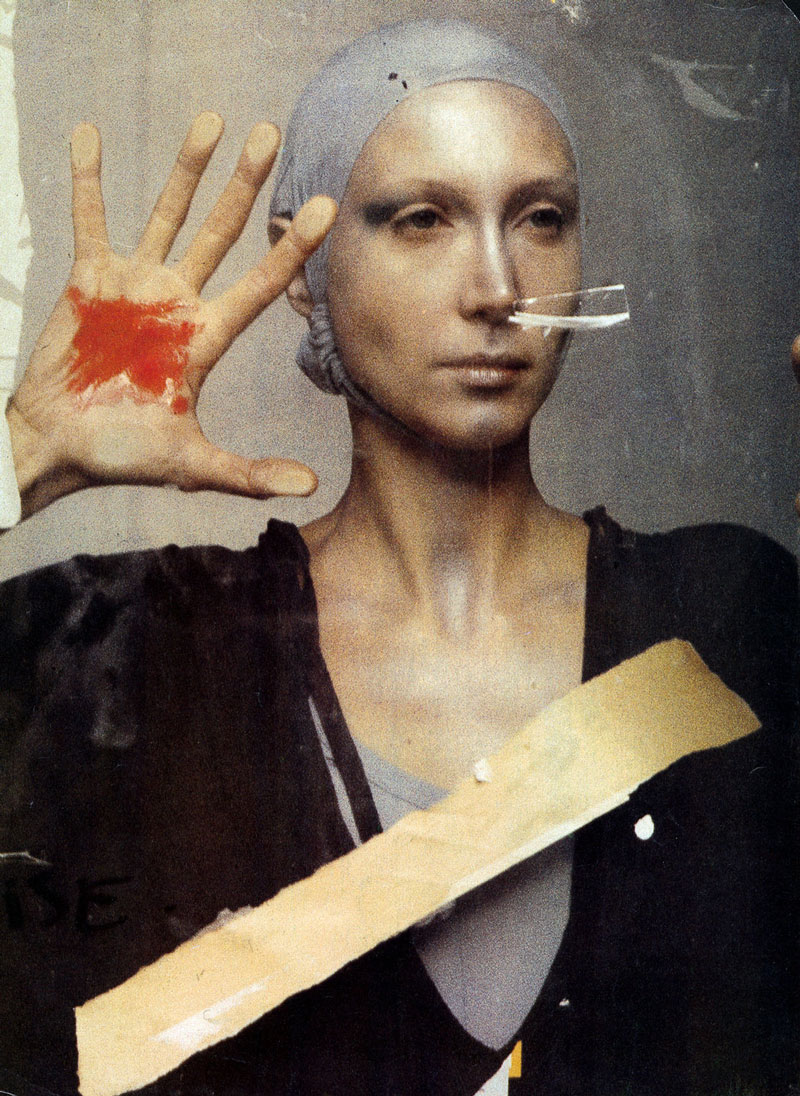
As most of the Master Pass members know, the best photographers learn from master paintings. This goes for Annie Liebovitz (see Day 2), Gregory Crewdson (see #505), Ansel Adams (see Day 293), and more (see Analyzed Photos). Here we see Deborah Turbeville getting some inspiration from the surrealist artist, Rene Magritte. This master painter died in 1967, right around the time Deborah was becoming a photographer.
She shows more of the figure in her version, but we can definitely tell who inspired this shot.
If you haven’t analyzed any master paintings for design techniques, it’s highly recommended. This can’t be stressed enough. You can see a ton of them in this quick clip of the Gestalt Psychology video collection. The video shows the vast knowledge you can gain from studying master painters. We’ll see several Gestalt Psychology principles further below that Deborah used in her remarkable photos.
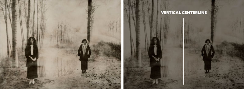
The first technique photographers and painters can take advantage of is balance, which relates to the Law of Symmetry (see Day 57). As you learn about balance, you’ll learn about a counterpart and how they are necessary when shifting a subject away from the vertical centerline. We have to think of the center of the image like a teeter-totter. As areas of contrast move further left or right, we have to counter balance them.
We can see in the image below how Deborah creates nice balance by using the vertical centerline to position the models. Balance is one of the techniques that usually comes naturally to artists, but with certain rules floating around out there (see ROT), it leads beginners and some professionals to put more emphasis on a third rather than overall balance.
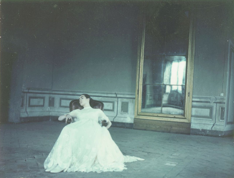
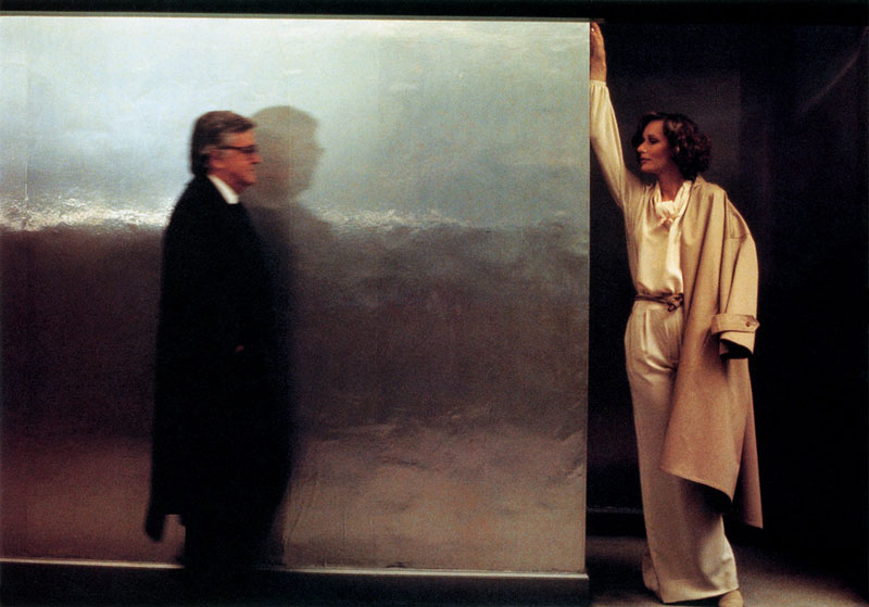
So, if you imagine the vertical centerline in this next one, are you able to see how the contrast is well balanced? Deborah places the model on the left and the reflecting window on the right. Now, if she had the model facing towards the mirror it would help with gazing direction (see Day 99). This would direct attention towards the mirror and further enhance the balance. With the model facing away it creates a story almost as if she doesn’t like what she sees in the mirror.
Speaking of mirrors, we’ll see that Deborah uses them a lot because they have the unique ability to add depth to an image (see Day 238). Cool eh?
Here we can see another example of a counterpart, with nice figure-ground relationship (FGR) (see Day 21) to help clearly identify each subject. She’s also capturing a big silver square on the left side of the frame…this is the building block of all geometry (see #410). Even though it may not be a perfect square, we perceive it as one.
This example shows similar play with the vertical centerline, where the subjects and areas of contrast are well balanced from left to right. The vertical area of light is almost dead center, acting as a fulcrum.
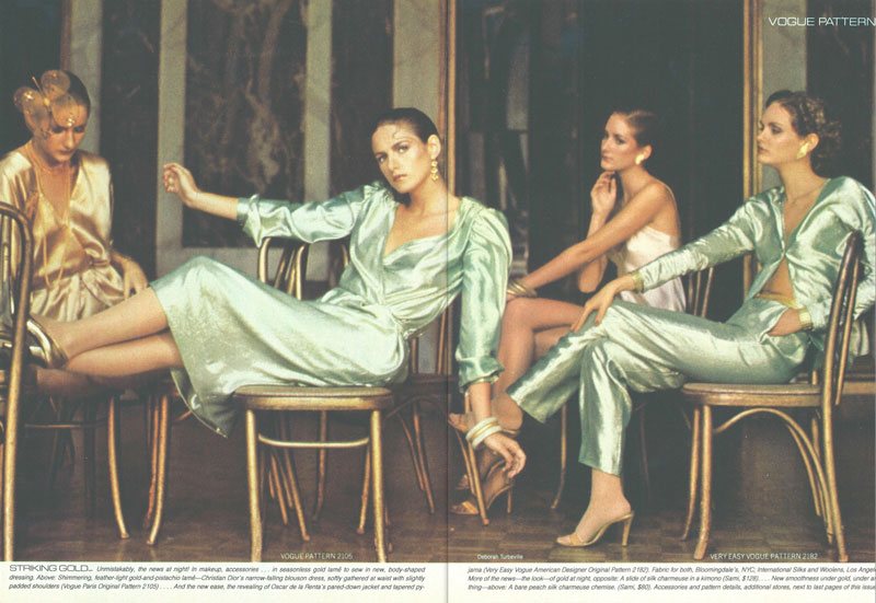
Another design technique that Deborah loved to use was separating shapes (see #374). This is exactly as it sounds; we reduce the amount of overlap between each subject to clearly define them. The nice FGR helps this technique even more, and we can see that the woman in the center is more identifiable than the others.
Don’t believe me? Try squinting and see which one stands out more.
The other three are subdued by shadows. This emphasis on contrast tells the viewer which one is more important. Deborah puts her front-and-center and with better FGR. Nice!
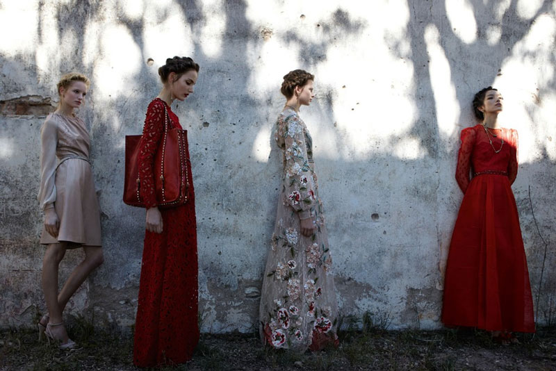
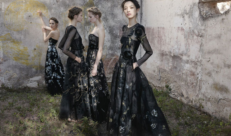
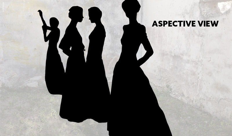
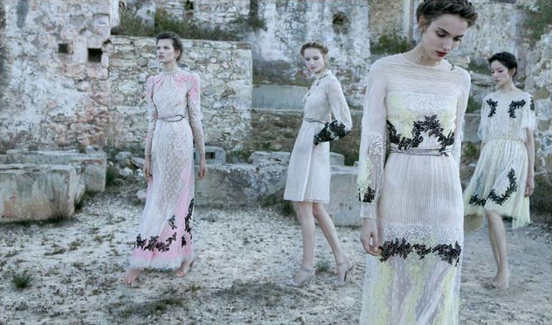
There’s nice FGR and separating shapes in this photo as well. We even have aspective views (see Day 78) in each model. Try to imagine how Ancient Egyptians created their art. The subjects typically show a side profile of the face and/or separated limbs to help identify them. We see that occurring below, where the two in the middle have a side profile of the face, and the outer two have spread arms.
The contrast in the image is very subdued, but if this were four models creating silhouettes against a sunny background, we would see just how powerful an aspective view can be when combined with nice FGR and separating shapes. In the diagram below, we have zero issues understanding that there are four women in dresses. So cool!
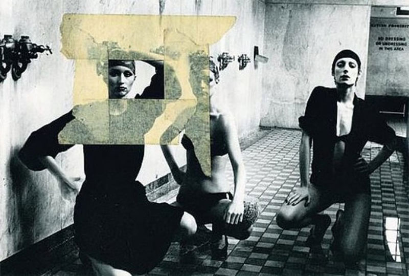
Here we see more separating shapes, aspective view and nice FGR. Deborah knows what she is doing! It looks like she’s added masking tape to the image to show an alternative cropped version.
Yep, you guessed it. More of the same! We are starting to see how Deborah embedded these powerful techniques into her avant-garde artistic style.
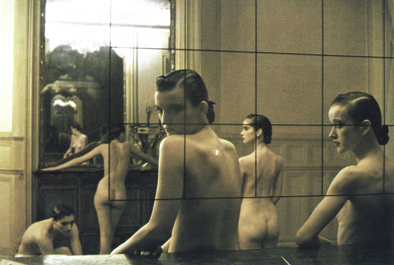
This is another great one that is reminiscent of the Magritte we saw earlier. The double reflection is really cool! If the lighting or image quality were better, we could probably see even more reflections in the “tunnel” of mirrors on the left.
Notice any interesting illusions in this one?
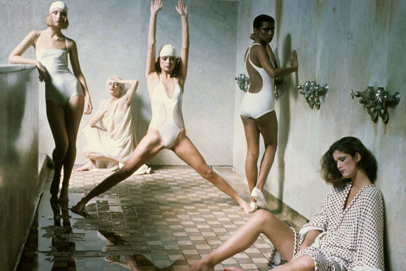
With the model in the bottom right having her knee coincide (see Day 48) with the tan woman above her, it looks like she is standing on her knee. This is the Law of Proximity at work (see Day 59), which can deal with visual tension, or in this case, forced perspective. Know and understand Gestalt psychology principles and design techniques to avoid or create illusions when you need.
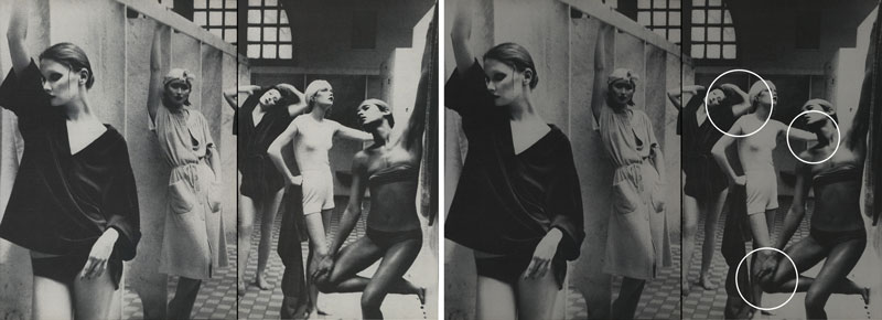
As with any technique, you have to be mindful of areas that trouble can occur. When separating shapes, it’s easy to avoid overlapping mistakes. In this image below, we see a couple of areas that coincide with others to create less visual clarity. Also, with the arm of the woman on the right going into the neck of the other woman it creates some visual tension.
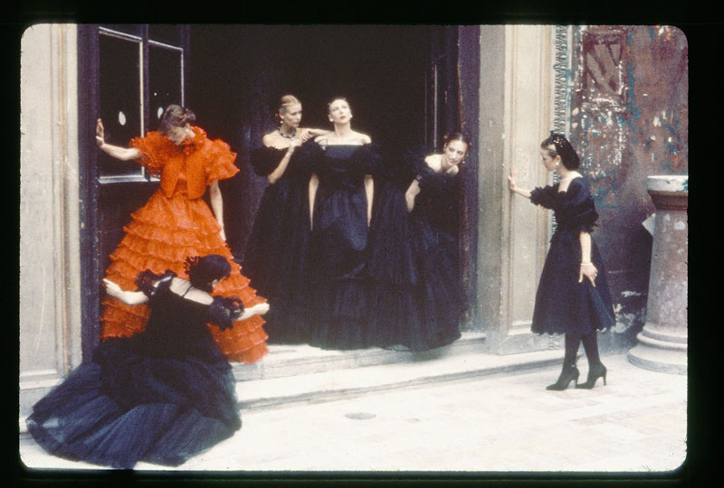
Here we see a nice film photo, where the models are separated with nice FGR on the important areas (the face), but the black dresses are lost in the dark doorway. Not a bad thing if you’re really wanting to bring attention to the woman in red…which is definitely the main subject. Another cool thing to notice is the woman in black in front of the woman in red. Deborah creates an aspective view and uses the dress as a blank background for nice FGR (see #466). Really clever!
In a different shot from the same scene, we see some bad overlapping. This makes the previous image much stronger. Are you starting to see the difference these techniques can make?
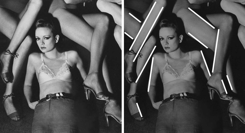
Another great technique every photographer and painter should understand is gamut (see Day 38), or limited number of diagonals. This adheres to the Law of Similarity (see Day 56), and gives us more repetition and unity.
We can see Deborah using the limbs of the models to repeat a limited number of diagonals throughout the image. Great FGR on the main subject as well.
She does the same thing in this image, but also combines it with separating shapes, nice FGR, and aspective view. The more techniques you can add to an image, the stronger it becomes!
Aside from the techniques we’ve mentioned previously, we can see Deborah using the Law of Continuity (see Day 19) to create an arabesque. This adds unity and movement within the image. In a contrapposto pose (see Day 125) it can also add a sense of beauty and elegance.
With Deborah being avant-garde, her experimentations will lead to some flaws. We can learn from this! If we run an imaginary line around the image, we’ll find high contrast, or edge flicker (see Day 49), in the woman’s head on the right. Even though this is to be avoided, some masters can control it by leading the eyes back into the image. Deborah does that here when she directs the model to gaze down. This leads our attention back into the image.
On the contrary, this next image creates more visual tension. We have edge flicker as well as a harsh crop through the forehead of the model. Here gaze isn’t helping direct attention into the image, so this flaw is emphasized.
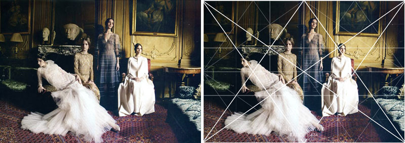
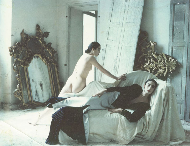
Photographers and painters from back in the film days were familiar with dynamic symmetry (a.k.a. geometry). Here we can see Deborah using a Root 2 grid to compose the scene and models. We have the models creating a triangular shape (see Day 87) in the middle and coinciding with the couch, while the model on the left is on the sinister reciprocal diagonal. We also have the couch on the right locking into a sinister reciprocal diagonal…creating our gamut. The models are well balanced with two on the right and left of the vertical centerline, separated, and with nice FGR.
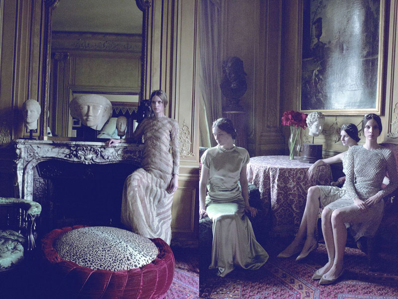
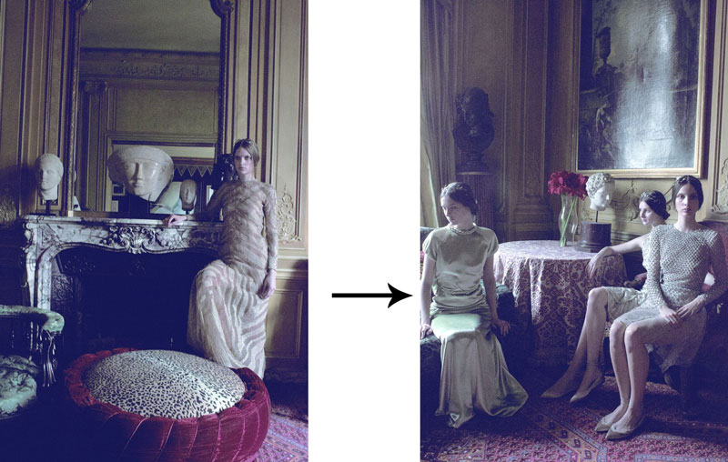
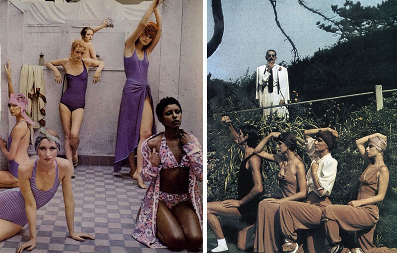
Deborah liked to do photo collages as well. In this diptych, we can see how the two images flow nicely together. But what if they were separated?
If we separate the images, we’ll see some really bad edge flicker in the image on the right. Not only that, but the model’s gaze is leading us out of the image. This gaze could benefit the story if Deborah is wanting to give us a sense that she is rejecting the other two models. Yet, when combined with edge flicker it emphasizes the flaw. Keeping the images together was a smart move!
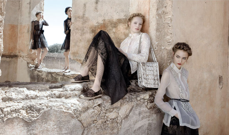
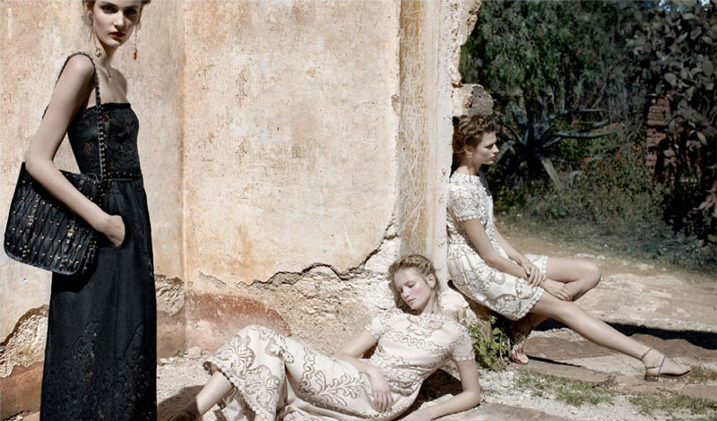
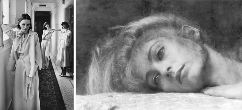
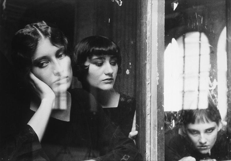
Now that you’ve seen how Deborah incorporates these techniques into her photos, try to spot them in these others. Also, try to notice any flaws. This will help you identify them in your own work, or avoid them altogether.
Conclusion
By now you should have a better understanding of Gestalt Psychology principles and design techniques, and how they can be incorporated into your art. If you haven’t studied any master painters, it’s highly, highly, highly recommended! Choose a few favorites and analyze them. Try to do a master copy and get inside their head. Why did they light a scene this way, or pose the model that way? Combine everything together and you’re certain to advance to the next level!
That’s it for today everyone, much love for joining in to show your support. If you found this useful, feel free to share it with more artists. See you next time!

