Dynamic Symmetry and Absinthe Inspired Drawings – Four (Paris Video)
#583
Hey everyone, welcome back! Thanks for all of your support, it’s amazing and always appreciated!
Today we are going to see how easy it is to construct the dynamic symmetry grids and use them to design a master copy remake. Still not understanding dynamic symmetry and wanting to use it more often? Well you’re in the right place, so don’t let me stop you from scrolling further!
The Absinthe Drinker Edgar Degas &
Dynamic symmetry may seem complex to some of you, but don’t let it scare you off. It’s just lines…that’s it. These lines help you block-in and organize your composition. Easy!
The confusing and hard to understand part is how the grids are built and how it promotes certain design techniques like unity, movement (see Day 48 & Day 35), dominant diagonals (see #441), rhythm (see Day 38), and strength (see Day 76). Don’t worry about that stuff for now…especially if it’s keeping you from using dynamic symmetry in your art. Learn about those techniques, and many more, when you’re ready.
All that being said, you’ll notice in the video further below how easy it is to use the grids to help guide and inspire the composition. But before we get into that, let’s talk a little about this painting by Degas.
This painting by Edgar Degas is one of my favorites called “The Absinthe Drinker,” and was painted in 1875. It seems rather tame for the 21st century, but back in the day it was quite controversial. The critics called it ugly, disgusting, uncouth; all the properly filthy names you could think of back then.
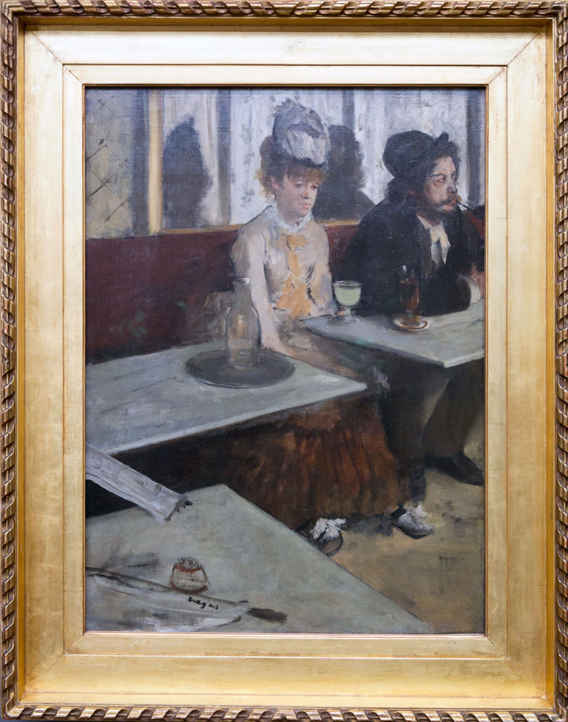
The painting has a man and woman staring off into space, in separate directions. Both drunk off of absinthe perhaps? Hmmm!
The guy might be thinking about work (or the cute waitress), and the woman might be hallucinating and seeing a green fairy float by (see #445). Who knows!
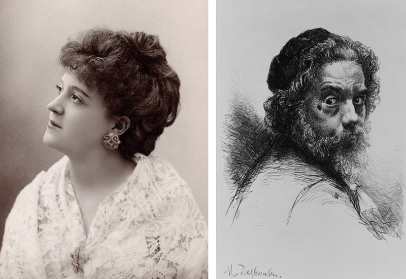
It turns out that the models for this painting were known artists themselves. Ellen Andre was an actress who posed for other artists like Manet and Renoir, much like Suzanne Valadon (see #469). The man was Marcellin Desboutin, a painter and etcher. Both had their likeness captured by Degas perfectly.
Aside from Degas’ particular choice of models and subject matter, he also selected his dynamic symmetry grids wisely. As seen in a previous analysis of this painting (see Day 194), it appears that he used stacked 1.5 rectangles to help him organize the composition.
Stacking grids might seem complex, but its just stacking one on top of the other, just like children’s blocks (see #557). You can select a wide variety of grids to fit the image you intend to create. This goes for painting, photography, sculpting, cinema…any form of art.
You can see that the grids below are locking into the painting nicely, and if you get a chance to check out the full analysis, you’ll learn how he added lines from point-to-point to create the diagonals of the tables.

This painting was so inspiring for me that I decided to do a master copy of it in April, 2019 (I’m still learning). Copying from the masters is one of the best ways to practice your skills and learn from a seasoned professional by ways of looking and applying. It’s amazing what you’ll see when you actually look at each line and shape (see #581).
I used the previous analysis of the original painting to help guide the block-in stage. I drew a grid of squares on the image of the original painting (with the computer), then enlarged them onto the canvas. After that, blocking-in the shapes was a piece of cake. The darks were painted in first, then the lights.
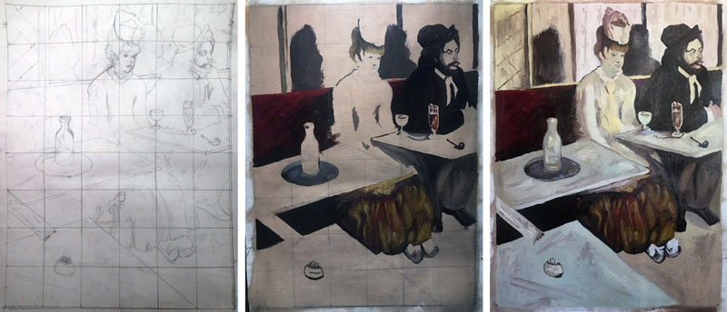
Once the canvas was covered, it was time for the finer details. When you do your own master copy, feel free to create a remake, as seen in the drawing further below, or redesign certain elements. In this case, I removed the pipe from his mouth and placed it on the table. Mainly because in the original, the pipe was very close to the edge and being lost in the dark background. I also moved the bottle of water to the left so the woman’s figure could be unobstructed. Fun stuff!
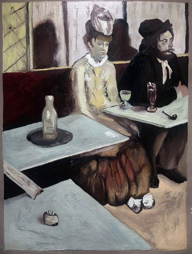
Master Copy Remake Dynamic Symmetry &
Now that you know a bit more about Edgar Degas and his controversial masterpiece “The Absinthe Drinker,” let’s take a look at the master copy remake and the video!
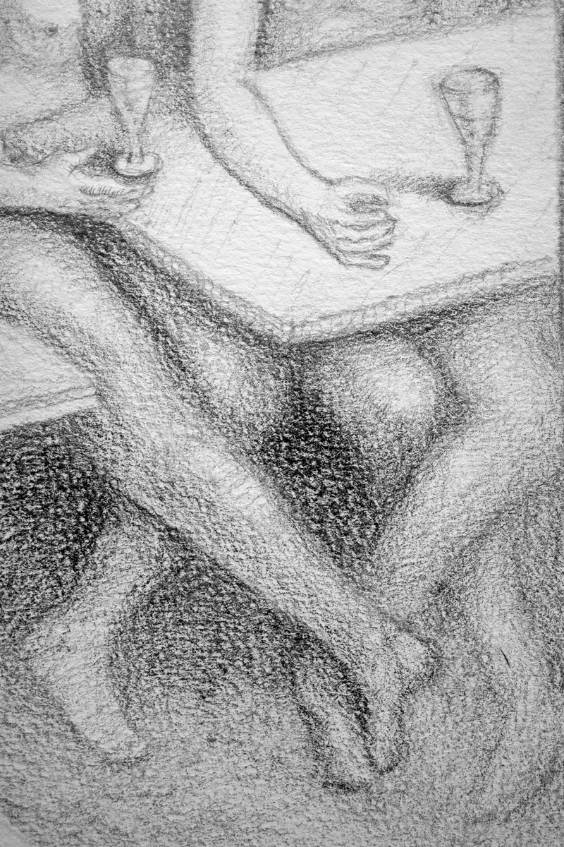
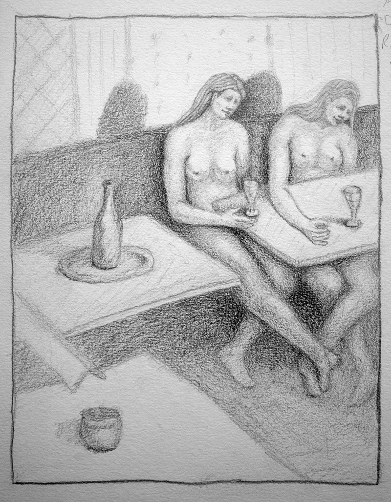
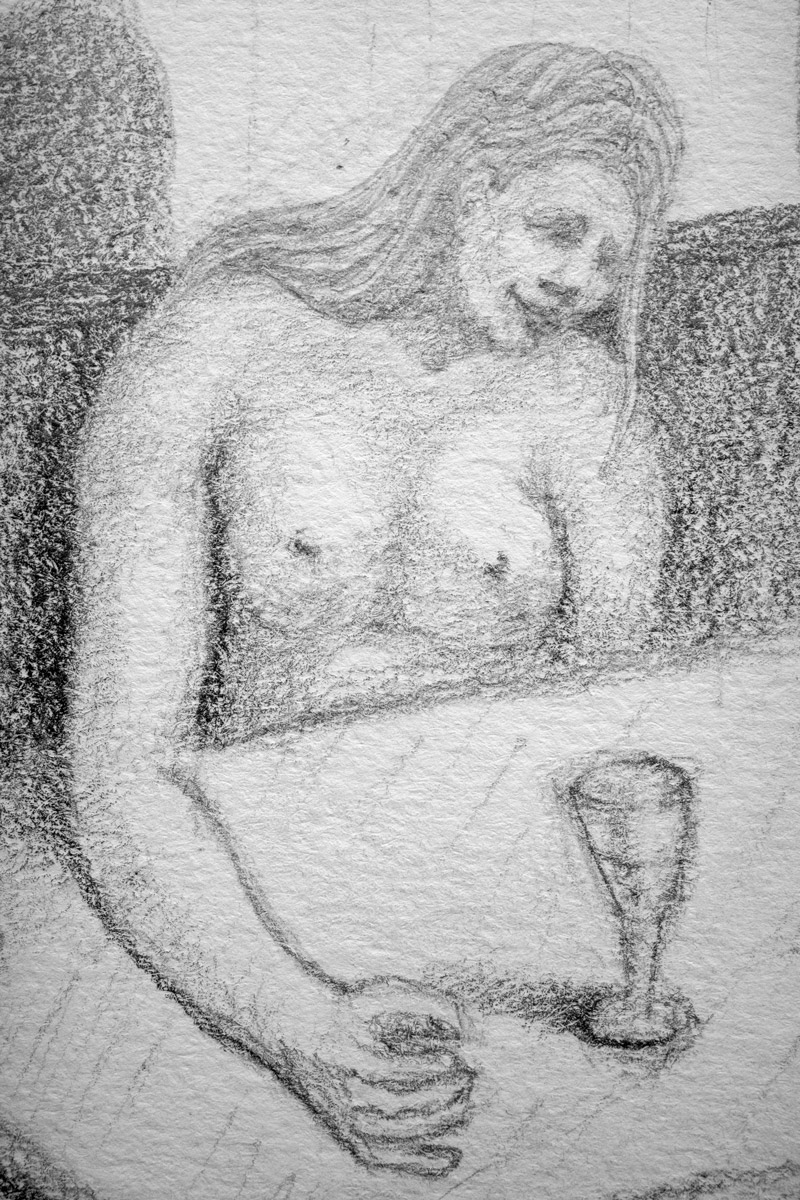
You can see the final drawing below, where two nude figures replaced the original models. Having consistent subjects in all of the dynamic symmetry and absinthe inspired drawings (see Intro, One, Two, Three) so far helps strengthen the artistic style (see Day 122). There are significant ways you can develop your artistic style, and consistency is amongst them all.
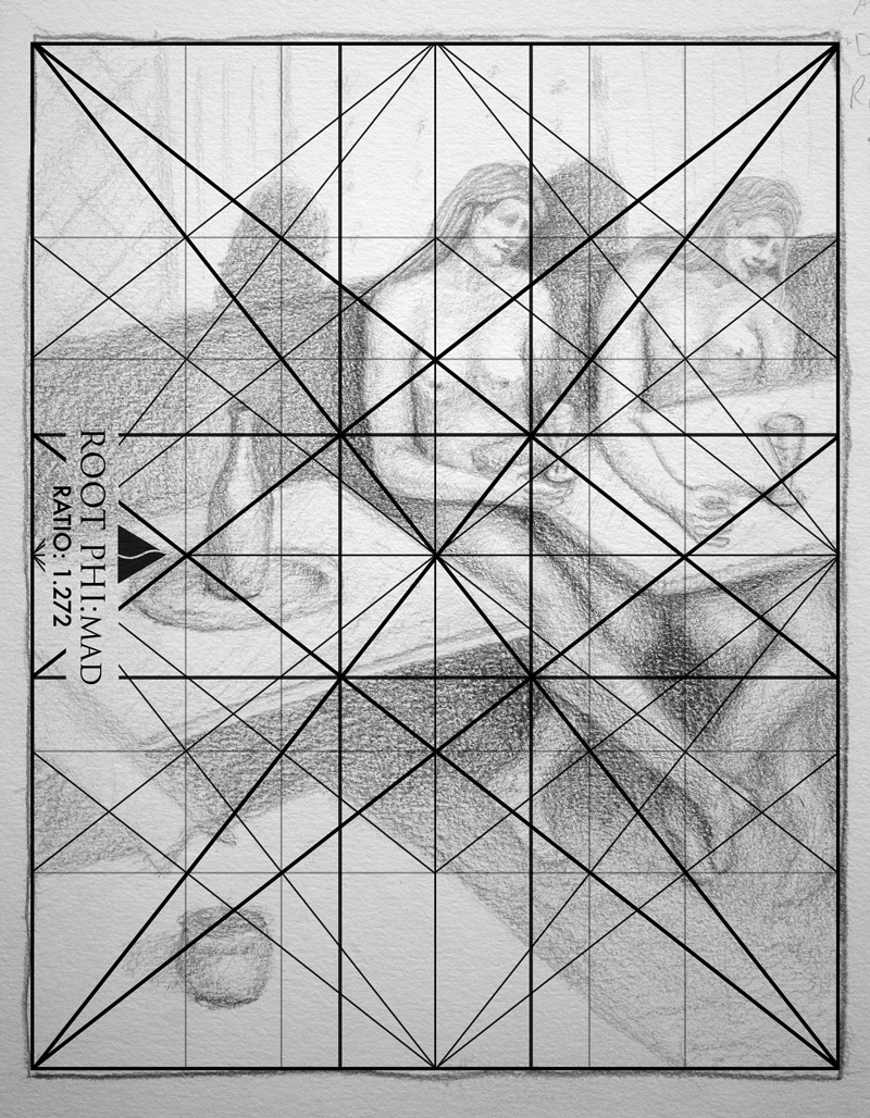
While in the Musee d’ Orsay filming the video, I thought that the original was a root phi, so that’s the size of grid that is shown in the video and below. When the computer grid is aligned to the drawing, you can see how close they are to each other. The subjects arms, legs, heads, feet, and even the tables lock in and parallel the grid.
Want some additional info about the grids? Are you ready for more?
Wait, are you sure? I don’t want your head to explode.
Ok, here you go.
If you know the ratios of the dynamic symmetry grids you can draw them fairly accurate by starting with the square. Take the root phi for instance, it’s ratio is 1.272, so if we draw out a square all we have left is .272. This is fairly close to equaling 1/4 of a square (.25). Pretend you’re cutting up a square-shaped peanut butter and jelly sandwich if this helps you out. Measure a fourth of the square you drew, then add a little bit more to equal .272 (see Why the Ratios are Gold). Boom, you have your rectangle!
After that, just draw the major diagonals (baroque and sinister), which run from corner to corner. The reciprocal diagonals are drawn next and run from each corner to intersect the major diagonals at 90 degrees. If the terminology is tripping you up, forget about it for now. Focus on drawing the lines. You’ll see in the video how easy this is to do.
Here are some details of the figures. Not proportionally or anatomically accurate, and the rendering is mediocre, but it’s a step in the right direction. It’s a great teaching tool to show you all how easy and fun dynamic symmetry and composition can be. You don’t have to have excellent drawing skills to be a master painter (see Pierre Bonnard Day 129), but if your skills are already masterful like Bouguereau (see Day 65), then perhaps you can apply this knowledge and finally create the art you’ve been envisioning.
Note: Just a heads up on the paper; it’s textured and is difficult to render smoothly. I recommend “Arches Hot Pressed 140lb” paper for your best drawings. It’s archival watercolor paper made of 100% cotton and pretty smooth. Try it when you can and see if it works for you. 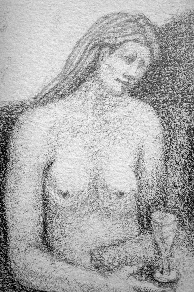
The Absinthe Drinker Video
As you watch the video, try to make note of how easy the grid is construction. There’s no excuse to not be able to do this easily. Well, if you have two broken wrists that would be a good excuse, but if that’s true you have more immediate problems than drawing a grid.
Watch how the figure is aligned to the grid. If the limb of the subject can’t be aligned approximately, it is paralleled.
Conclusion
When it comes to dynamic symmetry, take it slow, but don’t put it in a category of mystic belief. At the end of the day, it’s just rectangle with lines in it, not a creature from another planet. Use the grids to promote unity, movement, rhythm, and strength. That’s four techniques that are taken care of just by using them. Pretty cool!
Oh, and most importantly, try it! Don’t be one of those artists that read great information but never try it for themselves to see how it works. Application is a huge part of learning this stuff.
As always, thanks for joining in and for all of the support. See you in the next one!

