Golden Ratio in Art: Parthenon and Euan Uglow [Techniques]
#482
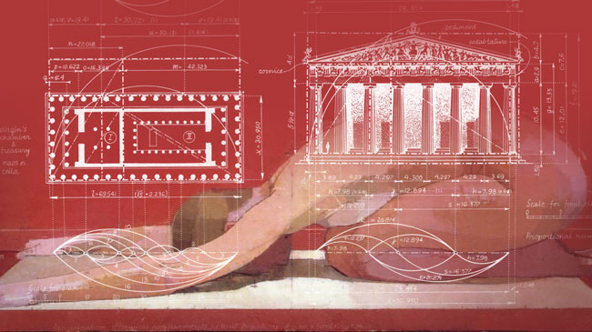
The golden ratio is more than just a number. It’s a powerful tool that artists have used for centuries to create beautiful proportions within their art. Yes, it’s a number that can help us in some ways, especially when it comes to dynamic symmetry, but the art doesn’t have to conform to a spiral or Nautilus shell like some of us have been lead to believe. More importantly, if you use the golden ratio in your art, it doesn’t mean you belong to a cult…just in case you were in doubt (see Day 80).
Needless to say, there’s a lot of confusion circling around the golden ratio and it’s application in art. This succulent article aims to clear the fog a bit with tons of unseen examples and unheard of explanations.
If you’ve ever wanted to see how a successful master artist uses the golden ratio within a painting, then you’re in for a real treat! We’re going to be diving deep into the masterful work of Euan Uglow (see Day 184), and see how he used his phi calipers, and dynamic symmetry to create all of his masterpieces. We’ll even cover some of the interesting facts about the Parthenon and how it was designed.
Thanks so much for all of the support everyone, I really appreciate you all! Let’s get into it!
Was the Golden Ratio Used to Build Structures
Before we look at the way the golden ratio is used in Euan Uglow’s fantastic paintings, let’s squeeze in a bit of history…
The golden ratio (a.k.a golden mean, golden section, phi ratio, phi rectangle, goldener Schnitt, divine proportion, fibonacci series, etc) has helped build some of the most beautiful structures. In fact, resources claim that the Great Pyramid of Giza (built 2580BC) and Parthenon (built 438BC) were built with the phi ratio. Do I believe this?
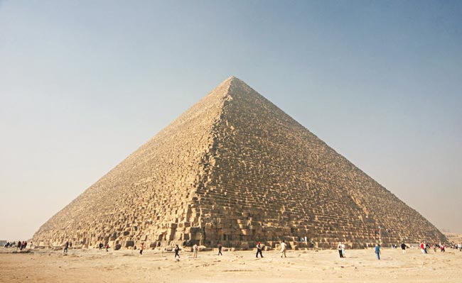
Well, since there is math involved when building any structure, then my answer is yes. To put it simply, I believe you can build a beautiful structure based around the golden ratio (1.618). I also believe you can use the ratio to get harmonic proportions within the small details of any structure, or a painting for that matter (some disagree).
When people clumsily slap a spiral overlay onto a photo of the Parthenon, that’s when I start to roll my eyes (even though the proportions might be present). Why are we allowed to kindly chuckle at this application of the golden ratio?
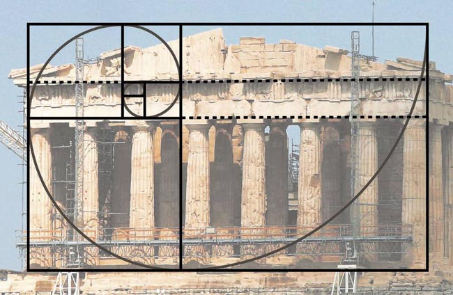
When we see the logarithmic spiral swirling around an image, we are assuming that the spiral plays a role in the final design. Yet, when the design is perceived by the viewer, there is no spiral present; no arabesque. It’s the golden ratio proportions that we should be concerned with when referencing the Parthenon, not the spiral.
The way art is perceived is tremendously important, that’s why Gestalt psychology principles are so valuable to understand as artists. They deal with the way the mind interprets visual stimuli. Sounds scientific, but it’s really not. It deals with design techniques like arabesques, ellipses, coincidences, illusions, figure-ground relationship, etc. In fact, the master painters used these masterful techniques all the time to communicate their visual message with clarity and power.
Once you understand Gestalt principles, then look back at the spiral overlay on the Parthenon, you’ll know exactly what I’m referring to. If the spiral were meant to be there, it would be cleverly designed, and hidden…not obvious. A magic trick for the viewer to enjoy.
Debunking the Golden Ratio and Parthenon Myth
The golden ratio and the way it pertains to the construction of the Parthenon have been debated forever. I’m not wanting to join the debate, but I’d like to shed light on some similarities that I noticed.
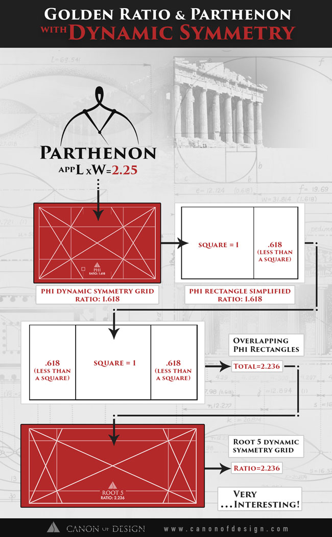
Here’s an article, written by George Markowsky, that was created to debunk some of the golden ratio myths floating around out there. He mentions that the dimensions of the Parthenon are approximately the ratio of 2.25, which are “well outside the acceptance range.”
Hmmm, little did he know that this ratio of 2.25 is very similar to something that I think is worth pointing out. Some of the students on this site, familiar with dynamic symmetry, may already know what I’m talking about.

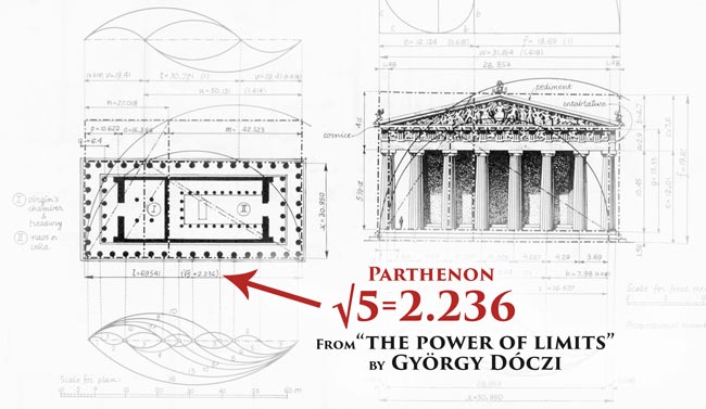
Now, I openly admit that my math skills are not exceptional, and I’m not trying to challenge the mathematicians that can bury me with equations. That being said, it’s important to point out that the ratio mentioned by Markowsky (2.25) is extremely close to the root 5 dynamic symmetry ratio (2.236).
What’s more, is the fact that the root 5 consists of overlapping phi rectangles. Did we just debunk the debunking? You be the judge.
Check out the infographic below for a great explanation!
Download a High Resolution Copy Here
Golden Ratio-Parthenon Infographic (5961 downloads )
Side Note: The parthenon and the root 5 ratio are also mentioned in “The Power of Limits,” by György Dóczi. My thoughts on the book? Well, it’s got some great illustrations, but it’s mathematically technical for artists. If you are intrigued by the golden ratio, and don’t mind the equations, then you’d probably really enjoy it. If you’re wanting something more applicable for your art, then you can see my four+ book recommendations here.
Getting Things Perfect is not Always Necessary – Dither
The ratio of 2.25 (mentioned by Markowsky) and 2.236 (ratio of the root 5) are only decimals off. Even if we had the exact length and width of the Parthenon (without deterioration from centuries of abusive weather), the construction process is surely allowed some dither (see #387).
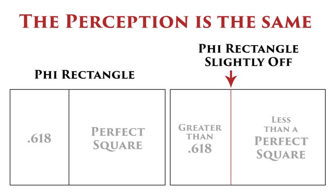
When we understand the linked article, we know that a little “play” can be present, while still allowing things to be perceivably perfect. In other words, the parthenon could be slightly off when calculating the exact mathematical equation, but it’s still perceived to have the golden ratio proportions.
A simplified diagram shows how the perception of the phi rectangle is the same…even when one is slightly off. As artists, we can aim to create harmonic proportions, but to stress about getting them mathematically precise is the wrong way to approach it. Get things as close as you can, and the visual perception will be equivalent to exact.
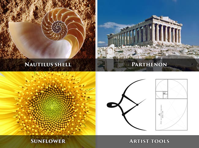
Aside from the structures that the golden ratio helped build, it has also been scientifically proven to exist in nature (sunflowers, pinecones, the human body, etc). We could go on and on about this enchanting ratio, but let’s not lose track of the art side of things.
Who Was Euan Uglow?
Ah yes, now let’s see how we can incorporate the golden ratio into our art!
I first heard of Euan Uglow from my mentor, Myron Barnstone (see #369). He analyzed a few pieces of his work in class, and it seemed Myron really admired his contribution to the art world. Euan Uglow was surprisingly not secretive, like the other masters, about his use of the golden ratio and dynamic symmetry.
I recently stumbled across some of Uglow’s preliminary sketches that show the marks he used to calculate the proportions of the golden ratio. This inspired me to further discover his use of it!
Uglow was a shy British contemporary artist known for his nude and still life paintings. Surprisingly, he just recently passed away in 2000 from liver cancer (born 1932).
It’s exciting to see a contemporary artist using the golden ratio and dynamic symmetry within his art, instead of the rule of thirds and leading lines.
Euan studied art at a couple of different schools in London for about six years (1948-1954), but wasn’t successful with his art until much later. In fact, he didn’t sell a painting until eight long years after he left art school. He stuck with his artistic journey and became very successful; exhibiting all over London.
His slow and methodical style kept him from doing too much, but he’s still got quite a few paintings for all of us to enjoy.
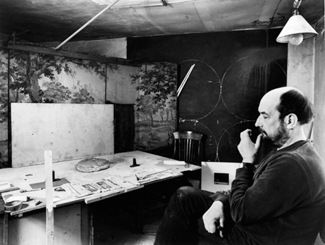
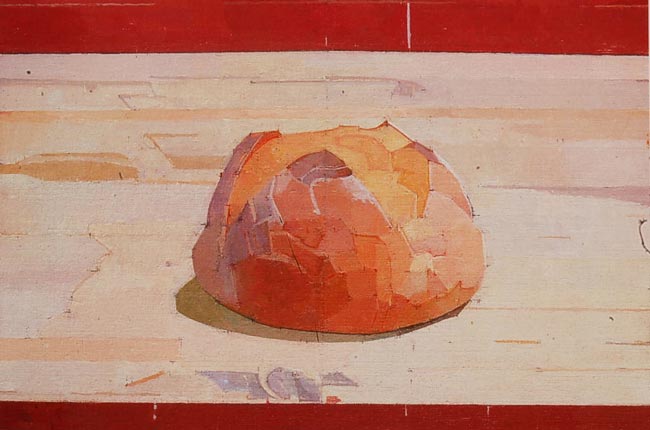
Here he is below, studying a crusty loaf of bread.
Here’s one of his crusty bread paintings…reminds me of a fresh loaf of sourdough! Mmmm!
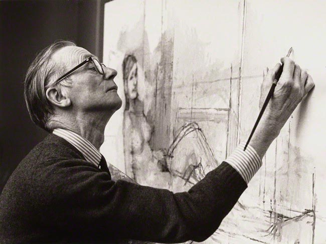
Uglow studied with William Coldstream for several years, who was also a successful painter. We can see him working on a large nude painting below.
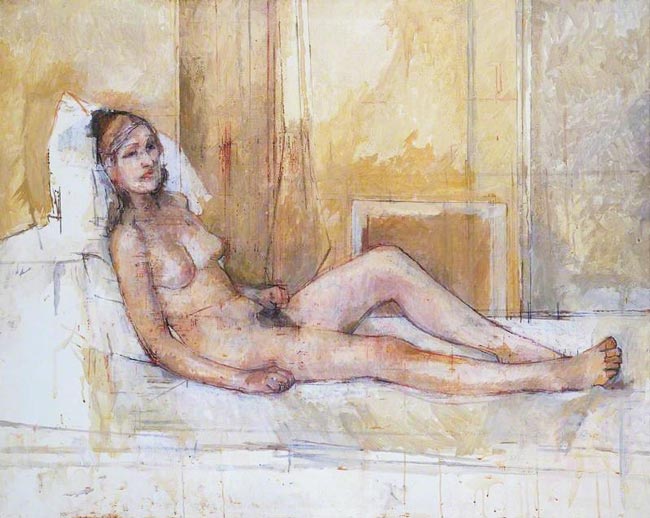
Here’s the entire painting created by Coldstream. Pretty interesting, and when we look close, we can see that he greatly inspired Uglow.
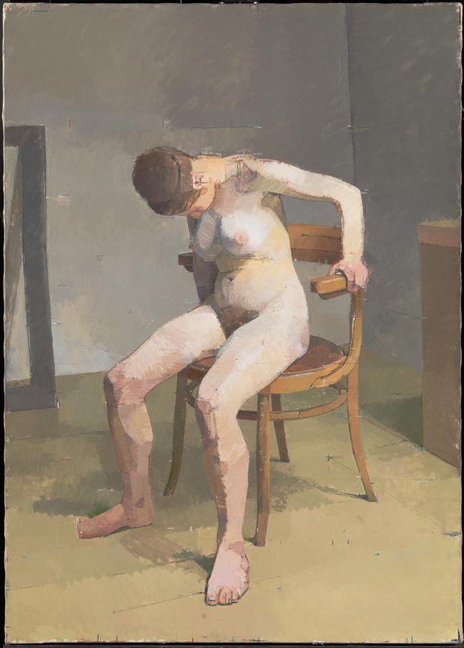
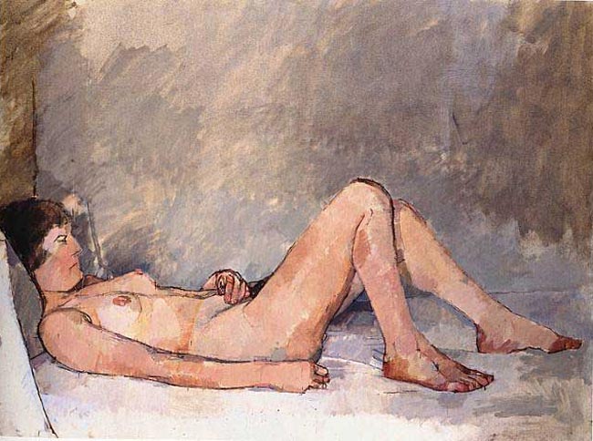
Euan Uglow’s nude painting below, has markings similar to what we saw in Coldstream’s painting. Turns out, Uglow adopted this as an aesthetic that he later incorporated into his artistic style (see Day 122).
Every Great Piece of Art Starts with a Sketch
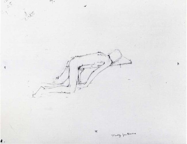
Below we can see a preliminary sketch by Euan Uglow…pretty simple looking right?
Or is it?
You see those dark, scratchy marks on the paper? That’s what we’re interested in.
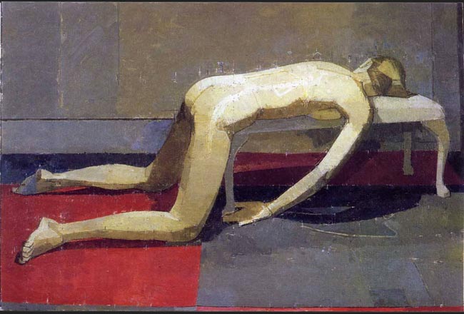
First, let’s check out the finished painting below. Pretty nice design, and I find it interesting that he chooses hard light instead of soft. It appears to be coming straight from above, instead of a more pleasing angle.
Side Note: When lighting comes straight from above, we might think of high noon sun…the worst time of the day to take photographs. Though, in this painting it works, and he creates nice volume with it.
Black Marks and His Phi Calipers
OK, back to the marks on his preliminary sketch. What are they?
These are the measurements from his phi calipers (golden mean calipers). Yes, he greatly understood the golden ratio (phi), and dynamic symmetry…implementing it whenever he could. Almost obsessively!
We can see in the diagram below, just a few of the areas he created with his tick marks…to represent the proportions of phi. Notice the red dots, which represent the proportions of the golden ratio.
His calipers didn’t touch the exact spot in some cases, but if you follow the red line, you’ll see that it meets the calipers exactly.
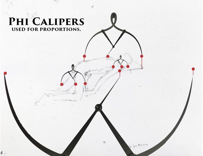
We can also see how the calipers align to our phi dynamic symmetry grid perfectly.
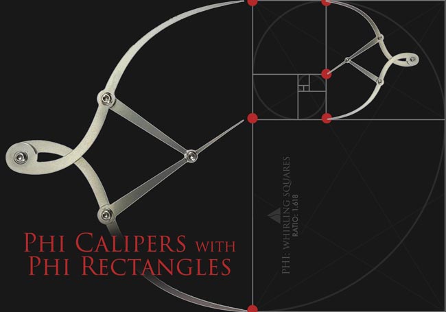
Download a High Resolution Copy Here
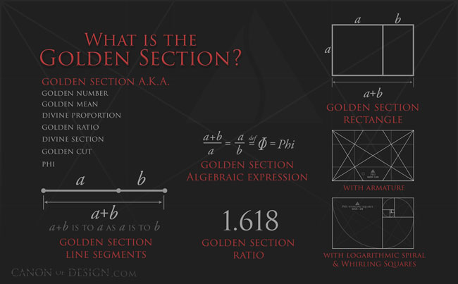
What is the Golden Section Infographic (6050 downloads )
Digging Deeper into Uglow’s Preliminary Drawing
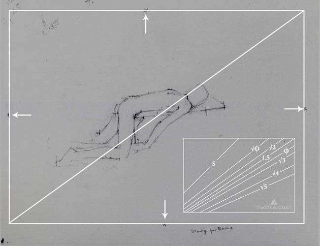
We can learn a lot from Uglow’s simple drawing. First, we can find the size of rectangle he was initially planning on designing within.
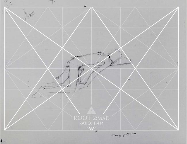
Let’s create a rectangle from the marks on his drawing (see arrows), then we can find the diagonal. When the diagonal is measured with the diagonal gauge, we discover that it’s a perfect root 2 rectangle.
Here we can see how he’s beginning to lay in his design. For now, he has a ton of negative space (see Day 83), but he takes care of that in the final painting.
Dynamic Symmetry Refresher for the Phi Rectangle
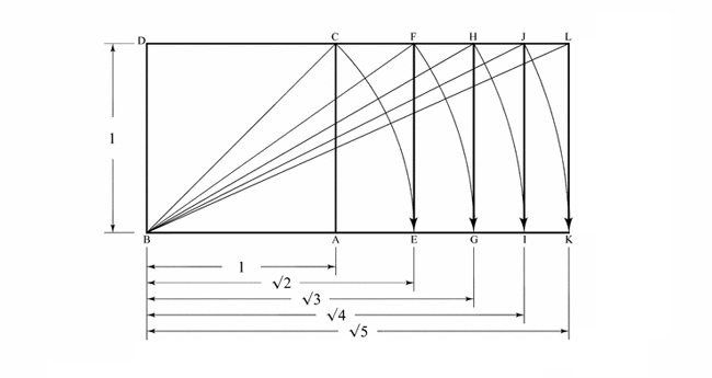
OK, before we go too far, I’ll give you a refresher on how the root and phi dynamic symmetry grids are built. It’s really simple, and it all starts with the square.
By taking the diagonal of the square, we can swing it down to get the root 2. Take the diagonal of the root two (√2), then swing it down to get the root three (√3)…and so on. Pretty simple geometry right?
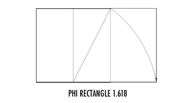
To create the phi rectangle, we swing a line down from the halfway mark of the square.
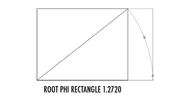
To create the root phi rectangle (ratio 1.272), we swing a line up from the phi rectangle. Simple stuff!
Analyzing his Final Painting
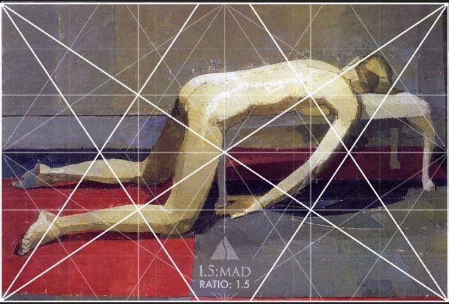
Now, let’s take a look at the final painting from the preliminary sketch we covered earlier. You have a basic knowledge of dynamic symmetry, so now we can have a better understanding of how he used it to organize the geometric shapes of the model. We can easily tell the size of the canvas is a perfect 1.5 rectangle (a square and a half).
Below, you’ll see many elements locking into the 1.5 dynamic symmetry grid, but I think he broke it down even further.
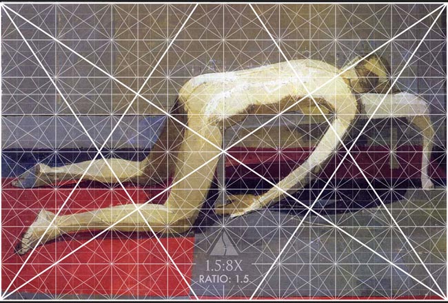
Here’s the 1.5 rectangle with 8 smaller 1.5’s inside of it. Lot’s of lines, but the diagonals are limited…a gamut (see Day 38). Artists use a gamut to help create unity, movement, and rhythm within their design.
Now we begin to see exact areas of the model and bench locking into the grid. Not just paralleling, but exact. Look at her arm, her feet, the shadows, the bench, and the linear designs. It’s a perfect example of using dynamic symmetry!
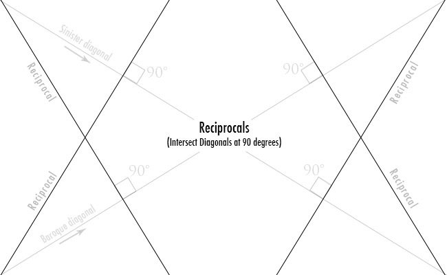
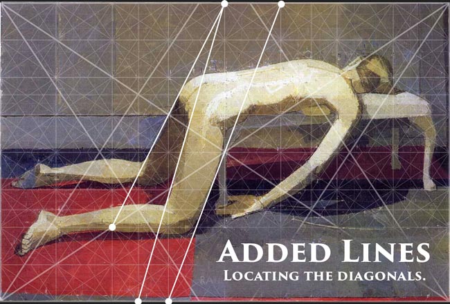
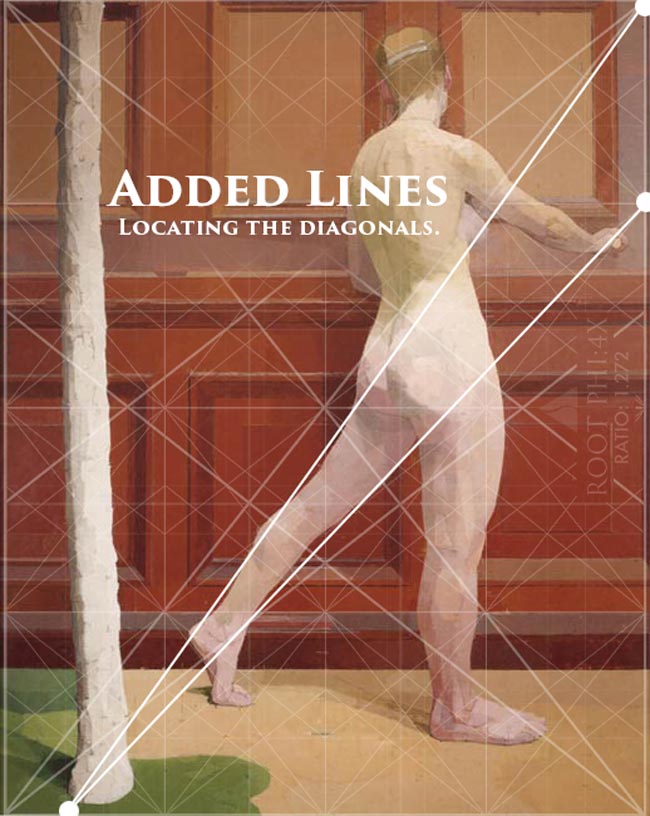
To get the diagonals of the legs, he added lines through the eyes (see Day 14) of the grid. Adding lines allows the artist to develop the dynamic symmetry further and fit his or her needs. Pretty cool right!?
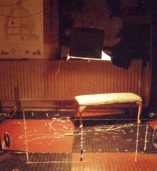
Here’s a look at his studio and the bench the model was laying on. There’s that harsh, DIY overhead lighting I was referring to. It looks like a light was placed into a cardboard box! Hey, nothing wrong with low-budget setups.
Digging into another Designed Preliminary Sketch
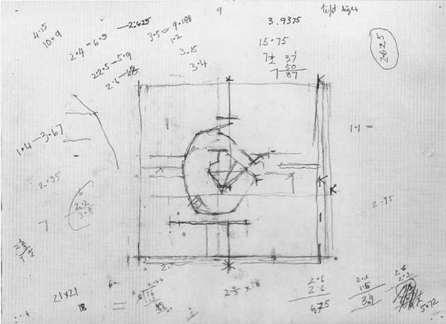
Let’s take a look at this other preliminary sketch…he’s got geometric equations written everywhere! I tried to understand them, but nothing seems to make sense.
The ratio I see repeating is 2.625, but it doesn’t match any of the ratios we’ve covered within this blog so far.
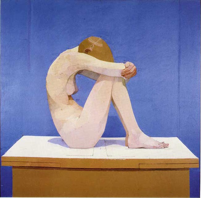
This is the finished painting for the sketch, but let’s take a closer look at his tick marks again.
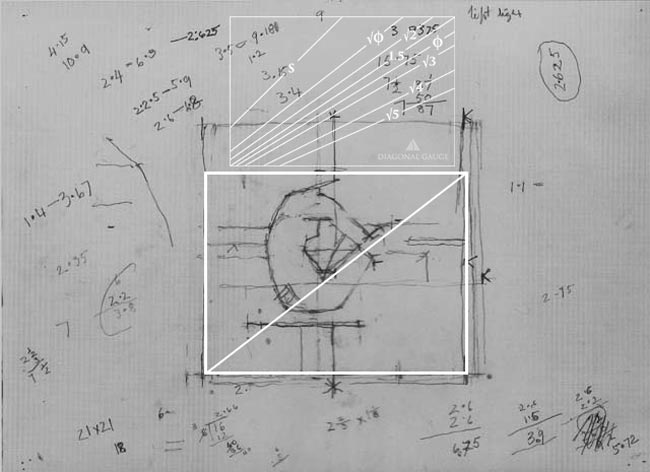
When we look close, we can tell he is designing for overlapping rectangles…he has the horizontal lines to help us determine this.
When we create a rectangle around one section, draw the diagonal, then compare it to our gauge, we see that it’s a perfect root phi rectangle. He’s using overlapping root phi rectangles…awesome!
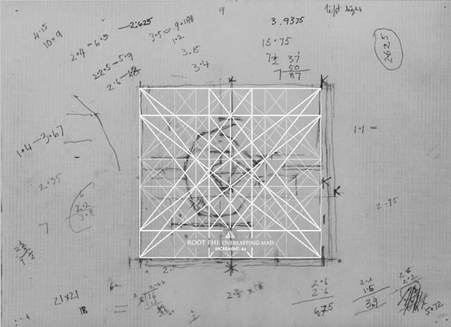
Here we see the “Root Phi: Overlapping MAD, Increment: 4x” (see #438) and Uglow is already locking things into place.
Creating exact diagonals with math (see #432), as Uglow did, is a challenge in itself.
More Amazing Examples of Uglow’s Work
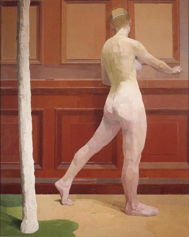
As mentioned earlier, Euan Uglow was known for his nudes…for good reason too. They are designed well, and his application of paint gives the figures a sculptural feel. In this next painting, we can see a dominant diagonal in the leg of the model.
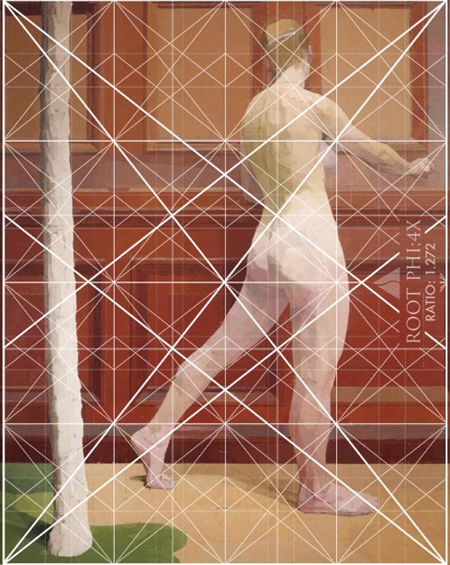
He’s also incorporating several geometric shapes within the background design.
When the root phi:4x is overlaid, we can see how he locks things into the grid. The head, shoulders, arm, hand, legs, feet, tree, background elements…tons of things!
To get the diagonal of the leg, he used added lines…as we learned before.
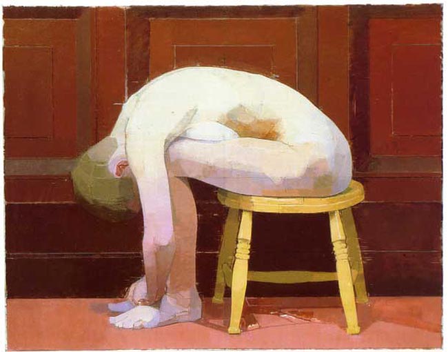
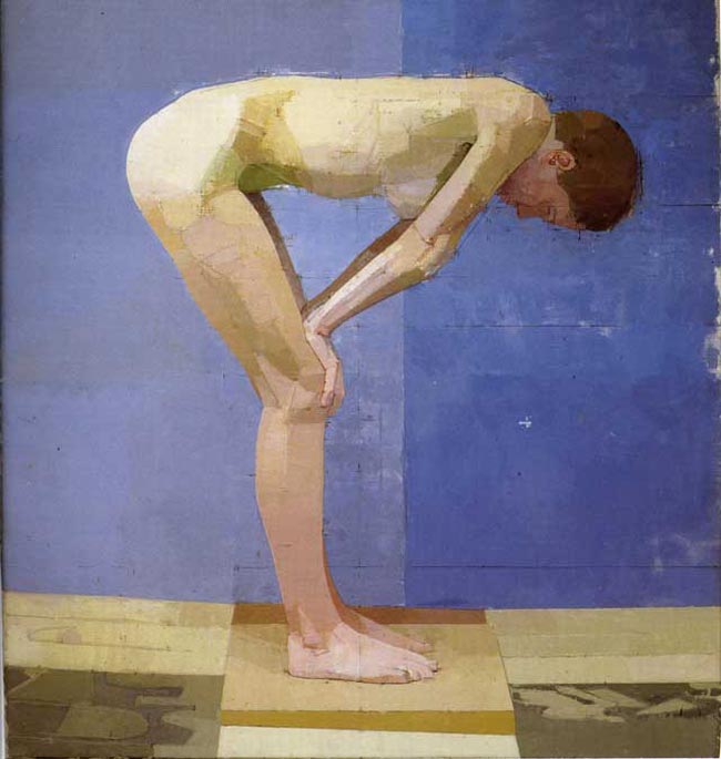
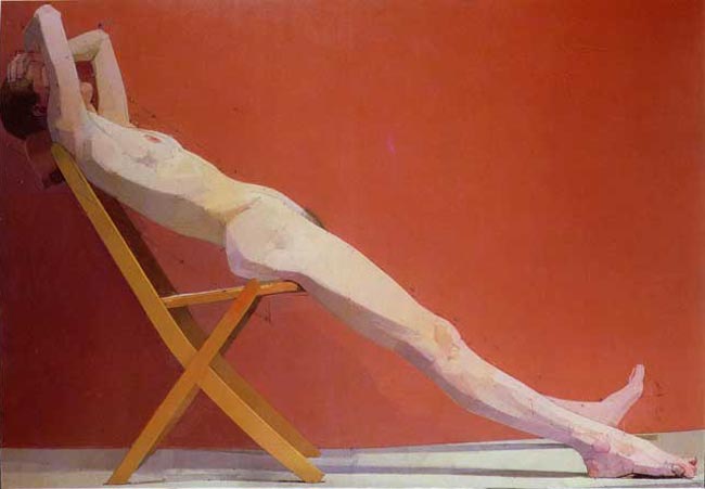
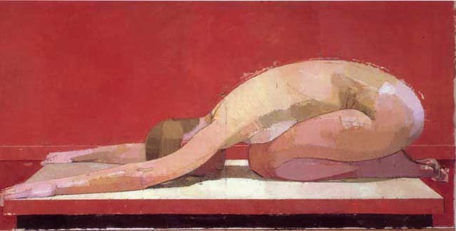
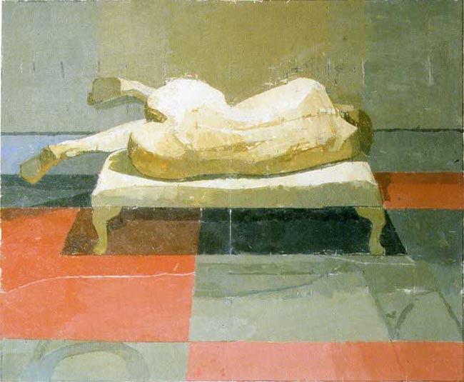
Here are some more amazing nude paintings by Uglow.
I love the strong triangular shape in this one! (see Day 87)
This is one of the paintings Myron Barnstone analyzed in class. He loved the strong diagonal and the twinkling of the toes.
There’s a nice arabesque (see Day 17) created in this pose!
Some Excellent Still Life Paintings by Euan Uglow
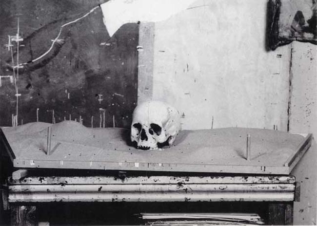
Now let’s take a look at some of Uglow’s still life paintings…they are equally interesting when it comes to design. Below, you can see a photo of the skull he used in his still life painting.
Did he use those vertical and horizontal marks on the wall to help him measure the proportions of the golden ratio? I think they definitely have something to do with it!
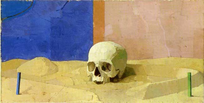
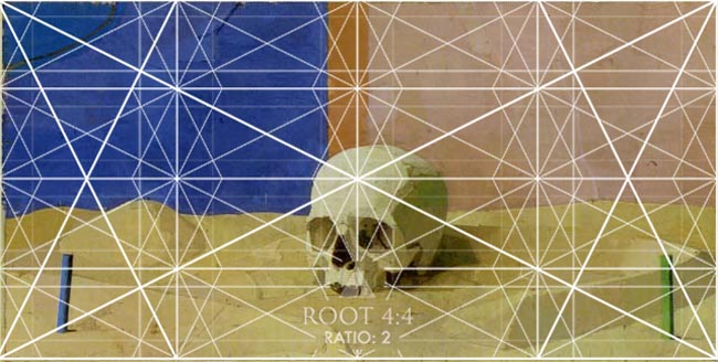
Just by looking at the finished painting below, we can tell it’s a root 4 rectangle (two squares side by side). He applies the same structural aesthetic to his still life as he does his figures.
When we overlay the root 4 rectangle, with four smaller root 4’s inside of it, we can see how he locks in certain elements. He doesn’t have a very strong diagonal in this one, but he’s using the verticals/horizontals for the small posts and the background.
He’s using the smaller diagonals in the center to help organize the shapes of the skull.
Paralleling and locking in like a master!
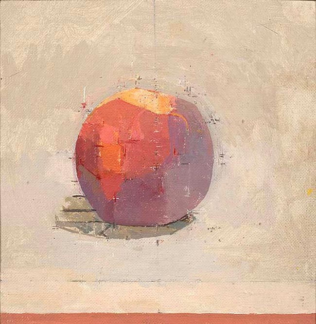
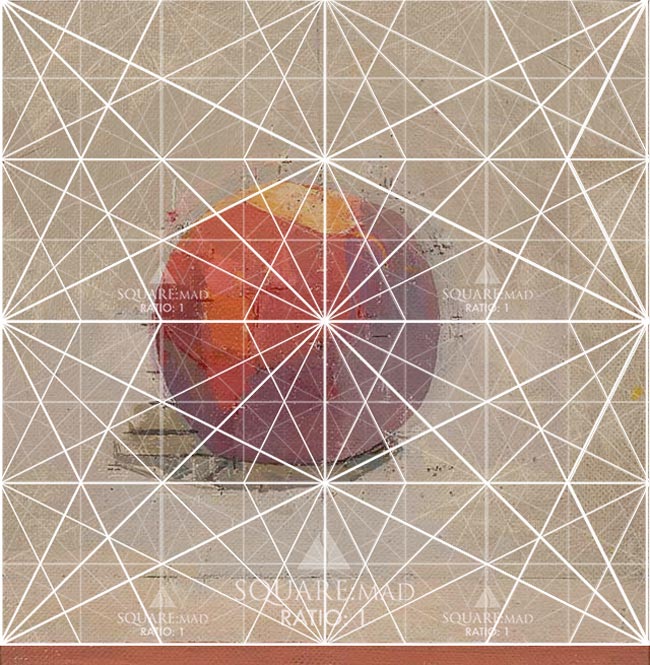
Here’s another geometric still life…this time of a juicy peach. We see the same beautifully stylistic markings underneath the surface of paint.
With the square dynamic symmetry grid overlaid onto the painting, we see that the lines helped him organize the different colors of the peach. Look closely and you’ll see them locking into different diagonals. Even the shadow does. Wow!
I like how he painted a little section at the bottom to help us determine that he designed within a perfect square…since his canvas is slightly bigger.
Conclusion
We’ve seen how the golden ratio relates to beautiful structures like the Parthenon, and the pyramids. We’ve even seen how it’s found in nature. Very cool stuff!
What’s even more amazing is the way we can incorporate the golden ratio into our art. By using calipers and dynamic symmetry grids, we can infuse our art with the same harmonic proportions found in nature. Use the tools of the masters to help organize the composition and design of your photograph, sculpture, architecture…any visual art. The golden ratio, in combination with dynamic symmetry, is a simple, yet powerful tool of elite artists!
Are you starting to get a better grasp on how the golden ratio can be used in the art world? It doesn’t have to be mystified or trivialized.
I’m curious, do you use the golden ratio in your art now? How do you use it…calipers, dynamic symmetry grids, nautilus shells? Leave a comment below, I’d love to hear about it!
Thanks so much for joining in today, please stay tuned for more amazing articles related to golden ratio, dynamic symmetry, Gestalt psychology, and design techniques. See you next time!






January 24, 2018 @ 12:27 am
Thanks a lot Tavis – as always that was fascinating!
January 24, 2018 @ 10:23 am
You’re welcome Pali, thanks for reading it! 😀
June 24, 2025 @ 6:27 pm
Pretty amazing, thanks for the share!
August 7, 2025 @ 8:15 am
Glad you liked it!