Gregory Crewdson – ANALYZED PHOTO #4
215/365
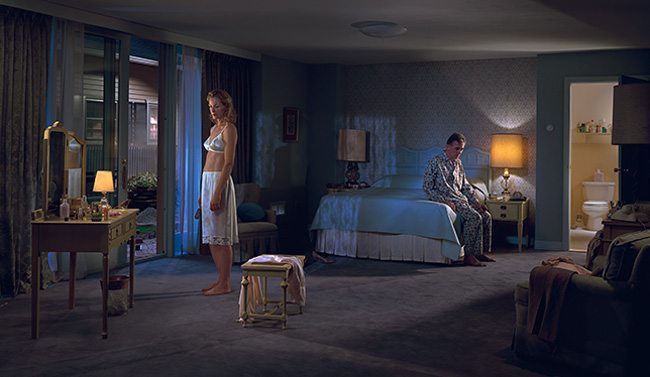
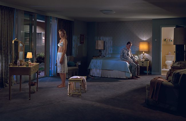
Today we are going to take a look at another one of my favorite Gregory Crewdson photos. I love the mysterious setting and his awkward characters, great lighting, and nice composition. Let’s dig into this and see if we can discover even more about this photo and the vision of it’s creator.
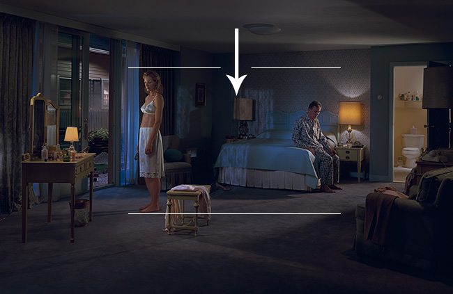
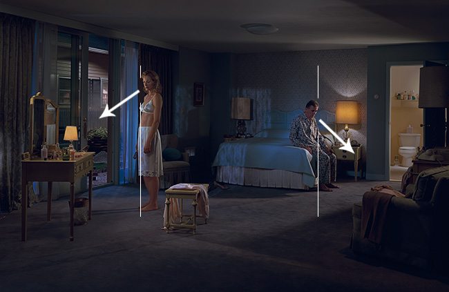
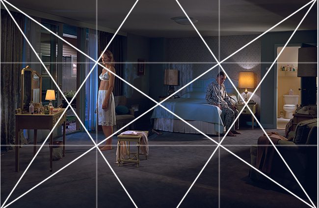
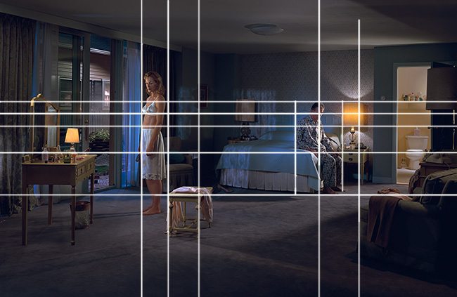
1.5 Rectangle Basic Armature – We can see that he’s using the 1.5 rectangle to organize his photo. Both actors are placed on the verticals to equally balance his design. The bed and curtains are also on the verticals. The upper horizontal also runs across and hits the dresser on the left, the woman’s chin, the framed picture, and across to the bottles in the bathroom.
1.5 Armature with Major Area Divisions (MAD) – With the MAD we can see even more being organized and locking into Crewdson’s grid. The bed, toilet, and dresser on the left are on the middle horizontal. The right side of the woman, the man’s arm, the dresser on the left, the top of the bench in the middle, the chair on the right…
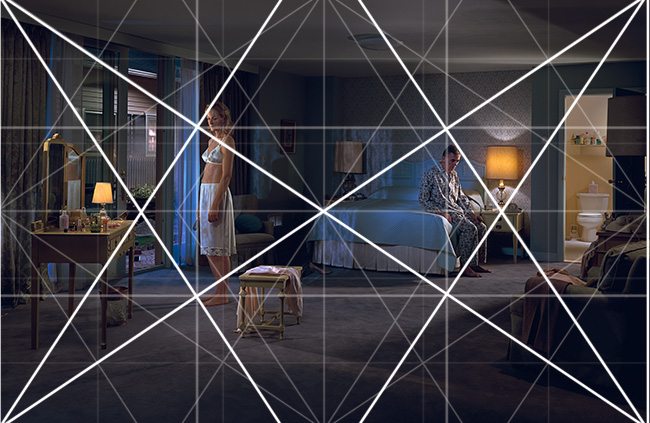
Locked into the Grid – Plenty of elements locking into Crewdson’s grid. We can see that he’s effectively using it to help him organize his composition.
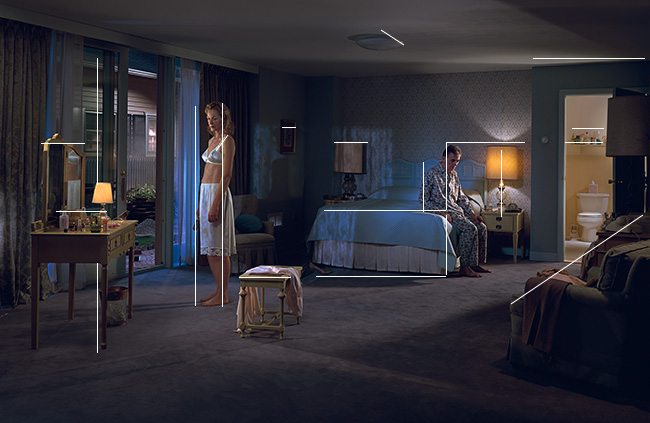
Gamut – Most indoor scenes will be riddled with repeating vertical and horizontal lines. This is normal and perfectly fine. Though, the rhythm is truly felt when the gamut has diagonals because those aren’t typically seen on a day to day basis.
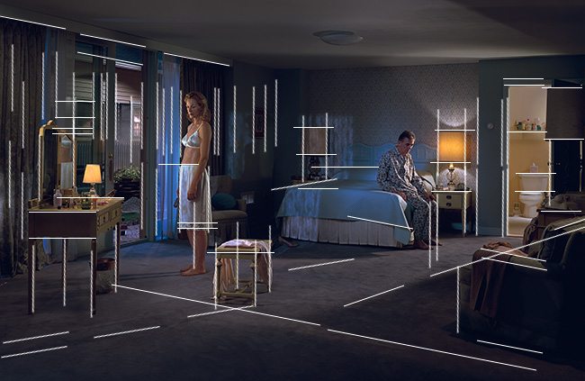
Coincidences – Crewdson uses these edge to edge relationships throughout his photo to create unity and movement from one element to the other. Follow the line from the dresser on the left, to the bed, to the top of the toilet. The man’s eyes, the bottom of the bra. The bench in the middle up to the woman’s right side. The bottom of the bed to the top of the chair on the right and to the top of the bench in the middle.
Arabesque – We have some nice and elegant movement created by Crewdson’s use of light and the way he directs it. He uses the shadows to help direct the eye across the photo.
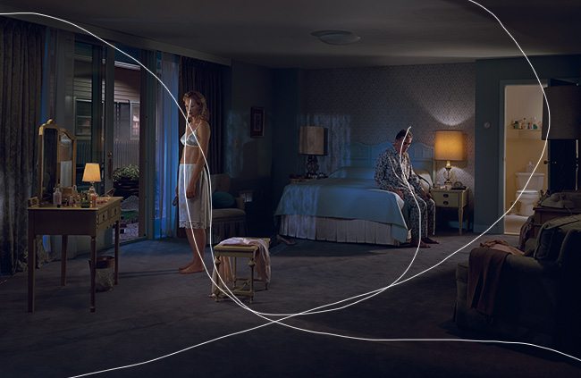
Ellipses – Here we can see an implied ellipse. Now whether he planned it, or it just happened to present itself, we can clearly draw a circle and hit elements as it circles. The shadow on the floor and coming from the lamp on the right help complete the ellipse.

Aerial Perspective – We can see Crewdson displaying excellent lighting as he creates depth and texture throughout his photo by allowing shadow to remain. Some amateurs will add too much light, or HDR the scene which would kill the atmosphere and 3D illusion.
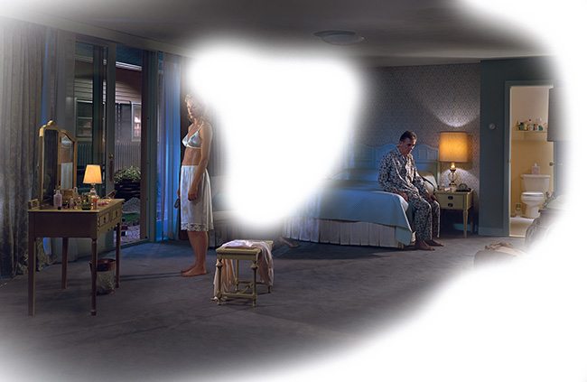
Breathing Room – We can see that he has the actors a bit higher in the photo to compensate for their gazing direction. If he had them lower it might create unwanted negative space above them.
Adjusted – Perhaps we could use the the root 3 rectangle to help us snip off just a bit more from the top and bottom without losing anything? Here’s a tighter version which also subdues some EF found on the left curtain and the right door crack. What are your thoughts? Does it fill the grid and improve the composition?
Gazing Direction – The composition is equally balanced with the actors gazing directions opposite of each other. It seems that there is a bit of tension in the room, don’t you think? He’s gazing at the ground, and she is gazing towards the dresser with the prescription drugs. Are they anti-depressants? Pregnancy pills?
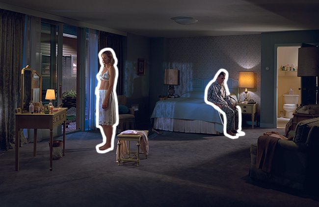
Figure Ground Relationship (FGR) – We can see that the two subjects are clearly defined from the background. This is due to Crewdson’s lighting as well as the positioning of each actor.
Black and White Blur (BW BLUR) – Once converted to black and white we see the nice tonal scheme in his photo. He builds a path of light from the bathroom, then around to the patio door.
Greatest Area of Contrast (GAC ) – When we find the GAC we can see that the lights are the lightest areas, which is to be expected. But what’s this? Her belly is also the lightest area? Is Crewdson trying to direct our eyes to this area? Is she pregnant after all? This might explain the tension in the room, and the prescription drugs on the dresser. If we look close we can also see a bird on the dresser. What is Crewdson’s story? Any thoughts??
Edge Flicker (EF) – He keeps the edge of his photo nice and subdued, free of distractions. As I mentioned in the adjusted photo above, there was a bit of a brighter area on the left curtain, and the door crack was drawing the eye. Both could be removed easily.
Hope you all enjoyed this one! Keep making art and keep being inspired! See you next time, and much love for all of the support!!

