
Haphazardly Filling the Grid
175/365
Welcome back everyone! Once again, thanks for all of the amazing support. Much love!
The other day I was browsing through pictures on my 500px app and I noticed something that inspired me to write this article. As I was scrolling, some images looked great, yet as I clicked over to see the whole composition it seemed to lose some of it’s oomph. The app was haphazardly cropping the image to a square for display purposes, but in some cases it made the composition stronger. It all falls back to our lesson about filling the grid.
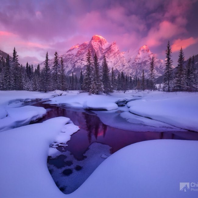
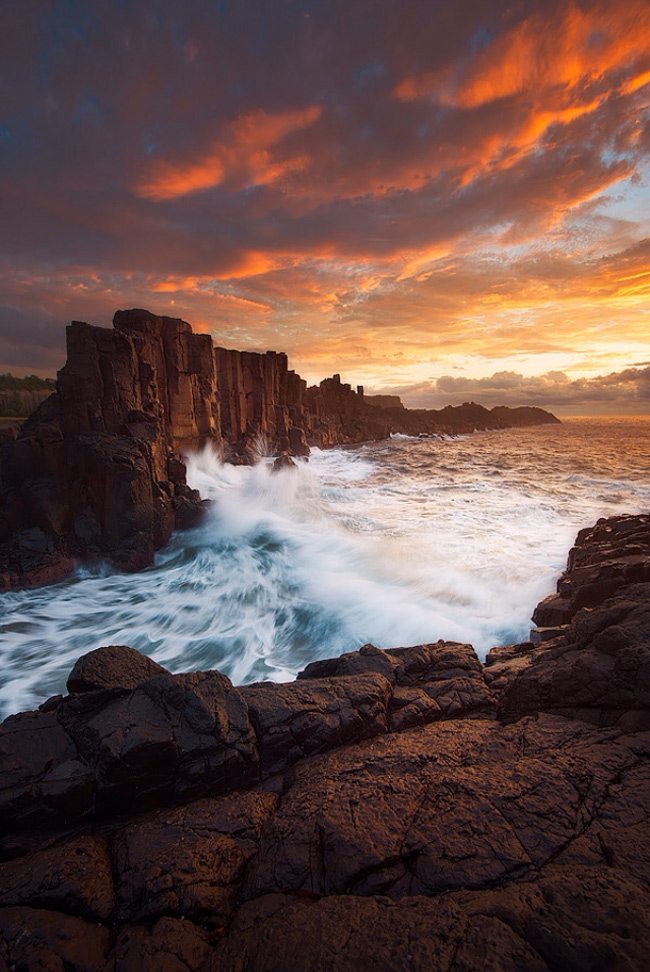
These first two examples are by Chip Phillips. They are quite striking, but they become even stronger if we snip out the unnecessary negative space? I believe there’s always room for improvement and lessons to be learned.
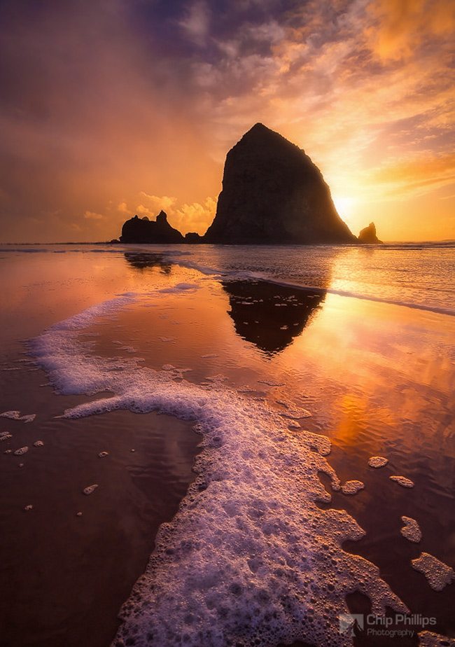
We know the sky continues upward, and the foam continues downward, so do we need this much of each in the image? Can we simply snip off these areas of excess and tell the same story? Below is the view which I saw in the app…a square crop right in the middle of the image. Even though it was not a planned crop, it helps the composition. Keep in mind I’m not promoting square crop, or cropping in general, but if it helps the composition, and you can’t create the shot again, then feel free to snip off what you need. It’s always best to capture it in-camera to preserve those precious pixels. The same goes for painting though. Fill the grid and create a stronger composition.
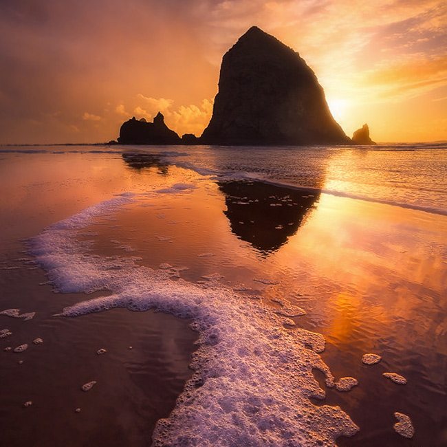
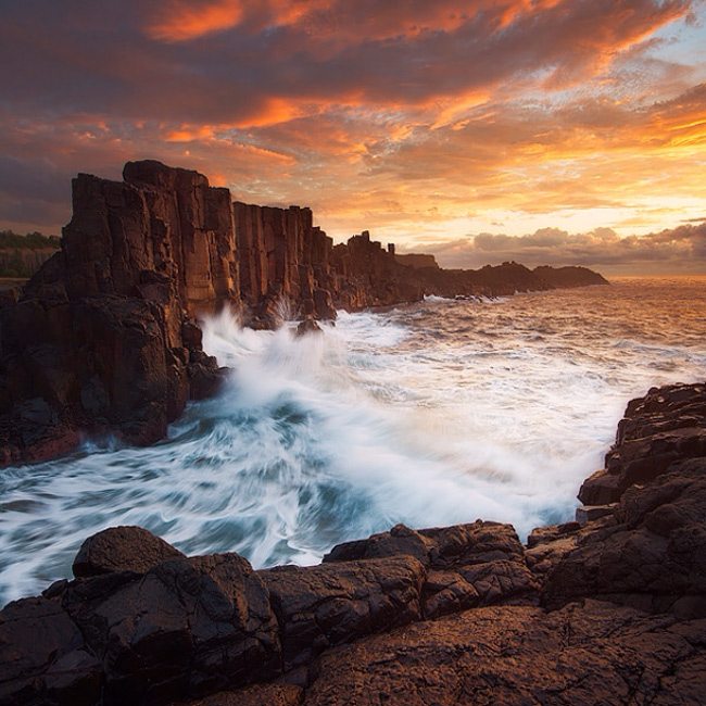
Here’s another one by Chip.
We can see in this preview version that the accidental square crop created by the app is snipping off the unneeded space on the left and right. This helps the balance of the image and strengthens the composition.
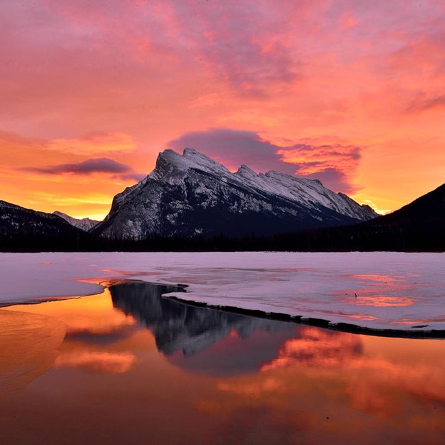
This photo by Jerome Berbigier does the same thing. We have a lot of sky and ground showing. More than enough to tell the story of this image.
Here we have the square crop created by the app. Can you see the difference? It makes the diagonals near the middle much more powerful.
This photo by Shuchun Du could use a bit of snipping too. All of the action is in the middle, so why not bring more power to it?
Now we can see the format in which I first saw the image….the one that made me click over to see more.
Using the Square Grid
Now that we saw how these happy accidents helped the composition, let’s see if we can use the square grid to bring more strength to the following compositions.
This first one by Mario Pereira is nice and minimalist, but we can snip off some unneeded areas and help it out.
By aligning our square grid (see Resources) we can place the subject in the center, line up the top and bottom diagonals on the left, and echo the 45 degree angle in the leg.
Here’s the final cropped image. Do you feel that it helped?
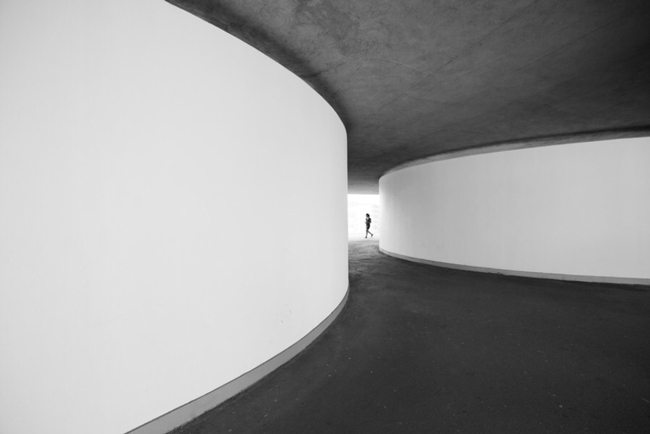
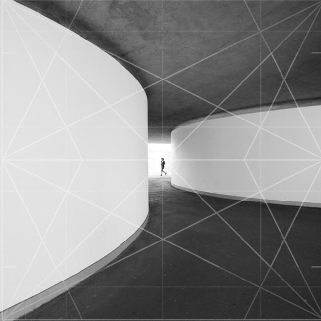
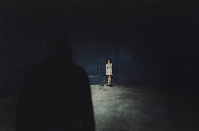
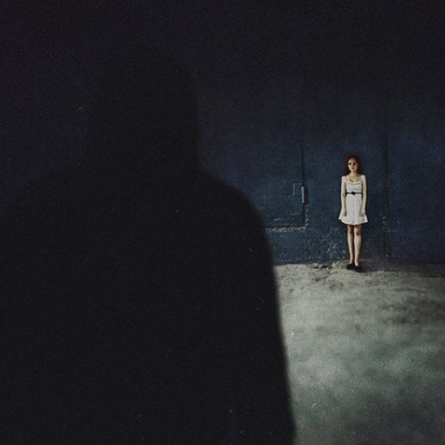
This mysterious scene by Dmitriy Hohlov displays a lot of negative space on the right. Let’s see if we can use the square grid as a guide for composition, then bring more attention back to the story.
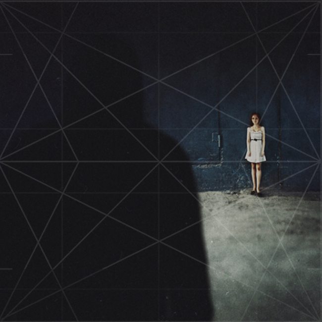
Here we can see the grid being aligned with the female character in the polar point, the man locked in on the left vertical, and the ground on the lower horizontal.…remember that there are two stacked Root 4’s with 45 degree angles found in this grid.
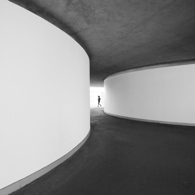
Here’s the final adjustment which brings more attention back to the characters. We can still tell it’s a dark and creepy place even though the large black area from the right is gone. Still needs a bit of adjusting to clearly define the dark characters silhouette on the left, but that’s another issue.
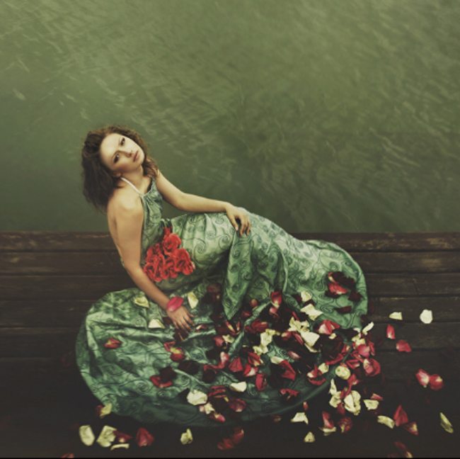
This really nice picture by Aleksey Radchenko is already a square crop and this is how I saw it within the 500px app, but can’t we snip off more negative space, fill the grid, and bring more power back to the composition? Yes!
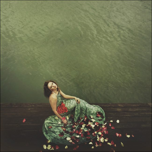
I’ll admit, I really like this one, but taking our knowledge of filling the grid, we can use it as a guide and make this image even more remarkable. Here I line up the grid to the middle horizontal peer, the female locks in on the diagonals near the left polar point…the flowers in the lower right even follow the diagonals.
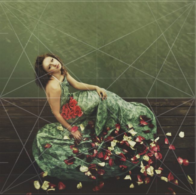
Here’s the final adjusted image. Now that’s a great image!
I hope this helps you realize why some images worked at first, but when you saw them in their full size they fall a bit short. Don’t be scared to challenge yourself. Get close to the subject and fill the grid. Painters should do the same. How much can you cut out? How much can you refine? How much can you simplify? These are all questions you should be asking your self. Go back through some old photos and see if they can be improved by cutting out the unneeded space while still communicating a more powerful story. With this practice, you’ll be able to achieve this on the first try.

")
")