Henri Cartier-Bresson – ANALYZED PHOTO
226/365
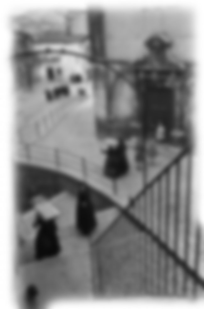
Any street photographers out there? Today we are taking a look at Henri Cartier-Bresson’s photo full of his favorite thing…geometry. He’s a huge inspiration to me and well known by most street photographers and serious photojournalists alike. Let’s take a look deep into this image and see if we can get inside his thought process, because once we know that, we can apply it to our own photography.
This isn’t just a quick snapshot he grabbed. He is a hunter. His prey is geometry combined with fleeting moments. He saw the potential at this location, so he sized it up, waited till the women started their daily routine, and at the precise moment…BANG! He freezes it in time forever.
“What I like is the stalking; I have no use for the meat.” ~Henri Cartier-Bresson
Bresson liked to shoot, but he didn’t care to process the photos in the dark room, or print them out. The hunt and stalking is what excited him.
1.5 Rectangle Basic Armature – As we all know, Bresson and his pals at Magnum Photos choose not to crop their images. What you see is what you get. They edit them, but cropping seems to be forbidden (I think in some cases it’s acceptable, especially if you are designing with a root rectangle in mind. More is covered in Day 203).
We can see that he’s using the 1.5 rectangle. Everyone is in motion and moving in different directions, so he had to time this perfectly to get the women in the middle to line up. Can you see the geometry he was interested in?
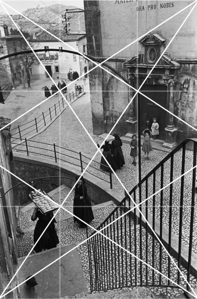
Locked into the Grid – No sense in adding the MAD because with street photography you don’t have time to refine your design further than the basic armature. Here we can see that the railings, even the pigeon, are locking into the reciprocals and the women in the middle are on the baroque diagonal.
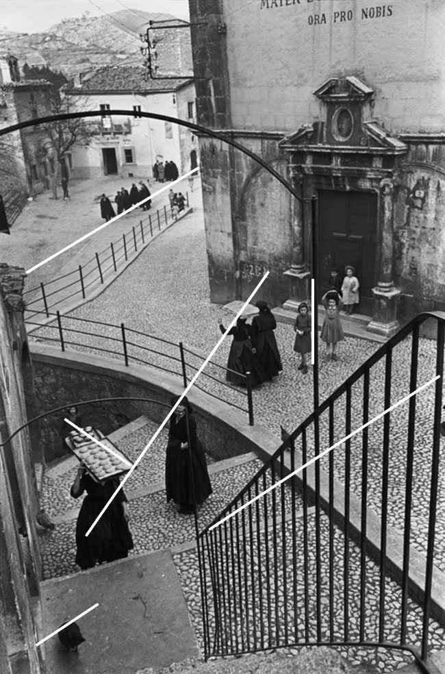
Gamut – He’s capturing all of the repeating verticals of the railings which also helps with depth. But the hard part, and one that takes a bit of thinking, is to capture the diagonals. Here we can see he’s repeating three diagonals.
The middle diagonal, with the line of women, is the exact line of direction (even though some of the women can be found on the baroque diagonal). We can’t forget to point out the fact that the women in dark robes also adds to the rhythm of the photo. He hunted this scene down and knew exactly when to press the shutter button to get the design he wanted.
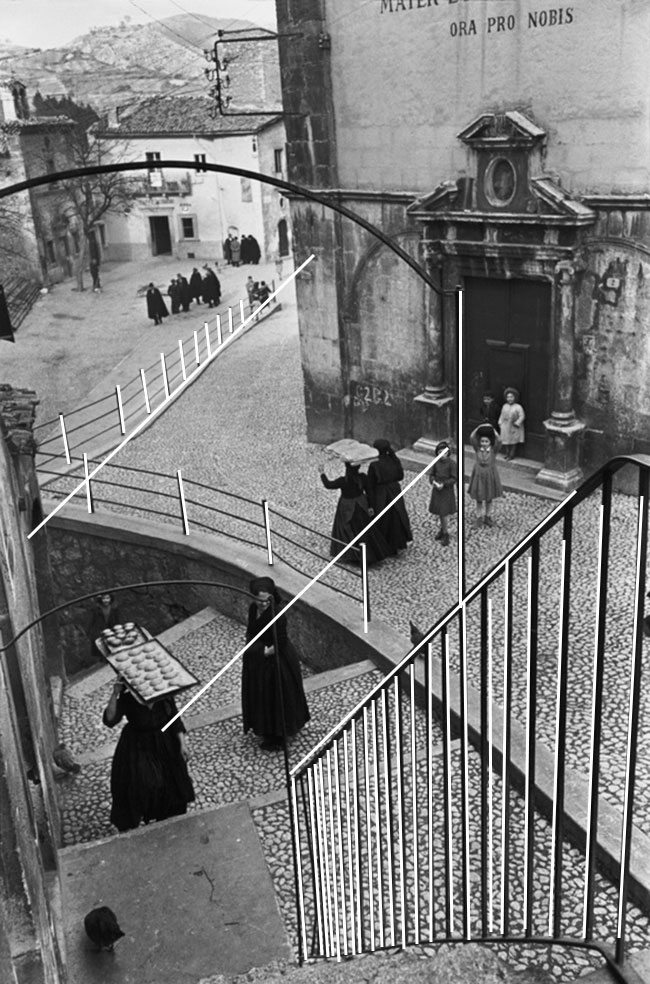
Coincidences – He’s even got a few coincidences where he planned to press the shutter button. The one that impresses me the most is the one that comes down from the top middle and coincides with the woman standing and the railing.
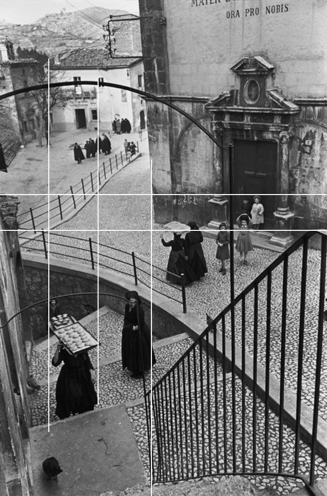
Arabesque – There are a few sweeping arabesques creating movement throughout Bresson’s design. He could easily see the arch and the movement of the railings cement edge, but the arabesque coming from the door to the stairs was some luck, some planning (anticipating their routine), and his quick reaction.
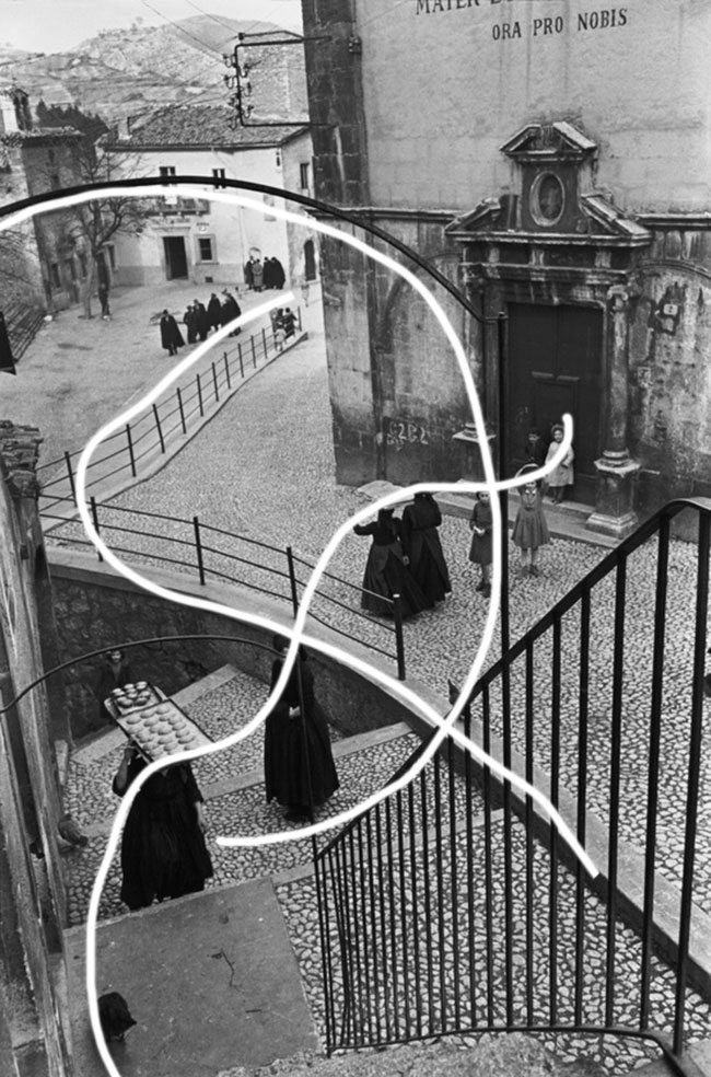
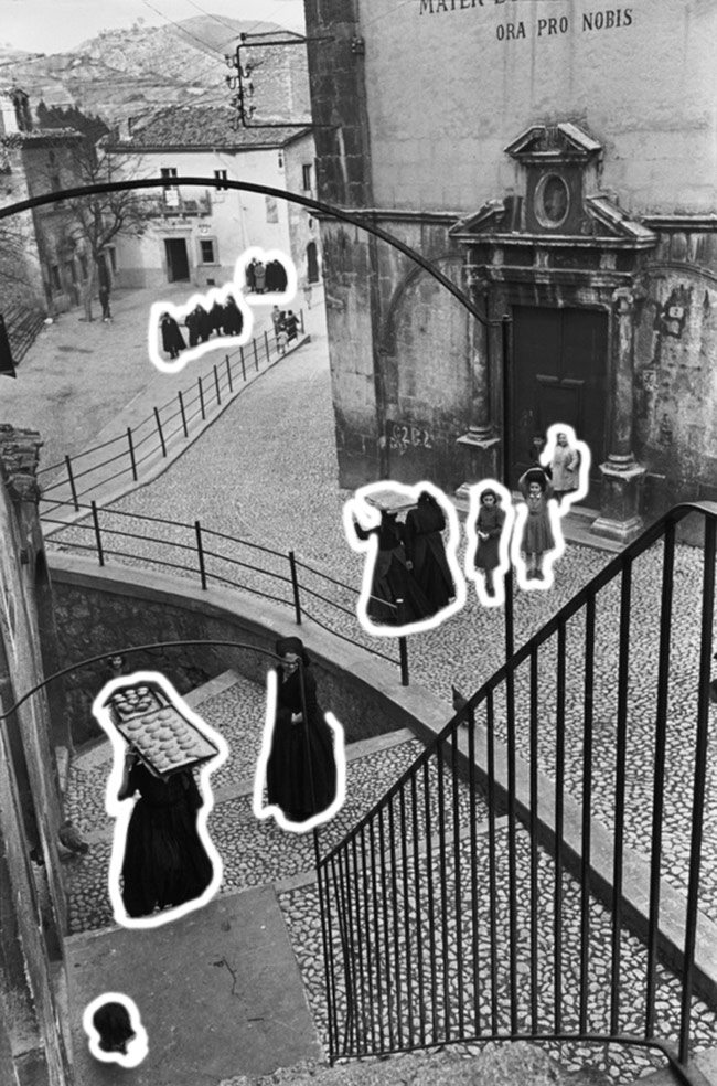
Figure Ground Relationship (FGR) – Each of the characters are clearly defined. The only area that is a bit lost is where the girls dark hair meets the dark door. Did anyone else notice that their is someone coming up from the stairs in the lower left (just beyond the baking pan)? So many different levels adds nice depth to the design.
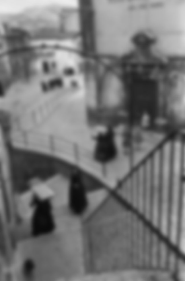
Black and White Blur (BW BLUR) – When converted to black and white, then blurred, we can easily see his tonal range, the repetition found in the women’s robes, as well as the simplified geometry.
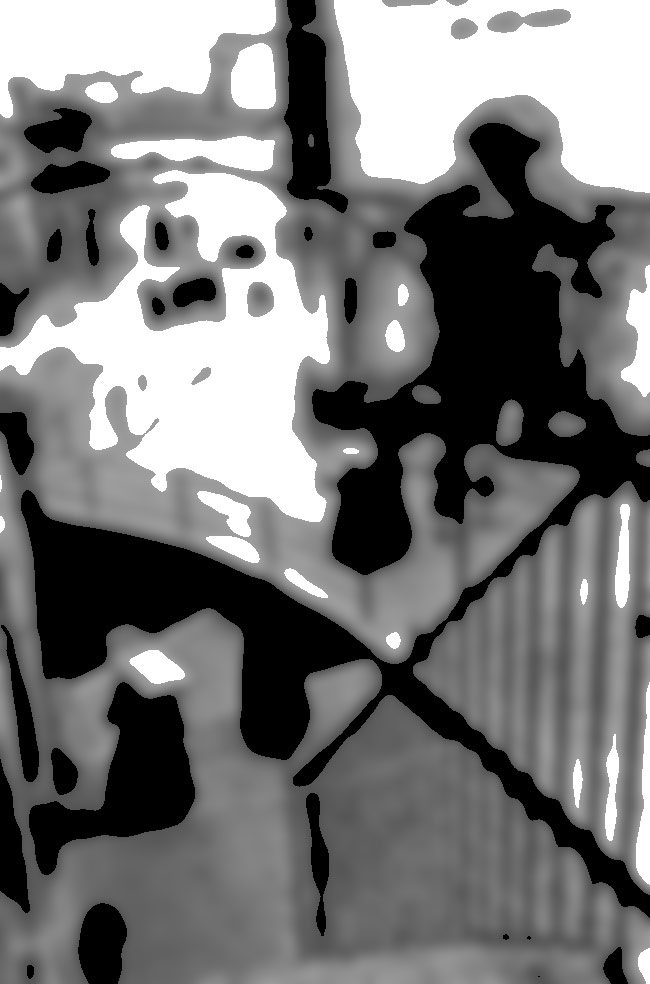
Greatest Area of Contrast (GAC ) – We can see that when we find the GAC (see Day 71) the woman in the front is a great starting point for his design. She has very light values up agains very dark values which draw our eyes. Well done Bresson!
Edge Flicker (EF) – Bresson controls the edges of his photo very well. Being that he never crops, you can see that he is in full control. Only a few areas of contrast near the edge, but all part of his design.
I hope you all enjoyed that one. If this is your first time seeing Bresson’s work, I recommend you take a look at some of his other photos. Especially if you are into street photography and design found within fleeting moments. Thanks for joining in and all of the support. Much love! See you next time!!




Dynamische Symmetrie in der Kunst – Frank Tegtmeyer
December 17, 2016 @ 12:23 pm
[…] Zum Abschluß eine Fotografie von Henri Cartier-Bresson – ebenfalls analysiert von Tavis Leaf-Glover: […]
November 29, 2017 @ 9:11 pm
Thanks, you’re welcome! 😀