#684
I hope you’re all doing great, thanks for showing up for another interesting article!
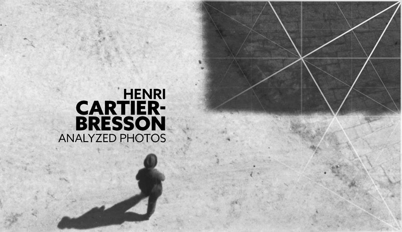
We’re digging into some Henri Cartier-Bresson photos today to see which composition techniques he’s capturing. There are a couple of new photos here that were hard to find on the internet, so this will be exciting! How did he compose such captivating photos? Let’s find out now!
Interesting Facts Henri Cartier-Bresson
Aside from being a photojournalist, always risking confrontation from strangers, Henri was very shy and private. At least that’s what the rumors are. In some of his interviews it seems to be true because he acts super humble and confused as to why people think he’s so great.
He also tried to avoid being photographed. At an Oxford University in the 1970s, he supposedly held a paper in front of his face while he spoke. Perhaps this was all to add to his anonymity in the streets?
Bresson shot with a 35mm Leica camera and a 50mm lens, with black and white film. In one of his interviews he mentions that after he takes the photo he has no interest in the rest of the process. Developing and editing were left to others to figure out (see #511). In this article you can see some of the editing process. Oh, and he was really against cropping because it messed up the geometry he captured…even though his most famous negative was cropped (see #434).
I’m sure Bresson analyzed his own photos though. Why? Because it’s essential to analyze your own photos to see if you’re progressing…especially when shooting film because there’s no LCD to view. How else would he know if that beautiful geometry, his obsession, worked in the final composition?
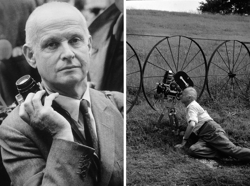
Here’s a photo of Henri holding his Leica on the left, and one of him shooting a film on the right. Yes, he shot a few movies in his time. He even drew and painted. I’m sure many of you probably have a few visual arts you like to dabble in.
In this detailed video we’ll hear Bresson talk about his love for surrealism, as well as geometry (see #472). We’ll see these techniques come alive in some of the photos below!
Composition Techniques Henri Cartier-Bresson
Ok, let’s start digging into some photos!
In this first one we can see that the woman in the middle is the main focal point. She’s clearly separated from the background and the men around her with nice figure-ground relationship (FGR) (see Day 21). He’s also capturing the woman with an aspective view (see Day 78). Such perfect timing! Talk about the “decisive moment,” look closely at her left foot and you’ll see that it isn’t touching the ground. Much like the man jumping over a puddle…his heel is just about to touch the water.

In the same photo, we can find aerial perspective (see Day 42) helping with the FGR. Was it a foggy day, or was this because they manipulated the background in the darkroom? Perhaps both! Dodging and burning were common techniques in the darkroom, and it’s where Photoshop adopted the terms.

We can also see the Law of Similarity (see Day 56) at work here. Notice how the men are forming two groups, but our mind groups them together because they are men and wearing the same outfit. The woman has a different outfit and is perceived to be separate from them.

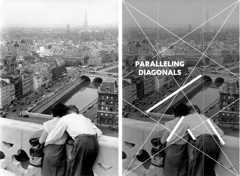
Here’s a cool photo of Paris and the Eiffel Tower (see #575) in the distance. We can see how Bresson is paralleling the diagonals of the 1.5 grid. Once you memorize the basic armature (see #512) you can look for these paralleling diagonals really quickly, then combine them with other techniques.
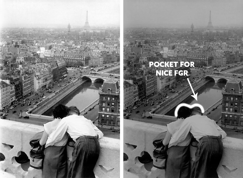
Bresson is also at the perfect height and position to fit the couples heads inside the pocket of negative space in the distance. This helps with FGR in the most important areas. If they wanted, they could even improve the FGR by slightly adjusting the woman’s dark hair or the dark reflection by her hair. Subtle editing could improve it without making it too obvious. It’s very easy to overdo traditional dodge and burn techniques.
With such a great distance captured, it’s nice to have some aerial perspective. If Bresson were into creating HDR images, this wouldn’t have the same depth. They may have emphasized this technique in the editing process as well.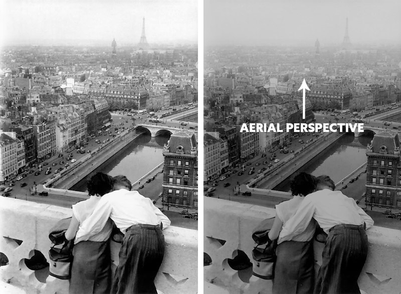
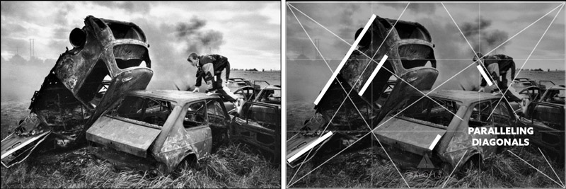
Yes, Bresson loved geometry. Dynamic symmetry is geometry, and we can see him capturing the boy in the upper-right polar point (see Day 5) and paralleling diagonals.
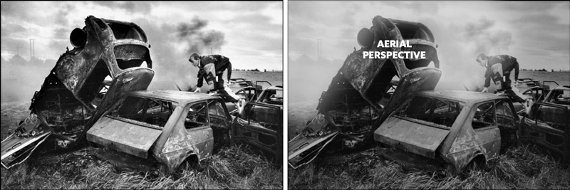
Where there is smoke, there is aerial perspective. We can see how the smoke adds more depth, but also more drama in this photo.
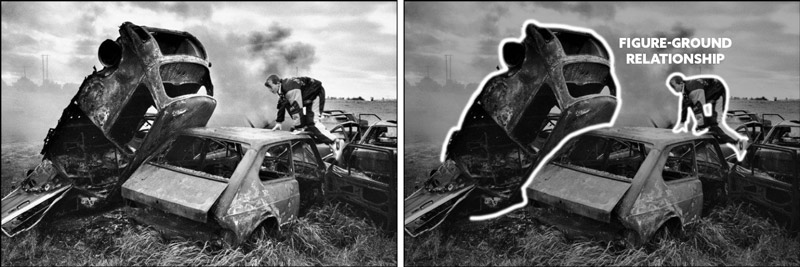
We can also tell that either the background or the car were edited to enhance the FGR. These two focal points have nice FGR, but the car definitely dominates when it comes to contrast. It almost looks like HDR, don’t you think? There is a halo near the lower-right and lower-left sides of the dominant car.
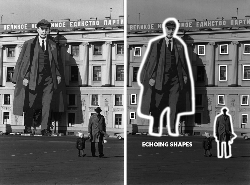
This is a fun one! Bresson has a great sense of humor, and we can see it in many of his photos. This one for instance shows how he uses echoing shapes (see Day 90) to create rhythm and unity.
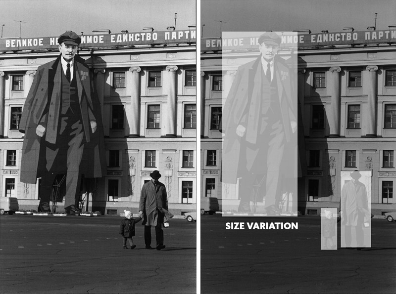
Bresson is also to capture a hierarchy (see #442) of size. The figures go from small, medium, to extra large.
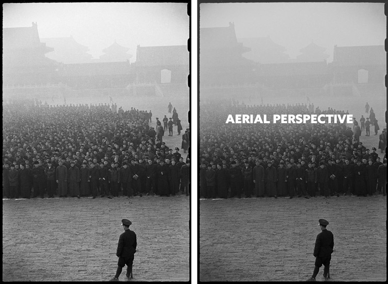
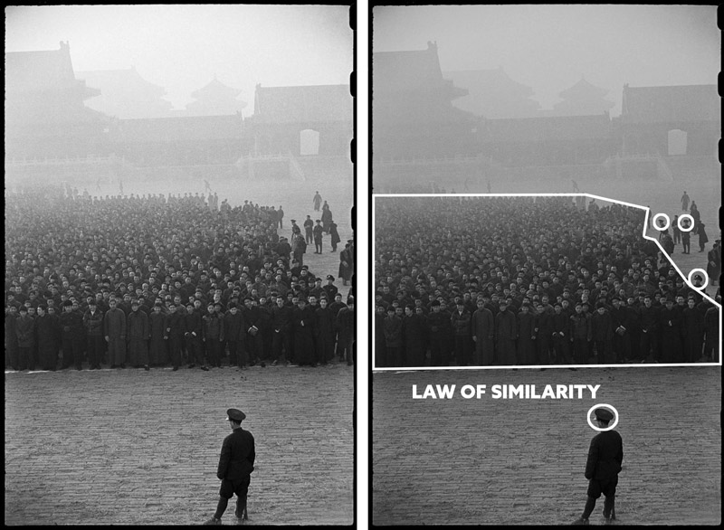
This photo is interesting for sure, but it’s not because of the aerial perspective he’s capturing. It’s other techniques. Can you see them?
He’s using the Law of Similarity again! Notice how the large group of people are clearly separated from the guys with specific hats (see circles). It looks like an ominous photo, like the guy in the bottom is telling everyone what to do, but thankfully the group is smiling. The guy on the bottom could be some random officer who isn’t even significant, but the way Henri captures it makes him look like the leader.
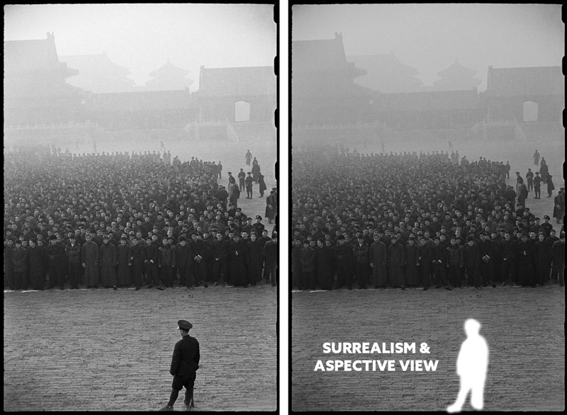
We’re also seeing Bresson’s love for surrealism. He’s capturing the guy in the bottom to look like he’s standing right on the edge of the frame. The black border of the negative is still being shown, so this will show you how exact Bresson was. The man’s foot is right on the border. I was never able to get this precise with a rangefinder film camera (see #52o).
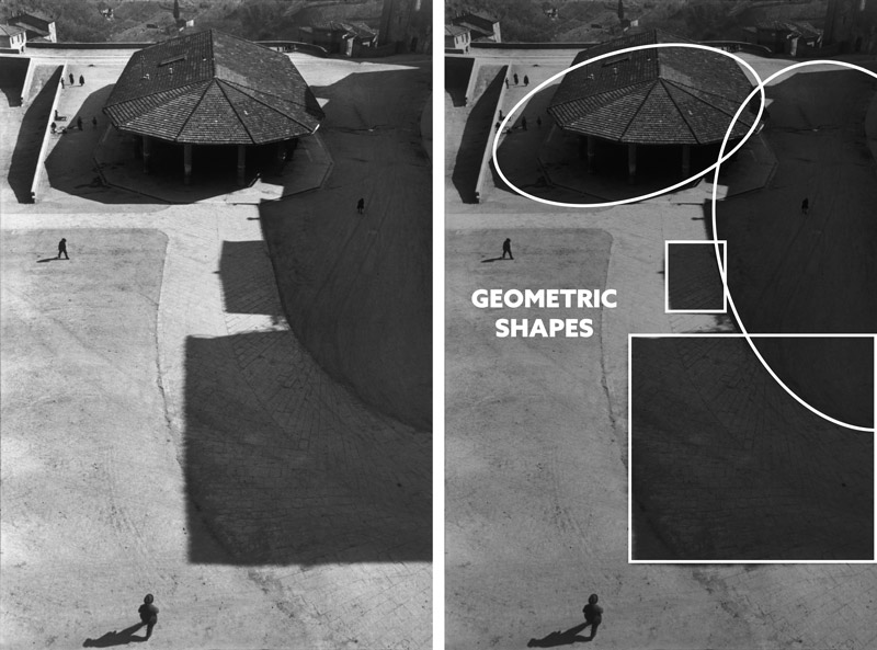
This is a great way to capture the shadows as part of your design. Here’s Bresson using his sensitivity to geometry and composition to capture the geometric shapes created by the sun.
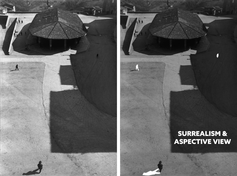
He’s capturing a similar illusion in this photo as well, with the man being on the edge of the frame. Crafty isn’t he! Is this edge flicker (see Day 49) affecting the shot? No, because it’s part of his design and leading the eyes back into the composition. He’s also capturing four subjects in the scene with an aspective view. The fourth one is in the upper-left corner and very small, but it’s there.
In this one, Bresson is still showing how he can easily capture paralleling diagonals. If you don’t use the grid on your LCD or study the grid in another way, you can get lucky, but you’ll never be as consistent as this.
Check out how he’s using coincidences (see Day 48) to create movement and unify the men in the scene…even though they might not know each other.
Want some more surrealism? Here you go! The lack of contrast on the man’s back allows the background shape to be united with his shirt. Bresson captures it in a way to create a hunchbacked man. So cool!
Conclusion
Henri Cartier-Bresson was certainly a master of his craft. He studied the grid and techniques, then applied them in the streets. Learn, apply, repeat! This is the best way to develop your skills and create remarkable art. Did you take any notes during this article? Do you plan on going out for at least one hour this week and trying a new technique? Do it and have fun!
Thanks so much for being a Master Pass member, this site wouldn’t exist without you! See you in the next one!

