How Inspiration Fades in Photography
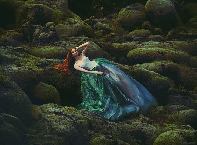
227/365
Welcome back you guys! Today we are going to take a look at why those artists who have greatly inspired us in the past are beginning to fade as time passes by. In this article we’ll cover what we can do to avoid the fading away of our inspiration and our art. What better way than to compare Miss Aniela and Brooke Shaden, two of my favorite photographers. Can you guess which one is starting to fade on me?
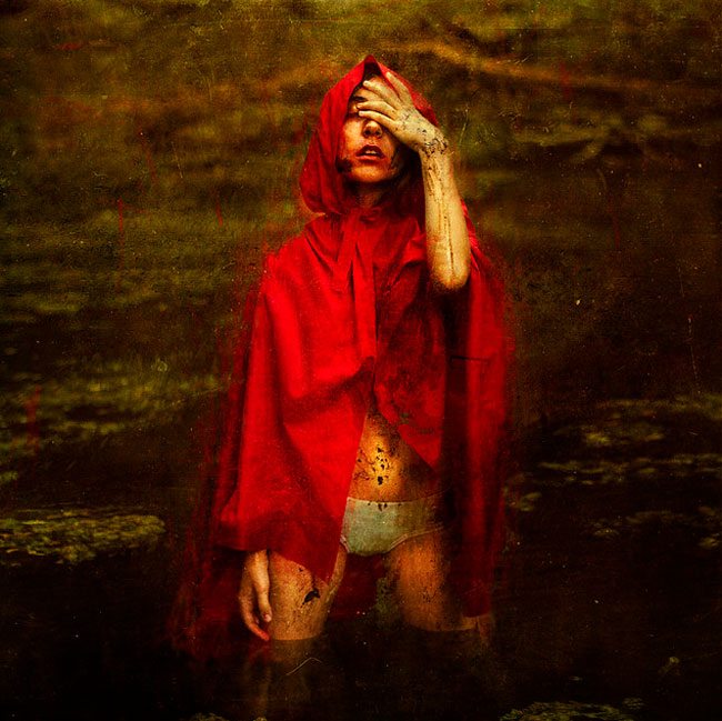
Since I started getting heavily into photography in 2010, both Brooke and Miss Aniela (Natalie) have both inspired my journey. I’m very grateful to have such amazing talent readily available to gaze upon and feed me with fresh inspiration. It guilts me to say that one of them is starting to fade on me though. It’s tough because she is such a kind, warm, and caring person. Sharing all of her passion and inspiration with the world. And if she ever read this I’d feel pretty bad, but I have to be honest. Miss Aniela continues to shine as Brooke Shaden begins to fade. Don’t get me wrong, I still like Brooke’s work, it’s just lost it’s inspiring “oomph” over the years. Not because she’s not creating amazing work, but because she hasn’t kept increasing her knowledge of lighting, editing, and expanding her horizons when it comes to the final image. So, if she inspired me in 2010, why is her inspiration fading if her artwork has remained the same all these years?
Our tastes change due to knowledge gained by means of study or experience. As time passes, wisdom and sophistication can be obtained if reception of information is nurtured into understanding. If your tastes in art are changing it means you’ve acquired information that has made you artistically mature. The same goes with other scenarios like the long stint of hatred I had for red wine, or how I hated the taste of coffee, or blue cheese.
I’ll never drink wine again!
When I was 15, my friend had obtained a bottle of Chianti from his parent’s liquor cabinet. Of course, we ran to his clubhouse in the top of his garage. Three of us sat in a circle, took a shot of Chianti, then passed it on. I seemed to handle it better than the others, so I kept drinking shot after shot as they cheered, “Tavis, Tavis, Tavis…!” Before I knew it I was puking on the side of the hill by myself and could hear them in the clubhouse ridiculing me for being so naive. I stumbled my way home at about 1 am. Thankfully my Mom was working! Somehow I made it up to the shower. I had been sick all over my clothes, so I got in the shower with everything on. Being too drunk to stand up, I sat in the tub…sulking in depression and dry heaving in-between tears.
Not a fun time for a 15-year-old. So yes, I had quite the disregard for red wine. But as time passed by and my tastes matured, I gained new experiences and realized that you aren’t supposed to take shots of wine. I was able to enjoy it again with a nice meal, and some great company. People change. Our taste for wine or art will change. What will you do to keep your following interested after all of these years? You must seek new horizons. Educate yourself to keep your artistic skills sharpened as well as improving (lighting, Photoshop, paint strokes, blending, sketching). Gain wisdom, and let it reflect in the unique vision of your art. Otherwise, it will just be a matter of time when the others around you learn your tricks, predict your next piece, and allow you to fade away into the forgotten abyss.
Brooke Shaden
Here are some amazing images by Brooke Shaden…leaps and bounds better than any of my photos. This one below is a recent one and when I saw it I was instantly inspired and was happy that she was attempting something a bit different.
Watch this VIDEO of her during her Creative Live workshop.
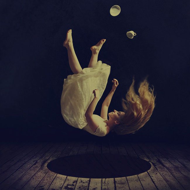
This is another rather recent one that inspired me too. So creative and it tells a unique story that shares her vision.
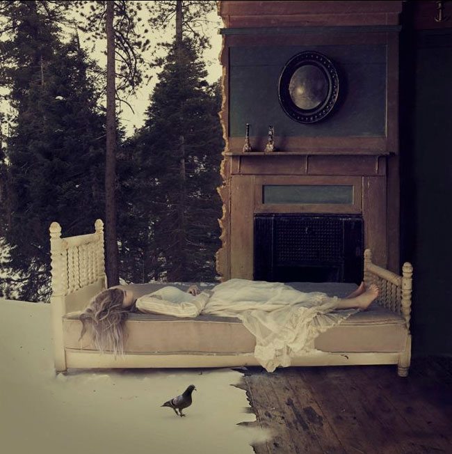
And yet another one. Simple and the post-processing is under control.
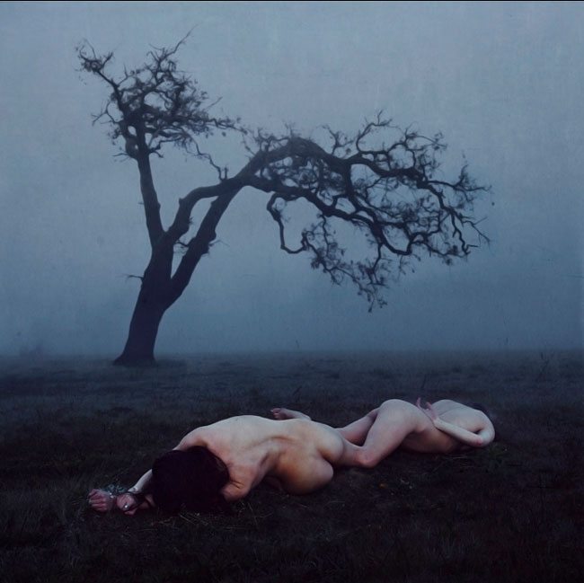
This is probably one of the earliest images I was inspired by. I saw this in 2010 about 2 years after she created it.
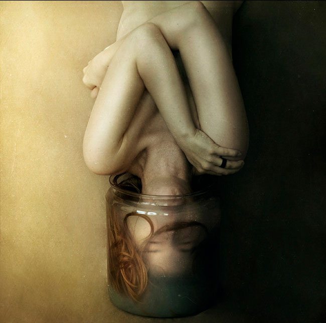
And this is one of the earliest self-portraits in her Flickr photostream. Again, very creative and imaginative!
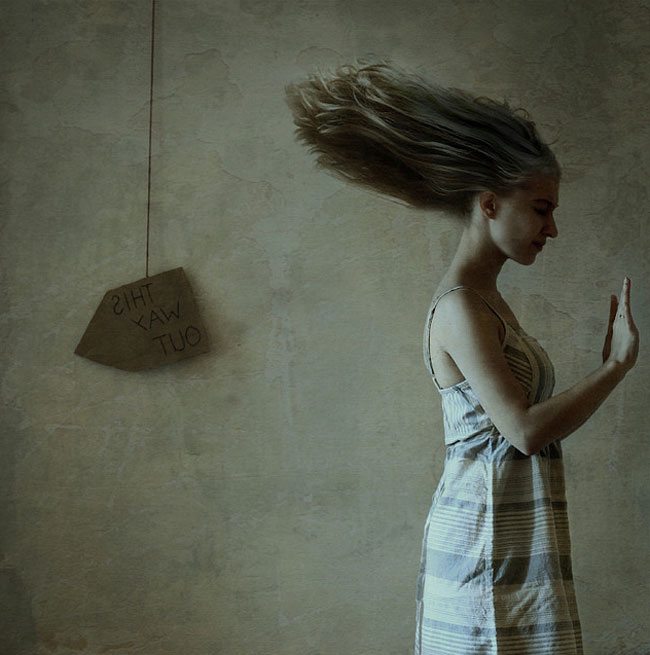
This one below is equally as amazing as the others, yet by now I’m beginning to see a pattern. As the years have gone by, I’ve acquired some skills in lighting, Photoshop, composition, and art, I begin to easily figure out the magic trick which amazed me in the beginning. It’s as if one magician goes to another magician’s show. They know the same tricks and they can predict the smoke and mirrors.
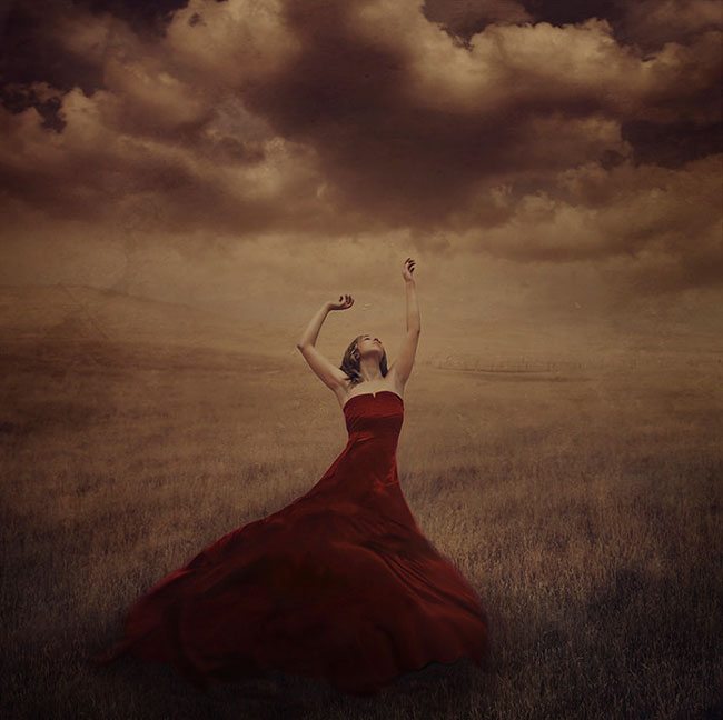
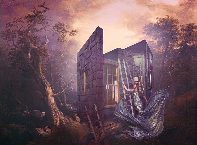
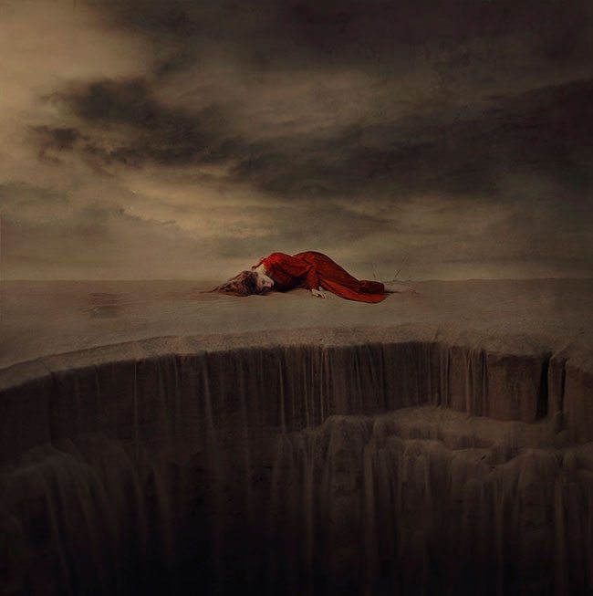
It’s great to have a personal style, actually, it’s a dire necessity. But be careful not to pigeonhole yourself into a strict style that places shackles on your potential to grow. Unfortunately, I believe that Brooke has accidentally fallen into this trap. Not to say these images aren’t freakin’ amazing, but as a fellow photographer, and a follower of her work, it’s easy to pick the lock of her magician’s trunk because I’ve learned the same tricks (as well as other tricks like lighting and composition). We begin to see square format, epic clouds, textures, dark vignetting, heavily saturated colors, dark settings, flinging dresses, and flat lighting. In my opinion, there are too many consistent elements defining her work. We can use textures and epic clouds, but we need to try and advance our understanding of light in order to properly edit and define the subject. Also, we can use different formats other than the square, but still use flinging dresses, epic clouds, etc. It doesn’t help that everyone copies her style too, which creates a saturation of similar work all negatively reflecting the style she constrains herself too. I guess that’s the problem of being a trendsetter, but you must keep excelling to continue inspiring.
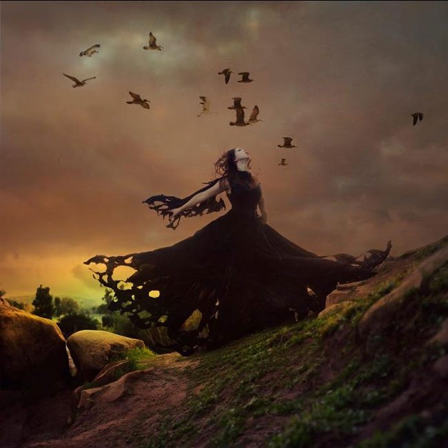
Take a look at the image below. With a sufficient amount of experience editing in Photoshop you’ll be able to see how she composited the birds, and the dress. It’s like watching an old sci-fi 80’s movie compared to the special effects of today. You can easily tell it’s fake. With a bit more knowledge of art, light, and Photoshop, she’d be able to blend this and make it look more realistic. The dress and birds appear to have no dimension.
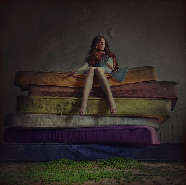
Again, with a knowledge of color theory, studying light, and learning Photoshop blending techniques this image below could be more pleasing to the eyes. The last thing I want to do is hurt anyone’s feelings. I’m just being honest and trying to help myself and others continue to stay fresh and inspiring. You can still retain your style while trying new things. Try a different format, try off-camera lighting, plan a trip to a new location and expand your horizons. And everyone likes to see a comeback, so it’s never too late 😀
“An artist should never be a prisoner of himself, prisoner of style, prisoner of reputation, prisoner of success, etc.” ~ Henri Matisse
Miss Aniela
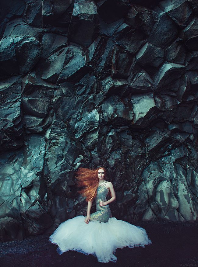
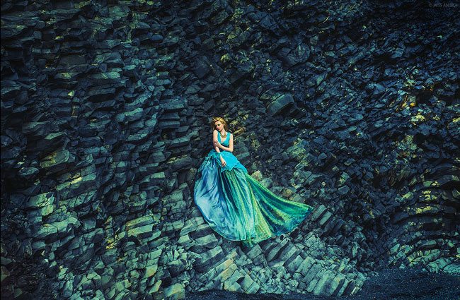
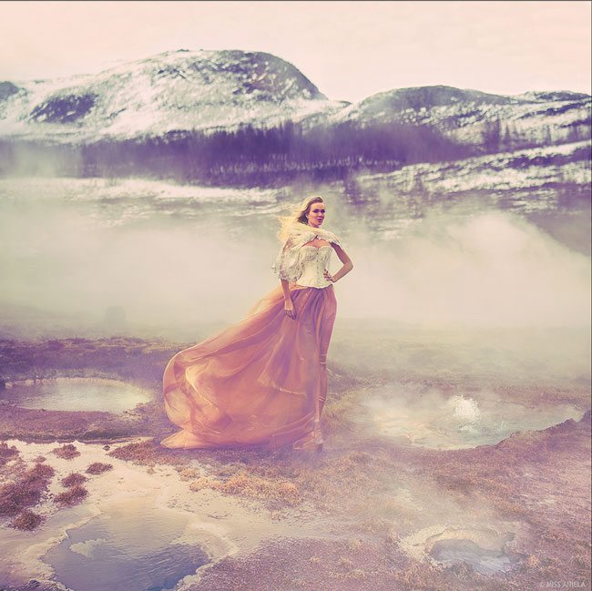
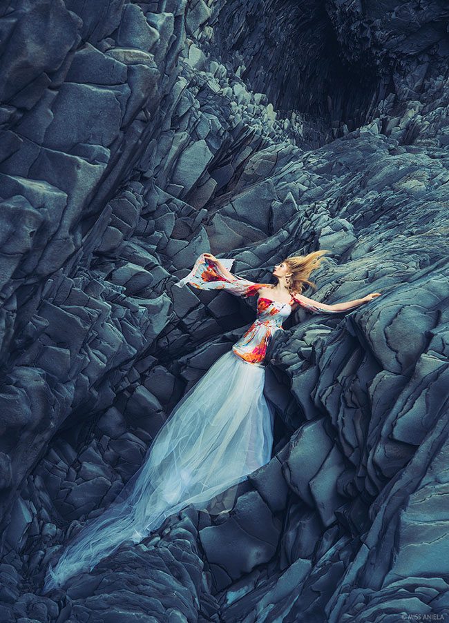
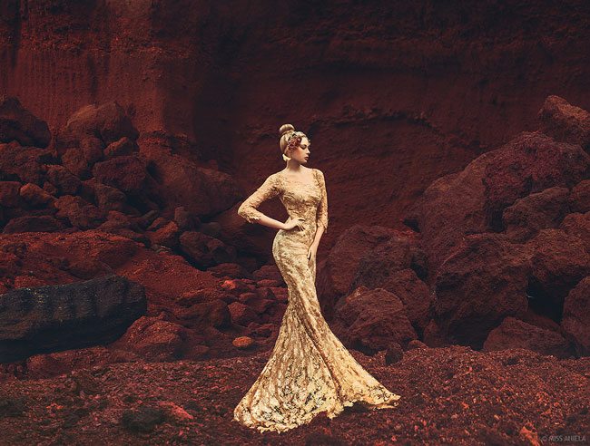
Now we can take a look at more of Miss Aniela’s work. These first shots are very recent and taken in Iceland, 2014. She’s working with colors, lighting, different format, new location, yet still keeping her unique style and whimsical feeling.
Watch this short intro VIDEO for her Creative Live workshop.
Nice diagonal, repetition, and colors in this one.
Great colors and lighting. She’s come pretty far from her first posts on Flickr.
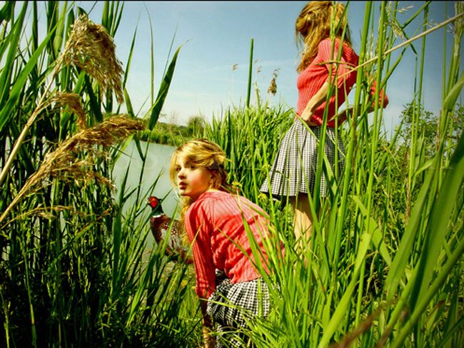
This is one of her early photos that inspired me when I was first starting out. Taken in 2006 I saw this image four years after she had created it. Nowadays, after learning new techniques, it’s very easy to create a multiplicity shot, and I can tell that the grouse is fake. Not to say it wasn’t a great shot for her beginning years.
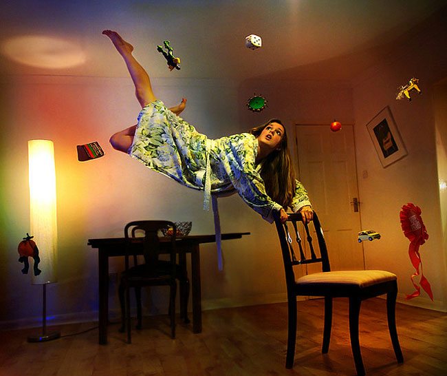
She continued to try new things, keep us amazed and used the format which worked best. This is another very inspiring image in my early years. Levitation shots are also very simple now that I’ve educated myself. They’ve almost become a cliche in the conceptual photography world. If she still did shots like this today, her inspiration would be fading.
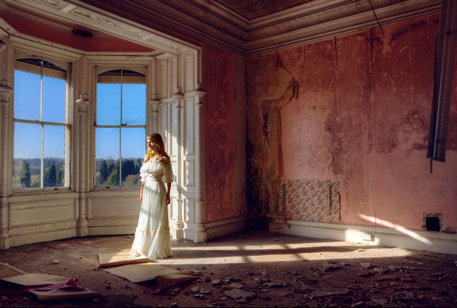
This is another simple portrait in an amazing location with great lighting. Early work that inspired me in 2010-2011.
She continues to inspire while keeping her unique vision, educating herself on lighting, Photoshop, and surreal techniques, all while expanding her horizons and venturing to new locations.
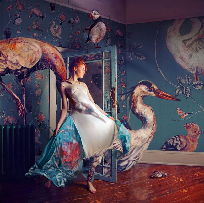
In this shot, she is mixing her photograph within a painting. Excellent lighting, location, Photoshop skills and blending to create an amazing atmosphere
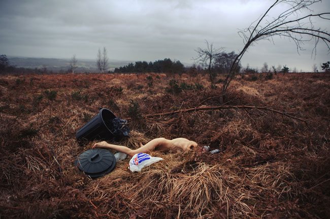
She even creates photos that have a strong message. Like this one called “While Stocks Last,”…
…or this one called “Free Range.” Still her unique vision and style, but telling a different story.
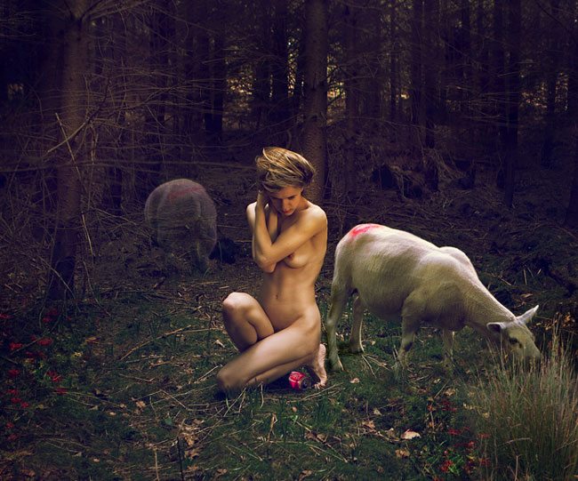
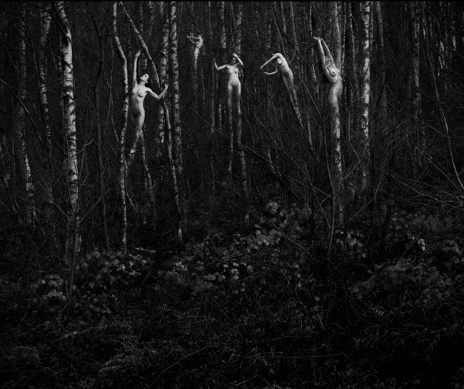
Miss Aniela also creates very dark and surreal images like this one of bodies in the trees.
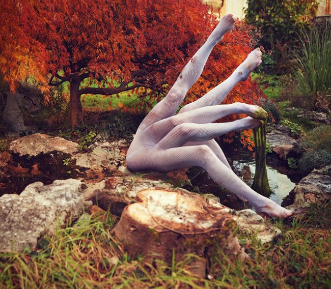
Or this photo of surreal awesomeness!
Here style remains consistent which is detrimental for any artist.
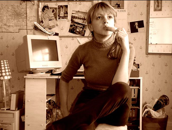
Here she is taking self-portraits in 2005. It’s been almost 10 years since this photo was taken. If you’ve been taking photos for this long, and continue to expand your horizons, educate yourself, and don’t constrain your art to a strict style, you will avoid being predictable and continue to shine as you inspire others. If I’m to take my own advice and give myself another 5 years, what will my images look like? What will yours look like in another 5 years? Don’t become stale and feed your viewers last weeks loaf, because we all know that bread tastes best when it’s baked fresh.

