How to Create Abstract Art with Composition Techniques (Video 1-3)
Composition Techniques Abstract Art &
The first step to creating any art with structure is to understand the design techniques. If you’ve made it this far within the articles, you should have an excellent grasp on the composition concepts. Just in case, here’s a list of the techniques covered in the video and a link to a related article.
Hierarchy (see #442), Texture (see #698), Coincidence (see Day 48), Aerial Perspective (see Day 42), FGR (see Day 21), Dynamic Symmetry & Major Diagonals (see Day 14), Triangular Enclosures (see Day 32), 90 degree Angles (tilted) (see Day 76), Arabesques (see Day 17), Ellipses (see Day 34), Gamut (rep diagonals) (see Day 38), Greatest Area of Contrast (GAC) (see Day 27), Patterns (see Day 189), Vingnette (see Edge Flicker Day 49), Negative Space (see Day 83), Balance (see Day 57). Techniques also discussed in the course include Magnetic Momentum, Color Theory and Color Variation.
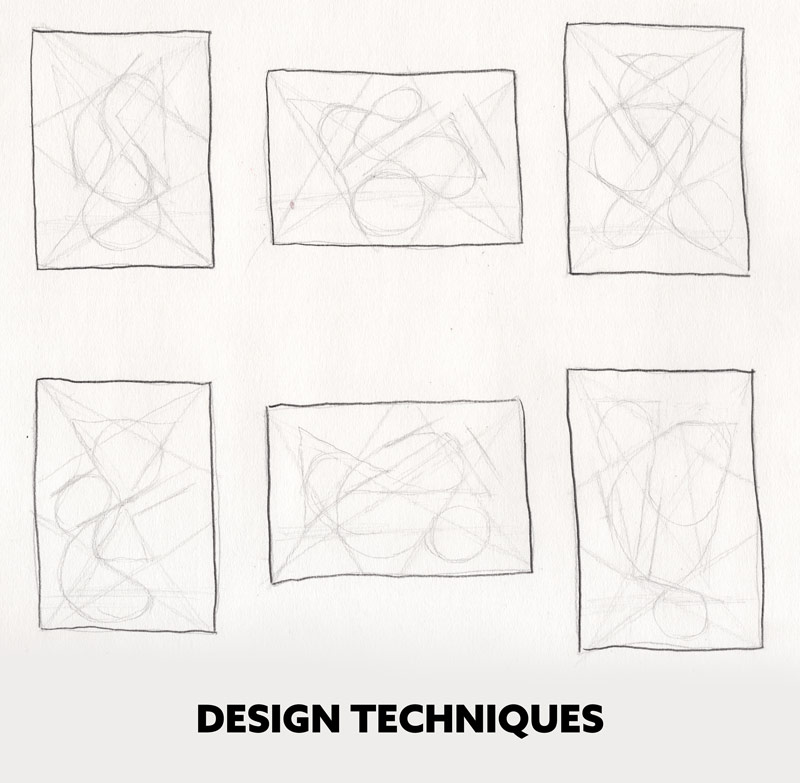
In this first example it shows the raw design techniques overlapped onto each other. Watch part one further below to see how these are created. By doing thumbnails like this it will really strengthen your muscle memory, and help you apply these composition techniques easier with more consistently.
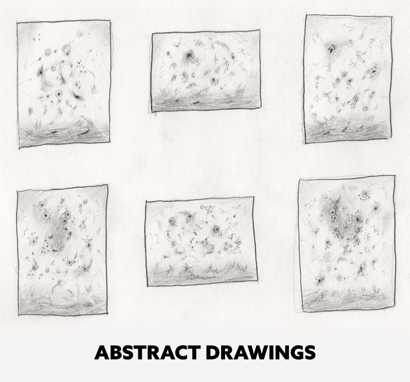
Once the design process is complete, the abstract shapes and values are filled in. This definitely doesn’t compare to a masterfully design Bouguereau painting (see #667), but it possesses the same integrity when it comes to composition and visual clarity. With so much focus on only aesthetic these days (see #713), it’s great to welcome this type of structure in the abstract world. This is a world where emotion is primarily dominant, and structure is nowhere to be found. If a house is to be built it needs structure to stand the test of time. It needs something more than Shock & Awe (see Day 111).
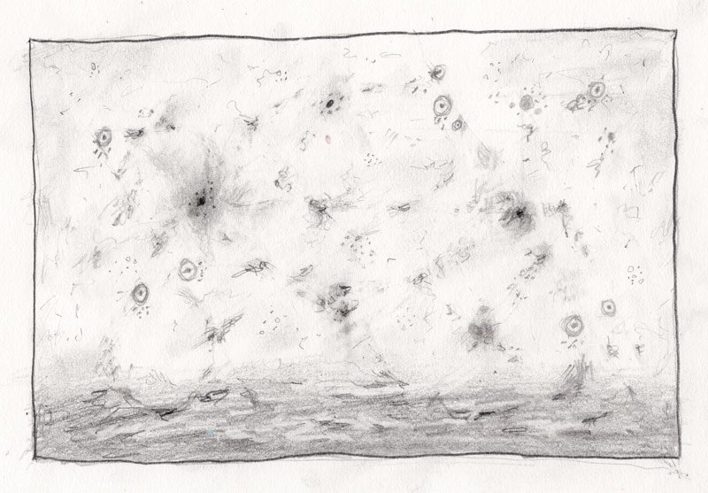
Final Design
This is the final design from part one. What do you think? Sloppy, expressionistic, horrible, beautifully horrible? It can be all or none of those things depending on the viewer, but one thing is for sure…a lot of planning and thought went into it, and that’s greatly satisfying. Applying your knowledge of composition is greatly satisfying, and can be used for more than just abstract marks (including figures, landscapes, cinematography and other visual arts). Practice making some organized marks, it can only benefit you!
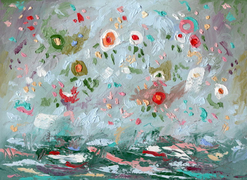
FInal Painting
This is the final painting with color theory applied to it. Be sure to watch the complementary colors video if you haven’t already (see #615). It will come in handy when creating any colorful abstract shapes.
More paintings
Here are some more paintings that I’ve created with the same design techniques and color concepts. There are a few more in the shop if you’d like to take a look.
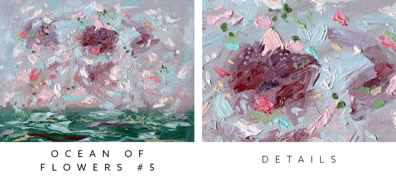
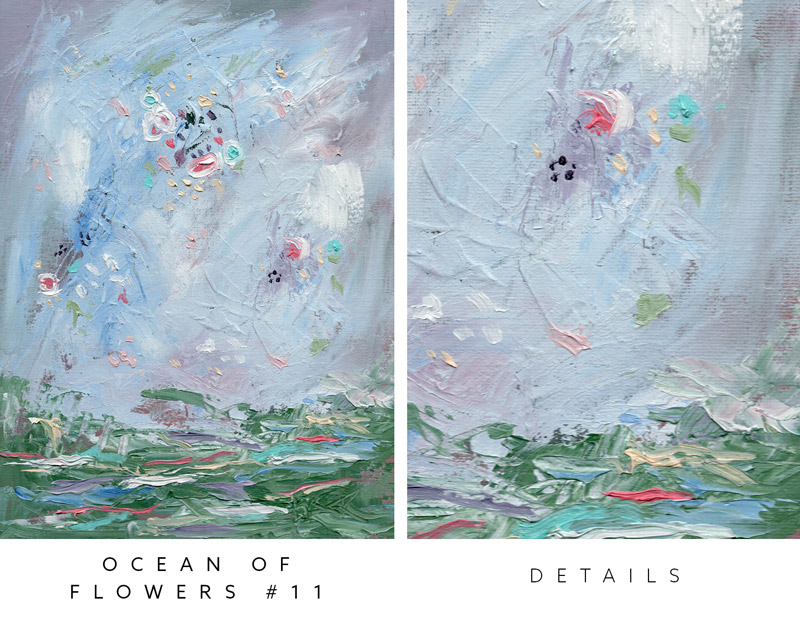
Videos 1-3 Mini Course
Part One
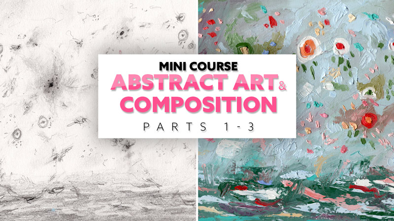
In part one, we learn the basics of the design techniques, draw the design, lay in the abstract shapes, then erase the construction lines.
Part Two
In part two, modeling paste is applied to a 9×12 canvas. Once it’s dry a base layer of gray paint is applied. We also see how grays help intensify colors (see #685).
Part Three
In part three the second layer of paint is applied, the design is drawn, colorful shapes are painted, then the construction lines are painted over.
Conclusion
That’s it for this one, I hope you found it inspiring or at least interesting! Try to apply these techniques to your own art. If it seems too complex, start simply with a triangle or dominant diagonal. Anything is better than nothing. We need to keep flexing our composition muscles so it becomes easier and easier to apply them with consistency.
Thanks so much for the support, I appreciate you all! See you in the next one!

