How to Pick the Right Dynamic Symmetry Grid for Your Subject – A Simple Step by Step Guide

#775
Thanks for joining me, the support is always appreciated!
Whether you’re a seasoned artist, a curious photographer, or just someone who accidentally wandered in while googling “what the heck is a root rectangle,” you’re in the right place. We’re about to explore a design concept that quietly powers some of the most compelling compositions out there—without getting too technical or boring (I promise). Let’s keep it simple, have a little fun, and maybe sharpen our visual awareness along the way.

Choosing the Best One Dynamic Symmetry Grid
So, you want to know which root rectangle is best for your subject. Good news—there’s no one-size-fits-all answer! But don’t worry, I’ve broken it down into two simple methods, depending on whether you’re more of a “set it and forget it” kind of artist or the type who uses a precision scale to weigh toothpaste before every brush.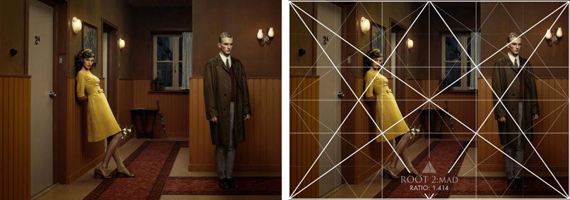
Method One: The “I’ve Got Better Things to Do” Method
Perfect for street photographers, travel junkies, fashion snappers, wedding shooters, or anyone who doesn’t have the time (or mental capacity) to rethink grid choices every time they capture a scene. Also great for painters who just bought a 12 pack of standard sized canvases. For this method, you’ll want to use the same rectangle (or square) and grid for every composition. Consistency is part of your artistic style (see Day 122).
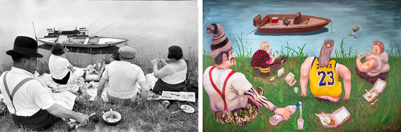
Example: I once copied and tweaked some Henri-Cartier Bresson photos and made them into contemporary oil paintings (see #587). I kept the 1.5 ratio for all of them even though I had the flexibility to paint any ratio that I liked.
Some Quick Grid Suggestions:
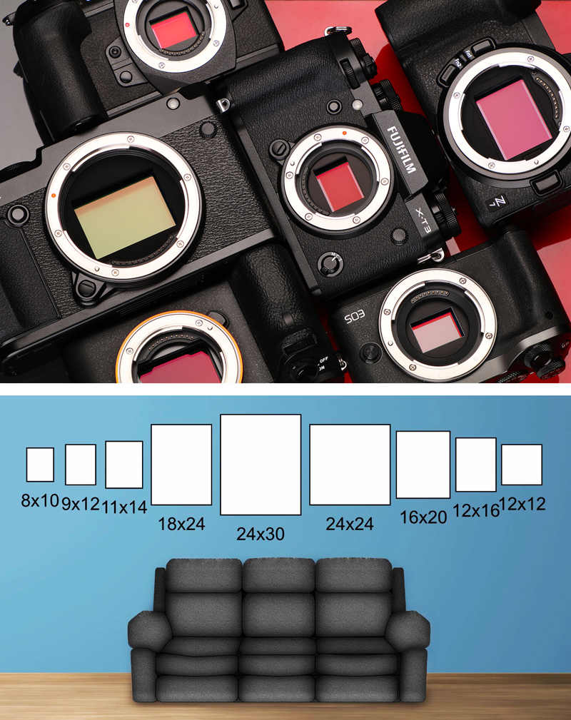
DSLR or mirrorless camera: You’ll most likely be working with a 3:2 rectangle, which is a 1.5 grid variation. You can use simple or complex variations, it’s all up to you. For quick moving photo sessions, the simple ones (basic armature or MAD) work best.
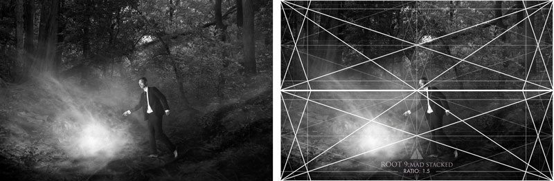
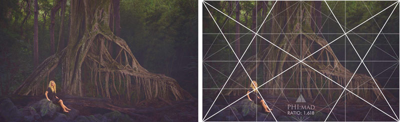
If you’re wanting to mix things up and still keep the 1.5 ratio, you can use the ratio guide (now available to download on the Resources Page) to find a different grid like the stacked root 9 grids. I used this grid for the following image because the background tree had the same exact diagonal as the root 9.
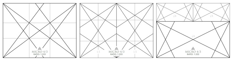
iPhone or micro 4/3 shooters: You’re living with the 4:3 grid variations, which work really well for most scenes. Again, keep the grid simple for fast paced environments.
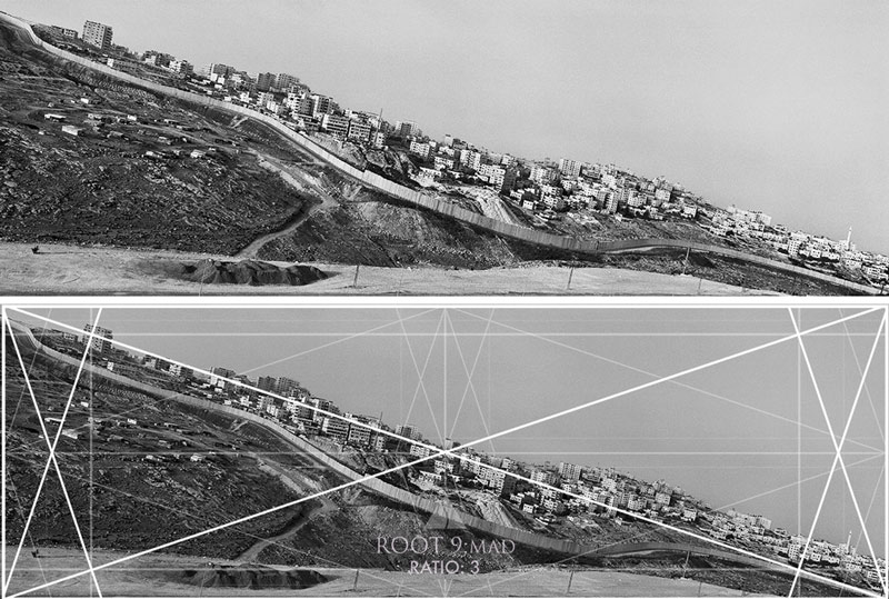
Cinematic souls: Go full panoramic with longer grids like root 3 to root 9 like Josef Koudelka.
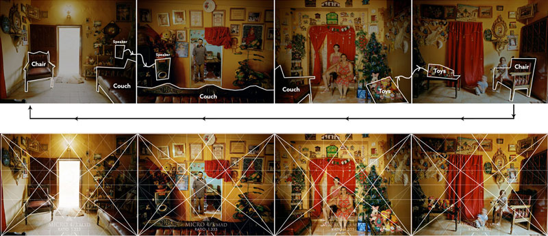
Or, line up your favorite grid side-by-side like Jonas Bendiksen (see #535) for unique panoramic captures.
Bottom line: Pick a format. Stick to it. Rule the world with your consistency.
Method Two: The “Fine Art Control Freak” Method
This one’s for the painters, fine art photographers, and design nerds who love to tinker, tweak, and test 27 crop options just because it makes them feel better more artistic.
If you can change your canvas size or crop your photo in post, tailor your rectangle to your subject. What a concept!
Here’s how it works:
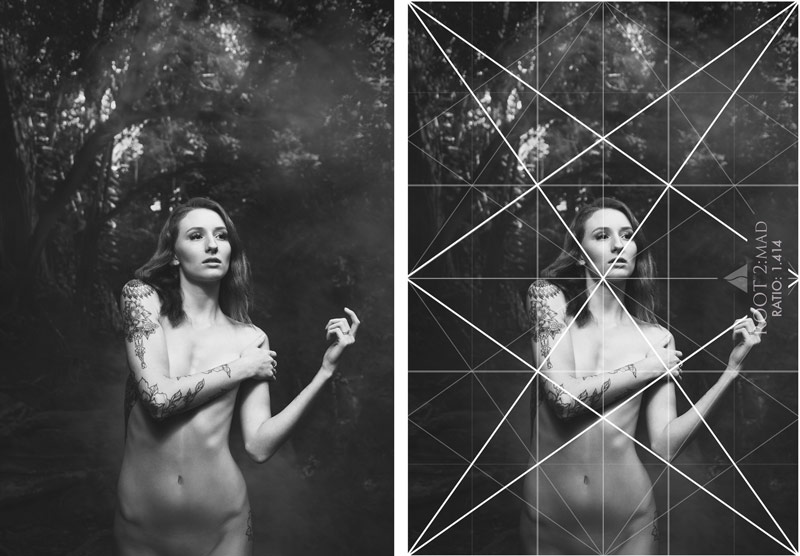
Let’s say you’re photographing a tree, and its major branches lean in such a way that locks in perfectly to a root 2 grid. If you’re okay with composing to this grid, then snipping off the excess in post, boom—that’s your grid. I did this in the next photo, where I measured the diagonal of the tree branch in the background, chose the root 2 grid, then had the model echo the diagonals within her pose.
Here’s an image that I composed with the phi grid on the lcd, then snipped the excess off in post to complete the composition
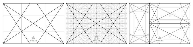
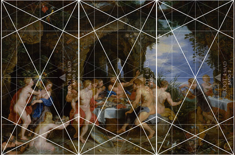
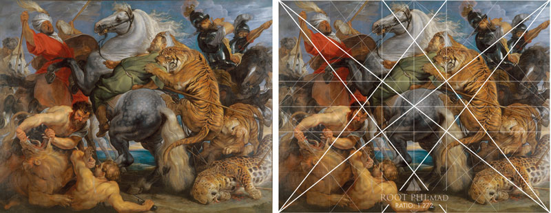
Painters? If you make your own canvases (or aren’t married to standard sizes), you’ve got infinite freedom. Use whatever grids provide the diagonals you need to lock in the subject and environment perfectly. Live a little. In this next painting, we see Peter Paul Rubens (see #632) using three root 4 rectangles rotated 90 degrees and side-by-side.
Step-by-Step Grid Mastery
Ok, be sure to grab your pen and paper and jot down some notes. If you’re serious about composition, you’ll want to remember some of these steps.
Step 1: Decide What Kind of Artist You Are
Do you like consistency? Or flexibility? (Spoiler: both are valid.)
Step 2: Pick the Right Grid
If you’re locked into a format (because of camera sensors or stretched canvas sizes), use the grid that matches your camera or canvas size. Be sure to use the ratio guide to see if there are grid variations with a similar ratio and diagonals that fit your needs.
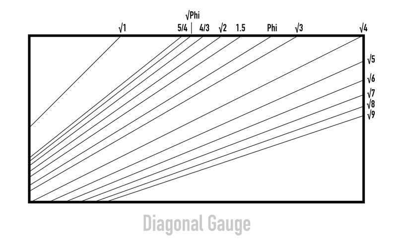
If you’re free to choose your grid, let the diagonals in the actual scene guide you…especially if the subject can’t be moved (like a mountain, river or tree). If you’re a painter or photographer in nature, you can always use the diagonal gauge to check the diagonals within the scene.
Step 3: Apply the Grid
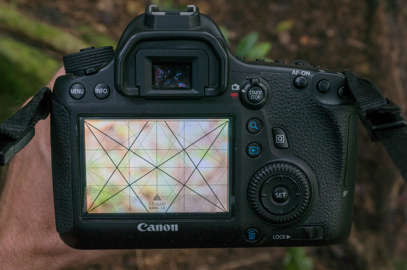
The first option would be to overlay the grid on your LCD screen (digital photographers rejoice) (see #552). Painters can do this if they’re wanting to capture a reference photo—what an easy way to paint what you capture and already have it composed to a grid.
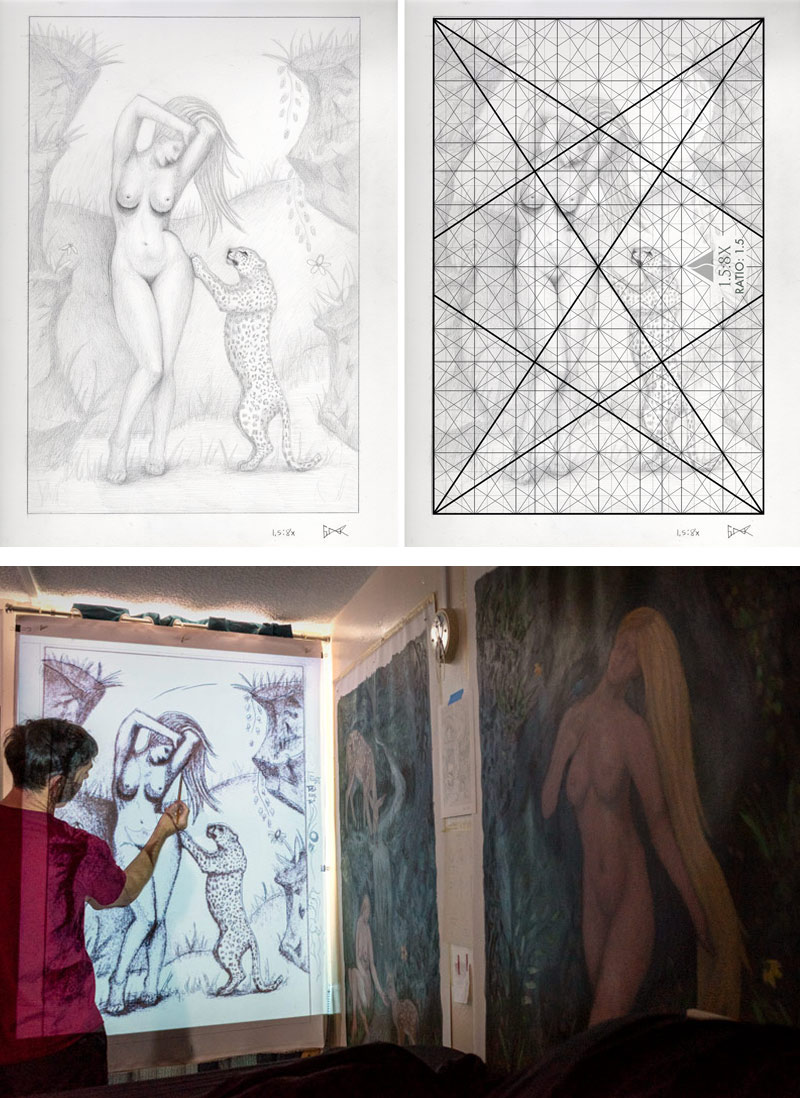
Use a light pad to design your drawing to the grid (showing the grid underneath the paper), then use a projector to blow it up on your custom sized canvas (see full process in this video). I did this for the following pieces.
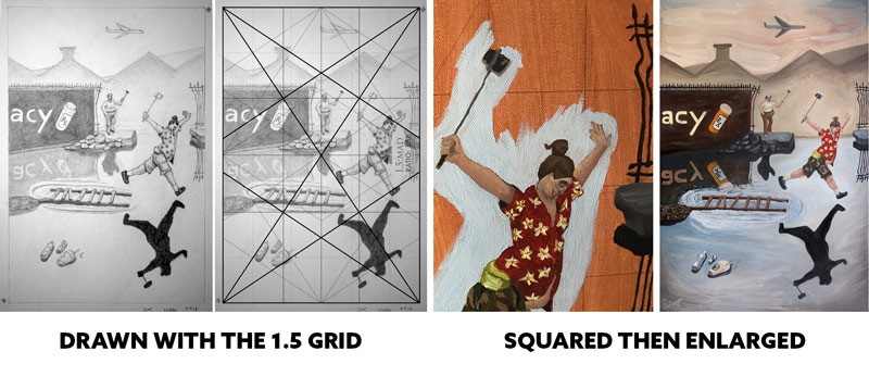
If you’re feeling old school and have some extra time on your hands you can do like the old masters and make squares on the drawing and canvas, then enlarge by transferring the shapes of each square. I did that for my Bresson paintings and it definitely sucked up a lot of time and led to some inconsistencies — a perfectionists worst nightmare!
Or, if you’re brave, draw the grid directly onto the canvas, but this isn’t recommended unless you’re working on abstract art or you’ve made peace with making a mediocre design. Yes, it’s true. Working out your design process with pencil and paper is much easier than doing it on the canvas with paint.
Step 4: Master the Holy Trinity of Composition
When you’re composing your photo or painting with the grid, you’ll want to juggle at least three core concepts like a design-savvy circus performer:
A. Figure-Ground Relationship (FGR)
Most of the time (about 99%), you’ll want clear separation between the foreground and background (see Day 21). Exceptions? Sure. Maybe you’re going for mystery like Dracula lurking in the background shadows, or you’re wanting to create intentional confusion like a surrealist (see Day 259), but you better know what you’re doing. Otherwise you’ll have a tree growing out of your subject’s head, or something even worse.

B. Diagonals Are Your Friends
Try to lock in your subject or parallel the grid. This is where dominant diagonals (see #441), 90-degree angles (see Day 76), gamut (see Day 38), and coincidences (see Day 48) all come into play. The grid promotes these things, and it’s all explained in an in-depth article and video (see #692).
C. Balance Isn’t Optional
Balance can get pretty in-depth, and it’s what makes the Law of Symmetry video so lengthy, but to boil it down to a simple understanding, your subject’s placement should promote left to right harmony across the vertical centerline.
Negative space – The amount of negative space within the composition can influence the story being told (stick to ~20%, or you risk telling a story of isolation, loneliness, or grand scale). This Gregory Crewdson (see #695) photo has a lot of negative space, but the more it’s cropped down the more we bring attention back to the main subject (the person in the car).

Gazing direction (see Day 99) – This is where the subject’s gaze directs attention (yes, even your dog’s stare or a cereal box’s lit side can influence the balance), and where the negative space resides from left to right.
Breathing room (see Day 102) – This is basically where the negative space resides around the subjects face, and the top and bottom of the frame (you’ll usually want more space near the top of the frame, unless you’re shooting downward or your subject is looking down).
Let’s not pretend balance is some mystical force. It’s an essential part of the design process and should be studied by serious artists. We can see in the painting below that Peter Paul Rubens (see #632) is doing everything properly to achieve nice balance — appropriate negative space, and considering the gazing direction and breathing room for each subject.
Step 5: Fine-Tune Like a Pro
Look for chances to:
– Parallel dominant diagonals (for a hidden rhythm, a.k.a. gamut) (see Day 38)
– Eliminate edge flicker (aka those annoying high-contrast distractions near the edge of the frame) (see Day 49)
– Add spice with other techniques like arabesques (see Day 17), triangular enclosures (see Day 32), and other design goodies (see: the list of 33 on the Resources Page if you want to nerd out). This is only if you’re already familiar with the previous techniques covered. Don’t overwhelm yourself!
Conclusion
Picking the right root rectangle isn’t about rules—it’s about your subject, balance, and design power. Whether you’re snapping street scenes or staging oil-painted epics, the grid is your backstage crew used to create a foundation for your art and help organize the elements within each scene. Use it wisely.
That’s it for today everyone, much love for being a Master Pass member. See you next time!