Joel Meyerowitz Top Design Techniques (ANALYZED PHOTOS)
#668
Your support is always appreciated, thanks so much for joining in on another article!
Today we are going to check out the top design techniques used by photographer Joel Meyerowitz. Who is he and how does he create such great imagery? We’ll soon find out. Be sure to check out the video analysis at the end!
Joel Meyerowitz? Who Is
Joel Meyerowitz was born in 1938 and is still shooting today. He’s a very passionate educator on photography and you can see this an old documentary further below. Joel began shooting color film in 1962, but he also shot quite a few great black and white photos. Back in those days black and white was more accepted and considered fine art, but thankfully not everyone stuck with the trend. By 1972, Joel had switched permanently to color, making it part of his artistic style (see Day 122).
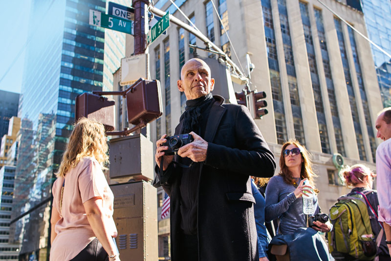
Some inspirations of Joel’s were Robert Frank and Henri Cartier-Bresson (see #472). Most photographers know these names and would probably give their left leg to see some of their photos in color! Speaking of color, Joel even had an exhibit with William Eggleston (see #375), which is around the time he switched to a large format 8×10 camera. Here’s a more recent shot of him with holding the huge camera.
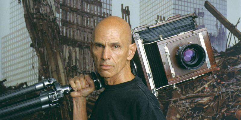
Street Photography Documentary
In this fun documentary, Joel talks about how “the street is delicious” while he’s shooting in New York (see Day 312). Such a poetic quote and it’s interesting to watch him weave in and out of the crowds. Be sure to check out his site to see even more of his photos…he’s got a ton of books too. Now let’s get into the analysis!
Joel Meyerowitz Analyzed
Aspective View
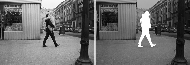
Joel uses a combination of design techniques throughout his collection of photos, but let’s start with one that most of us are familiar with…most street photographers anyway. Here we see an aspective view of the man walking (see Day 78). With his legs in full stride, we are able to easily identify his shape…even if he’s intimately carrying a big poodle. The silhouette still looks like a man walking. Joel’s also captured nice figure-ground relationship (FGR) (see Day 21) with the man because he’s a dark figure on a light background. FGR is tremendously important, so be sure to write that one down in your notebook!
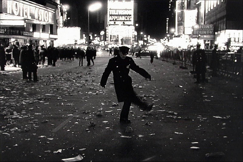
Here’s another shot with an aspective view and FGR. We’ve also got a nice shot of all the lights in the background and the pattern of trash on the ground (see Day 189). In reality, this negative was probably a little on the dark side, but by simply lightening the background the FGR is improved.
Negative Space
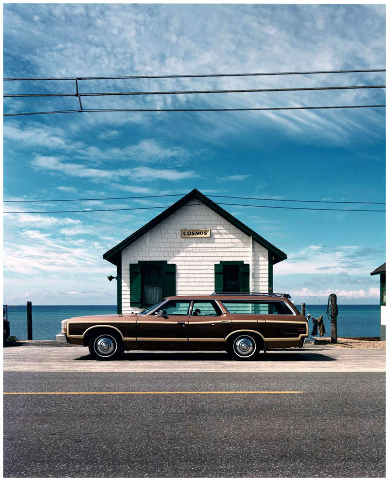
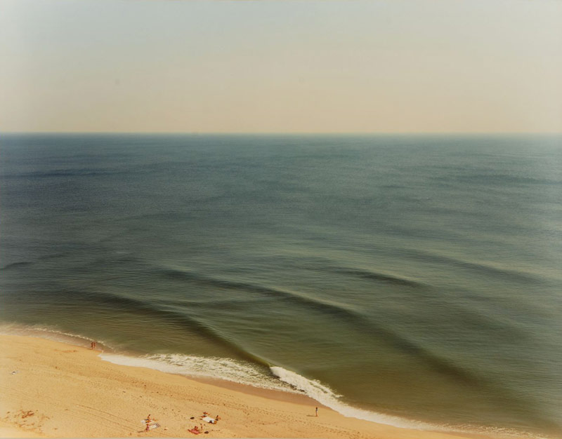
Joel loves his negative space (see Day 83), and we’ll see it in quite a few of his photos. Most images with the human figure and excessive negative space can tell a story of isolation, loneliness or show grand scale. If you’re not aware of this you could be telling the wrong story.
For example, this next image is telling a story about the rippling waves, not the people on the beach.
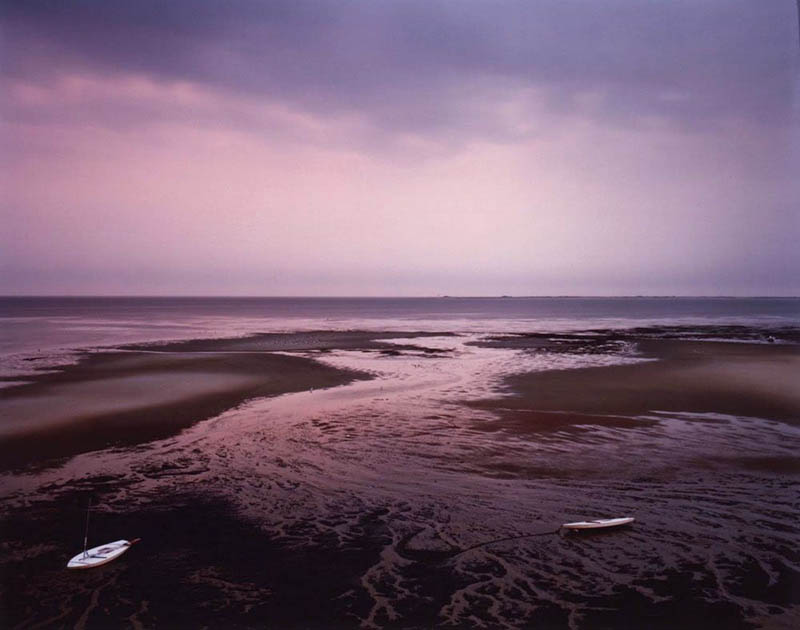
This one has tons of negative space and great colors…telling a story of peacefulness. There’s also an arabesque sweeping through the image (see Day 18). Can you see the reversed “S” shape being created?
Coincidences
Since Joel loves negative space, he’s incorporated another design technique to create unity and movement. This technique is called a coincidence (see Day 48) and it adheres to the Law of Continuity (see Gestalt Psychology principles). Did you notice how he unites the distant and foreground objects on a linear path? We can also see how the three main objects form a triangle (see Day 87).
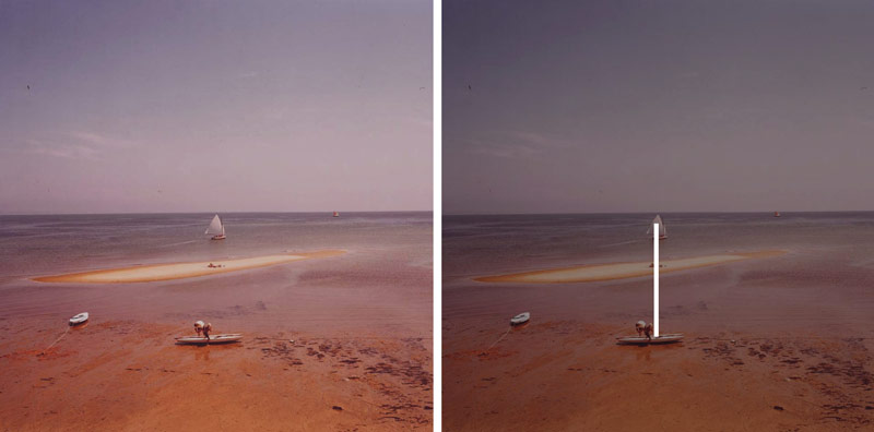
This one has negative space and a coincidence, but we also see Joel’s knowledge of balance. The gazing direction (see Day 99) of the subject and blimp add visual weight to the left of the image. To compensate for this, Joel places them to the right of the vertical centerline (black line) and creates nice balance.
This is another great photo with a coincidence and negative space. Would the image still work if the interesting clouds above were gone? You bet!
Aerial Perspective
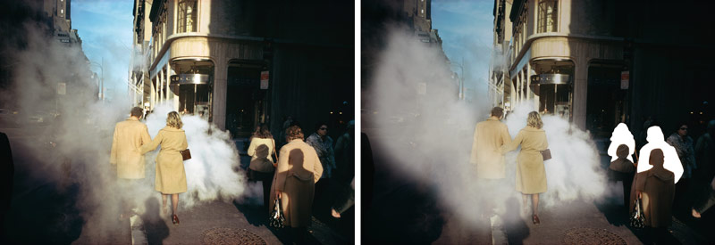
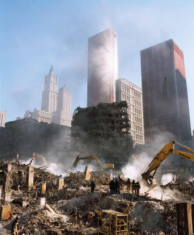
Joel is a big fan of aerial perspective too (see Day 42). Who isn’t, right? It’s the design technique that provokes the most emotion (see Day 353). This smokey, steamy shot is no different than a foggy day or cigarette filled room. Aerial perspective can come in many different forms like rain, lens flares, etc, but the main thing it does is reduces contrast to create depth. Smoke like this also creates a sense of mystery.
And if that weren’t enough, Joel’s also captured echoing shapes (see Day 90) in the shadows to the right. Nicely done! We’ll learn more about this form of repetition later, but first let’s see some more aerial perspective shots.
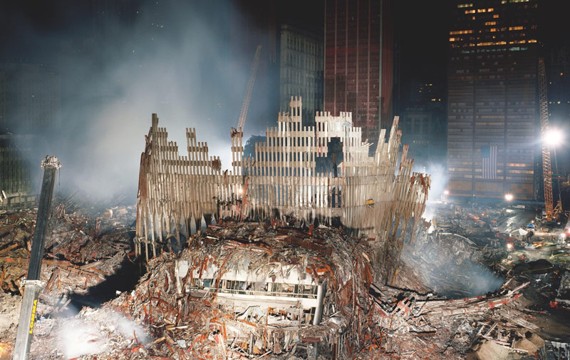
He’s taken some excellent shots of ground zero. We can see the smoke here capturing the light beams of the distant building, while also adding some depth and mystery in the foreground.
Such a great shot here! It wouldn’t be the same without aerial perspective.
Echoing Shapes
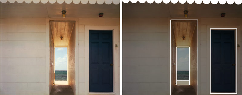
Ok, time for some more echoing shapes. This first one has a pattern running on the top, but the door and hallway also provide a series of repeating rectangles. It’s almost like a portal to another world!
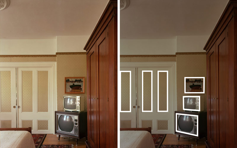
We’ve got the same thing here. The boxiness of the room is illustrated in the televisions, frame, and doors. Yet, amongst all of those rectangular shapes, we have some circles…do you see them?
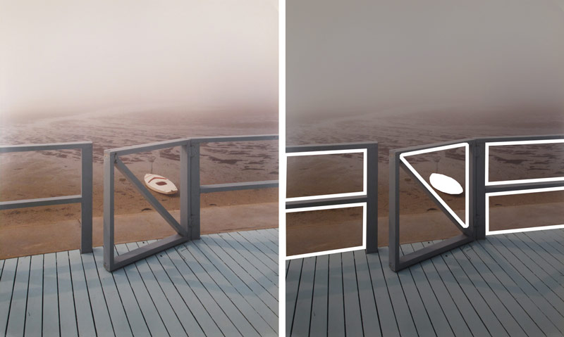
Joel is able to capture his negative space, echoing shapes, and nice FGR. He’s perfectly aligned the distant boat to fit inside the triangular frame. There’s also the repeating lines of the deck. And with the door open, he creates an inviting story to explore the distant land.
Color Theory
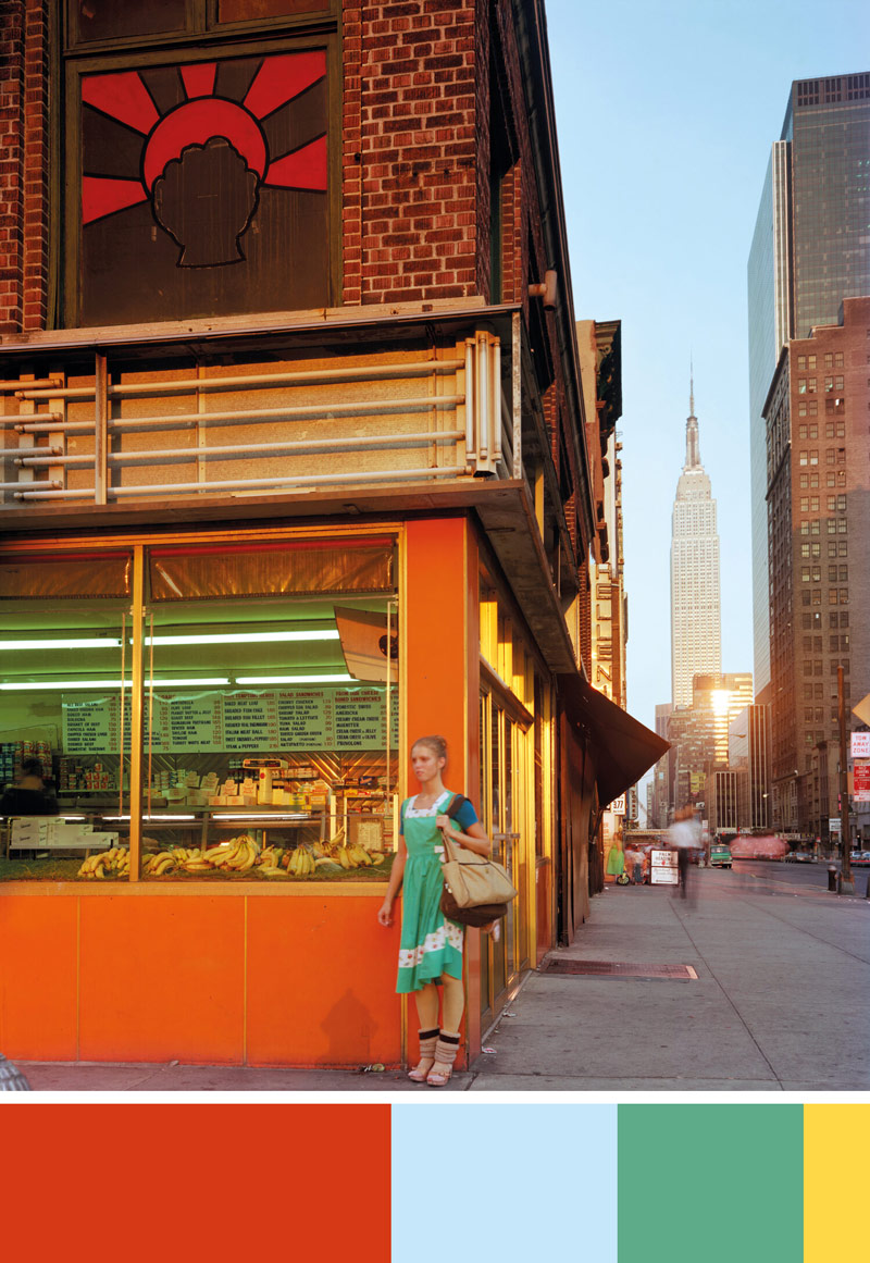
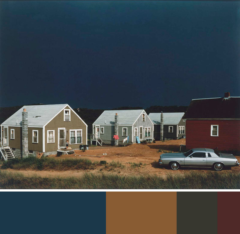
Since Joel has color as part of his artistic style, we better dig into some of his color theory. Like Van Gogh (see #470) and many other master artists, he’s capturing the four main colors (red, blue, green, yellow) in a hierarchy. See the swatch below the image? Its purpose is to illustrate that he’s got red as the main color, then blue, green and yellow. He’s got nice FGR on the woman, who acts as the fulcrum of the image. She’s dead center, and helping him balance the distant building on the right, and the red graphic element in the upper-left.
In this image he uses the same color theory, but the colors are grayed down. This concept of colors works for photos, paintings, and cinematography…same with the techniques. Isn’t it great?!
This one seems so simple, but it’s so full of life. Can you see the four colors? Can you identify the hierarchy?
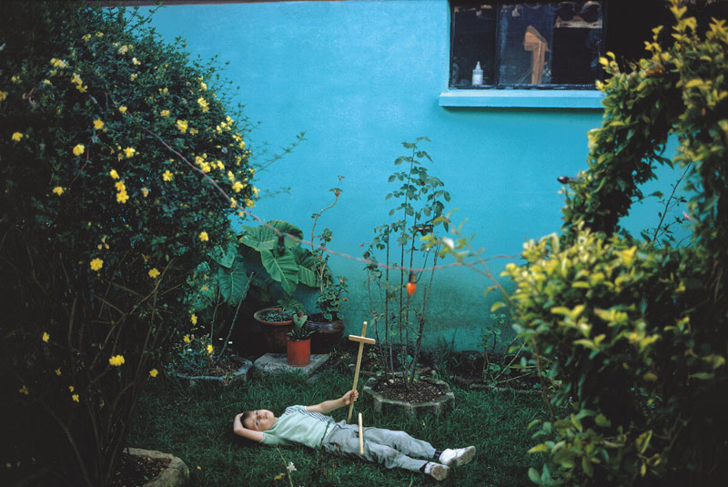
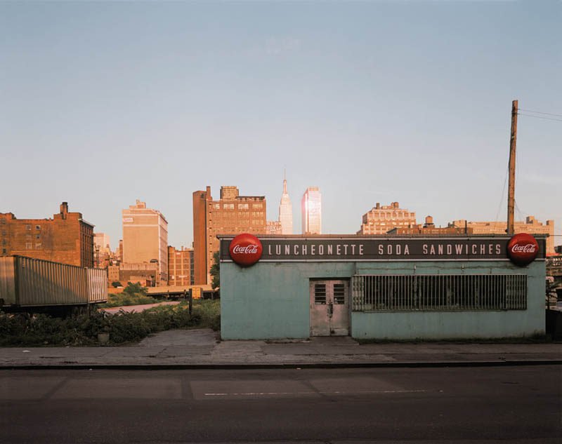
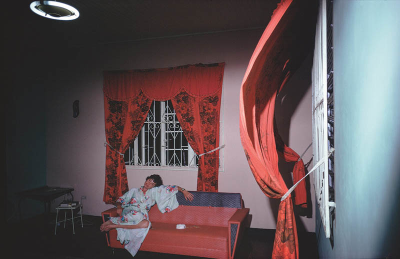
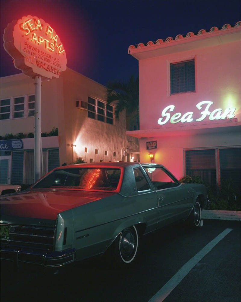
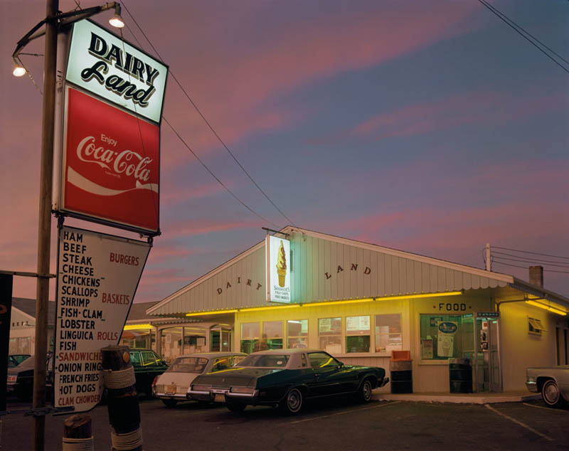
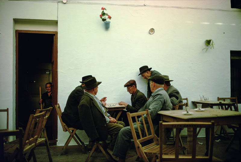
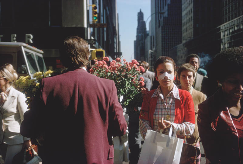
Here are some more images to enjoy. Be sure to look for the design techniques Joel used to make them remarkable. Was it a combination of techniques? Was it the color? Test your knowledge!
Video Analysis
Here you’ll see a full analysis of Joel’s street photos. If the design techniques above have you confused, maybe the video explanation will help. Be sure to subscribe on YouTube for more videos!
Conclusion
Is your brain exploding with inspiration? Joel is definitely a master of his craft and knows how to use design techniques to communicate visual clarity, add movement, unity, and beautiful color. Go through some of your old photos and see if you can identify any of these techniques. It’s a great way to select your keepers (see #588). If you’re a painter or cinematographer, do the same. Check your colors too…you may be surprised what you find.
That’s it for this one, thanks again for joining in. See you next time!


