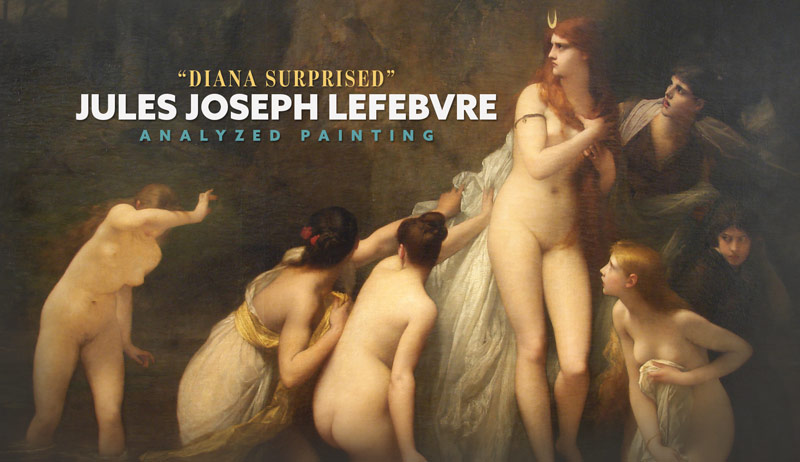
Jules Joseph Lefebvre – Diana Surprised (ANALYZED PAINTING)
#641
Welcome back everyone, much love for the continued support!
Today we are going to dig deep into a painting by Jules Joseph Lefebvre. It’s the first time his work has been analyzed on the site, so we’ll see if he can stand with the other masters we’ve seen so far. Does he use design and composition techniques, or does he create with his gut instinct? Let’s find out now!
Jules Joseph Lefebvre Who Was
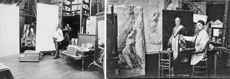
Jules Joseph Lefebvre (1836-1911) was born in France and mostly did figure painting. Beautiful figure painting by the way! We can see him posing in his studio below. They say “it’s not the size of the canvas, it’s how you use it.” He seems to have done pretty well.
He won the prestigious Prix de Rome in 1861. Between 1855 and 1898, he exhibited 72 portraits (mostly women) in the Paris Salon. He was professor at the Académie Julian in Paris and had tons of students, but the most notable one was Kenyon Cox (see Day 150).
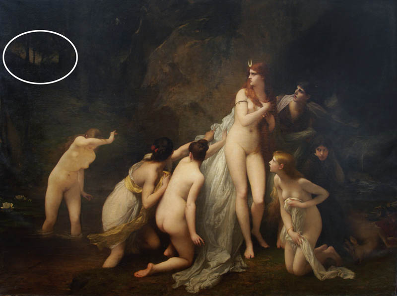
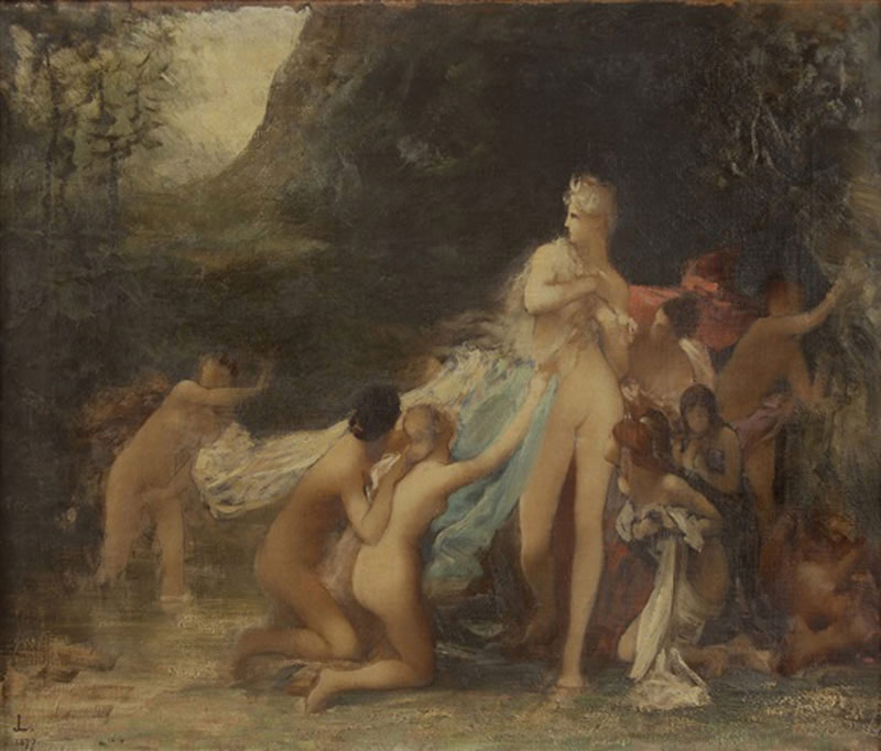
Here’s the painting we’ll be analyzing today. We see a bunch of frightened nymphs in a forest, with a dead deer to the right of them. What are they scared of, and why the dead deer?

This is a preliminary painting by Lefebvre.
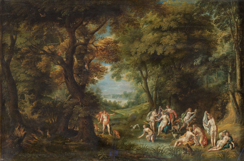
The story of Diana being surprised while bathing was a popular one among the Renaissance artists. It allowed them to paint nudes without being considered too risqué. In most paintings, we see a Greek hunter named Actaeon with horn-like branches on his head. He stands in the distance checking out Diana and her nymphs bathing nude. This seemed to be an accident, but his gawking didn’t go unnoticed by Diana who was the goddess of chastity. Unfortunately for him, his leering eyes created harsh consequences. Diana was furious that she was seen in the nude by a measly mortal. She made Actaeon suffer dearly by transforming him into a buck, who is immediately devoured by his own bloodhounds. Definitely not a fun way to go!
In Lefebvre’s version, we don’t see Actaeon. We do see the dead buck though, so maybe he was already transformed and they were looking in the distance to make sure no one else was watching.
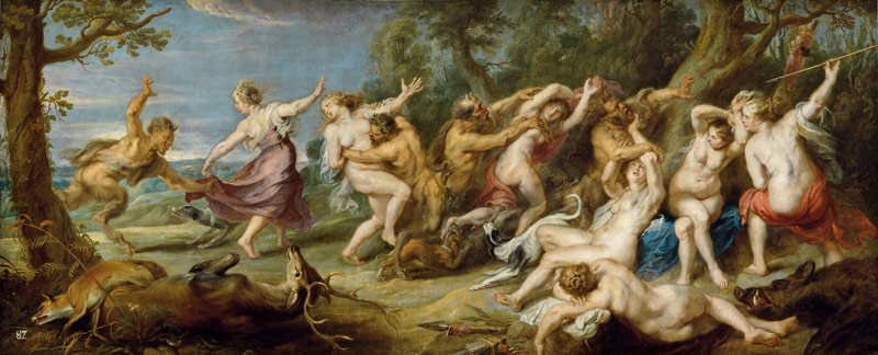
Some other paintings like this one by Peter Paul Rubens, show nymphs and satyrs, as well as the dead buck. Looks like a crazy wave of flesh!
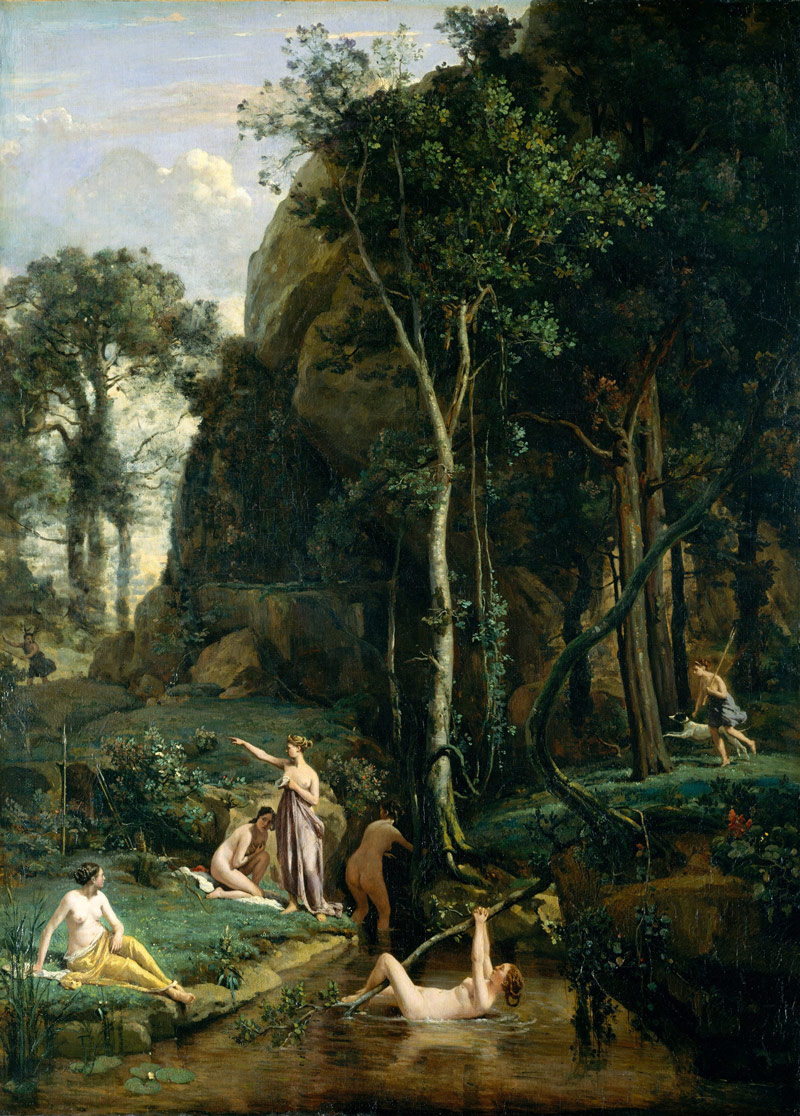
Here’s another one by Corot. It looks like a woman in the distance (left) wearing horn-like branches on her head, but knowing the whole story it is probably Actaeon. This painting was a huge inspiration to me in 2013 and was one of the very first paintings I analyzed on the site (see analysis). Such a great design by another master painter!
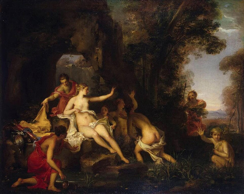
Here’s another version by Louis Galloche.
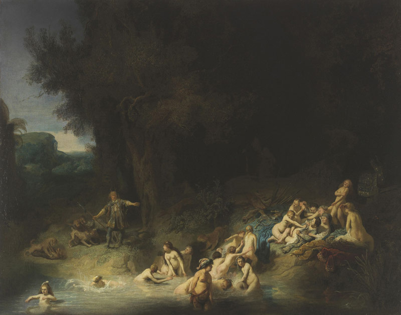
It might be hard to guess who painted this next one because the artistic style is a bit different (see Day 122). It’s by Rembrandt, and shows some nice drama within the nymphs who are scurrying away from the prying eyes of the hunter. It has the nice chiaroscuro lighting of Rembrandt (see Day 31), but since it’s not a portrait it is a little tougher to determine that it was painted by him.
Here’s another great forest scene full of surprised nymphs.
Now that you know a little more about Lefebvre and the story of the painting, let’s dig into the analysis!

Jules Joseph Lefebvre Analyzed
Dynamic Symmetry
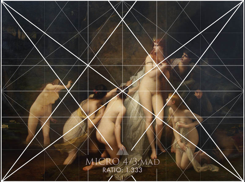
When we find the ratio of the painting, we’ll see that it’s a perfect 1.333 ratio (4/3 rectangle). This clues us in on what grid Lefebvre might have used to organize his composition.
Here’s the 4/3 grid lining up to the painting, which doesn’t look too bad. We’re mainly looking at the diagonals to see if they parallel or lock in. Let’s keep digging though.
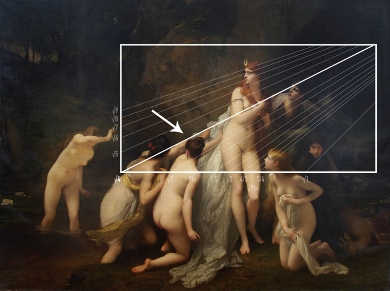
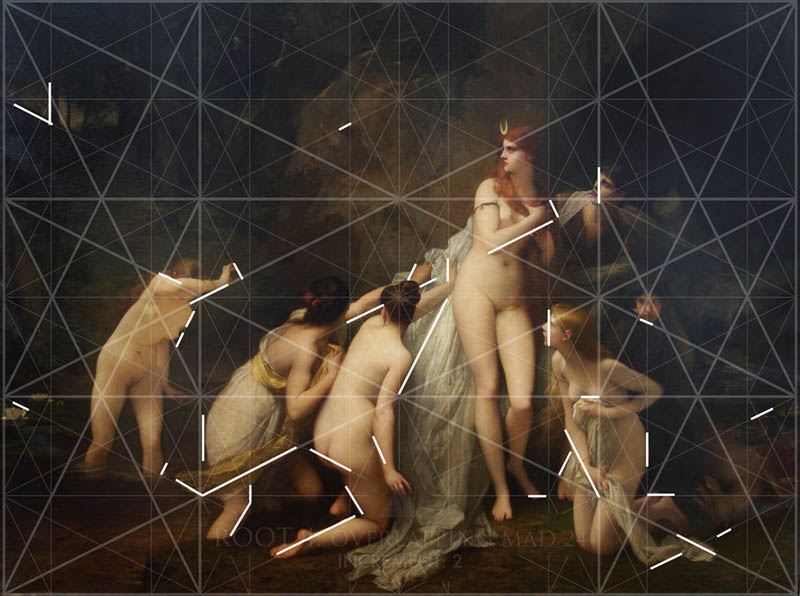
When the diagonal gauge is used, we find that the main diagonal of the arms is a Root 4 and not a 4/3. This leads us to a root 4 grid configuration. Is there one that is equal to the 1.333 ratio?
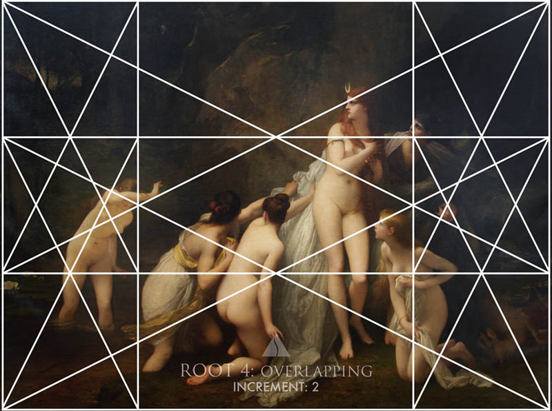
If we look at the back of the Dynamic Symmetry book and use the Ratio Guide, we’ll see that there are a few more grids that could be configured to this ratio, and the “root 4: overlapping – increment 2” has the 1.333 ratio we’re looking for. Perfect!
Here’s the basic grid aligned to the painting. We see some things locking in and paralleling, but we definitely need more lines to see how Lefebvre organized the nymphs.
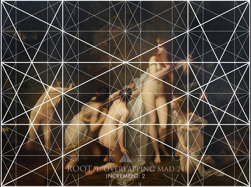
Major Area Divisions (MAD 24)
With the MAD 24 overlaid, we can see how the nymphs poses are designed to lock in and parallel nicely.
Note: to backtest the math of the grid is easy. The ratio of a root 4 is 2. There are four smaller ones on the bottom (side-by-side), and six smaller ones on the left (stacked). We just multiply ratio two by four to equal eight (2 x 4 = 8). Then divide eight by 6 to equal 1.333 (8 / 6 = 1.333).
Locked Into the Grid
Here are most of the areas locking into the grid; arms, legs, hips, feet, hands, thighs, faces, and background elements.
Gamut
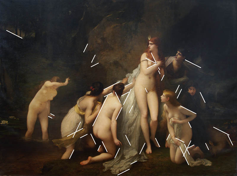
If we take the four main diagonals within the root 4 grid, we’ll find that they are repeated across the painting. This is the limited number of diagonals, or gamut (see Day 38), that Lefebvre used to create a hidden rhythm throughout his masterpiece.
Coincidences
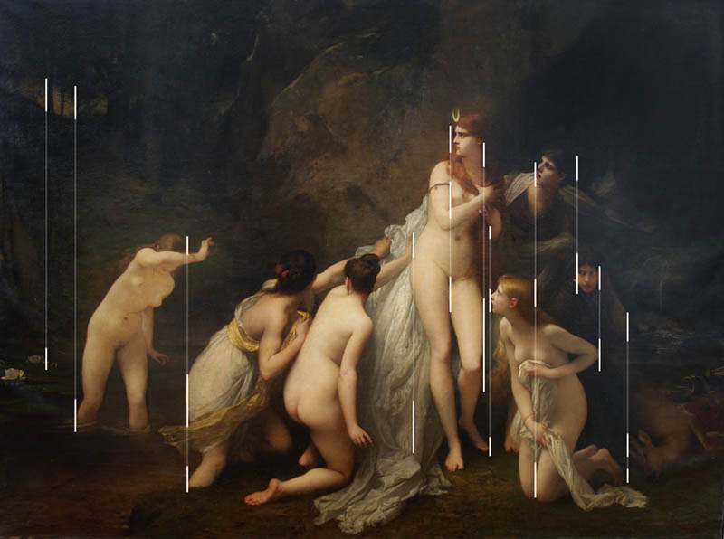
With coincidences (see Day 48) Lefebvre is able to create unity and movement in the painting. From one nymph to the next, he unites them on vertical and horizontal edge-to-edge relationships.
First we’ll see the vertical coincidences. Follow the lines to see how they unite with other elements.
Here we can see the horizontal coincidences.
90 Degree Angle
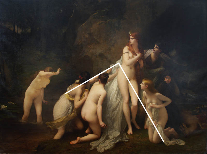
This large tilted 90 degree angle adds strength (see Day 76) to the composition. Notice how it leads us to Diana, a goddess full of strength.
Enclosures
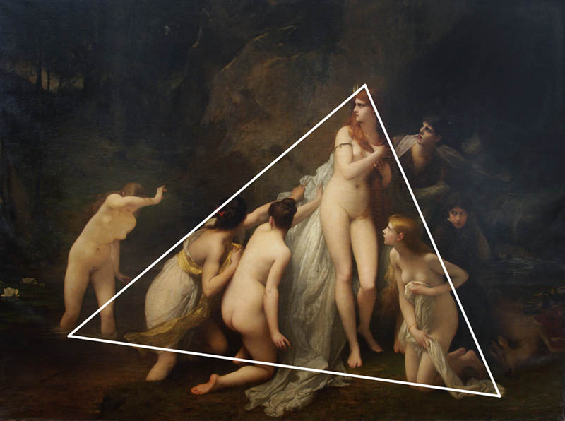
By using enclosures (see Day 32) Lefebvre is able to create even more unity within the group of nymphs. The mesmerizing triangle (see Day 87) is a great one to use, but other shapes like a cone or hemisphere can be used too. It’s interesting how the nymph on the left is not within the triangle. It tells a story that she was the last one to be frightened out of the water. Looks like the river rocks are a bit rough on her feet too.
Ellipses
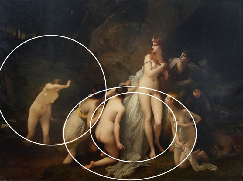
There are several ellipses (see Day 34) designed within the painting to help with unity and movement. If you don’t see them at first, try blurring your vision and looking at the contrasting elements.
Arabesques
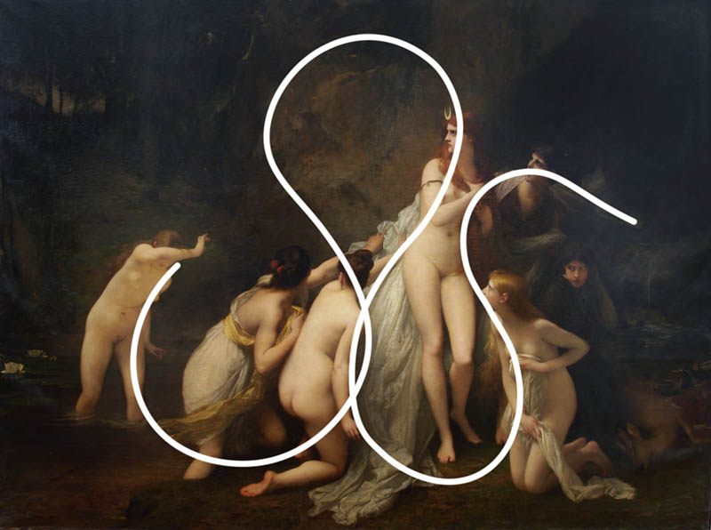
Gotta love the elegant arabesque (see Day 17) he creates here! It snakes through the entire composition to unify and add even more movement.
Aerial Perspective
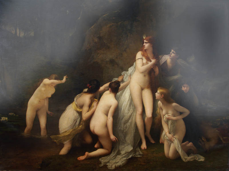
By using the technique of aerial perspective (see Day 42), Lefebvre is able to create an atmosphere and depth within the painting.
Window for Depth
He’s even created a window of depth (see Day 249). This is just a bit of contrast in the background to lead the eyes back and forth through the painting.
Figure-Ground Relationship (FGR)
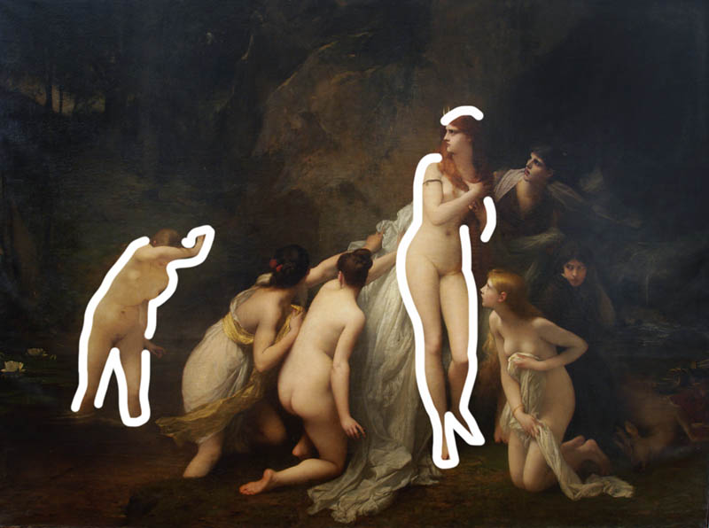
When we run an imaginary line around Diana and the other nymph on the left, we see that they have clear separation from the background. This nice FGR (see Day 21) creates visual clarity…something every painting requires.
BW Blur
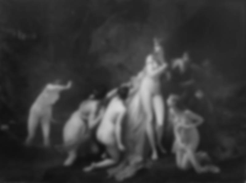
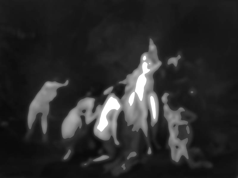
By squinting, or converting the painting to black and white and blurring it, we’re able to easily see the values of the image. Can you tell where Lefebvre wants us to look first? If not, we’ll discover that soon enough.
Edge Flicker
There isn’t much edge flicker (see Day 49), which is high contrast near the edge creating distractions. A bit on the left and bottom, but in this black and white version we can see that the contrast is subdued.
Greatest Area of Contrast (GAC)
The GAC (see Day 71) is used by every artist to determine where we should look first. The design should unravel from there. It looks like Lefebvre did a great job, making Diana the GAC and designing the painting to move our eyes around the painting.
Conclusion
As we saw, Jules Joseph Lefebvre was considered a master for a reason. Sure he was a talented painter, but there are tons of those in art history and the world today. Plus, his style and the style of other artists will always be different, so we can’t critique their mastery on something so subjective (see #625). It all boils down to the design and composition techniques they use to communicate their visual message. It’s what truly defines them as a master.
Thanks so much for joining in, your support is appreciated! See you in the next one!

