Laocoon – ANALYZED SCULPTURE [Top 9 Techniques]
20/365
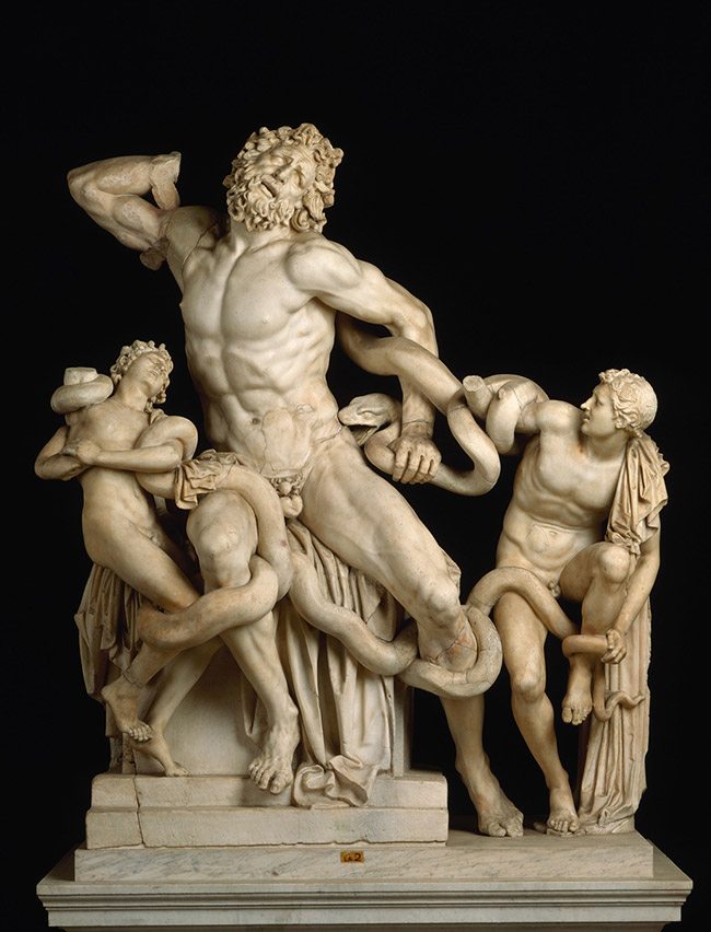
Believe it or not, sculptors used design to create their masterpieces as well. I’m sure they start with a sketch, like most good ideas. After that, they can compose it with a dynamic symmetry grid and go from there. A sculpture should be amazing from all sides, so I’m sure the artists put a lot of effort into the sides and the back, but the main composition was definitely focused on the front side. Let’s see which powerful design techniques the Greeks incorporated into this jaw dropping masterpiece!
The story behind this sculpture is pretty entertaining and you can read more here if you like. But to sum it up, Laocoon was a trying to warn the Trojans of the wooden Trojan horse that the Greeks were gifting to them. He didn’t trust the gift and tried to convince them to burn it down. After being painfully blinded by Athena (a Greek Goddess) for his attempts to warn the city of Troy, he still tries to give caution to everyone. Finally, Athena sends two giant sea serpents to strangle Laocoon and his two sons. They die a painful death. Eventually the city accepts the gift, and later in the night, Greeks come out of it, open the gates for the other Greeks, and conquer the city, ending the war.
This sculpture is said to have been created by three Greek sculptors from the island of Rhodes: Agesander, Athenodoros and Polydorus. Now located in the Vatican Museum, Rome. (I really wish I was into sculptures when I visited there…I love this piece!)
Rule of Thirds – with such a dramatic story, do you think they would settle with the rule of thirds being their guide to composition? Nope.
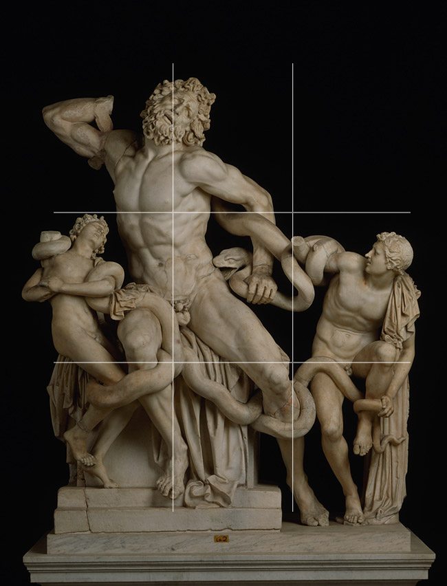
Rebated Square- This consists of two overlapping squares, with two 45 degree diagonals each. Some things are lining up, but not as convincing as the dynamic symmetry we see next.

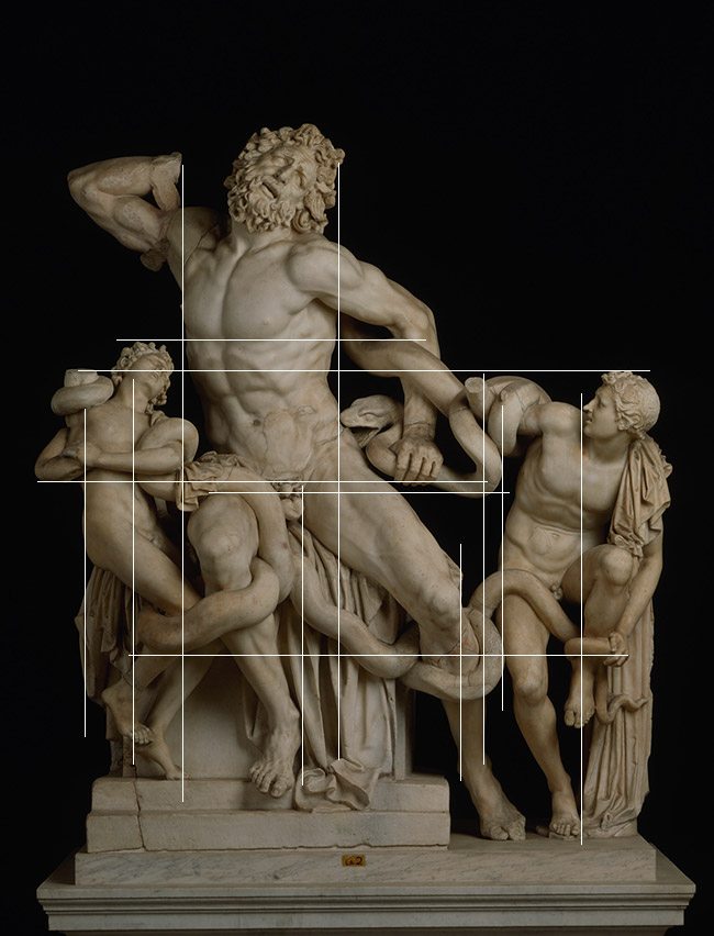
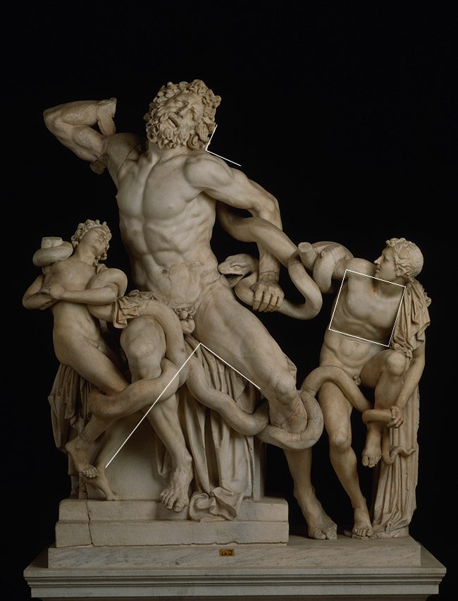
Root PHI Rectangle Basic Armature- We can see the sculptors chose the Root Phi to help design and organize their masterpiece. Laocoon’s left leg lines up with the sinister diagonal. This is the major diagonal going from the lower right corner to the upper left corner. Also his right shoulder follows down to his left arm, then down to his sons left knee….all collected up on the reciprocal.
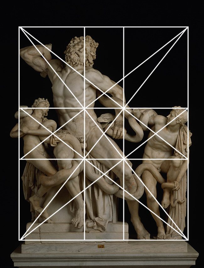
Root PHI Armature with Major Area Divisions (MAD) – Follow the lines of the MAD and you’ll find more elements locking in…the bottom of Laocoon’s chin, his sons right arm, the legs on the right…
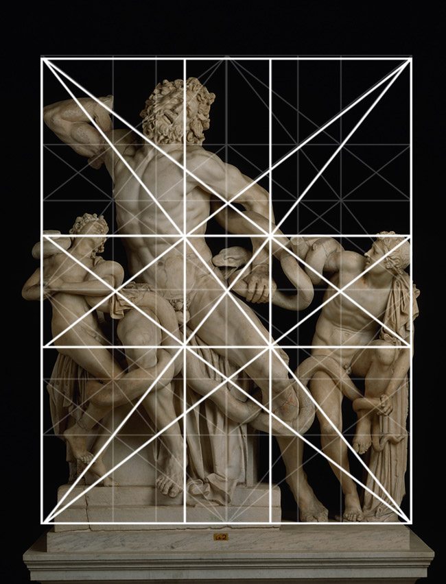
Locked into the Grid – Here are the major parts of the sculpture locking into the grid.

Gamut – When the diagonals of the root phi rectangle are repeated, we get a hidden rhythm across the sculpture. There should be a limited number of directions within a masterpiece, and this is referred to as gamut.
Can you see how they repeat across the sculpture?

Coincidences – There are plenty of coincidences to create movement and unity from side to side, and top to bottom.
90 degree – The 90 degree angle on a tilt (not straight up and down) adds strength do the composition. We can see a few being used within the composition. There’s even a complete square found in the son on the right.
Arabesque – The arabesque is a curvilinear movement that can provide unity and movement. We see plenty of them swirling around this amazing sculpture. That’s what makes it so animated, so full of life….uniting all of the characters and using the curving snake as a tool.
Ellipses – The ellipse adheres to the Law of Continuity, also helping to create unity and movement. These lines aren’t imagined; they are skillfully incorporated within the sculpture. As we’ve learned already, unity, movement, and rhythm are all vital to the life of any masterpiece.
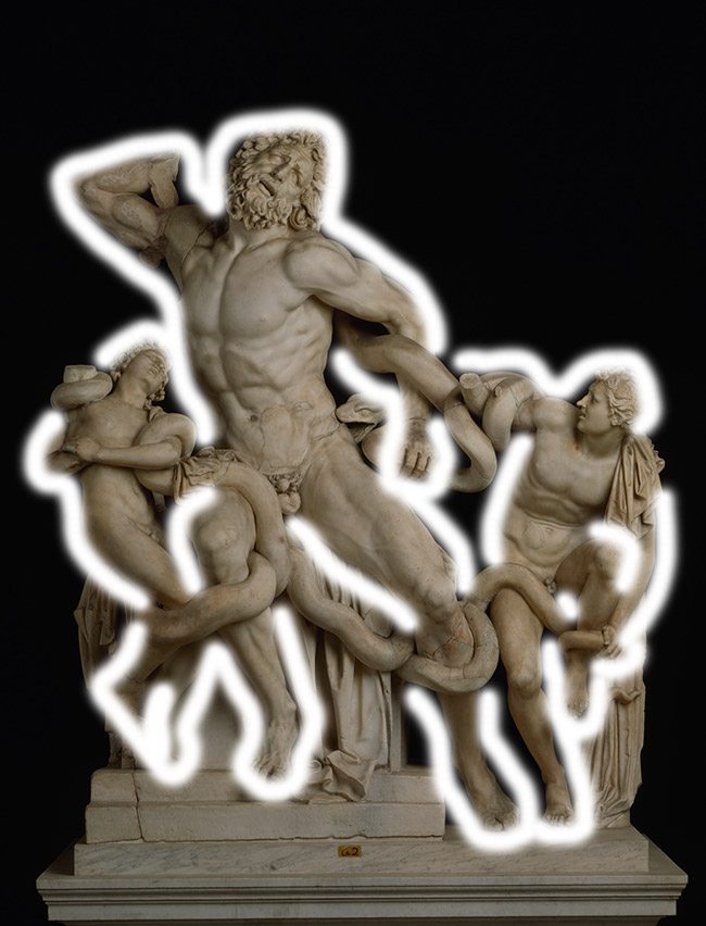
Figure Ground Relationship (FGR) – If we draw an imaginary line around each character, we’ll be able to see if they are clearly separated from one another. This is to ensure the visual clarity is good and we are avoiding any unwanted illusions.
Each character is composed magnificently, making the visual clarity quite pleasing. Since we are working with a sculpture, proper lighting will help define the forms as well. Right now the lighting is flat, but it still works great.
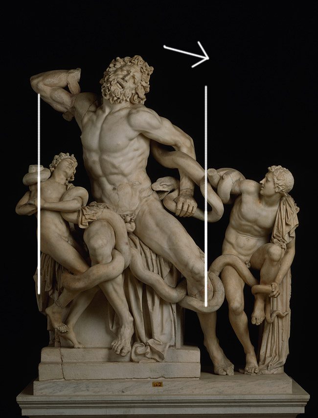
Gazing Direction-we haven’t covered gazing direction (see Day 99) much so far, but don’t let it scare you. Every work of art usually has a gazing direction, which is the dominant direction of the composition. It can also mean the actual gazing direction of the subject (if it’s a figure).
The gaze and position of your subject carries weight, and this weight adds to the balance of the image. We will cover balance in a later article, but for now take note of Laocoon’s position. He is on our left, yet facing our right….so is the son on our left. Their line of sight, or gazing direction, creates a weight which helps balance the sculpture. If they were facing left it would be left heavy. That’s why some people that use the rule of thirds completely fail. They will place someone on the left third and have them facing left, with no regards for gazing direction which plays a role in the balance of a great composition.
With sculptures, some of the other design techniques won’t come into play, like the greatest area of contrast (GAC) (see Day 27). This is because the lighting is what dictates the contrast. Also edge flicker (EF) (see Day 49) doesn’t apply because there is no visible rectangle surrounding the sculpture.
I hope you are beginning to see how these design techniques can be used to greatly benefit many forms of visual art. Again, if you have any questions, please let me know. I recommend you dig through the other techniques, and start analyzing some art that has inspired you. You be surprised to learn that it has the same design techniques within it. Thanks so much for joining in, see you next time!








February 21, 2016 @ 11:57 pm
Hi,
Amazing work analyzing the Laocoon. This piece kind of obsessed me for a long time but never though about it in terms of canon of design. This piece is been restored several times and as you might know already during Reinaissance they decided to add the three right arms which were missing at that time (also the Laocoon one). There was an interesting discusion about the right Laocoon arm about how it was posed originally and despite the Michelangelo opinion, who rightly said it was bended, the restoring artist (Jacopo Sansovino) opted for a more heroic extended arm. This is how it looked.
https://en.wikipedia.org/wiki/Laoco%C3%B6n_and_His_Sons#/media/File:Laocoonphoto.jpg
Which composition do you think is better in terms of canon of design?
Best Reggards
Alberto
February 22, 2016 @ 8:38 am
Hi Alberto, that’s interesting, thanks for commenting and sending me the link. I hadn’t read about the debate on the arms. I think Michelangelo was correct in his thoughts. I’m studying anatomy at the moment and when I look at both versions, I think the balance of the figure and the anatomy works best with the bending arm. He’s being attacked by serpents, so I imagine he’d be trying to get them off of his back instead of striking a superman pose 😉 Just my take on it though. Overall I think the version in this article works best. The composition in the other image you linked has a couple of design concerns. The son on our right has his hand sticking upwards which breaks the movement…it draws a lot of attention because of the shape it creates too. Almost seems like the hand is a major focal point, when it shouldn’t be. Laocoon’s arm is better bent because it helps keep our eye’s circling around the sculpture instead of thrusting it up and outward…plus the balance issue. I do like the arm of the son on the left, though it might help with the movement circling around the sculpture if it were bent just a bit more…that is, if Laocoon’s arm was bent also.
I hope that answers your question 🙂 Which one do you like the best? Thanks again for sharing!
February 23, 2016 @ 6:51 am
Hi Tavis,
Many thanks for the comment, accordingly to wikipedia (not best source even but ey!) The actual pose of the arm is the right one. Somebody found the arm buried in Rome and they re-attached it to the Laocoon, so…Michelangelo was right in his analysis.
I like more the bended arm and totally agree with your notes about why the bend arm fits better.
All the best
February 23, 2016 @ 6:11 pm
Hi Alberto, I enjoyed the additional history of the piece, thank you!