Paul Cezanne – Still Life Painting (ANALYZED VIDEO)
#661
Hey everyone, welcome back! Thanks for joining in to show support, it’s always appreciated.
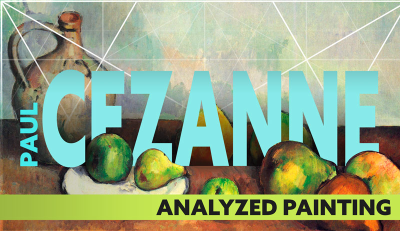
Today we are going to look at a simple, yet well composed, still life painting by Paul Cezanne. It takes knowledge to organize a painting of multiple elements with visual clarity. Knowledge of what though? The rule of thirds? You know the answer. Let’s check out Cezanne’s use of dynamic symmetry and design techniques!
Analyzed Video Paul Cezanne
“Whoa, whoa, whoa,” you might think. “He hasn’t mentioned the rule of thirds in an intro for a long time, what gives?” Well, sometimes it’s good to shed light on the fact that R.O.T. still eats at the head of the table when it comes to widely accepted compositional tools. Shedding light on its flaws is like telling someone that the earth is round when they grew up thinking it was flat. Or that Santa Claus isn’t real. Tooth Fairy, Easter Bunny…you name it. Once you find out something was false when everyone said it was true, it hurts the ego (see #590). But you know what they say…no pain, no gain.
I’ll get to the point of this soap box, but first a bit about Cezanne.
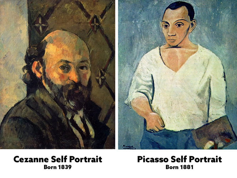
As you may or may not know, Cezanne was an important figure in the art world. The quote by Pablo Picasso below says it all. Cezanne has his own unique artistic style (see Day 122) which is not to everyone’s taste, but style is subjective. Judging style is a personal thing, and says nothing about the artist. We can only truly critique their compositions (see #625), and we’ll see further below how masterfully Cezanne uses his composition tools.
“He was my one and only master. Don’t you think I’ve looked at his paintings? I spent years studying them. Cezanne, he was like the father of us all.” Pablo Picasso
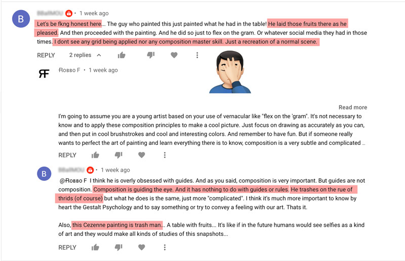
All that being said, it’s astonishing to see a completely hopeless, ego-filled comment like the one in the screenshot below. “…this Cezanne painting is trash man…” is only a piece of this tremendously thirsty comment. It screams, “please someone, anyone…show me some attention.” Meanwhile, they’re disrespecting master artists and completely blind to the techniques being used…even when the proof is all laid before them (insert facepalm emoji here). This is what the ego does.
The trigger for this person was shedding light on the R.O.T. flaws. After that…they hear and see nothing else. Most comments like this are created by those that have never tried the things they’re criticizing. Meaning, this person has probably never sat down to paint a still life or use the design techniques demonstrated. It’s a perfect display of defensive projection in psychology.
As you can see by the very level-headed response, there’s no reasoning with people like this. They only come back with more hatred and oxymorons like, “Composition is guiding the eye. And it has nothing to do with guides or rules.” To guide the eyes without knowing how to guide them…that’s a true riddle.
This is why unconscious trolls get ignored (see video) and blocked on YouTube. There is no point in reaching out or trying to help. Their skeptical wall is far too thick because it’s part of their identity. Their comment provided a great teaching moment though! It’s unfortunate for them, but for those of you who aren’t skeptical and want to learn from the masters, you’re in the right place.
Now, enough of that, let’s get into the video and analysis!
Cezanne Analyzed Video
Here’s the full video and some links to other Cezanne related articles. Further below you’ll see the written analysis with examples and links to design techniques.

Paul Cezanne Analyzed
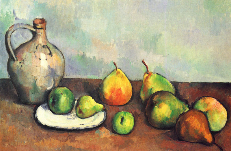
Original
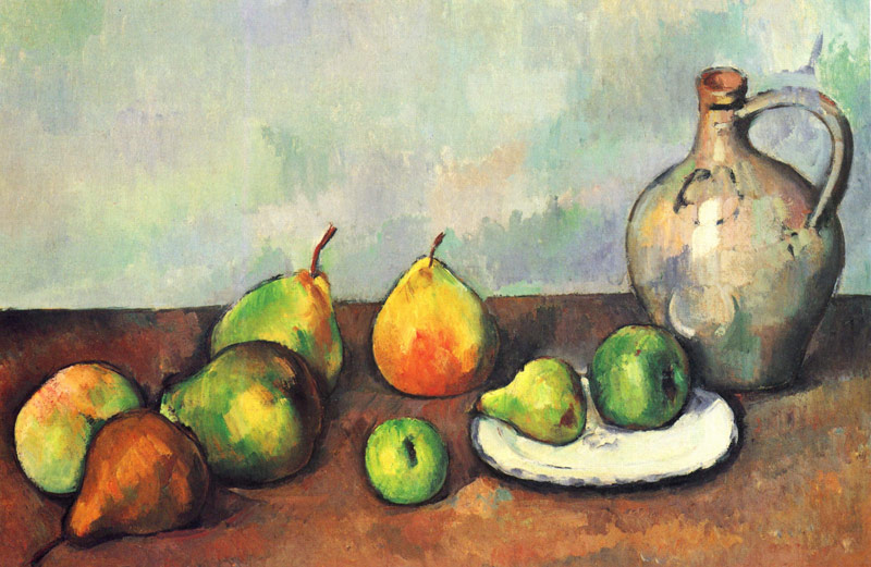
Here’s the original painting we’ll be analyzing today. Seems like a simple still life painting, right? Well, you’ll be surprised how much compositional knowledge is needed to create it!
Dynamic Symmetry
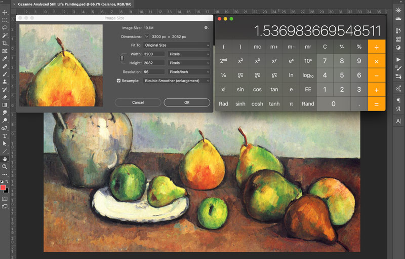
When the image is measured, we find that the ratio is 1.536. Why does that matter?
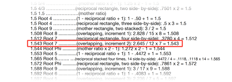
When we find the ratio of the image, we can look in the back of the Dynamic Symmetry book and use the Ratio Guide. This will clue us in on which grid the master may have used. Sometimes there are several different grids, as we can see in this next example. Let’s try the 1.5 grid and see how it aligns.
1.5 – Basic Armature
It doesn’t look too bad, some things are locking in. But what about that bit of uncovered section on the left and right? This is fine and we can still compose without affecting the geometry of the rectangle much, but it leads us to keep searching…just in case. That root 7 overlapping: increment 2 grid was pretty close to the ratio…how does it look?

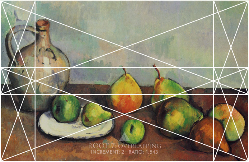
Root 7: Overlapping Increment: 2 – Basic Armature
Here it is overlaid onto the painting. It fits perfect and we can see many more things lining up. I think we have a winner! Check out the sinister diagonal of the lower root 7 armature. It’s locking into four pieces of fruit.
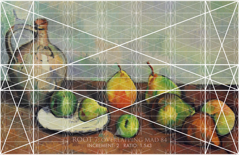
Root 7: Overlapping Increment: 2 – Major Area Divisions (MAD)
This painting isn’t so complex as to use this many lines, but it shows how we can refine the pieces of fruit and even use it to plot brushstrokes in the background.
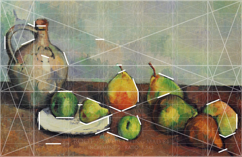
Locked Into the Grid
Here are all of the areas locked in. It’s undeniable how much this grid has guided Cezanne’s composition. Uh oh, there’s that word “guide” again! I guess guides do help guide us…who would’ve thought (if you didn’t read the first section about the troll, you won’t get the sarcasm.)
Color Variation
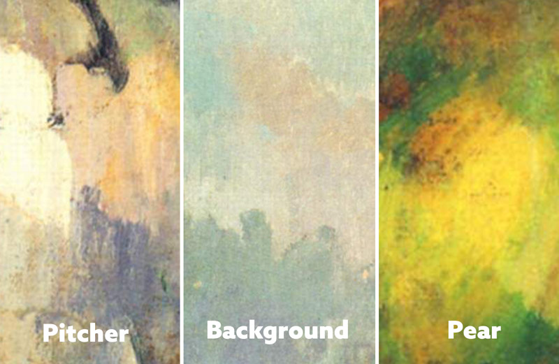
When it comes to colors, it’s sometimes confusing. This is probably why beginners keep it simple with colors straight from the acrylic bottle and don’t incorporate any variation (see #571). That’s perfectly normal and at least they are starting somewhere. We can learn a lot from the masters, and Cezanne is a great one to study for color variation.
When we look closely at these details of his painting, we can see how he’s using varying hues of the four colors (red, yellow, blue, green) and including them in the objects (see #470).
Aspective View
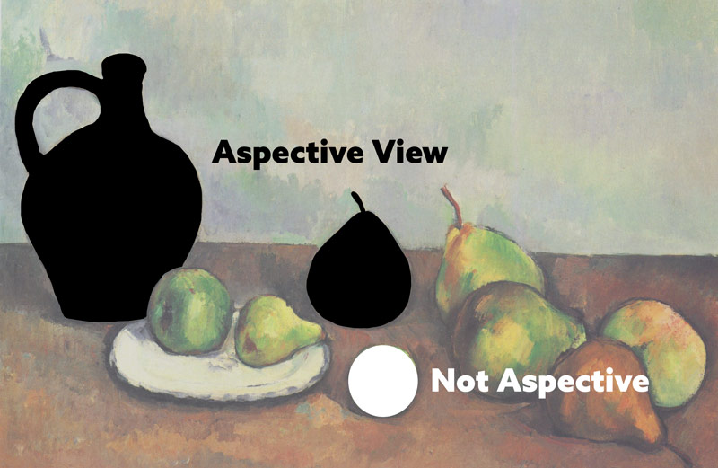
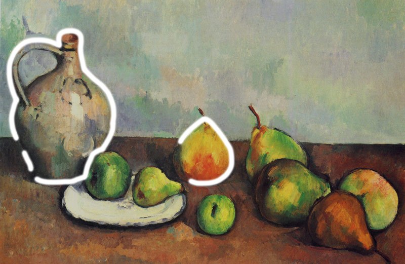
Cezanne has helped the visual clarity by providing an aspective view (see Day 78) on most of the fruit and the pitcher. The side profile of the pear is much more descriptive compared to the bottom of it. We can see this in the white circle diagramed below. It’s really impossible to tell what kind of fruit that is. It’s fine because Cezanne has given us variation in shape, but if all of the pears were like this it would be confusing to the viewer.
If you know of Giorgio Morandi (see Day 149) and the way he likes to coincide shapes, you could create a humorous painting. Maybe name it “apples, limes, and pears” then show only the bottom of each fruit. You could get a chuckle from that, which is why it’s important to know the techniques. You can be in full control!
Coincidences
Here we have some coincidences (see Day 48), which are created by edge-to-edge relationships. The unity and movement they provide the composition only amplify Cezanne’s skills. Follow the lines across and you’ll find that these fruits weren’t randomly placed on the canvas. Just a little more proof for the skeptics!
Balance
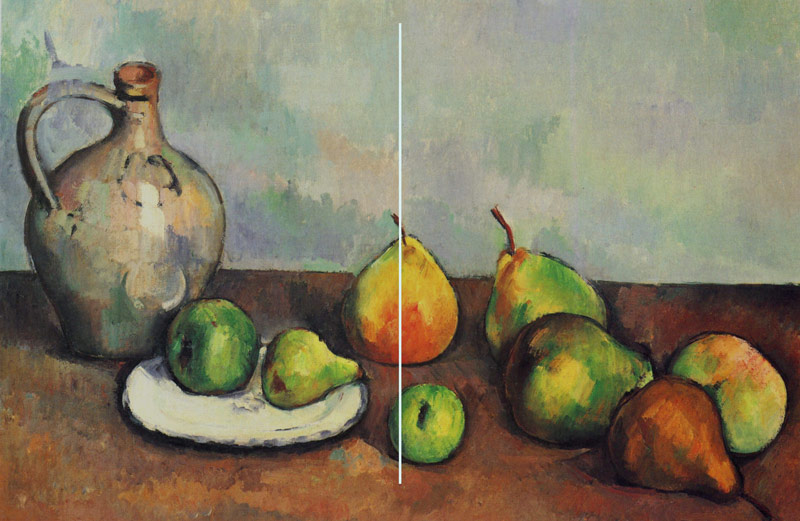
When a vertical centerline is drawn, we can see how Cezanne is balancing the composition from left to right (see Law of Symmetry). This balance is one of the techniques that come naturally to artists.
Arabesques
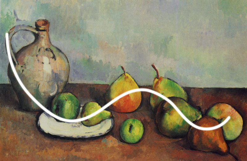
There’s a nice arabesque (see Day 17) squirming through the image. This elegant curvilinear element adds even more movement and unity to the composition.
Aerial Perspective
The painting doesn’t recede into the background like a landscape would, but Cezanne still uses aerial perspective (see Day 42) to create the illusion of depth in some areas.
Figure-Ground Relationship (FGR)
When we draw an imaginary line around a few prominent objects, we’ll see that Cezanne has given us nice FGR (see Day 21). This clarifies the composition even more!
BW Blur
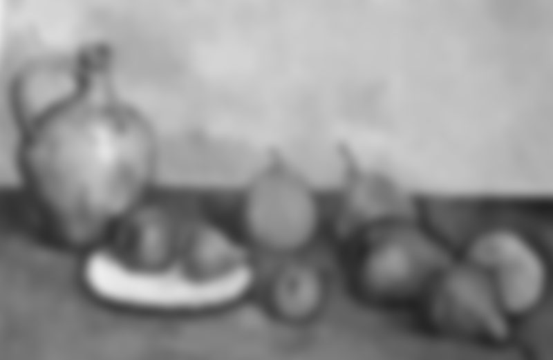
Squinting at the painting (see Day 85) will allow us to see something similar to this black and white blurred version. It simplifies the values and shapes so we can judge them with more efficiency. A tool you shouldn’t live without!
Edge Flicker
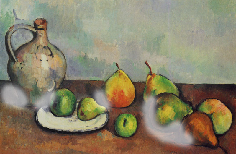
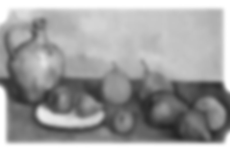
When we create art, we always want the edges free of high contrast, or edge flicker (see Day 49). Cezanne has done a good job for the most part, but some areas could have the contrast reduced a bit more to bring attention back into the composition.
Adjusted
Here’s a before and after with a little section of the left and right edges adjusted. The pitcher and fruit had some high contrast pulling our attention away from the main fruit in the middle. Do you see the difference?
Greatest Area of Contrast (GAC)
When converted, we can see that the GAC (see Day 71) is the plate, but it’s hard to deny the vibrant pear in the middle of the color version. This is a great example of how color contrasts can be stronger than value contrasts.
Flipped
The original painting moves in the direction of the sinister diagonal, but when it’s flipped we get the baroque diagonal. If you understand the concept of magnetic momentum (see #638), you’ll know that the original has more movement. The flipped version has nothing to pull the eyes back to the upper-left area.
Conclusion
There’s no denying the knowledge Cezanne packed into this colorful still life painting. Even if you don’t like his art, you can still learn a lot from analyzing his work. Take the grid and techniques one at a time until you get comfortable. Slowly add more and more…and more! All it takes is an understanding of the techniques, then the most important part; application. You need to apply what you’ve learned and do it until it’s not frustrating anymore. Then repeat the cycle.
Thanks again for showing support, see you in the next one!

