Perfectionism and Your Art (Paris)
#579
Hey everyone, I hope you’re doing well! Welcome back and thanks for your continued support!
Today we are going to take a look at some master painters and how they are able to create a masterpiece with imperfections. If you’re a perfectionist, this article will help you ease up a bit and be more productive. Let’s get into it!
Is it a Bad Thing? Perfectionism
As with most articles on this site, we can look at the masters to understand a bit more about the, sometimes overwhelming, creative process. Perfectionism can squander creativity (see #576), but shouldn’t we always strive for perfection?
Well, being a perfectionist myself I think we should, but not if it’s keeping us from shipping. What is shipping? It’s a term that Seth Godin uses to describe the action of releasing your work even if it isn’t perfectly perfect.
“The only purpose of starting is to finish, and while the projects we do are never really finished, they must ship.” ~Seth Godin
There will always be negative things you notice in a photo or painting as it marinates with time. If you let a painting sit for a week, you’re sure to find something wrong with it. Yet, if we can get our art at least 80% perfect to the best of our abilities, then we’ll be doing quite well. After all, the little imperfections we personally fuss over will be overlooked by most people.
The whole point of easing up on any perfectionism is to share and create more. Staying productive is key! If you’re being a studious artist, you’ll always be learning, but this doesn’t mean you have to revisit old pieces of art to update it as your skills improve. That would be a ridiculous thought and you’d never move forward fast enough.
Sure we want to use our knowledge of design techniques to avoid high contrasting distractions or get things as perfect as possible, but we need to be satisfied with things we may have overlooked. Learn from mistakes if you see something a month down the road, and apply it to something new. Keep your momentum!
Embrace Imperfections Master Painters that
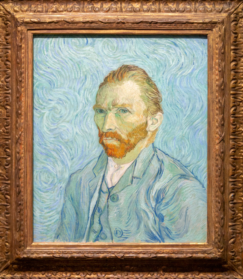
It’s usually the smallest imperfections that drive the perfectionist crazy. In this next painting by Vincent Van Gogh, is there anything that is bugging you? Maybe something that draws too much attention to itself? In other words, if this was your painting, is there anything annoyingly subtle that you would adjust?
Well, I found something that might puzzle the perfectionist in you.
In this detail of the same painting, check out his lips. Do you see it? There’s a bright red line on the left side of the lower lip. Why did Van Gogh paint this line? It helps describe the curve of the lip, but why did he choose red?
Now that attention is brought to it, doesn’t it look like he’s got a split lip? Isn’t this a distraction from the rest of his mouth? Can it be adjusted and still tell the same story? Does it need adjusted at all?
Lots of questions can occur when trying to learn from the masters and we notice these little imperfections. Do you think he saw it and let it slip by, or do you think he didn’t even notice this subtle distraction?

Either way, we can see that when the red line is removed it doesn’t look like he’s got an injury on his mouth. I think this “imperfection” is a great example of something a perfectionist would fuss over. Such a small thing can make some artists go crazy!

Pablo Picasso is known to not really care about perfection, and we know this by just looking at the expressive brushstrokes in his art. Yet, shouldn’t he be more delicate and careful in areas of importance?
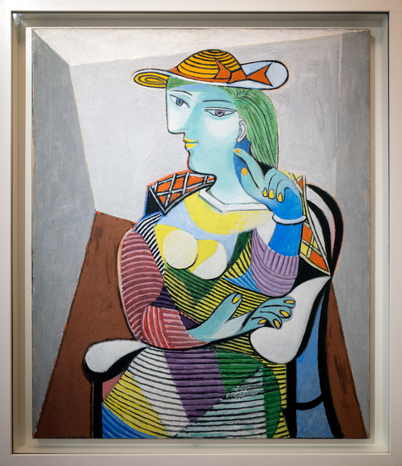
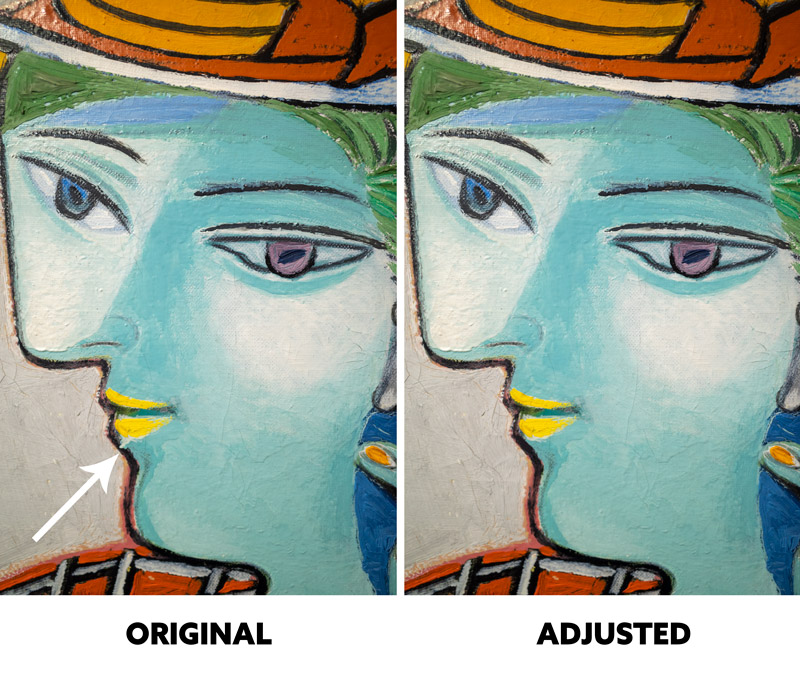
Speaking of lips, in this detail of the Marie-Therese painting, we see a similar imperfection. We could call this a small distraction because of the light mark against the dark line, but should he have corrected it? Of course not, he’s Picasso, but does that mean he can have small distractions in his paintings and we can’t?
We can see how the adjusted painting looks cleaner, but it’s part of that 20% that we can ease up on. Sure, if we see the imperfection and know it’s creating a distraction we can fix it, but we don’t want to fuss over it and allow it to impede our progress.
Do you see any imperfections in this one that you would fix?
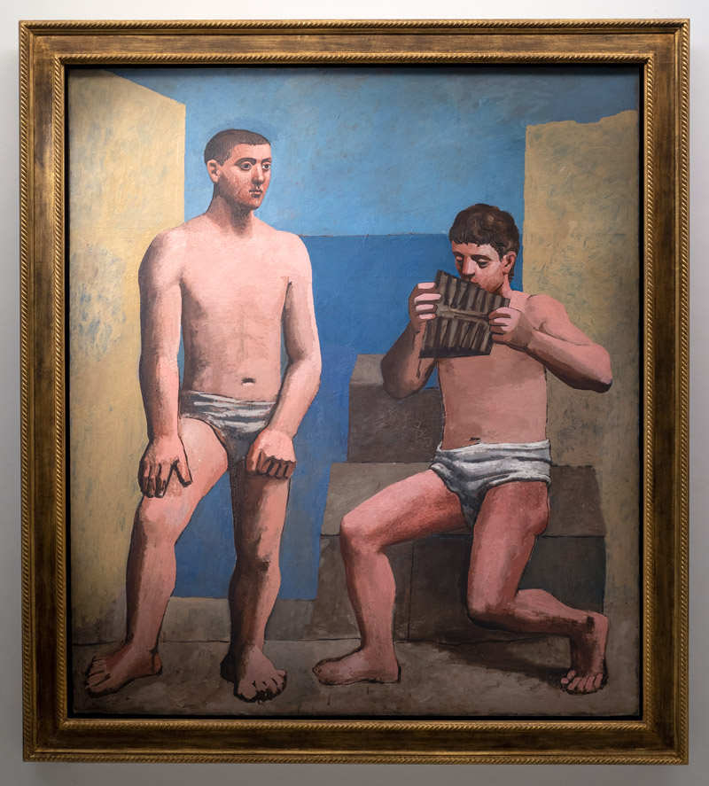
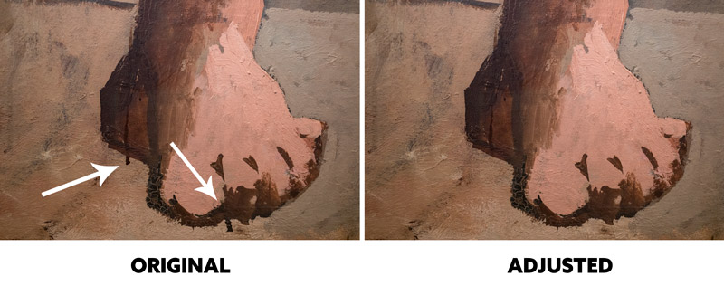
There are a couple of “head scratchers” noted in these next two detail shots. Why didn’t he correct these obvious imperfections? He painted a dark line over the skin colored paint that makes the leg more anatomically correct, but he just left the skin color as is. We can see in the adjusted version that it looks cleaner, but the original looks more like Picasso. He was always trying to draw like a child, so having it look like he painted outside the lines fits his artistic style perfectly (see Day 122).
“It took me four years to paint like Raphael, but a lifetime to paint like a child.” ~Pablo Picasso
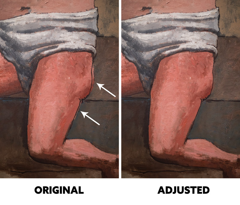
Ok, but what about these dark distracting lines that have nothing to do with anatomy or defining the structure? Would you fix this? I know I would, mainly because it’s a distraction. If I saw these distractions a year later I would just chalk it up as a learning experience and continue to move forward, rather than fixing it or beating myself up. You should do the same; learn from mistakes and continue to create and share. The art world needs more of what you have to offer!
If there are any Stanley Kubrick fans here (see #489), wouldn’t you like to see more of his movies? He was perplexed with perfectionism and sadly only finished a handful of amazingly excellent movies.
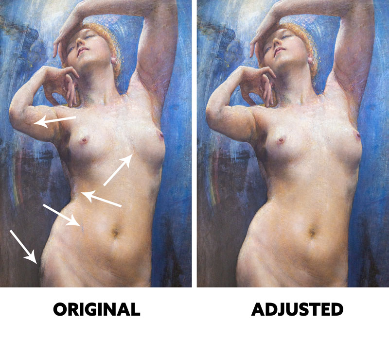
Imperfections aren’t just in modern art, even some of the most refined masters will let things ship without being perfect. In this beautiful painting by a recently discovered artist from the 1800’s, Annie Swynnerton, we can see a few imperfections that are quite noticeable up close.
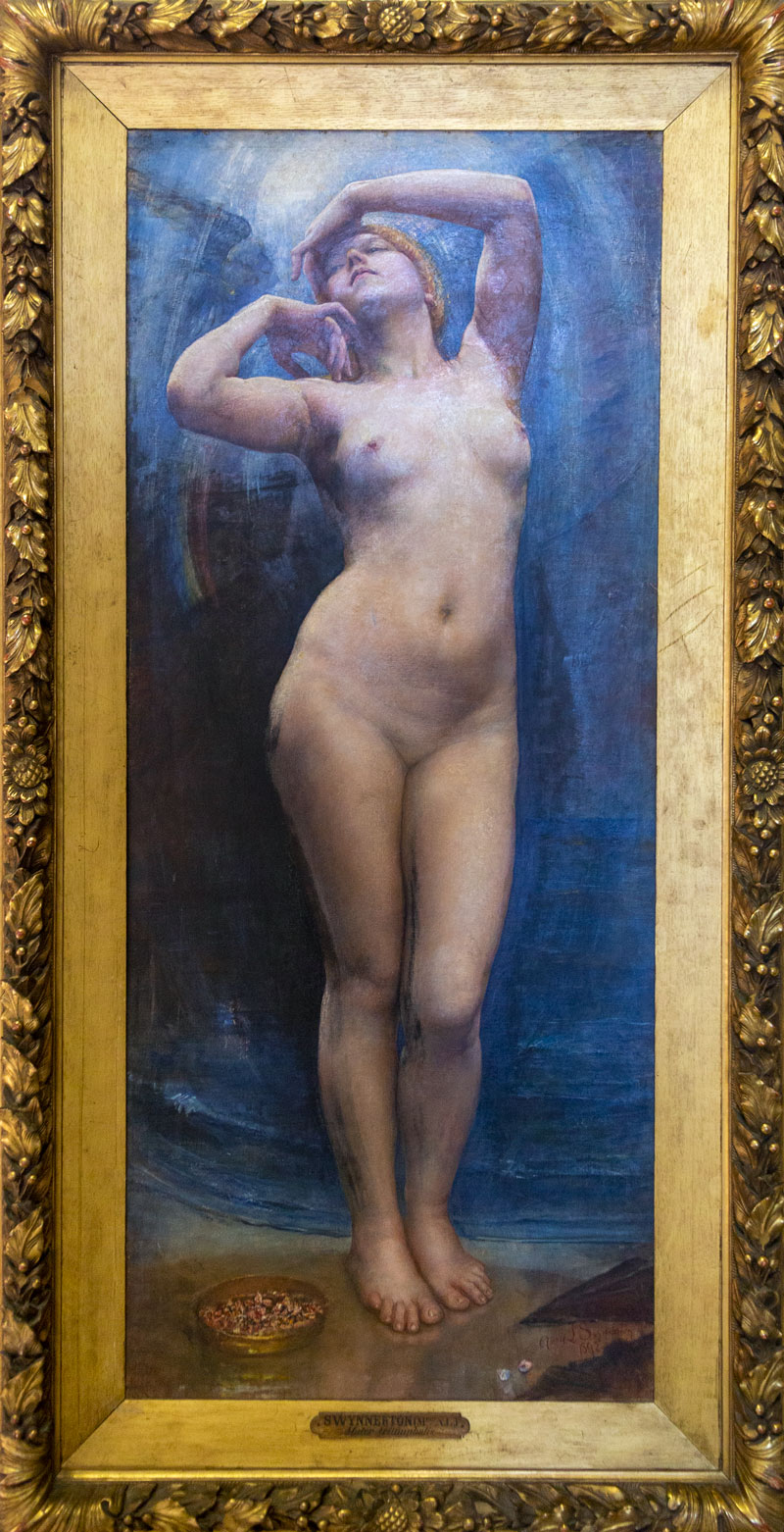
It’s safe to say that this masterful painting is 80% perfect, don’t you think? So yes, the blue mark and all of the other “distractions” don’t make much of a negative impact on the whole.
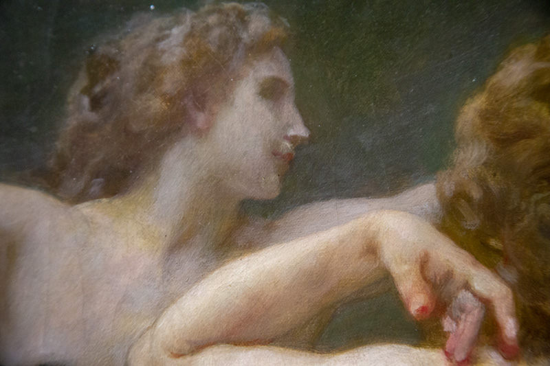
Of all masters to let loose and embrace some imperfections, you’d probably never think that William-Adolphe Bouguereau (see Day 306) would be one of them. He’s well known for his masterful compositions and highly refined paintings, but when we look closely at this next painting, we can see that he was keeping things relatively “loose as a goose.”
Do you see anything jump out at you yet?
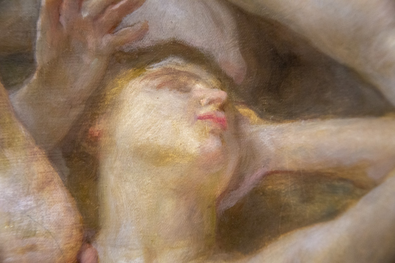
As always, we see the image as a whole, and his composition is quite breathtaking, but when we look at the individual parts we’re able to see some imperfections. I’ve always loved this painting and still do, but when I was admiring it in the Musee d’Orsay I noticed the faces of each nymph, and that’s when my jaw dropped.
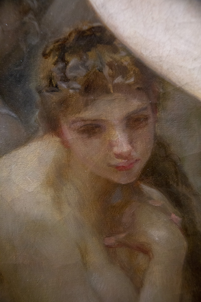
Some were well done as seen in the next few examples, but most of them looked rushed. Bouguereau rushed a painting?? Yep! Understandably so, because if he painted each face to perfection it would’ve taken forever!
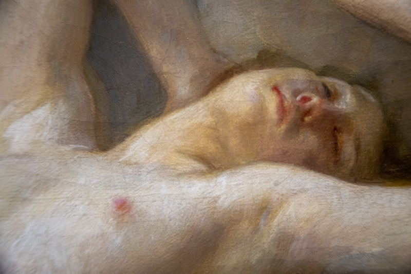
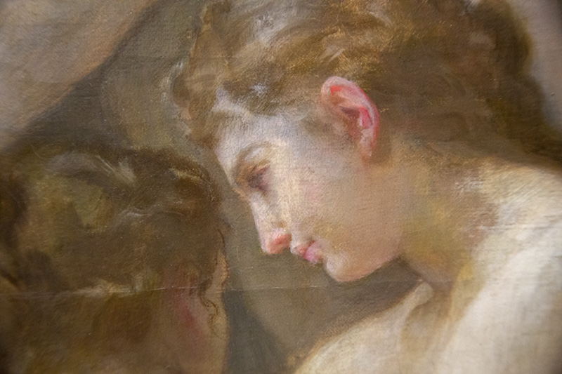
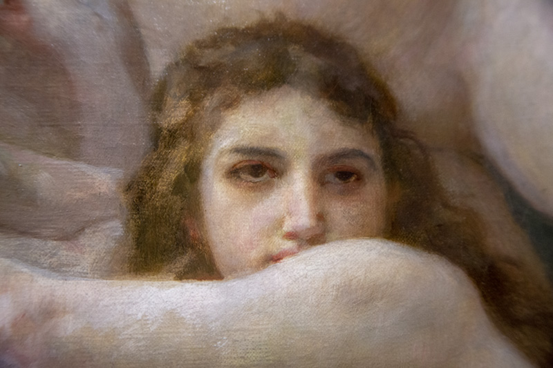
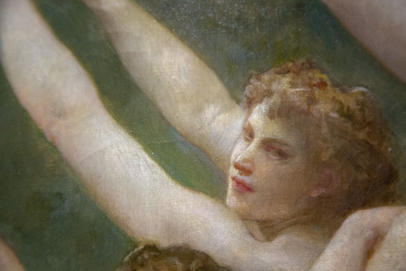
Now let’s see some of the faces where Bouguereau decided to embrace some imperfections. Most of the nymph faces look like they are literally beat up, deformed, or cross-eyed, yet the painting still works. Isn’t this next one pretty bad? Would you have fixed this? Knowing myself, I would’ve tried to make all of the faces perfect, but seeing how Bouguereau did this is a great learning experience.
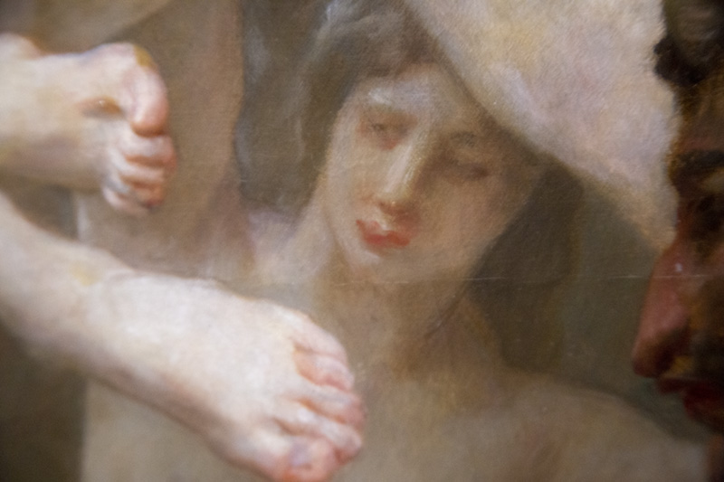
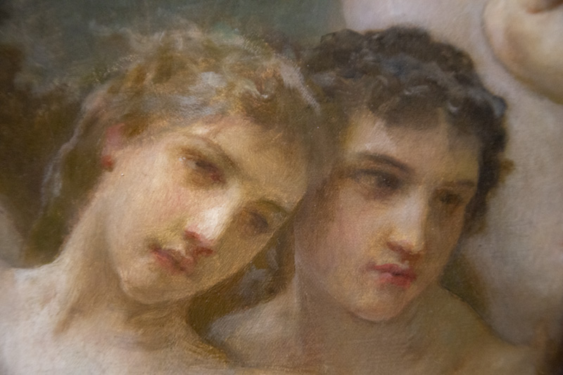
This perfectionism can even be seen in your application of dynamic symmetry. The grids are created to help guide you when organizing your composition, but to fuss over the perfect placement of a line is not the way to approach it. Sure, most of us want to get things exactly right in the beginning, but it’s not necessary to create something remarkable.
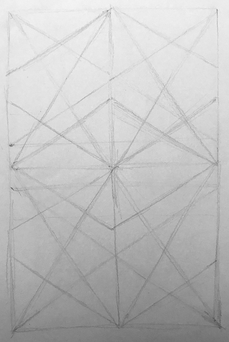
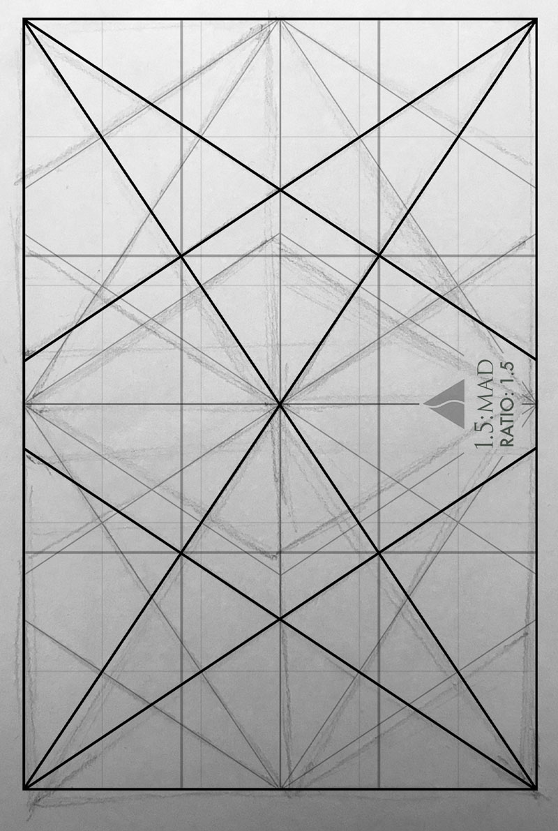
In the Dynamic Symmetry and Absinthe inspired drawings (see #576), I start by hand-drawing the grid from memory. Does this look perfect to you? Not even close!
We can see how imperfect it is compared to the computer grid, but it still serves a purpose when I’m drawing to help promote unity, movement, rhythm, strength, and dominant diagonals. When you’re organizing your composition with a grid, or adding lines, don’t get caught up on the exact placement of the subject. Sure, try to parallel or lock into the grid as much as you can, but if your diagonal ends up being two degrees different, don’t stress. Try to get it perfect, but after that, learn from any mistakes you encounter and move forward.
Conclusion
So, are you inspired to ship more? Hopefully you’re seeing how perfection isn’t needed to create a masterpiece. Focus on learning your design techniques to avoid as many imperfections as possible, then ship when you feel it’s 80% amazing. If you notice something later that you should’ve adjusted, just learn from the mistake and keep moving forward. Life is too short to not share your work just because you’re fussing over something small.
That’s it for this one, thanks for joining in. See you next time!

