Pieter Bruegel – The Harvesters (ANALYZED PAINTING)
#724
Thanks for joining in to discover more master secrets of composition and design!
Today we’re going to take a look at a peculiar and talented master named Pieter Bruegel the Elder. You’ve probably heard of him, but who is he…really? Let’s learn more about him and his methods of composing a masterpiece!
Pieter Bruegel? Who Was
Pieter Bruegel the Elder (1530-1569) was a Dutch and Flemish Renaissance painter, and was considered to be one of the most significant artists from that region (also see Day 58 & #635). He probably inspired Peter Paul Rubens (1577-1640), another excellent Flemish master (see #559).
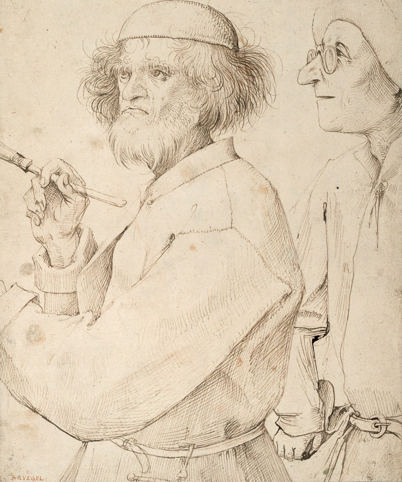
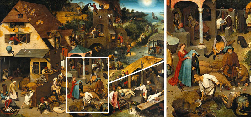
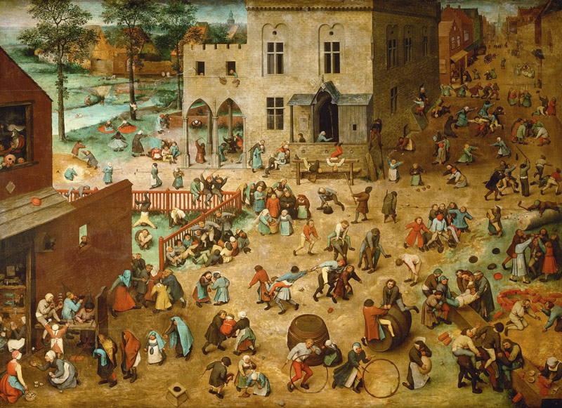
Bruegel was known for his complex, highly detailed landscape paintings full of peasants and other interesting characters. You can see in the paintings below that complexity didn’t scare him. He creates several different scenes within the composition as a whole, and incorporates his sense of humor by making the characters do interesting things.
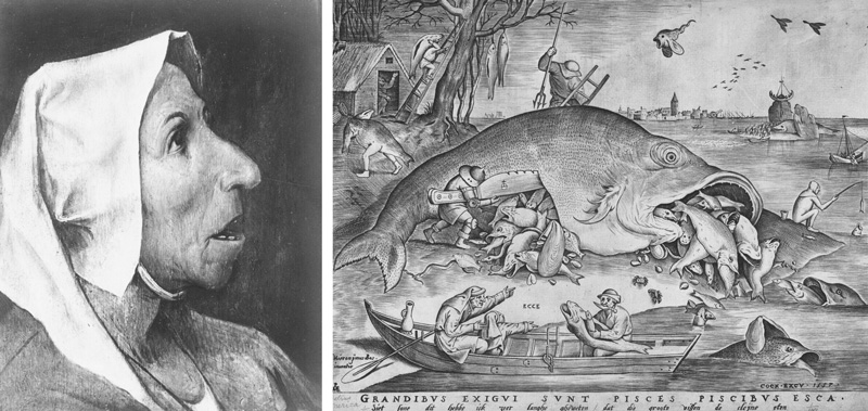
After Bruegel trained in Italy, he came back in 1555 and settled in Antwerp, where he created print designs for a publisher. He only started painting for the last 10 years of his life, but created some excellent masterpieces within that time. The print below shows the same amount of complexity as his paintings. The peasant drawing is pretty great too! Some assume Pieter the Elder came from a peasant background because he painted them so much, but this can’t be proven. He was thought to be highly educated though, based on his compositions.
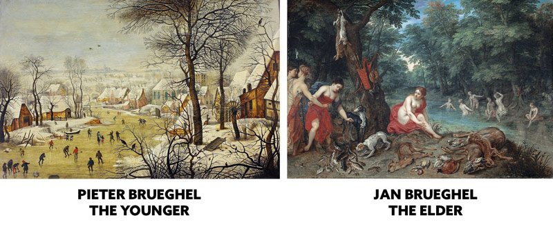
Not much is known of Pieter’s family background, but he did have a couple of sons. Pieter Brueghel the Younger (1564-1638) , was also a talented painter. Actually, their artistic style is pretty much identical (see Day 122). His other son, Jan Brueghel the Elder (1568-1625) (see Day 341) has a slightly different artistic style that includes more animals. You may have noticed that his sons have an “H” in their name and Pieter the Elder doesn’t. This is because he eventually dropped the “H” and started signing without it. Why? Because his sons would copy his work and sign them Bruegel. The missing “H” was to help distinguish who painted what. Pieter also had two notable grandsons, Jan Brueghel the Younger (see #653) and Abraham Brueghel. Too many talented Brueghels to keep track of! Imagine being born into that family! Wow!
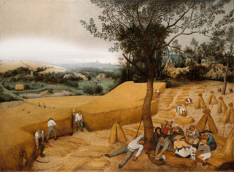
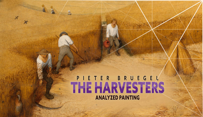
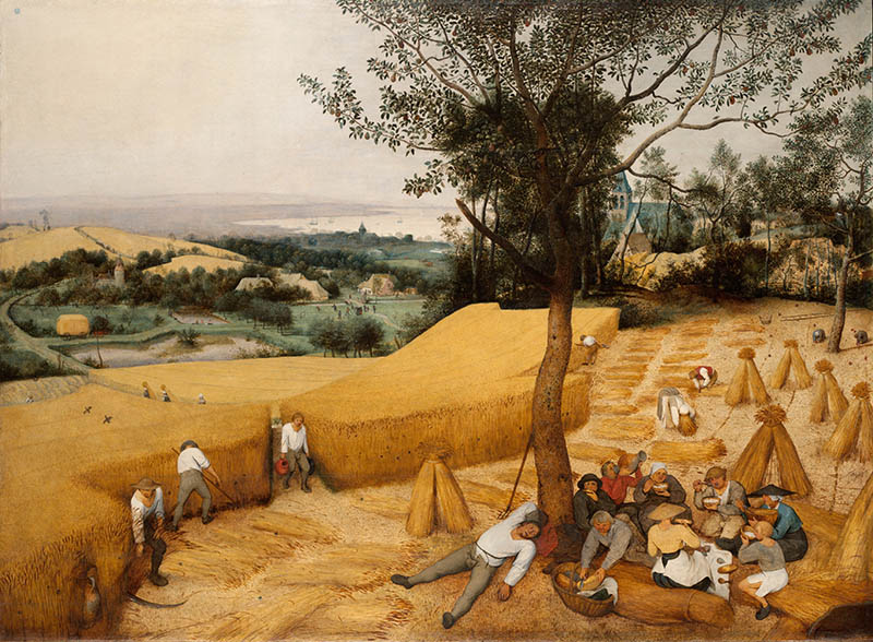
Here’s the painting we’ll be analyzing today, and it’s called “The Harvesters.” It shows a typical hot summer day in the Netherlands, where the men harvest the field, and the women feast on a picnic in the shade to show their loving support. Are they eating cereal?? Maybe fresh wheat puffs?
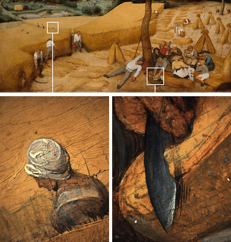
Here’s some interesting details of the knife cutting what looks like a loaf of bread, and another detail of the woman in the field.
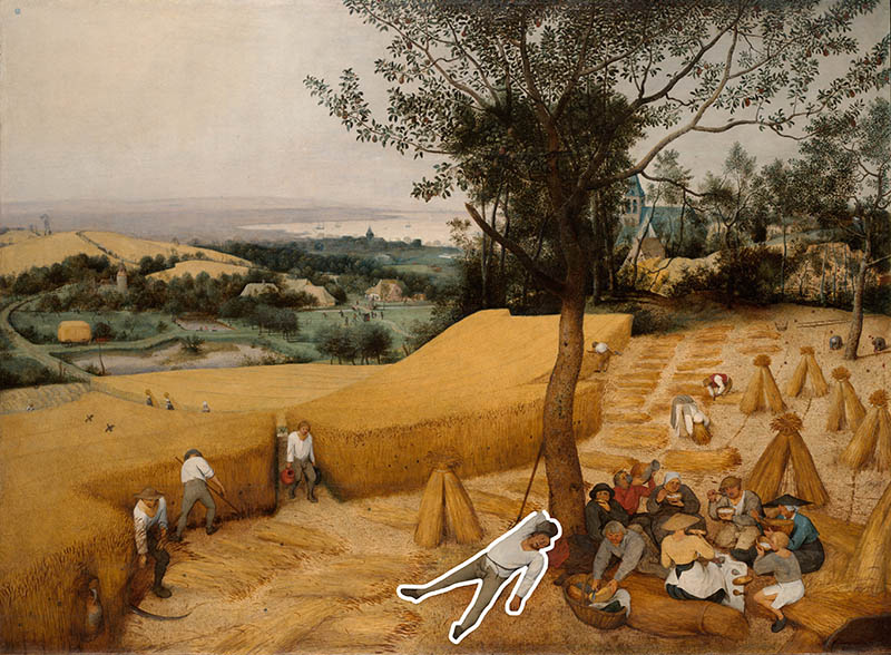
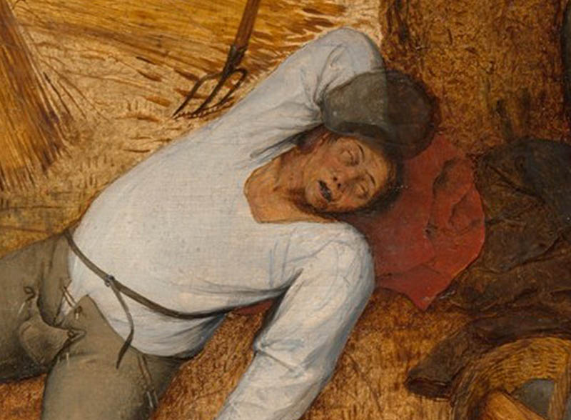
And then there’s “Willy,” (we’ll call him Willy) who probably had so much absinthe (see #445) the night before that he had to take an extended siesta under the wobbly tree. No one seems to mind. Maybe they’re use to his antics, or maybe their just happy that his safety pin is still holding together his crotch flap. This was a time, long before the zipper was invented! Either way, Pieter Bruegel is definitely showing us his sense of humor.
Now that you know a bit more about Pieter Bruegel the Elder and his family, let’s dig into his composition techniques!
Pieter Bruegel Analyzed
Dynamic Symmetry
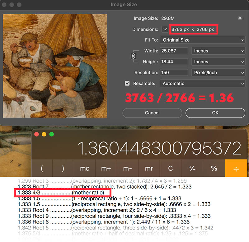
To find the ratio of the painting we can divide the dimensions into each other. Even though there were several grid options available in the ratio guide of the Dynamic Symmetry book, the 4/3 grid fit perfect!
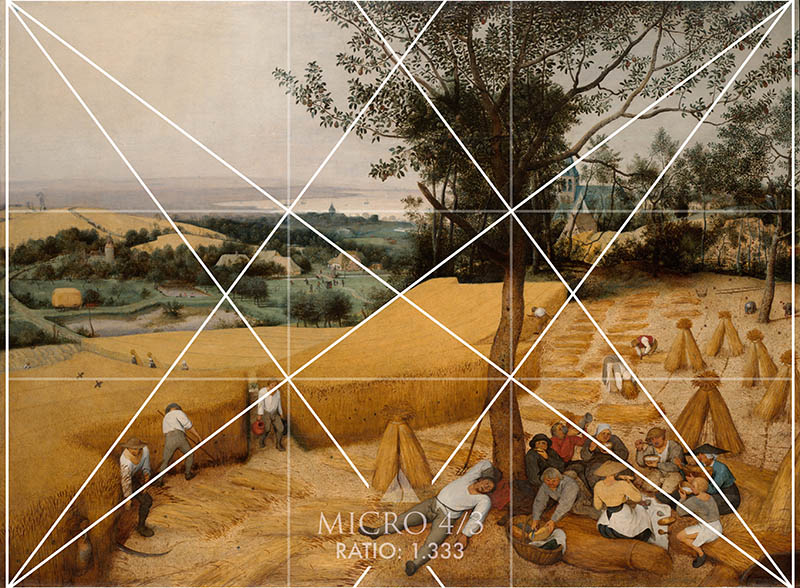
4/3 – Basic Armature
With the basic armature overlaid, can you see anything specific locking in? How about that tree! We’ve also got the distance locking into the horizontal. Other areas are locking in and paralleling, but we definitely need more lines for such a complex composition!
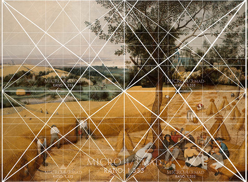
4/3 – Major Area Divisions (MAD)
Here we have four smaller grids inside the mother. Now we see more of the peasants locking in…the big group on the right, Willy’s leg, the guys on the left. Nice! But I always say…more lines!
4/3 – MAD 16
Here we go. This refined grid (see #649) gives us 16 smaller 4/3 grids inside the mother and we are able to see how Bruegel organized the smaller details. Some of the diagonals of arms and landscape are locking in perfect.
Locked Into the Grid
This shows how many areas of the grid are being used to organize the shapes within his composition. There’s a guy on the left and you can see his arm diagonal is aligning exactly to the grid.
Gamut
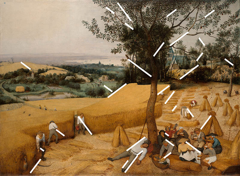
Bruegel creates a hidden rhythm by using a gamut (see Day 38). This limited number of diagonals is pulled straight from the 4/3 grid and repeated throughout the composition. This kind of magic trick can provoke emotion in the viewer, but the technique can’t be obvious (see Day 353).
Coincidences
Ah yes, coincidences (see Day 48). The dynamic symmetry grid promotes these, but we can create them anywhere we like to create unity and movement. Notice how the foreground workers on the left coincide with the background workers and birds. Even the wobbling tree touches it’s own linear paths!
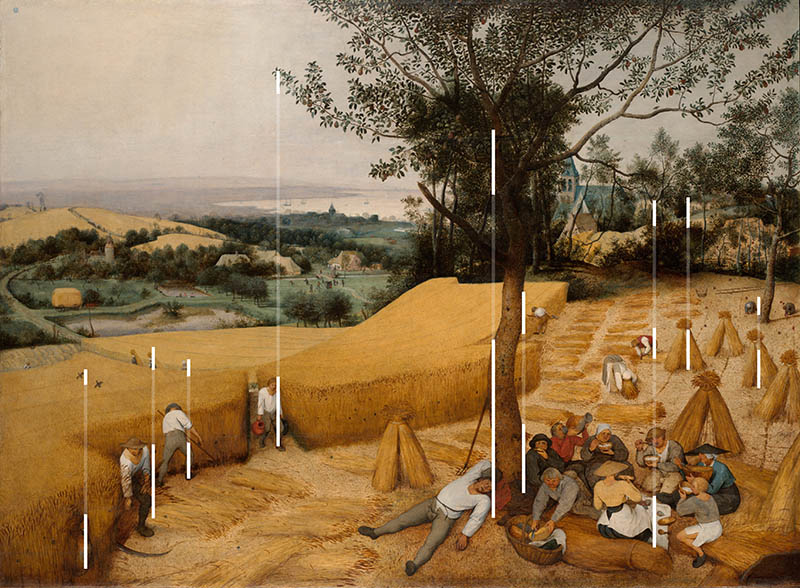
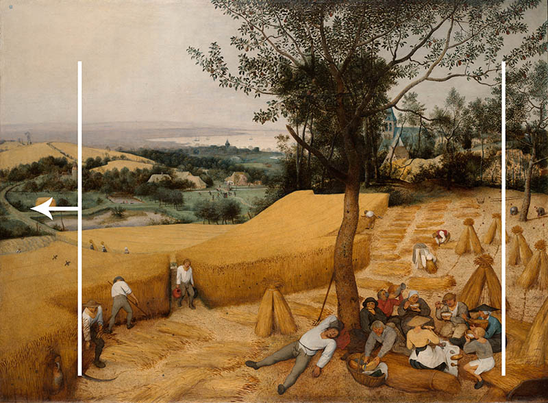
Horizontal Coincidences
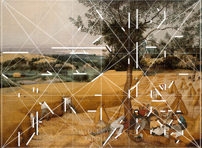
These horizontal ones can be seen uniting the different elements across the composition. There’s tons of them! Keep the lines broken in order to hide them from the viewer.
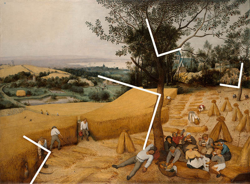
90 Degree Angle
There are a few 90 degree angles (see Day 76) that are hidden as well. These add strength to the composition when they are designed on a tilt and not straight up and down. Notice the biggest one. It starts at the pitchfork leaning on the tree, then runs up and left across the diagonal of the field.
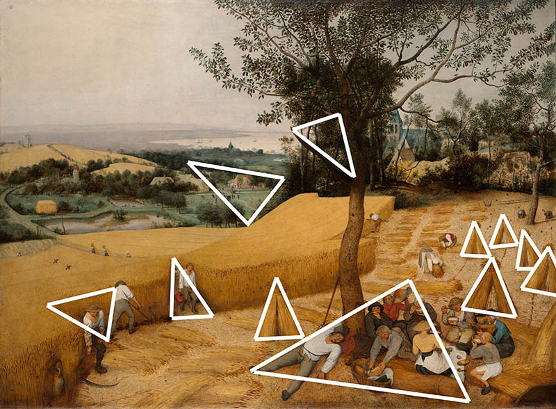
Enclosures
Aside from the bushels of wheat creating triangles, we have a few others hiding in the masterpiece. These are enclosures and adhere to the Law of Closure (see Day 32 & Day 87) to create unity. Simple geometric shapes work great for creating enclosures!
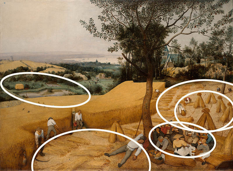
Ellipses
The ellipse (see Day 34) is another form of enclosure that creates unity and movement. We can see how the group of women are designed within an ellipse, and we have the men on another ellipse.
Arabesques
These arabesques (see Day 17) create an elegant movement throughout the composition and usually work hand-in-hand with the ellipses. Keep all of these magic tricks hidden from the viewer for maximum effect!
Gazing Direction
When it comes to balance, we use the gazing direction (see Day 99) to determine the left to right visual weight. Is the “bulk” of the composition more on the right or left? Here we see that it’s more on the right, so we have a right to left balance. This is thanks to the extra negative space on the left.
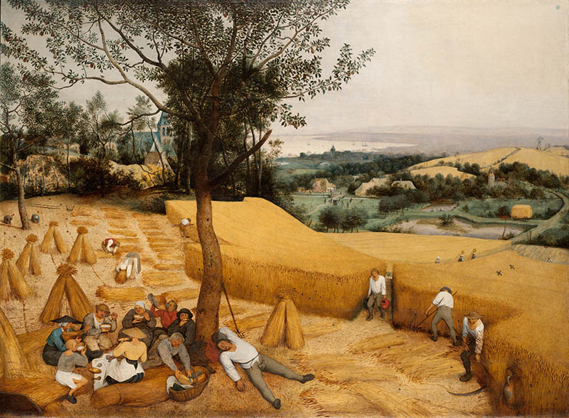
Flipped
Contrast, diagonals, and the way we read left to right has a lot to do with the balance and movement of a composition. When we view the image flipped (see #638), do we see anything change? With more contrast on the left side and the sinister diagonal coming down the wheat field, we seem to get more movement. Don’t you think? Flipping the image is a great way to see if an image is properly balanced with the contrast and diagonals within the composition.
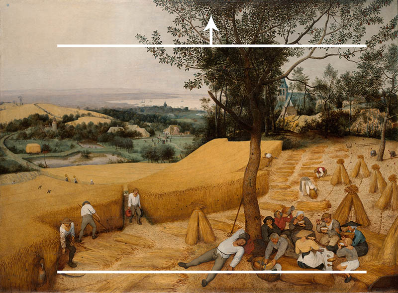
Breathing Room
The breathing room (see Day 102) has to do with balance and negative space as well. The bulk of the composition is more on the bottom, so we have a bottom to top balance even though we are looking down on the scene.
Aerial Perspective
The aerial perspective (see Day 42) is used to create depth. This can be fog, mist, or even lighting techniques. Reducing the contrast is the key, and we can see how he fades the background into nothingness.
Figure-Ground Relationship (FGR)
Most of the characters have nice FGR (see Day 21), which helps with visual clarity. Good ol’ Willy stands out the most…do you know why? It’s because he’s one of the largest figures, but also has an aspective view (see Day 78). The spread limbs add to the visual clarity, making him the center of attention. And don’t forget that face! Is that drool too??
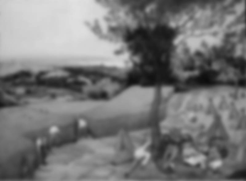
BW Blur
Squint your eyes and you’ll begin to simplify the values and hone in on where the contrast resides. The dark tree in the center next to the light wheat field holds a lot of contrast, but it leads our eyes down to the group of people and around with other design techniques. See how Bruegel is controlling our eyes?
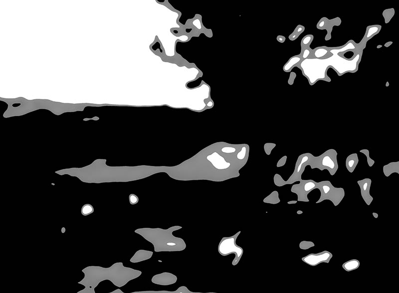
Edge Flicker
There isn’t any high contrasting EF (see Day 49), but there was one curious area on the bottom right. I made note of this because it caught my eye only as I was drawing the line around the edges.
Greatest Area of Contrast (GAC)
The landscape holds a lot of contrast, which draws us in to the finer details. Out of the characters, Willy is the GAC (see Day 71). He has nice FGR, aspective view and is the GAC. Bruegel is telling us something. He’s saying, “Look at this slacker! LOL!”
Conclusion
Well, you know Pieter Bruegel the Elder like he was one of your own kin. Were you impressed? He could’ve been a peasant, who knows. But when we look at his art, we see that he was definitely highly educated and talented. He started a family full of painters, and inspired some of the best painters ever known. Bruegel even has a quirky sense of humor!
Thanks for joining in to show your support, you’re much appreciated! See you next time!

