Score Your Compositions
#403
Welcome back everyone, I’ve got a fun little article today! After watching the video below, which asks the question, “why is modern art so bad,” I was inspired to create a way to score composition. Of course, only someone trained in design (this could be you) will understand the techniques well enough to identify them, but at least we have a better way to measure our compositional skill level adjacent the masters. Let’s see how we can do this!
Note: The Master Pass members can download the SCORESHEET PDF on the Resources Page.
Why is Modern Art so Bad?
Before we get started, I think it would be fun to watch this short video to get an idea of where we need improvement within the measurement of great art (funny rant here with strong language). It’s ok to go against the standards set forth by the industry, but it’s ridiculous to think we can abandon the compositional techniques used by masters to clearly communicate to the viewer. The impressionists rebelled, but they still held tightly to the design techniques proficiently used by the remarkable artists before them.
Not all modern art is bad, and it doesn’t have to be bad to be considered modern art. Dali, Picasso, and Matisse all used the design techniques of the masters before them. Some modern artists think that a famous name will make them a successful artist, but they absolutely must learn composition.
Before We Get Started
Just a quick note before we get started. This scoresheet is only effective for scoring paintings, drawings, or fine art photography. To try and apply all of the measurable techniques in a sculpture, wedding or street photo would be unobtainable. I’ll have to make a separate scoresheet, and until I do, you can see Day 98 for the measurable techniques.
Oh, and yes, this scoresheet of techniques could be broken down and fine tuned even further, but I think it’s important to use the techniques and not get into how effectively they were used. We need to first get artists to start applying these design techniques again before we try to measure the application efficiency.
A Great Way to Measure Art
To set the standard for our new Design Scoresheet, we’ll use William-Adolphe Bouguereau’s analyzed painting of the “Birth of Venus” (see Day 65). His compositions, next to Peter Paul Rubens (see Day 331), are some of the most complex and remarkable that I’ve had the pleasure of analyzing.
Bouguereau was criticized harshly for his traditional academic style. I guess, if all he did was produce life drawings as he saw them, without adding his own unique interpretation, then he wouldn’t get too many points for composition. But, he didn’t do that. Composition at his level is a process that has to be worked into the art…it’s never arbitrarily present in a fixed environment. Some techniques can definitely be captured without knowing anything about them, but not at this level. Not at the master level.
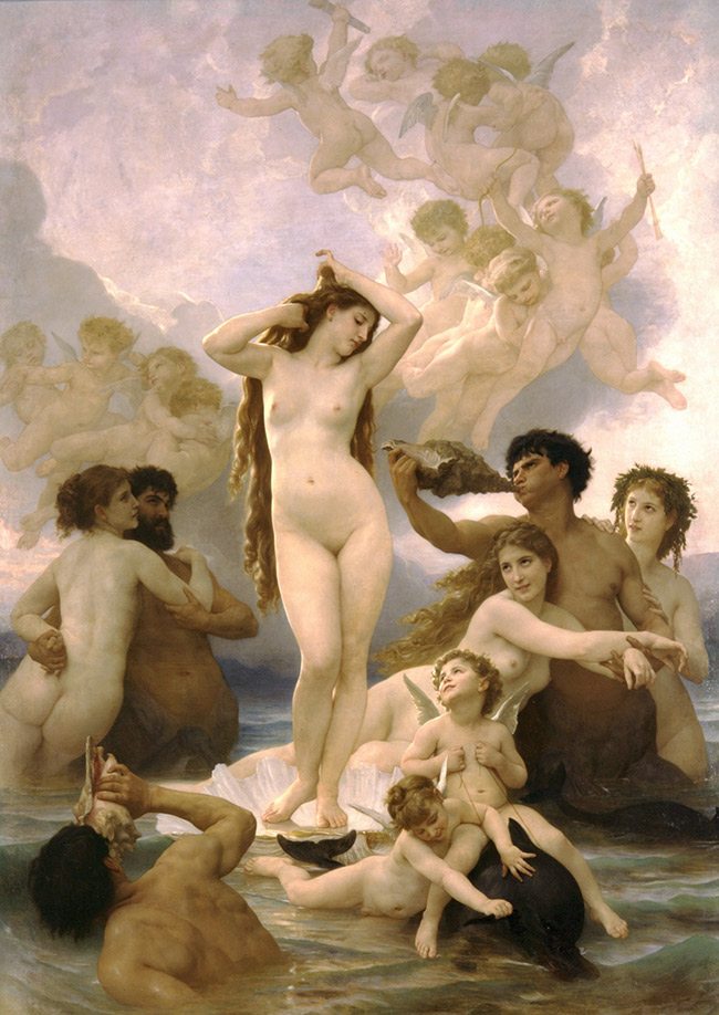
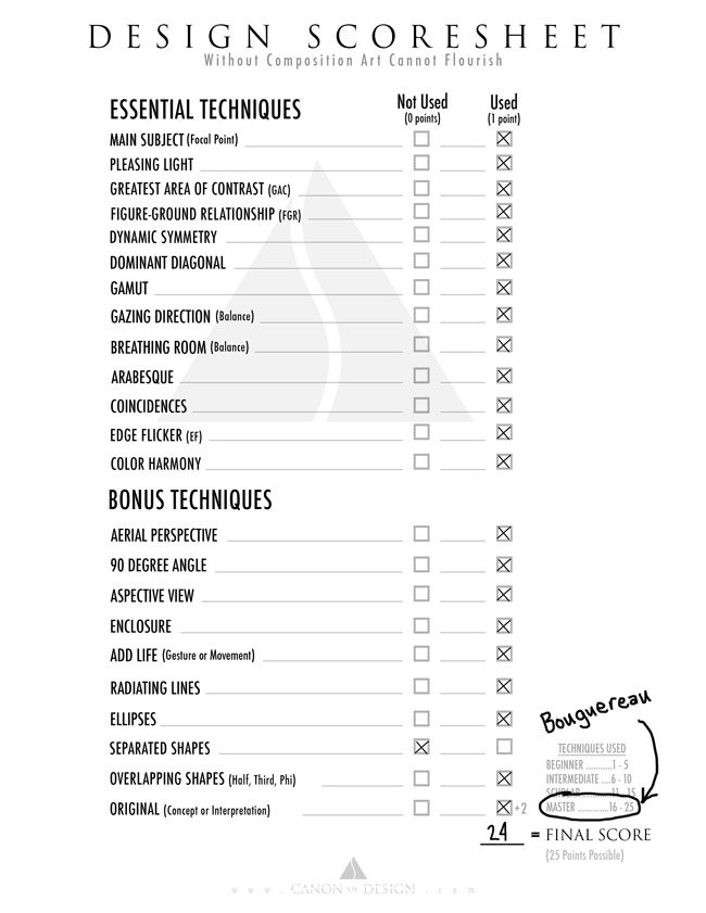
If you had a chance to look at the analyzed painting, you’ll know that he used almost every technique listed on the scoresheet. The only one he didn’t use was separated shapes, which is fine because he overlapped his shapes without causing visual confusion, or “kissing.” It is possible to use both overlapping and separated shapes in the same piece if you wish.
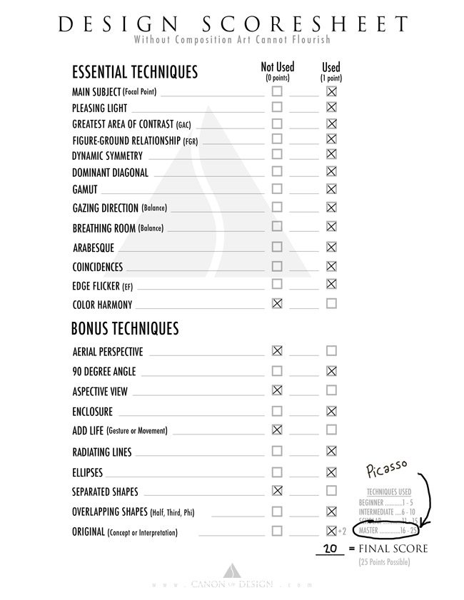
On the bottom right of the scoresheet, we’ll see that there is a total of 23 points available, and Bouguereau scored 22. This is our standard! It doesn’t get much better than that. Plus, not all masters used all of these techniques, so even if you score a 13, you are composing at a master level. This doesn’t make you a master. Only consistency and the ability to teach what you’ve learned will make you a master. Most artists, like Da Vinci, studied with their masters 10 years before they could apply and teach the techniques they’ve learned.
Jackson Pollock’s Score
Ah yes, now let’s take a look at the modern artist, Jackson Pollock. His paintings are considered by some to be “revolutionary” and “bold,” but in actuality he’s just dripping paint. Sure, that was original at the time, but he didn’t score very well when it came to his application of masterful composition.
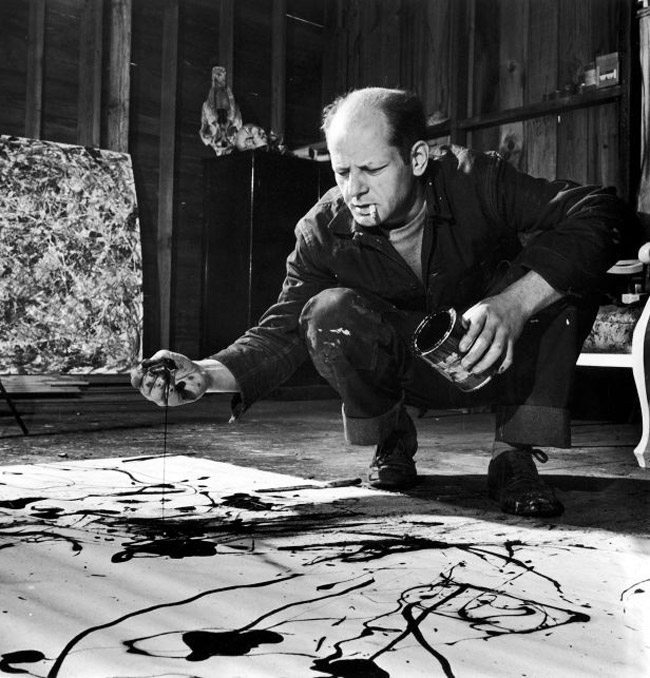
This is the “remarkable” painting we’ll be scoring (adding quotes around that makes it seem harsh, doesn’t it? Sorry about that Pollock.).
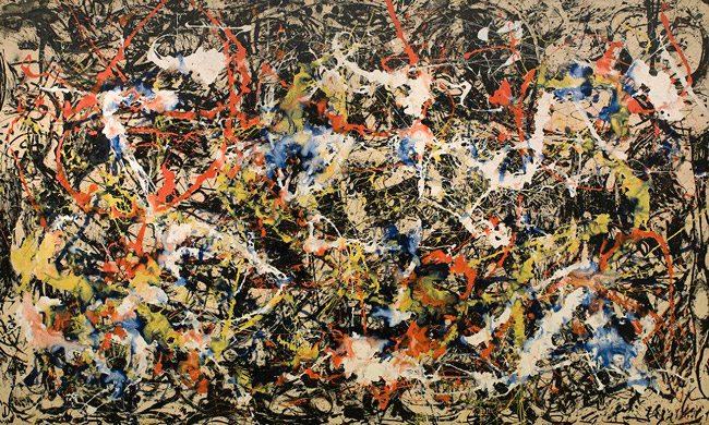
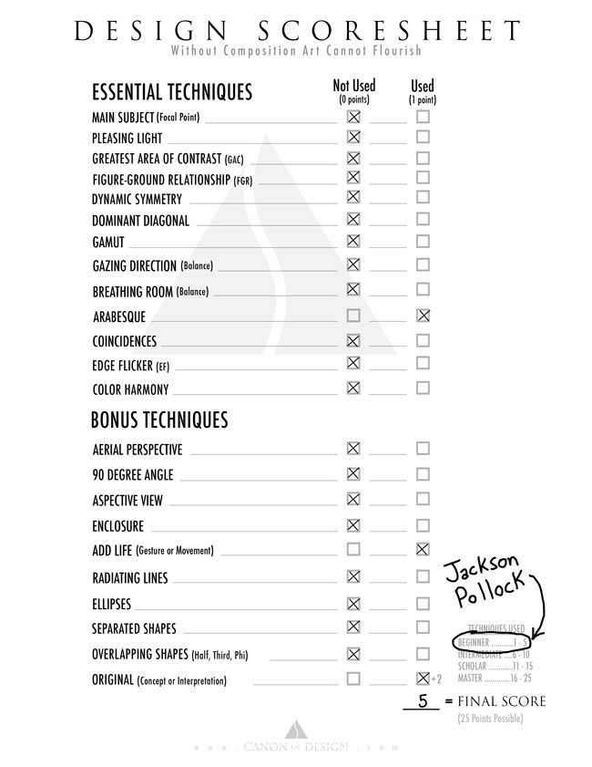
As you guessed, he didn’t do too well with this painting. I gave him the benefit of the doubt and said that there are subtle arabesques in there. I gave him a point for movement, even though there seems to be too much movement…almost like a petri-dish full of squirming bacteria. He also received extra points for originality, which is very important, so that totals five whole points!
If we look at the rating system, we’ll see that he is at the beginner stage. Poor Pollock, maybe next time!
“Dear Mr. Pollock, creative expression is great, but you can’t abandon the design techniques passed down by masters, such as myself, and expect to stand amongst us in the end. Sincerely, Peter Paul Rubens.”
Cy Twombly’s Score
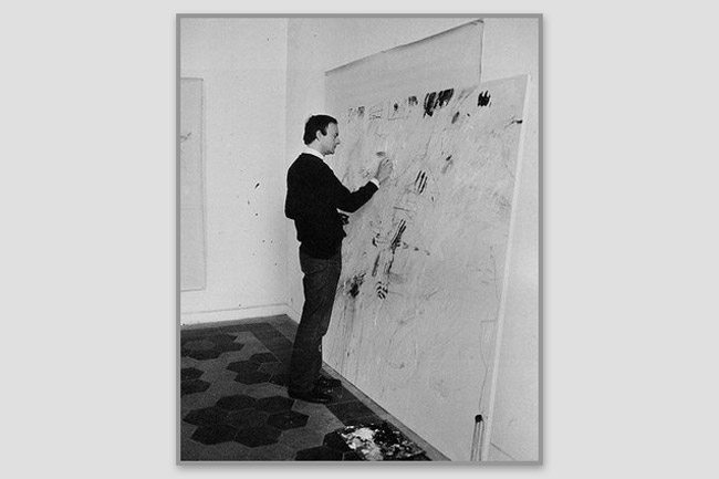
Now, let’s take a look at another modern artist by the name of Cy Twombly (see Day 111). Here we can see him scribbling marks on a huge canvas. I didn’t think it could get much worse than Pollock, but it does.
This is the painting we’ll be scoring next. Does he do better than Pollock? We’ll see!
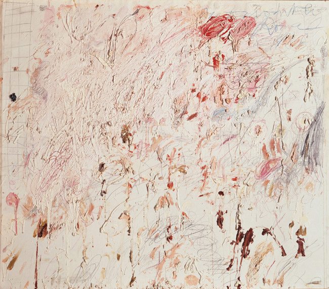
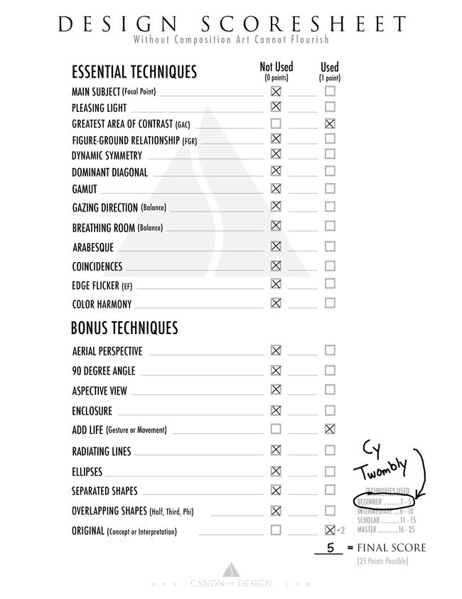
Like I did with Pollock, I gave Twombly the benefit of the doubt. I gave him one point for the Greatest Area of Contrast (the dark mark on the bottom right), one point for movement, and one point for originality. Might I add that, originality counts for absolutely nothing if the art is not communicated with clarity.
We have a tie! Pollock and Twombly can battle it out on the playground with the other infantile pieces of art, while we learn and apply the design techniques used by the masters. Ok, I realize I’m being too negative…I’m sorry Pollock and Twombly…I’m just jealous….that’s what it is.
Scoring Fine Art Photography
Here’s a fine art photo I created for the Law of Symmetry video. We can take a look at techniques applied to the photo and see how I did.
Hey, look at that! A score of 17…figures I would highly score my own art! Ha! Like I said earlier, these techniques could be critiqued even further for application efficiency, but for now we are just focusing on techniques used. There’s no way I am a master like Bouguereau…I’m merely applying techniques he used…even though he did it much, much better than me.
In fact, now that I think about it, we would be ridiculous to put a measure on how well someone used a technique. If they are using it, then that is the most important thing, because they are attempting to communicate their visual message with clarity. Anything after that and it remains to the personal taste of the viewer. We’ll always do our best to apply it though…right?
My score could’ve been better. I didn’t necessarily have a dominant diagonal, so I refused to give myself a point. Plus, the arabesque was small (within the model), so no point there (Yes, I’m trying to be critical and push myself further). The edge flicker didn’t get a point either, because I have high contrasting waterfalls near the edge…not a big deal…it’s still balanced with Gazing Direction and Breathing Room.
Annie Leibovitz’s Score
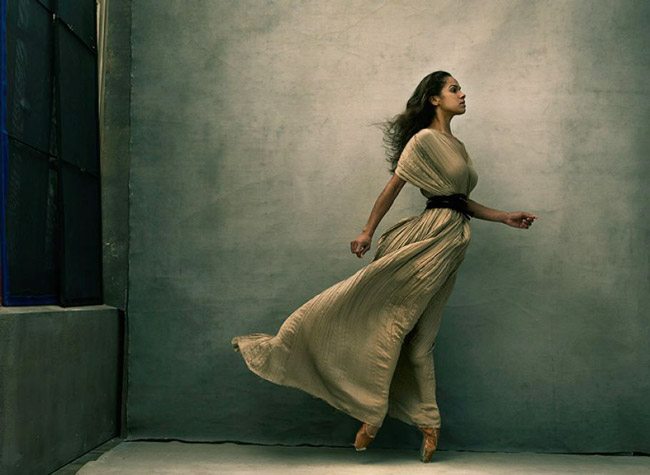
A photo doesn’t have to be apparently complex to achieve a high score. With this seemingly simple Annie Leibovitz photo, we can see that she scores rather high.
The gazing direction is to the right and the model is placed to the right, which makes unwanted negative space on the left. Annie still gets a point because it adds to the story and the expression of the model. The only thing she didn’t score on were aerial perspective, radiating lines, ellipses, overlapping shapes, and originality. Her score of 20 ranks her up there with the masters though.
Scoring a Drawing
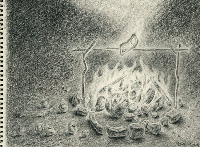
So, let’s take a look at how this scoresheet applies to a drawing. I definitely created this one with composition techniques in mind (see below). I drew it out on the computer first, to work out the design problems, then I printed it, and later traced the outline onto charcoal paper.
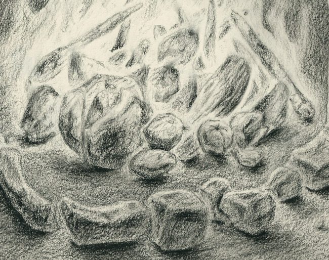
Here’s a detail of the vegetables burning in the fire as they lightly roast the pop-tart. I don’t consider myself good at drawing at all, so I know there are plenty of improvements that could be made. We’re mostly focused on the composition here, and the way I went about it.
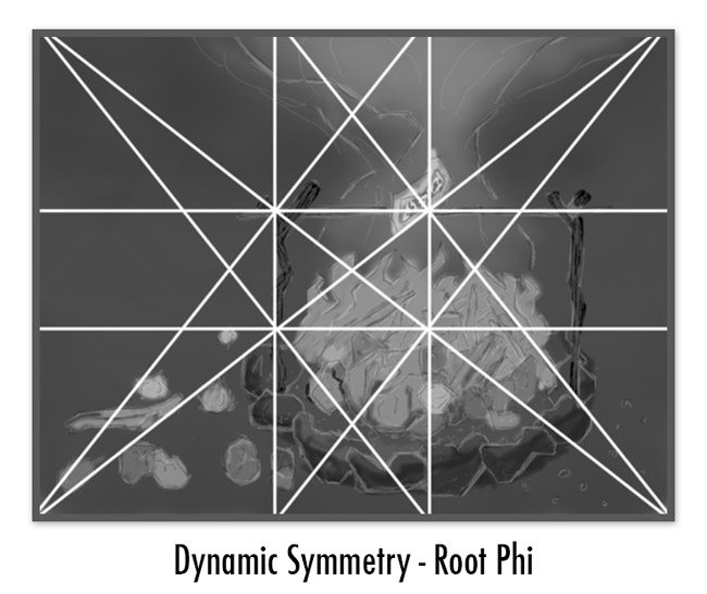
Here are some screenshots of the design process I went through. I used a root phi rectangle to organize the elements.
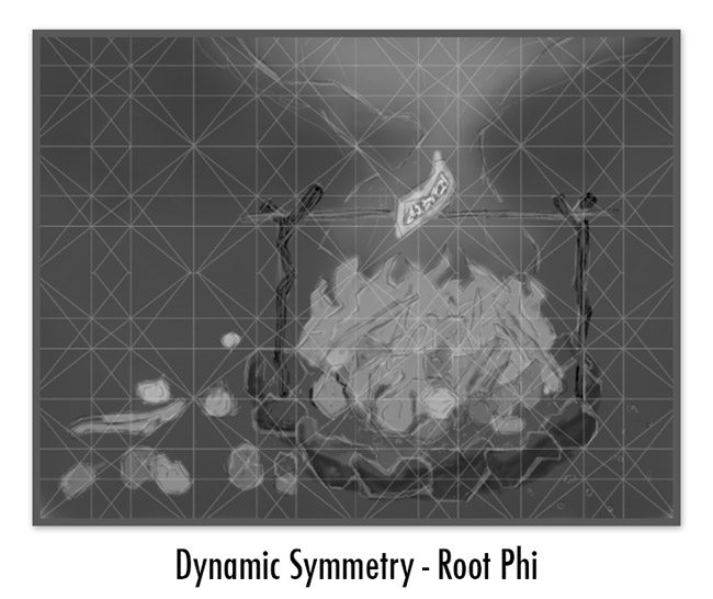
Here’s the grid broken down further to help me organize the smaller vegetables and rocks.
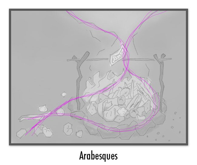
The arabesque flows up and around the fire pit and smoke.
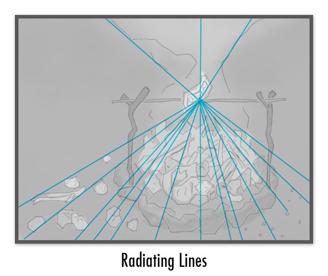
I wanted the radiating lines to direct the viewers eyes to the pop tart which is my main subject and the greatest area of contrast.
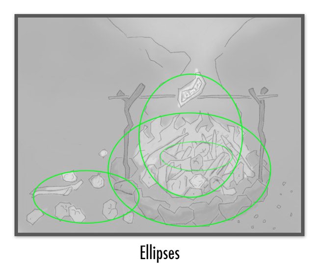
Here I’ve used four ellipses to create unity and movement.
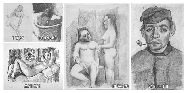
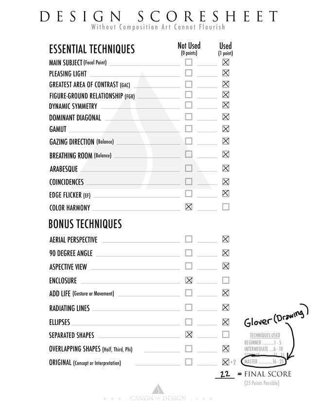
I scored a 22 for the techniques used. That seems rather high I think, because I don’t feel like the drawing is that remarkable compared to the masters. I wish there were a way for me to measure it for technical things like value (where I would lose points), but I honestly don’t think that’s a necessity to become a master even though it’s something I’d love to achieve (see the drawings below by Degas, Bonnard, Matisse, Picasso, Van Gogh). As long as it’s original, and communicated clearly…that’s the important thing…and that’s what composition is all about!
Pablo Picasso’s Score
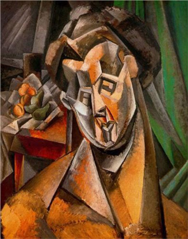
Ok, finally we have a cubist portrait painting by Pablo Picasso (see Day 103). We already know he’s going to score the point for originality!
I would imagine it’s going to be rather hard to incorporate enough techniques into a portrait to reach that master level, but it can be done. Van Gogh achieves this in his self portrait (see Day 54), so we have to hold our art to this high standard.
Trying to incorporate all of these design techniques will push us to be something we love being anyway…more creative!
We can see the scoresheet that Picasso did rather well (obviously), with a score of 20. I felt his color theory was a bit weak, with no hierarchy, so he didn’t get a point for that. Also, he could’ve used aerial perspective to add more depth, and push the fruit still life back a bit further. Right now, as it is, the fruit competes with the portrait in the foreground. This is because the yellow’s are the same intensity and the harmony is affected (see #400). This is all fine, because he uses the other techniques perfectly…he could’ve made it even better though 😉
Well, that’s it for today. I hope it excites you to know that there is now a way we can score our compositions. This is a work in progress and might be adjusted later. Please share this info to help others score high as the masters did. If you have any helpful suggestions, please leave them in the comments below. See you next time!




Score Your Compositions | Abolish the Rule of T...
May 10, 2016 @ 11:09 am
[…] After watching the video below, which asks the question, "why is modern art so bad," I was inspired to create a way to score composition. Of course, only someone trained in design (this could be you) will understand the techniques well enough to identify them, but at least we have a better way to measure our compositional skill level adjacent the masters. […]
A simple scoring system for composition – Frank Tegtmeyer
May 10, 2016 @ 11:26 pm
[…] See his article at the IPOX STUDIOS blog. […]