The Rule of Thirds Inventor: John Thomas Smith
10/365
Have you ever heard of John Thomas Smith? I know, me either. Not to say he wasn’t a decent artist. Well, he was an engraver, and I’m assuming that he wasn’t a decent artist only because it was very difficult to find his art online. But yes, who is he? Well, he’s the one that first coined the ever so popular phrase “Rule of Thirds”. Sometime around 1797, he wrote it down in his book “Remarks on Rural Scenery.”
“Analogous to this “Rule of thirds”, (if I may be allowed so to call it) I have presumed to think that, in connecting or in breaking the various lines of a picture, it would likewise be a good rule to do it, in general, by a similar scheme of proportion; for example, in a design of landscape, to determine the sky at about two-thirds ; or else at about one-third, so that the material objects might occupy the other two : Again, two thirds of one element, (as of water) to one third of another element (as of land); and then both together to make but one third of the picture, of which the two other thirds should go for the sky and aerial perspectives.”
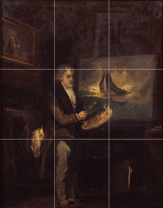
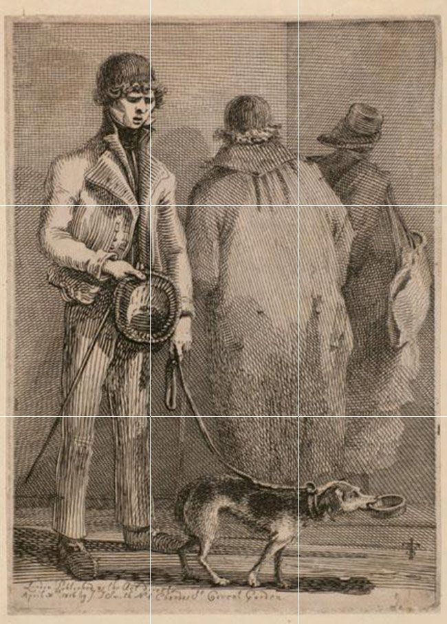
Here is one of John Thomas Smith’s paintings…he’s plotting objects on points instead of using design techniques to create a remarkable painting.


He goes on to say…
“This rule would likewise apply in breaking a length of wall, or any other too great continuation of line that it may be found necessary to break by crossing or hiding it with some other object : In short, in applying this invention, generally speaking, or to any other case, whether of light, shade, form, or color, I have found the ratio of about two thirds to one third, or of one to two, a much better and more harmonizing proportion, than the precise formal half, the too-far-extending four-fifths—and, in short, than any other proportion whatever.”
I could agree if you have overlapping objects a third or half would be better than having edges too close together causing them to “kiss” (see Day 48). I’m referring to overlapping objects though, and not divisions of your canvas or plotting subjects on thirds. As you can see by his images he was plotting on thirds and nothing more…he has several objects kissing. And if he had heard of an arabesque, he might’ve incorporated it into his figure so they wouldn’t look so stiff. Oh, and why are his feet meeting the bottom of the canvas, while there is too much negative space above the man. Doesn’t Mr. Smith understand pictorial balance? (see Day 99)
And then he challenges us by saying…
“I should think myself honored by the opinion of any gentleman on this point; but until I shall be better informed, shall conclude this general proportion of two and one to be the most pictoresque medium in all cases of breaking or otherwise qualifying straight lines and masses and groups.”

This piece couldn’t be more stiff and boring.

Wow, so we finally met the man who coined the phrase that would become the default building block of composition. A catch-phrase, repeated and repeated century after century, drilled into every artists and photographers mind as the one proven method of composition. Sure, ok, it has it’s applications for overlapping objects, and just like a soup made of boot leather, “it’s better than nothing”, but it leads composition down a dead end alley waiting to be fondled by mediocre photos. Instead of the “Rule of Thirds”, I wish someone would’ve taught dynamic symmetry. Why? Because it’s the TRUE building block, just as easy, but which can be expanded endlessly upon.
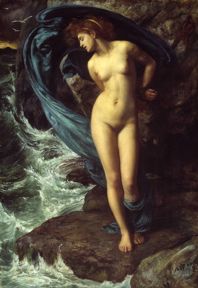
Compare Smith’s paintings to the one by Edward Poynter below. The evidence is clear as Poynter displays many design elements in his painting, compared to merely using the rule of thirds to line up his subject.


