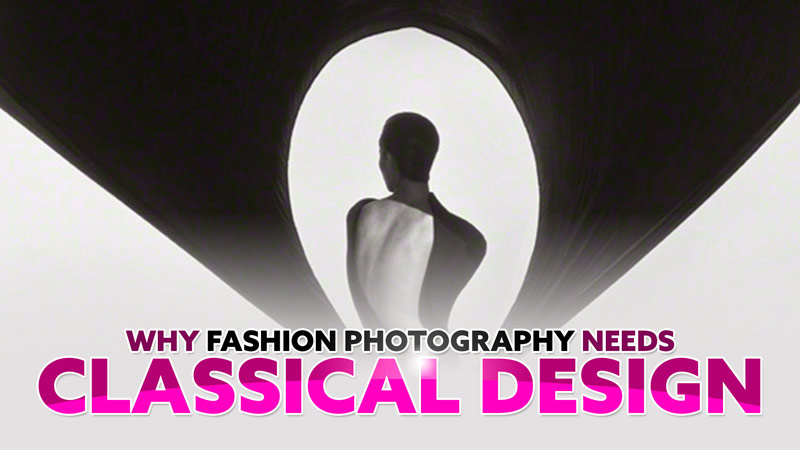
Transform Movie Night Into a Design Masterclass (20 Tricks)

#773
Welcome back, everyone — and huge thanks for the continued support!
This time, we’re turning your next movie night into a design masterclass. That’s right — while everyone else is watching for plot twists, you’ll be spotting clever visual tricks used by top cinematographers. From lighting magic to sexy diagonals, these 20 design techniques are pure gold for artists. Let’s get into it!
PS. Master Pass members can download a printable PDF from the Resources Page to keep these techniques close to them next time they watch a cinematic blockbuster.
This Will Get You Warmed Up Epic Trailer
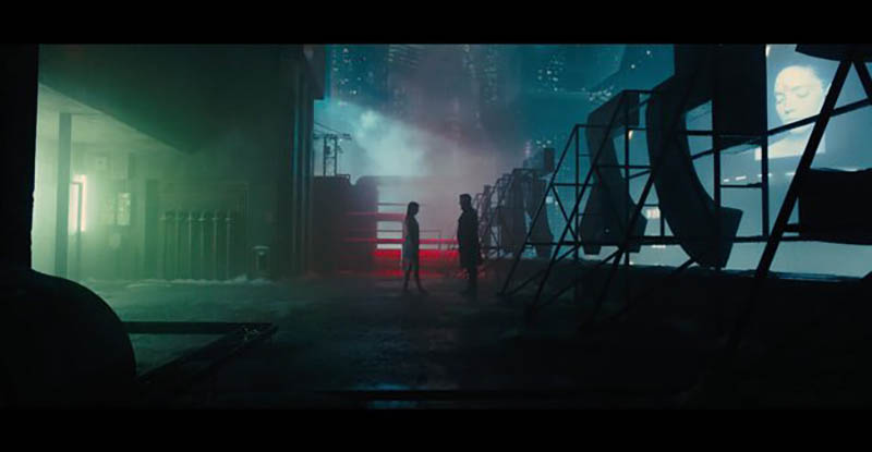
To start you off right and warm up your noggin, I thought I would share this trailer for Blade Runner 2049 (see #448, 449, 450), which encapsulates pretty much every technique. Watch it and see if you can identify any of the design techniques that we cover here on the site. I know you can spot at least two or three! After you’ve done with that, go through the list below and learn all of the cinematic tricks to make your movie nights more entertaining. Next time you watch a movie you’ll be sharpening your skillset rather than mindlessly drooling over special effects and explosions.
Movie Night Masterclass 20 Tricks
We all know that watching a great film is already a treat. But if you’re an artist, it can be so much more. You can turn it into a secret art school in disguise! Every frame becomes a lesson, every shadow a hint, every camera move a whisper from the design gods. Here’s a quick overview of 20 visual tricks you can shamelessly steal from cinema’s best. It’ll make your next movie night way more fun and will definitely keep your skills sharp so you can incorporate the techniques into your own art.
1. Light is Everything
We can’t have a movie without light, so it’s the perfect place to start. Light sculpts a scene like a chisel on marble — carving out form. It can create mystery, add vibrant colors, increase depth, and, in the case of Once Upon a Time in Hollywood, it sets the entire mood. When contrast is carefully controlled (see GAC), it guides our eyes exactly where they need to go — no neon arrows required.
2. FGR & FGR Reversal
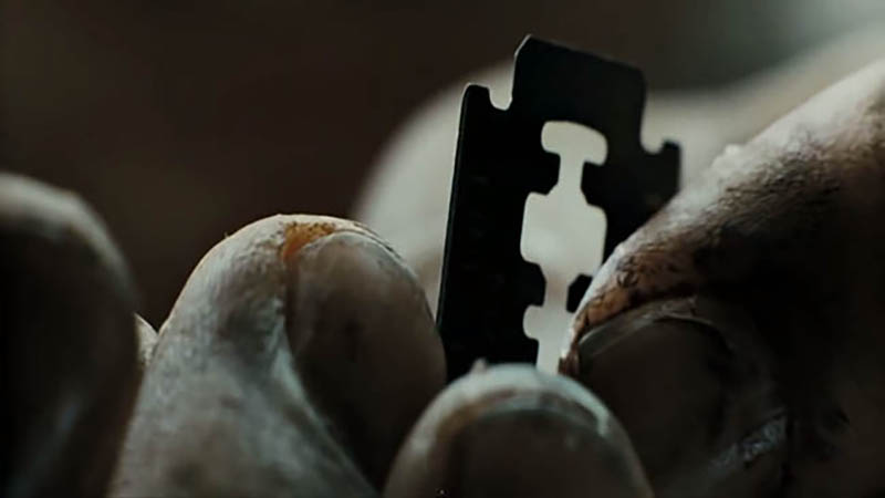
Want your subject to actually read clearly? Don’t let it melt into the background like a ghost at a fog party. The Figure-Ground Relationship (FGR) (see Day 21) is all about keeping things visually crisp — your subject should pop, not vanish. Dune (the first one) handles this like a Photoshop wizard, layering tones with precision. In the scene below, the dark pin sits cleanly against the light skin. An inch to the left or right, and poof — the tip of that sharp object disappears into visual mush.
![]()
FGR Reversal flips the script. The foreground gets blurry, and suddenly the background steals the spotlight. It’s like cinematic sleight of hand — used constantly to add depth or sneak us into the perspective of the foreground character (see #677). Dune is full of these moments, and each one whispers, “Hey, look back there… it’s super important.”
![]()
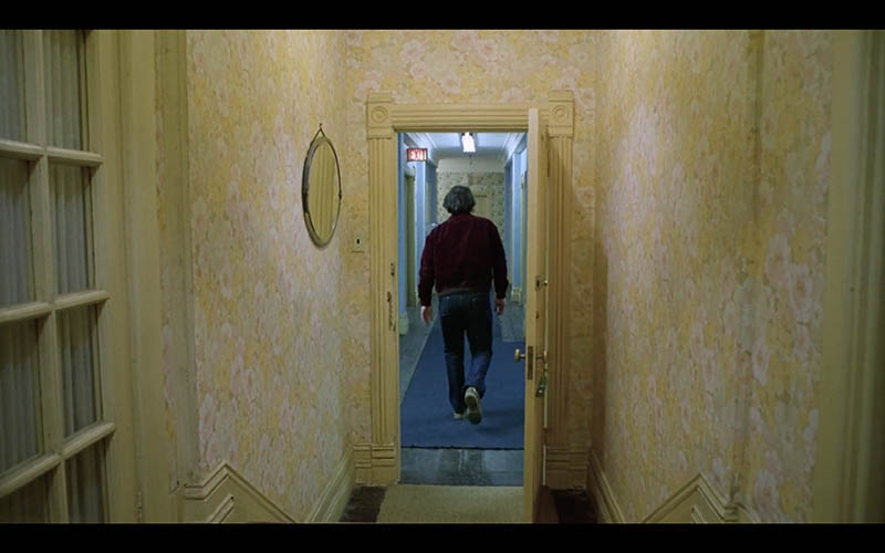
3. Frame within a Frame
When you’re wanting to double down on the structure of a scene, you can always create a frame within a frame as we see in this shot from The Shining (see #677). You can box characters in doorways, windows, furniture, in-between tree branches…anything to frame them inside the frame. It adds order, focus, and sometimes a sense of psychological entrapment. Cool, right?
4. Centered vs. Asymmetry
People love to bash centered composition. “Rule of thirds! Get it out of the middle!” — yeah, yeah. But that’s a fallacy. The center is exactly where true balance begins. Pros like Kubrick, Tarantino, and Scorsese aren’t afraid to plant the subject dead-center and dare you to look away. In The Third Man (see #468), the iconic shot had to be centered — anything else would fall apart. Want asymmetry? Easy. Just teeter-totter your visual weight left and right from the vertical centerline (see Day 57). It’s not about avoiding the middle — it’s about knowing what to do with it.
5. Negative Space
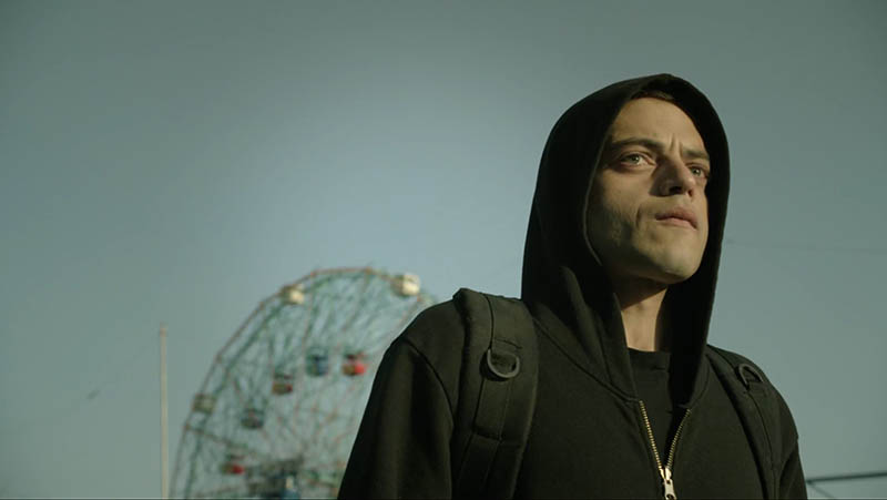
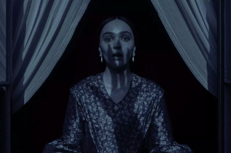
Speaking of balance, let’s talk negative space (see Day 83). Use too much or too little and suddenly your scene starts whispering a different story. Now throw in a character’s gazing direction (see Day 99) pointed straight at the edge of the frame, and boom — you’ve got crazy visual tension. The kind that makes viewers lean in without knowing why. In Mr. Robot (see #411), this combo creates a sense of isolation that’s practically screaming through the silence.
6. Repeating Shapes
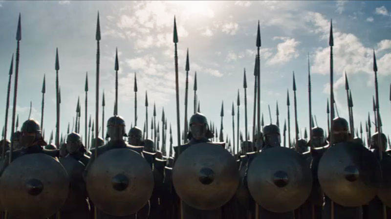
Repeated shapes = visual poetry. There’s something oddly satisfying about spotting the same arc, triangle, or silhouette echoing through a shot. It creates rhythm, patterns, and a great sense of unity. This taps into the Law of Similarity (see Day 56), where the brain groups matching shapes like it’s solving a design puzzle. Game of Thrones (see #543) uses this trick like a medieval art director with OCD — and it works.
7. Dominant Diagonals and Grids
One of the great things about using dynamic symmetry grids is that it promotes certain techniques (see #692) — one of them being dominant diagonals. These can add visual impact (see #441) to a scene—way better than just stacking boring verticals and horizontals. The diagonals can be anything from a branch, the crack in a building, or like the canoe and paddle that we see in this shot from the TV show Bloodline see #456).

8. Repeating Diagonals (Gamut)
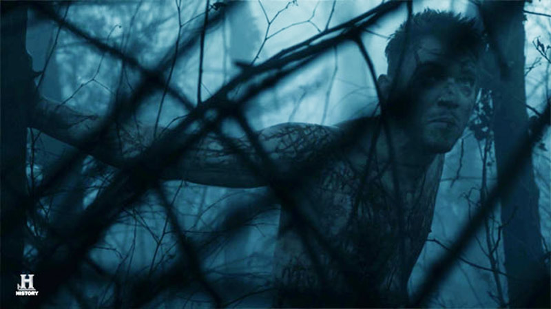
In the TV Show Vikings (see #498) they pull off some crazy cinematic scenes using countless techniques, but in this next one we can see the repeating diagonals or gamut creating a hidden rhythm (see Day 38). It doesn’t even have to be as literal as this, because the rhythm works even when the diagonals are low in contrast.
Side Note: See how the branch covers one of his eyes? This can create a sense of mystery too—much like the eye patch of a peg-legged pirate (see #540).
9. Separated Shapes
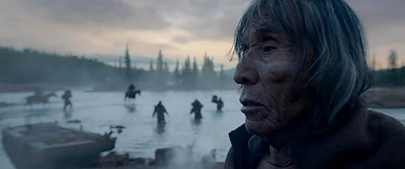
Stack shapes too close and it’s a blob. Pull them apart, and the viewer breathes. We can see this in the shot from The Revenant (see #418). Foreground and background characters weave through space, not into it. Clarity at its finest! Even in a chaotic fight scene, design can keep the chaos visually clear and stunning..
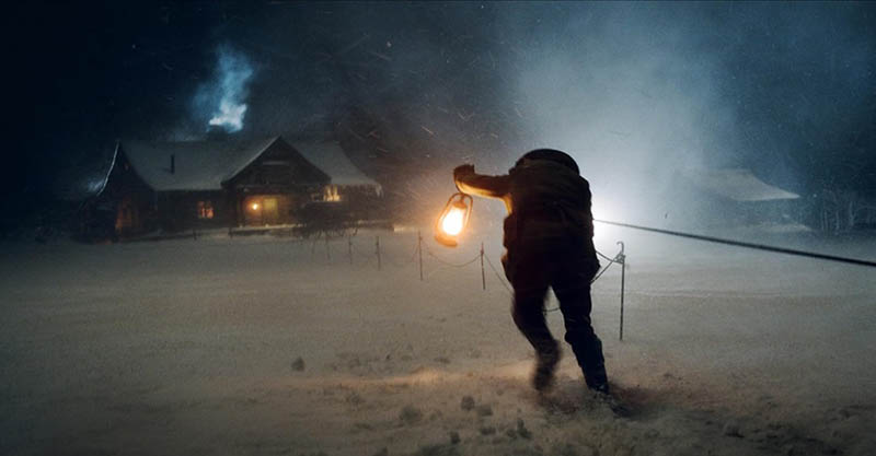
10. Aerial Perspective
When the background turns all soft and blue-gray, it’s not just fog — it’s a trick. Aerial perspective mimics what we see in nature: distant things get faded, lighter, and cooler in tone. Smart filmmakers crank this up with snow, smoke, dust, or whatever the fog machine has left in the tank. In The Hateful Eight scene below, it’s all of the above. The background vanishes into a white abyss, the subject pops forward, and suddenly the freezing air feels like a co-star — right next to Kurt Russell’s glorious mustache.
11. Unique Perspectives
In the TV Show Ozark (see #459), the cinematographer makes you feel like either a bug or a god, depending on where the lens lands. Shoot low and the subject towers with Olympian confidence. Shoot high and suddenly they’re the village fool — lost, limp, and powerless. Perspective isn’t just a camera trick; it’s a psychological weapon. Change the angle, change the story.
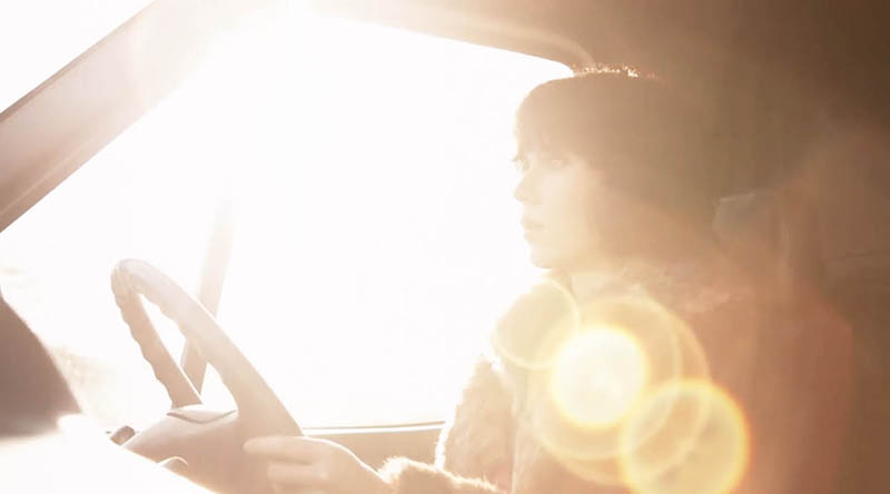
12. Lens Flares
Is this cinematography trick overused? Probably. But are lens flares fun? Absolutely. Under the Skin (see Day 354) uses them to blur the line between dreamy summer vibes and man-eating alien menace. A well-placed flare adds emotion, realism — sometimes even transcendence. Just don’t go full JJ Abrams unless your goal is to blind the audience into submission.
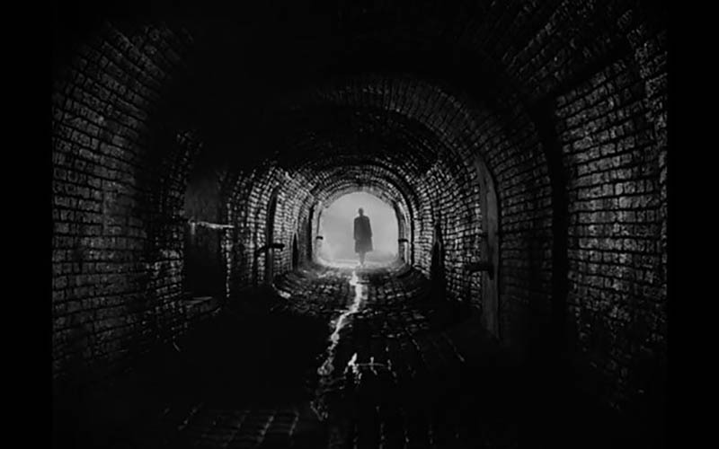
13. Wet Streets
Dry asphalt is for amateurs. Want instant drama? Add rain — or just hose down the pavement. Fight Club weaponizes wet streets like a noir pro, or Gregory Crewdson (see #695). Light bounces off the slick surface, transforming a dark abyss into a glowing stage. It’s visual jazz: it can warm the soul or drown it in a puddle of tears.
14. Shadow Play
Shadows that slither and stretch like they’ve got their own agenda? Classic. The new Nosferatu by Robert Eggars (also see The Lighthouse) didn’t invent it, but it made shadows scarier than the actual monster. Also: way cheaper than a CGI budget.
15. Detail Shots
Gathering detail shots is like data collecting for drama. A flickering light. A twitchy hand. Blood crusted on the edge of a sink. These are design stabs between story beats. Se7en (see Day 277) does it like a detective on a caffeine bender. Artists zoom in to show structure. Directors zoom in to show obsession.
16. Color Theory
Warm colors approach. Cool colors recede. Complementary pops hit the eye like a slap. The palette in Blade Runner 2049 (see #448) isn’t accidental. Neon cyan vs. blood orange? That’s storytelling through color. Sure, it might be cliché by now—but it still hits. Cinematographers use color to shape mood: blood red screams danger, canary yellow whispers warmth. Or take a Kubrickian route and balance primary colors with green in a deliberate hierarchy, like he did in The Shining (see #677). Whether you’re shooting a film or painting a canvas, color isn’t just decoration—it’s design.
17. Aspective View
Think: Walk Like an Egyptian. Dune 2 (see #755) is just one of many movies that gives characters their own iconic bubble of space. Using an aspective view (see Day 78), where the limbs are splayed and the stance is open, makes even silhouettes unmistakable. It’s not just about looking cool (though they do); it’s about visual clarity and power. A wide pose reads better from a distance and says, “I own this scene.”Closed-off figures feel weaker. Want your character to command the frame? Give them room to breathe — and stand like they mean it.
18. Arabesques
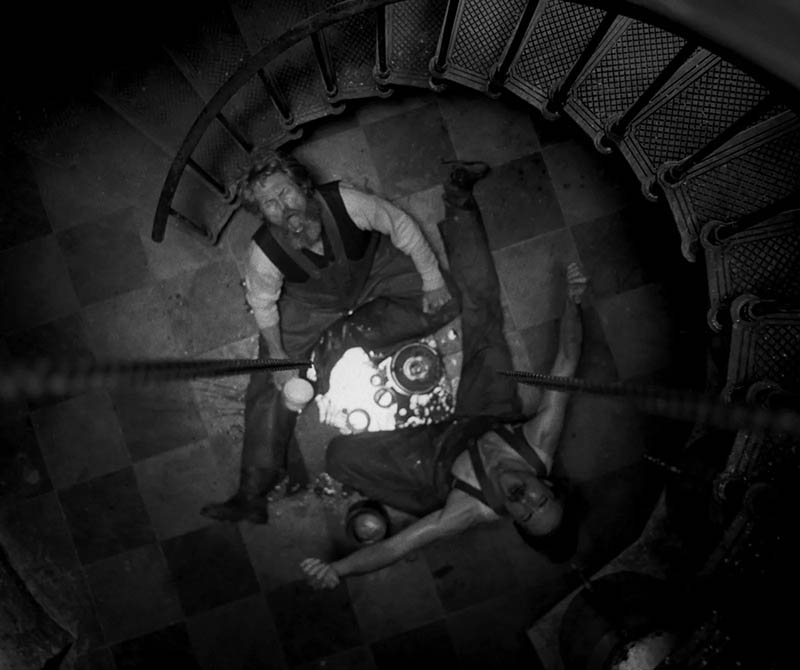
Arabesques are like secret handshakes for your eyes — guiding them through a scene with elegance and flow. They don’t always have to scream “look at me” like the spiraling staircase in The Lighthouse (see Day 19). Sometimes they whisper: a curved pose, a winding road, the tail of a dragon, or the quiet rhythm in the pattern of leaves. Find one, and you’ll usually be lead to something important.
19. Counterparts
If you thought we were done talking about balance — surprise! Using a counterpart (see Day 57) is another trick to solve that teeter-totter problem we mentioned earlier. Drop a second subject on the opposite side of your frame and boom: balance achieved. In Joker, we see this play out beautifully. We don’t see his face, just the face of time—balanced from the vertical centerline.
20. Establishing Shot
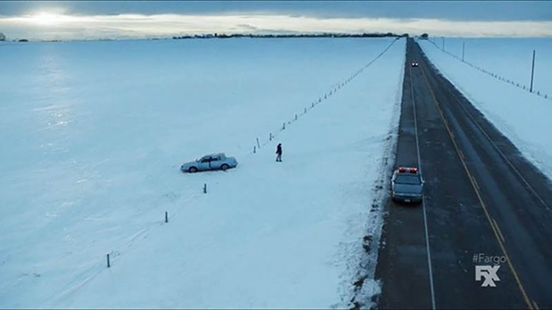
Pull out wide. Now wider. Now drop in a tiny figure. Congratulations, you just made your audience feel the crushing weight of existence. Fargo the TV show has scenes with big, lonely landscapes. These establishing shots (see Day 267) don’t just say “Where” — they say “How it feels to be here.”
Bonus: Mirrors and Reflections
The Tragedy of Macbeth (see #693) is practically drowning in visual metaphors — and reflections. Mirrors aren’t just decorative, they’re character devices. They ask: “Who are you, really?” Spoiler: No one good ever sees a mirror and smiles.
Conclusion
Now you can watch movies with a Kubrickian eye, spotting techniques that most folks just feel without knowing why. Whether it’s a wet street in Fight Club, a centered shot in The Third Man, or a sneaky arabesque in The Lighthouse, you’re seeing the blueprint behind the beauty.
Happy watching — and good luck ever watching Dune the same way again.