Vincent Van Gogh – Color Theory

#470
Thanks again for everything you guys! Welcome back to another great article!
We’re going to be digging deep into Vincent Van Gogh’s paintings and see the color combinations he used to help us with color theory. We’ll analyze 15 paintings for color, see why they work, then compare them to each other. The colors you choose to include in your painting or photograph are important for creating color harmony, but you also must create a hierarchy for proper balance. We’ll cover all of that today!
As you’ve seen in many articles (see below), color has the potential to control the viewers eyes, give birth to distractions, or create beautiful harmony. It’s been a difficult topic to grasp for many artists, but when we break down the paintings with excellent colors, we can begin to understand it better.
Articles covering color: Day 178, Day 179, Day 181, Day 183, Day 337, #370, #371, #400, #404, PC&D book
We can’t cover all of the techniques in this article, but we will discuss a lot of them while using Van Gogh’s paintings for reference.
Quick Definitions
Here’s some quick definitions (as I’ve learned them) to get us started, but these will be elaborated further below. I’m simplifying these terms too…this keeps it easy to understand instead of confusing with all of the different color terms (i.e. analogous, complimentary, monochromatic, tertiary, etc). We don’t need to make it more difficult at the moment.
Hierarchy – In this case, we are talking about the approximate amount of each color present in the piece of art.
Color Harmony – When the colors go well together instead of clashing.
Color Balance – When a hierarchy is created with the selected colors, while also complimenting the readability of the composition.
Completed Color Balance – The same as color balance, but using variations of four colors: red, blue, green and yellow.
Side Note About the Term “Balance”: When we hear the word “balance,” we might be thinking it means to have equal parts (i.e. half red and half blue). Yet, if we created this symmetrical balance between many colors, we wouldn’t have a pleasing painting. We would end up with something that looked like the color wheel. There needs to be a noticeable hierarchy in your colors. We can safely say the term “balance,” when referring to color, can be easily misconstrued.
Simplifying the Color Palette
When we look at a painting with nice colors, and want to learn more about the color harmony and balance, we can break it down by hierarchy. To do this we can make note of the most prominent color, second most prominent, third, and fourth. We’re looking for variations of red, blue, yellow, and green, which help complete the balance and harmony.
By using the term variations, I’m referring to hues (colors and combinations), tints (created by adding white), tones (created by adding gray), and shades (created by adding black). These mostly have an impact on composition and not color balance. Let me explain further, because that sounds kinda confusing.
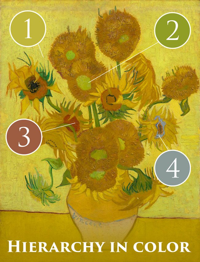
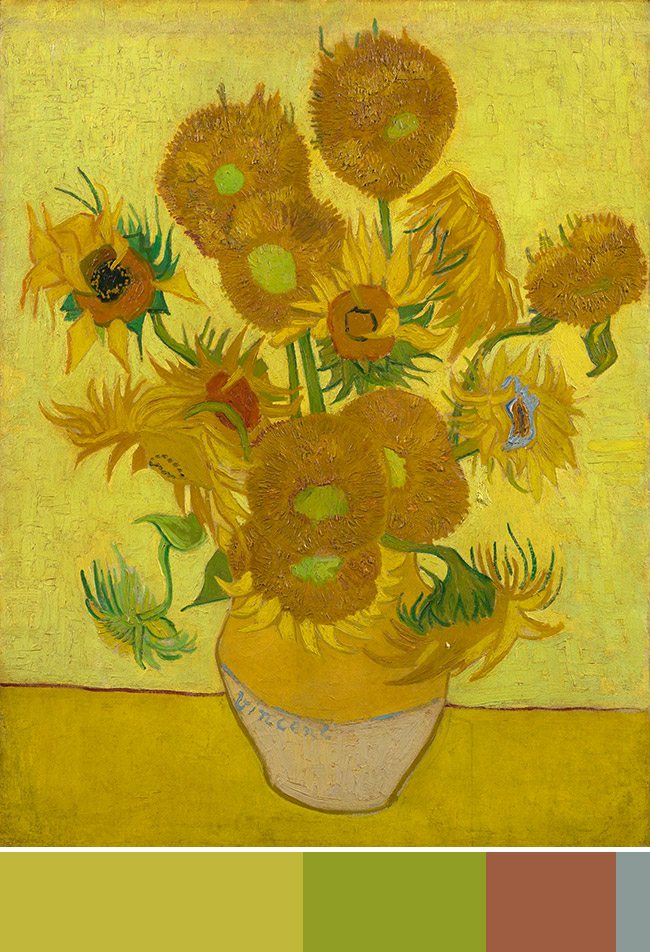
In the diagram below, we’ll see the hierarchy of colors; first is yellow, second is green, third is red, fourth is blue. Van Gogh has got the four colors for a complete color balance, but notice how we aren’t really concerned with any varying hues, tints, tones, and shades. We are just looking at the hierarchy he’s created with the four colors. Proper application of the hues, tints, tones, and shades of these four colors are what will help his composition to be read clearly.
He’s got a couple hues of yellow and green, so let’s take a look at those. When we look at the light yellow-green background it helps the dark yellow flowers stand out…creating a nice figure-ground relationship (FGR) (see Day 21). We can see how the low hanging yellow flower on the left isn’t easily seen like the dark yellow flowers. Sure, we see the green stem of this flower, but not the yellow petals. When we look at the dark green stems of the other flowers we can see that they stand out better against the light background. If he used the light green color of the flower’s center to paint the stems it wouldn’t have enough contrast…reducing the nice FGR.
So, these different hues, tints, tones, and shades of colors help with the composition, while the choice of colors helps with the color balance. We don’t always have to have the four colors (or variations) red, blue, yellow, green to have color balance, but when combined with a hierarchy it completes the color balance.
We can take our hierarchy from above and simplify it into a bar format. You could use a circle pie, triangle, or any other shape to create a visual aid for the hierarchy, but the bar works for these examples.
This hierarchy helps only if there is a noticeable difference in the amount of each color. If your canvas or photos have 29% yellow, 26% green, 25% red, and 20% blue, then the hierarchy won’t be easily perceived by the viewer. We can see that Van Gogh selected his hierarchy of colors properly in this painting.

What about Neutrals? We won’t include neutrals (beige, gray, white, black) in our swatch either because they will typically help the overall composition and balance no matter what. Neutrals go great with any other color.
Testing What We’ve Just Covered
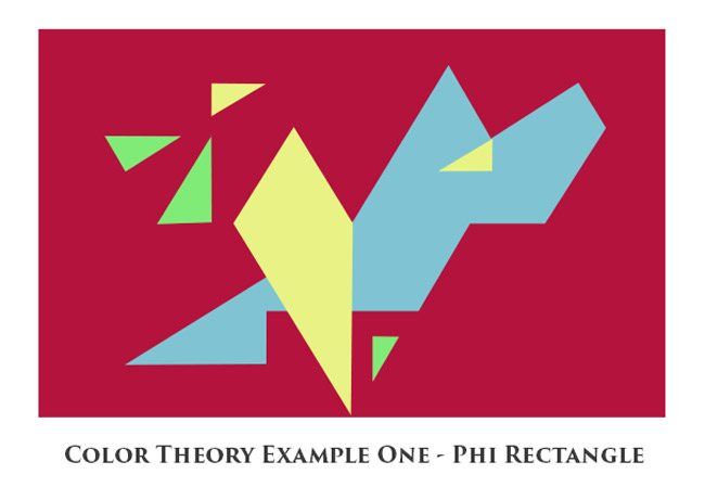
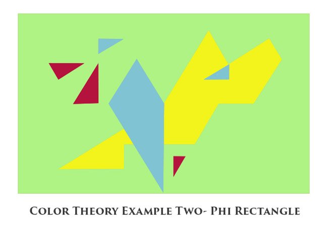
I created a couple of simple abstract examples in Photoshop by using the color theory we just covered (and the Phi grid). In this first example, I have all of the four colors, and I’ve got them in a hierarchy. First red, then blue, yellow, and green. I’m also paying attention to gamut (repeating diagonals) (see Day 38), the Law of Symmetry (visual balance)(see Day 57), a dominant diagonal (baroque) (see Day 63), Law of Symmetry (visual balance)(see Day 57), Law of Continuity (coincidences) (see Day 17), and Law of Closure (heart shape) (see Day 32). Simple stuff though…all I did was trace the phi grid. MoMA here I come! 😛
One thing to make note of is the color harmony…the way the colors tend to go together. Another thing to make note of is the readability of the composition. We have light blue on a dark red background…creating nice FGR. The lighter yellow is also on the blue and red. If these colors weren’t lighter than the red, the composition wouldn’t be very readable and the colors would start to clash…looking very unpleasing.
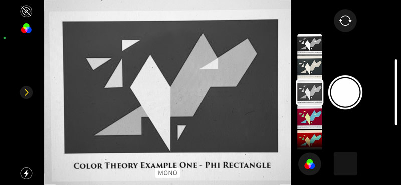
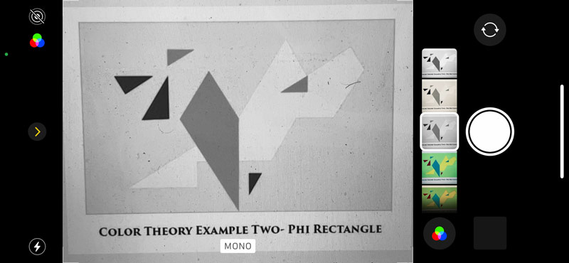
The Photoshop black and white adjustment layers can be really unreliable (see complementary colors video) so try using the mono filter in your phone camera. In the next screenshot you’ll see how the tonal value of the yellow, green, and blue colors are clearly visible against the dark red background.
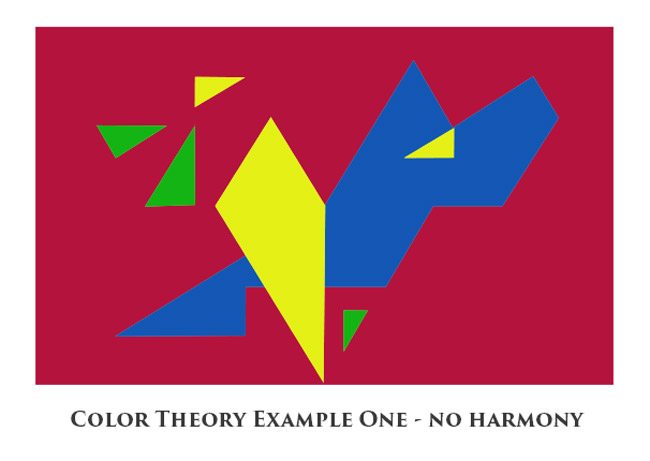
In this next example, we can see how the colors don’t work together, they clash. They all beg our attention instead of singing together in harmony. Harmony is usually the easy part. Most of us can tell if colors go well with each other, but we have to make sure to either tint, tone, or shade them to make them sing together in harmony and create a readable composition with hierarchy.
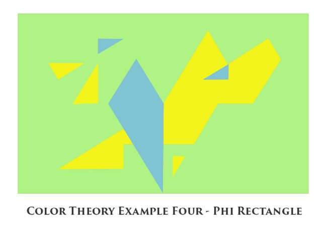
In this next example, we switch around some of the colors from our first example, and the same color concepts for harmony and balance are applied. In order to have a nice composition we need to ensure the colors on top of the light green background are either lighter or darker. In this case, we have a complete color balance as well because there is a hierarchy including the four colors, and the readability of the composition is improved.
Here is the mono filter screenshot where we see the tonal value. The yellow is more intense and lighter than the light green, but the light green is lighter than the blue and red.
If we don’t include one of our colors, like red, we can see the difference in the color balance. The colors still look good together, but the color palette seems to be missing something. The red completes the balance.
A Fun Test for Color
Do you see a color palette you prefer more than the other? Identify your favorite and see if it’s a Van Gogh painting you are familiar with. Maybe it’s one you’ve loved for a long time, or maybe it’s a new one. It will be interesting to see how the colors affect your decision.
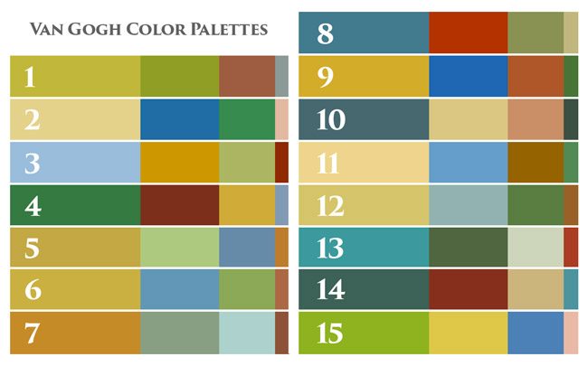
Another thing to note, is the way the colors change depending on it’s surrounding color. If we look at the complete set of swatches it doesn’t seem to have much harmony because the colors are very close to each other. Only when we look at each strip individually, does it start to harmonize.
Vincent Van Gogh Paintings and Color Palettes
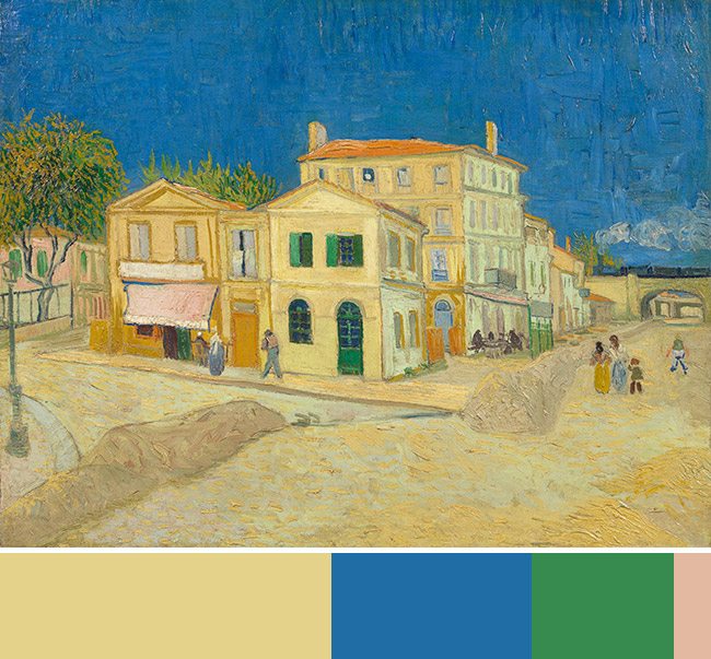
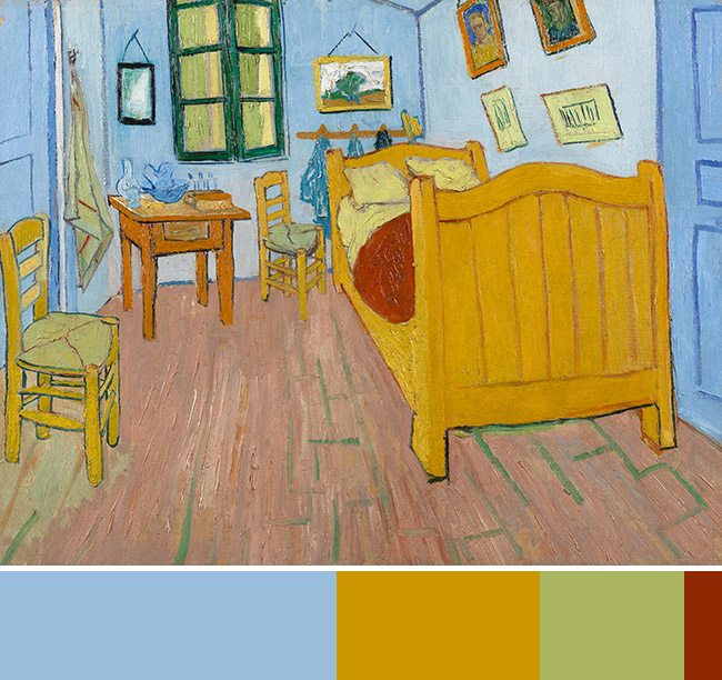
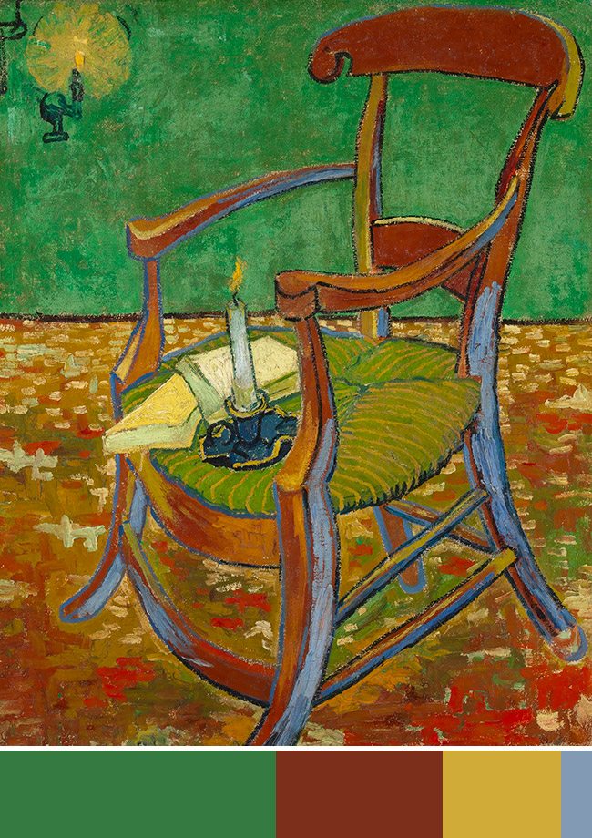
None of the colors Van Gogh uses is straight from the tubes. We can see this in the swatches above, which show all of his palettes from the following examples. Everything is slightly mixed with other colors to create a different variation, which is great. The first thing most painters learn is to mix the colors (with other colors or neutrals), and not use it straight from the tube. Of course, there are always circumstances that call for the raw colors.
Please scroll down to enjoy 15 of Van Gogh’s paintings with the color swatch of hierarchy.
1.
2.
3.
4.
5.
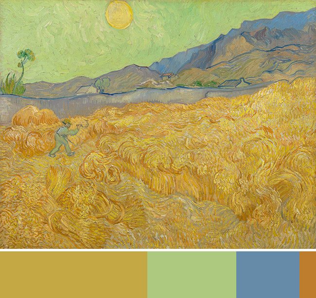
6.
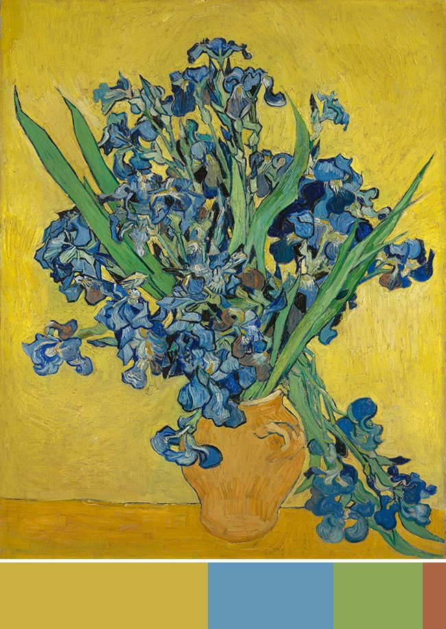
7.
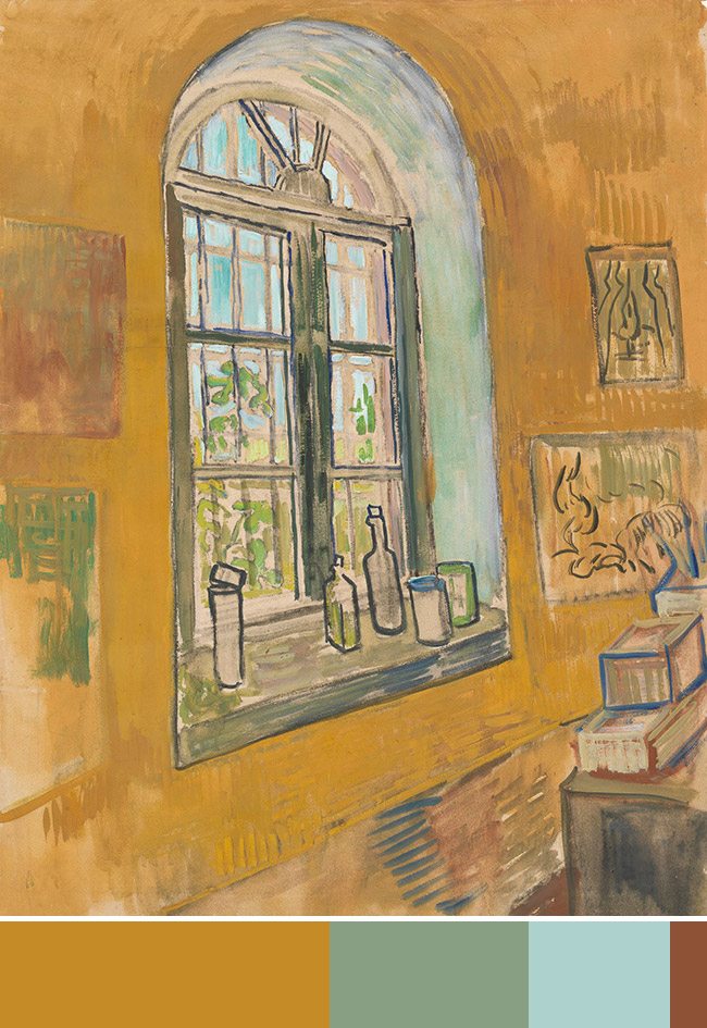
8.
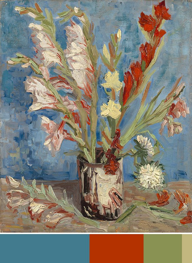
9.
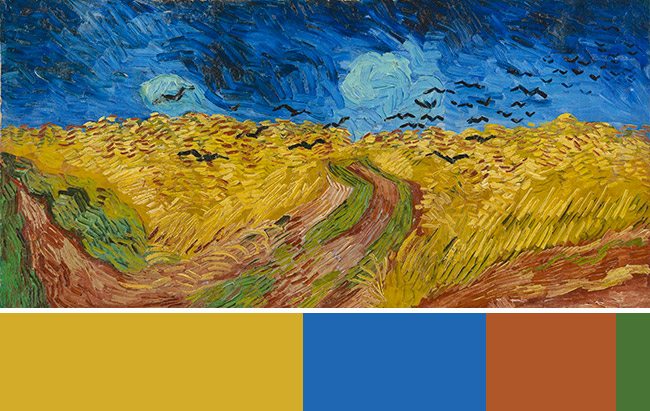
10.
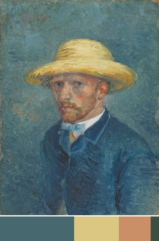
11.
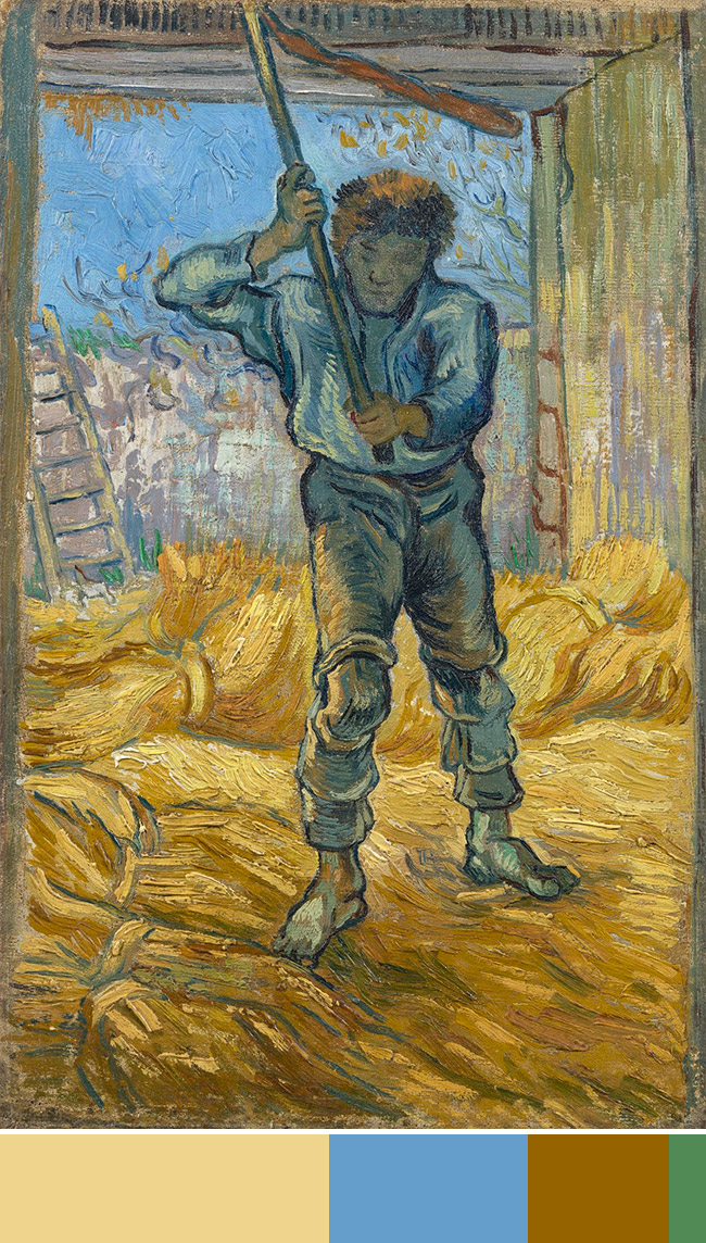
12.
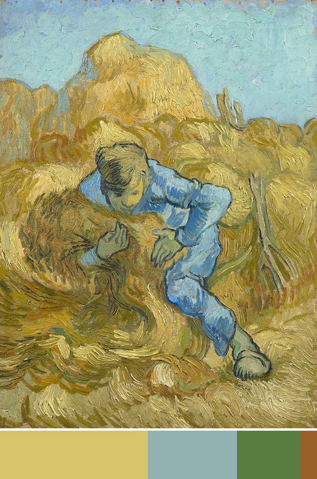
13.
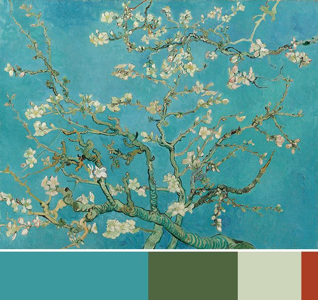
14.
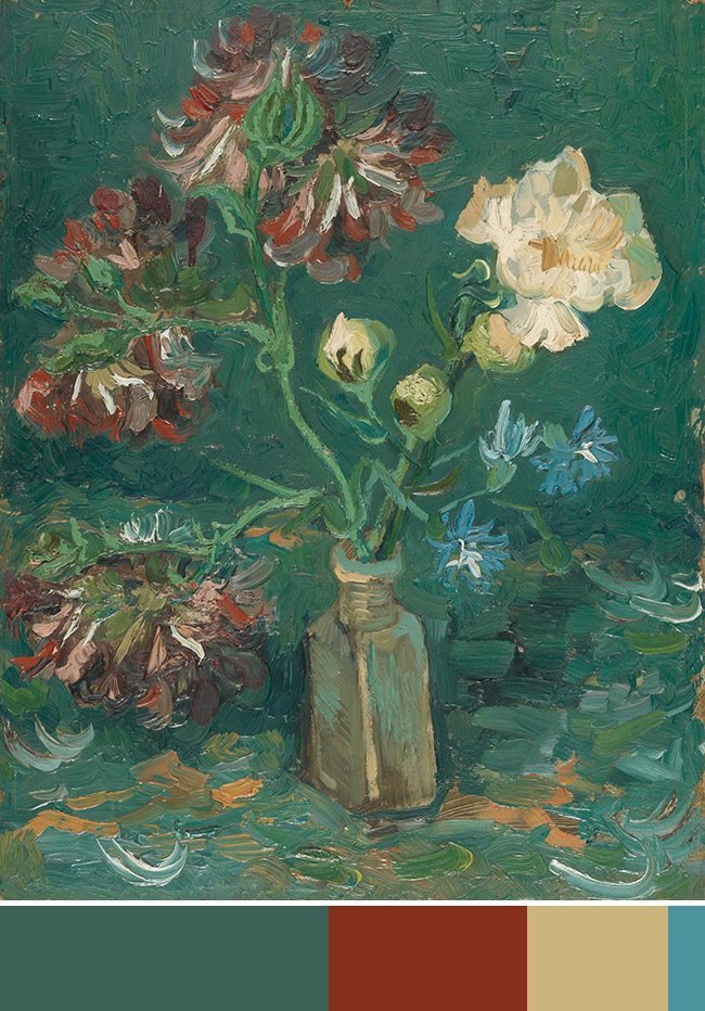
15.
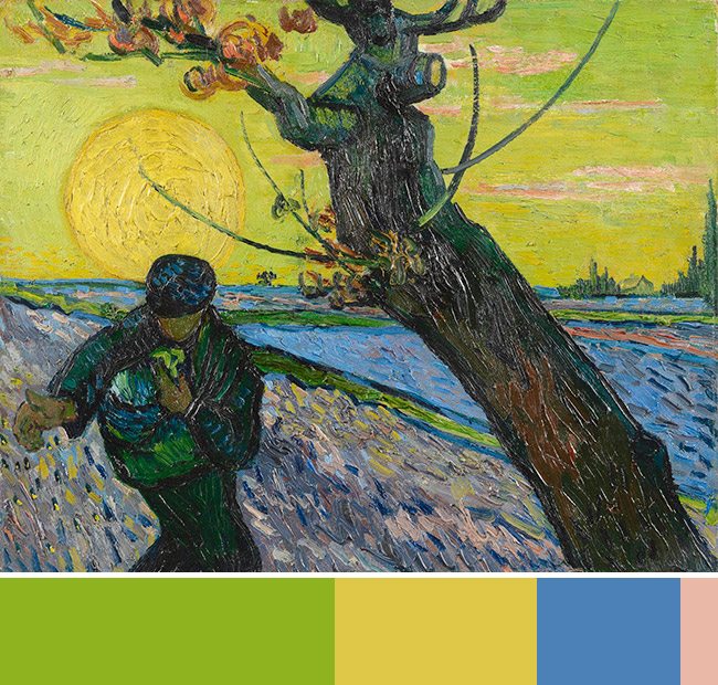
Conclusion
Whether you are photographing colors or painting them, always try to create a hierarchy. If you can include the four colors (red, yellow, blue, green) and allow them to sing in harmony (instead of clash) with different neutrals, tints, tones, and shades then you’ll be on your way to mastering color theory in a simple way.
Thanks for joining in today, and huge thanks for everything! I really appreciate you all! Take care, see you next time!


Fine Art Photos by Stephen Shore - ANALYZED
January 9, 2018 @ 6:24 pm
[…] hear the word fine art, you probably won’t think of his amazingly banal photographs, but his color harmony and use of dynamic symmetry are worth a closer look. Let’s get into […]
Stellar – Oh, border!
December 31, 2019 @ 7:43 pm
[…] Let’s now get back to Starry, Starry Night. I found this page about Vincent Van Gogh’s Colour Theory. VVG’s colours are always so emotional, so dynamic, and so vibrant. Let’s take any one […]
May 15, 2020 @ 7:08 am
very cool.
May 23, 2020 @ 10:27 am
Thanks for reading!