Which Dynamic Symmetry Grid is Best (CINEMATOGRAPHY)
#718
Hey everyone, thanks so much for all of the support! You are much appreciated!
Today we are going to dig deep into dynamic symmetry and see how the pros are using it in cinematography. Which grid is best to capture movies and TV shows? Is there one? How do we determine which grid is best? Let’s find out now!
Determining the Best Grid Dynamic Symmetry
Depending on the grid we choose for our photos or cinematography, or whatever other art we create, we’ll have to consider what happens when we add more points of interest to the scene. The more points of interest we add, the more difficult it becomes to organize them. In the example below from “The Revenant” (see #418), we have two points of interest and they are using the root 6 to compose the scene. Look at how the diagonals are paralleling the grid, and the smaller character is on the vertical. Nice work!

We can also see how something very specific changes as more points of interest are added. Can you guess what it is? It’s the negative space (see Day 83)! Kind of like when we grab a bowl and add fruit loops to milk. We usually find a nice balance between milk and cereal, but this depends on the size of bowl. The bowl is our image frame. If there’s only one fruit loop in a huge bowl, we’ll have tons of milk to drink. We see something similar in the establishing shot below. We have a large bowl (image frame), so it looks like there’s a lot of milk (negative space) surrounding the fruit loop (boat). Are you starting to understand this breakfast analogy? If we shrink the size of the image frame (bowl), it’ll reduce the negative space (milk), and we’ll have a better balance between point of interest and negative space.
Now, establishing shots are meant to show the environment of the subjects to give us an idea of where they are. Plus, negative space helps portray isolation, loneliness, or a grand scale, which can help tell the visual story. So this shot is perfectly fine, but imagine if the entire movie was filmed like this…with tons of negative space. It wouldn’t be good.
When we look at the negative space of each frame as more and more characters are added, we see that the root 6 grid close up crops off a lot of the subjects face. Imagine if the entire movie were like this…up close and cropped heavily. It wouldn’t be good. This shot is great and shows the intensity of the actor, but we can’t do that with everyone. The same goes for the group scene. It looks great, but we can’t capture every scene like this and tell a riveting story. We need to understand composition and organize the scenes differently depending on the points of interest.
So, we’re already starting to see how there must be a compromise in cinematography because we won’t typically change our grid halfway through the movie, and we can’t have all close ups or all group shots. We should choose the grid that fits the majority of the scenes.

As we know, it’s not all about the grid. When adding more interest to the scene, we’ll have to continually balance things from the vertical centerline. Here’s a perfect example from Dune. The large character is in the center, and the smaller ones are on the right and left. All of these characters can be adjusted left or right as long as the visual weight is distributed somewhat evenly. If they were all on the left side it would be left-heavy.

We’ll also have to pay attention to other design techniques like figure-ground relationship (see Day 21) and separated shapes (see #374). This shot is also from dune, and we can see how they’re trying to organize the subjects to be separated, while the man in the middle is the most recognizable because of his size and aspective view (see Day 78).
Now that we know what to watch for, let’s determine which grid is best for cinematography!

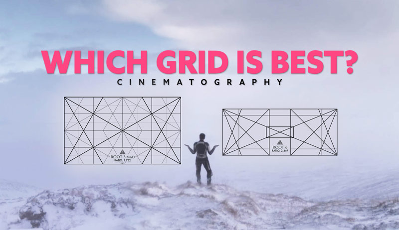
Which Grid is Best? Dynamic Symmetry
Composition is all about organizing the elements within the frame to have visual clarity, balance, movement, rhythm, strength, and unity. But we first must have visual clarity and balance. That’s why we have to at least understand figure-ground relationship no matter what. We also must select the grid that best fits our needs as an artist. Do we have one subject to capture, or many? Do we have a great environment we want to capture, or is everything in a small room?
Each grid correlates to specific cinematic ratios, and they are listed below. So, depending on the ratio we’re shooting our video in, these are most likely the grids we’d choose from. They can get wider or taller if it fits your needs. I’ve even seen square compositions in movies!
Grid Key:
4:3 = 4/3 MAD
16:9 = Root 3 MAD
2:39:1 = Root 6 MAD
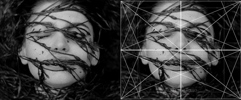
1.19 = Root 6 MAD Stacked
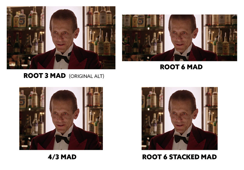
In these next examples below, we can see the original scene and the grid they used, then the crop of other alternative cinematic grids. First up we have a scene from “The Shining” (see Day 677), where the head and shoulders are captured perfectly in the original root 3 grid (16:9). There is enough negative space around the image to allow the single character to be balanced in the center, with sufficient context in the background. As the image is cropped to the root 6 grid, we can see that the composition isn’t as good.
Believe it or not, cropping into the head is quite normal to see in long cinematic frames like the root 6 because there is no other option. When the characters face is large in the root 6 frame, it’s usually going to be cropped. This doesn’t mean it’s the best composition for the scene…it’s mostly just a compromise. The 4/3 grid doesn’t look too bad, but it’s starting to feel too tight for the character. The root 6 stacked is actually squeezing the character…creating a claustrophobic feeling.
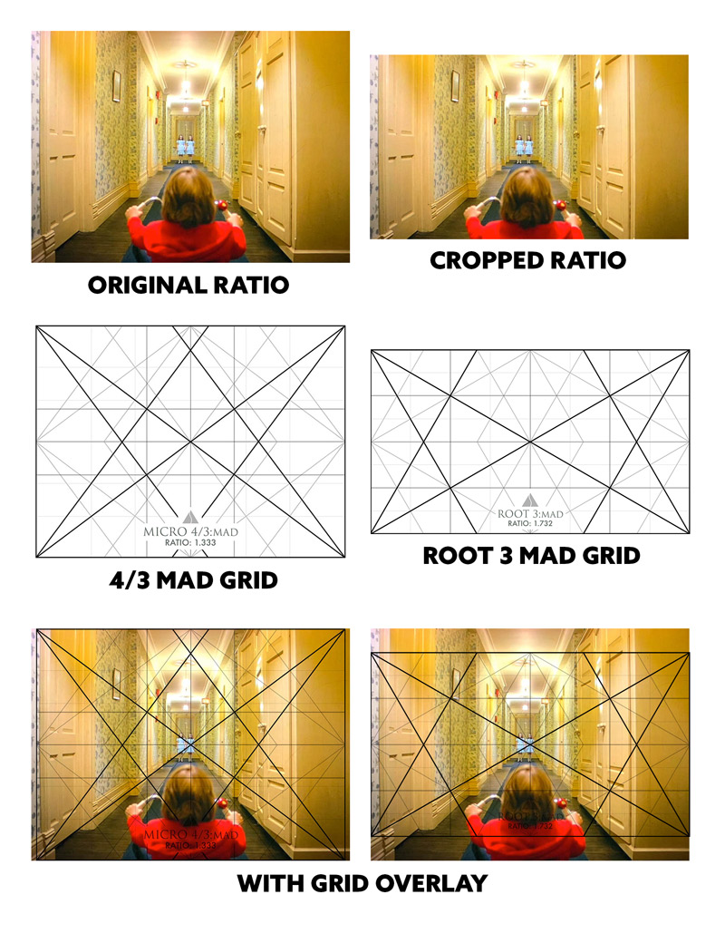
Stanley actually filmed with the 4/3 grid, and anticipated it being shown in the root 3 format. You can see the difference it makes for the scene and negative space. They both look good, but when the top of the hallway is cropped off in the wider format it’s still telling the same story.
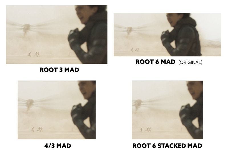
In this one by Dune (see #680 & #681) with the original ratio being a root 6, we can see how they position the main character on the right and balance him with interest on the left. As parts of the scene are cropped off to fit the different grids, we can see how they get a little tight in the examples on the bottom. The root 3 actually works fine though. It tells the same exact story, but if they chose the root 3 for some of the other scenes with large groups it might tell a slightly different story. They are trying to capture the vast landscape in this movie, so the excessive negative space helps.
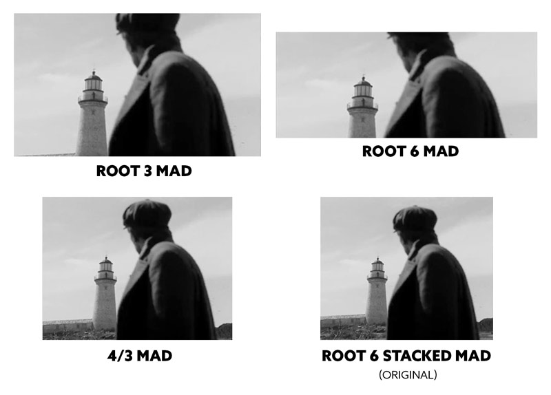
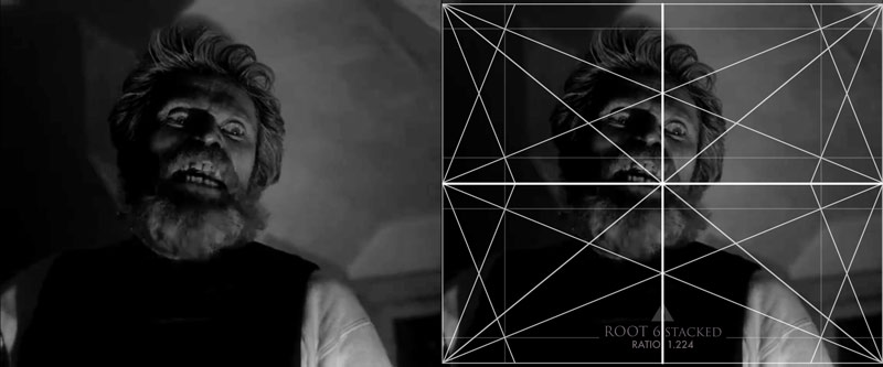
No matter what grid you choose, there will always be a trade off depending on the scene. In this one from “The Lighthouse” (see #612) we can see the original ratio works great, but with the wider root 6 grid it crops most of the man and lighthouse out of the frame. This would have to be composed differently to capture both subjects and tell a similar story. It could be done, it would just be more difficult because the lighthouse is so tall. It looks ok with the root 3, but better with the 4/3. See, it’s all about how we organize the subjects within the frame. If we go wider or taller, we just have to organize the points of interest differently.
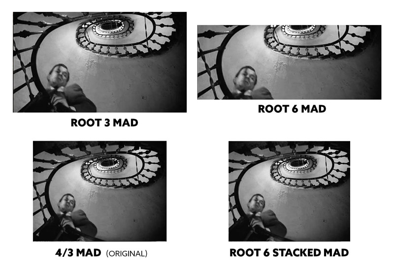
Here’s a scene from “The Third Man” (see #468), where we can see the original 4/3 ratio is excellent, the root 6 stacked is good, but the wider we go the worse it gets. If the cinematographer was using the root 6 and wanted to capture this scene properly, they’d have to perhaps use a wider lens to capture everything better. They can’t necessarily move much and capture the staircase the same.
When we look at great cinematic shots, we can see that they are choosing the grid that fits their needs, then using the vertical centerline to balance from left to right, create visual clarity, etc.
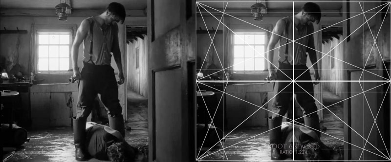
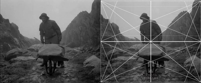
In the movie “The Lighthouse,” they have two main characters who are mostly in a small room, in addition to a few outdoor scenes. They choose the root 6 grid stacked which gives us a different perspective compared to the typical root 3 or root 6, but also allows them to compose the scenes they’re needing.
Try to notice the balance and negative space in these shots.

In the movie “The Tragedy of Macbeth” (see #693) we see the 4/3 grid locking in the points of interest nicely. This movie typically has a few characters per scene, but they also want to capture some of the unique and mysterious environment. The cinematographer could’ve used the root 3 or root 6, but they’d have to deal with more negative space on the right and left.


In these scenes from “Dune” we can see how they are using the grid to capture the environment with small human elements. This ratio is perfect for such scenes, but they could definitely get away with using the root 3 grid to tell the same story.


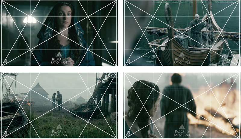
In the TV show “Vikings” (see #498) we see the root 3 basic armature being used. This grid works well for each scene because the cinematographer is doing a great job of organizing each point of interest. They are considering balance and visual clarity, and it works well no matter if the subject is close or far away from us.
In the movie “The Third Man” (see Day 468) they use the 4/3 grid. Without the grid overlaid onto each scene, can you determine if it works or not? Look at the negative space and balance of the subjects. Can they use a different grid to get better shots?
The first three shots are near perfection and no other grid would do a better job to tell the visual story. The last image though, with a group of 5 or 6 guys in a cemetery, might do better with the root 3. Right now it looks ok, but they are tightly fit into the frame…like it’s almost too much cereal and not enough milk. The root 3 would allow more context and negative space to tell a better story.
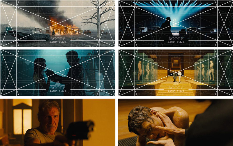
In the movie “Blade Runner 2049” (see #448, #449 & #450) they usually only have a few characters per scene. No large groups like “The Revenant” or “Dune,” so why the long grid? Well, the excessive negative space fits their story, but they also capture vast environments that fill the negative space in most of the scenes.
This ratio makes it difficult to capture a closeup while also creating balance and filling in the negative space, but they do a great job as we can see in the last two screenshots. The gun fills in some negative space, and in the other they turn the characters head to also include the hands.
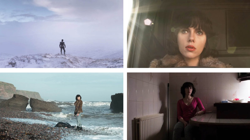
In the movie “Under the Skin“(see Day 354), they used the standard 16:9 ratio (root 3 grid), but most of the movie only has a few main characters. Does it work? Yes, because even though there is a lot of negative space in some of the scenes, they balance things nicely and it helps the story of isolation and loneliness. They also have some great scenes including the environment of the characters. This is a weird, but excellent movie!
By looking at the scenes below without the root 3 grids overlaid, could they have used the root 6 or the 4/3 grid? Certainly, and that would get rid of some of the negative space on the top and bottom, or sides of the frame. Yet, for this movie it works just as it is. The scenes are beautifully captured and balanced, and full of design techniques.
Conclusion
Well, do we have a clear grid winner? Kinda. It all depends on your needs as a cinematographer. The same goes for any artist using the grid. If you only have a few subjects to film, you can definitely get away with using the 4/3, or root 6 stacked grids. Using these grids to capture scenes with groups of characters would be very difficult to balance and create visual clarity, but it could be done if you’re up for the challenge. For large groups and epic scenery the root 3 or root 6 would work better.
So, if we had to choose one grid that seems to work best for most of the scenes we’ve gone through, it would be the root 3 grid. The root 3 can officially be the best grid to use for cinematography! Perhaps this is why they chose the root 3 for so many movies and the aspect ratio of phone screens. Cool! Yes, the grid is powerful, but we can’t forget to balance from the vertical centerline, and create visual clarity.
That’s it for this one, thanks for joining in. See you next time!

