
Why Fashion Photography Needs Classical Design

#779
Thanks for all the amazing support you guys, I appreciate it!
Today, we’re going to break down 10 great photos and 10 not-so-great ones to show you exactly what classical design does for a photographer’s eye and the final image. This isn’t about nitpicking…it’s about giving you the tools that fine artists have used for centuries, so you can blend modern style with timeless composition.
By the end, you’ll see why some images instantly pull you in and why others make you scroll past without a second thought.
Fashion Photography Why Classical Design
Lighting and styling matter. But if your design sucks it’s game over.
I know that sounds harsh, but it’s true. I’ve seen beautiful models, perfect lighting, and the most expensive wardrobe fall completely flat just because the image lacked solid design. In fashion photography, you can’t just rely on mood and styling to create a remarkable image. Without classical design principles like balance (see Day 57), rhythm or gamut (see Day 38), negative space (see Day 83), and figure-ground relationship (see Day 21)the eye has nowhere to land, and the image feels empty, confusing, and lacking visual clarity, no matter how elaborate the shoot appears to be
Video
Please enjoy the video, or scroll down and read every detail!
Fashion Photography Digging Deeper
Let’s start with the not-so-great ones, because that’s where we see how the basics of composition can improve visual clarity. When I say not-so-great, I’m not trying to bring down the photographer or say they aren’t skilled. Sometimes flaws slip through the cracks, but the more we train our eyes, the better we’ll be able to spot them.
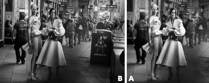
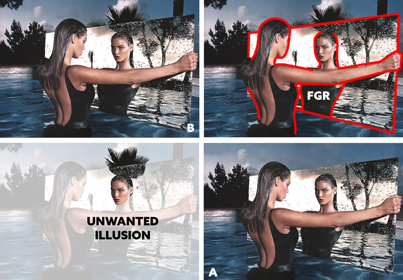
First up, a black-and-white photo by Peter Lindbergh. Anyone with a decent eye can tell something’s off…it’s just an okay photo. The problem is visual clarity. So if you squint your eyes, the main subjects, the two models dressed in high fashion, blend into the background too much. The figure-ground relationship, how the foreground subject interacts with the background, is critical. Without it, most compositions end up mediocre. And when an image is chaotic like this, your best move isn’t to overcomplicate it even more. Simplify it. Strip away distractions and increase the visual clarity by controlling the contrast.
There’s no better place to start than with the figure-ground relationship. Get that right, and you give the viewer something solid to hold onto. You can blur the background slightly, or crop away most of the image if needed. The best approach, though, is to learn these composition and design principles before you click the shutter. You can’t rely on post-processing to save photographic disasters.
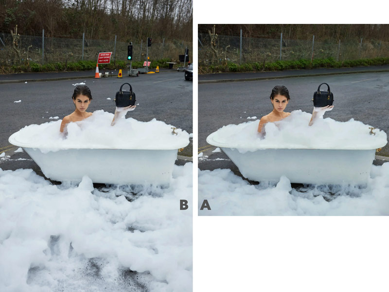
Next, a quirky, avant-garde photo by Juergen Teller: a model casually sitting in a bubble bath, holding a ridiculously expensive handbag, in what looks like a random parking lot. The main subject is the woman with the handbag, but everything else is just an unrelated distraction. Images like this aren’t doomed to fail, but they need a trained eye to clean them up and keep the visual clarity. If this was an ad for the handbag, it’s drawing attention everywhere except the product.
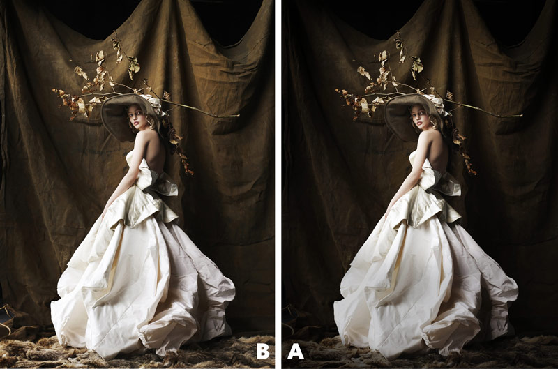
It’s surprising how many professional photographers lose control over the contrast and allow distractions in the background. Most stick to seamless backdrops for a reason…they help with figure-ground relationship and visual clarity. But mistakes still happen, like in this Mario Testino photo. The backdrop’s contrast grabs more attention than the model with a branch on her head. To clean it up, we need to improve the visual clarity by subduing the busy background.
In this Steven Meisel photo, the model’s light skin and head-wrap blend into the light fabric of the bedding. Light on light means minimal contrast. Contrast drives visual clarity, so when it’s missing, the image is easily forgotten. Adjusting contrast helps, but that’s not the way to go about things. Get it right in-camera, maybe use dark sheets, this way you don’t need to rely on Photoshop magic.

Ellen von Unwerth’s photo has some chaos as well because she didn’t focus on the figure-ground relationship. Yes, another pro photographer fumbling the basics of composition…it happens. See how the long railing lines up perfectly with the model’s leg? This creates an unwanted illusion (see Day 55) that should’ve been avoided.
It’s like a tree growing out of someone’s head, as in this Mert & Marcus photo. It’s a great image, but an illusion slipped through, making her look like a pineapple. If we adjust the contrast in Ellen’s photo we can bring more focus back to the model. The same goes for the pineapple head.
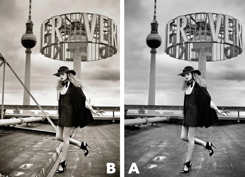
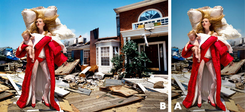
David LaChapelle loves chaotic, busy images, but the composition should always come first. In this one, noise pulls attention from the main subject. The highlights in the whites are also lost, where slight texture should be. There’s an imbalance too…she’s placed left of the vertical centerline without a strong point of interest on the right to help balance things out. Her gaze to the left makes it even more left-heavy. We can crop the right side and fix the blown-out highlights to refocus on the subject while keeping the background’s context. Before, the background overwhelmed the image.
Lindsay Adler is a talented photographer, especially with light, but this image shows imbalance with all the visual weight on the right. Think of the vertical centerline as the fulcrum of the image…just like a teeter totter, we need to balance the contrast on both sides. Moving the model slightly left of the centerline to offset the lens flare at the top right helps us get better balance.

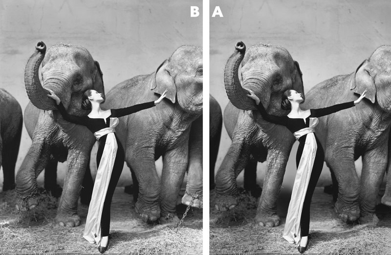
Richard Avedon’s photo might seem flawless, but some errors stand out. The chains on the elephants leave a bad taste for anyone who cares about animals, hinting at beauty from confinement. Cropping the elephant’s eye on the right is a bad look as well…it adds to the negative vibe. You wouldn’t crop a person’s face like that. Plus, the figure-ground on the model creates an unwanted illusion: her body curves match the elephant’s leg in the background, making her waist look wider. To fix this, we can adjust the contrast, reshape the elephant’s leg, and crop the right to remove the eye.
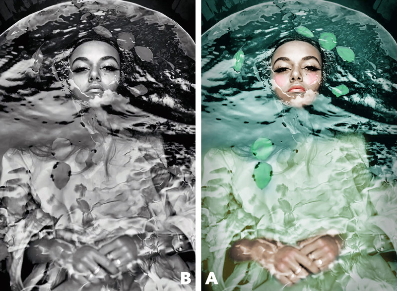
Mario Sorrenti should’ve considered how color affects visual clarity before shooting this image. When colors have similar values, they blend together in black-and-white, losing details like wardrobe, scattered leaves, and makeup. I colorized the shapes in Photoshop to help bring back clarity, but it’s better to plan ahead before the shutter clicks.
10 Great Images
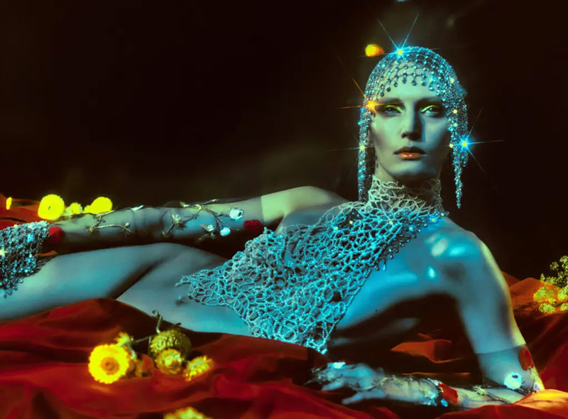
Now, let’s move to the 10 great images, starting with Elizaveta Porodina. She uses four colors (red, yellow, blue, green) in a clear hierarchy, just like Van Gogh in his paintings (see #470). Her figure-ground relationship ensures visual clarity, and she adds depth with a lens flare and motion blur.
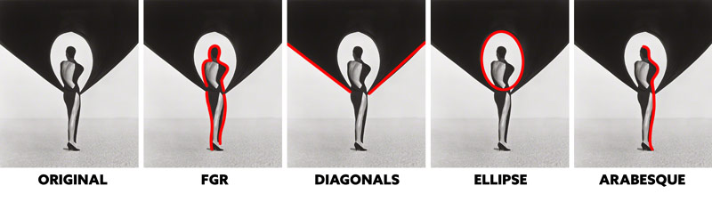
We talked about balance with Lindsay Adler and David LaChapelle. Balance starts at the image’s center, which is why the rule of thirds can mislead artists, from beginner to pro. It focuses on thirds without considering figure-ground relationship or proper balance. You’ll notice many pros use center compositions, like Herb Ritts in this striking photo. It has massive visual impact with the dominant diagonals (see #441), perfect figure-ground relationship, and graphical elements like an ellipse (see Day 34). The old-school shoulder pads help add to the arabesque (see Day 17) of her pose.
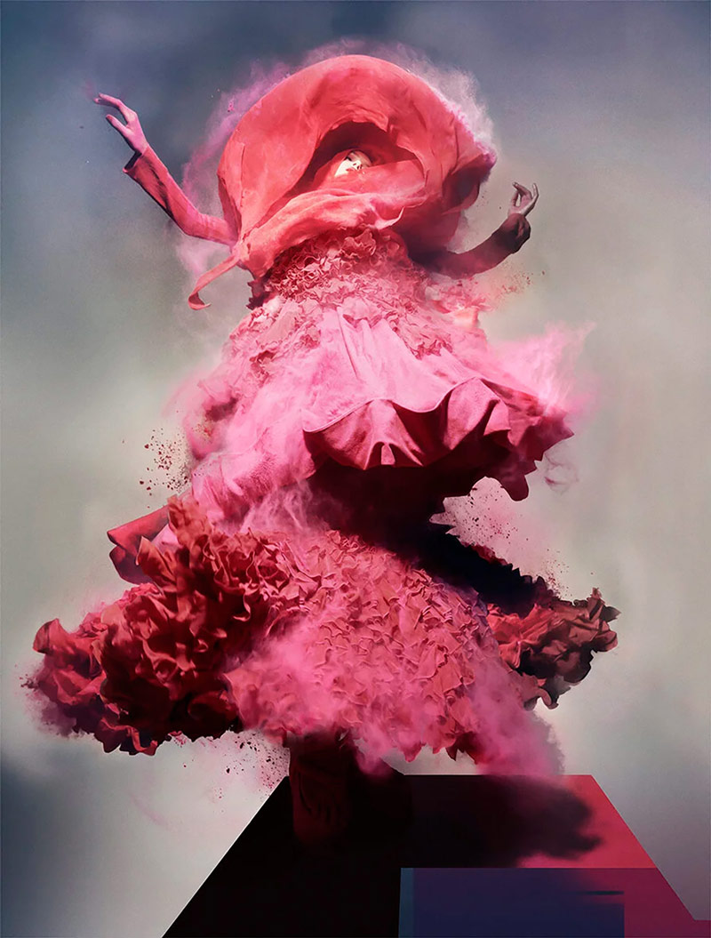
Nick Knight’s center composition is full of movement and depth. Sweeping lines and particles in the air mimic the depth you see in nature’s aerial perspective (see Day 42).
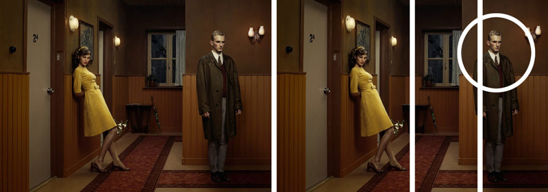
To drive home balance, look at Erwin Olaf’s photo. He knows exactly what he’s doing, balancing the woman in yellow on the left with the man on the right, using the vertical centerline as the fulcrum. If we further divide the right side in half, you’ll see that the man is placed on the right, and he’s gazing to the right. This creates visual tension, much like the TV show “Mr. Robot” (see #411). Doing this adds a touch of mystery to the photo which can be felt by the viewer.
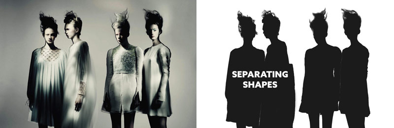
Paolo Roversi’s photo has perfect balance, great figure-ground to relationship, and spot-on lighting contrast. You can spot flaws or strengths by simplifying the image in Photoshop with a threshold adjustment layer, sliding it to check the contrast. He’s got four model’s standing very close to each other, but he’s ensuring that the most important parts, their head and face, are clearly separated (see #374). This helps with visual clarity even when the shapes are silhouetted. Cinematographers use this technique for visual clarity all the time.
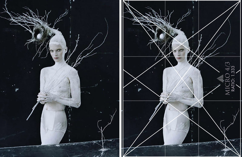
Classical design includes dynamic symmetry (see Day 14), which promotes techniques like 90 degree angles for strength (see Day 76), repeating diagonals for rhythm, dominant diagonals for visual impact, and linear movements or coincidences (see Day 48) for movement and unity. It’s also used to help organize compositions, whether it’s simple or complex. Tim Walker uses a 4/3 basic grid to align the model and branch-like props. Pair this with a strong figure-ground relationship created by the bold white makeup on black background and his nesting concept is taken to new heights.
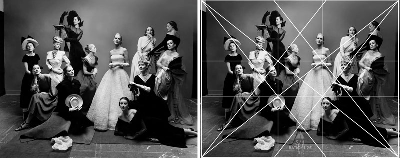
Irving Penn uses a 5/4 grid in this complex composition to organize a group of models with unique poses. Aligning them to these simple diagonals of the dynamic symmetry grid creates unity and movement. The more techniques you use, the stronger the composition becomes.
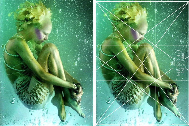
Even loosely using the grid, like Sølve Sundsbø does here still works fine. You can parallel the model’s diagonals to the grid if you need, but always try to combine it with nice figure-ground relationship if you’re looking for visual clarity. Have the model pose in an elliptical shape, or like this next model creating an aspective view (see Day 78).
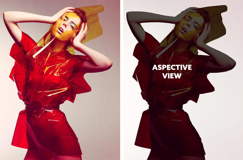
In this photo by Craig McDean, he’s had the model spread her limbs to create the aspective view which much like ancient Egyptian art, gives us the most identifiable shape to boost visual clarity and create interesting diagonals.
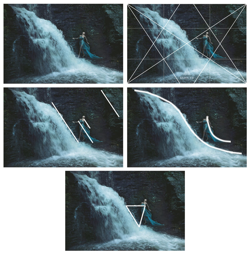
Annie Leibovitz pulls it all together in this masterpiece: strong figure-ground relationship, an aspective view in the pose, repeating diagonals in the dress, arm, waterfall, and rocks, an arabesque in the waterfall and dress for movement, and a hidden triangular enclosure in the center. The beauty of this image is undeniable, and it only works with a great knowledge of classical design.
Conclusion
That’s it for this one! I hope that inspires you to learn more about composition and design, then apply it to your art. Analyze master paintings and photos…it all helps develop your eye for classical design.
Thanks so much for the support, see you next time!


