Why is the Rule of Thirds Grid on Pro Cameras

#462
Welcome back everyone, thanks for all of the continued support!
Ah yes, the battle against the status quo of composition continues after all of this time. Rule of thirds still remains the number one composition technique to teach artists of photography, painting, drawing, you name it. Why is this? The excuse “because it’s easy” is not good enough anymore.
As we learn more about our art and start to think for ourselves, we work past some of our worst creations; we become a pro at what we do. Since we’ve moved forward, evolved, and educated ourselves to a higher level, does the rule of thirds still have to be a part of our art? Nope, thankfully. But why does it have to be hardwired into our pro camera if we are considered professional photographers? Shouldn’t it be removed just like the generic auto modes and replaced with a more advanced grid system?
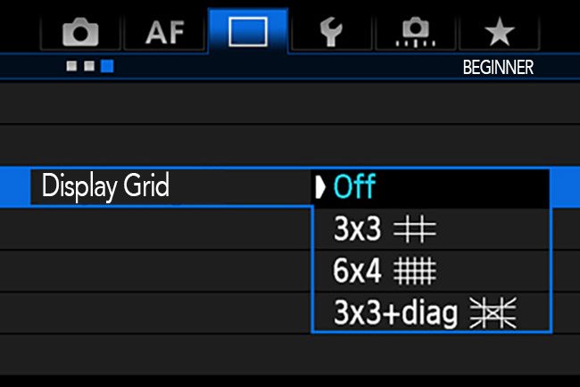
In the example below, we see the typical screen for grid displays on a camera. A beginner grid like the rule of thirds creeps it’s way into every professional camera out there. It’s like selling Lance Armstrong a bike with training wheels.
People have written responses in regards to the rule of thirds like, “you need to learn how to crawl before you walk.” Heck, I’ve even used a similar phrase in my articles, but then they follow up by saying, ” it’s just a tool, to have in your box of tricks, and to be used in certain situations.” With this logic, does it mean that it’s ok for a grown man to crawl across the crosswalk in certain situations?
The rule of thirds is not a tool that we can continually use and incorporate in our art if we are wanting to reach the master level. It’s a tool that leads us all down a dead end road. It would be like teaching a baby to roll around on the ground because it’s faster than crawling. Rolling is easy to do and comprehend and it can produce results, but shouldn’t we be teaching them to walk which has a better outcome?
Everyone needs a starting point, but it should be a good starting point with great end results.

A Solution
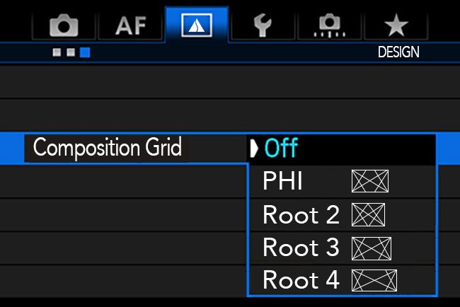
As we know, grids are excellent tools to help us create unity, movement, and rhythm, but they have to be proper grids; a system. Dynamic symmetry is a system.
We also need an understanding of how to use the grids, all while paying close attention to the background of the image (see #453).

Wouldn’t it be great to have all of the dynamic symmetry grids displayed on your camera rather than the rule of thirds grid? This is a pipe dream, I know, but it’s the world I want to live in. Camera companies should think outside of the box, and provide these helpful tools of composition and design. They seem more concerned with every other bell and whistle except for those which will dramatically help our images. Keep the pro gear full of pro tools…inside and out. What are your thoughts?
Thanks again for joining in today! See you Next time!


September 7, 2017 @ 10:39 am
Thanks for trying anyway Frank! Maybe some day, but I doubt it.