Canon of Design Essentials
7/365
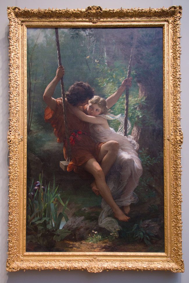
How would you possibly compose the painting above as Pierre Aguste Cot did in his “Springtime” painting? Well, below I break down the design elements he uses to make this masterful composition (see Day 240). Later in the 365 I will analyze this painting and show you all of his tricks.
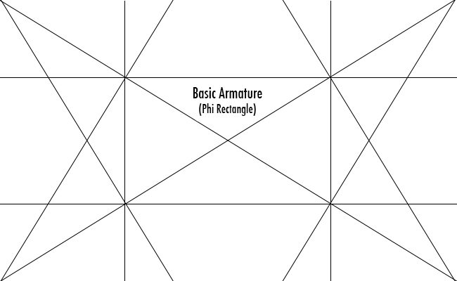
The Canon of Design consists of many things, but it all starts with the basic armature of your rectangle…so don’t freak out! I’ll cover all of these throughout the 365 and explain what they are and how to use them to your advantage. Here is a brief description for all of them, which will give you a better understanding of the analyzed images I’ll be posting as this project progresses. Don’t be overwhelmed! Learn one thing at a time. Through repetition and taking the initiative to understand (not just viewing the image) the analyzed works you will be able to grasp the concepts shown.
Basic Armature-the dynamic symmetry of a rectangle (we’ll cover root rectangles later). Two diagonals, four reciprocals, and vertical/horizontal lines dropped from the four intersections.
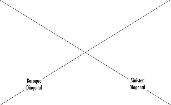
Baroque Diagonal– A line from bottom left to upper right
Sinister Diagonal– A line from bottom right to upper left
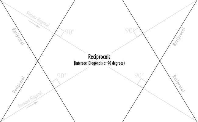
Reciprocal– A line that intersects a main diagonal (sinister or baroque) at 90 degrees from the corner. Four total.
Eye-the intersection of two lines meeting, where another line can be generated.
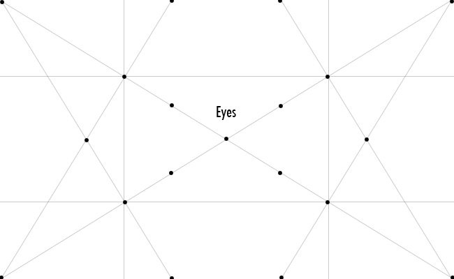
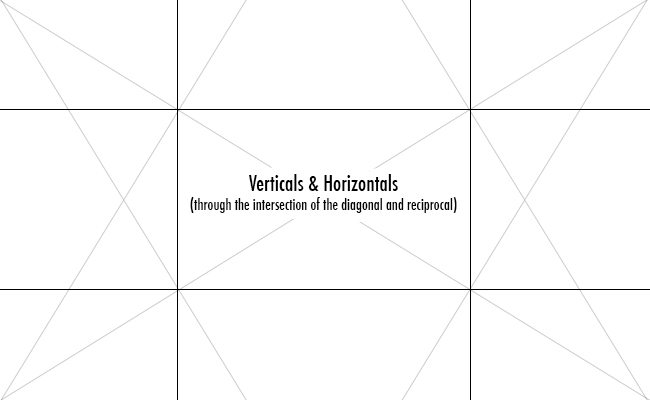
Horizontal/Vertical-Two lines total drawn through each eye of the reciprocal
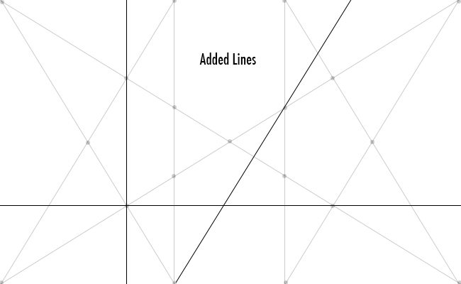
Added Lines– if needed, you can build up your armature by adding lines point to point or through the intersection of eyes.
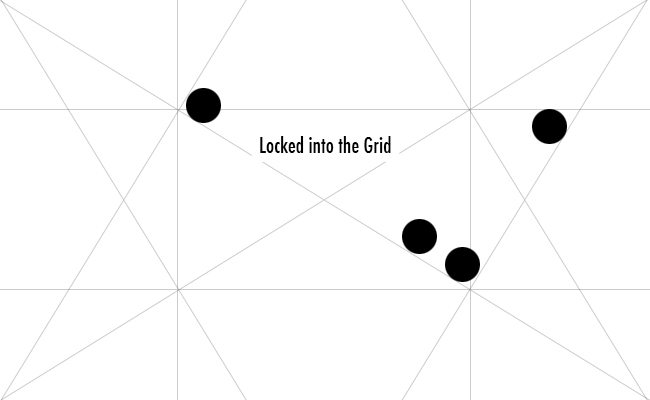
Locked into the grid-these are points that are locked into the armature of your rectangle.
Major Area Divisions (MAD) – Using major area divisions gives the design more strength. This is achieved by shrinking down your dynamic rectangle with it’s armature and creating smaller rectangles inside (usually four or nine). This will give you more areas of the grid with the same armature as the mother…allowing for repetition, gamut coincidences, etc. If the design doesn’t need to be broken down much, it will prove to be a stronger composition.
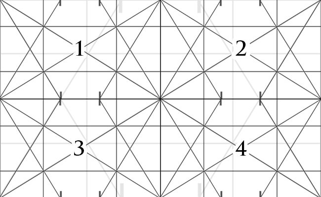
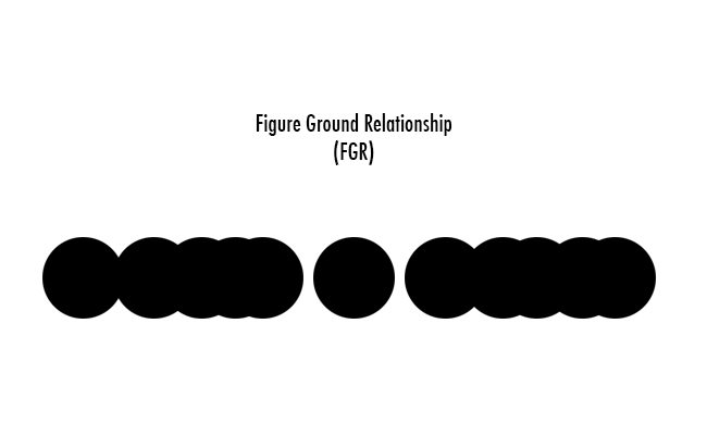
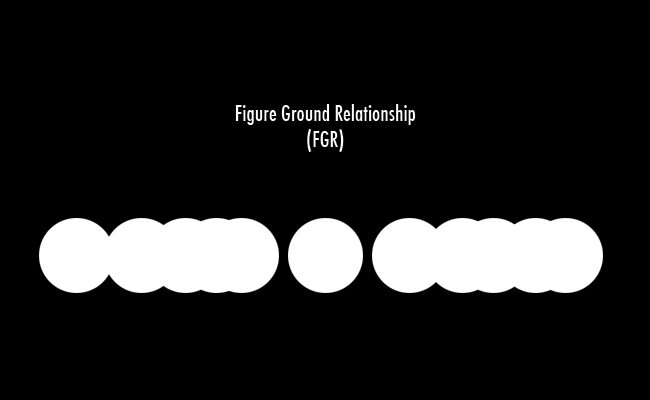
Figure Ground Relationship (FGR)-a clear distinction between figure (subject) and ground (background). This could be a light figure on a dark background, or a dark figure on a light background.
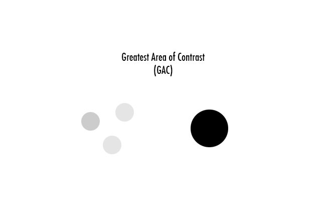
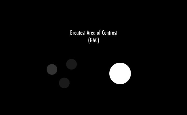
Greatest area of contrast (GAC)-where the eye will look first. Whether it be a light on dark or dark on light. FGR, Simultaneous Contrast, and GAC compliment each other.
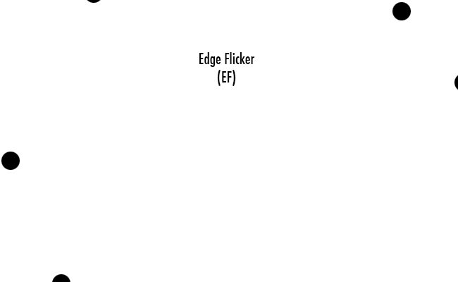
Edge Flicker (EF)– flickering distractions around the edge creating an escape route for the eye. These should be subdued in order to keep the eye wondering inside the image.
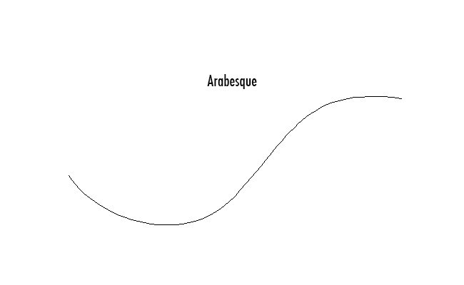
Arabesque-(adhering to the law of continuity)-a curvilinear element that leads the eye through the image (Also see Hogarth’s line of beauty)
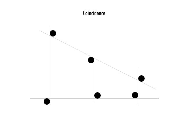
Coincidences– (adhering to the law of continuity)- objects that coincide with each other throughout the image to create movement in the piece and relate objects. Another term is “Kissing”-objects that meet edges exactly which weakens the illusion of depth by making it appear that they are on the same plane.
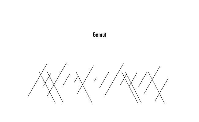
Gamut– the limited number of directions incorporated in your work create repeating intervals and shapes that introduce a necessary rhythm which is very pleasing to the eye. It is the substructure that speaks to the viewer without them knowing.
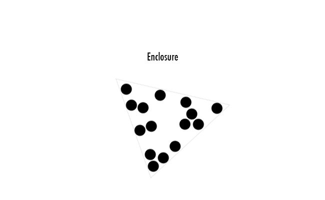
Enclosures-Circles, Triangles, cones, hemispheres and other simple geometric shapes-used to organize and give unity to the objects placed in an image.
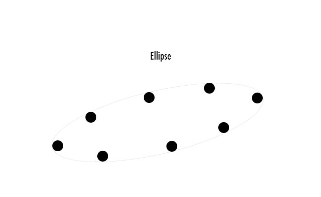
Ellipse-a circular form or arc used to unite objects.
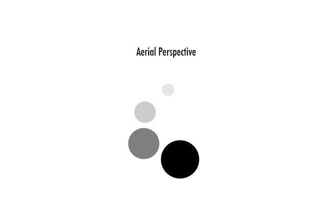
Aerial Perspective-the sense of atmosphere (aka SCREENS, PLANE SEPARATION) particles in the air reducing saturation and contrast as an object recedes into the distance.
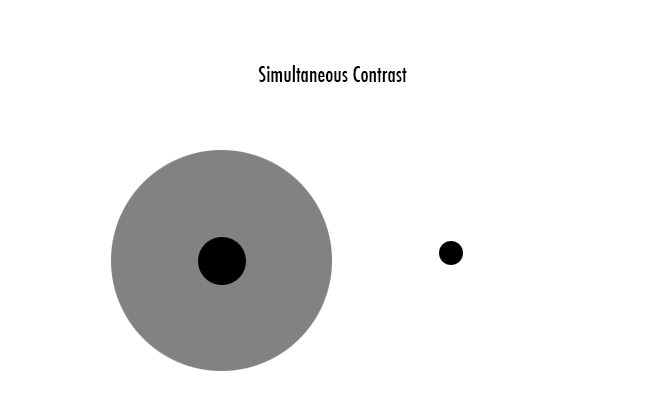
Simultaneous Contrast– a white will look brighter if it is placed by something that is very dark as opposed to a neutral gray. The opposite is true for black. (This can come in handy when editing and trying to make the subject stand out a bit more.)
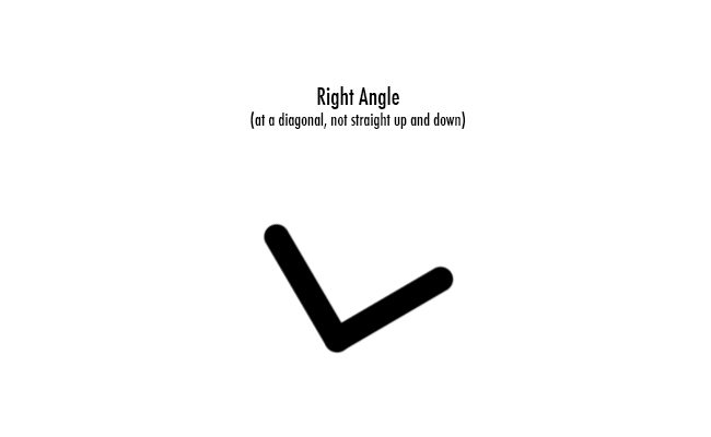
90 Degree Right Angle– a right angle that is not straight up or down. This adds strength to the composition and is very pleasing to the eye.
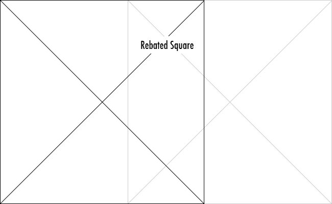
Rebated Square-another way to compose an image is by rebating the square. Two squares placed on each side of the rectangle (most of the time overlapping) with a simple “X” in the middle of each…creating the 45 degree angles. Simple and limited, but better than the rule of thirds.
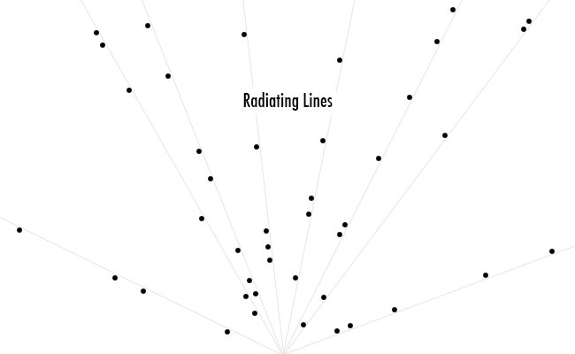
Radiating Lines-used to unite objects with lines generated from a common point.
BW Blur-finding the simple shapes and tones used by converting it to black and white, then blurring. It’s like squinting.
Gestalt principles-how the mind simplifies forms with the least amount of effort. Most of the important principles will be explained in a separate section.
Whew, that was a lot!
Just remember, digest it slowly…don’t get overwhelmed! And feel free to comment below if you have any questions. I don’t need anyone losing their heads over this. But I promise, if you give design a chance, it will open your eyes to much more beauty in the world, and give you the power to capture it!
Congratulations, you’re one step closer to designing your own masterpiece!





December 17, 2018 @ 6:25 am
This is really a gold mine of information… Thank you so much! I am sure to be posting more across all of these post. I have been trying to understand composition for some time now, for photography, Graphic Design and Fine Art.
January 6, 2014 @ 1:05 am
This is really a gold mine of information… Thank you so much! I am sure to be posting more across all of these post. I have been trying to understand composition for some time now, for photography, Graphic Design and Fine Art.
January 8, 2014 @ 10:12 am
Thanks for all of the support Russell, glad you are enjoying the information so far! Congrats to you for trying to understand composition which is usually not even considered by most artists.
January 31, 2014 @ 9:04 pm
Great stuff! Thanks for sharing. I have a lot of questions, but you’ll probably have them answered in the other articles. Excellent job on this. I am very excited to read more.
February 1, 2014 @ 1:35 pm
Hi Chibamonster, glad you found the site! If you don’t see the answers to your questions shoot me an email and I’ll do my best to help. Happy reading!
February 16, 2016 @ 4:18 pm
Hi Yujin, thanks for the comment. This just means that the large diagonals and reciprocals will have more strength than the smaller ones. I guess an analogy would be this: If you took a photo of someone holding a life-size surfboard in their right hand, and a 2-inch miniature surfboard in their other hand, which one would you see first? Which one would carry more visual strength over the other? The large one. So, with photography, when you are trying to incorporate dynamic symmetry, you want to focus on big, bold diagonals and reciprocals to work with. If tiny diagonals are used then it’s not noticed as easily because it doesn’t carry the same visual strength. I hope that helps 😀
February 16, 2016 @ 5:32 pm
Got it. Thanks!