A Painter Finding His Way with Composition
95/365
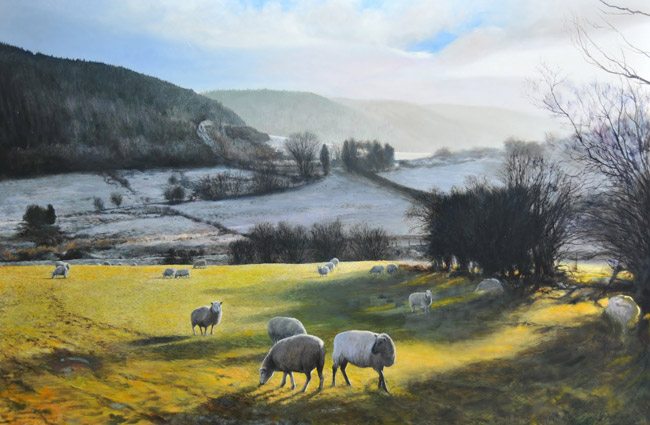
Here’s a BLOG by Harry Robertson where he demonstrates how he’s constructing his painting by using geometry. I give him kudos for even mentioning geometry. Now let me say first off that he is a talented painter, far better than I will ever achieve, but that doesn’t mean I can’t intelligently critique his composition. A composition (based on the examples provided and his knowledge of geometry) in which I would give him a C+ grade… that might be harsh, but it’s a lot better than most have an understanding of when it comes to composition. And with his apparent knowledge of painting, what is one thing he could improve on? Composition. So just…hear me out.
I have to give him credit for trying to think past the simplified rule of thirds thought process, but when he mentions that he used the rule of thirds it sends a chill down my spine.
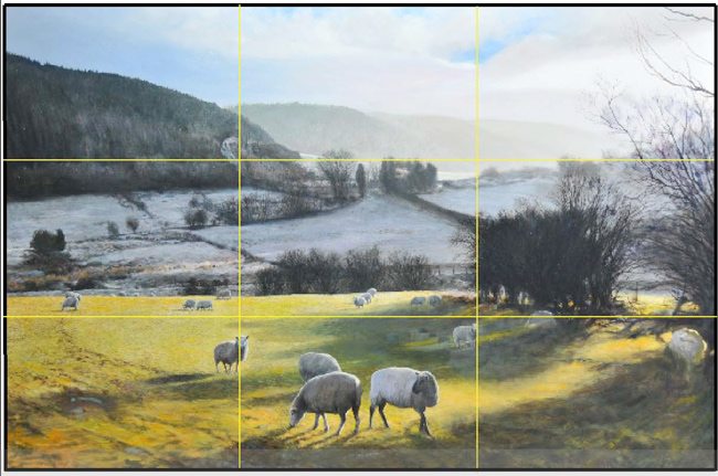
As he starts in his blog he mentions the golden mean or golden proportion which we all know to be PHI. This is the rectangle of the whirling squares right? Well why is he using a 1.5 rectangle? It may seem a slight oversight, but when you claim to be using the PHI ratio you should be true to the dynamic symmetry. Every root rectangle has it’s own unique proportions and internal geometry, and will have more order and be more pleasing when designed using the symmetry of the unique rectangle.
A simple test of how this works is seen in the examples below. Can you tell which one is more pleasing to the eye?
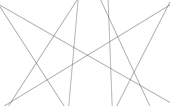
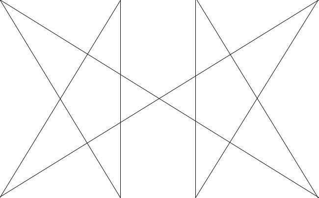
So for his rectangle, he still needs to clip off some from the top to make it fit the ratio of the golden rectangle. Then he would have to generate diagonals that come from the internal geometry of the rectangle, not arbitrary ones.
These are captures from his blog.
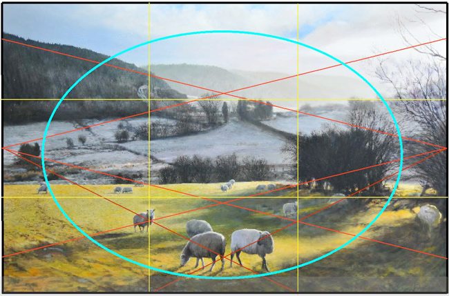
He begins to use radiating lines, but he doesn’t unite anything with them….mainly the sheep on the left third…if that were up or down a bit further it would create unity with the sheep’s feet in the front right (according to his red lines). There’s also a lot of opportunity to create coincidences to help the flow of the image.
Unfortunately his GAC is on the right side where the bushes and light meet. Not sure if he intended on this being the main subject or having our eyes go here first, but that is what is happening. It’s doing that because of simultaneous contrast…the light area is surrounded by darks, so it’s popping out more than the area with the sheep.
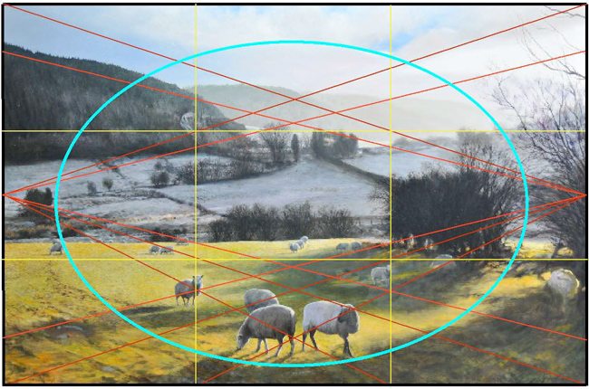
The ellipse is great, but there is a break in his circuit…can you spot it? It’s the upper left quadrant where the mountains are. The flow of the ellipse could have been enhanced by adjusting the shade or highlights of certain trees in that area.
The Edge Flicker is pretty good, though I found the sheep on the right edge to be a bit too bright, the upper right corner branch can be removed, and subduing the bright blue triangle in the clouds can help by reducing the attention that it draws.
He’s using gamut pretty effectively as he has the same sinister diagonal repeating in the middle ground fences, in the distant mountains, and in the branch on the right, the foreground on the left. Could’ve had some introduced in the clouds and maybe the darker mountain, but for the most part, he has an understanding of gamut.
He could’ve aligned things better on his red radiating lines which would create coincidences of movement and unity. He’s close in a few areas but should dial it in just as the masters did.
Here’s an adjusted painting which enhanced the ellipse, controlled the GAC, fixed the dark area in the clouds, and subdued the EF. I also added aerial perspective because the foreground bush should be darker than the distant trees…this will enhance the overall depth. Other items could be better aligned, but this might give you an idea of how small adjustments can improve the effect on the viewer.
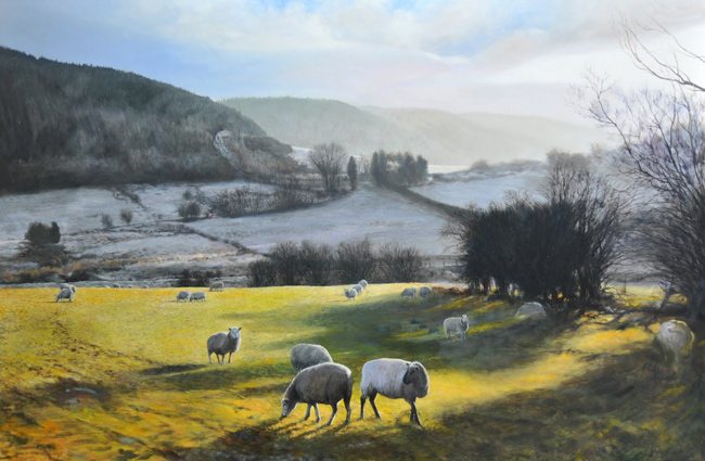
The Original is below. Can you see the minor adjustments made? There’s only so much I can do in Photoshop, but proper planning and awareness of the techniques found in the Canon of Design will give you full control over your art.

Saying you used the rule of thirds to compose your painting or photograph is a true sign of a beginner. It really is! It shows your compositional ignorance. No, I’m not calling YOU ignorant, but maybe your compositional skills could use an overhaul. This isn’t meaning that you can’t divide your frame into thirds (the Root Two rectangle can be divided on the theme of two or three). But you can display some intelligence by saying something like “I composed it using the dynamic symmetry of the 1.5 rectangle and lined up the main subject on the square where I’ve created a pleasing FGR and where the GAC is. Then to lead the eye around I used an ellipse in the foreground followed by an arabesque which completes the viewing circuit across the sinister diagonal of the mountains, through the clouds which echo the sinister diagonal, and back around to the other side.” This may sound nerdier, but at least you don’t sound ignorant. You know exactly what you’re doing and you have the power to lead the viewer’s eye.
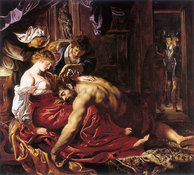
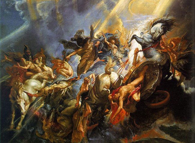
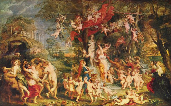
In the blog, he mentions that “if geometry is used too pedantically then the painting will be stilted and dry, so I try to be a bit ‘light-touch’ in this respect. A painter always has to strike a balance between compositional and formalistic decisions on the one hand, and straightforward visual honesty on the other.” In a way, I agree that there has to be balance in composition and artistic vision, but before you can seamlessly intertwine them you have to learn it so well that you can do it without much thinking. You have to learn to ride a bike before you can launch off a ramp and jump three cars. And geometry won’t make your work stilted and dry, it will make it organized. You’ll introduce movement when you create a beautiful arabesque or use an ellipse to carry the eye. Rubens was a master of geometry and composition and his paintings are far from stilted and dry. Congratulations to Harry Robertson for trying to understand composition deeper than the rule of thirds, and employing design techniques which help communicate his painting to the viewer.
