Berthe Morisot – Unveiling Her Painting Techniques
#753
Thanks for all the support everyone, welcome back!
Today we’re going to unveil the painting techniques of Berthe Morisot. She’s not here to teach us her techniques, but each painting leaves clues of her mastery. Who is she and what can we learn? Let’s find out!
Berthe Morisot? Who Was
Berthe Marie Pauline Morisot (1841-1895) was a French impressionist painter (one of the top 7 in my opinion). Her parents and relatives were into their own kind of art which probably set her down a similar artistic path. In fact, her mother was the great-niece of Jean-Honore Fragonard. Check out these old photos of Berthe. She’s a looker!
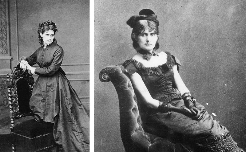
Berthe was a middle child of four; two sisters and a brother. She took art lessons at a young age and was introduced to the Louvre. She went there frequently to copy master paintings. Eventually she met Manet, Monet, and Corot. Some of the top dogs of that era! Wow, she was really rubbing elbows with big names and making all the right moves.
She exhibited in the illustrious Paris Salon in 1864, but eventually joined a group of “rejected” impressionists and exhibited with them. The Salon was too stuffy and still looking for polished academic work rather than the expressive, colorful brushstrokes of the impressionists.
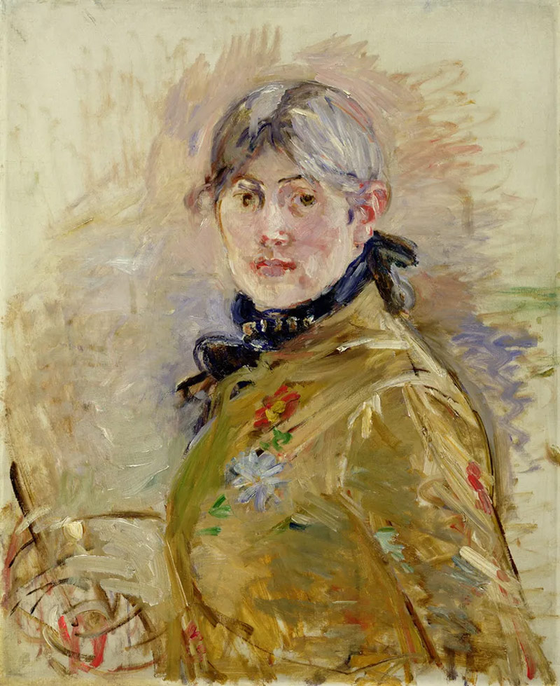
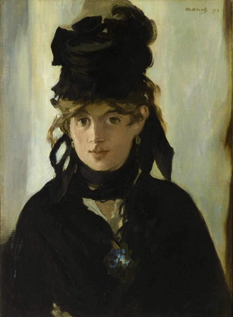
Berthe was married to the brother of Edouard Manet, another master painter. We can even see a painting he did of Berthe Morisot below. Being a female artist wasn’t easy back then, but she made it happen. Now let’s take a look at her painting techniques to see what made her one of the top female artists of all time.
Painting Techniques Analyzed
All of the paintings we’ll be viewing are from photos I took while visiting Berthe’s exhibition in the Musee d’ Orsay in 2019 (see #473). I was pretty blown away, but it’s not the same unless you can get super close and look at her brushwork. That’s why I wanted to share the high resolution photos with you. Download them below if you like. It’s a sign of my appreciation for your support. Now let’s run through these exciting painting techniques!
Color Balance
The first thing you’ll notice in Berthe’s paintings is her mastery of colors. Male critics back in the day would say they were full of “feminine charm” because of their elegance and lightness. Berthe didn’t like this critique at the time because it separated her from her peers. On the other hand, it’s quite the compliment! Understanding the ego more (see #590), it’s clear that if these critics meant to be rude it was only because they were jealous and threatened by her mastery of color.
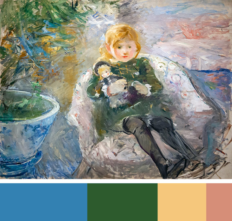
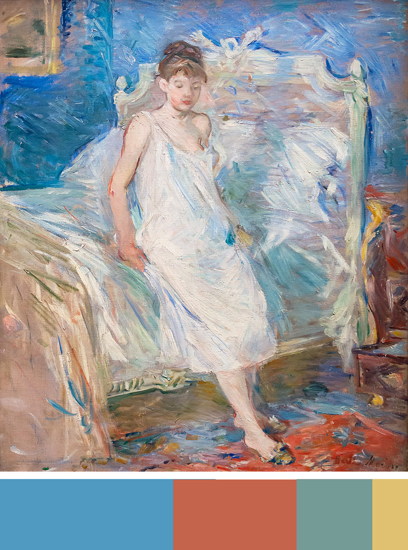
As we learned from Van Gogh’s color theory (see #470), there’s simply using colors like a beginner, or taking the time to use four colors (variations of red, blue, yellow, green) in a hierarchy. Berthe uses this type of thought process in most of her paintings to balance the colors. We can see in these next examples that the swatches identify her use of the four colors in a hierarchy.
Colorful Contour Lines
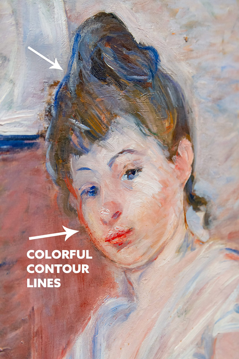
Another way she incorporates color and helps identify the shape is by using colorful contour lines. We can see that the model’s hair is brown, but Berthe uses a blue contour line to define it and add more color. She does the same with the cheek.
Notice the intensity of these color accents too. This hierarchy of grays (see #685) and intensities is really prominent throughout her work and greatly important for artists to understand. Color variation is one of the main things beginner painters never use (see #571). Color variation is flavor, and there’s a huge difference between a kid and Michelin chef when it comes to cooking a grilled cheese sandwich.
This color variation can be implemented as we see here, by placing a random color (blue) where it doesn’t belong. It also pertains to the variety presented by grays and intense colors. Adding this variation helps the color balance and adds interest to the painting. It can be done subtly by using colors with similar values, or with more contrast. If you squint at the portrait below, you’ll see that the blue contour line has the same value as the hair, so it doesn’t stand out as much as a light pink line in the hair. If we look at the background we’ll see that she has used the four colors, but she keeps them grayed and with the same value so they don’t gain as much attention. Squint at the background and you’ll see how they all blend together.
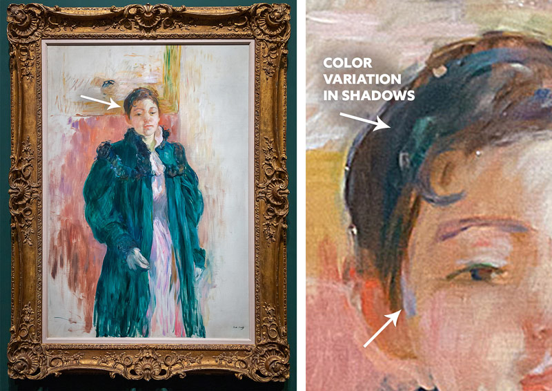
Berthe also adds color variation in the shadow areas. Green doesn’t belong in this woman’s hair, but since the value is the same Berthe is able to add color variation without distracting.
Brush Work
Using a paintbrush is one thing, but variation also applies here. If each stroke looks the same it can become boring. When some are short, long, dotted, messy, etc it becomes more interesting. Just like color variation, Brushstrokes are delicious flavor (see #585 & 586). Yes, variety comes in many different ways; size, color, contrast, depth, etc.
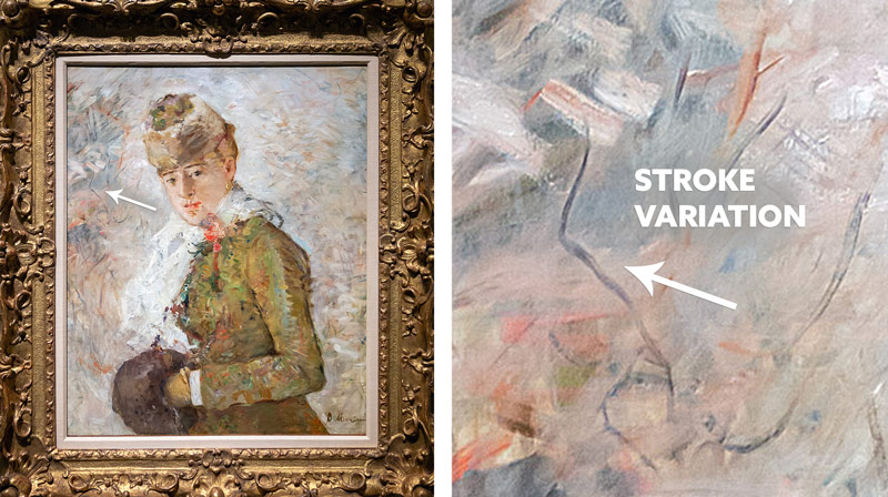
Berthe adds tons of stroke variation in her paintings. In this example, we can see her creating a background texture with long-skinny strokes next to fat-thick ones.
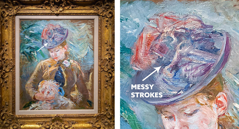
Here are some sporadic messy strokes to add to the interest and give her painting more expressive qualities.
Edges
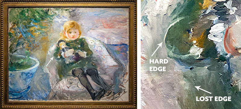
Controlling the edges of the shape with paint strokes is a way that the artist can create depth. Using hard edges makes the shape more defined. Using lost edges (a.k.a. Sfumato) allows depth to be created (see #578). Just as fog can add depth to a field of trees, softening lines and blending them in with the background has the same effect. We can see these take effect in the next painting. It’s almost like a fog surrounds the young girl in certain areas.
Mediums and Layers
When painting with oils it’s important to remember the “fat over lean” “or “thick over thin” principles. It can be confusing, but it all boils down to drying time. You want each layer to dry slower than the previous one, otherwise you risk cracks or ripples. I’ve painted a thick layer onto another thick layer, but when it dried I saw ripples. To remedy this I had to add more oil to the upper layer so it dried slower. I’ve also painted thin paint onto a thick layer and saw cracks as it dried.
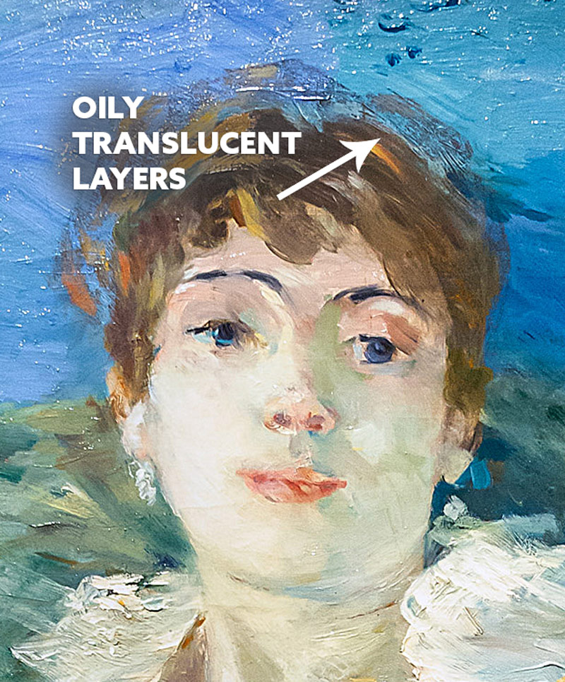
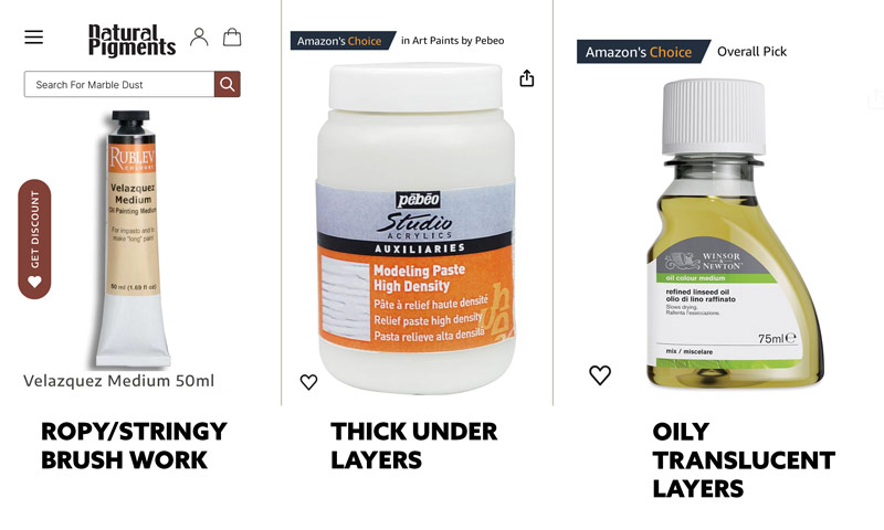
This is where mediums come into play. There are a ton of different ones that do slightly different things, but I’ll show the ones I use. This first one is linseed oil, which makes the paint “fatter” since oil dries slower. When oil is applied to the paint it can create this glazing effect we see here. It’ll be somewhat translucent depending on how much you use with the paint. In this case, Berthe uses it to add more depth to the woman’s hair. It doesn’t have crispy hard edges because she went back and subdued it with lost edges.
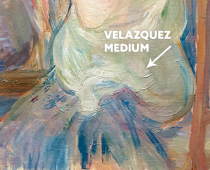
This Velazquez medium is new to me, but it was discovered by analyzing Berthe’s paintings. I went down a rabbit hole and discovered that this medium has a consistency like honey and can help create long strokes, or ropy/stringy brushwork. It could be a different medium combined with her oil paints, but Velazquez medium definitely fits the look.
The term impasto refers to the thickness of the layer. In some cases, artists will use modeling paste to create a texture, then paint over it. Is that what Berthe did here? It’s evident that some thicker paint is painted over with thin paint. In most cases this would create some cracking in the future as it dries, but modeling paste dries super fast. She could’ve laid down some modeling paste to create a texture, then used oil paint on top. Either way, it opens the door to new creative techniques! And don’t worry, I’ll show an example of these mediums further below.
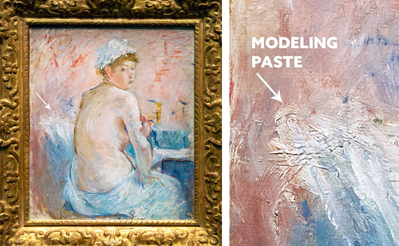
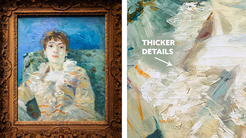
In some cases, Berthe will create impasto in areas with lots of details. Like this woman’s blouse. See how thick it is?
Here’s a visual of the different mediums and what I bought for my own art. All mediums can be found on Natural Pigments, but I found some cheaper versions on Amazon.
The Natural Pigments company looks like it’s run by two nice people who have really done the research on mediums and their specific effects. Here’s a quick video where they explain some of them.
Destruction Aesthetic
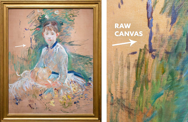
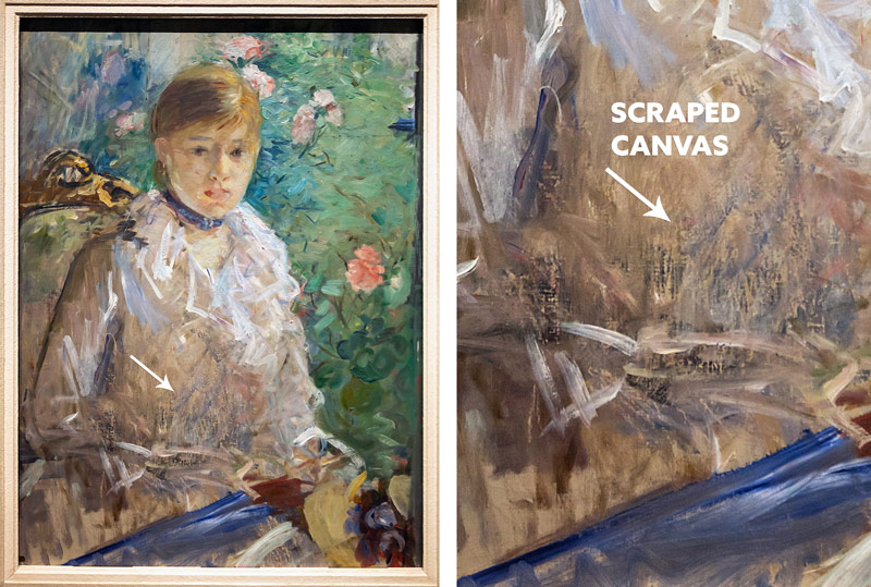
One of my favorite discoveries from digging deep into Berthe’s paintings was her destruction aesthetic. Most canvases come primed with gesso to make the surface white and easier to paint. Here we can see that she opted to paint on raw canvas which definitely alters the finished look. The paint is more absorbed into the raw canvas, so her painting looks rather thin. This is just the beginning though, she gets way more creative with her destruction aesthetic.
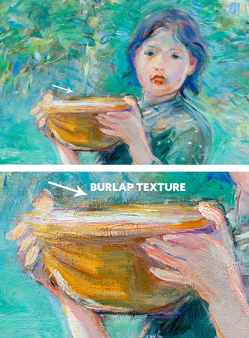
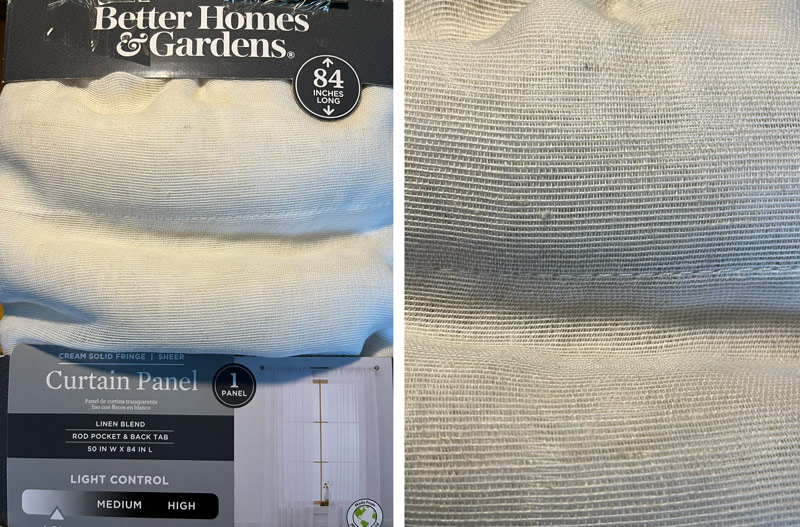
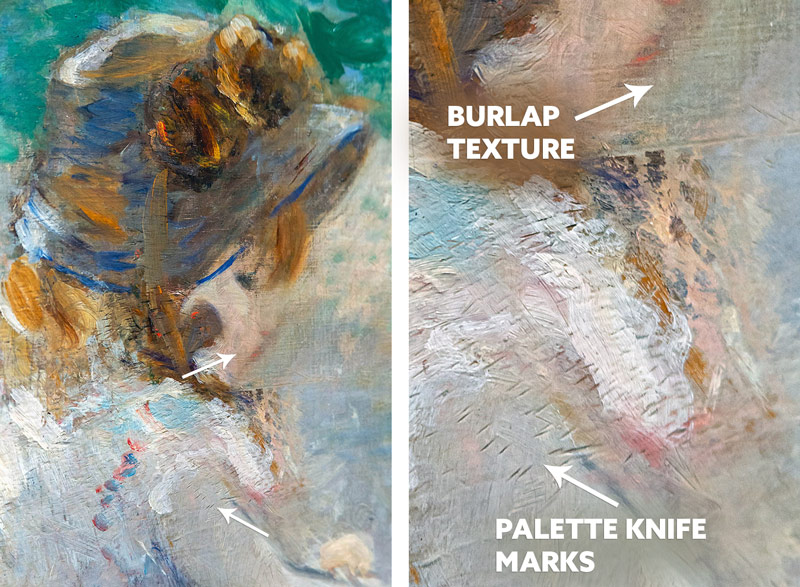
A favorite one of mine is the way she creates this texture over the paint strokes. How does she do it? I think it’s done with another piece of raw canvas or a piece of fabric. I bought burlap and it’s too “hairy” to use. It would leave fibers everywhere. So I went into the store and found some curtains in the clearance section that had a similar texture. This fabric could be used instead of buying raw canvas. Basically anything with the type of texture you want to imprint into the paint.
Berthe might lay a piece over wet paint, then let it dry a little, then remove it to show the texture. It would depend on how absorbent the fabric is that you use.Then you could paint over areas to make adjustments like Berthe does here.
I’m excited to experiment with this type of texture some more. Here’s a photo of the curtain fabric and texture.
 technique I noticed was the textures she created with the tip of her palette knife. She could’ve used a different tool, but a palette knife makes the most sense. We can see both unique textures in this next example.
Speaking of palette knives, she probably used it to create this scraped texture. Some artists even use sandpaper to create certain effects, but this definitely has noticeable scrape marks. So cool, expressive, and beautiful all at the same time!
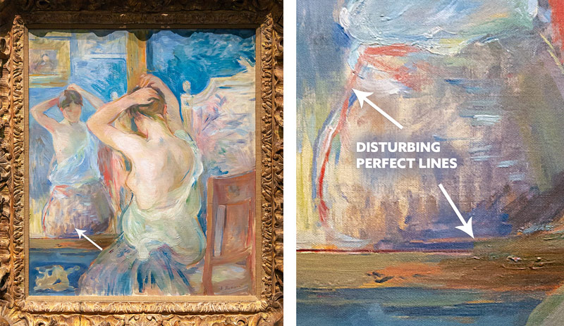
Another way Berthe adds expressive qualities to her paintings is by breaking up clean lines. This is similar, but different than lost edges. See how she painted the red line and thought to herself, “no, that looks to clean,” then takes a dry brush and swipes over it. Same with the line of the table. She throws a big streak of dark orange over all of those clean lines. Such a rebel!
Conclusion
Well, what do you think? Was Berthe Morisot a master or what? We all know that none of these painting techniques would work without first knowing the mere basics of composition. Berthe does it all and then some! She left us a great resource to inspire our own work with expressive qualities and unique textures.
I’ll leave a summary of her painting techniques below so you can screenshot it and maybe try it out on some of your paintings. Thanks again for joining in, I appreciate everything! See you in the next one!
Top Painting Techniques
1. Color Balance and Hierarchy
2. Colorful Contour Lines
3. Gray and Intensity color variation
4. Color variation in shadows
5. Brushstroke variation (long-skinny, short-thick)
6. Messy brushstrokes
7. Edges (soft, hard, lost)
8. Mediums and Impasto (Oils, Velazquez, Modeling Paste)
9. Raw Canvas
10. Burlap Texture
11. Palette Knife Marks
12. Scraped Canvas
13. Disturbing Perfect Lines