Complementary Colors – The Biggest Myth of All Time (Video)
#615
Hi everyone, thanks for joining in today! Huge thanks for the amazing and continued support!
We’ve got a massive article and video! We’ll be digging deep into complementary colors to find out the biggest myth of all time. Great for beginners or professionals. Color is tough to master, so all artists will benefit. You’ll learn how to control complementary colors and what to watch for as you create your art. This has been in the making for a while, so let’s not waste anymore time!
Video Complementary Colors Myth
Here’s the full video that goes through all the different way you can control complementary colors in your art. Check it out, share it, help your friends understand color theory like a master!
Complementary Colors What are
There’s one huge myth about complementary colors floating around out there that most artists fall for. It’s that they “always look good together.” Do they really? This is truly misleading for any beginner artists trying to make sense out of color theory, and it even catches professionals off guard.
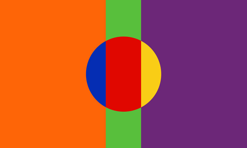
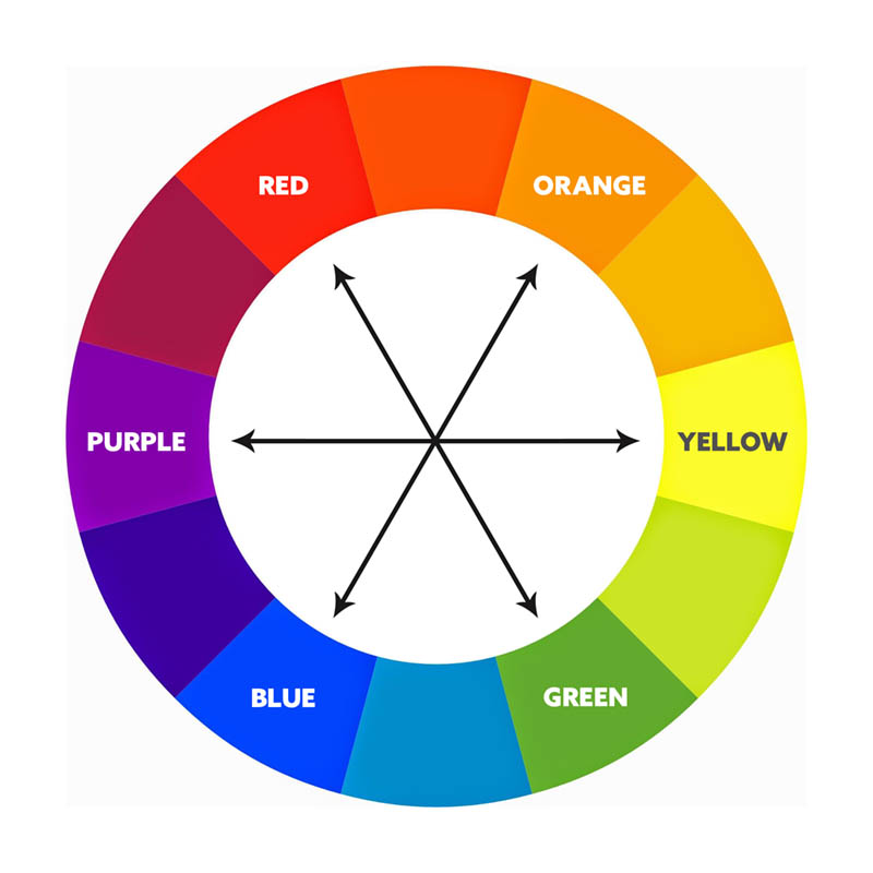
Complementary colors are opposite on the color wheel; red to green, purple to yellow, blue to orange, etc. This includes varying hues of color (i.e. red, pink, magenta, etc). They aren’t always needed, but if you plan to use them and they’re next to each other you need to know the essential information that follows.
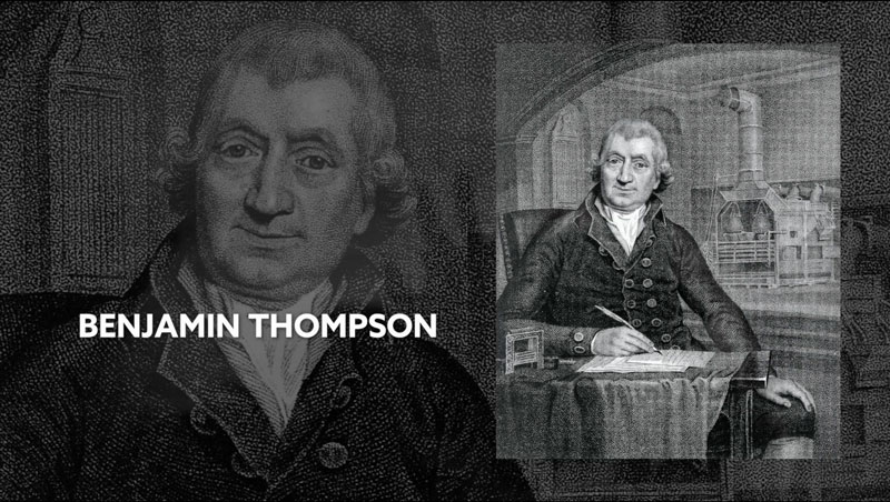
So, way back in 1793, there was an American-born British scientist Benjamin Thompson who coined the term complementary colors. They didn’t have Netflix back then, so he was messing around with candles for entertainment. He noticed the way the cast shadows had contrasting colors. This discovery led him to write, “to every color, without exception, whatever may be its hue or shade, or however it may be compounded, there is another in perfect harmony to it, which is its complement, and may be said to be its companion.”
Digging Deeper Complementary Colors
This leads us to our myth. Do they always look good together? Are they always in perfect harmony as Thompson stated? Well, if you’ve seen my other video about the Rule of Thirds myths (see #396), you’ll know that digging deeper is the only way to find the truth and more efficient ways to benefit your art.
In order to understand how complementary colors work together, let’s go back in time to the first time this myth was proven wrong to me.
It was back in 2010, when I was a measly old worker at a print and graphic center. I was designing a poster for a jewelry company, not an online store, an actual brick and mortar store with real people walking by. The owner wanted to catch the attention of shoppers searching for their next “string of bling.” I thought, “Oh he wants to grab attention, huh? I definitely have to use complementary colors!” After all, that’s what we were taught in graphic design school.
I used green letters with a magenta outline, but noticed something was weird. A sickening pulsating feeling happened when I tried to read the lettering. Can you see it too? They are complementary colors, which are always suppose to work, so why does it seem so harsh on the eyes? Needless to say, he brought the poster back and had me redo it because it was “hard to read.”

It even pulsates in this version. Not so complementary right?
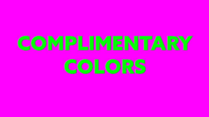
And we can do this with any complementary color to see that this horrible effect.
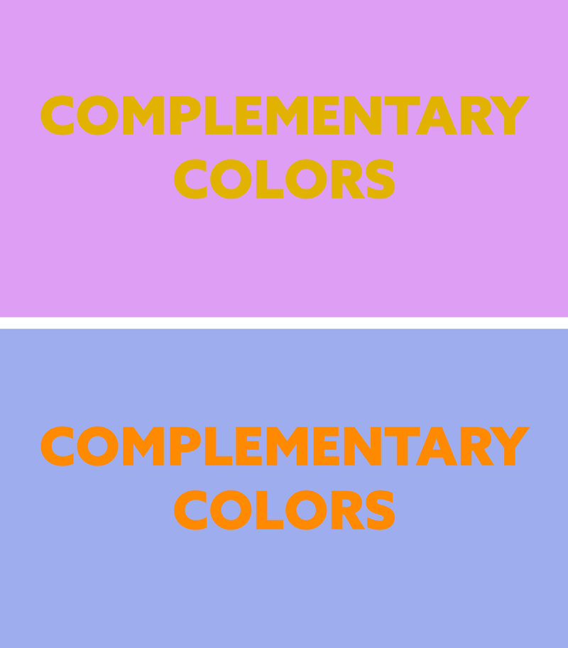
This pulsating effect is what we would refer to as “clashing” colors, and occurs when one intense or vibrant color is neighboring another intense complementary color. In fact, it happens in other variations that have less intensity.There are several ways to tame this effect and control complementary colors to our liking, so turn that frown upside-down.
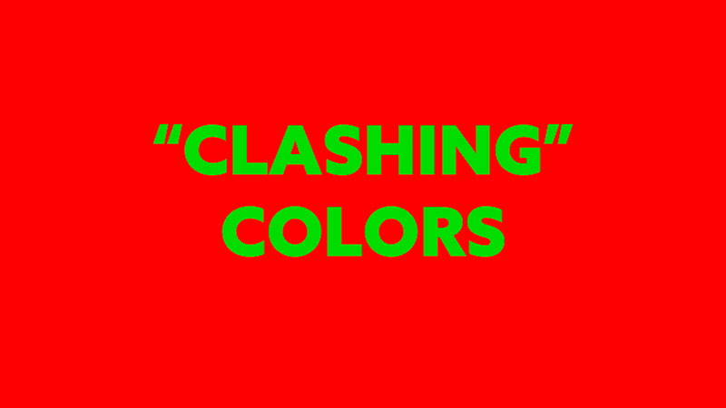
As with any lesson to be learned, we can always turn to the master painters for guidance, who learned their knowledge of color from nature. Claude Monet states that, “color makes its impact from contrasts rather than from its inherent qualities….the primary colors seem more brilliant when they are in contrast with their complementary colors.” This quote by Monet gives us clues to understanding, but doesn’t specify how to confidently control the complementary colors.
Simultaneous Contrast
To continue our journey into understanding, let’s look into a phenomenon called “simultaneous contrast.” It may sound intimidating because it has seven syllables, but I assure you we can simplify the concept.
In this example, we’ll see a light gray circle surrounded by dark gray background.
If we change the value of the dark gray background and make it lighter, the circle in the middle appears darker. We haven’t changed anything except the background, but our perception of the circle’s value has changed. That’s how simple simultaneous contrast is. Values will change depending on their neighboring value. There’s no need to make it more complicated than that.
This same concept applies to colors and it’s the key to controlling complementary colors.
That being said, in order to control complementary colors, we need to have a significant difference in the value of each color. Otherwise we risk them clashing or creating ugly colors. In most cases, we want harmony and beauty in our colors, not ugliness.
Ok, so you might be saying, “but Tavis, if the previous example with the words was black and white, it would have enough contrast. What gives?”
Well, if the complementary colors are next to each other and have the same intensity, we’ll typically always create this clash. To control it, all we have to do is further lighten or darken one of the colors.
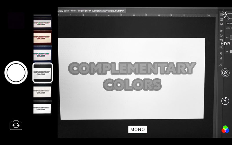
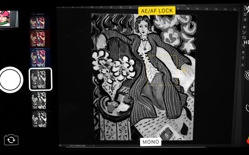
If we take this example of “complementary colors” and convert it to black and white, we’ll see the values. A great way to do this is with the camera on your phone and using the black and white (mono) filter. If you try to use Photoshop you’ll get unreliable results. In this case, when the black and white filter in Photoshop is used it makes the lettering darker, but we can clearly see that it is lighter than the magenta. Artists can even squint to help see the values, but our phone camera and mono filter removes any doubts.
So you’ll see that we have enough contrast between the lettering, but the clashing colors are still there. Let’s reveal the problem. We’re in Photoshop and using a phone camera to see the values. We can change the green to be lighter to help with the clashing, but we see that there is very little change in value. This is why it’s important to judge the intensity and value of each color, then adjust things from there.
In the next example, we can see how lightening the letters helps create more harmonious colors.
That was the seemingly tough part, so in summary, we can control complementary colors by adjusting the intensity and/or value of each. That’s it.
Now let’s see this work with oil paints, then continue with more photos and master paintings.
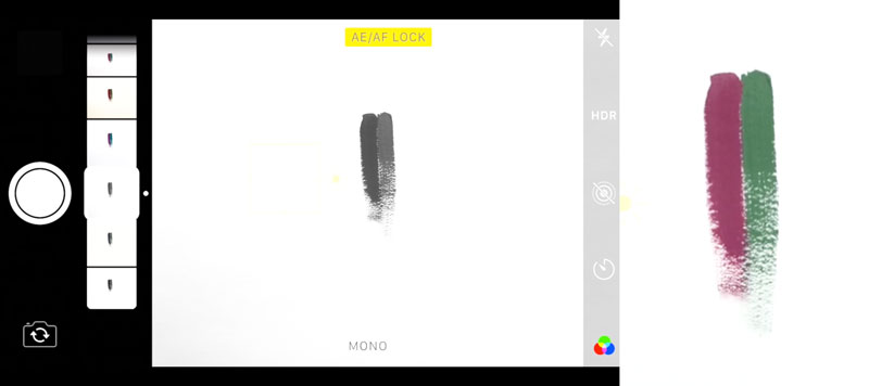
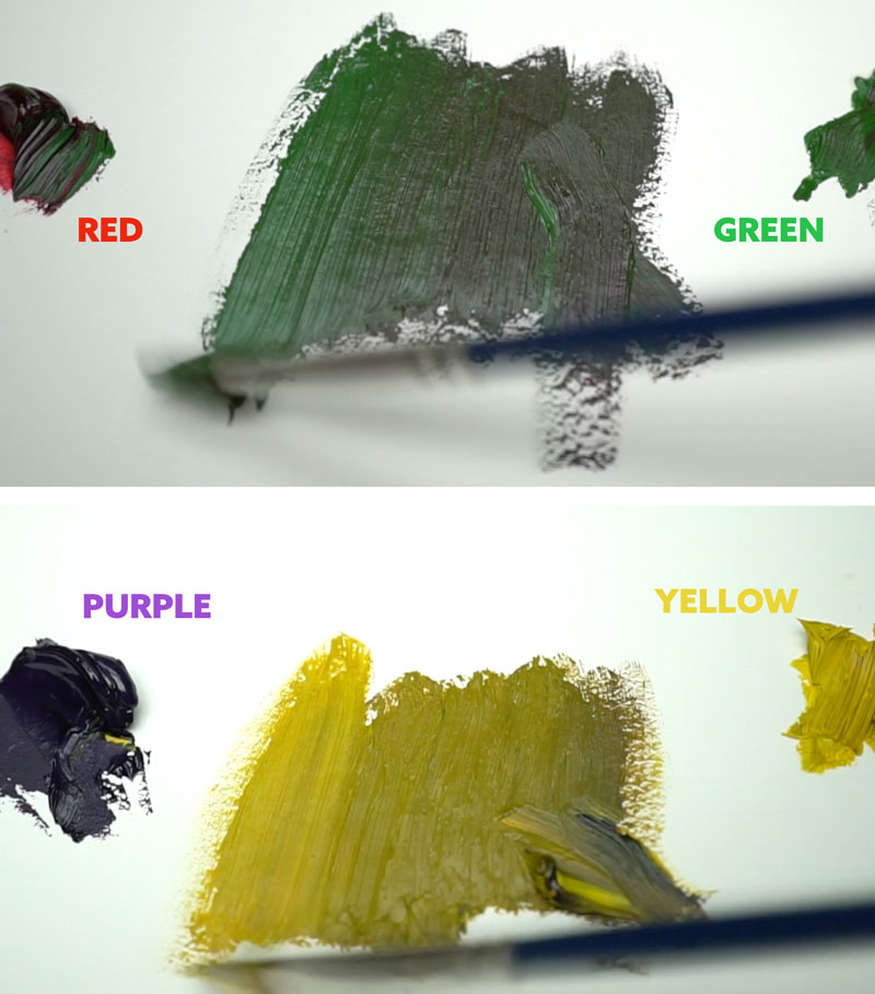
In this black and white video we see two brushstrokes, but they have a similar value. This means low contrast. When the color’s revealed we see red and green and they’re clashing, even though it’s not as intense.
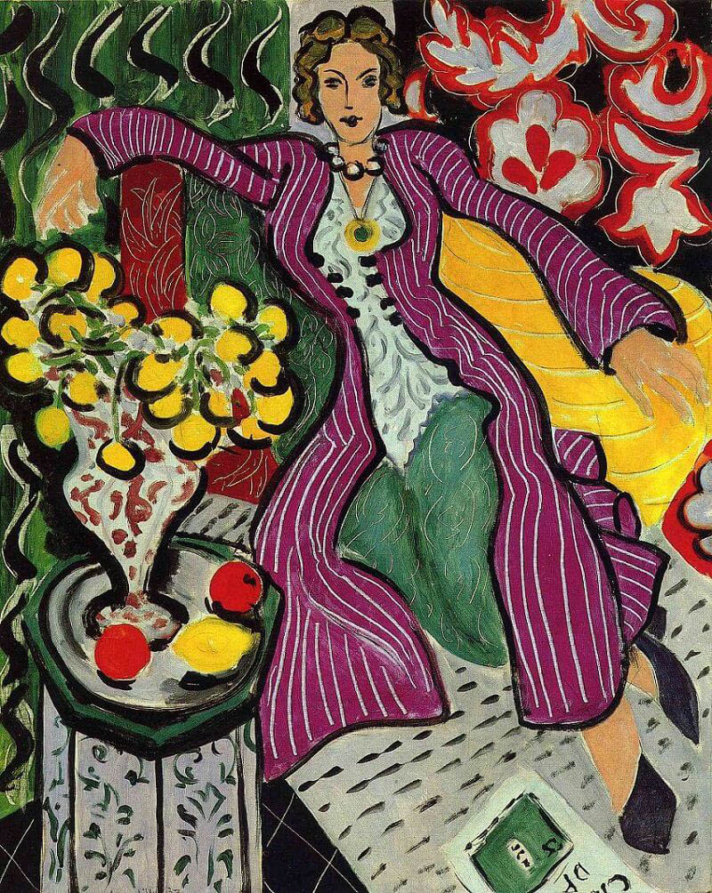
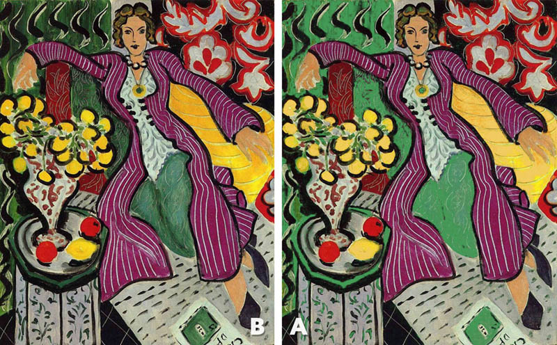
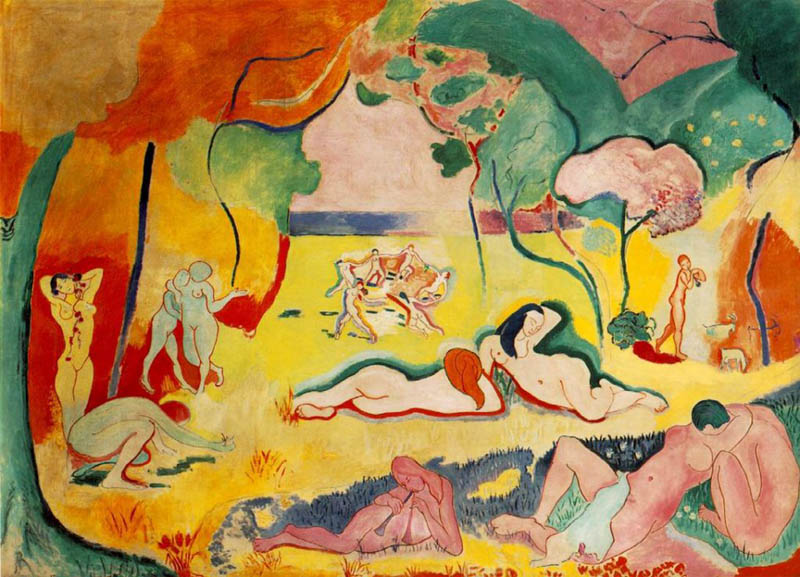
If we take this painting by Matisse with complementary colors yellowish-orange and purple, green and red, we can see that there’s something not right about it. Matisse loved to experiment with colors, but sometimes experimentations produce results that could be developed a bit further. We can see that the colors aren’t as harmonizing or beautiful as they could be. So how can it be improved?
Take your phone camera, put on the black and white filter and see if you notice anything. Can you see how the yellowish-orange is lighter to contrast with the dark purple? Yet, a purer yellow would be more complementary. Don’t you think? Also the purple, green, and red all blend together in the same dark value range.
Using Neutrals
So, another way we can try to tame our complementary colors and keep them from clashing is by using a neutral to separate them. This includes black, white, gray, and even brown colors.
In this photo, I had the model wrapped in a red fabric with green ferns around the frame. The complementary colors would clash if next to each other, but they were separated by a neutral which helped them work well together.
This is what the colors look like in a simple comparison with and without the neutral.
Here’s another photo where we started a fire in the foreground to create the orange colors, and the waterfall in the background added the complementary blue colors. They are also separated by a neutral. So the neutral helps them play nicely together.
When we look at Matisse’s painting again, we’ll see that he used a thick black line to separate the complementary colors of yellow from purple, and green from red, but the colors are still not as beautiful as they could be. This is partly because the black border is dark in value just like the purple, green and red. So you might be asking what else can be adjusted?
If we take what we’ve already learned, we know that we can lighten the green to add more contrast between the dark purple and red. We can also lighten the yellowish-orange to make it more yellow.
With these simple adjustments made, the contrast of the complementary colors is clearly defined. So what do you think? Don’t the colors seem to harmonize a little bit more?
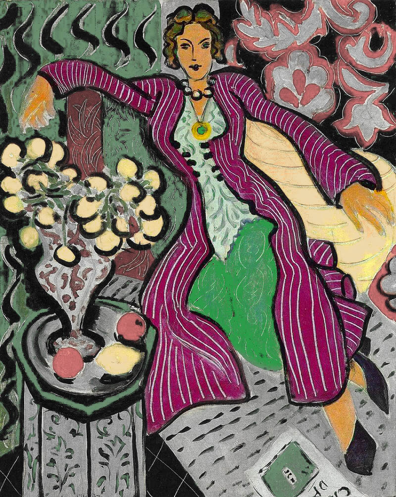
If we want to further control the way our complementary colors are seen and create more interest in an area, we can gray down the colors. If we do this everywhere except for where the main focal point is, it will pop the colors even more.
If you’re painting, a gray can be created by slowly mixing the complementary colors together. So if you want a grayish green, you’d add a bit of red. If you want to reduce the intensity of yellow, you’d add a touch of purple (blue and red).
If we have some fun in Photoshop with Matisse’s painting again, we can add gray to the colors surrounding the woman to direct more attention to her. The adjustments you make depend on the story and mood you’re trying to create. I think the more colorful version is exactly the story Matisse was wanting to tell, but absorb this knowledge and use it when needed.
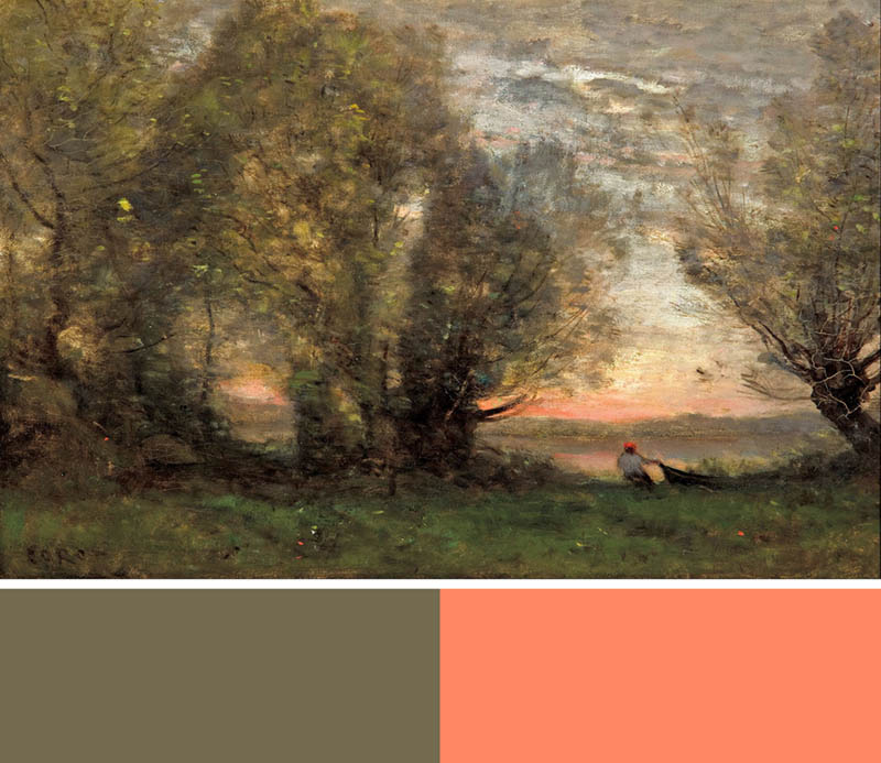
Here’s a nice landscape painting by Corot where he used a grayish-green in the leaves of the trees to make the red sky more vibrant. The swatches show how the contrast makes the colors pop. This hierarchy of contrast and intensity helps us avoid clashing colors.
More Master Paintings
Now that you know how to control complementary colors, let’s take a look at some more master paintings to allow it to sink in even further.
Van Gogh was absolutely known for his colorful paintings, so let’s dig into him a bit.
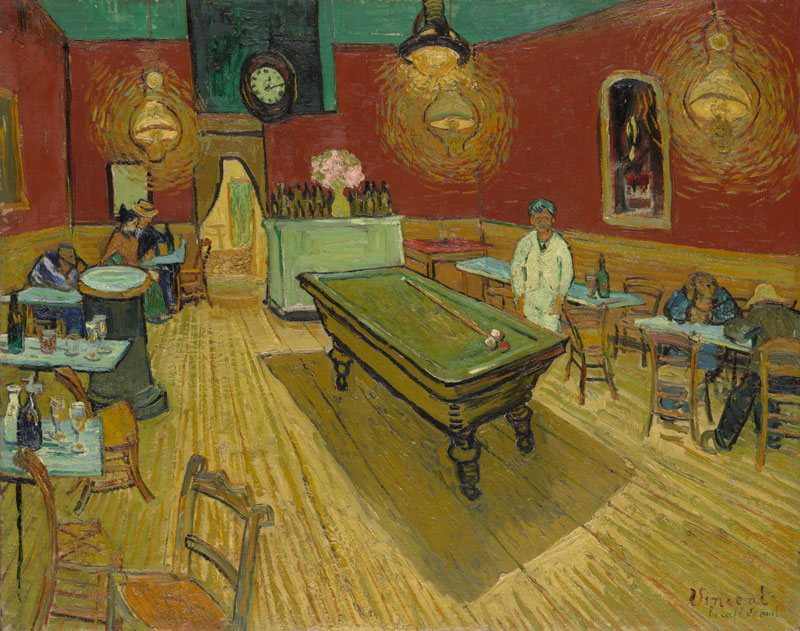
When Van Gogh was describing his painting, The Night Café, to his brother Theo in 1888, he wrote: “I sought to express with red and green the terrible human passions. The hall is blood red and pale yellow, with a green billiard table in the center, and four lamps of lemon yellow, with rays of orange and green. Everywhere it is a battle and antithesis of the most different reds and greens.”
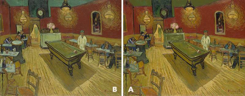
Here’s Van Gogh’s original painting. Notice how the background cabinet holding the bottles of liquor is painted with a light green next to a dark red. The Green on the ceiling is also lighter than the red.
If you take your phone camera out and use the mono filter, you’ll see that the values are like a perfect Ansel Adams photo. Hmmm, seems as though Van Gogh new exactly how to control the complementary colors.
If the light green areas were adjusted to be a darker green like the pool table, it would definitely not work as well (see right).
Van Gogh also wrote to Theo, “searching for oppositions of blue with orange, of red with green, of yellow with purple, searching for broken colors and neutral colors to harmonize the brutality of extremes, trying to make the colors intense, and not a harmony of greys.”
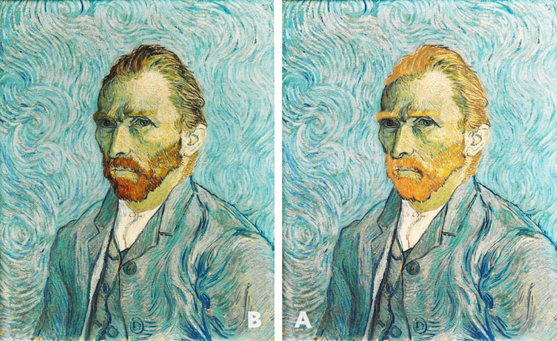
In this selfie by Van Gogh, we can see that he used a darker orange for his beard and hair, so they’d contrast nicely against the light blue background.
If he painted the beard to be as light as the background, we wouldn’t have the desirable contrast needed for complementary colors (see right).
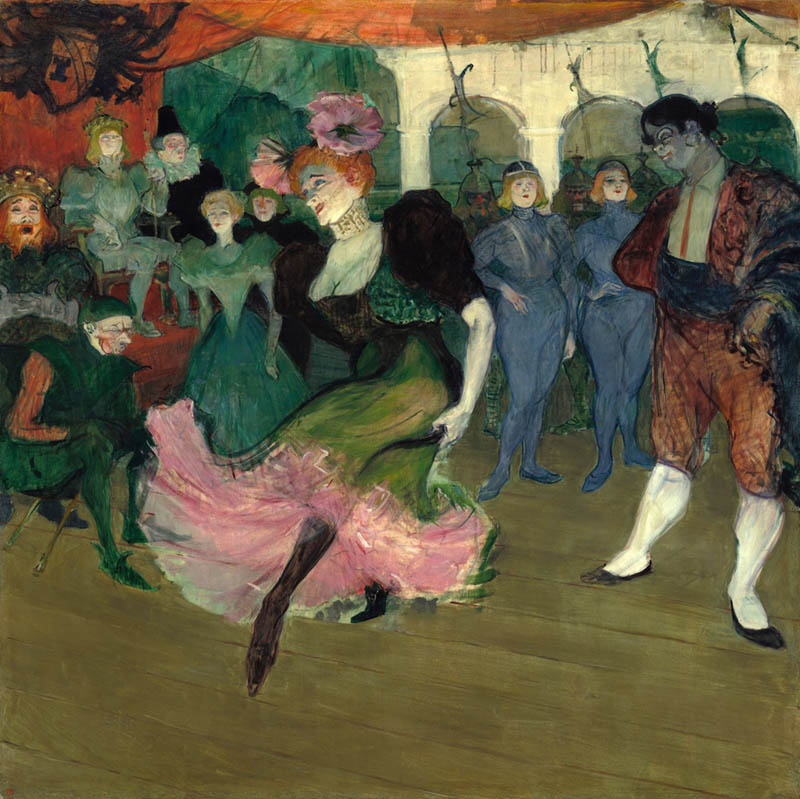
Here’s Toulouse Lautrec using a light pink dress and surrounding the woman with dark greens. The dark reds and greens in the background are equal in value and subdued, which we’ll talk more about in a bit.
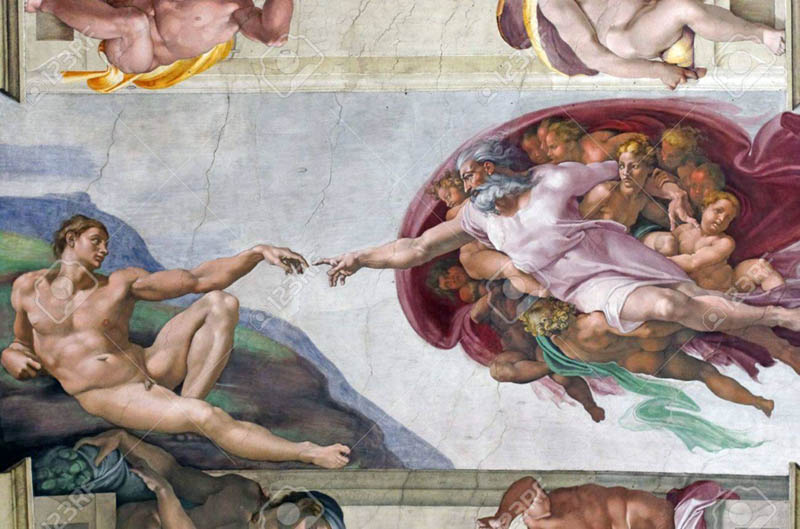
This famous painting by Michelangelo shows the same control of complementary colors. He uses a light green next to a dark red in the subject on the right.
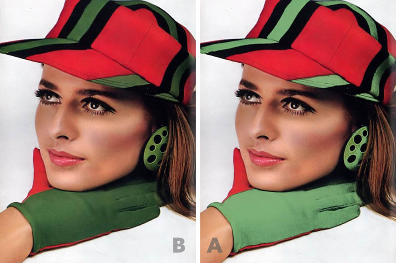
In this next photo by a creative fashion photographer named Hiro (Yasuhiro Wakabayashi), he’s using complementary colors. Yet, if we use our phone camera again to see the values, we’ll find that the red and green are very close to each other. Sure the red is very intense and there’s a neutral separating them, but it still doesn’t help create beautiful colors. So what can we do to make the colors more harmonious?
When we lighten the green, we see how the simultaneous contrast of the colors work in favor of the image. Don’t you agree?
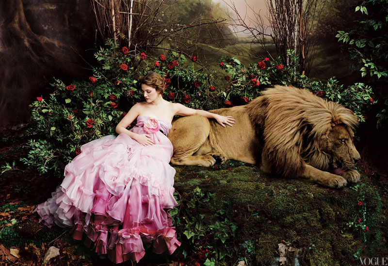
In this photo by Annie Leibovitz, we can see how well the light pink complements the dark green colors of the rose bush. The shadows also create the neutral in between the various greens around the roses.
What About Logos?
The same concept applies to logos too. This Burger King logo with complementary colors dark blue and light orange works well. They’re also separated by a neutral white, which tames them even more.
Here’s a Laker’s logo that has complementary colors light yellow with dark purple and surrounded by white on a dark purple background. The contrast between yellow and purple is also enough to allow us to easily read the letters on the basketball.
In this Applebee’s logo they use complementary colors that are close in value, which is typically not desirable, but they use neutrals to try and tame them. If we create more contrast by lightening the green, we can see how the bottom of the apple isn’t being lost in the dark green like it use to be (see right).
Here’s a Starbucks Christmas design that is improved by adjusting the value, just as we did with the Applebee’s logo. In the original, the dark red was the same value as the dark green, but when a lighter pink snowflake design is behind the logo, the logo pops. Since the only white of the new design remains in the logo, our attention is directed to it more, as opposed to the original with smaller white snowflakes stealing attention.
Time to Flex Your Skills
Now let’s test your knowledge so far. Think about adjustments that need to be made, and be sure to ask yourself plenty of questions. Are these complementary colors? Are they next to each other? Do I want these to be subdued or more prominant? Is the contrast correct between the colors to achieve your goal? If the complementary colors aren’t being separated with enough value contrast are they being tamed with a neutral? Did I use my phone camera to see the values better?
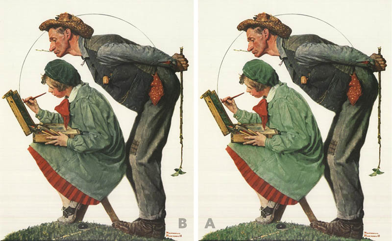
In this painting by Norman Rockwell, are the complementary colors of red and green in high enough contrast to create a visual pop, or are they low in contrast to remain subdued? If you use your phone camera or even squint, you’ll see that the contrast is very low. If these colors were more intense they would clash. The results all depend on the goal of the artist.
When the green of the woman’s outfit is adjusted to be lighter, we can see how it enhances the overall colors.
Sometimes though, the colors don’t need to be tamed and can clash on purpose, but this is usually not desired…unless you’re Matisse. In this wildly colorful painting, we can see that a lot of his reds and greens are similar in value, but he was the leading figure in the Fauvism movement; a movement where loud and vivid colors were welcome.
So these paintings with complementary colors of the same low value, as we also saw with the Toulouse Lautrec painting earlier, these can be used strategically in areas that don’t require a lot of visual interest. Background elements are usually subdued so they don’t distract us from the main subject.
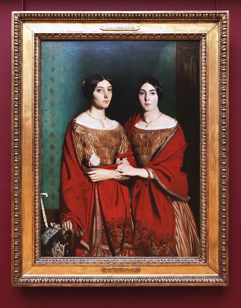
Let’s see this all come together in another great master painting by Theodore Chasseriau. Here we see on the left that there is a darker neutral between the light green background and the red. We also have a low value red next to a low value green on the middle shoulder. High contrast isn’t needed in this area, so the complementary colors are subdued. Squint hard or use your phone camera to see the values.
“Color is my daylong obsession, joy, and torment.” ~ Claude Monet
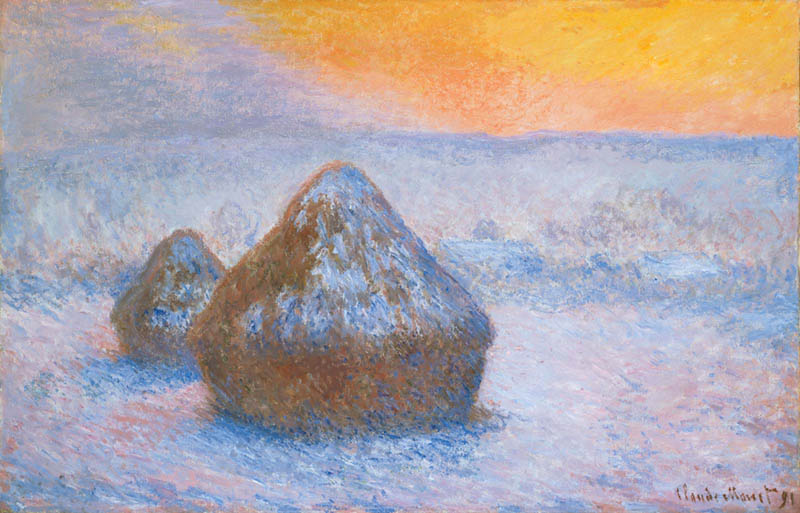
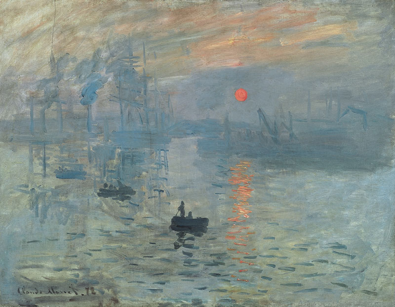
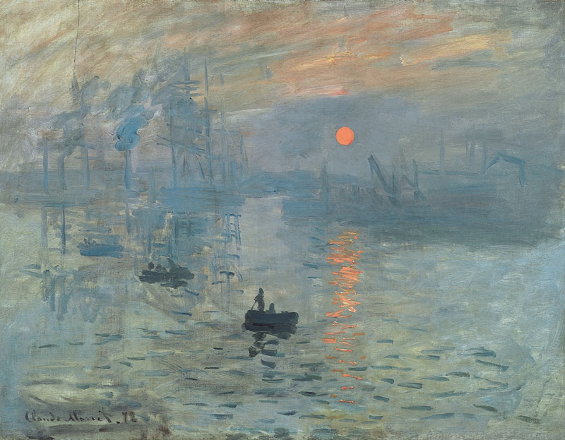
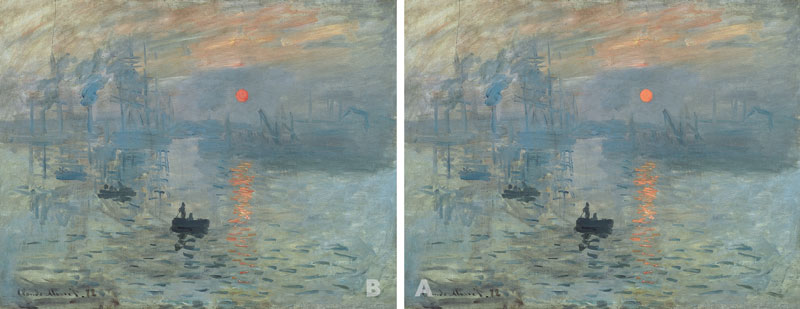
So in this painting by Monet, what adjustments should be made, if any? This is a great example of what you should do to benefit the overall purpose of the painting. If you use your phone camera to view the values, you’ll see that the orange sun almost disappears. This means the contrast is very low.
If we lighten the sun to increase the contrast it loses that pulsating feeling, which is good, but it also becomes the main subject and steals the show from the person in the boat. We kind of have a battle of contrasting elements and the main subject should be the ultimate winner. Is Monet trying to tell a story about the person in the boat, or the beautiful sunrise? This is how powerful contrast is and how it can help communicate your story. We’ll all have different opinions, but I’d assume that the story is about the sunrise and the people in the boat are appreciating it.
Here’s a comparison to see the subtle difference.
Looking Back at Your Work
So, what if you go back through some of your old paintings or photos and make subtle color adjustments to improve them? The possibilities are endless now that you have this knowledge at your fingertips.
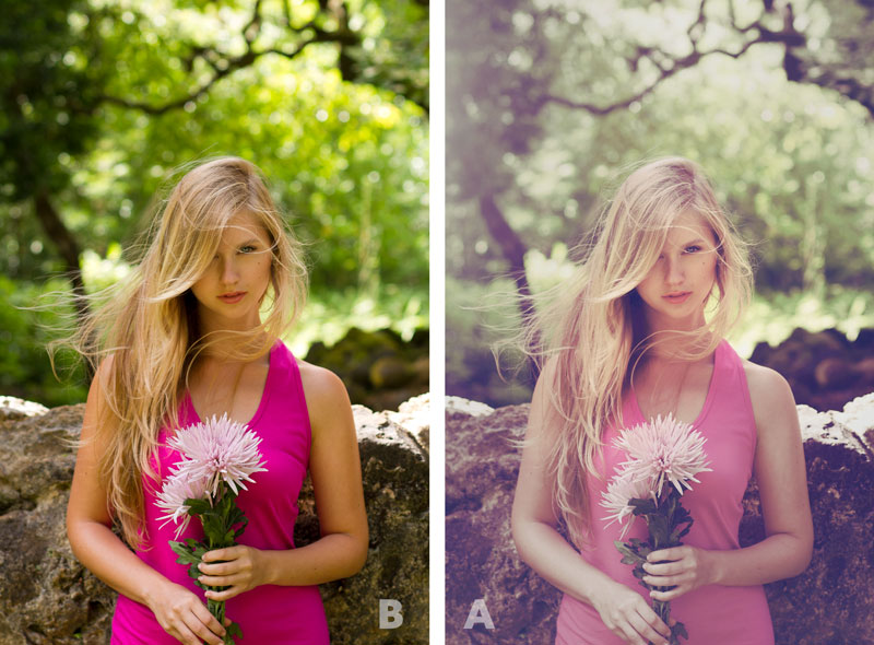
In this old photo from 2012, the magenta and dark greens were a little harsh. Some aesthetic adjustments were made in Photoshop to lighten the magenta so it would harmonize better with the greens. Also, some areas were grayed out with less vibrancy, while it was slightly increased near her face.
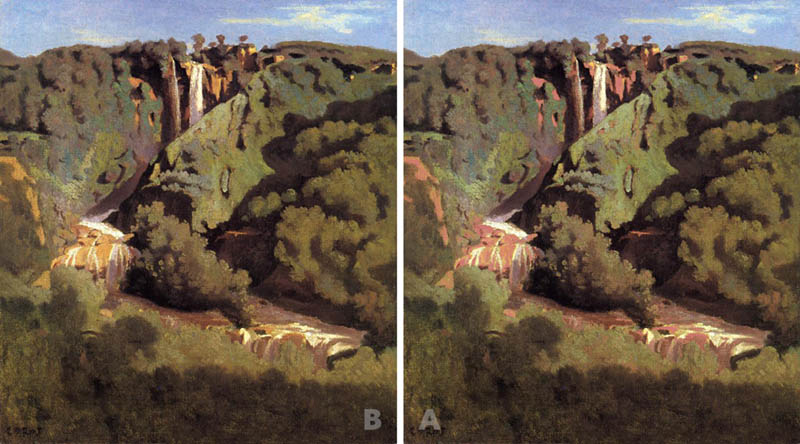
In this painting by Corot, we see that the landscape is primarily dark green and orange. If we make the orange a lighter reddish color and lighten some of the greens, we’ll get a subtly more colorful painting.
Conclusion
By now you should have a greater understanding of complementary colors and how they can be controlled to benefit your art. Heck, this knowledge might even help those that are colorblind because they can use their phone cameras and Photoshop to see the value and intensity. We now know that complementary colors don’t “always work together” as the myth goes, but we can certainly make it so. Just be sure to pay attention to the intensity, the contrast, and use neutral colors if you need to tame them further.
Thanks for joining in today, I appreciate all of the continued support! It means the world!

