Composition is More Important than Beautiful Light

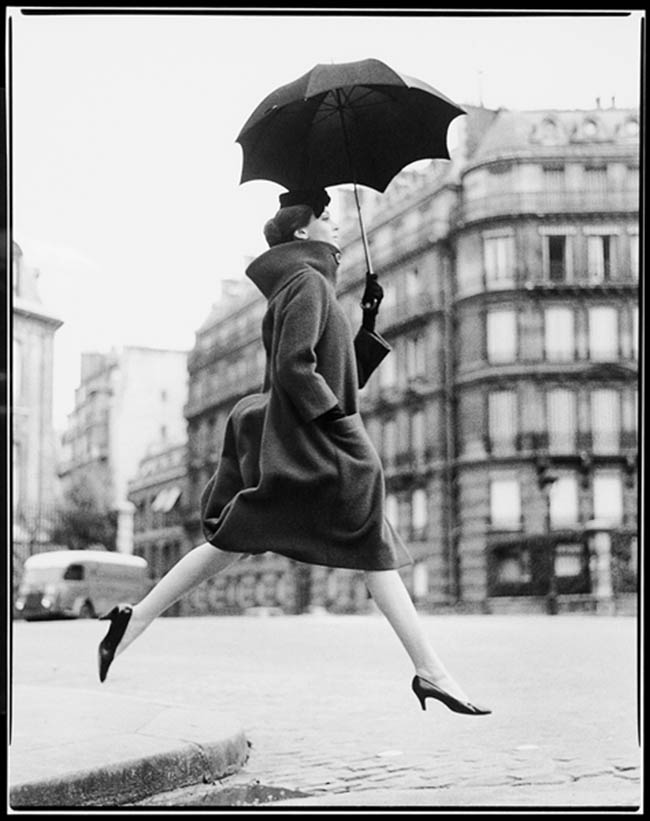
- Intro Photo: left is by Annie Leibovitz, right is by Dan Winters.
#488
Welcome back everyone, I hope you are all doing well! As always, thanks for the amazing support! :DToday we are going to be looking at something very interesting. Composition vs Lighting! There’s a well-known phrase in the photography community, “Lighting is everything,” but today I show you how composition is more important. Sure, we can’t create anything without light, but that doesn’t me our light has to be perfect or beautiful to get a stunning image. In fact, there are some amazing examples below that show how the worst light is transformed into a masterpiece. Let’s get into it!
Beautiful Lighting? What is
Whenever people think of beautiful light, they immediately think of sunrise or sunset. Does that mean, in order to be a great photographer you have to always shoot at these specific times? Not at all. The light you capture is only one elementof the whole image. Great lighting is also always complimented with nice shadows, so if they aren’t dancing harmoniously together, the lighting won’t be as pleasing.
Here are some examples of sunsets from a Google search. Nice lighting in most of them, but the compositions are only good in a couple of them. They tend to capture only one technique, nice lighting, instead of many. The more techniques you incorporate, the more masterful the image will be.
 Let’s compare this next image of the Taj Mahal with the one underneath it. They both have the same beautiful light, but the first one has a better overall composition. The excessive negative space in the second image makes it have less impact.
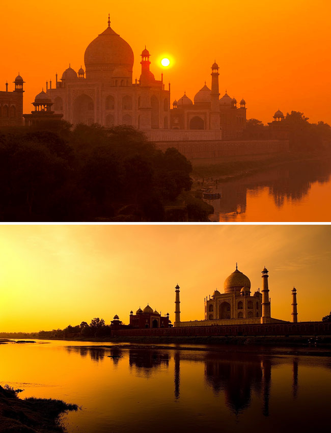
This next one has beautiful light, and a better composition than the previous examples. Can you tell the difference? We have nice lighting, better balance and symmetry (see Law of Symmetry), a sense of scale, aerial perspective (see Day 43), aspective view (see Day 78), and separated shapes (see #374). There’s a lot of negative space like the one above, but in this case it works to tell a story.
What is Considered Bad Lighting?
To define bad lighting is to say it is flat (minimal shadows), too harsh, or unflattering for the subject. Take an ordinary street lamp for instance. You wouldn’t think it could produce light worthy enough for a picture, but that isn’t the case. By positioning the model properly, and composing the image well, you can create something pretty nice.
The image below is an example of this scenario.
Rembrandt lighting was captured by using a street lamp and an iPhone flashlight. Composition was also considered to clearly define the subject. It’s not a perfect image, but perfection isn’t the point. What I’m trying to do is get you to think differently about what you consider to be “beautiful light.” Maximize what’s given to you by presenting it in a way that will compliment the overall composition.
Kinda like presenting a meal in a restaurant. If you’re serving a bologna sandwich, it will look more appetizing to the customer if it’s presented nicely, as opposed to having it slopped on the plate.

What is Considered a Great Composition?
That’s a great question! But it’s also a tough one. It depends on a lot of things, but the optimal goal is visual clarity. If the subject isn’t clearly defined within the scene, then the image will ultimately have a horrible composition. We can easily create visual clarity by using the design techniques of master painters.
After the visual clarity is taken care of, we can look at other things like story, dynamic symmetry, unity, movement, rhythm…things like that. If our subject isn’t clearly defined, then none of these things will matter.
Beautiful Lighting with Nice Composition
First, let’s take a look at photos with beautiful light and nice compositions, then we’ll get into some comparisons. These next few photos are pretty stunning, and I can’t think of anything else that would make them even better.
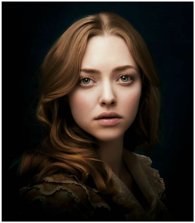
In this first one by Annie Leibovitz, we can see nice figure-ground relationship (see Day 21), the greatest area of contrast (see Day 27), arabesques (see Day 19), aerial perspective, balance (see Day 104), and complimentary colors (see #470).
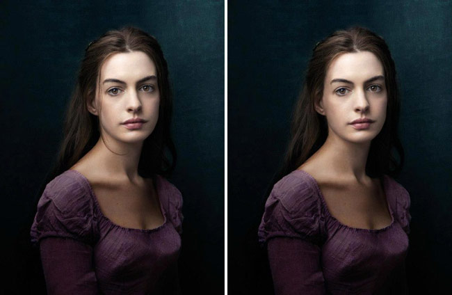
This next one is another one by Annie Leibovitz with the same qualities. Do you see how the little strand of hair creates an arabesque? It’s the smallest details that can really make an impact.
Take that piece of hair away (example on the right) and it loses a sense of elegance and movement.
 The soft light in this one is very beautiful. We have some of the same design techniques as the previous examples, in addition to repeating diagonals in her arm and the background.
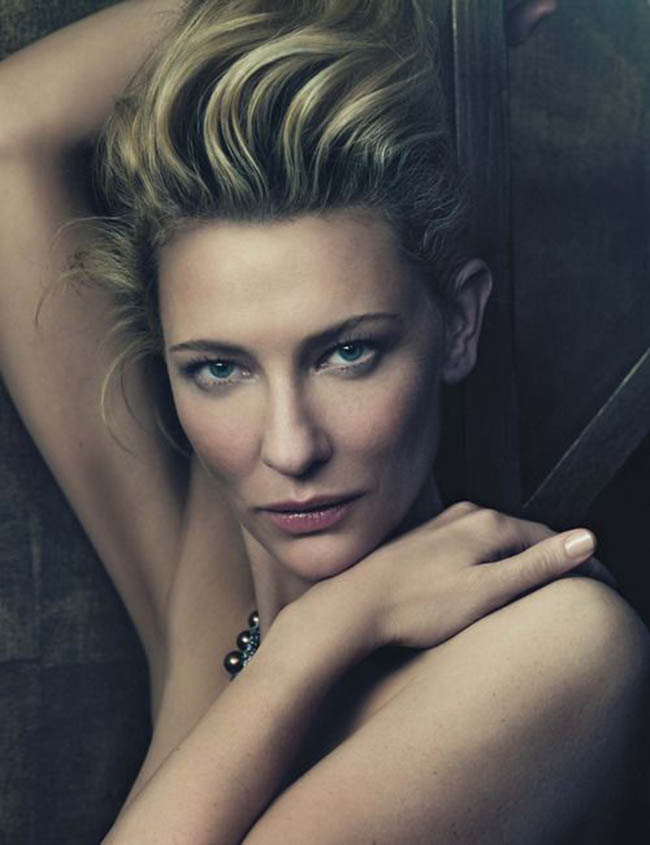
Comparisons of Light and Composition
OK, now let’s compare some different scenarios of lighting and composition. These next examples are by Richard Avedon. We have the same model, the same nice lighting, but only one composition is better.
On the left we see the subject is clearly defined with nice figure-ground relationship, and an aspective view. The same goes for the image on the right, but because three of her limbs are hanging off the edge, we have edge flicker (see Day 50). This causes a visual tension and distracts from the model.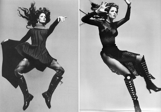
This next one by David Bellemere has nice lighting, but the composition could be slightly improved. If the woman on the left moved a bit more to the left, it would separate both figures and remove the coincidence, or “kissing” effect (see Day 48). The coincidence is where the cheek of the woman on the right lines up with the other woman’s back. There’s also a bit of edge flicker on the right side that could be subdued.
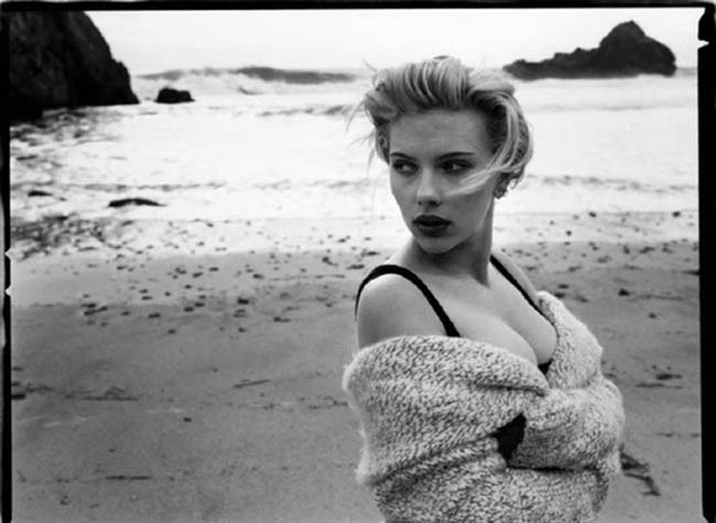
This next one, by Dan Winters, has interesting lighting, but the composition isn’t very exciting. It almost reminds me of someone that has scanned their face on a Xerox copier. With the light hitting the face only on the front, it flattens out the face. This is emphasized with the top of the head leading off of the top edge.
Now, compare this to the excellent composition and light from the first photo by Annie Leibovitz. You’ll see a drastic difference between good lighting, and beautiful lighting combined with composition.
This portrait by Annie Leibovitz also has a better composition than the one by Dan Winters. She’s created movement (see Day 15) and a sense of atmosphere in the image by making the hair blow.
We can also see repeating diagonals within the hair.
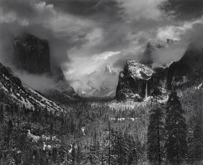
In these next examples by Ansel Adams, we have a similar scenario. Both have great lighting, but the composition is better in the one to follow.
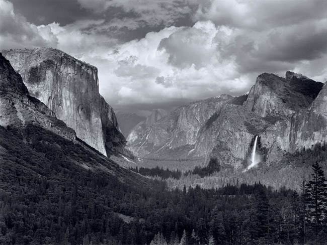
Don’t you think this next composition is much better than the one above? It’s way more mysterious, and the contrast on the landscape is much more dramatic. It reminds me of an epic establishing shot (see Day 267) from Game of Thrones!
Let’s see some more comparisons, shall we?
This next one is by Richard Avedon. The lighting isn’t anything special…it looks like a cloudy day. Cloudy days are nice to soften the light, but they have a tendency to eliminate shadows. Remember, the shadows need to dance harmoniously with the light. In this case, we don’t have many shadows, which means we have too much light.
The shape isn’t clearly defined because the figure-ground relationship isn’t as good as it could be. If the background were lighter, then we would have sufficient contrast for clear separation.
Squint your eyes, and you’ll see what I mean…her shape blends into the background.
Pro Tip: On cloud days, you can still get interesting light by reducing the shadows. Find a way to block some of the light by placing the subject next to a dark wall, or near an over hang where some of the light is blocked.
This one by Elliot Erwitt (Magnum photographer) has similar lighting, but he’s incorporated more shadows and created a better figure-ground relationship.
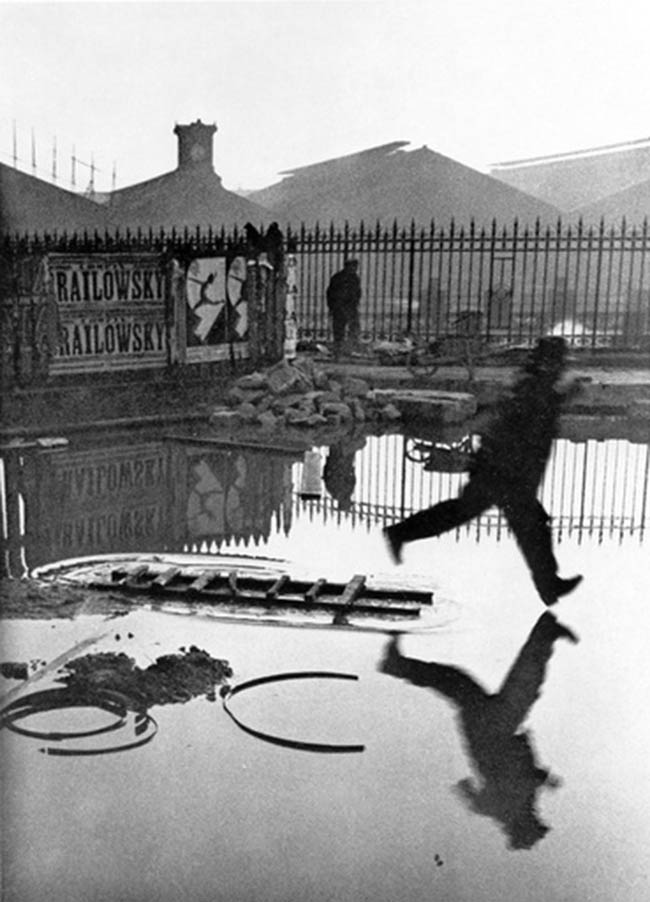
This one by Henri Cartier-Bresson has pretty poor, overcast lighting as well, but the composition is outstanding.
Here’s another one by Henri Cartier-Bresson, but now we have bad lighting and bad composition. The subject is the famous writer Truman Copote, but the lighting is not flattering (look at the shadows of the face), and the background is really distracting.

Here we have similar light being captured by Cartier-Bresson, but the composition is nice. We see an echo of shapes (see Day 90) with the woman’s hand, the babies ribs, and the wheel in the background.

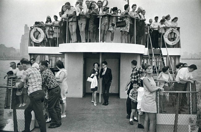
This one is by Garry Winogrand, where we have an overcast day, but a great composition.
This Yves Saint Laurent advertisement has pretty bad lighting, which messes with the potentially great composition.
We can see the repeating diagonals in the poses (see Day 39), but the lighting isn’t allowing us to read the shape on the right side of the image.

Here’s a quick edit in Photoshop to show you how a bit more light on the right side could help define the form and create a better composition.
Cool right!?

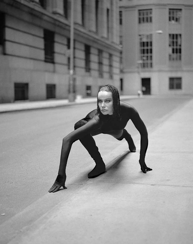
This photo by Irving Penn has pretty unflattering light, but it’s a cool composition. We see an aspective view in the pose, and nice FGR.
Are you starting to see how powerful composition techniques can be?
 This photo by Horst P. Horst has pretty bad lighting (there’s too much), but an interesting composition.
I love this one by George Hoyningen-Huene where he has pretty harsh light, but creates a surreal shape with the swimmers.
Do you see the face he’s creating by using the Law of Pregnanz (see Day 55)? The heads are eyes, and the legs are big puffy lips.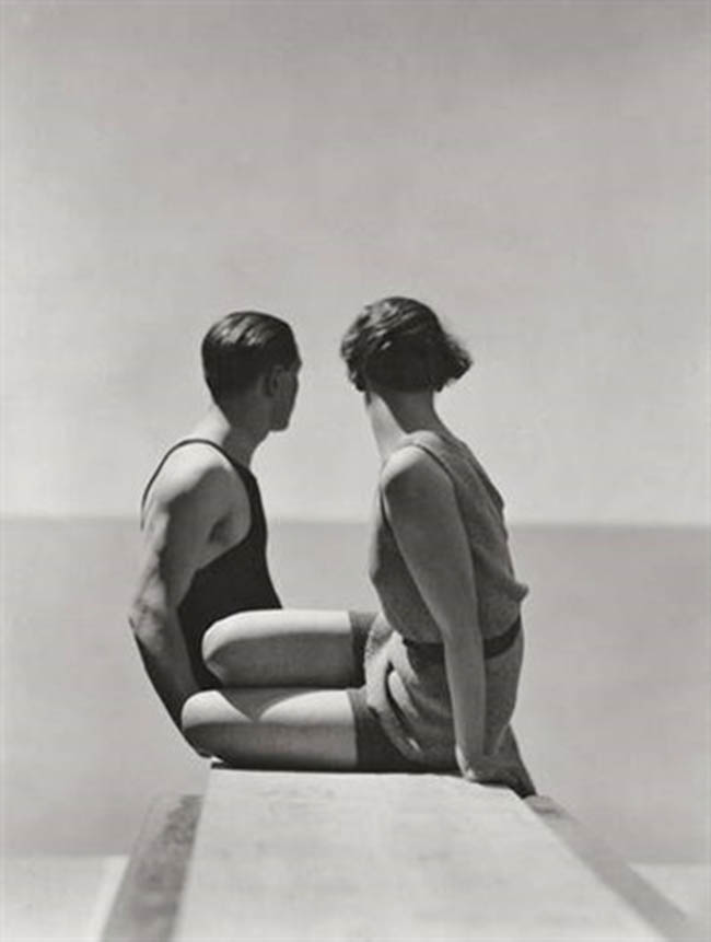
These next three images by Annie Leibovitz have pretty rubbish lighting, but the compositions help define the subject.
 If it weren’t for the aspective views in this next image, it would fail to clearly define the subjects. The dog on the bottom is already lost, along with the lower part of the models. Squint to see this.
Perhaps this is a bad replica of the image?
This one by Annie has really bad light, and it’s a bad composition. No one is perfect, but we can always learn from mistakes…even if they aren’t ours.
 This photo by David Bellemere has bad lighting and composition as well. We have a hot spot on her forehead, and her chest. A stick coming out of her head, bad FGR, and no aspective view. But like I said, let’s learn from these common mistakes 😉
Conclusion
Wow, that was a lot! Hopefully you’re starting to think of light in a different way. The best light in the world is nothing without a nice composition. The worst light in the world can be presented in a way to optimize the potential of a nice image. Composition and design is everything, so be sure to incorporate it whenever you get a chance.
Thanks so much for being a Master Pass member, see you next time!