Composition Matters in Still Life
#761
Hey everyone, welcome back to another extremely important article!
Today we’re going to see some great still life comparisons to see why we absolutely need to try our best to understand and apply composition. When this article is finished you will clearly see why. Let’s get into it!
The Masters Learning From
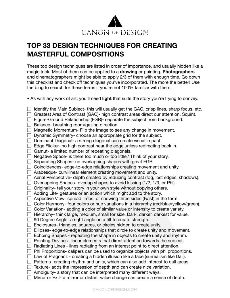
We’ve learned a ton of design techniques from master painters so far and most of them are conveniently organized in the Design Techniques Checklist. Here’s the list just in case you didn’t see it yet, but it’s also on the Resources page. There are tons of techniques we can use, but it’s usually the most basic ones that amateur artists overlook. Like balance, figure-ground relationship or edge flicker.
Aside from the checklist, you also have the Canon of Design Workbook (in Resources), which covers all the techniques and tests your skills with multiple choice questions. There’s tons of excellent examples from cinematography, painting, sculptures and photography, so be sure to check it out when you can. If you’re a Master Pass member on the site there is no great excuse for not using these techniques in your art. Even if you’re just taking baby steps, it’s better to apply them slowly than not at all.
Now let’s get into the stark comparisons!
Master vs Amateur Analyzed
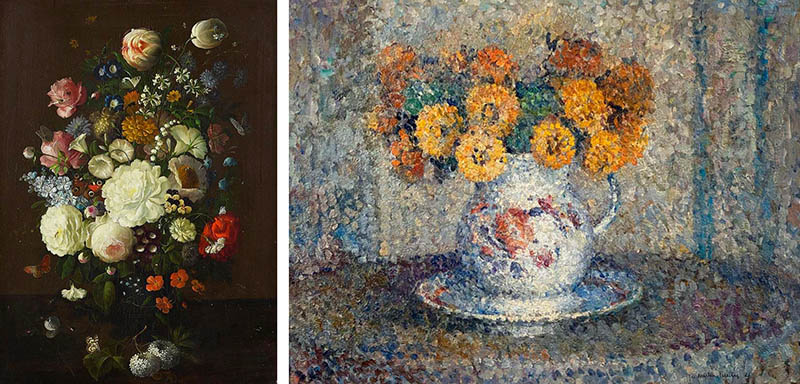
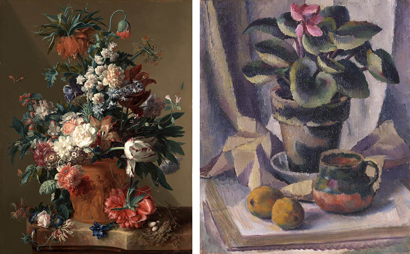
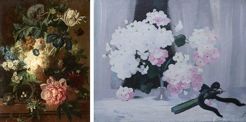
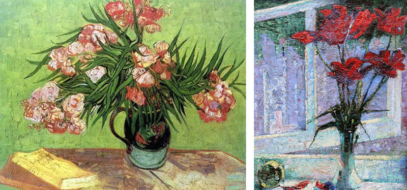
As you scroll through these various still life paintings you’ll notice the master painting on the left is far superior than the amateur painting on the right. Some of the amateur paintings have potential, but there are several opportunities where simple composition techniques could elevate the visual clarity, rhythm, strength, movement and unity.
This first comparison shows an excellent painting by Vincent Van Gogh next to an amateur painting with several composition problems. If we divide the painting by the vertical centerline, we can see that is right-heavy, messing with the balance. Having all of the interest on the right side also diminishes the movement (see magnetic momentum). The figure-ground relationship (FGR) (see Day 21) is really bad too. Squint your eyes and you’ll see that the red flowers on top are blending with the background because the contrast is lacking. We also have edge flicker (see Day 49) in the lower left corner creating a distraction. Overall, it’s riddled with errors that could’ve been avoided with basic knowledge of design techniques.
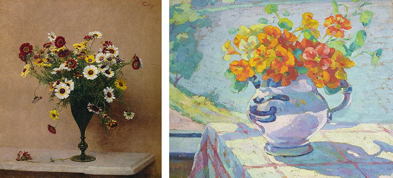
This master painting is by Fantin Latour, and you can see how clean the composition is. The visual clarity is top notch! The amateur painting on the right has some nice colors, but the contrast is in the wrong place. Squint and you’ll see that it’s in the lower-left again. What’s the deal?! You’ll also see how the shape of the vase is lost because the contrast isn’t controlled. The organization of the flowers is clumpy rather than elegant. They would benefit from using a few arabesques (see Day 17) to create better movement.
Jan Brueghel The Elder (see #725) painted this masterful bouquet full of yellows, blues and reds. The amateur painting looks smooshy, messy and it’s really hard to look at without getting a sick feeling in your stomach. It resembles four-day-old macaroni and cheese. Appetizing for some, but not those with a trained eye.
The greatest area of contrast (GAC) (see Day 27) is on the right side of the vase. Is this really where they want us to look first? You would think the flowers are more important. In addition, there’s absolutely no structure within the flowers or leaves. They should at least try to incorporate arabesques, ellipses, or 90 degree angles to add some movement and strength. Even abstract art can be designed with the composition techniques (see #757), but if you’ve never sought out this info you’re kind of hosed (for lack of a better word). That being said, be sure to share any of these articles with others if you think they could benefit from the composition techniques.
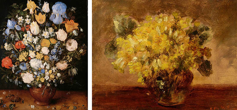
Are you starting to see the drastic comparisons? The difference is night and day! Most of the amateur paintings fall short with the most basic techniques like FGR, edge flicker, and the GAC. Controlling the contrast is absolutely paramount, otherwise the visual clarity is lost.
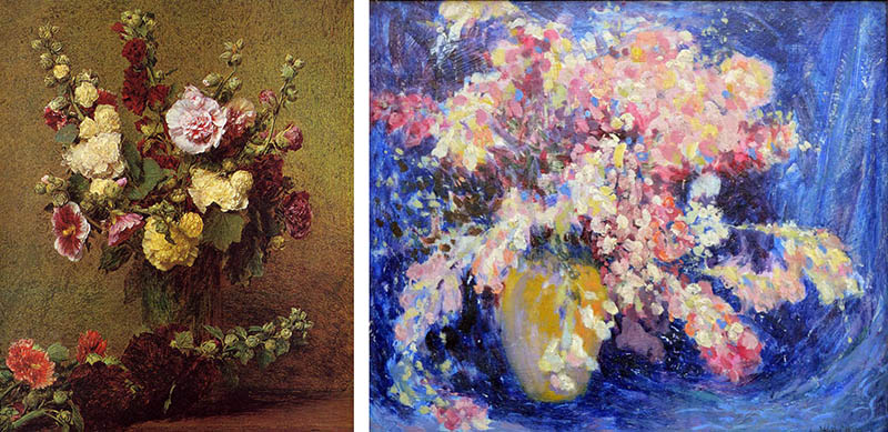
You can tell by just looking at this next amateur painting that the organization of shapes is haphazard. Even if the colors aren’t that appealing, and the brushwork isn’t as sexy as a Berthe Morisot painting (see #753), they could still create a better painting with simple design techniques.
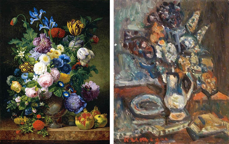
Look at these other comparisons for a minute or two and try to identify how the amateur painting could be improved. Did they control the contrast? Can you identify an arabesque? Is there edge flicker? These are all simple questions to ask and answer.
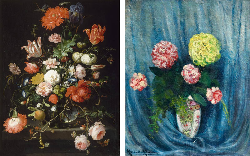
This one isn’t that bad, but it sure is boring. Don’t you think? There’s no movement, strength or hierarchy of contrast. The flowers are the main subject, but the background fabric gains just as much attention. The master painting has a playfulness within the stems and vines that help move the eyes around the composition.
Conclusion
Many artists know that composition is important, but they rarely search to compare amateur art to masters, then identify what could be improved. It’s all a learning process, and by now you should be seeing the massive difference between knowledge and “winging it.” One of the best things humans can invest in is knowledge. Drink it up whenever possible!
Thanks so much for the support, see you in the next one!

