Corot – Master of Design
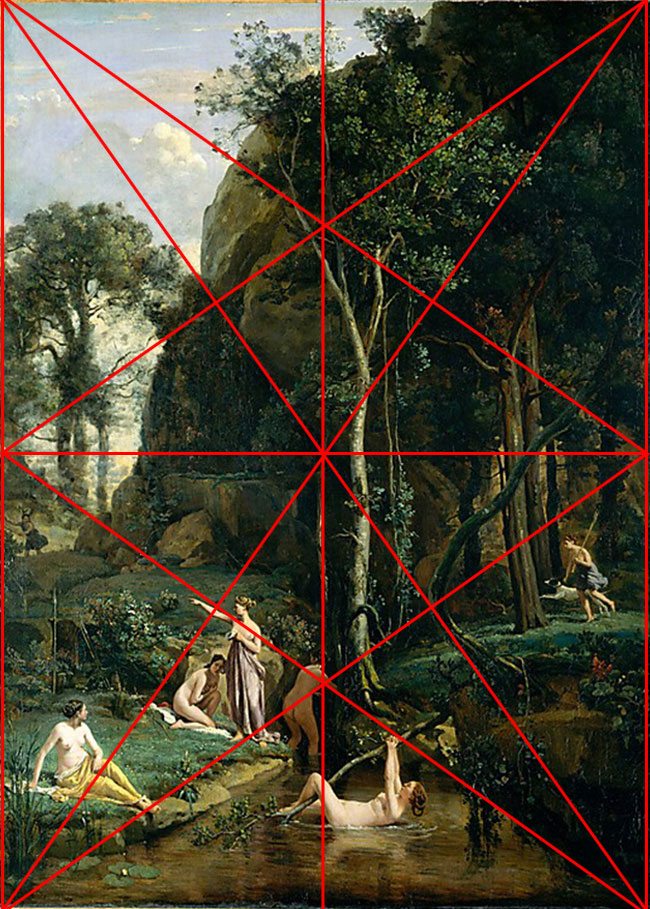
Jean-Babtiste Camille Corot (1796-1875) is considered the grandfather of landscape painting and inspired many of the master impressionists. His technique and use of value was superb, and the closer I analyzed his paintings, I learned that he was a master of design as well.
I have been studying painting and drawing techniques to incorporate into my photography through the excellent teachings of Myron Barnstone (if you’ve never heard of him, Google him, watch him, and learn as he shares the secrets of master painters, drawings, and artistic design. Aladine Vargas, and Adam Marelli, students of Myron, also helped in my understand of analyzing paintings). Upon his many lessons, he explains that most master painters incorporated repeating lines, arabesques (curvilinear element), and most importantly designed on a golden rectangle. There are only a handful of golden rectangles, PHI being my favorite, that incorporate the dynamic symmetry found all around us…to say the least. Myron also explains that it is necessary to adopt a mentor to study their technique and learn from them. Most of the apprentices would do this in their day to learn the techniques and secrets of the master draftsman, or painter. This is why I have adopted Corot as a mentor, and what has made me thrilled to analyze his work. I love landscape, and I love the female form, so why not!
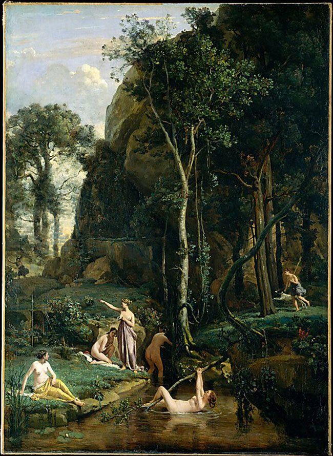
I chose this specific painting, “Diana surprised at her bath”, not only because the subject matter is so tantalizing, but because this was the first painting where I realized the power of the arabesque, and made me seek it out almost first and foremost during my initial setup of composition (the first being a dominant diagonal). After analyzing this painting I sat in awe at what I had discovered, so without further ado, let’s take a look at Corot’s masterpiece!
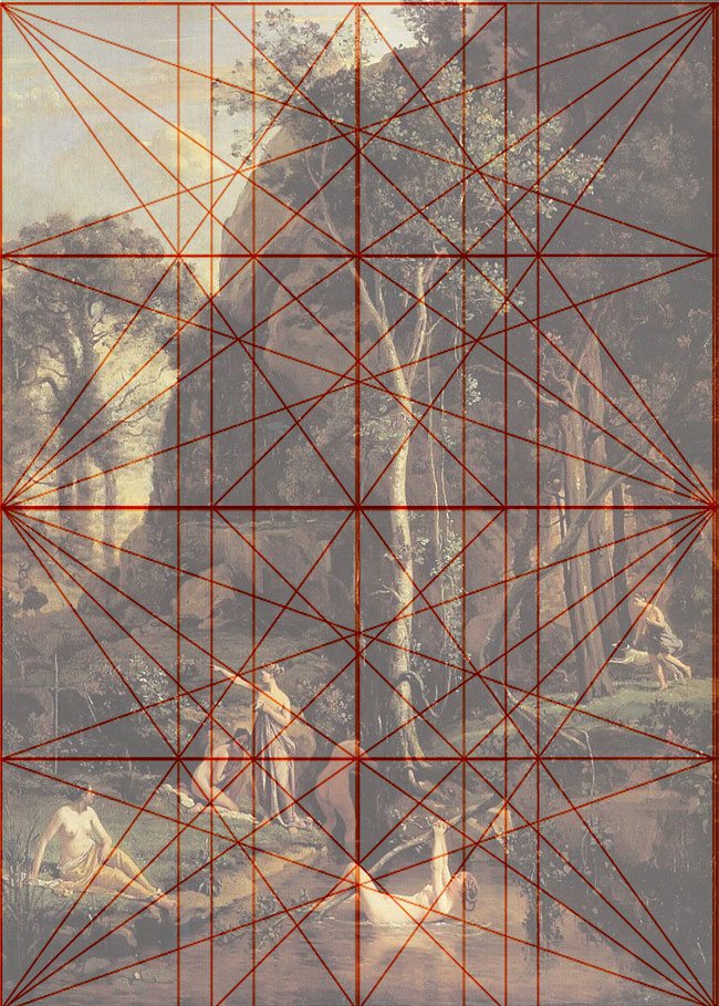
First, I had to consider the shape of the painting and try to figure out which golden rectangle Corot used (PHI, root 2, 3, 4, 5, root PHI) and I learned that it was a Root two rectangle (how to construct these rectangles can be found through Myron Barnstone’s teaching, or a book on Dynamic Symmetry by Jay Hambridge). Here is the Root two grid placed onto the painting. You can start to see how some of the major lines are locking into the grid.
The golden rectangle armature is constructed of two diagonals and four reciprocals, and the intersection at 90 degrees makes a powerful positioning for your subject. Can you tell which one is Diana, and do you see her being surprised? She is the one embarrassingly covering her naked body as her friend points to the on-comers. Corot knew exactly where to put his main subject!
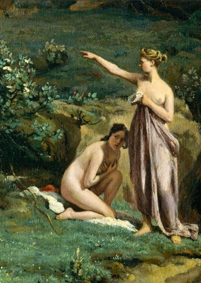
This is what the woman is pointing at…it looks like maybe their friend trying to play a game and scare them. She’s wearing fake antlers!
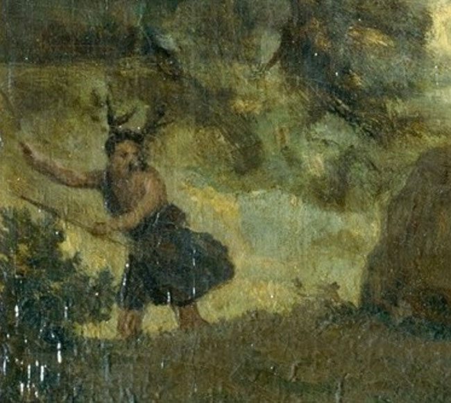
I wouldn’t mess around too much because with a closer look, these women are packing some heat! Look at their spears, bows and arrows!
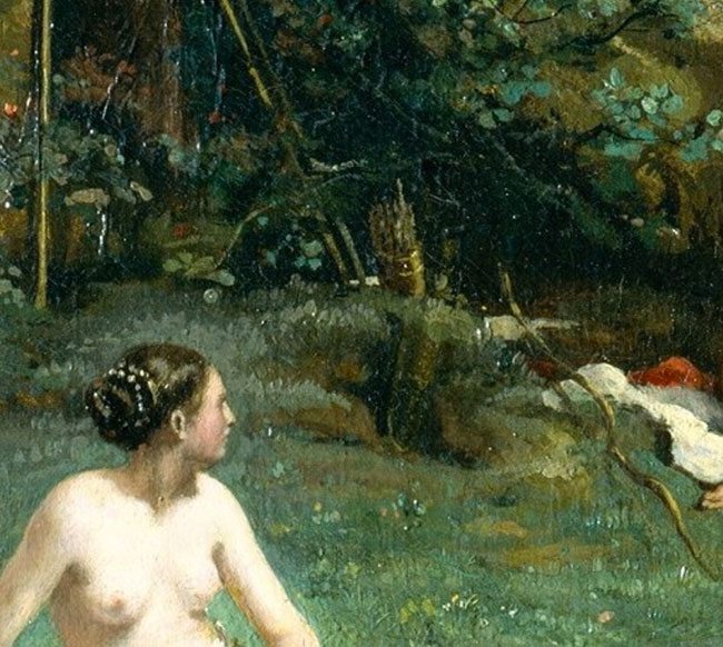
Well, those details are amazing to me, if you want to see more, click here and you can scan around the entire painting. Without getting too side tracked with his amazing painting, here is the root two with its basic armature:
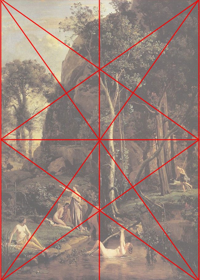
Here are two root two’s stacked one on top of the other:
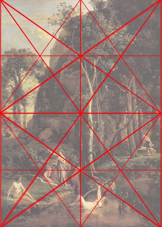
After placing the grid, I’m able to lay down two more Root twos, one on top of the other. Notice how all of the lines generate from the dominant diagonals of the rectangle.
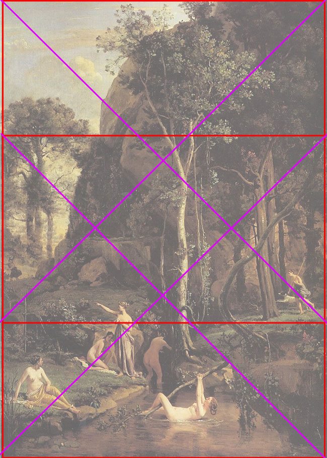
This rectangle also includes a rebated square, which is two overlapping squares with their diagonals (the square is the building block of all of these dynamic rectangles which makes it very powerful.) These two squares form an “X” shape from corner to corner with a diamond in the middle…this is called the “Saint Andrews Cross”.
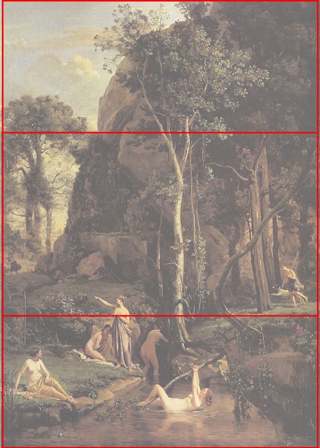
Here is the rebated square:
Here is the St Andrews Cross:
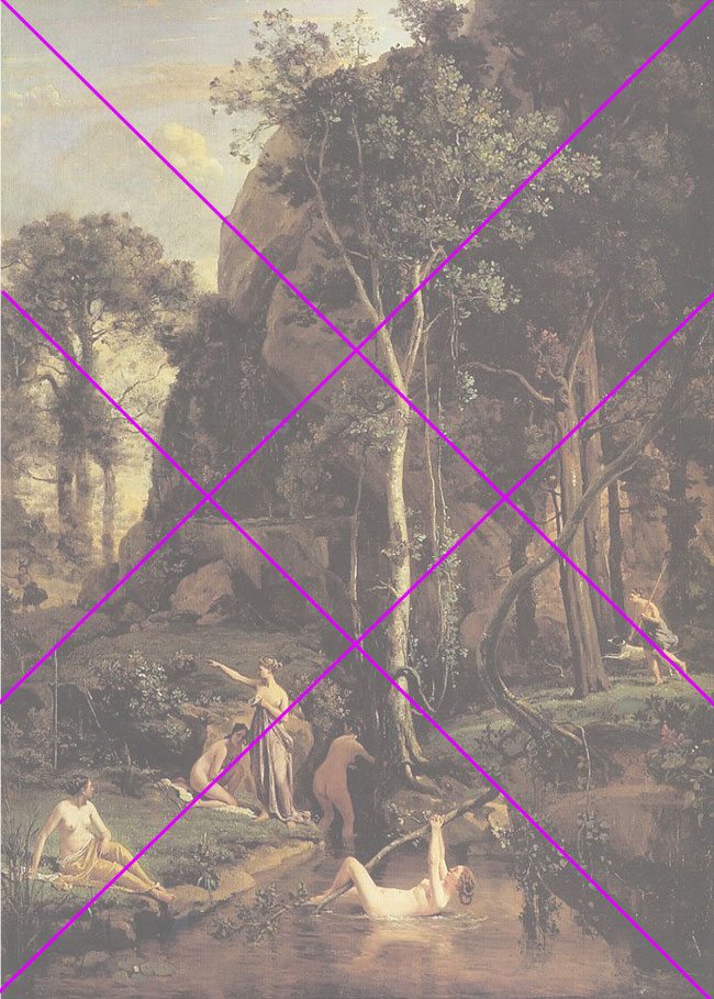
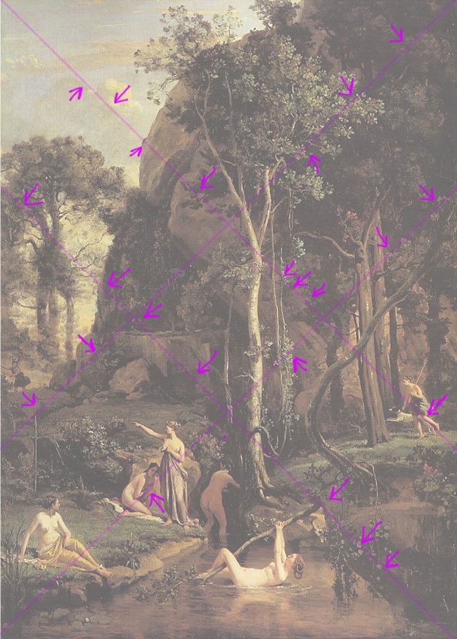
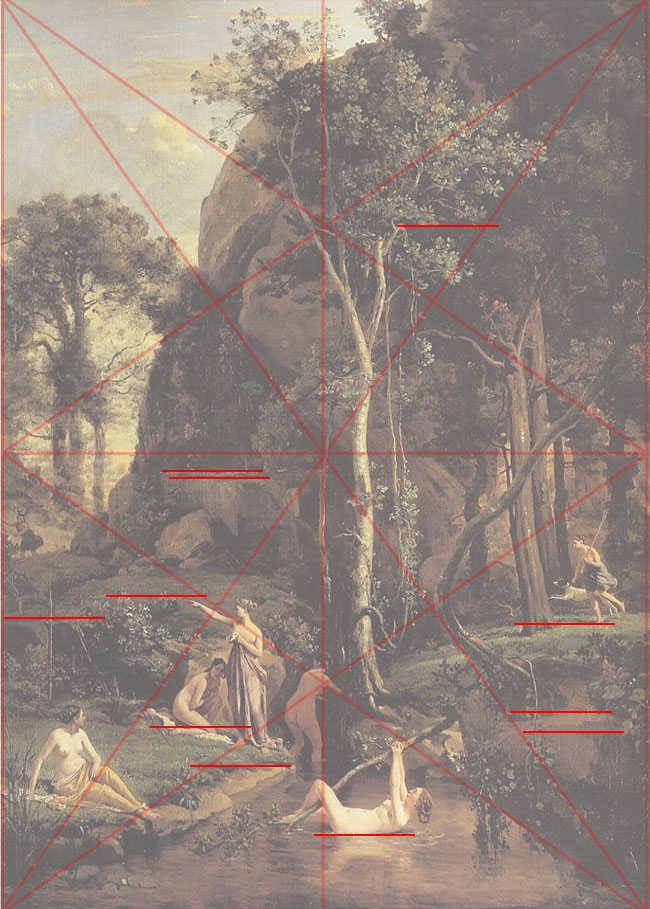
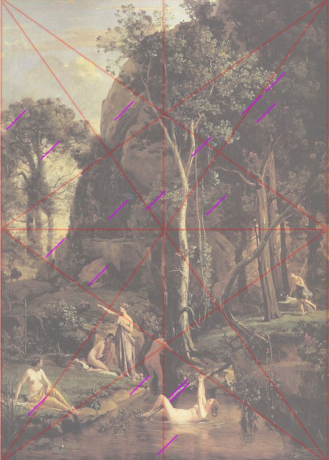
You can see how the geometry of the rebated square alone, begins to lock in features of the painting. I drew arrows pointing to the areas that Corot would paint with a specific diagonal to correlate with the geometry of the design. He would also design his painting to have many coincidences across everything…follow the line and see it hit other areas with the same angle. These aren’t arbitrary though, every one of them is planned in order to create motion and rhythm throughout the painting…almost like the tempo of a song. Did I mention Corot is a master of design? Don’t believe me yet, keep reading.
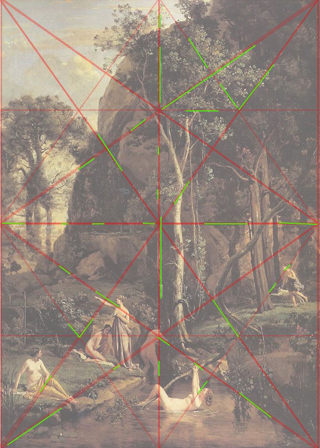
Here’s an example of how Corot would use radiating lines (lines generated from one corner or point of the grid, extended out to another point or intersection of the grid) to relate the subjects and lines across the painting.
Here are points of his painting locking into the grid of the Root two rectangle. Notice how most of them coincide with each other (what’s a coincidence in a painting? Keep reading)
Now comes the fun part! You’ve seen how Corot lays down the basic composition of his painting. Now watch as I discover his gamut (a limited number of directions to incorporate the movement and rhythm…the part that affects your feelings towards the piece without you realizing it.) Most great artists use a minimal gamut to simplify, yet strengthen the piece. All of these are generated from the symmetry of the golden rectangle. They should play off of the bold diagonals found in the main rectangle, or secondary diagonals generated by the “eye” of an intersection. It can’t be broken down too much, or it will lose any strength of design. Using bold area divisions will make the design more powerful.
Here’s a detailed shot of the woman on the branch:
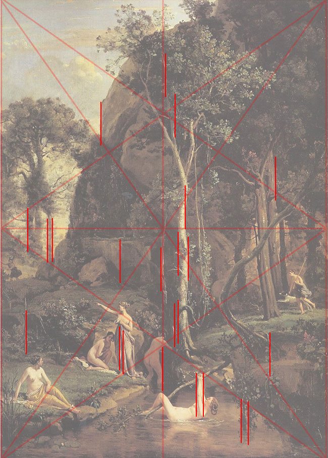
I’ll start by finding the easy ones…the vertical and horizontal lines, repeated throughout the painting. And keep in mind, these lines aren’t as plain as day, such as a branch, or sharp edge of rock, they are mostly hidden in the way the shadow and light play with each other, and the shapes of leaves. What I do when I’m looking at a seen and try to see the lines is close one eye, then blur my vision…or squinting works very well too!
Do you see how the small tree is directly in the middle of the Root two rectangle, and it coincides with the woman’s side, and the contact of the other woman’s leg on the branch…it runs up through the leaves of the tree, but I don’t want to get too excited here. The more coincidences your painting, photo, or drawing has, the more fluid the movement your piece will have.
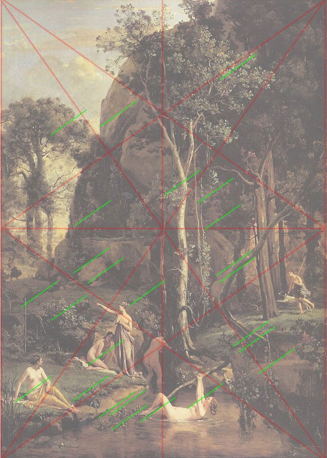
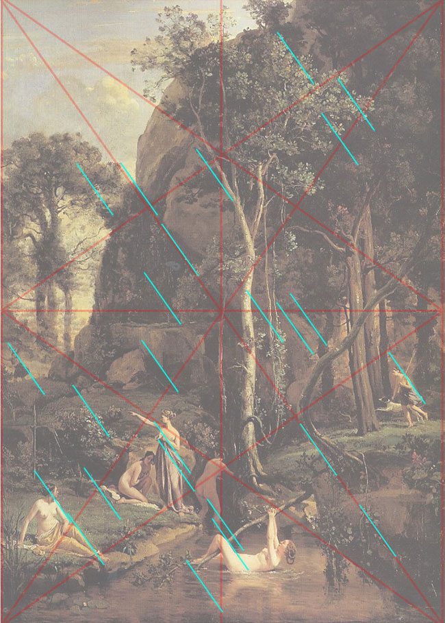
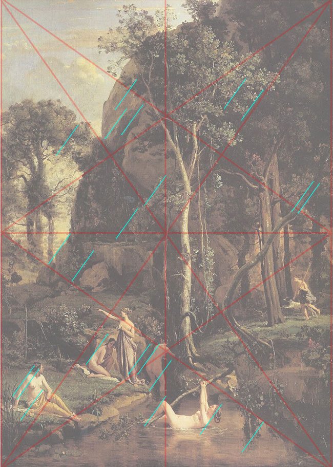
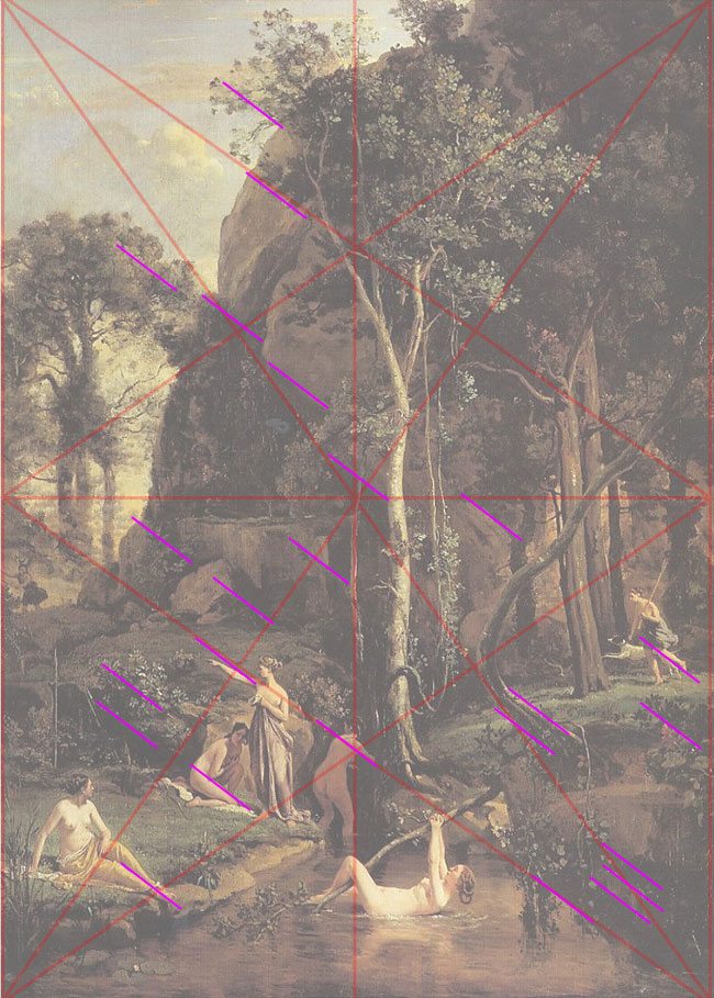
Here are some repeating diagonals throughout the painting….both sinister (right to left) and baroque (left to right). Notice how much these are repeated to create the subterranean rhythm.
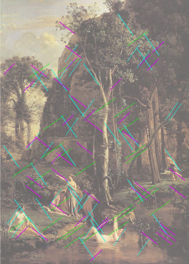
This is what they all look like together…do you see what I see?
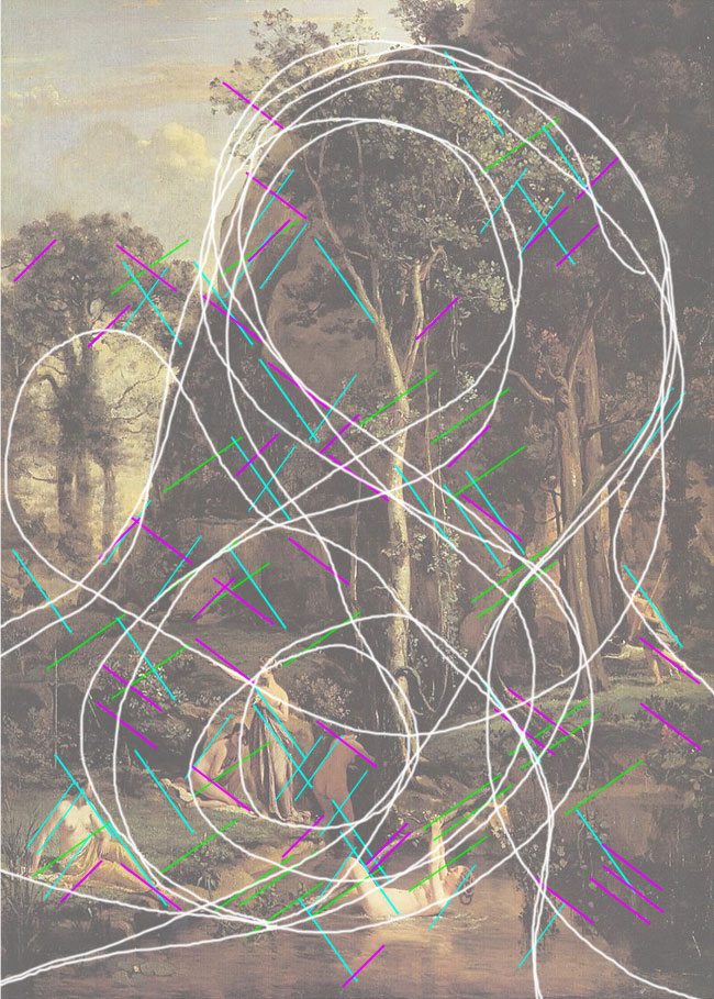
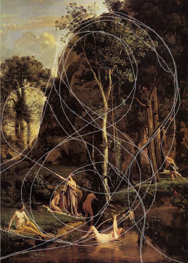
All of the diagonals Corot emphasized in his painting are creating a circular motion throughout the painting. When I realized this, my jaw dropped because I saw Corot’s intentions and saw how he wanted our eyes to flow throughout his painting. Wow! Seriously genius! This brings us to one of the most important elements of the design process…the arabesque! The arabesque is a curvilinear element that flows through the whole design, creating movement and fluidity. Here is Corot’s arabesque.
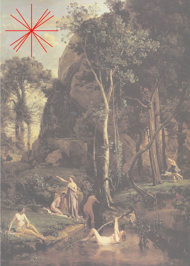
Now that we’ve seen the repeating directions Corot used, and his magical arabesque, we can plainly see the gamut he used. If you take this “starburst” and move it around in Photoshop, you will see how he created his entire painting on a limited number of directions.
I hope this has pointed out some of the secrets that have been lost over the years and explains how masters would use their drafting skills to design works of art that have integrity and power that doesn’t cease to amaze. And to think that all of this was generated from something that looks so simple and beautiful.
I really want to thank Myron Barnstone for teaching these techniques because they have changed the future of my photography.

