Dot Bunn – ANALYZED PAINTING
236/365
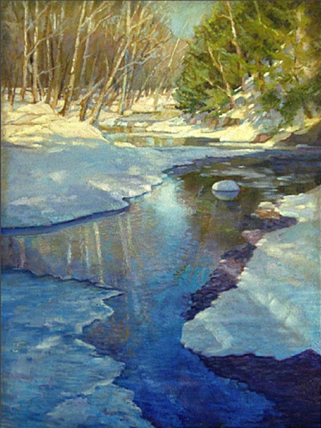
Today we are taking a look at Dot Bunn’s amazing painting. She was a student at the Barnstone Studios, so we know she’s aware of design techniques. Let’s see if she incorporates the the working methods of the great masters!
At Myron Barnstone’s retirement party, I saw that Dot would be attending as well. I really admired her work, so I thought it would be great to meet her. After about 10 minutes of asking around, my friends finally stopped her on the way down the Studios infamous three flights of stairs. She was very kind and humble, and invited me to check out her classes. Trust me, learning to paint like she does would be a dream! Anyway, I always find it interesting to meet talented artists…after all they could be the next Degas, Van Gogh, or Matisse!
1.5 Rectangle (Stacked) Basic Armature – Dot uses two 1.5 rectangle’s stacked to bring order to her composition. We can already see the shadow line and edges of the snow are locking in.

1.5 Armature with Major Area Divisions (MAD) – When we place the MAD over her painting we can see even more locking in. The diagonals of the trees, the iced rock in the water, the reflections…
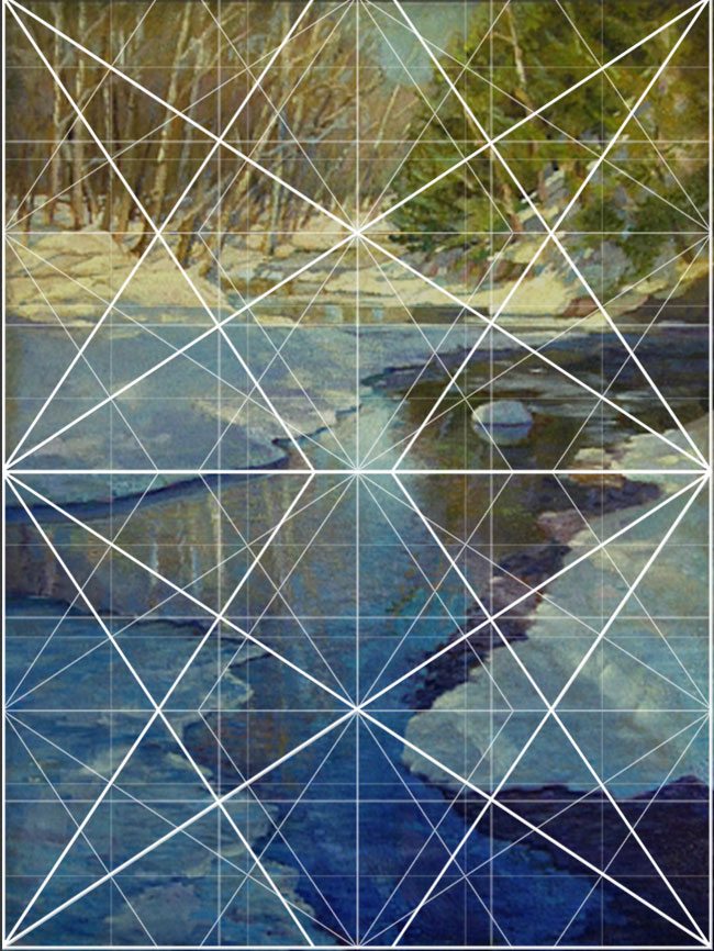
Locked into the Grid – Here we can see most of the areas locking into Dot’s grid system.
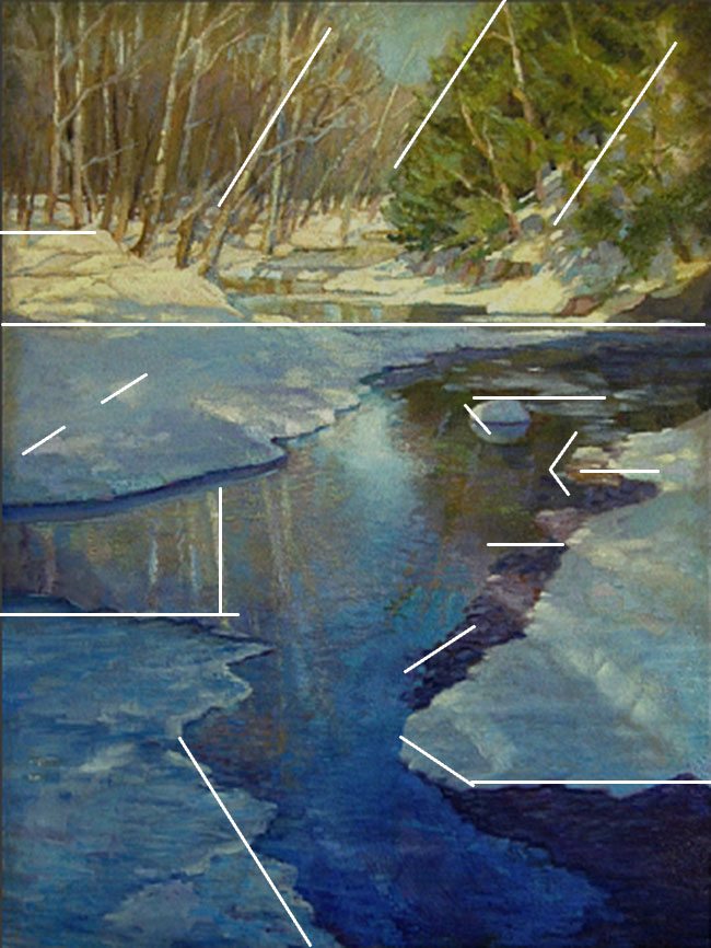
Gamut – She does a great job at incorporating rhythm into her painting. She does this with most of her paintings…plenty of diagonals, rhythm, and unity. This is the hidden song within her painting. It speaks to us, even if we don’t know design, because it can be felt. No joke!
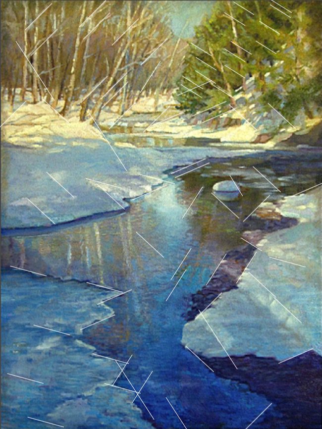
Coincidences – She remains consistent with her design skills and incorporates plenty of coincidences which create movement and unity. A much needed element within any design!

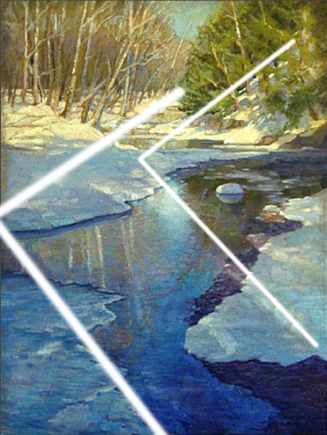
90 degree – Here we have two large 90 degree angles which are adding strength to her composition.
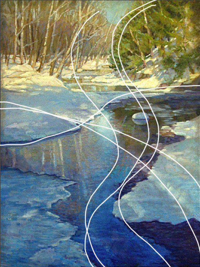
Arabesque – Just look at these beautiful arabesques weaving their way through her composition. Nice, fluid movement which links objects together to help create unity.
Ellipses – We can see Dot using quite a few ellipses within her design. Need to unite a few objects in your painting? Swing an arc, draw an ellipse…it’s a great way to unify elements.

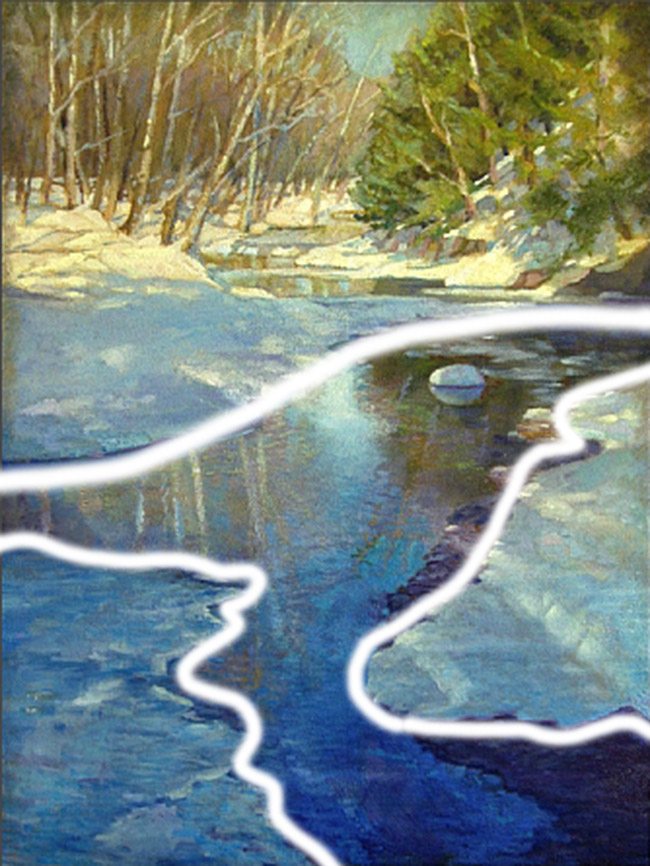
Figure Ground Relationship (FGR) – It appears that the freezing water and it’s reflection are the main subject within the painting. Here we can see that it’s clearly defined. No confusion between water, snow, or reflection.
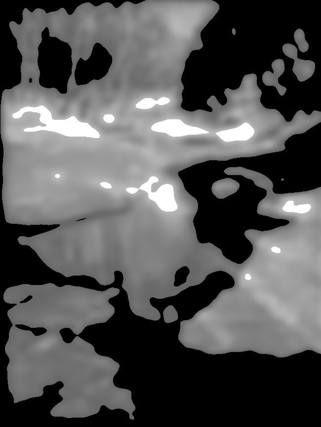
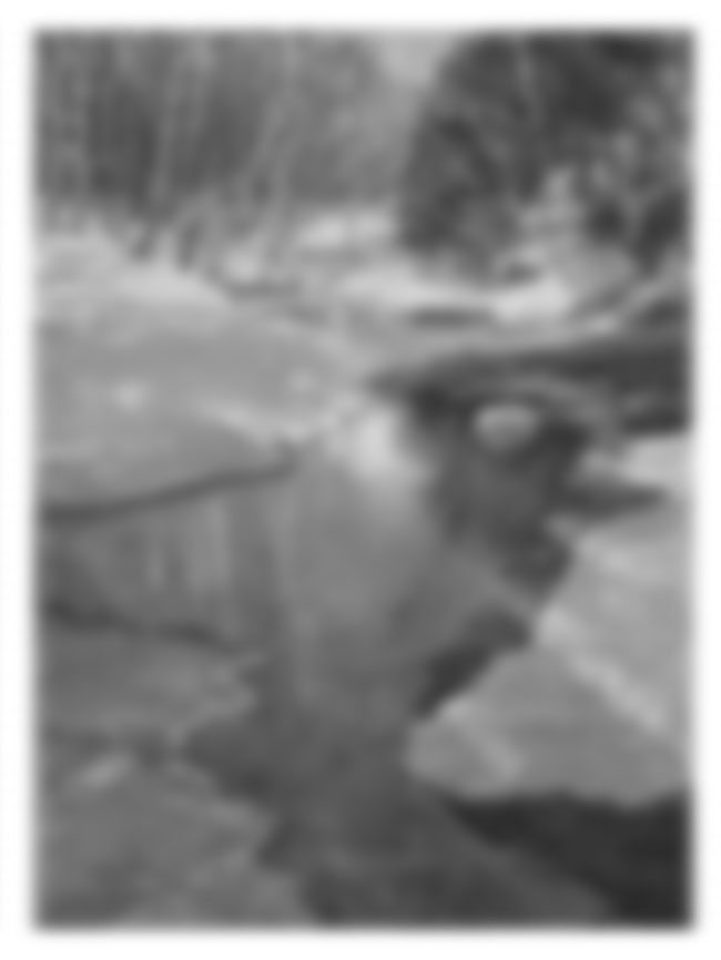
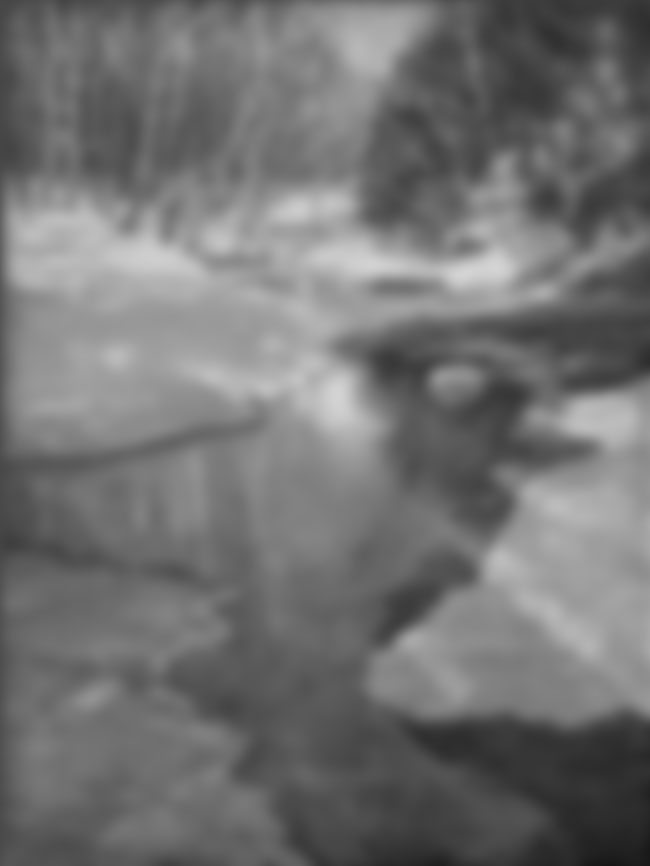
Black and White Blur (BW BLUR) – When we convert it to black and white we can begin to see her value scheme. It appears that lightest area is where the sun hits the snow. That makes complete sense, and she couples it with darker values to draw our eyes where she wants them. I would say the GAC is the reflection next to the iced rock in the water. After that her design unwinds like a spiderweb.
Edge Flicker (EF) – She keeps her edges free of high contrast which leaves the eyes happily moving throughout her composition.
Another great piece of work that displays excellent design techniques. Most of the Barnstone students I’ve met are equally knowledgable when it comes to amazing composition. Nice job Dot!
Thanks again for joining in everyone! Keep up the sharing and support, it means the world!!! See you next time!

