Dot Bunn – Secrets of Color & Design (Landscape Painting)
#671
Welcome back everyone! The continued support is much appreciated!
Today we are going to take a deep dive into the landscape painting process of Dot Bunn. In this special guest article, Dot shares her secrets of design, color and more. Let’s get into it!
Dot Bunn? Who Is
Some of you may already be familiar with Dot Bunn from a previous analysis of her amazing icy landscape (see Day 236). You may also have heard of her if you studied with Myron Barnstone or watched his DVD’s. Dot is a teacher of the arts and is a full time studio painter who lives in Bucks County, Pennsylvania. She’s been in countless exhibitions and has a strong sense of design. Definitely check out her website where she has excellent examples of her drawings, portraits, landscapes, and offers workshops.

This quote from Dot says it all…
“Good paintings are the result of intelligent planning and the endless study of technique and process. My paintings are thoughtfully developed by design, with preliminary drawings using traditional methods of composition built on the geometry of rectangles much the same as was done by painters dating back to the Renaissance. I enjoy the challenge of building a composition that works two dimensionally while depicting reality.” ~ Dot Bunn
Now that we know a bit more about Dot as an artist and teacher, let’s dig into the way she uses dynamic symmetry, golden mean calipers and more!

Getting a Nice Reference Photo Color & Design Process
Dot’s painting method is called indirect painting. This means each painting is built from composition to finished work through many sessions of drawing and painting. She’s able to achieve amazing depth of color by using layers of glazing and opaque paint. The word glaze might make some of you salivate, but this type will never be found on a Krispy Kreme donut. It’s a familiar painting process, which is much different than alla prima (see #585). Non-edible!
Some landscape painters prefer to paint outdoors, or en plein air, but it’s rare for Dot to do this. Remember her great quote from above? She plans her compositions, so she much prefers to go out in nature with her camera and capture some nice reference photos. These will later engage her memory during the painting process, while also providing any important details.
Mostly any camera or lens will work, but Dot uses an Olympus Pen Lite 55-pl-5 with a 14-150mm lens. The great thing about using a zoom lens is that you can compose in-camera without having to crop and move around as much.
After years of studying masterpieces and learning design techniques, you’ll develop an eye for which photos will make a good painting. This is no different for Dot. She even feels that casual shots turn out to be the most interesting once they are enhanced with editing software (i.e. Photoshop).
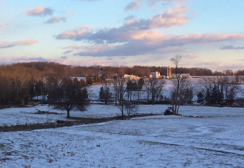
It’s important to organize the reference images, so Dot keeps them in computer folders by month and year. She has tons of reference photos collected over the years, and this next one was taken in March of 2017. This beautifully chilly location is Gayman Road, Bucks County, Pa. It was late in the day, and the winter scene is of a preserved farm near her studio. It’s one of her favorite locations to capture and paint.
Value Study
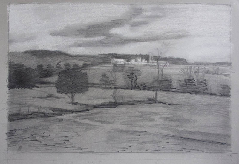
For large works, Dot will start with a small value study in pencil on gray or white paper. The reference image for this demonstration is rather dark, so gray paper is a better choice because gray already gives her the middle values. The pencils she likes to use are Cretacolor Monolith woodless (full range of hardness). Charcoal works well too, and she notes any highlights with white chalk.
This value study does’t need detail because it’s just there to give her an overall sense of the value range for the painting. She does this because light is an additive system where as drawing and painting are subtractive systems. Therefore, she feels that looking at a lit image on the computer screen can be misleading when studying value.
Dynamic Symmetry & More
During the design process Dot uses Golden Mean Calipers (a.k.a. Phi, Golden Section, etc) to organize areas according to the divine proportion (see more articles). These calipers were used by master painters (see Day 306) and represent the golden division of a line.
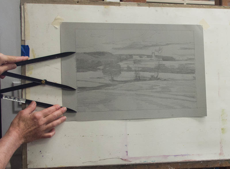
She’s using a 24×36 linen panel, which is a 1.5 ratio (36/24=1.5); exactly the same as the reference photo (most cameras have a 1.5 ratio). If you’re familiar with dynamic symmetry, you’ll know there are many different grids that can be used to help organize the composition within this specific 1.5 rectangle. Dot uses a variation of overlapping root 4 grids as seen below (in red).
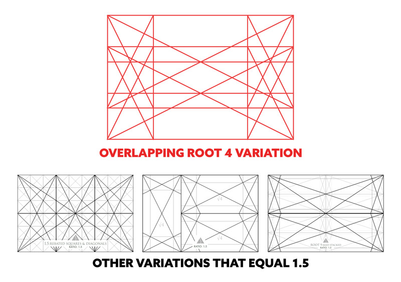
Dot says, “Generally I do not decide on which rectangle to use until I have worked on a drawing. After I have the initial idea down on paper I find the dominate angle in the work and then push the composition to better use that angle. There are so many tools that can be applied to a composition to make it more cohesive.” She also said that her mentor, Myron Barnstone, would introduce her to another design technique for each new composition she started. Techniques like arabesques (see Day 17) and coincidences (see Day 48) are great for creating unity and movement.
Dot continues to explain that, “it makes the work more challenging. It does require spending more time in the beginning to get the composition just right. Color may be what excited me about the image, but it’s the last thing that I consider when designing.”
She displays her reference photo on a 27” iMac screen. It’s mounted to the wall at eye level next to her easel, so It’s like she’s looking out the window. Definitely beats standing in the cold weather for hours trying to paint with frozen fingers! Unlike a window, Dot can enlarge areas for the finer details she wants to include.
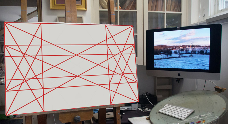
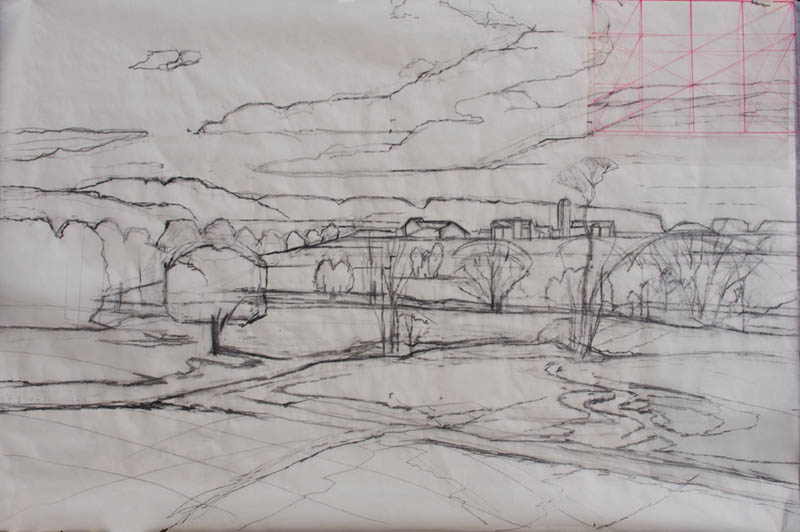
Dot draws the image at the same size as her linen panel, which makes it easier to transfer later. No projector (see #665) or light table is needed in her process. She draws the grid onto white paper in red, then places the same size of tracing paper over it (24×36 for this example). She then proceeds to develop the drawing directly on the tracing paper…allowing her to see the grid underneath. This way she can reference the dominate divisions and diagonals with ease.
Dot says she works “lightly and loosely at this point looking for connections and running angles that will balance the composition.” In the image below, we see the first draft towards the final drawing with the red grid underneath. Rarely can she get away with just one drawing.
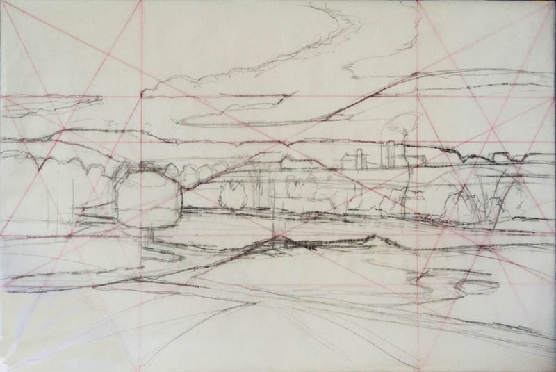
To help her with gamut (see Day 38), Dot uses a smaller version of the overlapping root 4 rectangles. See it in the upper-right corner? Interesting, don’t you think?
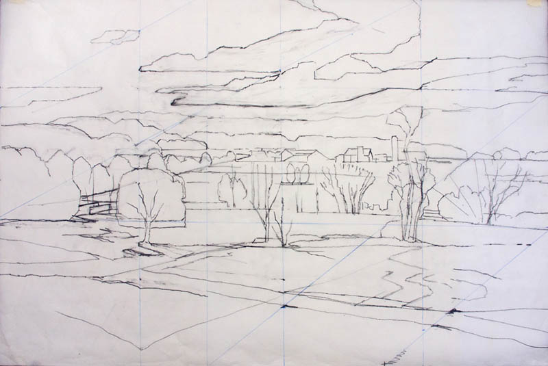
Dot’s drawing and design process can take two or three revisions to get a “cohesive feel to the composition.” Here’s her final drawing which will then be transferred to a linen panel.
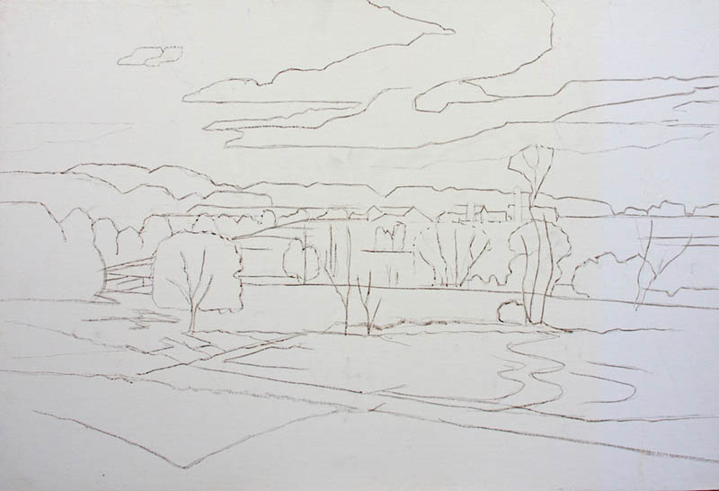
For the transfer process, she covers a sheet of newsprint with charcoal, then places it on top of the linen panel (charcoal side down). She then places her drawing onto the newsprint and traces the lines…transferring the drawing. Much like a carbon copy or using a printed image (see #601). In order to preserve the drawing during the first layer of paint, she brushes black walnut ink over the charcoal lines. This is an ink she makes from trees around her property, but any water based ink would work.
Here is the linen panel with the transferred drawing now fixed with water based ink. Now she can focus on value and color!
Value and Color
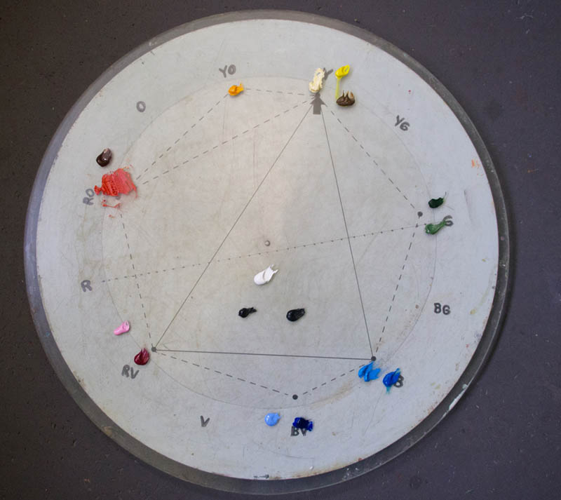
Sometimes Dot will work the entire painting in a single neutral color to establish a value based painting (a.k.a. underpainting), but in this case she started with color. We can see these colors on the circular palette she made below. She mentioned that some of the students in her color theory class were inquiring about the circular palette, so she now makes a two-part laminated palette that they can use in class and at home.
Her method of working with color has evolved out of the system that was taught by Myron Barnstone (see #369). It is a derivative of the Fletcher System which can be found online and is available through Barnstone Studios as a DVD. Dot has taken what she learned from Fletcher and Barnstone, then developed her own system to meet her needs as a fine art painter. This is an excellent practice for any working artist!
Without digging into the whole system, let’s have Dot explain why she chose these colors for her painting. Dot says, “the Fletcher System asks that you choose three basic colors that will control the whole painting and this is called the painting’s color key. The majority of this painting will be built from the use of cool colors. As you can see on the palette (above), I will be using Red Violet and Blue mixes for most of the painting. Yellow is the punch color that enriches the otherwise cool color harmony, so my Key for this painting is Yellow. Yellow is the least used color in the painting but its presence gives that painting spark and life. The three colors in this key are RV – Red Violet, B – Blue, Y – Yellow. It is the mixing of a controlled and limited palette of colors that produces harmony. Since I can not explain the whole system of color management here I will leave it at that.”
Dot has the value more important than color at this stage. Keeping things light is a priority for her because darker values can always be added later.
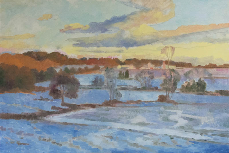
When it comes to mediums, she uses very little. If the paint is too thick and not flowing like soft butter, she’ll use a little medium. Here’s the first layer of color.
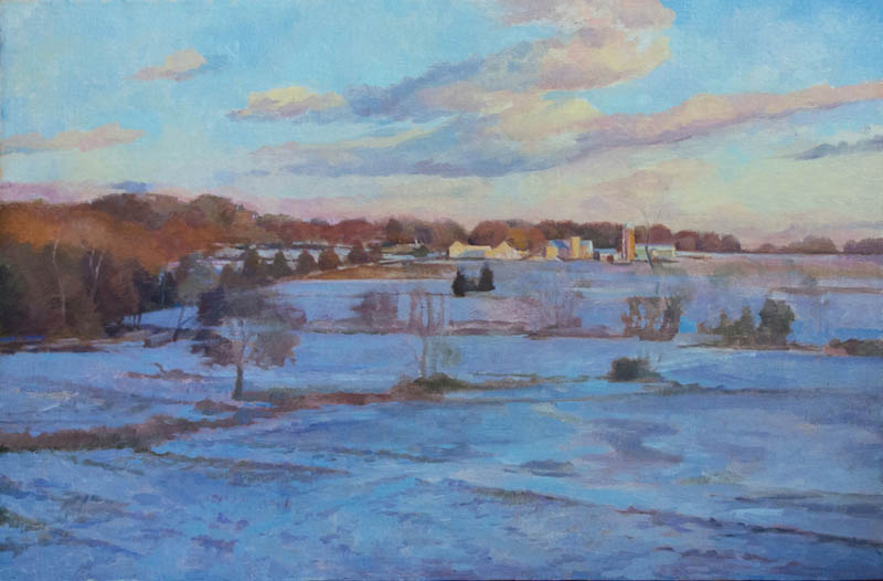
Here’s the second layer where we’ll see subtle color adjustments.
The painting will have many different layers; each completely dry before the next begins. At first, she paints large areas of flat color. As the layers are built up she can break the areas down into complex color notes to better describe the light and form. The final layer is saved for
tiny notes of color, to soften edges, and to reinforce areas of extreme light with thicker paint. Since she chooses to make some of the light areas thicker with paint, she’ll keep the darker areas thin by using more transparent colors.
In the final stages of the painting she follows the “fat over lean” principle by adding glazing mediums or linseed oil to the final layers. The linseed oil can also be used to eliminate that matte-look of dried paint to bring back the original intensity of color. Lightly rubbing some on the painted surface should do the trick. Don’t use too much or it will show drip lines.
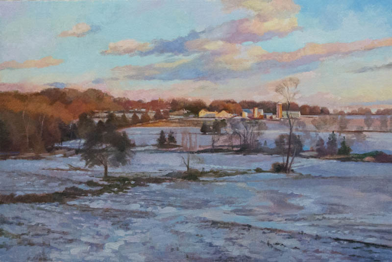
Here is the third layer of color. Notice how it’s slightly getting darker and darker as mentioned previously.
At this stage her values are established, so now she can focus on building up the beautiful colors. To help enhance the illusion of depth, you’ll need to pay close attention to the edges (see #578) and saturation of color.
Sometime during the second and third color layers, she might go back and make sure that her original design is still intact. If she’s strayed a little from the design, she uses “white chalk on the dry painting to redraw the angles and dominate movements.”
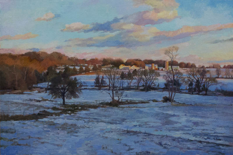
Here’s the final painting, but she feels a painting is never really done. Dot says, “I find that I can work on paintings to refine and enhance forever but at some point you have to set it aside and let it be. It may call for further work or after some reflection I might find that it really is finished. So, I have stopped painting on this painting and put it in a frame. It will hang in my studio and speak to me over time.”
Conclusion
As you see, another contemporary master painter is using the same exact powerful design techniques as the other masters. Dot starts with an inspiring reference photo, develops it into a nice design, then paints it with beautiful colors. She takes the time to create a Michelin Star meal for us rather than a microwaved hot pocket. Delicious!
Be sure to check out her website to see her excellent work and more info. Thanks again for joining in, see you next time!

